Showcase Of Beautiful Vertical Navigation Designs

Email Newsletter
Weekly tips on front-end & UX.
Trusted by 200,000+ folks.
 Flexible CMS. Headless & API 1st

 Register!

Go to any website and you’re guaranteed to find one thing: a navigation menu. Navigation menus enable visitors to move from page to page; without them, we would have no way to conveniently explore websites. Perhaps this is why designers, information architects, usability researchers and user experience specialists invest so much time and resources into devising aesthetically pleasing and user-friendly navigation systems.
Website navigation menus generally come in one of two orientations: vertical and horizontal. Horizontal navigation menus display items side by side. Vertical navigation menus stack items on top of each other. In this post, we highlight some remarkable vertical navigation menus, for your inspiration.
Further Reading on SmashingMag:
- Showcase of Modern Navigation Design Trends
- Horizontal Navigation Menus: Trends, Patterns and Best Practices
- Navigation Menus: Trends and Examples
- The Case Against Vertical Navigation
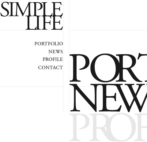
The vertical navigation in this portfolio website is simple and clean in looks yet robust in functionality and interaction. Clicking on “Web,” “Print,” or “Identity” filters the thumbnails on the right, and clicking the “About” menu item shifts the navigation to the right, making way for content on the left.
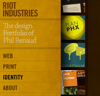
Here, you can see one of the benefits of vertical navigation: it allows for highly compact and modular menus that appear distinct from the rest of the layout. Sitting in the top-left corner, just below the website’s name, the menu is one of the first things visitors see (at least with left-to-right languages).
This portfolio has a clean and simple navigation design that leaves the visitor to focus on the vibrant content to the right.
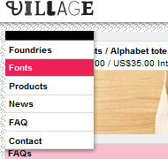
A quite distinctive, original navigation menu with five different typefaces. A bit unusual navigation for a crowdsourcing community.
Navigation menu on the right side of the layout for a change: although the design is basic, almost rudimentary, it works well and is easy to navigate. Navigation menus do not have to look outstanding.
This vertical navigation design is elegant and functional. Hovering over a menu item triggers a horizontal animation.
This website’s vertical navigation sits right in the middle of where the visitor is focusing when the page first loads. Active menu items are denoted by a pointing hand.
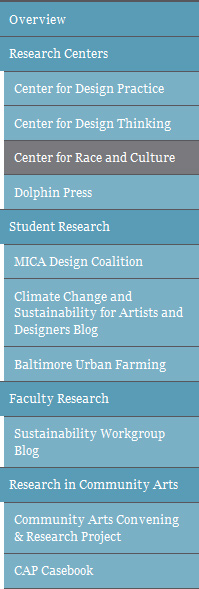
The navigation design for the Maryland Institute College of Arts demonstrates another advantage of vertical navigation: it shows hierarchy and allows you to group menu items without resorting to drop-down menus, whose sub-menus are displayed only when the user mouses over an item.
The vertical navigation design on this website is positioned right below the website’s name, making it prominent without drawing attention from the large rotating banner in the top-right.
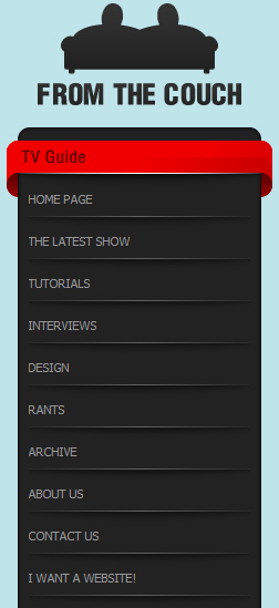
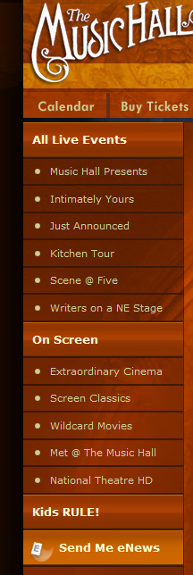
The vertical navigation here shows yet another benefit: being able to accommodate more menu items.
The portfolio of art director Nick Jones has vertical navigation towards the middle of the page. The menu summarizes his work and has an interactive component that scrolls the menu up and down based on the user’s mouse movements. When an item is clicked, the menu shifts to the left, making room for the corresponding content.
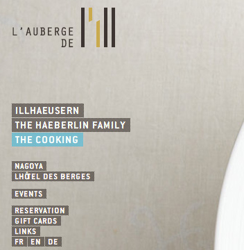
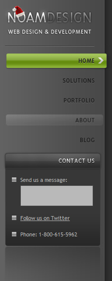
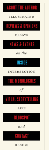
This dark vertical navigation for Noam Design leaves the menu option for the contact form permanently open.
The vertical navigation on this website is grouped into two categories, giving users the ability to quickly find the link to the page they’re interested in.
The vertical navigation in this portfolio reflects the traditional table of contents in a book. Menu items are categorized in two groups.
This simple vertical navigation is presented right below the website’s name, giving it a prominent position in the layout without taking away attention from the main content area. A dark gray background denotes active menu items, with an arrowhead pointing at the content, encouraging natural and effective eye flow.
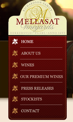
Mellasat Vineyard’s vertical navigation menu is a modular, one-piece design element that also contains the website name and logo. The menu is a focal element here.
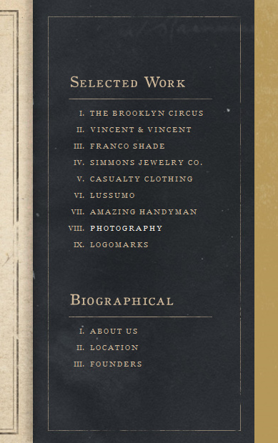
The navigation in this elegant, minimalist, typography-based portfolio is a central element and contributes to the overall layout. The menu items are repeated on the right in a larger font.
This menu creatively weaves in the description and purpose of the website.
This interactive menu has a slick slide-out menu that displays sub-links and content when a user hovers over a primary menu item.
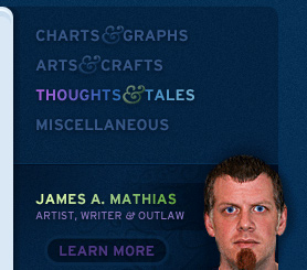
The coloring of this navigation is subtle, but the menu manages to attract the user’s eye through its prominent location in the layout and the author’s high-contrast headshot.
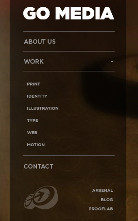
Go Media Inc’s navigation is an accordion that reveals sub-menus. Clicking on a primary menu item triggers an animated downward effect that opens up sub-menu items.
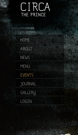
This dark grunge-themed vertical menu is subtle yet hard to miss because of its position.
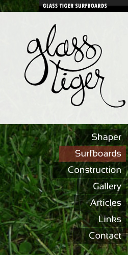
Glass Tiger Surfboards opts for a vertical navigation menu with low opacity so that the grassy background shows through.
The menu on this minimalist portfolio website has a red see-through background so that the featured photo is visible even when the menu is expanded.
This artistic menu is transparent, so that the distinctive floral pattern in the background isn’t obscured.

This menu has a dark-gray semi-opaque background that allows the background image to show through.
This navigation system is revealed when the user hovers over “Menu.” The simplicity of the design is creative; the background images are the distinguishing element.
This menu has illustrated icons beside menu items, which both complement the overall theme and help with visual recognition.
This vertical menu is a distinctive element in this layout. The icons to the right serve as eye candy and as visual representations of the menu items.
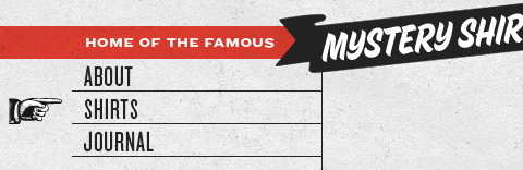
This menu is interesting because its grainy style is rarely seen on websites for institutions of higher education.

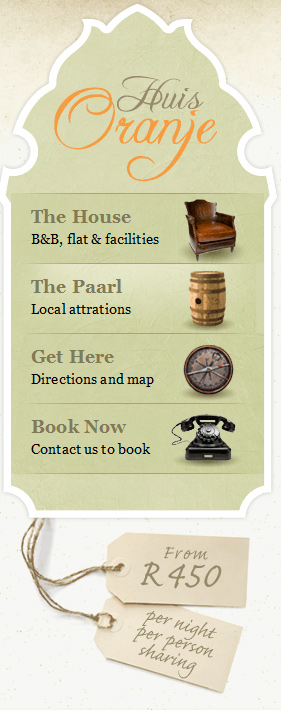
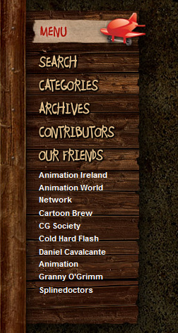
The navigation here is set against a wooden background, with links in an organic scribbled font.
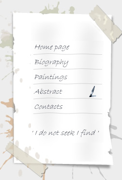
The portfolio of A J Miles has vertical navigation as its primary visual element. The menu is fashioned as a piece of paper held in position by tape.
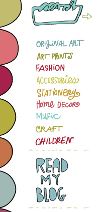
This menu has colorful fonts with a hand-drawn look to them, complementing the overall theme.
This vertical menu is central to the layout. It has large fonts and a 3-D effect.
On this website, you can see how big font sizes can get when you have more vertical space to work with.
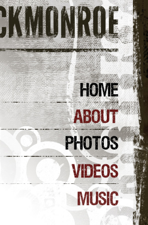
The personal website of Rick Monroe has navigation links on top of a textured background, right below the website name.
The big font size contributes to the minimalist theme of this website.

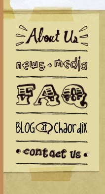
This website has an organic hand-written font for its menu, which sets the tone for the layout (which is arranged as a gridded notebook).
This menu offers an interesting interaction. When an item is clicked, the menu shifts left or right to make room for the content, thus creating an engaging user experience.

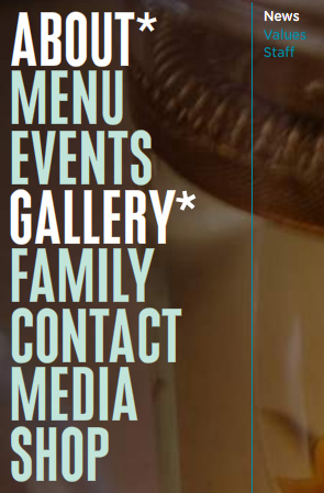
This navigation has over-sized fonts, making it the highlight of the layout. Hovering over a menu item reveals an interesting animated effect.
In this navigation system, the primary links are vertically oriented. Sub-menu items come out horizontally.

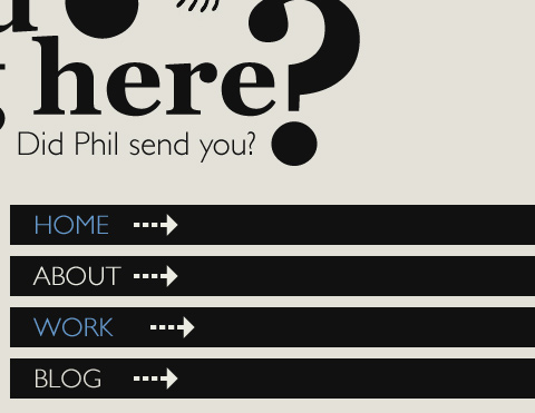
This simple text-based menu is findable without drawing too much attention from the focal point of the page: the slideshow.

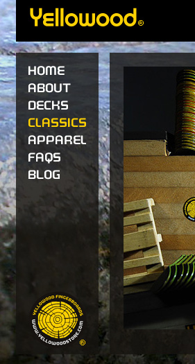
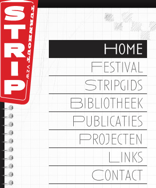
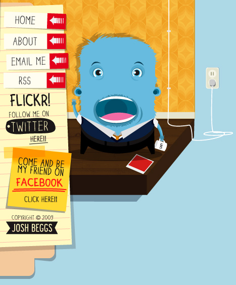
The items in this menu are done as strips of paper, adding a nice touch to the illustrated theme.
The vertical menu here takes up a large part of the layout. Hovering on an item reveals a simple CSS animation that moves the right-pointing arrows further right, giving the user a feeling of moving forward.
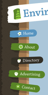
This irregularly arranged menu truly embodies the website’s organic look and feel. Icons on the left of each item help with visual recognition and complement the design.
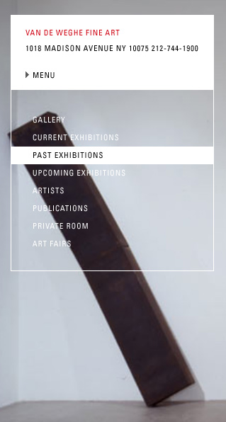
On this website, menu items are located near the middle of the viewport. The simple navigation adds a certain elegance without dominating the layout.
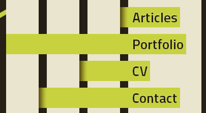
This website’s navigation is unique, looking a little like basket-weaving. Being in the top-right gives it prominence.
Bill Gates’ official website has a unique menu that conveys innovation and forward-thinking: themes that the technology baron surely wants to convey to visitors.
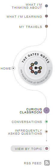
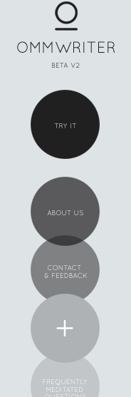
This menu’s items are displayed as translucent circles. On hover, a symbol is revealed that relates to that particular menu item, making the menu memorable.
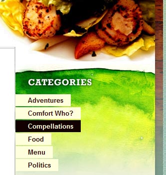
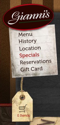
This menu is slightly tilted, and its skewed orientation is sure to grab the visitor’s attention. The design is appropriate for the website, which is for a restaurant.
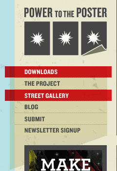
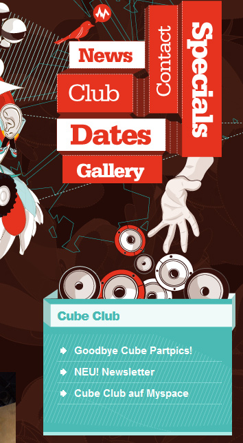
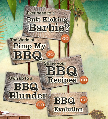
Bold, striking, eye-catching. These adjectives aptly describe Aussie BBQ Legends’ vertical navigation. The menu plays a big part in setting the tone for the website.
In this navigation system, the primary links are vertically oriented. Sub-menu items come out horizontally.
This simple text-based menu is findable without drawing too much attention from the focal point of the page: the slideshow.
The items in this menu are done as strips of paper, adding a nice touch to the illustrated theme.
The vertical menu here takes up a large part of the layout. Hovering on an item reveals a simple CSS animation that moves the right-pointing arrows further right, giving the user a feeling of moving forward.
This irregularly arranged menu truly embodies the website’s organic look and feel. Icons on the left of each item help with visual recognition and complement the design.
On this website, menu items are located near the middle of the viewport. The simple navigation adds a certain elegance without dominating the layout.
This website’s navigation is unique, looking a little like basket-weaving. Being in the top-right gives it prominence.
Bill Gates’ official website has a unique menu that conveys innovation and forward-thinking: themes that the technology baron surely wants to convey to visitors.
This menu’s items are displayed as translucent circles. On hover, a symbol is revealed that relates to that particular menu item, making the menu memorable.
This menu is slightly tilted, and its skewed orientation is sure to grab the visitor’s attention. The design is appropriate for the website, which is for a restaurant.
Bold, striking, eye-catching. These adjectives aptly describe Aussie BBQ Legends’ vertical navigation. The menu plays a big part in setting the tone for the website.
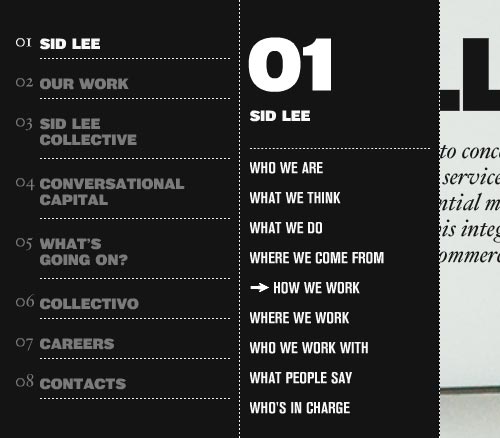
Sid Lee agency uses an interactive navigation menu on the left side of the page. Some sections of the navigation have sub-sections which are displayed next to the primary navigation.
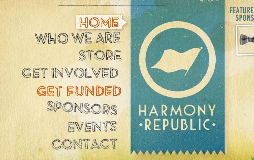
Harmony Republic places the navigation menu on the left side of its logo. Unusual placement, but it works nicely. The current navigation section is highlighted by a white background.
Further Reading
- 35 Examples of Effective Use of Vertical Navigation Menu in Web Design
- Navigation Menus: Trends and Examples
 (al)
(al)

