Grid-Based Web Design, Simplified

Email Newsletter
Weekly tips on front-end & UX.
Trusted by 182,000+ folks.
 Celebrating 10 million developers

 Custom Web Forms for Angular, React, & Vue. Your backend.

A grid at its barest is nothing more than a series of intersecting horizontal and vertical lines spaced at regular intervals, but its innate propensity for creating order out of chaos makes it one of the most powerful tools at a designer’s disposal. If you want to reap their benefits of grids on your next project but are unsure of the specifics, this article is for you.
Introduction

Grids are everywhere in our society, and have been for centuries, as this city plan for Washington, DC drawn in 1792 by Charles L’Enfant demonstrates.
If you’re even vaguely acquainted with the fundamentals of graphic design, you’ve probably worked on some kind of a grid or at the very least seen examples of grid-based layouts. Grids are an established design tool, and a wealth of knowledge exists in the literature discussing the theory of grids and extolling their benefits. I will make no attempt to summarize them here (if you want a good primer on grid theory, have a look at this piece by Mark Boulton).
Be sure to check out the following articles:
- Designing With Grid-Based Approach
- G
- CSS Grid, Flexbox And Box Alignment: Our New System For Web Layout
- The Semantic Grid System: Page Layout For Tomorrow
Instead, this article will attempt to explain how to put the theory of grid-based design into practice, taking into account the typical workflow of a Web design project. We’re not redesigning the BBC here, just looking for a flexible, effective solution for the small to medium-sized projects that a freelancer or small agency is likely to tackle.
The status quo, as it were
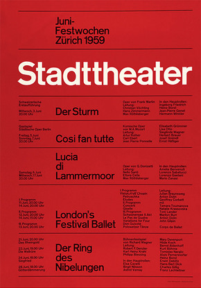
This iconic poster by Josef Müller–Brockmann epitomizes early grid-based print design. It was created in 1959 to list showtimes for the Stadttheater (State Theater) of Switzerland in Zurich.
Use of the typographic grid in print design quickly achieved ubiquity following its popularization by modernist graphic designers in postwar Switzerland - the same school of thought that created our venerable Helvetica. While grids became entrenched in the culture of print design, factors such as the inconsistent interpretation of CSS across browsers and a lack of formal graphic design training among Web designers stifled the implementation of grids on the screen.
Times are changing, however. The Web standards renaissance has ignited interest in grids among innovators in the community, and a whole slew of CSS-based grid frameworks (like 960 Grid System and Blueprint) have emerged and gained popularity, claiming to greatly reduce development time, all the while providing the same structure and unity that grids have afforded print layouts for so long. Problem solved, right? Not so fast.
While these prefab frameworks perform admirably if used as advertised, the problem is that many designers aren’t taking full advantage of them! From what I can gather based on observation and conversation with colleagues, some among us are deliberately avoiding the use of grids for fear that they will be limited in what they can do with the design. Nothing could be further from the truth!
Grid systems can facilitate creativity by providing a framework and already answer some designers’ questions such as ‘where should the folios go’, ‘how wide should the measure be?’ etc. A well designed grid system will go some way to answer these questions and more.— Mark Boulton
In addition to strengthening your layouts, adopting a grid for consistent use in both your source files and code will streamline the entire development process and make future edits less painful. Choosing and using a prefab framework is one obvious answer, as a ton of documentation and resources are already available. Honestly, however, I don’t think they’re always appropriate for a simpler project. The number of columns in the default grid and the extra stylesheets can be overkill if all you need is a simple three or four column layout. The good news is that creating your own custom framework is very simple, and you’ll learn a thing or two in the process.
So where to begin? While some industry notables, namely Andy Clarke, have begun to advocate cutting out the Photoshop and going straight to the code, this is not always a feasible or even desirable step. Many designers, myself included, find that creativity flows more freely into a graphics program, since elements are more easily created and manipulated in this environment than within the context of code. To properly execute a grid-based Web layout using the traditional Photoshop-to-code workflow, we need to back up a step and start designing static comps on a grid that mirrors the one on which the design will be coded.
Getting started

Before we get started creating a design comp, we’ll need to do a little math and some quick planning, then configure our software to create an environment that facilitates grid-based design. This tutorial assumes that you’re using either Photoshop or Fireworks, but virtually every piece of graphic design software on the market has similar features.
Choosing a base unit

The American football field is laid out on a grid with a base unit of one yard. Every five yards, the hash marks are replaced with a gridline that crosses the entire field, making it easier for players, spectators and officials to understand where the play is taking place, no matter where they are standing.
Similarly, our grid will have a base unit of one pixel, but every 10 pixels a gridline will help us align objects relative to the page as a whole.
First consider the medium. Since we are designing for the screen, we will use pixels as our base units of measurement. As I’m sure you’re aware, however, individual pixels are far too small to form a grid to which we can easily align elements at 100 percent scale. Imagine if an American football field were marked off in inches instead of yards!
The solution is to create a larger interval consisting of multiple pixels which will form the base unit of our grid. I like to use 10 pixels, primarily because doing math with 10 is very clean and intuitive. Additionally, holding Shift + Arrow Key to move objects in Fireworks and Photoshop will move the object in increments of 10 pixels, which is perfect for quickly moving things around whilst keeping them aligned to the grid. Those who are familiar with the metric system will likely feel comfortable using 10 as their base increment. Designers who are familiar with print standards may find nine or 12 more intuitive, as these numbers go nicely into 72, which is the number of points in one inch on the pica scale.
If you plan to integrate your design with an existing CSS framework, it goes without saying that you should check into the default dimensions of their grid before doing anything else. Some of those frameworks even come with design templates that you can just pop open and voila, your grid is already set up and ready for design.
You could potentially use a larger number as well, but it should be small enough so that you’re not constantly placing elements between gridlines to achieve the level of precision you’re after. This is one of my bigger gripes with the prefab frameworks, as their base unit is sometimes quite rough, for example Blueprint’s is 30 pixels. Remember that the number you choose is not extremely important. What is crucial is that you use it consistently within and across projects so that it becomes second nature.
Creating your file and setting up the baseline grid
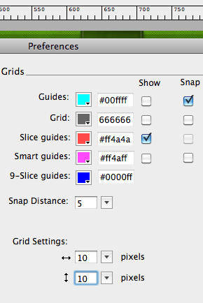
Fireworks has an intuitive panel which allows you to control the properties of grid and guides from one place. You can even edit colors, which is handy if your grid or guides blend in with your design too much.
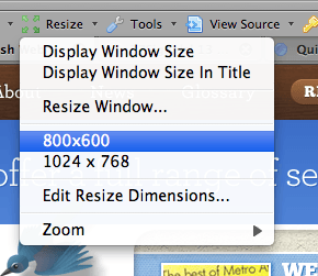
If you want to test your design in varying screen resolutions, Firefox’s Web Developer Toolbar add-on has an ingenious Resize command which allows you to resize your browser viewport to many common resolutions with the click of a mouse. You can even create and save custom resolutions.
When creating a new file for a Web layout, first consider the width of the canvas. Let me pause for a moment to explicitly tell you that we are creating a fixed-width layout. Going the fixed width route (as opposed to a fluid width that fills the entire browser window) allows designers greater control over the measure, or the number of characters per line in a column. Together with leading (line-height) and font size, maintaining an ideal measure of 55-75 characters per line in your main content region is a key factor in creating a pleasant reading experience.
I try to keep my layouts limited to around 960 pixels wide to accommodate the 1024 x 768 screen resolution, which is still a reasonably common size. Some designers are pushing the limits and creating pages close to 1,000 pixels wide, but be aware that exceeding 970-980 pixels will likely force a horizontal scrollbar on a 1024 x 768 monitor due to the added width of the vertical scrollbar and the “frame” of the browser in which the site is viewed. That being said, there is not an absolute. A web design blog could probably be 1200 pixels wide or wider, as I don’t know any designers still working on 1024x768 (if you’re out there, I’m sorry, it must be miserable). Design for your audience, but keep in mind that as width increases, font size should increase commensurately to maintain an ideal measure.
To allow ample room to design a tiled background on either side of the content area, I usually make my source file about 1,600 pixels wide.
Once you’ve created the new file, go ahead and set up your grid using the base unit you chose.
- Access the Guides and Grids section of the Preferences panel in Fireworks, or the Guides, Grid & Slices section of the Preferences panel in Photoshop.
- Change the grid intervals to the base value you chose earlier.
- In Photoshop, make sure to change the unit of measurement from inches to pixels as well.
- Enable snapping, as this makes aligning elements to gridlines much easier.
- I also strongly recommend enabling rulers, as they simplify drawing guides and enable you to quickly get a sense for the dimensions of objects as you are drawing them.
<h3”>Adding columns and gutters
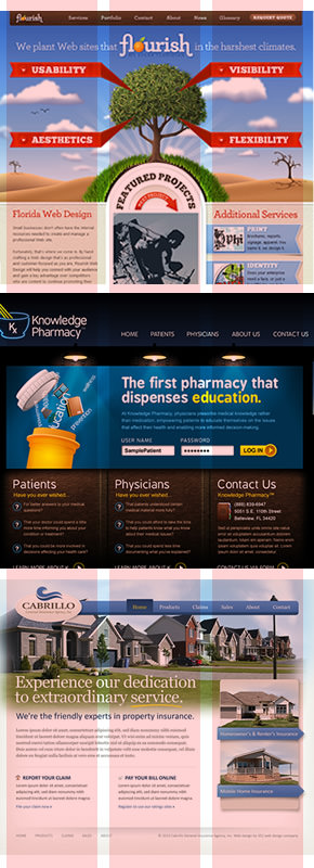
Each of these home page designs was created on a three-column grid. Though the width of the columns and gutters varies slightly on each design, the overlay demonstrates the structure that the three column grid can provide.
Now that you have a document with a grid, do something useful with it and create columns and gutters. Columns are the groupings of grid units that create the visual structure of the page. They are not necessarily uniform, but they often are. Consistently aligning your page elements to columns is the main reason to utilize a grid and what will make a great deal of improvement both in the strength of your layouts and the efficiency with which you can code and edit them. Guides are without a doubt the most convenient way to establish the boundaries of columns and gutters.
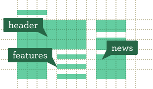
When creating columns and gutters for your layout, the simplest way to start is by creating three columns of equal width. This is a proven foundation that can accommodate a wide variety of content. In fact, most designs I create fall along a three column layout, with columns about 280-300 pixels wide and gutters anywhere from 30 to 60 pixels. On the home page, your page banner/hero area can span all three columns, and beneath it you have three consistent regions for common home page stuff like news, blog posts, product features, etc. When you merge two columns into one, the proportion of the large column to the remaining small one is not terribly far from the golden ratio, and it works great for a typical side navigation/main content area layout of blog posts or inner content pages.
This is where many critics would stop me and say something like “If I design all my sites with this layout, they’ll all look the same.” To which I reply “Nonsense!” Layout is only one part of a design’s overall aesthetic, and when you can answer layout questions with time-tested proportions that work, you have time to focus on other things like color, texture and typography. As a case in point, take a look at this sample of home page designs I’ve done. Each of these has nearly the same three-column underlying grid, but each communicates a profoundly different message.
While the three-column setup works brilliantly for most projects, you shouldn’t feel limited to this simple foundation, either. Take a look at this diagram. A 960 pixel layout is broken into columns of varying width and number. Each of the columns and gutters is an exact multiple of 10 pixels wide, and all the columns in one row are of equal width. By combining these columns in varying ways, you can quickly develop complex layouts as well as the tried and true standards. For example, if you wanted a wider content region for a slideshow and a narrower sidebar for descriptive text, you could start with the row which is split into three columns, combine the rightmost two or the leftmost two to form the large column and leave the remaining one as-is. Further down the same page, perhaps you need to outline your product’s four (or five) top features. Done.
The beauty of a system like this is that it takes much of the guesswork out of layout, resulting in a much more consistent and strongly aligned finished product. Feel free to utilize my example framework, or better yet create your own which suits the needs of the project and your design tendencies. The most important thing to keep in mind when creating a grid layout is consistency. Gutters should be the same width throughout the layout, and items of equal hierarchical importance should reside within columns of the same width. For example, if you’re displaying four features of a product and each feature is equally important, then the space that each one occupies on the page should be equal. In a nutshell, this is rational design.
That being said, breaking the grid in one place to communicate something meaningful can add a great deal of emphasis to the “broken” area.

The Basecamp pricing page is a brilliant example of this concept. The “Plus” plan is the most popular plan, so to draw attention to it, they’ve made it significantly larger than the other plans, which are all strongly aligned to a four-column grid.
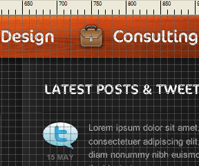
A great way to get inspired to work on more complex grid layouts is to study other grid-based sites. Snap a screenshot of the site, then paste it into your graphic design application. Draw solid rectangles over the different content areas, then delete the screenshot layer. The remaining arrangement of rectangles will give you a great perspective of the grid layout the site is using without being distracted by the content. I like to visit Design By Grid’s showcase to check out a sampling of nicely executed grid-based Web layouts.
Coding your finished design comp
When you’re finished with the design comp and go to start coding, first off rejoice because you’ve introduced rationality and consistency to your design. The same principles that strengthen your design will also make it easier to code. Then, begin to write your markup. Don’t insert any <div> tags at this point. Pretend you’re writing your code to be displayed without any CSS. While this may be a foreign concept for some of you, it’s an excellent way to minimize the amount of markup you write and structure it as semantically as possible. I even like to preview my markup in the browser to see how it looks without CSS. Ask yourself “Can I read and navigate this page as it looks now, with no CSS?” If you answer no, you’ve got some work to do tidying things up. It may not look pretty, but it needs to make sense.
Now you can start adding your structural markup. If you’re using a prefab CSS framework, now is the time to bid this article adieu and consult their documentation. Assuming you’re creating your own custom CSS, you’ll generally need a <div> tag per column, though if there is only one element within the column (for example in an image gallery) you could target the “content” element directly to create the grid layout. Assign classes in a manner that makes sense to you, though keep the sanity of future editors in mind. I personally feel that it is most semantic to assign class names that describe the role that the content plays in the document (masthead, nav, feature, aside, footer). In HTML 5, we’ll actually get elements with nice semantic names, but I digress.
Once you’ve got the markup down, analyze the layout to determine exactly what you’re working with. If you’ve forgotten the widths of the columns and gutters, measure them with the Slice tool. Now all you need to do is select your columns in the CSS and add their appropriate widths and the widths of their adjacent gutters. While there are no hard and fast rules here, consistency and clarity should be your guides. For example, let’s revisit our four product features, each contained in a column 210 pixels wide with a 40 pixel gutter (960 pixels total):
.feature {
   display: block;
   float: left;
   width: 210px;
   margin-right: 40px;
}
.feature.last {
   margin-right: 0;
}
Notice how an extra declaration is needed for the last column in the row to remove the right margin representing the gutter. Otherwise, the excess width will push it down to the next line. After you conclude a row of columns, your final consideration is to clear the floats so you can start a new row. I prefer this method from Perishable Press.
And that pretty much wraps it up. What you see above is fundamentally the CSS structure that you will use to code out the entire design. All of the width and margin values should be multiples of 10 pixels, resulting in much clearer and easier to understand CSS. If within your site you have multiple uses of the same column arrangement, for example four product features on the home page, and four press releases on the press page, you can simply stack selectors onto the same set of properties to recycle CSS:
.feature,
.press-release {
The only issue with this is if, for example, the product features used one typographical style and the press releases used another. This is easily solved by putting the structural CSS in one declaration and the typographical styles in another. Some folks even like to put these on two separate style sheets, structure.css and typography.css.
Conclusion
By approaching grid-based Web design from a holistic perspective that encompasses the entire workflow (design comp, coding, future updates) we’ve created a flexible framework shared between our graphic assets and code files that rationalizes many things about our designs. Our users are wowed by the stability and visual strength inherent in a grid-based design and subconsciously surprised when the site loads a little faster because of cleaner CSS. We’re thrilled because our client just called to offer us a retainer contract, and we know that management of source assets and code to maintain a consistent visual language will be much simpler. End result? Instead of hanging around late adding four more repetitive declarations to a stylesheet, we left early and we’re four pints in at happy hour. All thanks to a series of horizontal and vertical lines, spaced at regular intervals of course. — CB


