The Current State of Web Design: Trends 2010

Email Newsletter
Weekly tips on front-end & UX.
Trusted by 182,000+ folks.


 Celebrating 10 million developers
 Custom Web Forms for Angular, React, & Vue. Your backend.
Web design is a fickle industry. Just like every other form of artistic expression, Web design has undergone a continuous and surprisingly fast evolution. Once a playground for enthusiasts, it has now become a mature rich medium with strong aesthetic and functional appeal. In fact, we are experiencing what could be the golden era of Web design — or at least the best period thus far. We have powerful new tools at our disposal (CSS3, HTML5, font-embedding, etc.), a plethora of freely available resources, a strong design community and also (if you needed any more!) reliable support of Web standards in the major browsers.
We’re seeing better interaction design and more aesthetically pleasing designs. And we’re seeing more personal, engaging and memorable sites, too. But what exactly is making the difference? What new directions is Web design heading in today? What new techniques, concepts and ideas are becoming important? In this article, we present some observations on the current state of Web design. We describe existing and upcoming trends and explain how Web design might evolve in the coming months and years. We’ll also touch on what we as Web designers should be ready for to keep abreast of new challenges and opportunities.
You may want to take a look at related articles:
- Symptoms Of An Epidemic: Web Design Trends
- Be Careful: Trends Come And Go
- The State Of Responsive Web Design
1. Design For Delight
As designers, our job is to communicate ideas effectively. For every particular message, we create a context in which the message would work best, guiding users to achieving their tasks, gaining their trust or convincing them of whatever we’re communicating. Of course, there are endless ways to create this context. One of them is to design for visual aesthetics, surprise, joy, happiness — design for delight; design to be memorable and remarkable.
Attractive things work better and help focus and keep the user’s attention. Memorable design increases excitement for products and brands, leading to increased engagement. In fact, a strong, reliable emotional relationship between your clients and their audience could be the best thing that ever happens to your career.
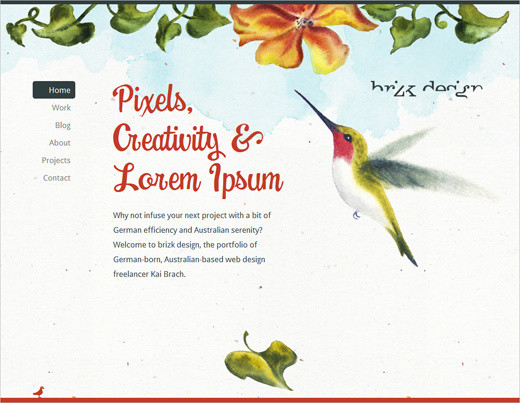
Brizk design studio has an aesthetically stunning design, with subtle animations, beautiful typography and a clean layout. When you hover over the red bird in the footer, a small Twitter box is revealed. First-class design that is a pure delight.
Although the vast majority of brands are still silent, passive and impersonal, we’ve observed more websites trying hard to engage our senses, whether through a strong aesthetic appeal, through witty animations in the content block or simply through a little extra attention to small design elements on the “About” page. Such designs are beautiful to look at, fun to navigate but, most importantly, memorable — for the simple reason that they are different. By adding delightful personal touches to your designs, you stand out from the crowd and give visitors something to talk about and share with friends and colleagues. And that’s a good start.
You can elicit delight in a variety of settings: on your maintenance mode page, on the 404 error page, in your pre-loader, and everywhere else. The idea is to surprise visitors by giving them something pleasant to talk about.
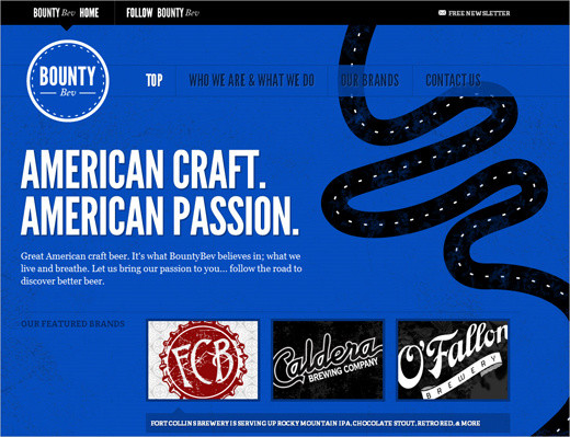
Bounty Bev Bounty Bev is a beverage company with a beautiful one-page design. Apart from its subtle hover effects and animations, the website has some nice extras: if you scroll down the page manually with the mouse wheel, a small pop-up appears asking you if you need a lift. The typography is strong and memorable, and the design is playful. Simple, clear and personal, the website leaves a strong positive impression.
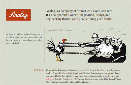
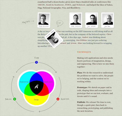
Analog.coop Analog provides a very personal experience to visitors. When you visit the page, it displays where you are located and tells you the members of the team who are closest to you (in our case, Alan and Jon, who are about 500 miles away in Bristol). The website has a couple of nice Easter eggs that are not visible at first glance. You might want to play around with the header and the photos of team. The page is just fun to explore.
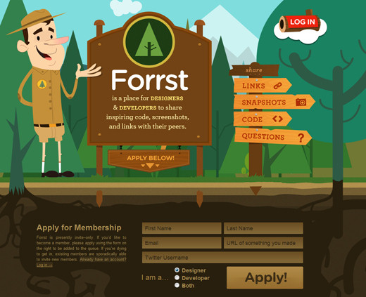
Forrst Beautiful design with attractive visual elements and original navigation — a design that manages to make a good lasting impression. Notice how the background of the upper area of the page changes when the browser window is resized (Parallax-effect). The “log in”-box is quite cool, too. Surprisingly, the form is built with tables for some reason.
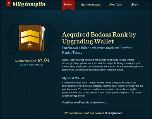
Billy Tamplin On his blog, Billy Tamplin focuses on the small victories in his life. Each post records a personal achievement, displaying a custom-designed merit badge and an explanation of the conquest. Billy uses this metaphor throughout the website, speaking of “super Web abilities” (Agile CSS, PHP-prepared, IE6-reinforced, etc.) and “heroic design strengths” (human-friendly aim, keen creative detail, etc.). He also has a personal portfolio on the website. Notice how well the color scheme fits the theme. The design is simple and beautiful, and the “achievement” twist is unusual and memorable.
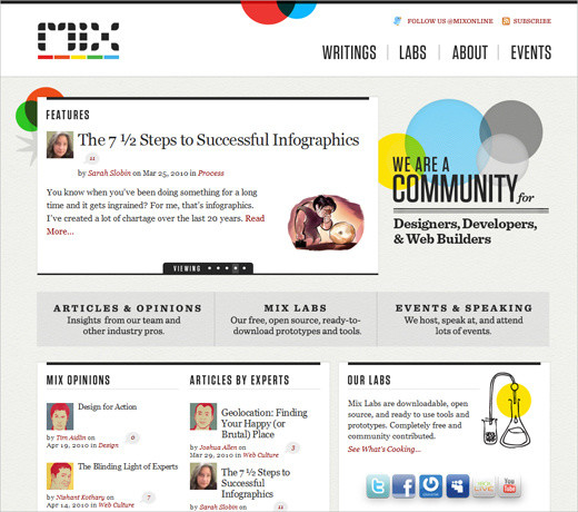
MIX MIX labs, a community blog for designers and Web developers, doesn’t have hidden features, appealing animations or striking hover effects. Instead, it has a consistent, visually appealing design: can you spot where and how often colorful circles are repeated throughout the website? The design emphasizes the content and has a personal touch. Simply beautiful.
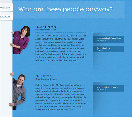
Blue Sky Resumes This website of a small team of resume writers has a couple of nice unusual extras in the design: the header contains a Flash-based cloud animation that perfectly fits the branding of the company. The website also has subtle animations and soft hover effects. And the “About” page introduces each co-worker in a quite original and memorable way.
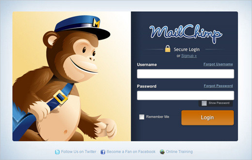
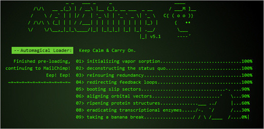
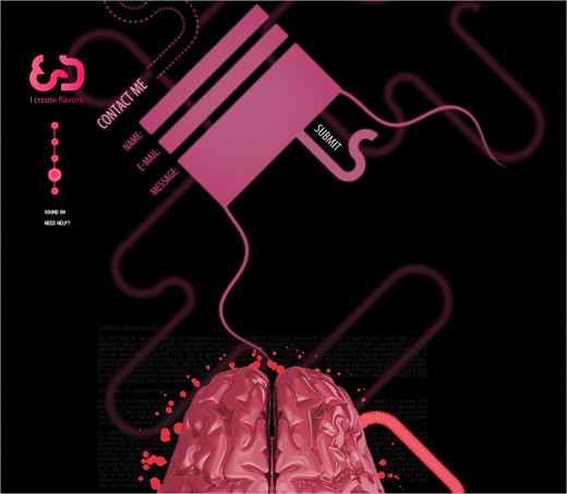
Mailchimp MailChimp heavily incorporates the monkey metaphor in all aspects of its design. To inform customers of recent updates, Mailchimp present an ASCII animation that tells the user something is happening in the background; this nice detail is surprising yet unobtrusive. The company also uses personal, friendly and perhaps occasionally geeky language when addressing user needs. This is the part of the image that MailChimp thoughtfully preserves in its Web application.
Further Reading
- 52 Weeks of UX: Design for Delight This article explains the importance of designing for delight and features some websites that try to engage the user’s senses.
- In Defense of Eye Candy Research proves that attractive things work better. How we think cannot be separated from how we feel. The next time a boss, client or co-worker scoffs at the notion that beauty is important to interface design, point their peepers here.
- Looks Matter Because We All Have Feelings Discusses the importance of emotions and aesthetics in design.
2. Keypress Navigation
As designers try to make their designs more intuitive, it is no surprise that websites are becoming more responsive. Not only does this apply to user interfaces in modern Web applications (which are becoming as robust as desktop applications — and often smarter), but with the wide adoption of JavaScript libraries, “classic” websites are becoming more robust and interactive, too. One way to make websites more responsive is through “keypress navigation,” which hasn’t been widely adopted so far. But lately we’ve observed more designs implementing this effectively. The most popular setting for such navigation is on photo websites such as Flickr or FFFFound.
The general idea is to give users keyboard shortcuts that help them perform tedious tasks, such as navigating between blog posts, moving through images in a slideshow, changing the current view (e.g. from a horizontal to vertical grid), liking articles and navigating between sections of a website. Keypress navigation is common in Flash-based designs, but we are now seeing it applied to CSS-based designs, too. Google Reader is a prime example of advanced keypress navigation, but other websites have good implementations, too.
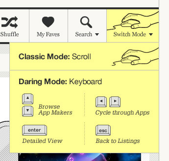
They Make Apps A couple of months ago, They Make Apps began offering users smooth and advanced keyboard navigation as an alternative to classic scrolling. Users could switch between both modes using a drop-down menu in the main navigation of the page. In “keyboard navigation mode,” users used the arrow keys to navigate between content blocks; the “Return” key triggered the detailed view and “Escape” returned to the main page. For some reason, this navigation isn’t available any longer.
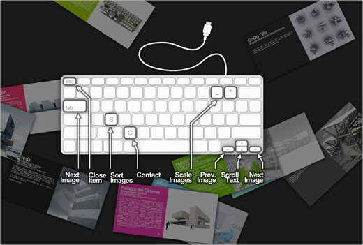
Mad-ar.ch Marc Anton Dahmen’s website is Flash-based, and its navigation is quite advanced: users can jump to the contact form with “c,” scale images with “-” and “+,” and then navigate and sort images and scroll through text with the vertical arrow keys.
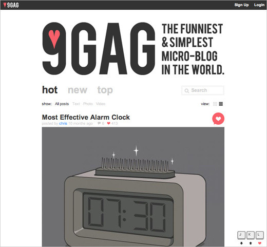
9GAG 9GAG is a social image bookmarking website. Users can navigate to the next and previous image using “j” and “k,” respectively. The current image can be voted up using “l” (for love): no mouse scrolling necessary. In this case, a shortcut to the grid view would be useful, too.
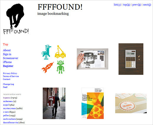
FFFFound! One of the first social image bookmarking websites, FFFFound offers shortcuts to jump to the top of the page (“h”), change the view of the images (“v”), browse images (“k” and “j”) and skip to the next page (“l”).
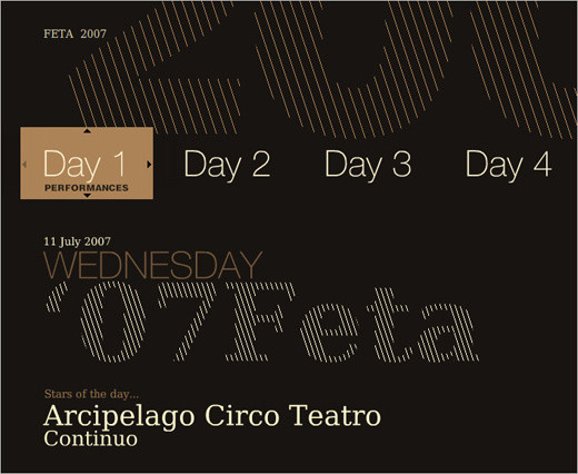
Feta Yet another Flash-based website that lets you use the left and right arrow keys to browse items of a section, the down key to select and the up key to go back.
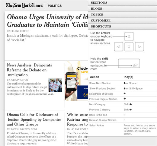
NY Times: Times Skimmer The New York Times’ quick overview page has very advanced keypress navigation. Users can use the arrows to navigate sections, zoom in using “Shift,” return to the top with “t,” refresh the current section with “r” and select article using “a” and the arrows. Learning the keys is a bit time-consuming, but once you’ve got them, navigating the page is much easier.
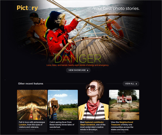
Pictory PictoryMag, a magazine dedicated to photo stories, also has “j” and “k” navigation to browse images.
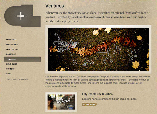
CrushLovely CrushLovely, a single-page portfolio, lets you use the arrow keys to navigate sections of the page.
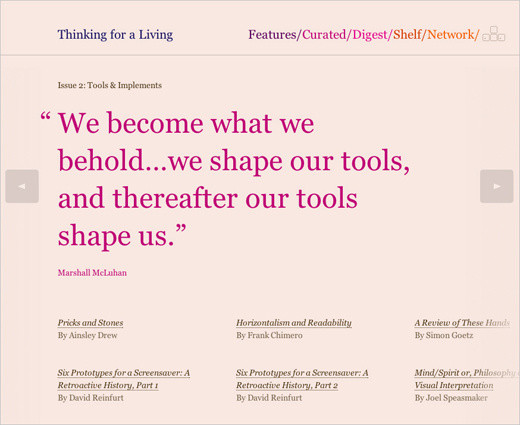
Thinking for a Living Thinking for a Living lets users use the left and right arrows to navigate between featured quotes.
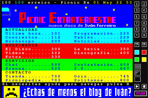
Picnic Extraterrestre Aside from being one of the most unusual designs we’ve seen so far, Iván Ferreiro’s Picnic Extraterrestre has quite advanced keypress navigation. The design imitates Teletext and does a pretty good job. All navigation items can be loaded using the digits shortcuts. Now that’s fun!
Coding Techniques and Tutorials
Note that when implementing keypress navigation in your design, make sure that the shortcuts you define do not conflict with common browser shortcuts, OS shortcuts, screen-reader shortcuts or user-defined shortcuts. This may sound simpler than it is. As usual, extensive testing (with savvy and novice users) before implementation will help you find issues with your shortcuts. It’s safe to assume that the arrow keys, the “j” and “k” combination and the “Escape” key are safe. On the other hand, using the “Control,” “Alt” and “Shift” keys is not recommended.
Also, regard keypress navigation as an additional (and therefore optional) feature that will not be available to users who have disabled JavaScript in their browsers. Therefore, it is highly recommended that you offer keyboard navigation as a secondary, not primary, layer of navigation. Below, you’ll find some helpful techniques, tutorials and references for implementing keypress navigation in your designs.
- Adding Keyboard Navigation with jQuery This screencast describes how to implement keyboard navigation to move a slider backwards and forwards. The demo and code are available as well.
- How to Create Keypress Navigation Using jQuery This tutorial describes how to implement keypress navigation to browse sections of the website.
- Advanced Keypress Navigation with jQuery You could use your mouse to select links, but you can also use the arrow keys (i.e. up and down) to navigate the list. This script is a bit advanced because of the extra functionality when the user combines the mouse hover and key presses.
- Using Keyboard Shortcuts in JavaScript In this article, you’ll learn how to use JavaScript keyboard shortcuts, with and without the JQuery framework.
- How to Build a Site With Keyboard Navigation: PSD to HTML This article looks at how to add keyboard navigation to a website using a few simple lines of JavaScript. First, you’ll create a simple theme in Photoshop and then transform it into a working website that offers keyboard functions to jump pages.
Plug-Ins and Useful Resources
- js-hotkeys: Cross-Browser Javascript jQuery Plug-In for Hooking Keyboard Events The jQuery.Hotkeys plug-in lets you easily add and remove handlers for keyboard events anywhere in your code, and it supports almost any key combination. Binding and unbinding a hot-key combination takes one line of code.
- jQuery Keyboard Navigation Plug-In The jQuery Keyboard Navigation plug-in provides the capability for page elements to be navigated and activated via the keyboard’s arrow keys.
- HotKey: Programmable Keyboard Shortcuts with Prototype JS Library HotKey provides functionality similar to that of the access key attribute but has many enhancements that allow for more granular control of keyboard-driven interfaces.
- Detecting Key Strokes: Reference Table Detecting the user’s key strokes turns out to be a specialized branch of event handling. This page details some of the more annoying problems and includes the obligatory compatibility table.
3. Print Design Influence
While designing for delight is primarily about impressing visitors with unexpected and pleasing touches to a design, modern Web designers often go one step further and experiment with the underlying details of their work, producing more creative and unique layouts. In fact, one doesn’t have to be an expert to see the growing influence of traditional print design techniques on the Web. They are often manifested in so-called “art-directed” blog posts (or “blogazines”), whereby every blog post has a unique and carefully crafted design.
The layouts of these websites often resemble those of print magazines or posters, with striking headlines, multi-column text, highlighted quotations, indented text, supporting imagery, sidenotes and footnotes. The designs usually adhere to grids and have strong, vivid typography.
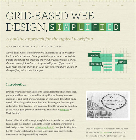
Design Informer: Grid-Based Web Design, Simplified has a simple clean two-column layout that clearly separates text from illustrations. Notice the capital letters in the author’s name under the header, also visible in the quote design on the page. The content here dictates the layout.
In most cases, art-directed designs are fueled purely by the ambition and determination of their creators. Such designs are predominantly found on freelance websites (being the fruit of personal projects) and rarely found in corporate settings. The main obstacle to wider adoption of these techniques is that the creation of such designs (or rather their implementation with (X)HTML and CSS) is time-consuming. Art-directed layouts are quite difficult to code and maintain, and they often require inline CSS styling, or else designers would end up with dozens of un-semantic classes in their style sheets. Also, integrating advertisements on these pages is difficult because they put constraints on the designer’s layout. So, at the moment, these designs are more appropriate for less frequently updated websites because of the overhead.
If you decide to experiment with art-directed design, be aware that the layout of an article should be secondary and always support the content itself, not dominate it. The problem is that once you start designing a blog post, it’s easy to overdesign page elements just because you can, not because the content dictates it. In fact, the design community is having an ongoing debate on whether art-directed designs are merely “over-Photoshopped articles,” designed purely for the sake of design.
Good design is about effective communication, not decoration at the expense of legibility. As Francisco Inchauste puts it, “I think it’s a ‘pick two’ sort of scenario. The choices are: great content, great art direction and regular schedule. If you try to hit all three, one of those will begin to fall short.” Bottom line: Web designs that are heavily influenced by print design are beautiful, but only when the techniques support your article.
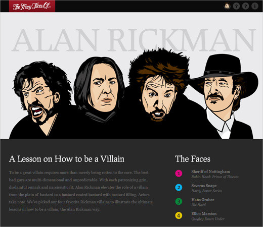
A Lesson on How to Be a Villain
A colorful and nicely illustrated article in a unique layout. Notice something unusual? The design has a table-based layout. The design has a CSS-layout with tabular data for the actual info-graphic bits. Sometimes that’s necessary for art-directed designs.
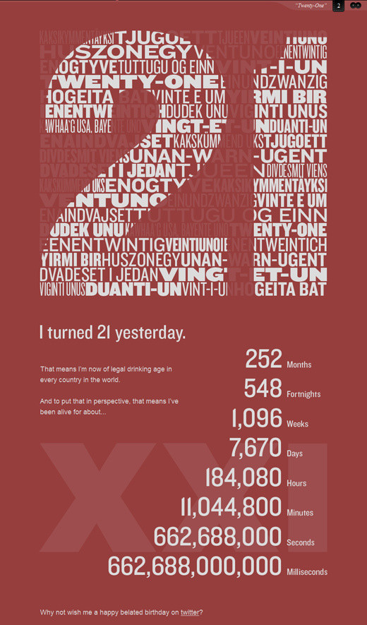
Evan Dinsmore: 21 A poster design for the Web. This blog post is simple, and it replaces tired plain text with vivid images. But that can be a disadvantage, too: a text-based version would be more user-friendly here.
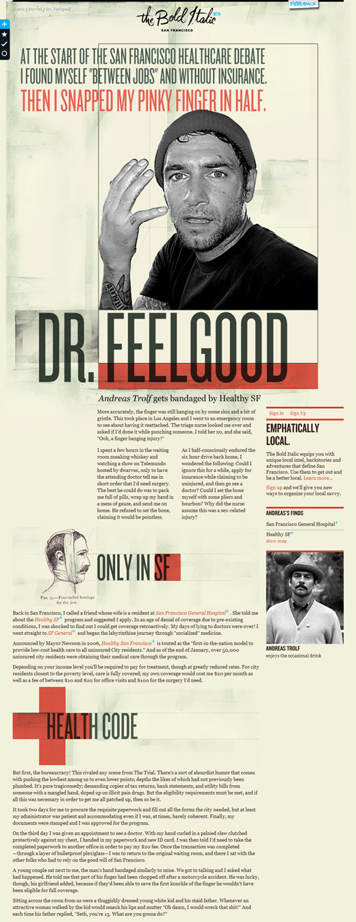
The Bold Italic: Dr. Feel Good
A very impressive magazine-like layout, with multiple columns, imagery, headlines and a sidebar. If you had only seen this page printed out, you wouldn’t have recognized it as a Web design. The page has 40 div containers.
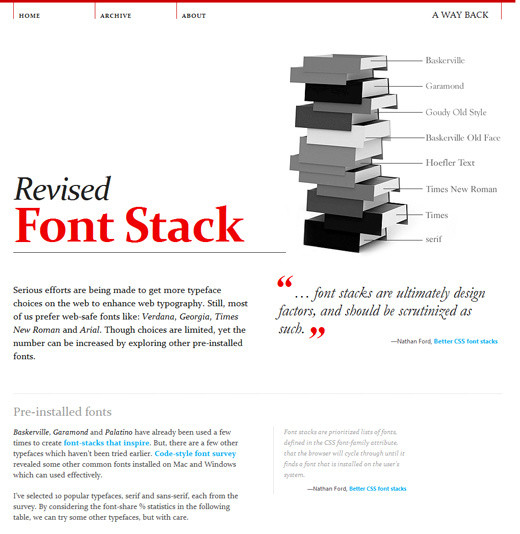
A Way Back: Revised Font Stack A very long, detailed and elaborate design. In art-directed designs, including this one, large images are often used to push the boundaries of the layout. Such images are often 800 to 1000 pixels wide, filling the width of the entire layout.
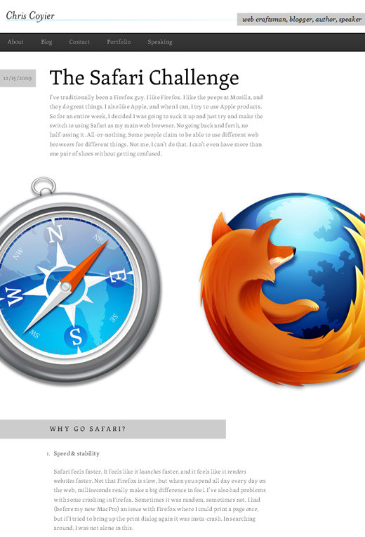
Chris Coyier: The Safari Challenge Here is a subtler design, with big margins, multiple columns of text, footnotes and indented headings. From an aesthetic point of view, it could be a page from a book.
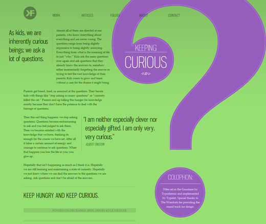
Kyle Fielder: Keeping Curious A classic. Do you remember those old magazines that used big quotes and visuals to create text flow? Notice how well this headline and colophone are positioned in the question mark. A nice, simple, original design.
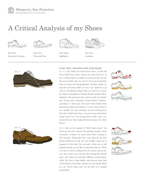
Sleepover: A Critical Analysis of my Shoes A simple grid-based design with justified text, serif typography and nice shoe illustrations. Unfortunately, justified text still doesn’t look very good on the Web.
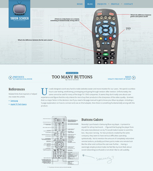
Yaron Schoen: Too Many Buttons Sometimes art-directed blog posts require something slightly more: like a background image and bakground color, as well as a bit of CSS styling. This examples demonstrates exactly that.
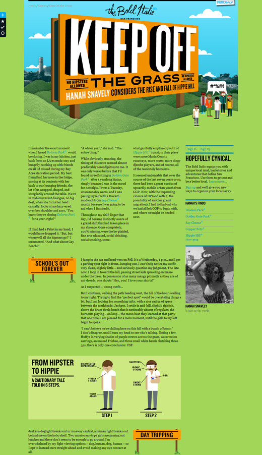
The Bold Italic: Keep Off the Grass Another remarkable example of multi-column-layouts…
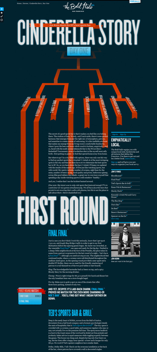
The Bold Italic: Cinderella Story … and another one. Print-design inspiration at its best.
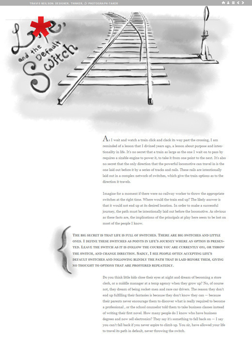
Travis Neilson: Default Switch A calm, simple, clean design with custom headings.
Further Reading
- The Super Freaking Amazing Future Trend of Blogs
- The Death of the Boring Blog Post? An article about art-directed designs from here on Smashing Magazine.
- Jason Santa Maria Talks About His Rethinking
- WordPress Art Direction Plug-In
- WordPress Post Styling Plug-In
- WordPress Designate Plug-in
- Jason Santa Maria: The Influence of Print Design
- HeartDirected A gallery of art-directed designs.
- Unique Article Designs Another gallery of art-directed designs.
4. Horizontalism
Over the last year, we’ve observed a slow transformation in the orientation of text-heavy Web designs. Not only are designs gaining depth and realism, but navigation is changing as well. Some designers are augmenting traditional vertical scrolling with sliding navigation (like here), which usually scrolls in both a vertical and horizontal direction, or even pure horizontal scrolling. This is called “horizontalism.”
Websites with horizontal scroll bars have been more difficult to navigate because the mouse was designed for vertical scrolling. But the emergence of multi-touch devices forces us to rethink the usability concerns of such designs. After all, whether the user browses vertically or horizontally on such a device doesn’t really make a difference. And some plug-ins (like Scrollable and jScrollHorizontalPane) simplify the action by enabling users to navigate horizontally by using the standard vertical scroll wheel on the mouse, thus shrinking the learning curve.
Horizontal scroll bars have been out there for a decade, but today it feels that they are gaining a new context. The move to horizontal scroll bars is probably an attempt among some designers to provide a more distinct user experience. Such designs are usually carefully crafted and found primarily on portfolio websites and elaborate e-commmerce websites. Whether horizontalism will expand to more types of websites remains to be seen in the months to come.
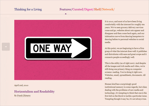
Thinking for a Living Not only does this article discuss the advantages and disadvantages of horizontalism with regard to readability, but it also has a nice horizontal layout itself, with multiple text columns. While the orientation is unusual at the first sight, reading the post is quite pleasing and comfortable.
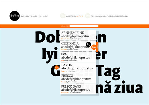
OurType A belgian type foundry with horizontal Flash-based navigation. Content blocks slide horizontally.
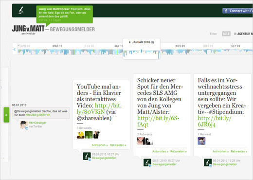
Jung v. Matt This website has a horizontal timeline for navigation. Notice that there is no horizontal scroll bar; visitors use the vertical scroll wheel to navigate horizontally.
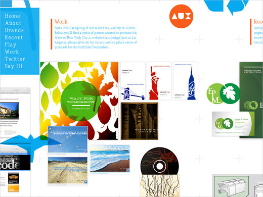
Your Auxillary One of many so-called “single-page layouts.” The full content of these websites is on a single page, which is navigated using either the keyboard, the mouse or a menu (this website uses the third option). Here we have a good (and common) combination of vertical and horizontal navigation (showing the jQuery ScrollTo plug-in in action).
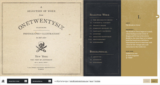
One Twenty Six This portfolio has a different kind of horizontal navigation. Apart from “Previous” and “Next” buttons, the user also gets an overview of selected content in a drop-down menu. Once they select an option, the page scrolls horizontally. Horizontal navigation with the mouse wheel would probably improve this design’s usability.
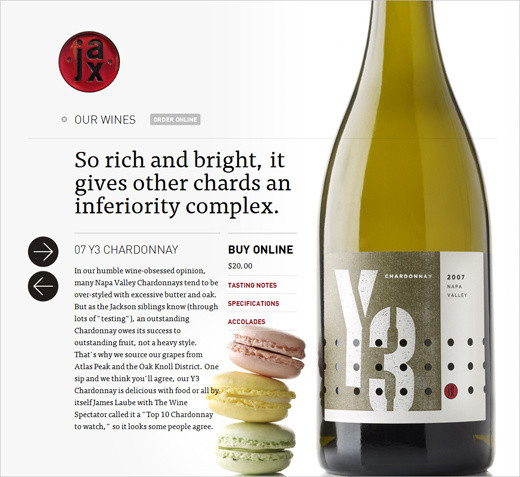
Jax Vineyards This wine store website has interesting and unique horizontal navigation, which is triggered when you browse the wine catalogue. Both the background image and description of the wine slide horizontally. Simple CSS and JavaScript are used. A beautiful and impressive design.
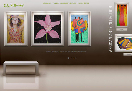
C. L. Holloway Candice Holloway’s portfolio has a nice take of horizontal layout. Her artwork is placed on a “wall”; horizontal navigation is used as a metaphor for strolling an art gallery. Also interesting: scrolling is triggered when your mouse hovers over the horizontal arrows; no clicking necessary.
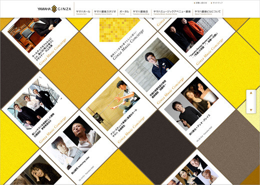
Yamaha Ginza You’ll find that designers experiment with perspective. Sometimes the orientation is diagonal…
Edpeixoto … and sometimes the layout just hangs in the air…
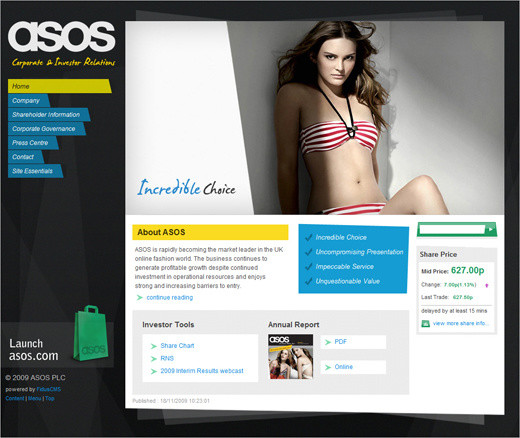
ASOS … and sometimes it’s slanted. Notice how none of the elements have perpendicular lines.
Further Reading
- Horizontalism and Readability
- Friday Focus: Slanted Web Design A showcase of designs that tilt to one side and avoid perpendicular lines.
- Horizontally Scrolling Websites: Showcase and Tutorials
- jQuery ScrollTo Plug-In This plug-in lets users scroll through overflowing elements and the screen itself. You get many different customization options and various ways to specify the direction in which to scroll.
5. Rich, Strong Typography
Typography has played a major role in Web design for years now. Bold, strong, heavy headlines can effectively convey the purpose of an e-commerce website or portfolio, while subtler headings help structure content and improve legibility. Obviously, the big change we’re seeing today is richer, more versatile typography, partly made possible by the @font-face attribute and the emergence of font-embedding services such as TypeKit. Rich typographic elements can now be selected and copied from the browser, which wasn’t that easy a couple of years ago.
The future is big, bold and typographic. Rich font families will be used not only for headlines but for body copy, bringing typographic practices from print over to the Web. Also, designers will experiment more with rich, sophisticated serif fonts and bold, imposing slab fonts, supported by subtle imagery. Web designers are also adding more depth to typography with the text-shadow attribute in CSS3. Naturally, such subtleties are closely tied to the choice of layout. These typographic designs are often grid-based and borrow techniqes from print design, such as sidenotes and footnotes.
We’ve further noticed that designers are extending their font stacks, adding increasingly more fall-back fonts in case a specified font is not available. That’s fine, as long as the aspect ratios (or weights) of the fonts are not too different; some screen fonts will appear wider or taller than other fonts and hence have a larger aspect ratio, which means that some users would see your pages at a much smaller font size than others would. You might want to read more about CSS font stacks in Russ Weakley’s presentation.
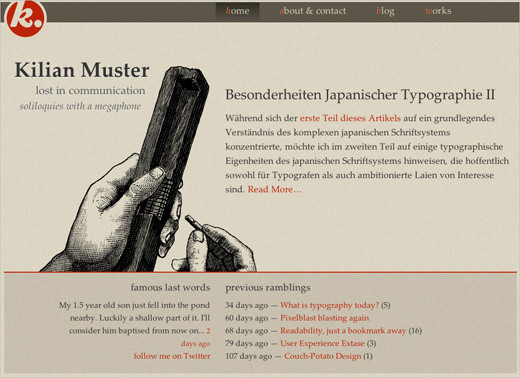
Kilian Muster
Kilian Muster uses quite an extended serif font stack for his design: font-family: Palatino, “Palatino Linotype”, “Book Antiqua”, Constantia, Times, “Times New Roman”, serif;. The posts in Kilian’s blog also have sidenotes.
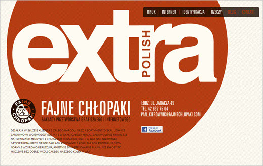
extrapolish Notice that the text on this website of a Polish Web design agency is set mostly in capitals: the navigation menu, introductory text and even contact address are in full capitals. Yet the design is calm, clean and polished.
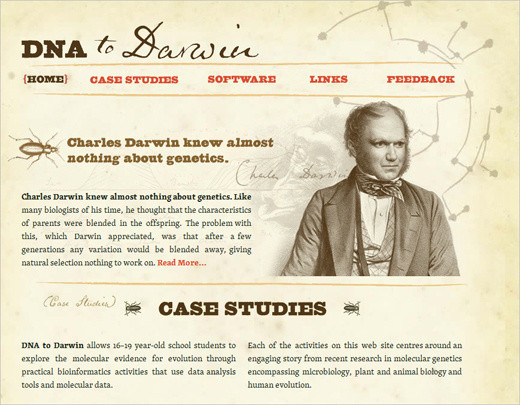
DNA to Darwin
This website has only serif fonts throughout its design: font-family: “skolar-1”,“skolar-2”, Georgia, Times, serif;. Notice that the text is split into columns; we didn’t see this last year.
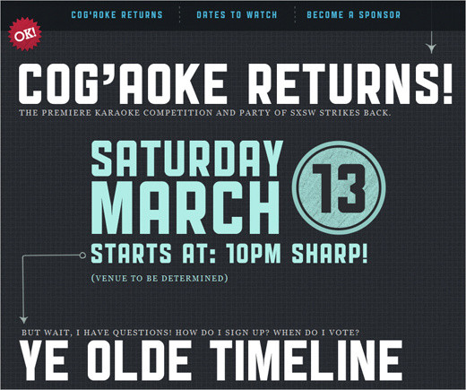
COG’AOKE Again, huge, bold slab typography that makes a strong impression and engages the audience.
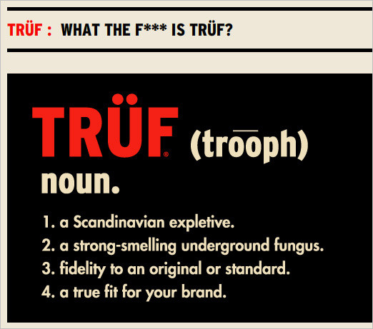
TRÜF This design agency combines a bold color choice with concise, equally bold sans-serif typography.
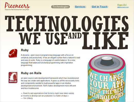
Pioneers This website combines vivid imagery and playful typography. The design looks more like a brochure or poster than a “classic” Web page.
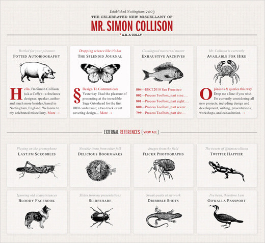
Colly Simon Collison’s subtle attention to the tiniest details make the typography literally stand out. No bold, screaming typography here; just legible, aesthetically pleasing design.
If you decide to experiment with art-directed design, be aware that the layout of an article should be secondary and always support the content itself, not dominate it. The problem is that once you start designing a blog post, it’s easy to overdesign page elements just because you can, not because the content dictates it. In fact, the design community is having an ongoing debate on whether art-directed designs are merely “over-Photoshopped articles,” designed purely for the sake of design.
Good design is about effective communication, not decoration at the expense of legibility. As Francisco Inchauste puts it, “I think it’s a ‘pick two’ sort of scenario. The choices are: great content, great art direction and regular schedule. If you try to hit all three, one of those will begin to fall short.” Bottom line: Web designs that are heavily influenced by print design are beautiful, but only when the techniques support your article.
A Lesson on How to Be a Villain
A colorful and nicely illustrated article in a unique layout. Notice something unusual? The design has a table-based layout. The design has a CSS-layout with tabular data for the actual info-graphic bits. Sometimes that’s necessary for art-directed designs.
Evan Dinsmore: 21 A poster design for the Web. This blog post is simple, and it replaces tired plain text with vivid images. But that can be a disadvantage, too: a text-based version would be more user-friendly here.
The Bold Italic: Dr. Feel Good
A very impressive magazine-like layout, with multiple columns, imagery, headlines and a sidebar. If you had only seen this page printed out, you wouldn’t have recognized it as a Web design. The page has 40 div containers.
A Way Back: Revised Font Stack A very long, detailed and elaborate design. In art-directed designs, including this one, large images are often used to push the boundaries of the layout. Such images are often 800 to 1000 pixels wide, filling the width of the entire layout.
Chris Coyier: The Safari Challenge Here is a subtler design, with big margins, multiple columns of text, footnotes and indented headings. From an aesthetic point of view, it could be a page from a book.
Kyle Fielder: Keeping Curious A classic. Do you remember those old magazines that used big quotes and visuals to create text flow? Notice how well this headline and colophone are positioned in the question mark. A nice, simple, original design.
Sleepover: A Critical Analysis of my Shoes A simple grid-based design with justified text, serif typography and nice shoe illustrations. Unfortunately, justified text still doesn’t look very good on the Web.
Yaron Schoen: Too Many Buttons Sometimes art-directed blog posts require something slightly more: like a background image and bakground color, as well as a bit of CSS styling. This examples demonstrates exactly that.
The Bold Italic: Keep Off the Grass Another remarkable example of multi-column-layouts…
The Bold Italic: Cinderella Story … and another one. Print-design inspiration at its best.
Travis Neilson: Default Switch A calm, simple, clean design with custom headings.
Further Reading
- The Super Freaking Amazing Future Trend of Blogs
- The Death of the Boring Blog Post? An article about art-directed designs from here on Smashing Magazine.
- Jason Santa Maria Talks About His Rethinking
- WordPress Art Direction Plug-In
- WordPress Post Styling Plug-In
- WordPress Designate Plug-in
- Jason Santa Maria: The Influence of Print Design
- HeartDirected A gallery of art-directed designs.
- Unique Article Designs Another gallery of art-directed designs.
4. Horizontalism
Over the last year, we’ve observed a slow transformation in the orientation of text-heavy Web designs. Not only are designs gaining depth and realism, but navigation is changing as well. Some designers are augmenting traditional vertical scrolling with sliding navigation (like here), which usually scrolls in both a vertical and horizontal direction, or even pure horizontal scrolling. This is called “horizontalism.”
Websites with horizontal scroll bars have been more difficult to navigate because the mouse was designed for vertical scrolling. But the emergence of multi-touch devices forces us to rethink the usability concerns of such designs. After all, whether the user browses vertically or horizontally on such a device doesn’t really make a difference. And some plug-ins (like Scrollable and jScrollHorizontalPane) simplify the action by enabling users to navigate horizontally by using the standard vertical scroll wheel on the mouse, thus shrinking the learning curve.
Horizontal scroll bars have been out there for a decade, but today it feels that they are gaining a new context. The move to horizontal scroll bars is probably an attempt among some designers to provide a more distinct user experience. Such designs are usually carefully crafted and found primarily on portfolio websites and elaborate e-commmerce websites. Whether horizontalism will expand to more types of websites remains to be seen in the months to come.
Thinking for a Living Not only does this article discuss the advantages and disadvantages of horizontalism with regard to readability, but it also has a nice horizontal layout itself, with multiple text columns. While the orientation is unusual at the first sight, reading the post is quite pleasing and comfortable.
OurType A belgian type foundry with horizontal Flash-based navigation. Content blocks slide horizontally.
Jung v. Matt This website has a horizontal timeline for navigation. Notice that there is no horizontal scroll bar; visitors use the vertical scroll wheel to navigate horizontally.
Your Auxillary One of many so-called “single-page layouts.” The full content of these websites is on a single page, which is navigated using either the keyboard, the mouse or a menu (this website uses the third option). Here we have a good (and common) combination of vertical and horizontal navigation (showing the jQuery ScrollTo plug-in in action).
One Twenty Six This portfolio has a different kind of horizontal navigation. Apart from “Previous” and “Next” buttons, the user also gets an overview of selected content in a drop-down menu. Once they select an option, the page scrolls horizontally. Horizontal navigation with the mouse wheel would probably improve this design’s usability.
Jax Vineyards This wine store website has interesting and unique horizontal navigation, which is triggered when you browse the wine catalogue. Both the background image and description of the wine slide horizontally. Simple CSS and JavaScript are used. A beautiful and impressive design.
C. L. Holloway Candice Holloway’s portfolio has a nice take of horizontal layout. Her artwork is placed on a “wall”; horizontal navigation is used as a metaphor for strolling an art gallery. Also interesting: scrolling is triggered when your mouse hovers over the horizontal arrows; no clicking necessary.
Yamaha Ginza You’ll find that designers experiment with perspective. Sometimes the orientation is diagonal…
Edpeixoto … and sometimes the layout just hangs in the air…
ASOS … and sometimes it’s slanted. Notice how none of the elements have perpendicular lines.
Further Reading
- Horizontalism and Readability
- Friday Focus: Slanted Web Design A showcase of designs that tilt to one side and avoid perpendicular lines.
- Horizontally Scrolling Websites: Showcase and Tutorials
- jQuery ScrollTo Plug-In This plug-in lets users scroll through overflowing elements and the screen itself. You get many different customization options and various ways to specify the direction in which to scroll.
5. Rich, Strong Typography
Typography has played a major role in Web design for years now. Bold, strong, heavy headlines can effectively convey the purpose of an e-commerce website or portfolio, while subtler headings help structure content and improve legibility. Obviously, the big change we’re seeing today is richer, more versatile typography, partly made possible by the @font-face attribute and the emergence of font-embedding services such as TypeKit. Rich typographic elements can now be selected and copied from the browser, which wasn’t that easy a couple of years ago.
The future is big, bold and typographic. Rich font families will be used not only for headlines but for body copy, bringing typographic practices from print over to the Web. Also, designers will experiment more with rich, sophisticated serif fonts and bold, imposing slab fonts, supported by subtle imagery. Web designers are also adding more depth to typography with the text-shadow attribute in CSS3. Naturally, such subtleties are closely tied to the choice of layout. These typographic designs are often grid-based and borrow techniqes from print design, such as sidenotes and footnotes.
We’ve further noticed that designers are extending their font stacks, adding increasingly more fall-back fonts in case a specified font is not available. That’s fine, as long as the aspect ratios (or weights) of the fonts are not too different; some screen fonts will appear wider or taller than other fonts and hence have a larger aspect ratio, which means that some users would see your pages at a much smaller font size than others would. You might want to read more about CSS font stacks in Russ Weakley’s presentation.
Kilian Muster
Kilian Muster uses quite an extended serif font stack for his design: font-family: Palatino, “Palatino Linotype”, “Book Antiqua”, Constantia, Times, “Times New Roman”, serif;. The posts in Kilian’s blog also have sidenotes.
extrapolish Notice that the text on this website of a Polish Web design agency is set mostly in capitals: the navigation menu, introductory text and even contact address are in full capitals. Yet the design is calm, clean and polished.
DNA to Darwin
This website has only serif fonts throughout its design: font-family: “skolar-1”,“skolar-2”, Georgia, Times, serif;. Notice that the text is split into columns; we didn’t see this last year.
COG’AOKE Again, huge, bold slab typography that makes a strong impression and engages the audience.
TRÜF This design agency combines a bold color choice with concise, equally bold sans-serif typography.
Pioneers This website combines vivid imagery and playful typography. The design looks more like a brochure or poster than a “classic” Web page.
Colly Simon Collison’s subtle attention to the tiniest details make the typography literally stand out. No bold, screaming typography here; just legible, aesthetically pleasing design.
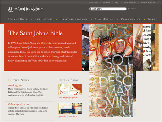
The Saint John’s Bible This website shows serif fonts at their best. The fonts complement the theme and fit the layout perfectly. Notice how well a beautiful visual design and classic typography can work together.
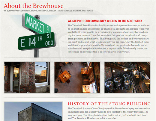
Brewhouse A nice combination of type and visuals make this page remarkable. But it’s not clear why the page has three different typefaces for the headings; two would be enough.
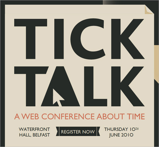
Tick Talk Can this get any bolder? Big bold typography, with capital letters spread across the whole page. When scrolling the page, notice the nice background effect. A very simple and strong design.
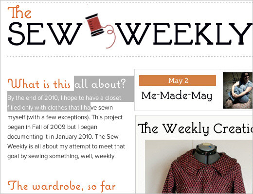
The Sew Weekly
This blog has very playful, inviting typography (Proxima Nova for the body copy and Coquette for headlines), and all of it can be easily selected and copied. This is the power of embedded fonts (TypeKit is used here). Only serif fonts are used: font-family: “skolar-1”,“skolar-2”, Georgia, Times, serif;. Notice the text is split into columns — again, a trend we’ve seen only this year.
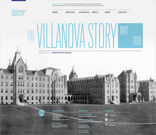
Neiman Group The Neiman Group incorporates its brand colors into the navigation and headline of the front page. The typography is light and classic and gives the page a certain atmosphere.
Conclusion
Modern Web design is better, richer and more user-friendly. We’re seeing better use of visual design for the sake of aesthetics and a pleasing user experience. Traditional techniques from print design are increasingly being applied to the Web, be they layout techniques or rich versatile typography. Horizontal and even diagonal orientations bring a fresh perspective to the flat 2-D designs we’ve seen for years (with their text-heavy, Flash-based pages).
These developments are a sign of the upcoming era of Web design, in which designers can use new tools and techniques to their fullest potential. Web designers should look forward to the exciting and promising years to come.
Stay Tuned!
This article is the first in our series on the current state of web design. Next time, we’ll discuss other developments, such as adaptive and interactive layouts, CSS3 adoption, beauty in chaos, subtle interactivity, context-sensitive navigation and over-designed design. To make sure that you don’t miss the second part, subscribe to our RSS feed and follow us on Twitter.
 (al)
(al)

