Applying Interior Design Principles To The Web

Email Newsletter
Weekly tips on front-end & UX.
Trusted by 182,000+ folks.


 Custom Web Forms for Angular, React, & Vue. Your backend.
 Celebrating 10 million developers

Web, industrial, interior… You name it and there are designers for it. We’re all trained in our particular areas (as we should be), but it would do us some good sometimes to look beyond our borders for new approaches to design problems. For a fresh perspective, here we’ll apply several principles of interior design to Web design and see what ideas would help change some of our stuck-in-a-rut design practices.
Be sure to check out the following articles:
- The Story Of Scandinavian Design
- Finding Inspiration in Uncommon Sources: 12 Places to Look
- Compositional Balance, Symmetry And Asymmetry
- Gender Disparities in the Design Field
Balance

How It Works
In interior design, balance breaks down into two kinds: formal and informal.
Formal balance is simple. It is achieved in a room when objects on one side of a room are a mirror-image of the other side of the room. It focuses on symmetry (creating a mirrored effect) and is the easiest to create — just think of two nightstands on either side of a bed or two sconces on either side of a fireplace. However, it can become overwhelming with too many objects or a busy color palette. Too much can make a good design concept ugly.
Informal balance is an asymmetrical approach based on visual weight. You don’t have to use identical objects to achieve balance; rather, use objects that are different but have similar visual “weight.” For example, you could balance a large couch by putting a large TV in the same room. In Web design, we also seek balance: large type can balance large imagery. Play with informal balance; it can lend intrigue to a seemingly simple design and add quirkiness to a vintage look.
Why It’s Important
Balance is one of the first things we notice in a design, often subconsciously. If something seems off-kilter, it may have to do with balance, and it can be difficult to move on and appreciate the design’s other aspects. Balancing color, images and textures gives a look of completion to a design and shows the user that you have an eye for detail.
Hint for Designers
Balance isn’t limited to being either symmetrical or asymmetrical. Try radial balance too: center a circular image and add smaller images “radiating” away from it (an example from interior design would be a circular dining table and chairs). Radial balance designates a focal point and almost effortlessly provides for a sense of rhythm or momentum.
Examples
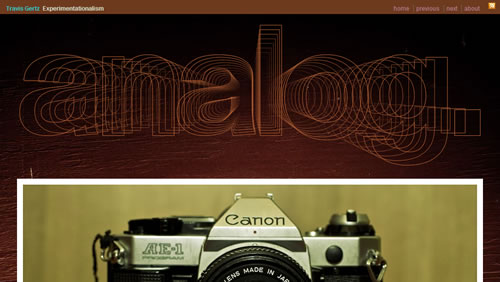
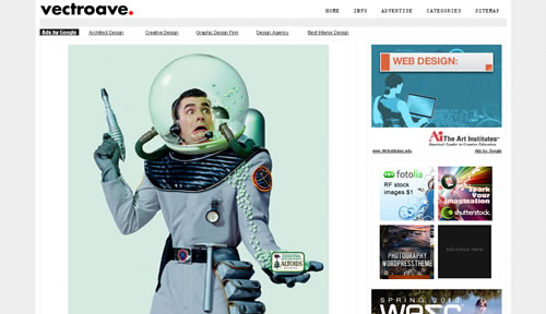
Travis Gertz Experimentationalism Here, the designer uses visual weight to achieve balance. The word “analog” is extremely big, but it balances out the larger width and length of the camera image — a point-size smaller and the word would have been lost. Below the image is smaller type, but it works because the paragraph spans the same width and height as the image.
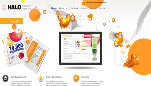
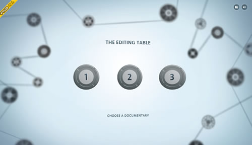
Ethno Port Ponzan Ethno Port Ponzan’s design uses radial balance, having the sub-page links placed on rings around a central focus. Though the links are placed at different distances, the ring design lends the balance because they lay equidistantly from the center logo. Radial balance can be one of the easiest, fastest methods of achieving balance, and Ethno Port Ponzan is an example of using such balance successfully.

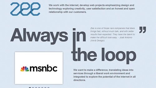
Zee This is asymmetrical balance using text as the design. Here “Always in the loop” is the focal point, and the designer uses the visual weight of heavier fonts, large punctuation and smaller images for balance.
Proportion

How It Works
Proportion has to do with how the sizes of objects in a room relate to each other. For instance, a large couch shouldn’t be in front of a 16” TV, and a large bed shouldn’t be between small end tables. The same rule goes for Web design; a large font shouldn’t be put beside a small focal point. We could also consider this when doing “scene” designs, such as a wall with frames and landscape illustrations.
Why It’s Important
Proportion is like balance: if it feels off, it’s hard to focus on anything else. Proportion is vital to recreating an environment. If a coffee mug is too big for a desk or a cow too large for the landscape, it’s hard to believe the setting. True-to-life proportion makes a scene believable and a font-graphic relationship appealing.
Hint for Designers
Most of us think that flamboyantly large text beside a large image is overbearing, and we tend to “fix” the problem by making one of them smaller. For proportion, though, we should keep large with large and small with small; that keeps the design believable and balanced.
Examples
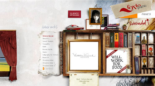
Foxie Foxie’s design is a great example of effective proportion because the bookcase area features objects that are generally in proportion and therefore “believable.” The various items in the bookcase (such as the remote and trophy) are meant to establish a whimsical atmosphere, so we can be somewhat lenient in accepting the scene as realistic. That is, despite the few inconsistencies in proportion, we still “buy it.”
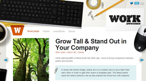
Work Awesome Much like Foxie, our eyes move naturally from the meat of the design to the information area because we aren’t distracted by disproportion. This scene’s main objects — keyboard, coffee cup, computer mouse — are realistically proportionate. Like the last example, it’s believable.
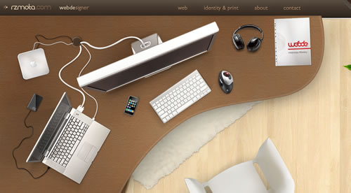
RZMota Unlike Work Awesome (in which a large part of the design focuses on the information area), RZMota’s design relies heavily on the believability of the scene. Making all of the objects proportional is not easy, especially with so many of them, but RZMota shows us that it can be done.
Rhythm

How It Works
In interiors, rhythm is created by placing a unifier in the room, such as a color, pattern or texture. A sense of movement is created when the unifier is repeated throughout the space; the eye doesn’t stop on one piece but rather alights here and there on pieces of the unifier. We can do this in Web design as well by taking a texture, pattern or form and repeating it throughout a design.
Why It’s Important
Rhythm keeps the room cohesive and allows the eye to move easily about the room to experience all parts of the design. Rhythm is as important to Web design as it is in physical places. In a unified design, finding information happens naturally and at a rhythmic pace.
Hint for Designers
The single most important thing to remember is to add variety to the repetition. If the color white is your unifier, then use it in textures, images, CSS, etc. A little variety is healthy and keeps a website from becoming boring.
Examples
Interaktionsdesign The rhythm on Interaktionsdesign’s site extends past the yellow accents. Rather, the careful repetition of the small arrows allows the eye to flow around the page and lends cohesiveness to the design. By using small arrows in the header, sub-headers and as links in the bottom left corner guide the visitor to the information they need. The yellow acts as a supplement, a highlight to these areas and backup plan in case the arrows didn’t catch visitor attention.

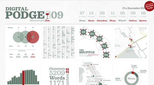
Digital Podge Like Clandrei, Digital Podge’s repetition of shapes creates cohesion and makes the eye move about. But this website showcases another perk of rhythm: no matter what is being repeated (i.e. no matter what the unifier), it can be used to highlight links and other information that is imperative to the user experience. On Digital Podge, the circles either indicate links to other pages or showcase an area that the visitor needs to see.
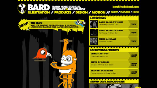
Bard Hole Standal The yellow color and slanted lines give this website its rhythm by dancing around the website to attract attention. This shows that a website can have more than one major repeating feature to create rhythm. The yellow is present in a variety of elements, which themselves repeat.
Emphasis

How It Works
Emphasis is the same thing as focal point. TVs, fireplaces, artwork: we all have an idea of what qualifies as the focal point of an interior space. It is typically in the center of the space and is the first thing to catch your eye. In Web design, as in interiors, we sometimes create focal points unintentionally. This can be caused by a central or large object in a design, or a central or large text area in a code-heavy layout. Try to complement your focal point with other features such as color, form and texture.
Why It’s Important
While focal points are often chosen for their aesthetic value, they serve a larger purpose in design. The focal point is the anchor of the space, and the item around that should influence all other design decisions.
Hint for Designers
Your secondary pieces don’t have to fall behind. By choosing a large focal point and centering it, you give the space its foundation; this allows the surrounding images to be quirky, without altering the atmosphere or making the design seem “hodge-podge.” Use different border colors to your advantage, or place your surrounding images in a way that appears random.
Examples
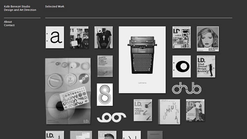
Kobi Benezri Studio The focal point here — the typewriter — is the first place most of us will look. This happens for two reasons. First, it is one of the largest images on the page and so demands your attention. Secondly, there is more white space in that image than in any of the others, which creates contrast. The surrounding images are set in the same monochromatic palette, which throws them into relief.
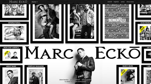
Marc Ecko Ecko’s name and photo are the central points of focus. They act as the anchors in this design and make the rest of the images look haphazard and cluttered but still thoughtfully chosen and professional.
The emphasis here, the dog, does not act as an anchor or hover around the middle, as many points of focus do. But it’s multi-colored brightness and size demand instant attention, as well as act as a break from the gray tones in the rest of the layout.

Color

How it works
Colors work together in many ways. The countless combinations influence our thoughts, opinions and feelings. Because color does so much, our discussion of it has to be limited here: we’ll talk about what it does to the amount of space in your design.
In interiors, the use of warm or cool colors is dictated by factors such as how much light the room gets, how much time you spend in it and how big it is. We Web designers don’t have to worry about these determinants, but we should consider color’s spatial influences when working with heavy or lighter layouts. If your layout is heavy with text, texture, images and the like, go for cooler tones, such as blues, aquas, turquoise and sage. These will make the space seem larger and balance the heaviness. Use warmer tones (red, orange, yellow) to create the appearance of extra space in a minimalist design.
Why It’s Important
The color in our home offers a glimpse into our personality. Our websites are our technological homes, so why would we put any less effort into their color scheme?
Hint for Designers
If you’d like to know whether certain colors go together, look to nature. Think of the beach, and you’ll realize that turquoise, beige and cream go together. Think of fields in autumn, and you’ll think of red, orange, brown and green. Purple, brown, magenta and green are eggplant-themed, while violet, navy and green remind us of hydrangeas. Grays, blacks and browns will always anchor other colors and provide relief. In addition, because of their neutrality, anchor colors don’t have to be included in the palette count; they allow for diversity. The color schemes of our websites also influence users by making them feel calm (with cool tones) or energetic and upbeat (with warm tones). For more information on color combinations and schemes, check this out.
Examples
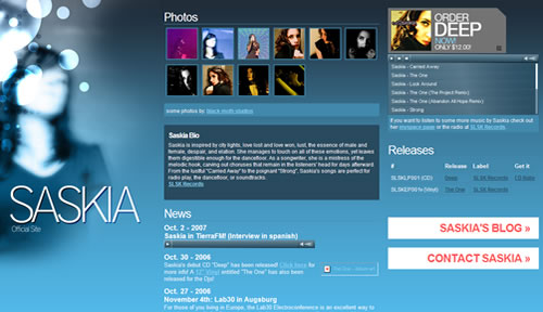
Saskia Music Saskia’s layout is wide and has a fair amount of information and graphics. The blue background makes the amount of information less daunting by “expanding” the space. Imagine this website in red — wouldn’t the space have looked smaller and more cluttered?
The Octonauts site is very busy: We have a patterned background, busy header image and two columns of featured news. However, what cools this business are the blue tones throughout. In addition, aside from the few bursts of warm tones, the layout uses mostly cool tones: sage green, light gray, teal and white. Featuring the same layout in warmer tones would have amped up the busyness, and with this much going on on the site, cool tones were a necessity.

ft designer ft designer uses black as its anchor color, which allows it to incorporate multiple colors (blue, green, white and yellow-green) without becoming overbearing and rainbow-esque.

Texture

How It Works
The key to success is to mix different textures. This is as true for the Web as it is for interiors. Pair rough with slick, patterned with plain, coarse with fine, fuzzy with silky and shiny with matted. Don’t be afraid to experiment with unlikely combinations. You’ll be surprised how well textures bring out the best in each other.
Why It’s Important
Texture is a strong determining factor in a user’s emotional response to a design. Balance, proportion, rhythm, emphasis and color are the basic principles, and texture is a necessary enhancement; it’s the cherry on top.
Hint for Designers
The need for texture almost doubles when using a monochromatic palette. Monochromatic palettes can easily become boring, whether in interiors or on the Web. But they can be intriguing and multi-faceted, and one of the easiest ways to make them that way is to give them plenty of texture.
Examples
Coraline features a variety of textures, but the diversity doesn’t take away from the concept. Running with an old-world, grass-roots advertisement motif, Coraline uses stained papers, the look of ‘placarded’ posters, a run-down suitcase with velveteen lining and thin brass nameplates. In so doing, Coraline shows that designers don’t have to sacrifice a strong theme for variety.

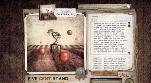
Five Cent Stand At Five Cent Stand, the layering of old papers and pictures with a soft patterned texture is interesting, not overbearing.
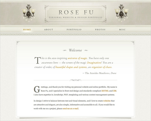
Rose Fu Rose Fu uses multiple textures in its monochromatic palette. Had there been more colors, so many textures might not have been necessary.
Lines

How It Works
Popular places for lines in a room are the floor, upholstery and, more notably, the walls. They’re a simple addition, but lines say a lot about a space. For instance, horizontal lines often give a casual vibe, while vertical lines express formality. Curvy lines can add grace or whimsy, while diagonal lines provide rhythm and movement. You can get creative by using atypical methods to create lines, as seen in the image on the left.
Why It’s Important
Lines help create a mood in an interior space and can provide the same benefit online. The best thing about lines is that they can be as understated or as powerful as you’d like, so it’s one of the less daunting design choices you’ll make.
Hint for Designers
Don’t be afraid to combine lines to find a good balance. For instance, adding horizontal lines can calm the strong formalities of vertical lines, just as curvy lines can add playfulness to casual horizontals. In addition, verticals and horizontals can be applied in a grid-like pattern for the appearance of structure and cleanliness.
Examples
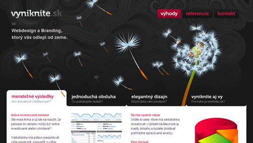
Vyniknite Vyniknite uses curvy lines to represent blowing wind, giving a whimsical feel to the design.
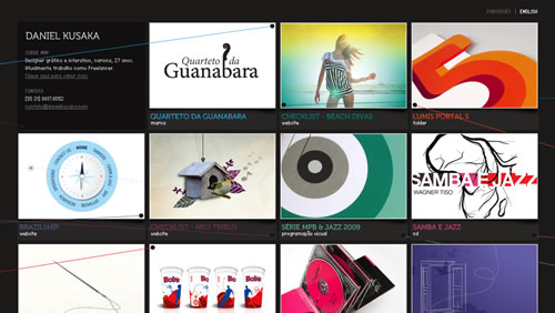
Daniel Kusaka Kusaka’s website uses diagonal lines around the square images, creating movement in a layout that could have easily felt stagnant. This simple alteration is enhanced by the various colors of the lines, making them more noticeable and therefore more effective.
What’s Up Cupcake? isn’t about adding a combination of lines to combine or ease certain vibes. Rather, the site uses lines to add to an already formal feel: While ornate picture frames and formal curves around the logo and link area supply the formality, and the vertical lines emphasize it.

Showcase
Balance

Kashmir

Proportion

Rhythm

NikeStore

Emphasis


Color


Textures

Lines
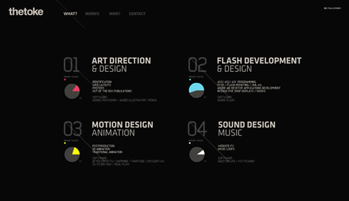
The Toke

Resources And Further Reading
- Design Rules by Elaine Griffin
- Discovering Home with Laurie Smith by Laurie Smith
- Domino, The Book of Decorating by Needleman, Costello and Caponigro
- House Beautiful: 750 Decorating & Design Ideas by House Beautiful
- New Decorating Book by Better Homes and Gardens
- Ready, Set, Decorate by House Beautiful
- Simple Home by Mark and Sally Bailey
- iStockphoto, an image resource for interior pictures
- Discover Interior Design, a blog by interior designer Kristen Warbington
- Paula Grace Designs, a blog by interior designer Paula Grace
- Interior Decorating: The Basics, an article by “The Interior Design Society”
- The Principles of Design , an article by Joshua David McClurg-Genevese at “Digital Web”.
 (al)
(al)

