The Beauty Of Typography: Writing Systems And Calligraphy, Part 2
Email Newsletter
Weekly tips on front-end & UX.
Trusted by 182,000+ folks.


 Celebrating 10 million developers
 Custom Web Forms for Angular, React, & Vue. Your backend.
We are now back for the second (and last) part, which is a bit different but just as interesting. You will see that some features of the languages presented here clearly correspond to our Latin-based system, while others are unfamiliar. The point of this second part is to complete our look at writing systems of the world and to think more generally about what they signify. We’ll cover the following:
- Hebrew
- Modern European scripts (Latin, Greek, Cyrillic, Armenian, Georgian)
- Mongolian
- Inuktitut
- International Phonetic Alphabet
Writing Systems Of The World
Before we get started, let’s take a moment to understand where everything fits in:

Click on the image to see it full-size.
Figuring out how many languages are spoken in the world is hard, but estimates are at around 7000 languages and dialects, with hundreds of script for writing them down. Fortunately, the major writing systems fall into four broad categories:
- Alphabetic. As you probably know, an alphabet is a segmental writing system in which a standardized set of letters (graphemes) roughly represents phonemes. The word “alphabet” is derived from Alpha and Beta, the first two symbols of the Greek alphabet. Two types of alphabets are important in classifying writing systems:
- Adbjad, which contains symbols for consonants only, or vowels optionally written with diacritics (e.g. Arabic and Hebrew).
- Adbugida, whose basic signs denote consonants with inherent vowels. “Following” vowels other than inherent ones are denoted by diacritical marks or another systematic modification of the consonants (e.g. Devanāgarī).
- Logographies. In a logographic system, each character (logogram) represents a single complete grammatical word and is more precise than a morpheme (e.g. Chinese).
- Syllabaries. As the name suggests, in a syllabic system, characters represent or approximate syllables (or more precisely “moras”), which make up words. A symbol typically represents a consonant sound followed by a vowel sound, or a vowel alone (e.g. Japanese).
- Featural. A featural writing system represents finer details than an alphabet. Each symbol represents not a whole phoneme but rather the phonetic features that make up the phoneme, such as voicing or place of articulation (e.g. Korean).
Unluckily for us, most writing systems cannot be classified as purely one type. Indeed, many languages include several of these features. In English, for example, the clusters of phonemic letters are a complex match to their sounds.
End of parenthesis. I could go on, but then this would not be the article you signed up for. So, we’ll go back to our subject and start exploring the typographic beauty of languages. If you’re interested in this classification of fascinating writing systems, then this Wikipedia article is a great start.
Hebrew
The Hebrew alphabet is a descendant of the Aramaic alphabet, which is itself a descendant of the Phoenician alphabet. Like Arabic, the Hebrew alphabet is an abjad in its traditional form (i.e. an alphabet consisting only of consonants), written from right to left. It has 22 letters, 5 of which have different forms at the end of a word (called “sofit”). The Hebrew alphabet has only one case, so capitalization is not used, and it is often called the “alefbet” because of its first two letters.
Diacritics
Again like Arabic, modern Hebrew orthography includes several types of diacritics as aids to pronunciation. These are written above, below or inside the letter, in ways that do not alter the spacing of the line. Text containing these markings is referred to as “pointed” text and contains three types of marks:
- The niqqud (points) are used most. They represent vowels or are used to distinguish between alternative pronunciations of several letters of the alphabet.
- The geresh (indicating initialisms) and the gershayim (indicating acronyms) are diacritics that affect pronunciation. They are also used to denote Hebrew numerals but are not considered part of the niqqud.
- The cantillation are accents that show how Biblical passages should be chanted and that sometimes function as punctuation.

Letters are in black, points in red and cantillation in blue.
Fonts

The Hebrew letter ה (hei) in four fonts (from right to left): modern Hebrew block, modern Hebrew handwriting, Torah scroll writing, “Rashi” script.
Hebrew can be written in three main scripts:
- Cursive Hebrew. Used almost exclusively when handwriting in modern Hebrew, because it is faster to write than traditional Hebrew.

- Rashi. A semi-cursive script used in books for editorial insertions or biblical commentary. (Named after Rashi, one of the great medieval Jewish scholars and biblical commentators.)

- Block. Used mostly in books. A stylized form of the Aramaic script.

Gematria
In Hebrew, each letter is also used to denote numbers. One interesting thing about Hebrew is “Gematria,” the system of assigning numerical value to a word or phrase, in the belief that words or phrases with identical numerical values bear some relation to each other. The best-known example is the Hebrew word “Chai” (meaning “life”), which is composed of two letters that add up to 18. For this reason, 18 is a spiritual number in Judaism, and many Jews give gifts of money in multiples of 18.

The word “Chai” is composed of the two letters: Chet (ח) and Yod (י).

There are 22 solid figures composed of regular polygons (5 Platonic solids, 4 Kepler-Poinsot solids and 13 Archimedean solids). Because the Hebrew alphabet has 22 letters, we can infer a correspondence between these two seemingly unrelated categories. The art of gematria is knowing which solid to associate with which letter.
This system is used to gain insight into related concepts and to find correspondence between words and concepts. According to most practitioners, there are several methods of calculating the numerical value of individual words and phrases. When converted to a number, a word or phrase can then be compared to another word or phrase, from which a similarity can be identified.
Calligraphy
Over 150 laws govern how the Hebrew alphabet can be written by a Jewish scribe. Needless to say, we won’t list them all here, but a few are below, including the standard for writing the letter “tsadi,” which consists of the letters Yud and Nun. For more information, this website is quite extensive.

European Alphabets
In this part, we’ll cover the five modern European alphabetic scripts: Latin, Greek, Cyrillic, Armenian and Georgian.
Latin
The basic modern Latin alphabet (containing 26 letters, possibly also used in combination with diacritics) is the best known of the Latin alphabets. The writing system is not only the most used in Europe but is the most widely used alphabetic writing system in the world today. Consequently, we have many Latin-derived alphabets.

Some languages have fewer than 26 letters, such as the Italian alphabet, which has only 21 letters (thanks to the person who pointed this out in a comment). Most Latin-derived alphabets use the basic 26 letters, plus extensions. Diacritics are the most common way to extend the alphabet, but not the only way, as we will now see.
1. Adding diacritics One way to extend the basic alphabet is by adding diacritics to existing letters, a practice followed by most Latin-based languages (English pretty much being the exception). The illustration below is from the very interesting article “On Diacritics” from I Love Typography, showing various diacritics in use.

2. Joining multiple letters to make ligatures Another way to extend the alphabet is by joining multiple letters to make ligatures. Fusing two or more ordinary letters creates a new glyph or character.

Typical ligatures in the Latin script.
3. Clustering letters Diagraphs and trigraphs are pairs and triplets of letters to which a special function has been assigned. They are not proper characters and do not correspond to the value you would get by combining two or three characters normally. Rather, they are pairs or triplets of letters with a special function.

In Welsh, the digraph “Ll” is fused as “ll” to form a ligature.
Digraphs and trigraphs are found in alphabets other than the Latin one, and we can discern various patterns in their form:

4. Collating The question arises: how to sort all these modified letters? This is where collating comes in handy. Collation is the assemblage of written information into a standard order. One common type of collation is alphabetization, although collation is not limited to ordering letters of the alphabet.
These additional letters can be regarded as distinct new letters and are assigned specific positions in the alphabet (such as the symbols Å, Ä and Ö in Swedish):
A · B · C · D · E · F · G · H · I · J · K · L · M · N · O · P · Q · R · S · T · U · V · W · X · Y · Z · Å · Ä · Ö
In other cases, especially with letter-diacritic combinations, extensions are identified by their base letter (as with Ä, Ö, Ü and ß in German).
A · B · C · D · E · F · G · H · I · J · K · L · M · N · O · P · Q · R · S · T · U · V · W · X · Y · Z ( + Ä · Ö · Ü · ß)
To complicate things further, there are languages in which certain extensions are regarded as new letters and others are not. For example, in Spanish, the character Ñ is considered a distinct letter and is sorted between N and O in the dictionary; but the accented vowels Á, É, Í, Ó, Ú are not distinct from the unaccented vowels A, E, I, O, U, respectively.
A · B · C · D · E · F · G · H · I · J · K · L · M · N · Ñ · O · P · Q · R · S · T · U · V · W · X · Y · Z ( + Á · É · Í · Ó · Ú · Ü )
Cyrillic Alphabet
The Cyrillic alphabet was developed by the Slavs in Bulgaria in the 9th century. It is based on the system of Greek capital letters, augmented by ligatures and consonants from the older Glagolitic alphabet to account for sounds not found in the Greek.
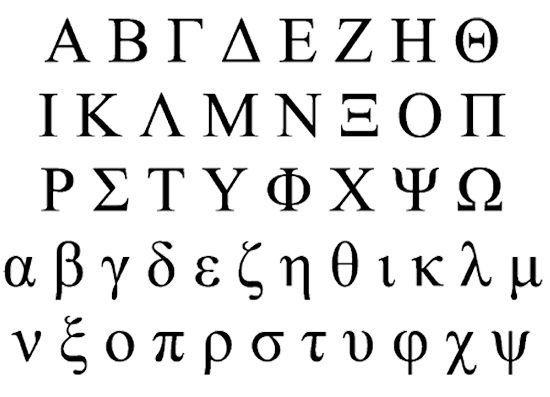
The Greek alphabet.
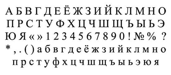
The Russian Cyrillic alphabet.
The early Cyrillic alphabet came to dominate over Glagolitic in the 12th century. Since its creation, it has adapted to changes in the spoken language and developed regional variations to suit the features of national languages. Variations of the Cyrillic alphabet are used nowadays for languages throughout Eastern Europe and Asia.

It is interesting how different some of these letters can be depending on whether they’re written in regular or italic cursive:

Likewise, uppercase, small caps and lowercase can be quite different:

Armenian
The Armenian alphabet has been used for the Armenian language since the 5th century. Until the 19th century, the Armenian language had only one written form: Old Armenian. Since then, phonological changes have split it into two dialects: Eastern and Western Armenian.

A typeface created by Khajag that improves on the legibility of current typefaces used in school textbooks.
Schools nowadays teach only the Eastern dialect as the written form because it is closer to the historical Old Armenian form, even though the Western dialect is more widely spoken. The following chart shows the alphabet, with its Eastern (EA) and Western (WA) phonetic values:

Punctuation in Armenian is quite interesting, because it is completely different than what we are used to:

The Erkatagir script is monumental in style. The majuscule letters are large, erect, with gracefully rounded lines that connect (or spring from) the vertical elements of the letters. All letters are written on a base line between two imaginary parallel lines, with ascending and descending elements only slightly extending beyond. Round Erkatagir is characterized by a contrast of thick vertical forms and razor-thin connecting curved strokes. [text and image from 15levels]

The Bolorgir, or minuscule, ancestor of modern Armenian type fonts, dominated scribal hands from the 13th to 16th centuries and continued well through the 19th. It has developed more elegant and graphic forms, and although by definition a round script, the characters are slanted and the letters have sharp corners. The contrast between base shapes and connecting strokes is not as extreme as in Erkatagir; it is a more cursive script (characters are closer to one another), smaller in size and different in shape. [text and image from 15levels]

The Notrgir, or notary script, is a blend of Bolorgir and Sła’gir, dominated by small cursive forms. Back in the 17th and 18th centuries, the secretary—working as a scribe in the royal court or Catholicosate—employed as a matter of necessity time-saving cursive versions of Bolorgir and even smaller Notrgir letters. The structure may have entered Armenian writing traditions in the late Byzantine Greek or Latin periods. [text and image from 15levels]

Georgian
Georgian (ქართული დამწერლობა) is the writing system of the Georgian language (of course), but also of other languages in the Caucasus, mostly South Caucasian languages. Georgian has always used three distinct alphabets: Asomtavruli, Nuskhuri and Mkhedruli. They have progressed through three forms, all dissimilar, even though they share the same letter names and “collation” (now you know that’s just a fancy way of saying alphabet order). The word meaning “alphabet” (ანბანი [anbani]) is derived from the names of the first two letters of each of the three Georgian alphabets, the modern one containing 33 letters.

Georgian is interesting because of its double influence. Like its neighboring language, Armenian, it displays Greek influences in its letter-ordering, while Iranian influences are visible in the cursive shapes of the letters (especially the ancient forms), and the abundance of sibilants are reminiscent of Pahlavi, an ancient Iranian script.
Mongolian

The Mongolian script has a long history. It was developed as an adaptation of the script of the Uyghurs, who were captured by the Mongols during a war against the Naimans around the 12th century CE. But it didn’t fit the Mongolian language: the spelling was ambiguous because Uyghur letters represented multiple sounds. In addition, the spelling fossilized while the sounds naturally evolved, thus separating the written and spoken language. Language reform during the 16th century CE alleviated the problem, and the resulting script is known as Mongolian:

Mongolian is special for its vertical writing. The Uyghur script and its descendants—Mongolian, Oirat Clear, Manchu and Buryat—are the only vertical scripts written from left to right. This happened because the Uyghurs rotated their script (which was derived from Sogdian, a right-to-left script) 90° counter-clockwise to emulate Chinese writing, but without changing the relative orientation of the letters.

For more inspiration from the Mongolian script, don’t miss these antiques of Mongolian calligraphy.
Inuktitut

Inuktitut (ᐃᓄᒃᑎᑐᑦ, literally meaning “like the Inuit”) is the language of the Inuit people, specifically the Inuit of the Canadian Eastern Arctic. It also refers to the Inuit language as a whole, which itself is more of a dialect continuum than a single language. Roughly four dialects and variants groups are on this continuum, depending on the region where they are spoken. The Canadian census reports that approximately 35,000 Inuktitut speakers are in Canada, including about 200 who reside outside of traditionally Inuit lands.

With only 0.01 people per square kilometer of land, Nunavut is one of the least populated regions in the world. And yet it has four official languages: English, French, Inuktitut and Inuinnaqtun. For this reason, the government of Nunavut adopted a clean sans-serif font called Pigiarniq (designed by Tiro Typeworks) that enables its people to use all four languages in a uniform manner. The result is a professional-looking free font family:


Preview of the Pigiarniq font: regular, light, italic, bold, heavy.
International Phonetic Alphabet
Let’s finish this series with the International Phonetic Alphabet (IPA). This system of phonetic notation is based on the Latin alphabet and is designed to represent only distinctive qualities of spoken language: phonemes, intonation and the separation of words and syllables.

Phonetic transcriptions of the word “international” in two English dialects.
The general principle followed by the International Phonetic Association is to provide one symbol for each distinctive sound, meaning:
- Individual sounds are not represented by letter combinations, and multiple sounds are not represented by individual letters (the way “x” represents [ks] or [ɡz] in English);
- Letters do not have context-dependent sound values (as “c” does in English and other European languages);
- Two sounds are usually not given separate letters if no known language distinguishes between them (a property known as “selectiveness”).
Interestingly, all pronunciations in the languages we have looked at can be summarized in the following IPA chart. That’s right: one page! Occasionally, the International Phonetic Association adds, removes or modifies symbols; but as of 2008, the IPA proper has 107 distinct letters, 52 diacritics and 4 prosody marks.

Obviously we won’t look at the chart in detail. Below, though, is the IPA chart for vowels, mapped according to the position of the tongue.

The IPA is a special type of notation, and yet we can still make out familiar words and names:

You may also want to check out the following Smashing Magazine articles:
- Japanese, A Beautifully Complex Writing System
- Brush Lettering: It Only Gets Better After Practice
- Understanding The Difference Between Type And Lettering
- Taking A Closer Look At Arabic Calligraphy
Resources
- Hebrew Gematria Finding numerical relationships between words and phrases.
- Writing System Wikipedia’s article about writing systems.
- Ancient Scripts A compendium of world-wide writing systems from prehistory to today.
- Hebrew diacritics A Wikipedia article about Hebrew diacritics.
- Hebrew scripts This page presents various forms of the Hebrew script.
- Sacred Hebrew Calligraphy An article covering various aspects of the Hebrew calligraphy.
- On Diacritics Article from “I Love Typography” exploring diacritics.
- Chai symbol A Wikipedia article about the Chai symbol.
- Digraph A Wikipedia article about digraph.
- Arek An Armenian typeface.
- Ruben Malayan The vision of this project is to create a book that encompasses most fascinating examples of Armenian calligraphy through time.
- Mongolian Calligraphy in Contemporary Art History and analysis of Mongolian calligraphy.
- Inkway Antiques of Mongolian Calligraphy.
- International Phonetic Alphabet A Wikipedia article about the IPA.
Disclaimer
This article is partly based on the copyrighted Wikipedia articles (”Writing System”,”Hebrew diacritics”, “Chai symbol”, “International Phonetic Alphabet”); it is used under the Creative Commons Attribution-ShareAlike 3.0 Unported License (CC-BY-SA). You may redistribute it, verbatim or modified, providing that you comply with the terms of the CC-BY-SA.


