The Ultimate Guide To A/B Testing

Email Newsletter
Weekly tips on front-end & UX.
Trusted by 200,000+ folks.


People just aren’t as aware of it. They don’t completely understand what it is or how it could benefit them or how they should use it. This article is meant to be the best guide you will ever need for A/B testing.
What Is A/B Testing?
At its core, A/B testing is exactly what it sounds like: you have two versions of an element (A and B) and a metric that defines success. To determine which version is better, you subject both versions to experimentation simultaneously. In the end, you measure which version was more successful and select that version for real-world use.
This is similar to the experiments you did in Science 101. Remember the experiment in which you tested various substances to see which supports plant growth and which suppresses it. At different intervals, you measured the growth of plants as they were subjected to different conditions, and in the end you tallied the increase in height of the different plants.
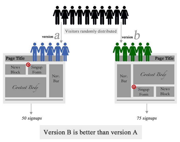
A/B testing on the Web is similar. You have two designs of a website: A and B. Typically, A is the existing design (called the control), and B is the new design. You split your website traffic between these two versions and measure their performance using metrics that you care about (conversion rate, sales, bounce rate, etc.). In the end, you select the version that performs best.
What To Test?
Your choice of what to test will obviously depend on your goals. For example, if your goal is to increase the number of sign-ups, then you might test the following: length of the sign-up form, types of fields in the form, display of privacy policy, “social proof,” etc. The goal of A/B testing in this case is to figure out what prevents visitors from signing up. Is the form’s length intimidating? Are visitors concerned about privacy? Or does the website do a bad job of convincing visitors to sign up? All of these questions can be answered one by one by testing the appropriate website elements.
Even though every A/B test is unique, certain elements are usually tested:
- The call to action’s (i.e. the button’s) wording, size, color and placement,
- Headline or product description,
- Form’s length and types of fields,
- Layout and style of website,
- Product pricing and promotional offers,
- Images on landing and product pages,
- Amount of text on the page (short vs. long).
Create Your First A/B Test
Once you’ve decided what to test, the next step, of course, is to select a tool for the job. If you want a free basic tool and don’t mind fiddling with HTML and JavaScript, go with Google Website Optimizer. If you want an easier alternative with extra features, go with Visual Website Optimizer (disclaimer: my start-up). Other options are available, which I discuss at the end of this post. Setting up the core test is more or less similar for all tools, so we can discuss it while remaining tool-agnostic.
You can set up an A/B test in one of two ways:
- Replace the element to be tested before the page loads. If you are testing a single element on a Web page—say, the sign-up button—then you’ll need to create variations of that button (in HTML) in your testing tool. When the test is live, the A/B tool will randomly replace the original button on the page with one of the variations before displaying the page to the visitor.
- Redirect to another page. If you want to A/B test an entire page—say, a green theme vs. a red theme—then you’ll need to create and upload a new page on your website. For example, if your home page is
https://www.example.com/index.html, then you’ll need to create a variation located athttps://www.example.com/index1.html. When the test runs, your tool will redirect some visitors to one of your alternate URLs.
Once you have set up your variations using one of these two methods, the next step is to set up your conversion goal. Typically, you will get a piece of JavaScript code, which you would copy and paste onto a page that would represent a successful test were a visitor to arrive there. For example, if you have an e-commerce store and you are testing the color of the “Buy now” button, then your conversion goal would be the “Thank you” page that is displayed to visitors after they complete a purchase.
As soon as a conversion event occurs on your website, the A/B testing tool records the variation that was shown to the visitor. After a sufficient number of visitors and conversions, you can check the results to find out which variation drove the most conversions. That’s it! Setting up and running an A/B test is indeed quite simple.
Do’s And Don’ts
Even though A/B testing is super-simple in concept, keep some practical things in mind. These suggestions are a result of my real-world experience of doing many A/B tests (read: making numerous mistakes).
Don’ts
- When doing A/B testing, never ever wait to test the variation until after you’ve tested the control. Always test both versions simultaneously. If you test one version one week and the second the next, you’re doing it wrong. It’s possible that version B was actually worse but you just happened to have better sales while testing it. Always split traffic between two versions.
- Don’t conclude too early. There is a concept called “statistical confidence” that determines whether your test results are significant (that is, whether you should take the results seriously). It prevents you from reading too much into the results if you have only a few conversions or visitors for each variation. Most A/B testing tools report statistical confidence, but if you are testing manually, consider accounting for it with an online calculator.
- Don’t surprise regular visitors. If you are testing a core part of your website, include only new visitors in the test. You want to avoid shocking regular visitors, especially because the variations may not ultimately be implemented.
- Don’t let your gut feeling overrule test results. The winners in A/B tests are often surprising or unintuitive. On a green-themed website, a stark red button could emerge as the winner. Even if the red button isn’t easy on the eye, don’t reject it outright. Your goal with the test is a better conversion rate, not aesthetics, so don’t reject the results because of your arbitrary judgment.
Do’s
- Know how long to run a test before giving up. Giving up too early can cost you because you may have gotten meaningful results had you waited a little longer. Giving up too late isn’t good either, because poorly performing variations could cost you conversions and sales. Use a calculator (like this one) to determine exactly how long to run a test before giving up.
- Show repeat visitors the same variations. Your tool should have a mechanism for remembering which variation a visitor has seen. This prevents blunders, such as showing a user a different price or a different promotional offer.
- Make your A/B test consistent across the whole website. If you are testing a sign-up button that appears in multiple locations, then a visitor should see the same variation everywhere. Showing one variation on page 1 and another variation on page 2 will skew the results.
- Do many A/B tests. Let’s face it: chances are, your first A/B test will turn out a lemon. But don’t despair. An A/B test can have only three outcomes: no result, a negative result or a positive result. The key to optimizing conversion rates is to do a ton of A/B tests, so that all positive results add up to a huge boost to your sales and achieved goals.
Classic A/B Testing Case Studies
Here are some case studies to give you an idea of how people test in the wild.
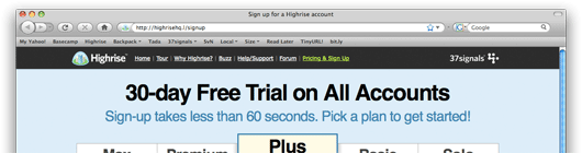
Writing Decisions: Headline Tests on the Highrise Sign-Up Page 37signals tested the headline on its pricing page. It found that “30-Day Free Trial on All Accounts” generated 30% more sign-ups than the original “Start a Highrise Account.”
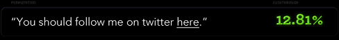
You Should Follow Me on Twitter Here (Dustin Curtis) This much-hyped split-test involved testing multiple versions of a call to action for Twitter followers. Dustin found that “You should follow me on Twitter here” worked 173% better than his control text, “I’m on Twitter.”
Human Photos Double Conversion Rates A surprising conclusion from two separate A/B tests: putting human photos on a website increases conversion rates by as much as double. Scientific research backs this up, saying that we are subconsciously attracted to images with people.

Google Website Optimizer Case Study: Daily Burn, 20%+ Improvement (Tim Ferriss) A simple variation that gave visitors fewer options too choose from resulted in a 20% increase in conversions. The winning version was also much easier on the eye than the control in its detail and text.
Two Magical Words Increased Conversion Rate by 28% The words “It’s free” increased the clicks on this sign-up button by 28%, illustrating the importance of testing call-to-action buttons and how minor changes can have surprisingly major results.

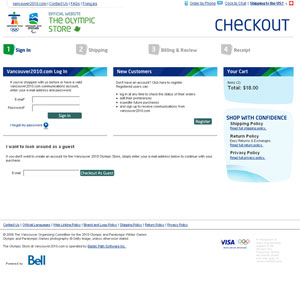
Changing the Sign-Up Button from Green to Red Along with its other A/B tests, CareLogger increased its conversion rate by 34% simply by changing the color of the sign-up button from green to red!

Single page vs. multi-step checkout If you have an online store, it is quite common to see visitors abandoning the purchase process at the time of checkout. This A/B test found out that a single page checkout process works much better at completing sales than multiple-page checkout process.
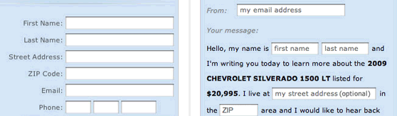
“Mad Libs” style form increases conversion 25-40% Defeating conventional wisdom, in this A/B test it was found out that a paragraph-styled form with inline input fields worked much better than traditional form layout. Though the result was probably specific to their offering as it wasn’t replicated in another, separate A/B test.
Complete redesign of product page increased sales by 20% A software product company redesigned their product page to give it a modern look and added trust building elements (such as seals, guarentees, etc.). End result: they managed to increase total sales by 20%. This case study demonstrates the effect of design on sales.
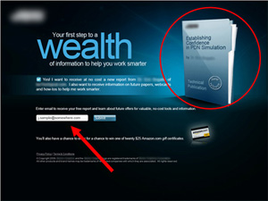
Marketing Experiments response capture case study – triple digit increase in conversions Through a series of A/B tests they optimized the mailing list opt-in rate by 258%. Focus was to remove all distractions and require the visitor to only provide email address. For completing his/her complete profile, the landing page motivated the visitors with an Amazon gift card (which was again split tested).
Resources For Deep-Diving Into A/B Testing
If you’ve read this far, then A/B testing has presumably piqued your interest. Here, then, are some cherry-picked resources on A/B testing from across the Web.
- A Roadmap To Becoming An A/B Testing Expert
- Multivariate Testing 101: A Scientific Method Of Optimizing Design
- Multivariate Testing In Action: Five Simple Steps
- In Defense Of A/B Testing
Get Ideas for Your Next A/B Test
- Which Test Won? A game in which you guess which variation won in a test.
- 101 A/B Test Tips A comprehensive resource of tips, tricks and ideas.
- ABtests.com A place to share and read A/B test results.
- A/B Ideafox A search engine for A/B and multivariate case studies.
Introductory Presentations and Articles
- Effective Testing By Ben Tilly.
- Practical Guide to Controlled Experiments on the Web (PDF) From Microsoft Research.
- Introduction to A/B Tests From the 20bits blog
The Mathematics of A/B Testing
- Statistics for A/B Tests From the 20bits blog.
- How Not to Do A/B Tests
- What You Should Know About the Mathematics of A/B Tests From my own blog.
- Easy Statistics for AdWords A/B and Hamsters
- Statistical Significance and Other A/B Test Pitfalls


