Designing Style Guidelines For Brands And Websites
A website is never done. Everyone has worked on a project that changed so much after it launched that they no longer wanted it in their portfolio. One way to help those who take over your projects is to produce a style guide.
Edward Tufte once said: “Great design is not democratic; it comes from great designers. If the standard is lousy, then develop another standard.” Although there’s no stopping some clients from making their website awful, by creating a style guide, you’re effectively establishing rules for those who take over from you.
Why Create A Style Guide?
- You’ll have an easy guide to refer to when handing over the project.
- Makes you look professional. They’ll know you did everything for a reason
- You maintain control of the design. When someone does something awful, you can refer them to the document.
- You avoid cheapening the design, message and branding.
- Forces you to define and hone your style, making for a more cohesive design.
Branding Guidelines: What To Include?
Strategic Brand Overview
This should be short and sweet. In as few words as possible, make clear the vision for this design and any keywords people should keep in mind while designing. Most people will probably flip straight to the picture pages, but they may read a few sentences here.

See Kew’s branding guidelines.
Kew uses strong photography in its “brand essence” message, with a few paragraphs that both inspire and define the brand. Even if you read only the first sentence, you get a sense of what it’s trying to do. While Kew has quite a few of these message pages, they are intertwined with beautiful photography that themselves define the photographic style and primary message.
Logos
For print and Web, most brands revolve around the logo. Make sure you provide logo variations and clarify minimum sizes.

See Cunard’s branding guidelines.
Cunard provides many variations on its minimum sizes. Because its crest can be displayed either on its own, with the name or with the tagline, specifying minimum sizes is important for legibility (for example, if the logo with the tagline is too small, it will be illegible).

See Think Brick’s branding guidelines.
Provide logos with different colors, and specify which colours are allowed. Think Brick gives designers a lot of options with its design. The point is to allow flexibility while maintaining consistency.
Show Examples of What and What Not to Do
You’re a professional, and you know better than to mess around with logos. But many others will try and think they’ve done a good job. They are so wrong. You must make clear what they can and cannot do with a design.

See I Love New York’s branding guidelines.
I Love New York has done a great job defining all the things you shouldn’t do with its logo. It has also produced a beautiful (though bit wordy) document.
Spacing
Many non-designers underestimate the need for white space. Include a spacing reference, especially for the logo. Rather than specifying inches or centimeters, use a portion of the logo (a letter or a shape) to set the clearance. This way, whether the logo is big or small, the space around it will be sufficient.

See BlackBerry’s branding guidelines (PDF, 2.2 MB).
BlackBerry not only explains its spacing policy, but also uses the capital B in the logo to define the clearance.
Colors
Always include color palettes and what the colors should be used for. And include formats for both print and Web: CMYK, Pantones (if they exist) and RGB (or HEX). Always include a CMYK alternative for Pantones because sometimes matching is hard (especially when Pantone printing is not possible). Specify primary and secondary colours and when and where to use them.
Channel 4 shows all of its Web and print colors, and it displays the swatches below an image that helps to define its color palette.

See the New School’s branding guidelines.
The New School is clear about its primary colors and defines them for both print (Pantone and CMYK) and Web (RGB). Its brand guideline document is beautiful, too.

See Christopher Doyle’s Personal Identity Guidelines.
Okay, so this one isn’t a traditional branding guideline, but rather a personal identity guideline. Here Christopher Doyle shows off some alternative color palettes. He does a fantastic job of mocking branding guidelines; well worth a look (and chuckle).
Fonts
You’ll need to define the typefaces to use: sizes, line height, spacing before and after, colors, headline versus body font, etc. Make sure to include Web alternatives for non-Web fonts.

See Yale’s typeface.
Yale has its own typeface, which it provides to its designers.

See Yale’s Visual Identity page.
On the typeface section of its website, Yale also details when fonts should be used. It has a specific Web font section, detailing which fonts to use there.
Layouts and Grids
By setting up templates and guidelines for grids, you encourage best practices and promote consistency. In Web, preparing some generic templates can curb excessive creativity with the layout.

See the Barbican’s branding, print and Web guidelines.
For its website, the Barbican has set up building blocks that are both flexible and ordered—meaning they’re likely to remain in a grid.
Tone of Voice
A huge component of a brand’s personality is the copy, and defining the tone is a great way to keep a brand consistent. When multiple people are writing the copy, the brand can start to sound like it has multiple personalities.

See easyJet’s branding guidelines (PDF, 2 MB).
easyJet has a well-defined personality, both verbal and written, and it gives examples for both.
Copy-Writing Guide
For those who require clients to write their own copy but want to maintain consistency, a copy-writing style guide can be helpful. Copy-writing is one of those things that most people register subconsciously. When reading, your brain automatically looks for consistency and patterns, and poor copy-writing can ruin the reading flow.

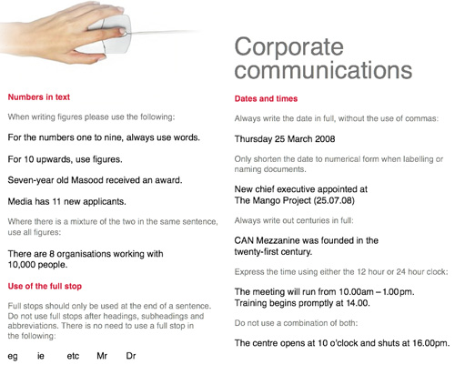
See CAN’s branding guidelines (PDF, 845 KB).
CAN wants its number formats to look the same. On another page, it defines which spelling variants to use, reminds people of common mistakes and more.
Imagery
Many designers have established a particular tone in their photographs and images. Show your clients examples, and explain why they are good choices. Show them in the context of your design, and explain why they were chosen for that context.

See Zopa’s style sheet (PDF, 3.7 MB).
Zopa has done a fantastic job of making its illustrated style clear. Its online style guide is very good, and it offers further tips on how to construct pages around its illustrations in the online style sheet.
Bring It All Together
Show a few examples of what the logo, photography and text look like together and the preferred formats.

See Skype’s branding guidelines.
Skype has done a fantastic job of showing how it want designers to use its illustrations and photography. It has examples of the subtle differences between good and bad usage. The whole guide is beautiful and well worth a look.
Web Guidelines: What To Include?
Many people create branding guidelines but forget to include important style guides for the Web. Just like branding guidelines, Web guidelines keep everything consistent, from button styles to navigation structure.
Button Hierarchy
You’ve carefully decided what all the buttons are for and meticulously defined their states. Unfortunately, the in-house designer hasn’t applied your hover states or has created their own, and they look terrible.
Create a page that shows what all links do (including the buttons), the appropriate behavior of each and when to use them (with examples of appropriate usage). If one button is dominant, make clear the maximum number of times it should be used per page (usually once at most). Define the hover, disabled and visited states for all buttons.
Gumtree has worked hard to define all button states, especially custom buttons (for example, Post an Ad has a + sign in front of it). These were defined for the Gumtree redesign, which is now live.
Icons
Defining size and spacing and where to use icons is another great way to promote consistency. If icons should be used only sparingly, make this clear.
![]()
See ZURB’s icon sizes.
Here, the ZURB agency defines icon sizes and when to use them, and it provides clients with an online source from which to download them. ZURB also defines badges and explains their purpose. It believes that its guidelines are best shared online.
Navigation (Logged In/Out States)
On the Web, good consistent navigation can make or break a website. New pages are often added to a website after the designer is done with it. Have you left some space for this? Doing things like letting people know what to do with new navigation items and showing logged-in states make for a cleaner website.

See the BBC’s Global Experience Language.
This is one of the most beautiful guidelines I’ve seen. BBC shows what to do with long user names, how much space everything should have and more.
Basic Coding Guidelines
There’s no way to make someone else code like you, but you can offer others basic guidelines that will minimize the damage, such as:
- CSS class naming conventions
Should they use.camelCaseor.words-with-dashes? - JavaScript integration
Are you using jQuery? MooTools? How should new JavaScript be integrated? - Form styling
Include the code, error states and more so that they understand what style conventions you expect. - Doc type and validation requirements
Do you allow certain invalid items? Do you expect the CSS and HTML to validate? - Directory structure
Make clear how you have organized it. - Accessibility standards
Should people includealttags? Is image replacement used for non-standard fonts? - Testing methods
Which standard should they test with? Do you have staging and production websites? - Version control
What system are you using? How should they check in new code?
How To Format
Some branding guidelines have been turned into beautiful books:

See the Truth brand guidelines.
This beautiful example, which was designed to go with a brand redesign, shows just how beautiful branding guidelines can be.
But this requires a substantial budget and a reprint every so often. For most companies with tight budgets, this is not practical. On the Web especially, content is constantly being refined and styles for elements are not set in stone.
Here are a few good practices for formatting your guidelines:
- Include a cover
This should include an example of best practices for the logo. - Make it beautiful
Even if it won’t be printed as a book, you can still make sure the branding guidelines appeal to the viewer. After all, you’re trying to inspire them to use your designs to the highest standards! - Include contact details
For when they have questions, so that you can prevent bad decisions from being made. - Make it easy to access and open
Usually this means putting it online or in PDF format. Don’t make it too big; use images sparingly. - Make it printable
For international companies especially, keep margins big so that the document can be printed in both A4 and US letter sizes. If it’s online, make sure your print style sheets render the document as expected. Don’t do white text on a black background, either: you don’t want the client to have to buy a new ink cartridge every time they print a copy. - Make it easy to change
Updating, adding new pages and making changes should be easy, because it will happen! - Create a mini version
Make a short handy guide that has just the basics, in addition to the full version. Both will get used in different instances. - Provide print templates whenever possible
Things like letterheads, business cards and envelops should have their own templates. While guidelines will help people put things in the right spot, they usually won’t help them get the right resolution or color format.

Here’s a useful template for a one-page branding guideline.
Length
Remember, people should be able to follow branding guidelines. A 100-page book will engage none but the most diligent designer. Many believe that a concise three-page overview is best for daily use, with a more in-depth 20-page document for more complex tasks. Less is more, usually!

See the BBC’s branding guidelines and poster.
The BBC has created a detailed 38-page guideline. But it has also produced a beautiful poster for quick reference. It’s a brilliant idea, and it keeps the guidelines at the front of mind.
Resources
- The Web Style Guide, 3rd Edition
A comprehensive guide for the Web. - Corporate Brand Guidelines
A list of design guidelines. Some are old but still useful. - Brand Identity
A great article from Computer Arts magazine on building your brand identity - 20 Top Tips for Designing Effective Brand Guidelines, from Saatchi
- The Corporate Identity Manual (Brand Style Guide)
Related Posts
You may be interested in the following related posts:
- What Makes A Great Cover Letter, According To Companies?
- The Art And Science Of The Email Signature
- Invoice Like A Pro: Examples and Best Practices
- Business Card Design: Better Than A Plain Ol’ Business Card
- How To Create A Great Web Design CV and Résumé?
(al)


daniel
July 21st, 2010 5:05 amGood article, thank you!
Angele
July 21st, 2010 6:50 amMissing file: See CAN’s branding guidelines (PDF, 845 KB)
kathyfofathy
July 21st, 2010 12:03 pmorly?
Patrick
July 21st, 2010 5:06 amGreat article! Very thorough and to the point.
Jeremy
July 21st, 2010 5:10 amReally interesting article, it’s cool to see “how they do it” in big companies, thanks for the read and the ressources.
Espreson
July 21st, 2010 5:15 amCompelling article to go through. Without proper branding company fails. Cost for proper branding is too high for start-up company. Self branding by reading series of article like this minimizes the capital investment to some extent.
Thanks for good article..
Lukasz
July 21st, 2010 5:16 amAwesome article and great guide, will use this as guidelines and reminder for my own work from now on!
Donna Vitan
July 21st, 2010 5:18 amSuper awesome gathering of resources. Cheers.
Joe
July 21st, 2010 5:42 amSeems what use to be industry protected knowledge back in the day is now available for everyone these days! So much for having one up on someone without a degree and experience. Watch out senior designers, the competition just increased ten fold!!!
9neo
July 21st, 2010 5:59 amSUPERRR
Asela de Saram
July 21st, 2010 6:02 amAbsolutely amazing! One of the very best compilations that I have come across. Just wish more of us followed these steps along the way. Nice insight Kate… Cheers.
Chad Mueller
July 21st, 2010 6:06 amGreat article, I just posted an article on the same topic – and included our company guidelines as well.
http://projekt19.com/the-importance-of-a-company-styleguide/
Pioter
July 21st, 2010 6:09 amwow! Nice overview. I will definitely use these guidelines. Thank you kindly.
Nubiama
July 21st, 2010 6:09 amThis came at the perfect time! I was looking over the brand guidelines posted at Identityworks.com and was trying to piece together elements from successful brands. Great and helpful article.
Aidan
July 21st, 2010 6:09 amIt’s such an comprehensive article! The tips for web copy is especially helpful. Have to take some time to digest them all…
Andrei Gonzales
July 21st, 2010 6:17 amGreat post. This is exactly what all the other johnny-come-lately “designers” don’t see, know, or understand.
Real design is serious business. It’s why it costs real money.
Kris
July 21st, 2010 6:18 amAh this is wonderful and very timely.
Anil
July 21st, 2010 6:39 amGreat read! Thanks a lot
cmckelvey
July 21st, 2010 6:58 amReally great article and perfect timing thank you :)
Abdel
July 21st, 2010 7:05 amCAN’s branding guidelines (PDF, 845 KB) isn’t missing, replace spaces with “_” :
Thanks a lot SM. :)
Christiane Rosenberger
July 21st, 2010 8:39 amFixed! Thank you, Abdel :-)
Ted Goas
July 21st, 2010 7:16 amFantastic! Don’t find articles on Style Guide in this kind of voice and tone.
In-House designers: This is a pretty good resource!
Malorni
July 21st, 2010 7:19 ami don’t think anyone read guidelines like this … never!
Coffee Fan
July 21st, 2010 9:34 amJust read one about a week ago. Brand guidelines are actually really helpful when designing for high-profile companies. You know exactly what you’re aiming for.
Awesome article Kat!
Corporate Designer
July 21st, 2010 2:25 pmDefinitely agree with Coffee Fan. All the companies we represent use style guides, which come in very helpful and handy when designing for them.
Bali
July 21st, 2010 7:28 amKat thanks for sharing it.
its very nice article with screenshot……..keep research like this and share…..thanks once again :)
thedevelopertuts
July 21st, 2010 7:55 amWow, this tutorial is really interesting. I would love to have such guidelines when working with a client, especially when you work in a team of developers and designers.
I am thinking of creating an opensource app that creates style guidelines automatically, and with this info, if would be really engaging!
Matt Orley of Akron, OH
July 21st, 2010 9:00 amIncredible Resource, you guys are awesome!
Craig
July 21st, 2010 9:28 amexcellent article! thanks for sharing kat. i couldn’t find the bbc guidelines in the poster format you mentioned. has it been removed or perhaps i’m just looking in the wrong place?
Speider
July 21st, 2010 10:44 amI’ve worked with many style guides for licensed character products but hadn’t though about presenting it for web development/design. Naturally, it makes perfect sense.
My fear is the “change-people” who must have their say, sometimes over and over and each time in a different direction. They inhabit corporations and sole proprietorships. As for leaving a style guide for “handing over,” I don’t want to make it easier for someone to replace me. Of course, if the creation of the style guide was built into the project with the client understanding it’s part of the process, then I would have it leather bound.
Great article, Kat!
kat neville
July 26th, 2010 11:45 pmHa ha! You should have more confidence in yourself! I personally take the, “I’m incredibly helpful, and that makes me irreplaceable” approach.
Jessica Thompson
July 21st, 2010 10:54 amThis is great! Thanks for the work!
David A
July 21st, 2010 11:31 amWonderful job. Clean and comprehensive. I’m bookmarking.
Nihat BALKAN
July 21st, 2010 11:43 amThank you :))
Martin Zahuta
July 21st, 2010 12:51 pmInsanely amazing!
Joseph B.
July 21st, 2010 1:00 pmNice article for non-designers. Otherwise, first semester of university you should have seen that.
Luís Salvador
July 21st, 2010 3:05 pmExcelent article, I loved it!
Amit
July 21st, 2010 3:30 pmAwesome article… helps heaps
EnriqueG
July 21st, 2010 3:33 pmInstant favorite, bookmarked.
Simon
July 21st, 2010 3:48 pmGreat article, very important for both print/web designers to have a good understanding of these elements.
Zoe
July 21st, 2010 9:02 pmStyle guides are invaluable when done well. Style guides that are 2 page word docs (with 1 of those pages made up of incomplete CSS code snippets) are horrible. Horrible style guides that are followed to the letter, only to have the client turn around and ask for the headers on pages X, Y and Z to be smaller (without changing the CSS!) are a developers worse nightmare. Thank you for making this article and setting the bar!
KedarWEB
July 21st, 2010 9:10 pmFollowers of these Guidelines call Great Designer.
LN
July 21st, 2010 11:11 pmNice article Kat. But, to all people who make style guides: please start including the hexadecimal values of your colours! It’s a pain in the a** to receive your guidelines and have to find the hexadecimal equivalent of your CMYK or RGB. We’re not living in the 80s any more – the internet is here! Thank you.
Chris
July 21st, 2010 11:45 pmVery good article! Thanks a lot!
gr8pixel
July 22nd, 2010 12:21 amThis is very valuable, useful and applicable. Thanks for sharing! :)
Rob
July 22nd, 2010 1:40 amexcellent stuff, lots of things I hadn’t though of, like the whole web design guidelines. Nice one
Dan Adam
July 22nd, 2010 1:54 amExcellent and inspirational article! Congratulations!
Nav Shan
July 22nd, 2010 2:25 amVery good info and Excellent read.
Haobam
July 22nd, 2010 3:24 amOne of the best article in recent time
kutumbarao
July 22nd, 2010 3:45 amVery good info.
Asif Siddiqui
July 22nd, 2010 4:25 amgood info and Excellent read
Name Required
July 22nd, 2010 5:53 amYessss, But….
If you go to http://www.iloveny.com you’ll see that their home page is made fully of examples of what NOT to do with logo:
- drop shadow
- reflection
- green heart
- inserted a blinking cursor between heart and NY, that on mouseover creates a searchbox
- clearspace? what clearspace?
Adrian
July 22nd, 2010 6:11 amA+ article, must read.
Great job.
Taina Busato
July 22nd, 2010 7:24 amI have recently quit a 20-hour art direction course because the teacher knew nothing about art and direction. Thanks for this post, it’s really inspiring and helpful.
But, I am afraid this guide is too perfect for the everyday job. Some clients just don’t care and are not willing to pay more for a complete brand design. But still, it is inspiring and I really appreciate your effort and time to write this down.
Rajesh Talageri (RT)
July 22nd, 2010 8:05 amReally good read. Precise and to-the-point.
-RT
MarVeena
July 22nd, 2010 8:05 amI ejoyed your article!
Thank youi!
MarVeena
Jules
July 22nd, 2010 8:15 amSkype’s guidelines are definitely the best I’ve worked with.
B
July 22nd, 2010 8:37 amIt’s like SmashingMagazine has been writing specifically for our team over the last few days. Have you guys been reading our inter-office mail? :)
Orlando
July 22nd, 2010 8:55 amExcellent article and very well organized!!! Designers should try their very best to keep up with a systematic way of presenting their branding philosophy to ensure consistency.
peteco
July 22nd, 2010 9:18 amReally good stuff…
Vlad Carp
July 22nd, 2010 10:14 amgood article…
Ted Thompson
July 22nd, 2010 12:20 pmGreat article. Very helpful and informative!
Bonde
July 22nd, 2010 12:51 pmGreat article! But where is the BBC GEL Poster? You can download the whole styleguide on their site but I can’t find the poster you refer to anywhere.
Doofuss
July 22nd, 2010 1:14 pmreally good article ! Of course it’s written by a Canadian ;)
gamby
July 22nd, 2010 1:18 pmSolid.
Adriano
July 22nd, 2010 6:58 pmVery good article, congrats.
Malcolm
July 22nd, 2010 9:13 pmSimply superb. Thank you very much :)
Tina
July 22nd, 2010 9:50 pmGreat reading here. Thank you.
Dja
July 23rd, 2010 1:35 amAwesome article!
Chris
July 23rd, 2010 3:12 amReally! Good! Article.
Denny
July 23rd, 2010 3:56 amAwesome article :)
Maicon Sobczak
July 23rd, 2010 6:54 amA new world to me. Thank you for the links and the knowledge shared.
Deepak
July 23rd, 2010 9:32 amgreat great great article…i was looking for.
David
July 24th, 2010 5:27 pmInteresting article. One of the questions I got from this article is that before a website is made, usually the branding of a company is already established. So, often a web designer applies the brand guideline set out by a design agency rather than creating it from scratch. I think very rarely does a website act as the starting point for establishing the visual identity of a brand. So, does it mean that a style guide for a website is not really about defining the visual branding of a company, but rather, defining the visual elements of a website so that it represents its branding?
Anyhow, I really like the bottom half of your articles, because it’s very specific to web designers. But another question sets in – specific details such as leading, font-size, column width, are very much implementation details. Therefore, besides designers, these pieces of information are also very useful for front-end developers, because they can highlight visual details, which could be easily overlooked. So, should a style guide be written and designed in such a way that it contains more implementation details rather than defining the general tone of a brand, acting as a documentation rather than a guide?
These questions got me thinking, thanks for the article.
Andrea
July 24th, 2010 5:55 pmAbsolutely brilliant excellent reference to draw on
Matthew Klein
July 25th, 2010 8:03 pmThis is a great post and very timely as we update our brand direction. Thank you Smashing Magazine!
Jonathan
July 27th, 2010 12:01 amVery useful… Thanks a bunch!
Andrija
July 27th, 2010 12:05 amJust what I needed!
yourwaytomagic
July 27th, 2010 3:20 amWhat a lot of credits for this article! So here is mine ;-) Thank you very much! I like the way you people discuss. Just one big happy designers family huh!
yourwaytomagic.com
Rachel
July 27th, 2010 7:31 amI created brand guidelines for a property site I worked on last year and despite being clear, concise and sensible they were completely ignored. The site now looks bland and directionless
Matt
July 27th, 2010 12:06 pmIn over a year of reading Smashing, this may be the best article so far. Fantastic job! Extremely useful.
Marjorie
July 28th, 2010 12:26 pmVery good article !
where do you find all this style guide ?
Ayush Kumar
July 28th, 2010 9:14 pmA very interesting article! Another great read from SM. Thanks!
Just Brad
July 29th, 2010 12:28 pmVery helpful and useful! thanks for posting these resources and guidelines!
Gregory Wilson
July 31st, 2010 12:27 pmThanks for sharing these great resources, I think we should all create a style guide for the companies we work for. These guide could be essential for vendors and even new staff to get up to speed and moving in the right direction immediately.
Bryant Littrean
August 3rd, 2010 8:57 amThis was great, thanks for putting all of this together. It could have been broken up into a “part 1″, “part 2″ post because it was so massive and filled with information. After clicking through to each of the brand guides and reading a few of the pages by each brand offered, about 75% through this article I felt like I needed a rest. I intend to print out the the BlackBerry guideline and possibly the Cunard guideline to explore further because those were so well put together.
The current guideline I offer to my clients is in no way as elaborate as these examples but I plan on offering an option for an additional cost if someone wishes to have a branding guideline like these designed.
I really enjoyed this article, thanks again.
Shantanu
August 4th, 2010 3:54 amNice article. It’s Very useful for designers. I had implemented something like this in my company but later realized that only designers are able to follow it. Non designers find it difficult and time consuming job. But anyways it’s always good to have something like this rather than nothing.
Nimal
August 8th, 2010 7:05 pmHi Kate, You are really great writer. This is a best article I ever seen. I have learned something on this. waiting for more.
Lmeiland
August 16th, 2010 2:52 amThis is the best guide I’ve read. Thank you Kat. I’m just setting up my own company and I’m going to try and follow all your guidelines. Don’t look at my website! I’m not there yet! Thanks again. Excellent.
Tanuj Dave
August 17th, 2010 8:49 amthis is really great post
njmehta
September 1st, 2010 6:02 amA website is never done. Everyone has worked on a project that changed so much after it launched that they no longer wanted it in their portfolio. One way to help those who take over your projects is to produce a style guide.
Vale_theBlogger
October 4th, 2010 12:47 amI was just going to design a logo and found these guidelines, thank you so much!
LoosedogMC
April 14th, 2011 12:16 pmDoes anyone have any examples of executing your style guide online? Using HTML/CSS instead of a PDF? Thanks!
Chanelle H
January 31st, 2012 8:52 pmI would imagine it’s the same except you separate it by page tabbed navigation rather than physical pages. That way a user can click through it and see what you are trying to convey.
Tea
May 13th, 2011 9:57 pmWow!! this is what i’ve been looking for!!
Thank you! :D
Deepika
May 31st, 2011 11:43 pmKat this article indeed has great points and very few designers or even client understands the need for brand guideline. At times I feel this should be a mandatory part of our design deliverable’ and project estimates should be planned accordingly :-)
I usually tell everyone around that brand document is not just for keepsake but should work as a “BIBLE” for whoever is associated with that brand – designers, developers and even client.
tayo abobarin
October 11th, 2011 2:03 amThis is the best part of my day..! Great discovery!
Ambush
October 17th, 2011 6:30 amGreat article, great resource.
Thank you!
Stefanie
December 7th, 2011 11:49 amI have a question along the same lines as Bryant Littrean’s comment.
Obviously these brand guidelines are beautiful and incredibly instructive… They also look like hours upon hours of additional work.
I currently offer a rudimentary “don’t stretch the logo” set of guidelines, and I provide the logo in several layouts… However, if I were to want to create something more thorough, does anyone have suggestions as to how to charge for that additional time and how to sell it?
Chanelle H
January 31st, 2012 8:51 pmI think the way to do is it up front, and break your work out in phases. Set up a template (in InDesign or something of your choice) that you can use for people who don’t want to pay for it or have smaller businesses and don’t necessarily need a 60 page guide, and when you also don’t want them messing up your work by stretching your logo, etc…. That way it doesn’t take you much work (it’s a drag and drop), and for those that have a larger company or business in which you know that it’s needed, spend the extra hours of work, and include those hours in the ‘Branding’ (or whatever you want to call it) phase estimate of your project.
Chanelle H
January 31st, 2012 8:48 pmThis is PERFECT! Such an in depth article, and helpful with resources. Thanks so much for this, I am in the process of doing my own style guidelines for my company, and I always get intimidated, but this made it something I look forward to doing.