How To Design Style Guides For Brands And Websites

Email Newsletter
Weekly tips on front-end & UX.
Trusted by 200,000+ folks.
 Register!
 Flexible CMS. Headless & API 1st


A website is never done. Everyone has worked on a project that changed so much after it launched that they no longer wanted it in their portfolio. One way to help those who take over your projects is to produce a style guide.
Edward Tufte once said: “Great design is not democratic; it comes from great designers. If the standard is lousy, then develop another standard.” Although there’s no stopping some clients from making their website awful, by creating a style guide, you’re effectively establishing rules for those who take over from you.
Further Reading on SmashingMag:
- How To Make An Effective Style Guide
- An In-Depth Overview Of Living Style Guide Tools
- Automating Style Guide-Driven Development
- Free Style Guides Icon Set For Writers And Editors
Why Create A Style Guide?
- You’ll have an easy guide to refer to when handing over the project.
- Makes you look professional. They’ll know you did everything for a reason
- You maintain control of the design. When someone does something awful, you can refer them to the document.
- You avoid cheapening the design, message and branding.
- Forces you to define and hone your style, making for a more cohesive design.
Branding Style Guides: What To Include?
Strategic Brand Overview
This should be short and sweet. In as few words as possible, make clear the vision for this design and any keywords people should keep in mind while designing. Most people will probably flip straight to the picture pages, but they may read a few sentences here.
 See Kew’s branding guidelines.
Kew uses strong photography in its “brand essence” message, with a few paragraphs that both inspire and define the brand. Even if you read only the first sentence, you get a sense of what it’s trying to do. While Kew has quite a few of these message pages, they are intertwined with beautiful photography that themselves define the photographic style and primary message.
Logos
For print and Web, most brands revolve around the logo. Make sure you provide logo variations and clarify minimum sizes.
 See Cunard’s branding guidelines.
Cunard provides many variations on its minimum sizes. Because its crest can be displayed either on its own, with the name or with the tagline, specifying minimum sizes is important for legibility (for example, if the logo with the tagline is too small, it will be illegible).
 _See Think Brick’s branding guidelines (PDF)._
Provide logos with different colors, and specify which colours are allowed. Think Brick gives designers a lot of options with its design. The point is to allow flexibility while maintaining consistency.
Show Examples of What and What Not to Do
You’re a professional, and you know better than to mess around with logos. But many others will try and think they’ve done a good job. They are so wrong. You must make clear what they can and cannot do with a design.
 See I Love New York’s branding guidelines.
I Love New York has done a great job defining all the things you shouldn’t do with its logo. It has also produced a beautiful (though bit wordy) document.
Spacing
Many non-designers underestimate the need for white space. Include a spacing reference, especially for the logo. Rather than specifying inches or centimeters, use a portion of the logo (a letter or a shape) to set the clearance. This way, whether the logo is big or small, the space around it will be sufficient.
 See BlackBerry’s branding guidelines (PDF, 2.2 MB).
BlackBerry not only explains its spacing policy, but also uses the capital B in the logo to define the clearance.
Colors
Always include color palettes and what the colors should be used for. And include formats for both print and Web: CMYK, Pantones (if they exist) and RGB (or HEX). Always include a CMYK alternative for Pantones because sometimes matching is hard (especially when Pantone printing is not possible). Specify primary and secondary colours and when and where to use them.
 _See Channel 4’s style guide._
Channel 4 shows all of its Web and print colors, and it displays the swatches below an image that helps to define its color palette.
 See the New School’s branding guidelines.
The New School is clear about its primary colors and defines them for both print (Pantone and CMYK) and Web (RGB). Its brand guideline document is beautiful, too.
 See Christopher Doyle’s Personal Identity Guidelines (PDF).
Okay, so this one isn’t a traditional branding guideline, but rather a personal identity guideline. Here Christopher Doyle shows off some alternative color palettes. He does a fantastic job of mocking branding guidelines; well worth a look (and chuckle).
Fonts
You’ll need to define the typefaces to use: sizes, line height, spacing before and after, colors, headline versus body font, etc. Make sure to include Web alternatives for non-Web fonts.
 See Yale’s typeface.
Yale has its own typeface, which it provides to its designers.
 See Yale’s Visual Identity page.
On the typeface section of its website, Yale also details when fonts should be used. It has a specific Web font section, detailing which fonts to use there.
Layouts and Grids
By setting up templates and guidelines for grids, you encourage best practices and promote consistency. In Web, preparing some generic templates can curb excessive creativity with the layout.
 See the Barbican’s branding, print and Web guidelines.
For its website, the Barbican has set up building blocks that are both flexible and ordered—meaning they’re likely to remain in a grid.
Tone of Voice
A huge component of a brand’s personality is the copy, and defining the tone is a great way to keep a brand consistent. When multiple people are writing the copy, the brand can start to sound like it has multiple personalities.
 See easyJet’s branding guidelines (PDF, 2 MB).
easyJet has a well-defined personality, both verbal and written, and it gives examples for both.
Copy-Writing Guide
For those who require clients to write their own copy but want to maintain consistency, a copy-writing style guide can be helpful. Copy-writing is one of those things that most people register subconsciously. When reading, your brain automatically looks for consistency and patterns, and poor copy-writing can ruin the reading flow.
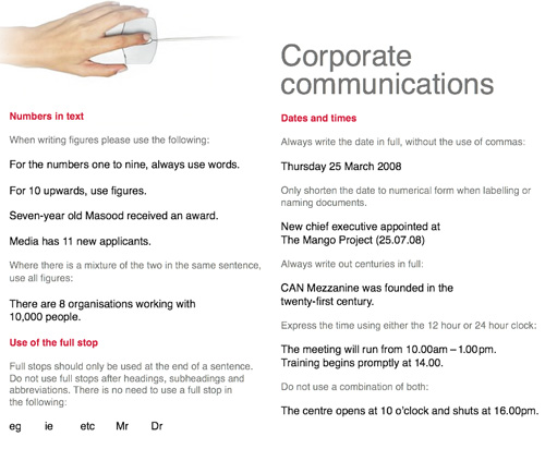 See CAN’s branding guidelines (PDF, 845 KB).
CAN wants its number formats to look the same. On another page, it defines which spelling variants to use, reminds people of common mistakes and more.
Imagery
Many designers have established a particular tone in their photographs and images. Show your clients examples, and explain why they are good choices. Show them in the context of your design, and explain why they were chosen for that context.
 See Zopa’s style sheet (PDF, 3.7 MB).
Zopa has done a fantastic job of making its illustrated style clear. Its online style guide is very good, and it offers further tips on how to construct pages around its illustrations in the online style sheet.
Bring It All Together
Show a few examples of what the logo, photography and text look like together and the preferred formats.
 _See Skype’s branding guidelines._
Skype has done a fantastic job of showing how it want designers to use its illustrations and photography. It has examples of the subtle differences between good and bad usage. The whole guide is beautiful and well worth a look.
Web Guidelines: What To Include?
Many people create branding guidelines but forget to include important style guides for the Web. Just like branding guidelines, Web guidelines keep everything consistent, from button styles to navigation structure.
Button Hierarchy
You’ve carefully decided what all the buttons are for and meticulously defined their states. Unfortunately, the in-house designer hasn’t applied your hover states or has created their own, and they look terrible.
Create a page that shows what all links do (including the buttons), the appropriate behavior of each and when to use them (with examples of appropriate usage). If one button is dominant, make clear the maximum number of times it should be used per page (usually once at most). Define the hover, disabled and visited states for all buttons.

Gumtree has worked hard to define all button states, especially custom buttons (for example, Post an Ad has a + sign in front of it). These were defined for the Gumtree redesign, which is now live.
Icons
Defining size and spacing and where to use icons is another great way to promote consistency. If icons should be used only sparingly, make this clear.
 See ZURB’s icon sizes.
Here, the ZURB agency defines icon sizes and when to use them, and it provides clients with an online source from which to download them. ZURB also defines badges and explains their purpose. It believes that its guidelines are best shared online.
Navigation (Logged In/Out States)
On the Web, good consistent navigation can make or break a website. New pages are often added to a website after the designer is done with it. Have you left some space for this? Doing things like letting people know what to do with new navigation items and showing logged-in states make for a cleaner website.
 See the BBC’s Global Experience Language.
This is one of the most beautiful guidelines I’ve seen. BBC shows what to do with long user names, how much space everything should have and more.
Basic Coding Guidelines
There’s no way to make someone else code like you, but you can offer others basic guidelines that will minimize the damage, such as:
- CSS class naming conventions. Should they use
.camelCaseor.words-with-dashes? - JavaScript integration. Are you using jQuery? MooTools? How should new JavaScript be integrated?
- Form styling. Include the code, error states and more so that they understand what style conventions you expect.
- Doc type and validation requirements. Do you allow certain invalid items? Do you expect the CSS and HTML to validate?
- Directory structure. Make clear how you have organized it.
- Accessibility standards. Should people include
alttags? Is image replacement used for non-standard fonts? - Testing methods. Which standard should they test with? Do you have staging and production websites?
- Version control. What system are you using? How should they check in new code?
How To Format
Some branding guidelines have been turned into beautiful books:
 _See the Truth brand guidelines._
This beautiful example, which was designed to go with a brand redesign, shows just how beautiful branding guidelines can be.
But this requires a substantial budget and a reprint every so often. For most companies with tight budgets, this is not practical. On the Web especially, content is constantly being refined and styles for elements are not set in stone.
Here are a few good practices for formatting your guidelines:
- Include a cover. This should include an example of best practices for the logo.
- Make it beautiful. Even if it won’t be printed as a book, you can still make sure the branding guidelines appeal to the viewer. After all, you’re trying to inspire them to use your designs to the highest standards!
- Include contact details. For when they have questions, so that you can prevent bad decisions from being made.
- Make it easy to access and open. Usually this means putting it online or in PDF format. Don’t make it too big; use images sparingly.
- Make it printable. For international companies especially, keep margins big so that the document can be printed in both A4 and US letter sizes. If it’s online, make sure your print style sheets render the document as expected. Don’t do white text on a black background, either: you don’t want the client to have to buy a new ink cartridge every time they print a copy.
- Make it easy to change. Updating, adding new pages and making changes should be easy, because it will happen!
- Create a mini version. Make a short handy guide that has just the basics, in addition to the full version. Both will get used in different instances.
- Provide print templates whenever possible. Things like letterheads, business cards and envelops should have their own templates. While guidelines will help people put things in the right spot, they usually won’t help them get the right resolution or color format.
 Here’s a useful template for a one-page branding guideline.
Length
Remember, people should be able to follow branding guidelines. A 100-page book will engage none but the most diligent designer. Many believe that a concise three-page overview is best for daily use, with a more in-depth 20-page document for more complex tasks. Less is more, usually!
 See the BBC’s branding guidelines and poster.
The BBC has created a detailed 38-page guideline. But it has also produced a beautiful poster for quick reference. It’s a brilliant idea, and it keeps the guidelines at the front of mind.
Resources to Style Guides
- The Web Style Guide, 3rd Edition A comprehensive guide for the Web.
- 50 Corporate Brand Guidelines A list of design guidelines.
- 20 Top Tips for Designing Effective Brand Guidelines, from Saatchi
- The Corporate Identity Manual (Brand Style Guide)
Related Posts
You may be interested in the following related posts:
- What Makes A Great Cover Letter, According To Companies?
- Business Card Design: Better Than A Plain Ol’ Business Card
- How To Create A Great Web Design CV and Résumé?
 (al)
(al)

