A Design Is Only As Deep As It Is Usable
There are well-known proverbs that imply (or state outright) that beauty is superficial and limited in what it can accomplish. “It’s what’s inside that counts” and “Beauty is only skin deep” are a few simple examples. Because the Web design industry is now flooded with a lot of raw talent, and because virtually anyone can create a “beautiful” website, recognizing a truly beautiful website experience is becoming increasingly difficult. What appears beautiful to the eye might in fact be more of a hindrance.
Further Reading on SmashingMag:
- Building Emotion Into Your Websites
- Designing For A Hierarchy Of Needs
- Why You Should Get Excited About Emotional Branding
- The Designer Will Make It Pretty
In this article, I hope to provide a clear demarcation between what is perceived by most to be beautiful in Web design and what is truly beautiful, along with some guiding principles to help designers today create websites whose beauty is not superficial, but rather improves and enhances the user experience.
Gradients, Drop-Shadows, Reflections, Oh My!
A lot of things could fall in the category of “beautiful” or “attractive” in the context of Web design. But a number of factors would make such beauty shallow. Is a website more attractive if it has tastefully placed drop-shadows, gradients or reflections? What if it has an eye-pleasing color scheme? What about big over-designed buttons? Could these be standards by which a design would be deemed beautiful?
If you’ve been keeping tabs on the Web design industry in the last five years, you’ve probably at some point visited one of the many CSS galleries. Visiting those inspirational showcases is great, and I’m sure we’ve all done it, but we need to be careful not to fall into the copycat syndrome, whereby we prettify our websites for no other reason than to make them CSS gallery-worthy.
The designers, developers and content strategists who planned and executed many of the websites in those galleries did what they did because they felt it would truly benefit the user experience and their clients’ bottom line. The truly beautiful websites and apps in those showcases are not just visually beautiful; they’re usable, accessible and optimized to benefit both the user and website owner.
The Dribbble Syndrome
With the recent popularity of Dribbble, the copycat syndrome might be gaining momentum. On Dribbble, a designer reveals a sample of something they’re working on, and then the style of that small snippet starts spreading. The context and strategy underlying it are unknown, yet the style is still viewed as beautiful in and of itself. The designer may have taken hours, days or weeks to arrive at the decisions that informed the design, but now that it’s out in the wild, the snippet becomes nothing more than eye candy.
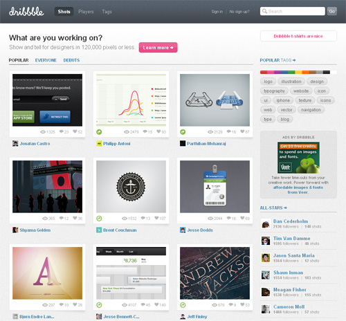
Dribbble shows out-of-context design shots. Is this a bad thing?
Of course, the intent of this article is not to blame those who share their designs on Dribbble, nor to blame those who review these designs and offer feedback. But we mustn’t lose sight of the fact that every design decision should have significant reasoning behind it.
The Style-Less Comparison
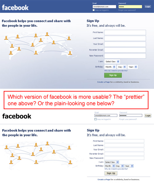
How do we measure beauty? If a website is difficult to use, then isn’t its beauty without purpose? Look at the comparison in the image shown below.
I think Nettuts+ is a very nicely designed website. But is the fancy navigation and logo section shown on top more usable than the plain blue and white version below it? Taken at face value, some might argue that the plain version is more usable (if only slightly) than the “beautiful” one.
The Facebook home page.
While the Facebook home page shown on top might not appear the most beautiful design to many of us, it still contains attractive aesthetic elements (colors, gradient background, styled buttons, etc.). But when most of these minor elements are made plain, does it really affect the usability (of course, after you increase the color contrast for the form labels in the right upper corner)?
If prettiness is really as important as we think, then the current Facebook home page should perform much better than the plain alternative. How do we know, though, that the plain version wouldn’t outperform the adorned version?
What Makes A Design Usable?
I’m not about to make a case for bringing back blue links on a white background on every website. In fact, as I’ll explain, both Nettuts+ and Facebook may very well qualify as truly beautiful websites. The examples above were more illustrative, and not meant to criticize the designers who worked on them.
Rather, I’m encouraging designers to consider two things when adding “beautiful” enhancements to their designs.
- Responsive and intuitive page elements,
- Branding and consistency of theme.
Focusing on these two things will give every pixel in a design a purpose and will contribute to the website’s overall usability. Let’s consider both of these, with a few simple examples to illustrate their effectiveness.
Responsive and Intuitive Page Elements Make a Design Usable
If a design element makes a website feel more friendly or gives subtle hints as to what’s happening, then this adds to its usability. Look at the simple example below from Design Informer:
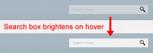
On the Design Informer website, hover over the search box in the top right, and you’ll notice it brightens up. This is not intrusive in any way, and it looks especially elegant in WebKit browsers, because the brightening animates with CSS3. The default look of the search box could be a bit brighter to improve the general usability of the site, but in this specific case the idea counts more than the execution.
This very simple effect conveys to the user that this is a usable element, and it makes the search box more inviting. It’s a ridiculously simple technique but has a very powerful effect.
But just because you can use an animated effect does not mean you should. If, as in the case of Design Informer, the effect makes the UI more intuitive and responsive, then it is justified. This statement by Stuart Thursby sums it up well:
If designers think that using HTML5 and CSS3 makes them a better designer just because they use them, then they’re sorely misguided.
Include an element only if it accomplishes some usability-related purpose. If the design is not made more usable by a particular technique (whether via CSS3, JavaScript or something else), then the designer should reconsider whether the extra code is worth the effort. Decoration only goes so far and often has an effect opposite to the one intended, so consider yours carefully before including it in your design.
Another example of an animation that enhances usability is found on Soh Tanaka’s new website. Look at the screenshot below from this post on his blog:
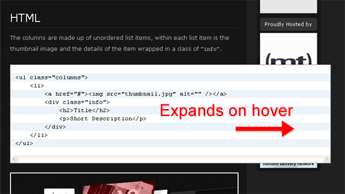
When you hover over any presentation of code on his website, you’ll notice that the block expands to the right (probably via jQuery, so it would work in every browser).
Again, a simple effect, but not just eye candy; it has a purpose. In tutorials, HTML code is often too long to fit in the highlighter, so the code either wraps or creates ugly scroll bars. Tanaka’s solution makes the code more inviting and readable, and it decreases the likelihood of wrapping or scroll bars.
So whether we’re talking about text links that change color on hover, buttons that move when clicked, AJAX that creates subtle yet intuitive effects, we can take a design beyond mere decoration in many ways and truly enhance its usability.
Branding Makes a Design Usable
If an element contributes to a website’s overall branding, image or reputation, then it’s safe to say that it contributes to its usability. Properly planned and executed branding is not superficial or decorative. Carefully chosen colors and graphic elements create an inviting atmosphere that leads the user to make easy decisions and helps them interact with elements smoothly and intuitively.
Look at the screenshot below from 10k Apart:
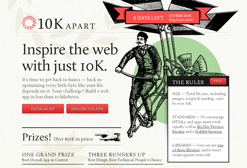
The laurel wreath in the background and the distinctive illustration immediately distinguish this website as belonging to A List Apart. Consistency in branding contributes to the usability of this ALA microsite and makes it feel inviting and familiar.
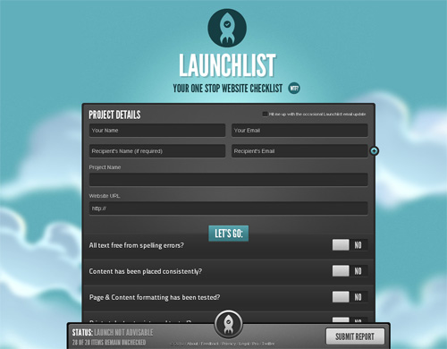
And then we have the beautiful and intuitive design for Launchlist:
This screenshot doesn’t do justice to the website’s look and feel; you’ll have to poke around to really experience it for yourself. The design might appear decorative and superficial at first glance, but it’s not. The elements work together to create a consistent and inviting atmosphere, extending the “launch” theme throughout with subtle animations.
Usable Doesn’t Have To Mean Ugly
My purpose here was not to tell designers to forget about slickness, sexiness and beauty. This should be obvious from the beautiful examples shown, which certainly qualify as both usable and attractive. No one expects owners of beautiful websites to suddenly drop their enhancements in favor of the Craigslist look just to make them more usable.
Rather, this post is just a reminder that eye candy is important, but it isn’t everything, and that for a design to be truly beautiful, it has to be functional, have purpose and contribute in some way to the website’s intuitiveness, usefulness and branding. All of these things contribute to the overall effect of a design.
Related Posts
- In Defense of Eye Candy Research proves attractive things work better. How we think cannot be separated from how we feel. The next time a boss, client, or co-worker scoffs at the notion that beauty is an important aspect of interface design, point their peepers here.
- Looks Matter Because We All Have Feelings An article about the importance of aesthetics in web design.
- Stop Designing Aesthetics, Start Designing Emotions Gradients and colors and contrast are all good, but there’s a more important side to web design that many people overlook most of the time: Designing emotions. A beautiful article on Web Designer Depot.
- Stop Inspiration Hunting When Designing There is definitely a difference between looking at sites for research purposes when beginning a design versus looking at sites just to find some cool stuff you might be able to use. Nice article on Drawar.
- Web Design? Screw Aesthetics “When I talk about design I try to do more than mention the aesthetic/visual aspect of it, but it seems people tend to focus on that aspect the most. Web design however adds many more elements to the elegant answer that we are so frantically searching for.” Another interesting article on Drawar.


 See the full picture →
 SurveyJS: White-Label Survey Solution for Your JS App


 Celebrating 10 million developers