Expressive Web Typography: Useful Examples and Techniques

Email Newsletter
Weekly tips on front-end & UX.
Trusted by 182,000+ folks.
 Celebrating 10 million developers

 Custom Web Forms for Angular, React, & Vue. Your backend.

Wherever we turn online, typography jumps out at us — sometimes literally, with the assistance of some clever coding. And now more than ever, we are seeing greater focus on this design element and its varied implementations around the Web. With the growing popularity of font embedding services and @font-face, typography is the talk of the town, but even though it is a regular topic among communities, not all of our typographic efforts are successful. Sometimes we swing for the fences, only to miss or fall short.
Further Reading on SmashingMag:
- A Journey Through Beautiful Typography In Web Design
- The Good, The Bad And The Great Examples Of Web Typography
- Web Typography: Educational Resources, Tools and Techniques
- Benton Modern, A Case Study On Art-Directed Responsive Web Typography
This is what brings us together today. We have looked around the Web and checked some of the many typographic choices of website owners — some of which are successful, others not so much. Below is a selection of some elegant and interesting websites. We will critique the typography on them, in order to explore how we can improve the type on our own websites. Look through them to see whether you spot any typographical trespasses that you may have committed yourself.
Typography Examples
Denise Chandler When we look at the portfolio of Denise Chandler, right away the typography begins talking. The original hand drawn sans-serif offers a personal, artistic yet professional feel at the same time. Denise focuses on the most important information and presents it in a relatively simple one page layout. The hover effects offer a great element of interactivity to the site for sure, while the large, bold caps type along with the intricate ampersand for the header works well to playfully complement the page.

The only critique really would be in the contact area. A slightly larger font and line-height, along with some extra spacing between the paragraph and the social media links would have made the area feel as open as the rest of the site. Also, it’s a pity that the “Submit”-button in the contact form doesn’t change on click — a nice :hover and :active-effect could make the experience even more pleasant.
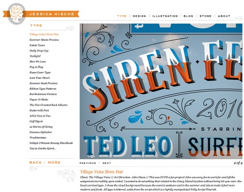
Jessica Hische Using a good type that doesn’t detract from the content is imperative. Jessica does a tremendous job with this, opting for a simple thin sans-serif font. Even in its simplest form, the italic type adds a flourish to the design. Perhaps for readability, though, the designer could have broken from the italics for the description of the featured pieces. Also, the type could stand to be a bit larger, and not only because the headers appear to blur a bit at that size.
MCQ The portfolio of Mike McQuade has a truly remarkable interactive page change effect that really grabs your attention. The site is set up as a grid with each square changing position and/or size to accommodate the content that opens with each selection. Also, because the layout is fluid, content squares appear on different positions when you resize the window and hence ensure the proper alignment of the content. It is a very clean, minimalist design that uses a unique combination of a thin and quirky serif and a clean and bold sans-serif to complete the tone and attitude of the portfolio.

The classic color scheme, a monochrome black and cream with just a splash of mint green thrown about, give the site a very attractive overall look. Though the contrast between the gray text and the dark gray background could be brought up by making the text just a tad bit lighter for sharper text.
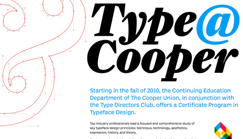
Cooper Type The large illustrated ampersand on Cooper Type is a perfect mascot for this typography website, and it works well with the big bold header. A bit more space between the illustration and the rest of the content would make it feel less cluttered. Some of the body type is too small to be readable, and a few of the paragraphs could use a wider letter spacing. Larger type or an alternate font would improve this greatly. The navigation looks a bit misaligned as well; it might work better aligned to the right over the main content.
Hype Nation Hype Nation uses a stylized font in the header which works really well for the funky feeling of the site, as does the bright orange and gray color scheme. And given that they went with such an unusual header font, the follow-up choice of a simple sans-serif for the rest of the site was a wise one. Though the header is certainly complementary to the site feel, it might have benefited from the contrast of the footer rather than the black on orange that they went with.

The footer is beautiful and perhaps working the header to match the footer a bit more would have been very beneficial to the overall look of the site. The ‘Projects’ section is a bit confusing to use: there is no separate, detailed portfolio or project pages which isn’t good for what is essentially a simple portfolio site. Though overall, the page has excellent type spacing and a good use of white space.
Wing Cheng Wing Cheng is a uniquely styled portfolio that uses hand drawn effects along with a script font on an accordion sketchbook background to bring together the entire presentation. Using the wireframes look to preview each project instead of the finished product is a very interesting choice, and it certainly adds to the uniqueness of the portfolio. The classy serif font used in the sidebar contrasts well to the hand drawn effect of the rest of the site, and plays into the finished designs you receive when you click on the wireframe of a project.

Though the handwritten, cursive font used to describe each of the projects is a little bit hard to read, and it could stand some tweaking. Also, because the whole website feels a bit more like illustration, it’s a bit difficult to see what elements are clickable, partly also because various elements are underlined. This problem is particularly apparent in the footer of the page where a contact form is displayed. Tooltips or striking button-like appearance of some elements could improve the user experience a bit.
Stephen Caver Stephen Caver’s portfolio is another site where the typographical presentation strongly stands out as soon as you arrive. The layout of the site is truly remarkable: the font size of the main header and position of elements change when you resize the browser window. The big, bold header with a very subtle letterpress effect, as well as the combination of thin and bold type, creates a great look.

However, the main site navigation on the top is far too small, especially for the font used, and as a result, has some readability issues. The same goes for the vast majority of the body text. Also, the large part of the ‘Vitals’ section has some really low contrast to deal with that creates some issues too. The overall layout of the site is really good with a really strong focus on the work which is great for a portfolio, but so much of the site is hard to read which could end up just driving visitors away.
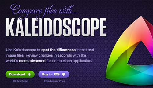
Kaleidoscope This web app website has an appealing combination of circular script and squared-off sans-serif font. The typographic choices really add versatility to this single-page website, a testament to the imagination of the designer. The type sets off each distinctly styled section, making the page easily scannable. The contrast could stand to be a bit stronger in a few places on the website (e.g. the section “Complete your workflow” and “Details”), to keep things readable and flowing.
Trent Walton Trent Walton has a minimalist black and white website with heavy typography. Each article on the website has an original design that features a number of typefaces, but always as large blocks of sharp text, thus maintaining consistency. The most recent article is always the landing page for the website, which gives the recent article a prominent position on the site. The “Articles” page has generous white space and solid alignment, although post illustration do appear to be position a bit too far away from the excerpts. The typography carries the page, filling in the white space and fleshing out the design quite nicely.
Barley’s This bar website combines serif headers with sans-serif body type well, a combination that tends to be used quite often on the Web. The entire home page could use a bit more white space; the elements feel a bit stacked on top of one another. The type and content need room to breathe. The “News & Events” and “Contact” pages are a much better example of how spacing for the whole website could have been handled.
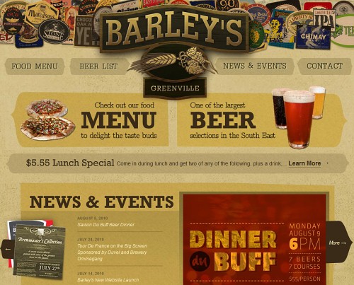
They feel much less compressed, which only makes the other pages feel that much more confined. One can argue if it is necessary to employ the letterpress effect for navigation items, as it does not quite match the rest of the website. A hidden highlight: the food menu page is a pleasure to look at, but it is not clear what the column “Beer pairings” stands for, especially because it’s always empty.
New Deal Festival Right off the bat, the header on the home page for New Deal Festival really grabs attention. The script, combined with the block-style sans-serif, gives a clean sharp look. For some reason, though, the company changes the header on interior pages, and these headers are squished together and distorted, making the rest of the website feel a bit unfinished and unpolished.
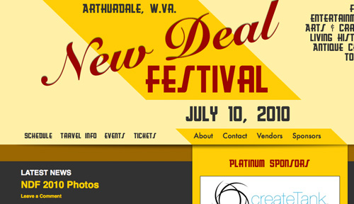
New Deal Festival could have kept the home page header throughout the website. Also, the typography would benefit from a wider letter spacing. And the main content area would look better with more padding between the edge and the type; 40 pixels would probably do it.
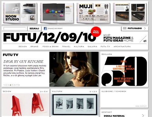
Futu The clean classic look created by the big bold type stands out right away on the Futu website. There is a bit too much animation, distracting you from the text. A better approach might have been to make the header ad either different or static and then just scroll the featured content. Also, the leading on the body type could stand some work. Some of the paragraphs have an uneven rag, which could rub some users the wrong way. As it stands, the website has a bit confusing hierarchy, and the reader could have difficulty figuring out what to focus on.
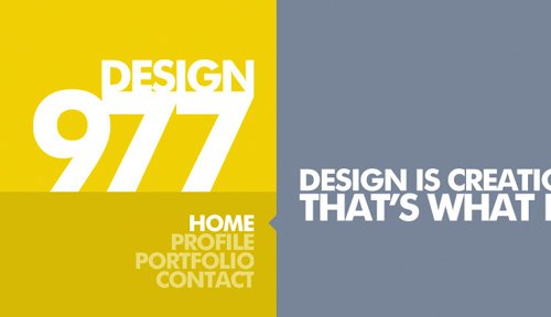
Design 977 The sans-serif type works really well for this website, which is clean, minimalist and to the point. Only the most important information is presented, and it’s done straightforwardly. At first glance, the letter spacing might seem a bit small, but in this case it complements the overall design. The website has a sharp angular look, and the tightness of the type sets this off. But while the social media link area is original, the constant animation in the corner is distracting. The text on the profile page could use more leading, and so does the contact form.
Robots Are Friends Here, the texture works quite well behind the bold serif font, although the type could use a wider letter spacing. Sans-serif fonts seem to work wonderfully for these kinds of minimal websites with big bold typography. However, the sudden solid-gray footer feels a bit out of place here, and the black and gray text on the “About” page has a low contrast against the dark blue, making it a bit difficult to read. Also, the font size in the “Design” section on the front page is way too small, and we are not quite sure if the choice of type for the body copy is optimal.
Louise Fili Ltd. The script and sans-serif type that Louise Fili Ltd. has selected for its website make for a classic and elegant look. The all-caps serif in the sidebar works well visually, but the sidebar would be more scannable if it were not in full-caps (although the full-caps everywhere else on the website do not detract from the design). The “About” page integrates a drop-cap beautifully into the typographical presentation, setting it apart from the other websites we’ve reviewed so far.
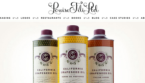
The flourishes between menu items really tie in with the logo script in a whimsical way. The main problem with the design is that the text is embedded into images almost throughout the site, making it impossible to copy. Also, on some pages the embedded text appears a bit blurry. Using plain text would be an improvement of this website.
Attack of Design The font on Sacha Greif’s website blends really well with the retro feel of the rest of the website. And there is plenty of white space, making the content a pleasure to read. The subtle hover effects on headlines and icons make for a pleasant user experience. The headings in the sidebar are a bit difficult to read, though; perhaps a bigger font size or different font altogether would help. The navigation and hover effect for the different categories are clean and original.
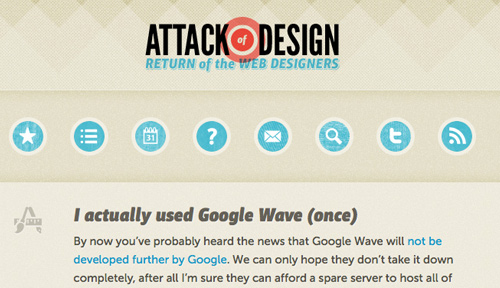
Overall, another great example of type spacing: easy on the eyes and legible. The dates on the comments could use some extra padding around them to feel less constricted. Also, the “Read more” links could stand out a bit stronger. The highlight of the site is a beautiful comments design. The hover effect on the logo is a nice touch, too.
Process Type Foundry Process Type Foundry uses a combination of serif and sans-serif type, which works really well. The clean minimalist design really highlights the big bold typography. The main body type could use higher contrast, and the relatively small light-gray type is not easy on the eyes. Still, the type throughout the website has a very good leading and letter width, making for a pleasant reading experience.
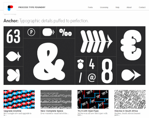
Also, the large bold headings combined with the thin, evenly kerned sub-heading make the website welcoming and engaging. The “About”-page is a beauty of simplicity and clean, sharp design with generous leading and whitespace.
Chipotle This restaurant website has a grungy handwritten look for its font, which, combined with the other hand-drawn elements, fits well with the brand and the ‘industrial’ design of the restaurants. However, the typography on the website is almost completely embedded in images, to the point that the little bit of HTML type looks out of place because the other fonts are so distinct.
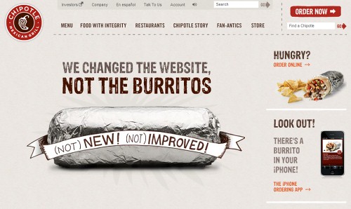
Also, the paragraph text (as seen on Chipotle’s story page) would look much better with a bit more attention paid to leading. As it is, it seems a bit squeezed together. Also, the main drawback of the site is the audio that starts playing automatically on page load. Notice: the footer contains some hidden treasures for typography lovers.
Worry Free Labs Another fine example of a subtle texture working with the type instead of against it. As has been demonstrated a number of times, script and sans-serif fonts can complement each other well, especially on websites with the kind of retro look of Worry Free Labs. However, the letterpress effect on the type looks rough and unattractive, while the script font does look attractive and playful. If a font does not scale properly, then finding an alternative is better than forcing it into your design.
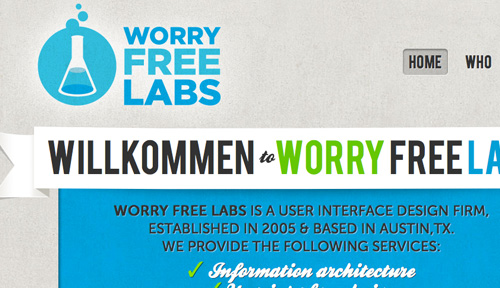
One site highlight that stands out, even though it is not necessarily type related, is in the portfolio section, the fluid scrolling through their work with the click of the ‘Next’ navigation button is — sorry for the wording — extremely awesome. We don’t really know why the company uses the German greeting “Willkommen” in the header of the page, though. But it is a nice touch for German visitors!
Made By Water The first thing that jumps out at us from this website was the oversized type for “Running Water,” bold and eye-catching for sure. Spreading “Running” out some and bringing “Water” closer together could improve the introduction of the site. The uneven, almost sketchy, font establishes the website’s character well, and the background works well, too.
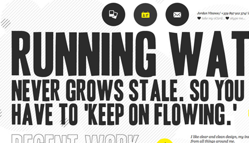
The gray and yellow color scheme works well with the font, and the minor yellow highlights stand out… except when you mouse over the header, the yellow is blindingly bright; a darker tone would work better. The contrast of the light-gray link and the subheading color could also use a bit of tweaking.
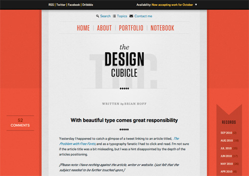
The Design Cubicle TDC has a minimalist theme, with a heavy focus on typography. The squared-off sans-serif fonts complement the rest of the design, with their diversity of italic, bold and all-caps. A fine example of well thought out spacing in the body text, making for optimum readability; you can tell a lot of attention was paid to this aspect. Much of the text in the footer feels a bit small; the difference between 11 and 12 pixels may not seem much, but as you can see here, it can make a huge difference in readability. The beautiful drop-down menu in the top navigation is subtle, but looks great and even has nice hover effects.
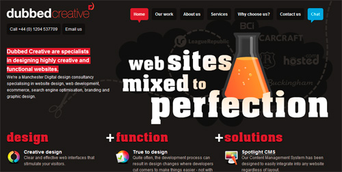
Dubbed Creative In the header, the thin red font of “Creative” gets lost next to the bold white of “Dubbed” and could use better balance. At first glance, the user is overloaded with information. An easy fix for this typographical barrage would be to move the description of the website from beside the header to under it. The site has a very promising structure, yet feels way too overwhelming because of the lack of whitespace. There are too many colors, too many icons, too much text, too much buttons. An example of a site where nice typography doesn’t necessarily lead to optimal results.
The Combine 2010 The designers of this website do a good job of establishing visual hierarchy by combining font types. Combining serif, sans-serif and script typefaces is no easy task, no matter how simple they make it look here. All of the calls to action are visible and attractive. The texture in (rather than behind) the heading type sets off the solid background well; this texture is different than most of the other ones we’ve seen.
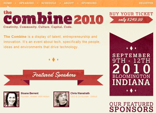
It is pretty obvious that the designers know their typography. On the “Schedule” page, “2010” would look better with a bit tighter letter spacing; also, the logos on the Sponsors page present so many different colors and fonts that it looks a bit sloppy.
Edgar Leijs As soon as you land on Edgar Leijs’ portfolio website, you are met with a bold oversized typographic header. The mouse-over effect in the logo is certainly nice, but the light yellow on white in the “LeIJs” is visually grating. Perhaps the yellow could be replaced by a more muted color, or the white could be softened to more of a gray. The yellow text in the main content area looks really good there, but it is not compatible with the white behind it.
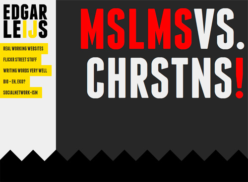
Also, increasing the contrast between the dark-gray background and light-gray text would improve readability. When you hover over a portfolio item, a clever text box pops up that offers details unobtrusively. The screenshots of the works in the portfolio don’t have to be greyed out though, making them clearer and more vibrant (at least on hover) would make them a bit more attractive. Very original, distinctive and interesting design.
Rouse Rouse employs a letterpress effect for the sub header which looks great on the textured background, really carving out the letters sharply. The combination of the sans-serif headers with the serif body text plays well into the slight retro look of the site. Though the effect that was used on the word ‘Rouse’ looks a bit strange. It is easy to see that it is supposed to be a 3D-effect, however it is pretty poorly rendered. The line length and leading of the body copy are done beautifully.

A couple of negative remarks: the footer could use some extra top padding to balance it out and give the overall design a symmetry, and too much text is embedded in the images, making it impossible to copy and paste.
Related Posts
Below are a few related posts you might want to check out. Also leave your thoughts in the comments section below.
- 20 Fresh High-Quality Free Fonts A post from our archive that looks at 20 free top-shelf fonts for your designs.
- 50 Helpful Typography Tools And Resources Another post from Smashing’s past that collects useful type tools for your design arsenal.
- 25 New High-Quality Free Fonts Another post featuring a collection of 25 fantastic fonts for the community.
(al) (vf)


