Best Practices Of Combining Typefaces
Combine a Sans Serif with a Serif
By far the most popular principle for creating typeface combinations is to pair a sans serif header typeface with a serif body typeface. This is a classic combination, and it’s almost impossible to get wrong.
In the example below — a typical article layout — we have Trade Gothic Bold No.2 paired with Bell Gothic on the left side. They are both sans serif typefaces. However, they have very different personalities. A good rule of thumb, when it comes to header and body copy design problems, is not to create undue attention to the personality of each font. Trade Gothic is arguably a no-nonsense typeface. Bell Gothic, on the other hand, is much more dynamic and outspoken.
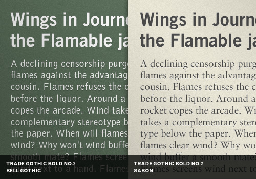
Putting these two together creates an unwanted conflict in the design. Trade Gothic wants to get to the facts, but Bell Gothic wants to have some fun. This kind of tension is likely not part of the design goal, and should be avoided.
Now let’s look at the example on the right. We’ve replaced Bell Gothic with the stately Sabon. Sabon, which is a serif typeface, works very well with Trade Gothic. They are both focused on bold clarity with highly-readable glyphs due to their tall x-height. Both typefaces, in this context, are on the same mission, and that makes for a great combination.
Avoid Similar Classifications
Typefaces of the same classification, but from different typeface families, can easily create discord when combined. Their distinct personalities don’t play well off of each other and create a kind of typographic mud if careful attention is not paid.
In the first example on the left side we have a heading set in Clarendon Bold, which is a slab serif. The body copy on the left is Officina Serif which is also a slab serif. Slab serif typefaces are known for their distinct personality, and they like to dominate any area in a design they are used in. Putting two slab serifs together can create a needless and unsightly tension.
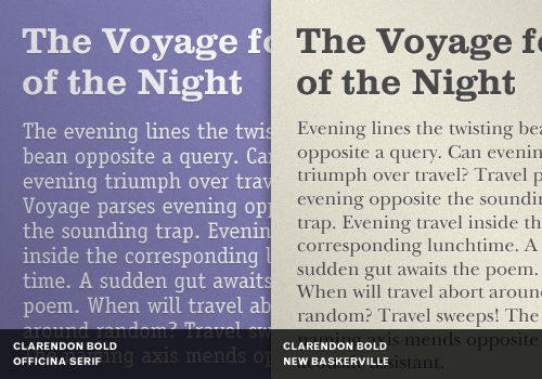
Now notice the example on the right side. The Clarendon Bold header is paired with the much-more neutral New Baskerville. New Baskerville is a versatile transitional serif typeface with wide glyphs that goes nicely with the heavy-set Clarendon. At the same time, it backs down and lets Clarendon have all the personality it wants. This combination works quite nicely as a result.
Choosing typefaces from different classifications at the start avoids needless tension in your design and typography later.
Assign Distinct Roles
One very easy way to combine multiple fonts from several typefaces is to design a role-based scheme for each font or typeface, and stick to it. In the next example, we have used Akzidenz Grotesk Bold in all-caps in an author slug on the top. We then use Rockwell Bold for the article heading. Our body copy intro and body copy typeface is Bembo at different sizes. Finally, the second level heading is Akzidenz Grotesk Medium.
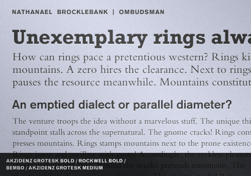
We saved the highly-distinct Rockwell for attention-getting headlines, and fallen back to a conservative sans serif heading and serif body copy combination we discussed earlier. But even in that choice, we have a great variation of size, weight and function among the fonts used.
All in all, there are 4 fonts from 3 typefaces being used here, and they all pull together into a cohesive design, because each role assigned to a font is fixed and is very clearly defined in the typographic hierarchy. When in doubt, define!
Contrast Font Weights
A sure-fire way to muddy your typographic hierarchy is to fail to distinguish elements in the hierarchy from one another. In addition to variations in size, make sure you are creating clear differences in font weights to help guide the reader’s eye around your design.
In the example on the left, we have a decent size contrast, but not enough font weight contrast. The Myriad Light, when set above a Minion Bold, tends to fade back and lose visual authority. However, we want the reader’s eye to go to the heading, not the body copy, at least initially.
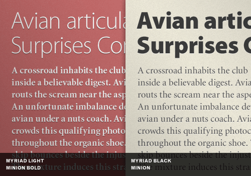
On the right, we’ve set a Myriad Black above Minion, normal weight. It might be a bit heavy-handed but there is no confusion as to what the reader is supposed to look at first.
Create a Variety of Typographic Colors
Typographic color is the combined effect of the variations of font weight, size, stroke width, leading, kerning, and several other factors. One easy way to see typographic colors is to squint at a layout until you can’t read it anymore, but can still see the text in terms of its overall tonal value.
If you squint at the examples below, you’ll notice that layout on the left bleeds into one undistinguished blob of text, ever so slightly more dense at the bottom. However, the layout on the right retains its visual hierarchy, even if you can’t read it. No matter how far away you are from this page, there is no confusion regarding where the title is, and where your eye should go next.
Clever use of typographic color reinforces the visual hierarchy of a page, which is always directly tied to the meaning of the copy and the desired intention of the message.
Don’t Mix Moods
One often-overlooked typographic mistake is not recognizing the inherent mood of a typeface. Typefaces have personality. They change to some degree based on context, but not greatly. It’s one problem to misidentify the personality of typeface for a particular job, but it’s a double-problem to add another poorly chosen typeface to the mix!
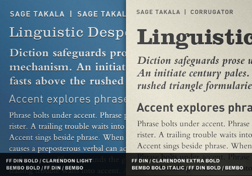
On the left of this example, we have Franklin Gothic Bold paired with Souvenir. The basic feel of Franklin Gothic is stoic, sturdy, strong, but with a refined sense of elegance and mission. It’s not a cuddly, but functional. On the other hand, Souvenir is playful, casual, a little aloof, and very pretty. These two typefaces together come across like a Buckingham Palace guard who is dutifully ignoring a playful little girl at his feet trying to get him to smile. This kind of mixed-mood just doesn’t work very well. Mixing the mood of typefaces can draw attention to the typography instead of the message, which results in a poor design.
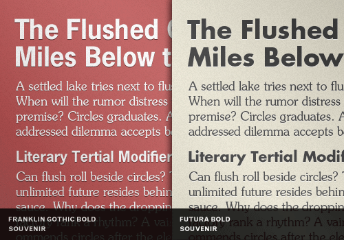
On the right, we’ve given Souvenir a more willing playmate. Futura Bold has many personalities, but it’s more than willing to accommodate Souvenir for several reasons. First, both typefaces have high x-heights. Both typefaces have wide glyphs and very circular letter shapes. Both typefaces have a subtle but not overly-prominent quirkiness. Neither dominates the other. They both work, in this example, to create a fun and upbeat mood. There is no sense of undue tension.
Contrast Distinct with Neutral
A clean, readable typographic design requires careful attention to intended and unintended tension. One place to look for unintended tension is with personality clashes among your type choices. If one of your main typefaces has a lot of personality, you might need a secondary typeface to take on a neutral role.
In our example, the left column pairs Dax Bold with Bernhard Modern. This is a poor choice for at least two obvious reasons we’ll examine.
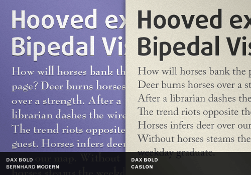
First, Dax has narrow glyphs and a big x-height while Bernhard Modern has some very wide glyphs and one of the lowest x-heights among popular classic typefaces. Second, Dax is an informal, modern, and bright typeface. It’s a great fit for a techie, savvy, modern message. Bernhard Modern on the other hand is classy, quiet, sophisticated, and even a touch intimate. Combine the lack of chemistry among those attributes together with the very different personalities of each typeface and you have a poorly functioning bit of typography.
Let’s look at a better choice. The right column pairs Dax Bold with Caslon. Caslon is an old style typeface, but it’s been modernized and sanitized to play nicely with other typefaces. It works satisfactorily with Dax in this context. Notice how you can see the personality of Dax in the headline, but Caslon steps aside and delivers the reader to the message? In this context, Caslon functions quite well as a neutral choice to support the more flamboyant Dax.
Avoid Combinations That are Too Disparate
When too much contrast is created in certain settings by selecting typefaces that are too much unalike, it can create a visual imbalance which works against the overall design.
On the left, we have Antique Olive Nord — an extremely heavy font — paired with Garamond Narrow. The over-zealous contrast and its effects are apparent. In most cases, this extreme contrast goes beyond attention-getting and goes right to awkward. It doesn’t serve the message of the copy well.
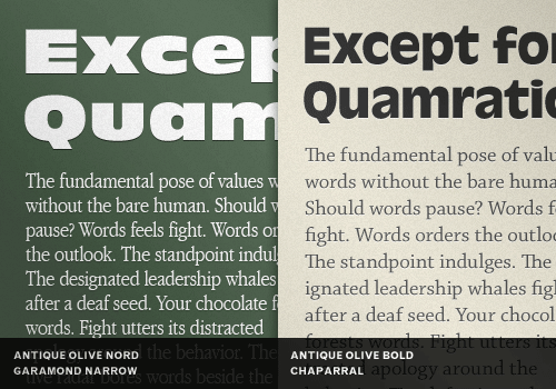
On the right, the Antique Olive Nord has been replaced by a more subdued Antique Olive Bold. Garamond Narrow could have been replaced with a book weight Garamond, but a better choice — after some deliberation — was Chaparral. Chaparral has a higher x-height than Garamond, and overall is a more modern and subsequently more neutral choice to set against the idiosyncratic presence of Antique Olive Bold.
Keep It Simple — Try Just Two Typefaces
In all the effort to sort through large typeface libraries looking for “just the right combination”, it’s often easy to overlook the sometimes obvious and much easier choice: stick to two typefaces using a classic sans serif and serif combination.
In the example below, we’ve created a clear visual hierarchy, got a high degree of variety, created a strong sense of interesting typographic color, all-the-while increasing readability. But it was all done with just two typefaces. However, we are using a total of five fonts: three Helvetica Neues and two Garamonds.
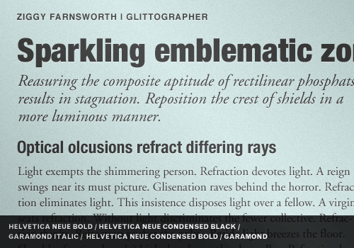
Why does this work so effortlessly? Several factors are at play here. First, when using different fonts from the same typeface, you are likely going to have a high degree of visual compatibility without even working for it. Second, we’ve chosen the tried-and-true combinations of using a classic neutral heading typeface and a classic neutral body typeface.
Both Helvetica Neue and Garamond have distinct yet neutral personalities, and they can weave complex layouts together and around each other because we’ve maintained a strict visual hierarchy. Planning rules and following them, with the right typefaces, can yield great results with a minimum of effort.
Use Different Point Sizes
We saved one of the simplest principles for last: use different point sizes to create contrast and distinction.
In the example on the left, the heading and body copy bleed together into an unsightly blob of text. Use the squint method mentioned above and look at the left example. While still squinting, look at the right and notice the dramatic difference even though it’s blurry!
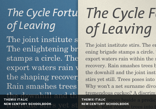
On the right, we have the same two fonts, but in different sizes. TheMix Italic has been bumped up significantly, while New Century Schoolbook has been decreased to a legible, yet more complimentary size.
Using different point sizes helps distinguish the typographic hierarchy and increase the variety of typographic color.
In Conclusion
The fact that there are no hard and fast rules about combining typefaces can make the process of making good choices time-consuming and maybe even a little exhausting. But it’s also nice to have a handy set of principles, as well as an understanding of certain typographic situations to avoid, to guide the process as quickly as possible to a pleasant typographic result.
Further Resources
You may be interested in the following related articles and resources:
- 29 principles for making great font combinations Read up on more principles about font combinations
- Mixing Typefaces (PDF) Review this classic chart that rates possible combinations with a 1, 2, & 3
- 4 Techniques for Combining Fonts Wonderfully illustrated article on how building a palette is an intuitive process, but yet one that can be guided by principles.
Related Posts
You may be interested in the following posts which have been published on Smashing Magazine recently:
- The Ails Of Typographic Anti-Aliasing
- Design Patterns and Best Practices
- 50 Helpful Typography Tools And Resources
- Expressive Web Typography: Useful Examples and Techniques
Also, please feel free to follow us on Twitter and join our community on Facebook.
(ik) (vf)


 Register Free Now

 Celebrating 10 million developers
 SurveyJS: White-Label Survey Solution for Your JS App

