Web Typography: Educational Resources, Tools and Techniques
In this post we present an extensive overview of educational resources, tools, articles, techniques and showcases all related to web typography. Please notice that the overview presents resources which we have stumbled upon, discovered, collected and reviewed over the last six months. This round-up is quite long, so save some time for a thorough study.
Further Reading on SmashingMag:
- A Journey Through Beautiful Typography In Web Design
- Tools And Resources For A More Meaningful Web Typography
- The Good, The Bad And The Great Examples Of Web Typography
We believe that such round-ups are valuable because they present many useful pointers in one place. From time to time we have many inquiries about such round-ups and we gladly prepare them for our readers, along with in-depth articles which are regularly published on Smashing Magazine.
Educational Typography Resources
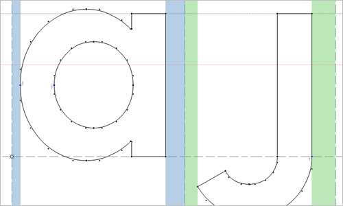
So You Want to Create a Font Alec Julien’s introductory piece on how you can create some beautiful fonts with a little hard work, a lot of knowledge and a little inspiration. The series covers font editing software, transition from paper drawings to screen drawings, vertical and horizontal metrics and kerning. Don’t forget to check out part 2 as well.
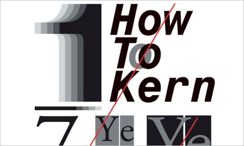
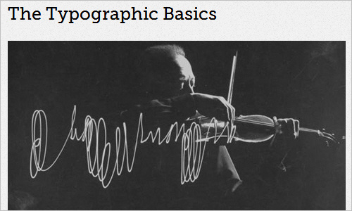
Kerning Type and Great Typography There are lots of tips on the best way to perfectly kern a piece of type. As with all designs, kerning can be subjective, but some are just plain right or wrong.
Perfect your Kerning Skills Kerning is the art of spacing individual characters in a word so that they sit in correct relationship to one another, creating a subtle harmony and rhythm. In this article, Tom Sewell gives some recommendations for good letter spacing.
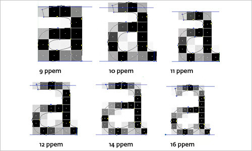
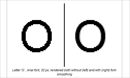
Font Hinting Hinting, or screen optimising, is the process by which TrueType or PostScript fonts are adjusted for maximum readability on computer monitors. This article compares different ways of hinting (black & white, grey-scale, ClearType, DirectWrite) and explains the behaviour of fonts under different rasterisers. You may want to read Font Hinting Explained By A Font Design Master and TrueType Hinting as well.
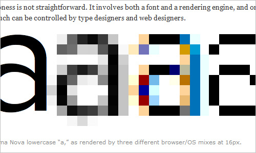
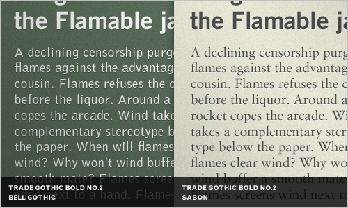
Type Rendering On The Web This article introduces a series of posts about type rendering on the Web. The translation of a font’s outline into pixellated text of varying quality, consistency and sharpness is not straightforward. It involves both a font and a rendering engine, and only so much can be controlled by type designers and web designers. Also, check design of fonts for the web.
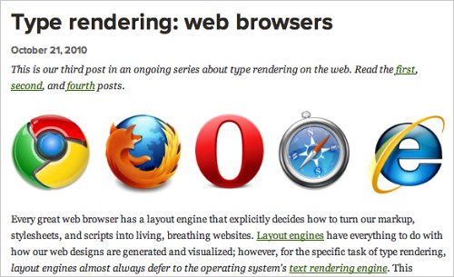
Type Rendering: Web Browsers Every great web browser has a layout engine that explicitly decides how to turn our markup, stylesheets and scripts into living, breathing websites. Layout engines have everything to do with how our web designs are generated and visualized. However, for the specific task of type rendering, layout engines almost always defer to the operating system’s text rendering engine. This article looks at how type rendering is affected, or not affected, by each popular web browser. Also, check operating systems.
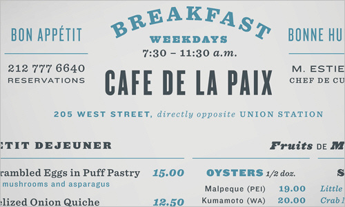
Four Ways to Mix Fonts H&FJ’s excellent article about ways to combine fonts in your designs. “Building a palette is an intuitive process, but expanding a typographic duet to three, four, or even five voices can be daunting. Here are four tips for navigating the typographic ocean, all built around H&FJ’s Highly Scientific First Principle of Combining Fonts: keep one thing consistent, and let one thing vary.”
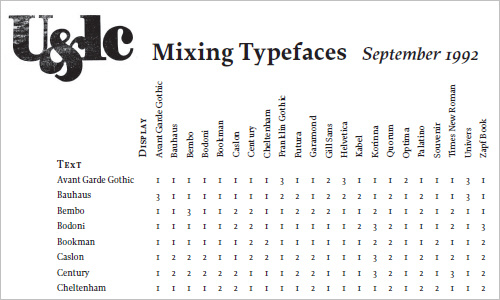
Mixing Typefaces (PDF) A handy overview of typefaces that fit and do not fit together when combined in a design. A September 1992 issue from the “International Journal of Typograpics”.
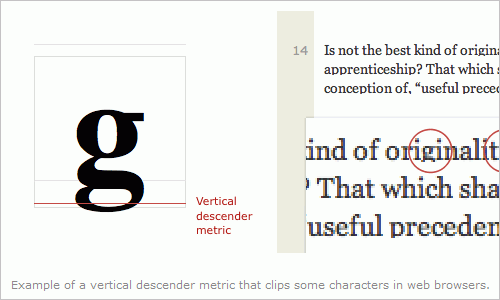
Font Metrics and Vertical Space in CSS If you have ever wondered why some fonts look smaller than others at the same typeset size, or why the vertical space between lines of text is such a guessing game, this one’s for you.
Fundamentals: Combining Type With Helvetica An interesting article presenting some choices that work well with Helvetica, presented by the German typographer Indra Kupferschmid.
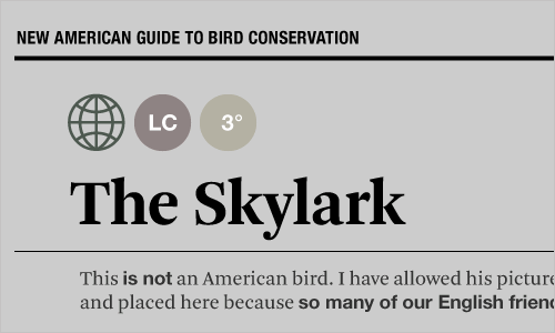
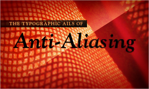
The Ails Of Typographic Anti-Aliasing As printed typography enjoys the fruits of high-DPI glory, proudly displaying its beautiful curves and subtleties, its on-screen counterpart remains stifled by bulky pixels, living in a world of jagged edges, distorted letterforms and trimmed serifs. Until display manufacturers produce affordable 200 or 300 PPI monitors, we’ll have to rely on software advances to fix these problems. Anti-Aliasing is the next best thing to a world of higher-resolution monitors.
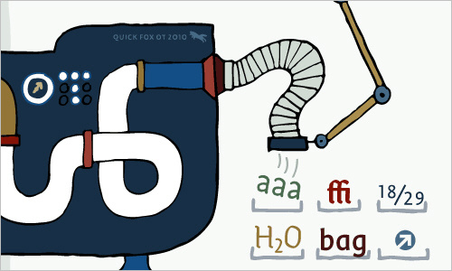
An Introduction to OpenType Substitution Features John Boardley’s beautiful article about OpenType substitution features. The article explains both pasic and more complex features and ideas. All examples should be considered starting points, just to pique your interest.
Beginners Guide to OpenType Using OT technology, you can substitute your characters for different glyphs using many different methods. This beginners guide will help to illustrate some of the more common features found in OT fonts and when they should be used.
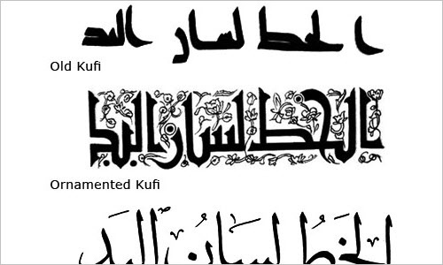
The Beauty of Typography: Writing Systems and Calligraphy of the World Pick any language you like: Arabic, Chinese, Japanese, maybe Nepali? Each is based on a different writing system, which makes it interesting to figure out how they work. This article covers five categories of writing systems. This may sound tedious and academic, but it’s not. If you take the time to understand them, you’ll find that they all give us something special. Check part 2, too.
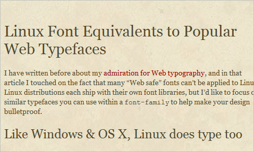
Linux Font Equivalents to Popular Web Typefaces Linux distributions each ship with their own font libraries. This article focuses on similar typefaces you can use within a font-family to help make your design look better across operating systems.
The Grammar Cheat Sheet When you know the correct way to structure a sentence, the world becomes a scary place — you start to notice how many people get it painfully wrong. The ease of content creation that the web now affords us is making the problem worse, so why not get a basic understanding to help make your text a little more professional.
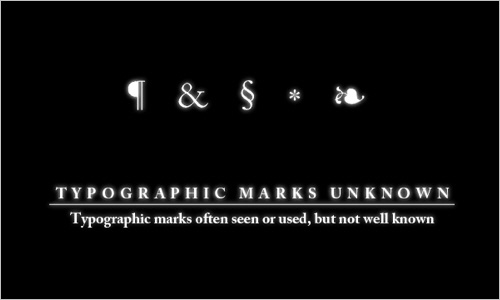
Typographic Marks Unknown There are many typographic marks which are familiar to most, but understood by few. Most of these glyphs have interesting histories and evolutions as they survived the beatings given to them through rushed handwriting of scribes and misuses through history. This article is an overview of typographic marks often seen or used, but not well known. Take a look at part 2 which discusses ligatures and blockquotes.
eXtreme Type Terminology Paul Dean’s detailed introduction to type terminology. The series explains the various kinds of typefaces, their properties as well as general typographic terms.
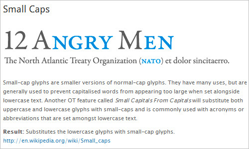
Better web typography with OpenType features In this article Ralf Herrmann shows some of the typical features of OpenType fonts and how they can be used in Firefox. The article describes the support of small caps, figure sets, descretionary ligatures, contextual alternates, case feature, stylistic sets and fractions.
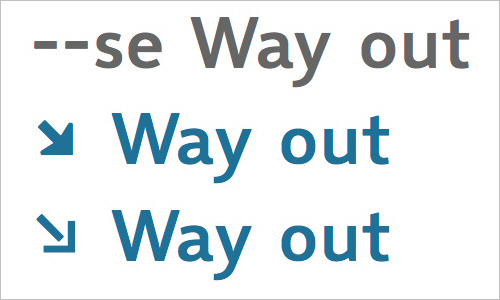
Best Practices of Combining Typefaces Creating great typeface combinations is an art, not a science. Indeed, the beauty of typography has no borders. While there are no absolute rules to follow, it is crucial that you understand and apply some best practices when combining fonts in a design. When used with diligence and attention, these principles will always yield suitable results. This Smashing Magazine’s article takes a close look at some the best practices for combining typefaces — as well as some blunders to avoid.
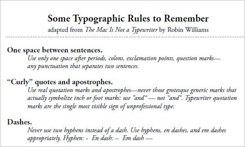
Some Typographic Rules to Remember (PDF) A nice compact set of typographic rules, adapted from The Mac Is Not a Typewriter by Robin Williams. The document also contains a typographic checklist.
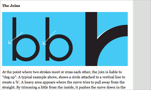
Making Geometric Type Work For graphic designers beginning to experiment in type design, a geometric or modular typeface is a natural starting point. Illustrator and other programs offer a simple collection of elements such as circles, squares, and triangles which can be combined to create a passable alphabet. Dissatisfied with the limits of commercial fonts at the time, this designer twisted and distorted each character to fit into a few simple, very strict rules of construction. Invariably this produced a wide range of exotic letterforms, some more legible that others.
The Typographic Scale A detailed introduction to the typographic scale, its history, relationships of hierarchy, its implications and practical applications.
Serif Font Guide A useful slideshow for those interested in the history of serifs and their usage in design. Prepared by Rob McMinn.
Choosing the Right Font: A Practical Guide to Typography on the Web Typography is an huge field. People devote years of their lives to this ancient craft, and yet there’s always something new to learn. In this article, the major points that you should consider when selecting a typeface for a website will be reviewed.
Useful Typography References
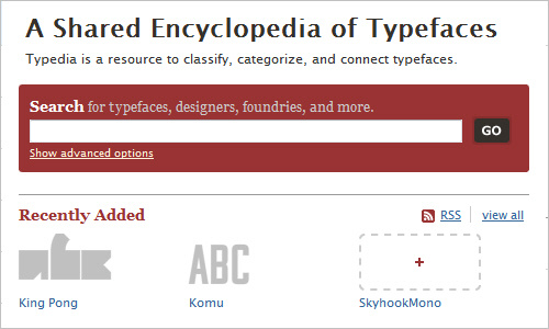
Typedia: A Shared Encyclopedia of Typefaces Where do typefaces come from? Who made them? If you want to learn about type and share your own knowledge, Typedia is the right place. It’s a community website and resource to classify, categorize, and connect typefaces. Anyone can join, add, and edit pages for typefaces or for the people behind the type.
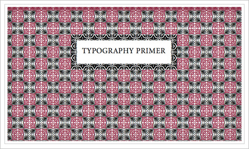
Typography Primer: all you need to know in one PDF This informative PDF from Adobe concisely covers all the basic terms about typography. Among others: Serif and Sans Serif, X-Height, Alignment, Spacing and Choosing and Using Typefaces. A quick download for a nicely designed and easy to read boost to your typography skills.
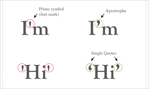
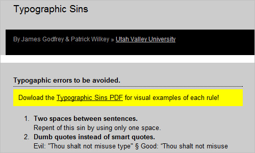
Typographic Sins Smart quotes instead of dumb quotes and when to use hyphens instead of a en dash. The most common typographic errors you want to avoid. Here they are all gathered together in one place. Worth saving and re-reading every once in a while.
FontShop Type Education FontShop provides useful educational resources for typographers and designers interested in typography. The documents are formatted for easy downloading and printing, perfect for the classroom or studio.
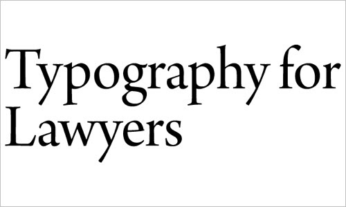
Typography for Lawyers Matthew Butterick prepared a very detailed overview of typographic rules, guidelines and examples for legal documents (e.g. court rules regarding the format of pleadings). As a result, the website is useful not only for lawyers but for everybody who is interesting in typographic rules and its subtleties. The overview is also available as a physical book.
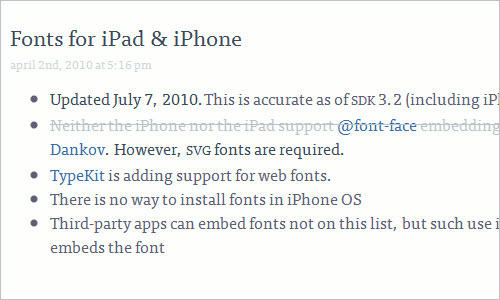
Fonts for iPad & iPhone Michael Critz gives you a long and handy reference table of the most popular typefaces available for the iPad and iPhone and their classifications.
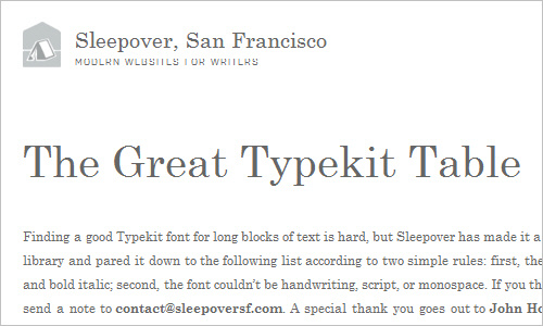
The Great Typekit Table Finding a good Typekit font for long blocks of text is hard, but this site made it a little easier. The guys behind Sleepover sifted through the Typekit library and pared it down to the list according to two simple rules: first, the font had to have lowercase, upper case, bold, italic, and bold italic; second, the font couldn’t be hand writing, script, or mono space.
Useful Typography Tools
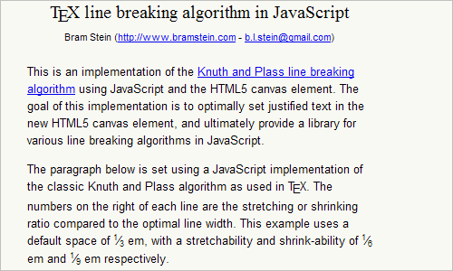
TypeSet An implementation using JavaScript and HTML5 canvas elementm which is meant to optimally set justified text in the new HTML5 canvas element, and ultimately provide a library for various line breaking algorithms in JavaScript.
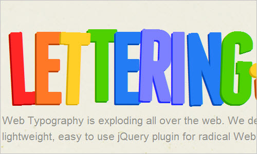
Lettering.JS Here is a nicely developed lightweight and easy-to-use jQuery plugin for radical Web Typography.
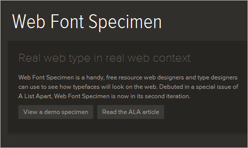
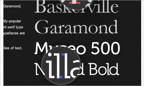
Web Font Specimen Real web type in read web context. Web Font Specimen is a handy, free resource web designers and type designers can use to see how typefaces will look on the web. Prepare your own web font specimen in three easy steps.
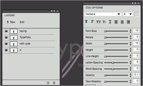
Type Folly TypeFolly allows designers to easily create beautiful, HTML/CSS3 “type follies”. The tool gives designers the freedom to create beautiful type compositions and test new font combinations. TypeFolly supports the following CSS properties: font-family, font-size, color, letter-spacing, word-spacing, font-style, font-weight, text-decoration, text-align, z-index, line-height, width, height, opacity, moz/webkit-transform, text-shadow and font-face.
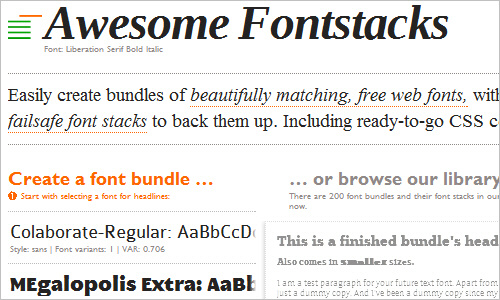
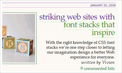
Awesome Fontstacks Easily create bundles of beautifully matching, free web fonts, with failsafe font stacks to back them up. Including ready-to-go CSS code!
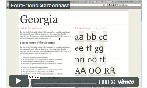
Soma FontFriend A bookmarklet for typographically obsessed web designers. Enables rapid checking of fonts and font styles directly in the browser without editing code and refreshing pages, making it the ideal companion for creating CSS font stacks.
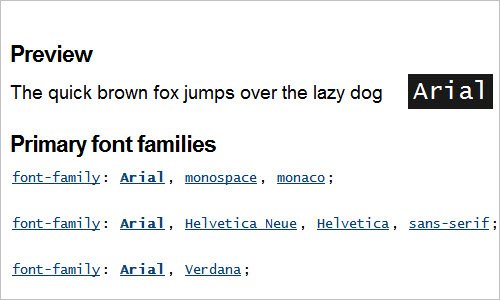
Font-Family.com Here is a site you can turn to in case you’re wondering what font family a particular font type belongs to. Preview available as well.
EmChart Using a relative unit such as EM is a great way to maintain the vertical rhythm of a web page when you want to resize text in your browser. Constantly reaching for a calculator to compute the correct EM value to use every time you need to is also a great way to drive yourself mad.

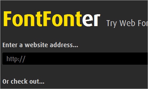
FontFonter High quality, screen-optimized fonts that are designed specifically for web use. FontFonter uses custom CSS and other techniques to temporarily replace a site’s font styles with Web FontFonts.
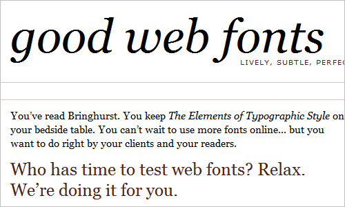
Good Web Fonts for Online Text In case you don’t manage to find the time to test web fonts, you’ll be happy to discover this site.
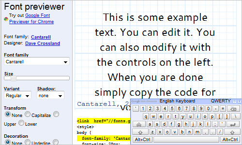
Font Previewer A preview is available to let you see how a font looks like once its size, variant, shadow have been changed. It is also possible to transform, decorate and add spacings. Font family names and their designers provided.
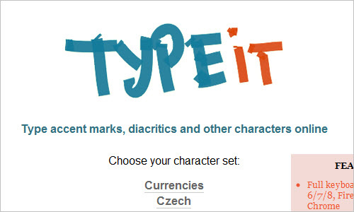
TypeIt If you have the need to type anything in a foreign language which has accents and other strange-looking characters, and you only have a US keyboard, your life used to be miserable.
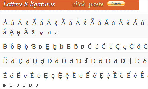
Letters & Ligatures Scroll through and find the letter you have been or are still looking for. Simply by clicking on it, you can paste it into your text or your personal collection of letters.
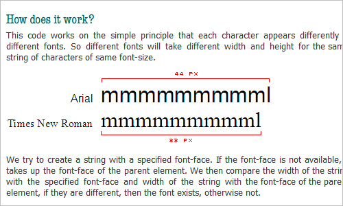
JavaScript / CSS Font Detector A JavaScript code that detects availability of a particular font in a browser using JavaScript and CSS.
How to Detect Font-Smoothing Using JavaScript Some fonts look bad in certain browsers without font-smoothing enabled in the operating system (e.g. Win XP systems don’t have the ClearType font smoothing activated by default). This post provides a way to detect whether or not font-smoothing was being used using JavaScript.
Type-a-file This tool provides a few looks or “flavors” for beautiful typography on the Web. These “flavors” make use of Typekit for their special font faces.
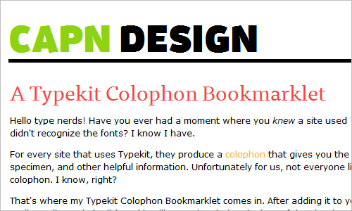
A Typekit Colophon Bookmarklet This bookmarklet produces a colophon that gives you the name of the Typekit fonts used on a site. After adding this bookmarklet to your bookmark toolbar, click on it and it will open the site’s colophon. If the site doesn’t use Typekit, it’ll pop up a little alert to let you know.
50 Useful Design Tools for Beautiful Web Typography When chosen wisely and used carefully, typography can be very effective in supporting the overall design. Designers are always exploring different techniques with type: some use images or sIFR to produce very beautiful typography, while others prefer CSS alone to get the typography just right.
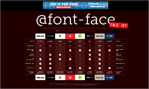
@font-face face off The wast arrey of font delivery services can be confusing at times. @font-face Face Off comparison table offers an overview of many of those services and what they offer. Including number of fonts, foundries and payment models.
50 Helpful Typography Tools and Resources A roundup of beautiful typography with great typographic techniques and tools. Here is the place you can find a fresh dose of further typography-related resources.
Altfontprev - Project Hosting on Google Code A JavaScript bookmarklet that allows you to preview how any website would look if a particular font was not available or a different font chosen.
wp-Typography A plugin for your Wordpress engine that helps you improve your web typography including hyphenation, space control, intelligent character replacement as well as CSS hooks.
Type-Related Articles
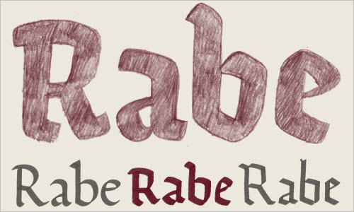
Ode, a Fresh Start for a Broken Script This article describes the origins and development of the typeface “Ode”. From the article: “When designing a typeface, I prefer to explore a construction principle rather than revive an existing typeface idea. These principles or writing models are based on the tools and techniques originally used. Understanding these workings are often a great source of inspiration for me.”
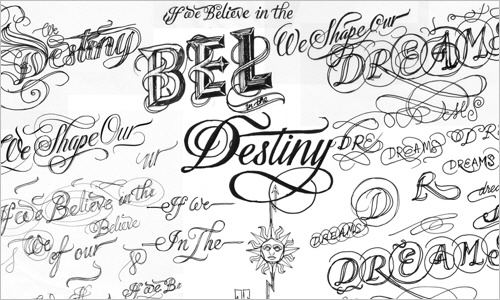
‘Dreams’, ‘Stars’ & ‘So Much To Do’ A look behind the design process of prints “Dreams”, “stars” and “So Much To Do”. From the article: “I’ll show all three prints in this article, but for practical purposes I’ll focus primarily on ‘Dreams’, one of my most ambitious prints to date. What follows is an outline of what I wanted to achieve, the lettering styles I developed, and why I produced it.”
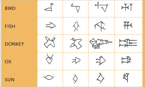
The Origins of ABC A world full of A, B and Cs, but how did they come to being? The Latin or Roman alphabet, the world’s most prolific, most widespread - where did it all start? This site lets you travel much farther back in time when even (agricultural) civilisation emerged itself.
History of Arabic Type Evolution from the 1930’s till present The origin of the Arabic script goes back to the first alphabets which were created by the Phoenicians. The Phoenicians were living on the costal area of Lebanon, Palestine and Syria. Since the Phoenicians were business traders sailing the Mediterranean, the alphabet influenced all the Mediterranean nations.
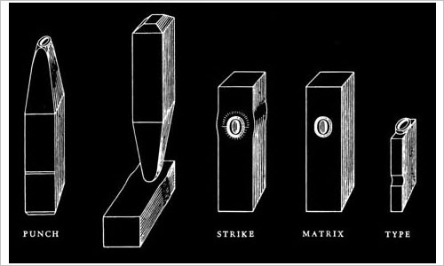
The Art and Tradition of Typography Here is a brief overview of some of the highlights of ‘typographic engineering’ from the past 500 years. Usually, it is the development of type and typography for Latin based scripts that are discussed; in this post however, you will learn that there is an equivalent rich history of other type scripts throughout the world as well.
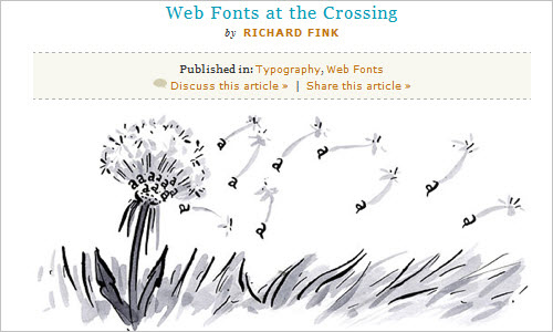
Web Fonts at the Crossing Latest browsers all known to us have rolled out roughly comparable implementations of @font-face font linking, making it possible for us to experiment with numerous and different fonts on our websites. Richard Fink describes the state of the art, explains various formats and the possibilities currently available for web designers.
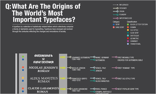
What are the Origins of the World’s Most Important Typefaces Here you can find a selection of stylistically related letters that make up a family of alphabetical letters used in typesetting as well the origins of the most famous typefaces used throughout the centuries.
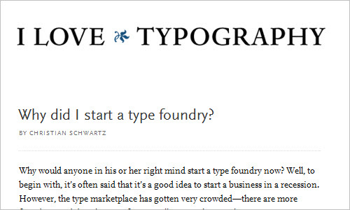
Why Did I Start a Type Foundry? Christian Schwartz tells us his story about how he started a type foundry. A pretty successful one.
A few things I’ve learned about typeface design Gerry Leonidas talks about ‘design’ having memory and being iterative, scale concepts that are not intuitive, tools as concepts and the fact that the Latin script is the odd one out.
Free Fonts: Free Is Not Always Free They are everywhere – pre-installed on every computer, bundled with software, and offered by the thousands on free font websites. Let’s take a look at the different types of “free” fonts out there.
With Beautiful Type Comes Great Responsibility Many free fonts can be extremely beautiful. The trick is knowing how/when to use them, their history, your message and how it’s being stated with the type of personality you select.
The Changing Typography of the Web An article on how the typography of the web has changed, is changing and getting even better!
What is Typography Today? Kilian Muster talks about how most people think that typography is only about designing and selecting fonts. This is true as far as architecture is about designing or selecting furniture. In reality, neither is a purpose but a means to an end.
Thirteen Ways of Looking at a Typeface Here Michael Bierut talks about the reasons why one should choose a particular typeface. Helvetica (naturally), Futura, Garamond No. 3, Century Expanded and Bodoni were the only five fonts he had mostly used between 1980 and 1990.
Technical Articles
Using HTML Symbol Entities Some characters are reserved for HTML markup. In order to display these characters as text, you must enter the HTML entities in the source code. Pass by to learn more.
Adding Subpixel-Hinting to Your Photoshop Text Layers The usual way to smooth text in Photoshop is to choose one of the different anti-aliasing techniques in the drop down menu. The downside as you know is, that the smoothing of the text is done by grayscale and not by blending different channels.

Using @Font-face for Icons Conceptually, if we deconstruct a font down to its basic elements, we can make use of @font-face for things other than type, icons. Fonts at their most basic molecular level are a series of vector glyphs packaged up into a single “glyph archive”. We can then reference each glyph by its corresponding character code. With this in mind, the glyphs we reference can really be any vector-based single color image.
@font-face Gotchas A few worthwhile notes on @font-face that are worth reading over if you geek out about this stuff. Collected by Paul Irish.
How to Use CSS @font-face This article by Tim Brown prepares typefaces for use on the web, goes through @font-face CSS line-by-line, and get the experts’ take on browser support. Updated with Paul Irish’s new syntax.
Typography Magazines and Inspirational Resources
Type Theory Type Theory is a journal of contemporary typography featuring news, views, reviews and interviews.
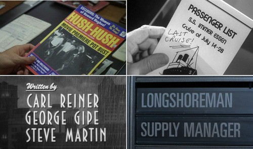
Typecasting This article provides a good overview of how period type has been used in different ways. The typeface of a film title, for example, usually reflects the era in which the film takes place. Beyond titles, every movie depicts a wide range of props and set pieces, such as newspapers, brochures and sign boards. How can one distinguish between a well-made film and junk?
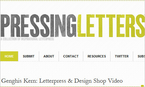
Pressing Letters Pressing Letters is an effort to catalog and promote creativity in the letterpress community. The goal is to collect and display references and progressive letterpress design as it is published or found. The creators of the site encourage designers and individual to submit their images, references or ideas, too.
We love typography Oldie but goodie: a growing showcase colleting type, typography, lettering and signage. Visitors of the site are encouraged to submit their images, too.
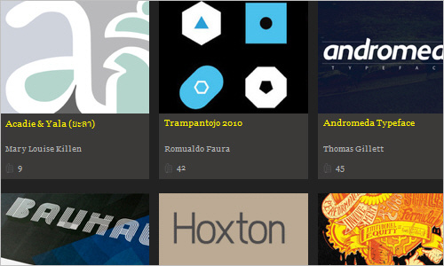
Web Font Awards The Web Font Awards showcases beautiful examples of how Web fonts are being put to use in the design community. Very inspirational.
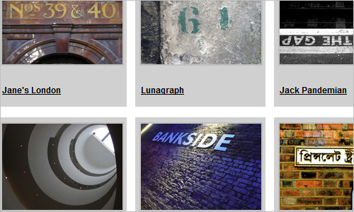
Letterpool London Letterpool London is a mass public art project, a celebration of the city’s urban art and architecture, looked at through its typography — the brands, graffiti, instructions and ideology.
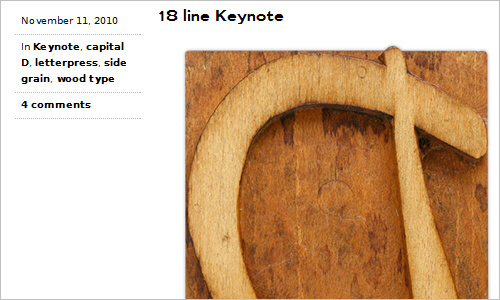
Letterpress Daily David Wolske is collecting printing equipment and wood type and documents his continually expanding collection online.
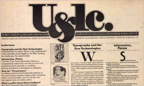
U&lc back issues to be made available Fonts.com regularly releases volumse of the classic journal “The International Journal of Typograpics” which was first published in 1974. Herb Lubalin was the editorial and art director of the first issue and his seminal design set the stage for future issues of trend setting and award winning editorial creations. Volume 1 is currently available for free download.
Type Union Another place for anyone to share their type work.
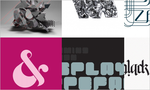
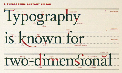
A Typographic Anatomy Lesson Typographers refer to elements of a letterform using a variety of terms that align naturally to architecture or the human body—eye, ear, foot, arm, lobe, leg—and this poster captures many of them. Simply beautiful.
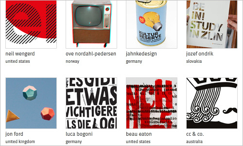
Typo/graphic posters Typo/graphic posters is a directory of typographic and graphic posters, a passionate project focused on the design community. The goal is to be a timeless source for studies, inspiration and promotion of good design through poster culture and cultivation of typography and pure forms of graphic design.
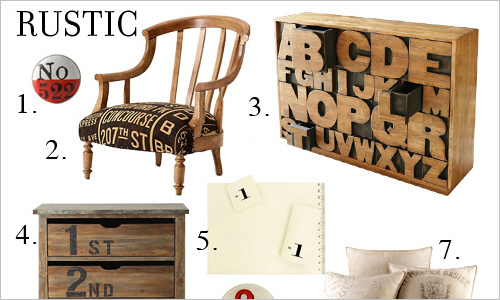
Trend roundup: Typographic home decor The best thing about type in print is that it is incredibly versatile — be it small or large scale, blocks of text, single words or single letters, it all looks great in the right context. The same goes for type design in home decor, which explains why there are almost as many great font-related design objects as there are typefaces. This page is a round-up of some pieces of furniture and home accessories that incorporate type in some way.
Typography Served Typography Served is a collection of sites that showcase category-specific content from the Behance Network.
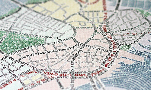
Typographic Maps These unique maps accurately depict the streets and highways, parks, neighborhoods, coastlines, and physical features of the city using nothing but type. Only by manually weaving together thousands upon thousands of carefully placed words does the full picture of the city emerge. Every single piece of type was manually placed, a process that took hundreds of hours to complete for each map.
Last Click
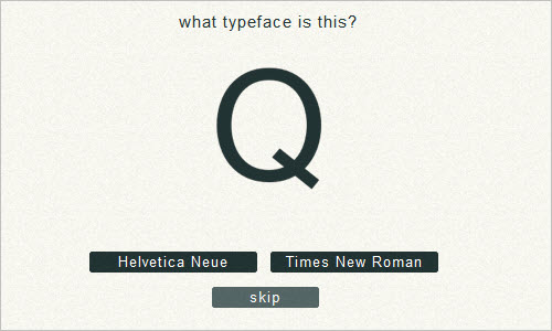
TypeWar A fun site to learn more on web fonts. Note that you will get more points for correctly answering one that other people had trouble with than one that most people got right.
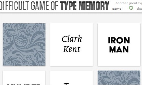
Type Memory The fun but quite difficult game of Type Memory.


 See the full picture →
 Celebrating 10 million developers
 SurveyJS: White-Label Survey Solution for Your JS App