Multivariate Testing In Action: Five Simple Steps To Increase Conversion Rates

Email Newsletter
Weekly tips on front-end & UX.
Trusted by 182,000+ folks.
 Custom Web Forms for Angular, React, & Vue. Your backend.


 Celebrating 10 million developers
The attention span on the Web has been decreasing ever since Google had arrived and changed the rules of the game. Now with millions of results available on any topic imaginable, the window to grab a visitor’s attention has decreased significantly (in 2002, the BBC reported it is about 9 seconds). Picture yourself browsing the Web: do you go out of your way to read the text, look at all the graphics, and try to thoroughly understand what the page is about? The answer is most likely to be a straight “no.” With bombardment of information from all around, we have become spoiled kids, not paying enough attention to what a Web page wants to tell us.
We make snap decisions on whether to engage with a website based on whatever we can make out in the first few (milli)seconds. The responsibility for making a good first impression lies with designers and website owners. Given that the window of opportunity to persuade a visitor is really small, most designs (probably including yours) do a sub-optimal job because the designer in you thinks in terms of aesthetics. However, most websites do not exist just to impress visitors. Most websites exist to make a sale. Whether it is to get visitors to subscribe to the blog feed, or to download a trial, every website ultimately exists to make a sale of some kind.
In this post we will talk about how to tweak a website for generating more sales, downloads, membership (or any other business goal) in a scientific manner, using A/B split and multivariate testing. Like everything else science-related, this article will explore a step-by-step, reproducible method for increasing your conversion rate (the percentage of visitors converted to customers). Also, you may be interested in the Ultimate Guide to A/B Testing that was published earlier here, on Smashing Magazine.
Step 1. Identify a Challenge
How to have website visitors notice your offering, then get them to act on it? I wanted to answer that million dollar question for a software download page on my personal homepage. That page had all the right ingredients: product name, product description, testimonials, awards, ratings and a prominent download link. Yet, only 40% of the visitors downloaded the free software. Note that almost all traffic on that page was targeted as it arrived, either through doing a Google search or via a relevant referring website. So, why didn’t the remaining 60% of visitors download the software? Fixing that leaky bucket was my challenge.

Key point: Clearly identify the goals of your website (or a particular Web page).
In my case, the desired action is to have visitors download the software and the challenge is to increase the download rate from 40% to as high as possible. Some of the most common challenges which can be solved using A/B split testing are:
- Improving sign-up rate, reducing bounce rate, increasing newsletter subscriptions,
- Increasing number of leads collected from landing page, increasing whitepaper or software trial downloads and
- Optimizing purchases and sales, converting a higher percentage of visitors to customers.
It is entirely possible that your website may be serving multiple purposes. An example would be a blog where the challenge is to get more subscribers and to increase visitor engagement (in terms of number of comments). In that case, the best strategy is to tackle one (clearly defined) challenge at a time.
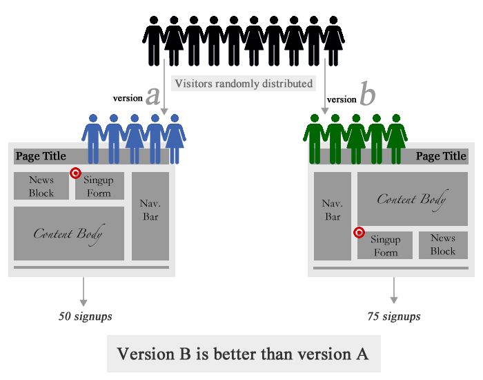
Quick overview: A/B Testing. Large version
Step 2. The Hypothesis
The next step is to make a list of hypotheses for the low conversion rate (percentage of visitors taking the desired action). Agreed, it is tough to come up with exact reasons (that is why we are calling them hypotheses) for a low conversion rate, but there are three excellent resources to help you:
1) You: Yes, you! Though it is hard not to fall in love with one’s own website, it is now time to be extremely self-critical. Try to step into your visitors’ shoes and ask yourself, is your Web page compelling enough to engage a visitor with no background knowledge about your offering? Remember that unlike you, your visitors don’t wake up in the morning saying, “Oh wow, this thing is fantastic!” Being critical towards your own website is an excellent way to improve it.
2) Web analytics data: Another source for getting a list of improvement ideas is your analytics tool. Specifically, data on referral sources and search keywords can provide interesting insights. For example, a lot of visitors may be arriving on your webpage by searching for keywords which you haven’t even thought about. In that case, your visitors may leave the website mistakenly thinking that your offer is not what they were searching for. Addressing such cases can increase the conversion rate.
3) Usability testing: Getting independent feedback from a usability test will always surprise you! Perhaps you will discover that visitors are not even aware that you are offering something on the page. In that case, a great idea would be to test the color and size of a prominent call-to-action. If you don’t have a large budget for usability testing, try out affordable services such as Feedback Army or UserTesting.
Key point: Determine what influences conversion rate.
Take feedback from others but evaluate your Web page honestly, and jot down a list of ideas on what could be affecting conversions. For my software download Web page, I had a hypothesis that the download rate was low primarily due to two reasons: a) a lot of visitors didn’t notice the download link and b) many didn’t know that the software is free to download.
My guess was that a normal visit went something like this: a visitor arrives at the website, sees a bunch of text, looks around for the download link, somehow misses it (possibly due to uniformity in color of headings), and finally leaves the website. Those who notice the download link probably don’t go to the trouble of reading the text, where it says “… is a freeware…”, so they assume that the software is a trial or a demo.
The kinds of hypotheses you may have at this step:
- Maybe your sign-up form is too long, and a shorter version will help increasing total number of sign-ups?
- Maybe your “Free Trial” button isn’t noticeable; will a larger button help in more downloads?
- Maybe your headline contains a lot of industry acronyms, or is too generic?
- Maybe your landing page has no obvious next step, which is leading to high bounce rate?
Step 3. A/B or Multivariate Testing?
Once your list of possible reasons for low conversion rate is ready, it is time to crank your brain once again to come up with different ideas for addressing those reasons. What you do in this step, is to come up with multiple different versions for all the factors you came up with in the last step. For the “Sign Up” case, for example, different versions will be:
- Form variations: Minimal form with just two fields; form not asking for email address; multi-step form; long form.
- Submit button variations: “Submit” or “Sign Up for Free” or “Instant Signup” or even “Sign Up Now!”
If you are skeptical that such minor differences cannot make any significant impact on conversions, read a case study where 37Signals increased sign-ups by 30% by testing a simple headline change. Also read how Dustin Curtis increased his Twitter followers by 173% by simply changing the link text to “You should follow me on Twitter.”
A/B Split Testing
In A/B testing (also known as split testing), you vary only one element on the page at a time. This element may be any part of the Web page critical to conversions (e.g. button color, size, ad copy headline). Contrast this to multivariate testing, where multiple different elements are tested at a time. However, A/B tests are simpler and easier to implement than multivariate tests.
Multivariate Testing
In multivariate testing, you identify different sections/factors on a page which effect conversion rate. Different variations of those factors are created, which are then combined to give rise to multiple different versions of the website. Multivariate tests take more time than A/B tests to show results, but are more likely to produce better results.
Key point: Create variations.
Conducting Tests
Coming back to the challenge of increasing downloads for the software page, I used my own tool, Visual Website Optimizer, that provides a visual interface for creating variations, but you could use other tools as well. An obvious solution to make visitors notice the download link is to make the download section the most prominent part of the page. In the page design, the “Download” heading size and color blended well into the rest of the page, which resulted in people missing the download link.
For the multivariate test, I selected two factors on the page for creating variations: the “Download” heading in the sidebar and the “PDFProducer” download link below it. The focus of the test was to observe the effect of the word “free,” and the effect of highlighting the download section. Here are the variations I came up with for this test:
For “Download” headline:
- “Download” in red
- “Download for Free” in red
- “Download” in default color, but a larger font size
For “PDFProducer” link:
- “PDFProducer” in default color, but a larger font size
- “PDFProducer” in red
In a multivariate test, different variations are combined to produce multiple versions of the Web page. In this case, combining the above variations, a total of 12 (4×3) different versions were produced (automatically), each with a unique combination of “Download” headings and “PDFProducer” links (variation 1 is the control, or default, variation).

Different versions of the download section used in the multivariate test.
For definition’s sake, because I have combined variations of two different sections, the test is called a multivariate test. If I had just varied a single section, say the “Download” heading, the test would have been called an A/B split test.
Key point: Define the goal of the test.
Every test has a goal against which the performance of different versions is measured. In this case, the goal was the number of downloads. Other types of goals may be sign-ups, purchases, clicks, leads, page views, or bounce rate. It is important to define the goal which is closest to your business objectives. For example, an eCommerce store optimizing for sales shouldn’t define clicking on the “Add to Basket” button as a goal. Rather, it should define the goal as a visit to the “Thank you” page after a purchase is completed.
Step 4. Running the Test and Analyzing Results
What an A/B split or multivariate test does, is simple: whenever a visitor arrives on your Web page, it displays a randomly chosen version of the Web page. In other words, your traffic gets equally distributed amongst different versions. The performance of the different versions is tracked against the conversion goal(s) defined for the test. For example, in my case the goal was increasing the number of downloads; each time a visitor downloaded the software, Visual Website Optimizer tracked which Web page version was shown to the visitor. Setting up a test using this tool helped here as I could select the sections, make variations in a WYSIWYG editor, and immediately preview how it will look live on the page.
After a large number of visitors have been included in the test, different versions are compared to see which one of them performed the best and how much improvement (over the default) it achieved.
Key point: Analyze the results.
After running the test for about 4 weeks, I had results for my software download test. Can you guess which variation resulted in maximum downloads? Any guesses on how much improvement I was able to achieve over the existing 40% download conversion rate?
Hold your breath, here are the results:
| # | Details | Conversion rate | % Improvement | Confidence* |
| 1 | Default combination (control) | 39.4% | - | - |
| 10 | “Download for Free” in red, default “PDFProducer” link | 63.2% | 60% | 99% |
| 9 | “Download” in big font, “PDFProducer” link in red | 56.5% | 43.3% | 98% |
| 12 | “Download for Free” in red, “PDFProducer” link in red | 54.2% | 37.7% | 95% |
| … | … | … | … | … |
| 2 | “Download” as default, “PDFProducer” in big font | 41.3% | 4.76% | 56% |
100*(Variation % – Control %)/(Control %)refers to the combination number as described in the screenshot above
Confidence*: Statistical confidence in beating the default combination.
You can observe that the headline “Download for Free” in red pushed the download conversion rate from 39% to 63%, a whopping increase of 60%. Having “Download” in large font size (combined with link color as red) also had a positive (43%) improvement over the default. Of all results, the top three are statistically significant at 95% or more confidence level. It means that I can safely implement winning versions on the Web page, to see a permanent increase in downloads. Also note that even the worst performing combination has about a 4% improvement over the control, though it is not statistically significant.
A common concern is that the test results may not be reliable and that the improvement seen may be due to chance. It is, therefore, important to understand different parameters that influence reliability:
- Number of visitors: the higher the number of visitors, the more reliable the results. You can use tools such as a split test duration calculator, to estimate how many visitors will be required for your test.
- Conversion rate: in general, results for pages with a low conversion rate (say 1-2%) take a much longer period to produce statistically significant results, than pages with a higher conversion rate (say 40-50%).
- Difference in performance: testing with a large difference in the performance of variations (say >10%) is always more reliable than one where the difference is extremely small (0.5% or so).
It is important to either use a tool which automatically crunches the reliability of results for you, or to use online calculators to gauge the confidence in results. Taking unreliable results and implementing them can actually cause decreased performance. The exact mathematics of what goes on behind split testing reliability analysis can be read in the 20bits article Statistical Analysis and A/B Testing, or my blog article Mathematics of A/B testing.
Step 5. Learn From the Test Results
Irrespective of whether improved versions of your page are found or not, every test ends up with a good amount of learning. Here are a couple of key takeaways from my test:
- The word “Free” is a very powerful attention grabber. You are doing a sub-optimal job if you offer something for free, and don’t make that super-obvious on the page.
- Best location for advertising your “Free” offer is near (or on) a call-to-action. Like in this case, “Download for Free” is displayed quite close to the download link itself.
- This brings us to next important point: why not make the word “free” clickable? I am sure if I had analyzed the location of clicks on the page, I would have found a lot of visitors clicking on the “Download for Free” headline, only to realize it is not a link. I should have definitely tested a version with a clickable headline.
- The color red, matters, but only if it is combined with other elements such as “Free” (or other effective call to action texts). Red may bring attention to your call to action, but if the text is not persuasive, the visitor will probably not take any action.
- The size of your call to action also matters. A larger size tells the visitor that you consider this particular section (in this case, downloading the application) more important than the other parts of the page.
Even if you don’t remember any of the points above, please take home one key point: don’t replicate the suggestions above without testing them on your website! Every website is unique, every conversion goal is different. While generic observations about the effect of the word “Free,” of the color red, and of the size of your call to action make logical sense, it is always wise to be sure of their effectiveness by setting up a quick test.
A/B split testing holds a lot of potential for positively impacting a company’s revenue and profits. In spite of that, surprisingly, adoption of testing is not that high. If you haven’t done any A/B split tests yet, why is that so? If you have done A/B split or multivariate tests in the past, please share your experiences in the comments below so that others can get to know real-world examples.
Related posts
You may be interested in the following related articles:
- Ultimate Guide to A/B Testing
- Getting Started With E-Commerce: Your Options When Selling Online
- Improve Your E-Commerce Design With Brilliant Product Photos
- Our 3-part-series “Optimizing Conversion Rates”.
(ik) (vf)


