Preparing Artwork for Screen Printing in Adobe Illustrator

Email Newsletter
Weekly tips on front-end & UX.
Trusted by 182,000+ folks.
 Register for Free
 Custom Web Forms for Angular, React, & Vue. Your backend.

 Celebrating 10 million developers

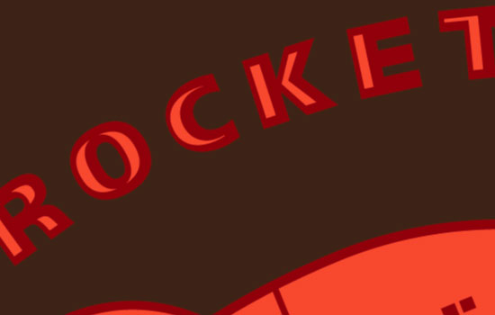
Getting t-shirts printed is an ideal way to promote your business, organization or event. They are a promotional item that people can actually use, and they have the added bonus of being an advertisement for you. In this post, Adobe Illustrator will be used to create a three-color screen print using a fictional company logo, and have it set up to allow a screen printer to easily print the color separations that create the separate screens for each color print.
Although some printers prefer to create their own separations, it’s always good to understand the process. Be sure to communicate with your printer as they will specify their requirements, and will often give you tips for avoiding potential issues in the process.
Further Reading on SmashingMag:
- 40 Excellent Adobe Illustrator Tutorials
- An In-Depth Study Of Symbols In Illustrator CS5
- 35 Excellent Adobe Illustrator Video Tutorials
- Inspiring Illustrator Artworks By Artists Around The World
Printing Techniques
As the t-shirt is going to be printed in three colors, we have to create separate artwork for each layer of color. Each of these layers interact with each other to form a complete image.
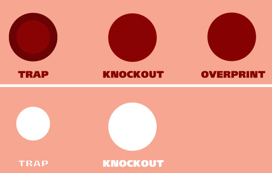
Examples of Trap, Knockout and Overprint
There are three artwork techniques commonly used for this type of printing: Trap, Knockout and Overprint. The Trap technique is when the bottom color “bleeds” under the top color, ensuring no gaps are left from inaccurate printing of the second color (when the so-called “registration” between the colors is “off”).
Screen printing is not always an exact printing technique, especially when printing onto fabric surfaces; for this reason the Knockout technique is rarely used, as it relies on printing a color precisely in a gap left on the bottom color. The third technique, Overprint, is the easiest to achieve as the top color prints directly on top of the bottom color; often this produces a new color, as the top ink color is not always opaque.
Preparing Your Artwork File
1. Create Layers for Each Color
The most reliable way to produce artwork for screen printing is to manually prepare it in Adobe Illustrator. Each of the three colors is going to form a separate artwork in a separate layer, using elements from the main image for each color. Using Layers does not affect how your artwork is output by your screen printer; it just makes it easier for you to work on.
Opening the vector artwork in Illustrator presents the graphic in Layer 1. Select the drop-down menu in the Layers window and select Duplicate Layer twice, to produce three layers of the same graphic; name the three layers after their respective colors, as this will help prevent confusion later on. Ensure the order of the colors is correct: the bottom layer is White; the next color layer is Orange; and the top layer is the Dark Red, which will be printed last, on top of the other colors.
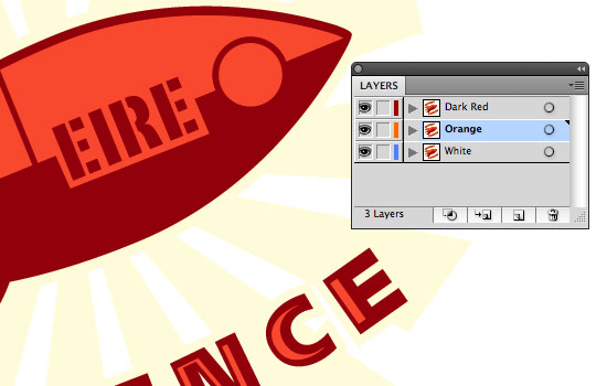
Layers being created and renamed
2. Create a Temporary Background Color Layer
At this stage — because the artwork is being prepared to be printed on a dark t-shirt — create a fourth layer for a temporary background color and name it Temporary Background. A rectangle is drawn the full size of the art board, and given a dark color; this layer will be removed later in the process. Drag the layer to the bottom of the layers, and Lock it. Each color of your artwork produces a separate screen, and the order in which the colors are printed is usually from the lightest to the darkest color.
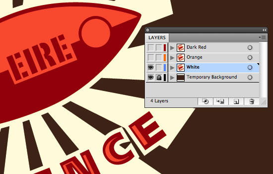
A Temporary Background layer is created
3. Remove Excess Objects From the Layer
The first layer to be worked on, is the bottom White layer. Hide the Orange and Dark Red layers by clicking the Eye icon next to their layers, and make sure the White layer is selected in the Layers window by clicking on its name. As the artwork layer was duplicated in full, all the objects of the graphic are on this layer; some objects must be removed, leaving the shapes that form the white outline of the rocket, the text, and the orange fan shapes used in the background.
4. Outline All Strokes
The rocket outline is a solid shape so no further work is needed on the rocket, but the white outline of the text is a thick stroke applied to the text shapes; working with strokes can be unpredictable, so it’s best to create outlines from the stroke by selecting the text and choosing Object ? Path ? Outline Stroke. This ensures consistency if the artwork needs to be resized (Strokes can often be pushed out of proportion when resized with the Scale tool).
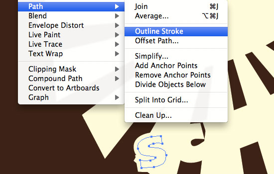
Outline Stroke on text objects
5. Create and Apply a Custom Spot Color
Select all the objects in this layer and apply a light color to each of them. Avoid using absolute white, as you won’t be able to see the objects when checking Separations later. Apply a color of 20% Yellow to the objects and then, in the Swatches window, select New Swatch from the drop-down menu. Name the swatch “White base” and choose Spot Color from the Color Type menu. Even though it’s set to 20% yellow, it will output as a solid color, titled “White base.”
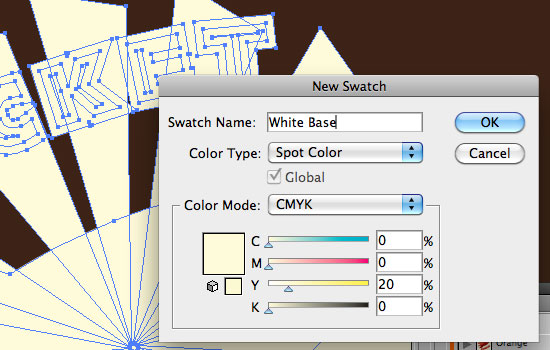
Creating a new Spot Color Swatch
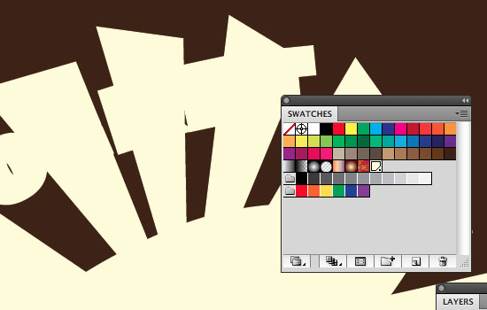
The swatch now will be in the Swatches window and there will be a dot in the corner to denote a Spot color. The Spot color should be applied to all the objects in the White layer.
Spot color in the Swatches window; note the dot in the corner of the selected swatch
6. Manually Creating Trap
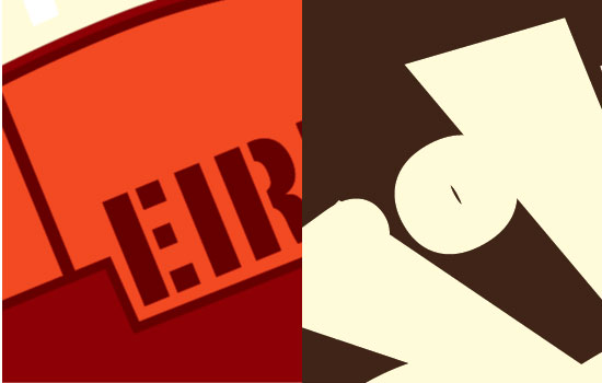
Hide the White layer and select the Orange layer. Remove any objects that are not relevant to this color layer, such as the white background objects and the dark red objects. The remaining objects are going to be printed in orange underneath the dark red. Due to the inaccurate nature of screen printing, you can’t simply knock out the shape of the orange elements from the top red color and precisely print over the orange; you have to create Trap between the two colors, to allow for slight “wobbles” in color registration.

Potential mis-registration of two colours, seen between orange and dark red
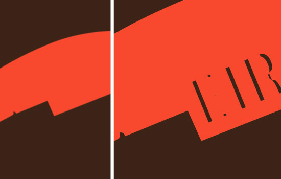
Select an Orange object and choose Object ? Path ? Offset Path. Offset the path by 1 mm to make the object larger in shape. Oftentimes printers specify how much Trap they require, similar to how they might specify Bleed. On this artwork, the white background outlines the color objects, but if you wanted the white to be printed directly behind the colors, without a white outline, you could offset the path of the White objects by a minus figure (for example -1mm).
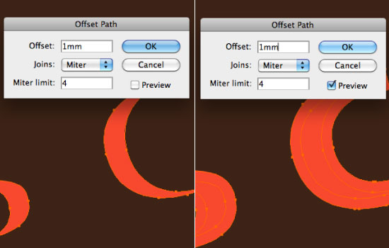
Left: Before offsetting path by 1mm. Right: After offsetting path to create Trap
7. Deciding on a Spot Color
Once Trap is created for all the orange objects, select all the objects and create a Spot color from the Swatches menu. If you are specifying a Pantone color, name the Spot color with the Pantone Matching System (PMS) reference; otherwise, name it descriptively, in this case, Orange.
Bear in mind that it is often the case that printers have inks that they keep in stock and you could save some cost by using an indefinite “orange” rather than specifying a Pantone color, such as Pantone 179. Additional charges can be placed on inks that have to be bought or mixed for a specific project (especially with smaller print quantities). Talk to your printer and see what your options are, as they might supply you with ink color samples to choose from. Samples are definitely worth paying for; they give you a much better idea of color than swatches do.
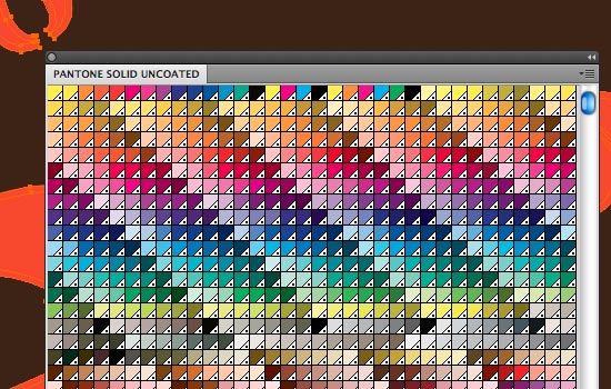
Pantone Colors can be found under Window ? Swatch Libraries ? Color Books
8. Knocking Out for the Trap Below
Once the Orange Spot color is applied to the Orange layer, hide the Orange layer and show the top layer, the Dark Red layer. Again, remove unneeded objects such as the white background elements, but leave the Orange highlight objects.
Artwork with white base color removed
For each object with an Orange highlight, use the Pathfinder tools (Window ? Pathfinder) to Exclude the highlight color, effectively creating a void in the object shapes. This is Knockout; but as we created Trap on the Orange layer objects, we won’t get any registration issues. When using the Exclude tool, the object takes the color of the top object which is excluded. Change the color back to the original Dark Red using the Eyedropper tool on one of the other other objects.
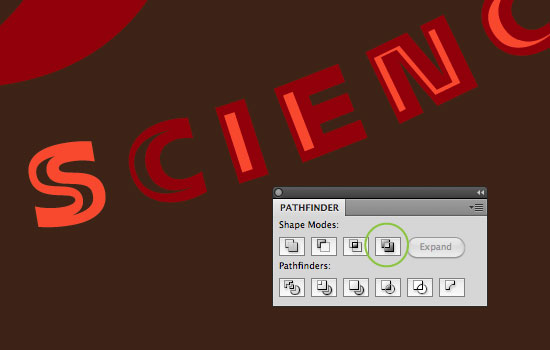
The Exclude tool (circled in green) is excellent for removing shapes from within objects
If the artwork was not being split into layers, the Knockout and Trap could be created automatically using overprinted strokes. This does save time but allows less control on the final print and is more prone to errors (such as forgetting to add Trap to objects).
9. Trap is Not Always Necessary
There was no Trap created for the Dark Red text on the rocket, as it will be Overprinted on to the Orange. In situations where the printing area is small, it’s best to not create Trap as the area left open below the Overprinting color usually ends up being insignificant.
For smaller text and objects, the Trap is too small, so the object is Overprinted instead
Again, select all the Dark Red elements and create a new spot color. If you are using non-specific colors, always supply the printer with a printed proof to allow them to match the color as closely as possible. This printed proof often helps the printer identify issues with your artwork before they move onto the expensive stage of producing film for creating the screens.
10. Checking Your Separations
Once you have completed the last step, you are now ready to prepare your artwork to send to the screen printer. First, you have to set the Orange and Dark Red colors to overprint. Select Windows ? Separations Preview. From the window that opens, first check the Overprint Preview box and then hide the CMYK separations by clicking the eye icon beside CMYK. The temporary dark background should disappear.
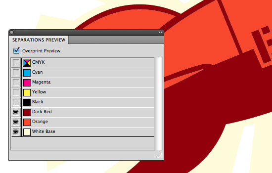
Separations Preview
Check your separations by hiding each color, one at a time, starting with the Dark Red. You will notice that the Trap you created earlier is gone and the white background is only an outline. This happens because the Orange and Dark Red are not set to overprint the colors below them.
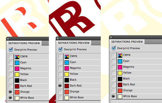
Separation of the three colors before Overprint is set
11. Setting Objects to Overprint
First, uncheck the Overprint Preview box in the Separations Preview window. Then, hide all the layers except the Orange layer (you can also delete the Temporary Background layer; it’s no longer needed). Select Window ? Attributes. With all the Orange objects selected, check the Overprint Fill box in the Attributes window. Do the same with the Dark Red layer, ensuring all the Dark Red objects are selected when you check the Overprint Fill box in the Attributes window.

Setting Overprint Fill on two colors
12. Recheck Your Separations
Go back to the Separations Preview window and check the Overprint Preview box. You should now see a color variation on the artwork, where you created Trap earlier. If you also look at the White layer, you’ll see that the whole shape is left intact, due to the Orange and Dark Red set to overprint.
Left: Trap can be seen by darkened area around Orange. Right: White base returns to a solid shape (shown with temporary background, for illustrative purposes)
13. Ensure There are No CMYK Objects in the Artwork
One thing you have to ensure before saving your file to send to the screen printer, is that there are no CMYK elements in your document. This can be checked easily by choosing File ? Print. Select your printer as Adobe Postscript File and click the Output option on the left side. Select Mode as Separations (Host-Based). On the list of colors below, if the printer icons shows next to any of the process colors (Process Cyan, Process Magenta, Process Yellow or Process Black), you have elements in your artwork which are set in CMYK colors.
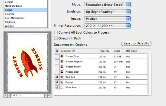
Checking for CMYK objects using the Print dialog box
14. Finish Up and Send It Off
Once you are sure your Spot colors will separate as you expect them to, save your file as PDF and send it along with either a JPEG or printed proof. Sometimes printers request the original Illustrator file, in case they need to make alterations themselves. A good printer will check your files, and let you know if there’s an issue before the process of creating screens begins.
Final Note
There are many alternative techniques to prepare your artwork for screenprinting; today’s post concentrates on more manual techniques, for demonstration purposes and also for reliability. Your artwork will probably be output on a different hardware and software configuration to yours; the more complex your artwork, the greater the possibility of errors during output.
There are two areas you must pay close attention to: make sure you are only using spot colors, and ensure all pieces of your artwork get output by the screen printer as you expect it to.
Often, a stray object set to a CMYK value is left somewhere on your artwork, which causes one of two issues: either the screen printer outputs an extra color(s) to film (with which the screens are created), possibly incurring extra cost; or the screen printer only outputs the specified Spot colors, and part of your artwork goes missing on the final print. Use the Separations Preview window to check the different layers of your artwork, making sure colors overprint where they should and that all pieces of your artwork are present and correct.
It’s important to strike up a good relationship with your screen printer, whether they are a local company or one you found on the Web. They can give you vital advice, and could potentially spot mistakes before the screens are made or any t-shirts are printed. Also, if they’re a local business, try to get a tour of their print shop; screen printing is a great process to observe, and being familiar with the process is a great help when making design and preparation decisions.
Further Resources
- Using Separations Preview (Adobe tutorial, with an alternative trapping method toward the end)
- How To Create Your Own Color Separations in Adobe Illustrator
- Gig Posters Process (t-shirt printing process photos)
- Screen Printing Overview (YouTube video)
- Trapping Tips For Improving the Quality of Print Jobs
(ik) (rs)


