25 Impressive Free High-Quality Fonts

Email Newsletter
Weekly tips on front-end & UX.
Trusted by 182,000+ folks.
 Celebrating 10 million developers

 Custom Web Forms for Angular, React, & Vue. Your backend.

In this selection, we’re pleased to present Pompadour Numeral Set, Lato, Crimson Text, Espinosa Nova, Musa Ornata, Spatha Sans, ColorLines, Roke1984, Neuton, Avro, Baurete and other fonts. Please note that some are for personal use only and are clearly marked as such. Please read the license agreements carefully before using the fonts; they may change from time to time.
Further Reading on SmashingMag:
- The Best Free Fonts for Designers
- Free Fonts With Personality And Style - 2017 Collection
- Typographic Design Patterns And Current Practices (2013 Edition)
- 55 Wonderful Free High-Quality Fonts To Jazz Up Your Designs
- The Art Of Hand Lettering
New High-Quality Free Fonts
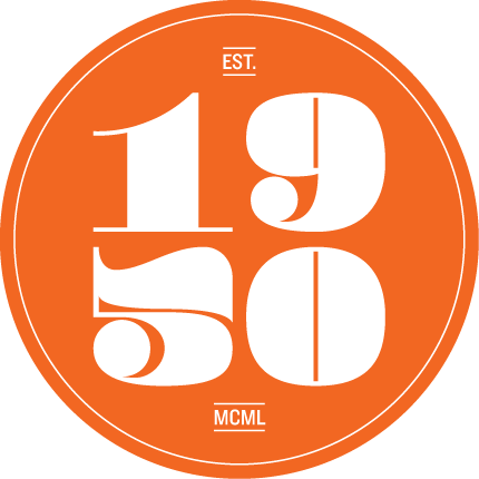
Pompadour Numeral Set (.eps, released under Creative Commons) A beautiful numeral font released by Andy Mangold under a Creative Commons license. The font can be useful in various settings, for instance for packaging design or logo deign. The .EPS file is available for free download. The font is free to use as long as the credit is given.
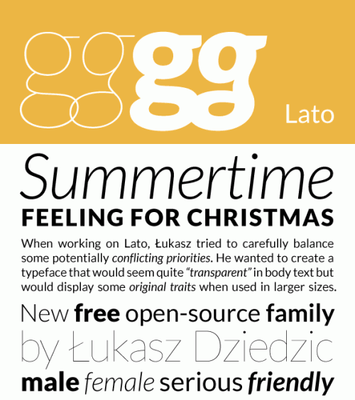
Lato (open-source sans serif) Lato is a san-serif typeface family. The semi-rounded details of the letters give Lato a warm feel, while the strong structure provides stability and seriousness. Lato consists of five weights (plus corresponding italics), including a beautiful hairline style. The first release includes only the Western character set. Designed by Lukasz Dziedzic.
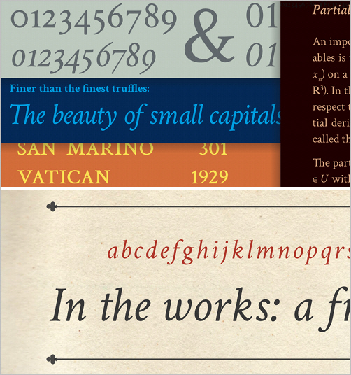
Crimson Text “Crimson Text is a font family for book production in the tradition of beautiful old-style typefaces. There are a lot of great free fonts around, but one kind is missing: those Garamond-inspired types with all the little niceties such as old-style figures, small caps, fleurons, math characters and the like. In fact, a lot of time is spent developing free knock-offs of ugly ‘standards’ like Times and Helvetica. Crimson Text is inspired by the fantastic work of people like Jan Tschichold, Robert Slimbach and Jonathan Hoefler. We hope that the free type community will one day be able to enjoy Crimson Text as a beautiful workhorse.”
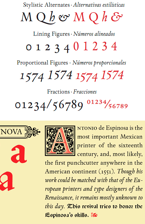
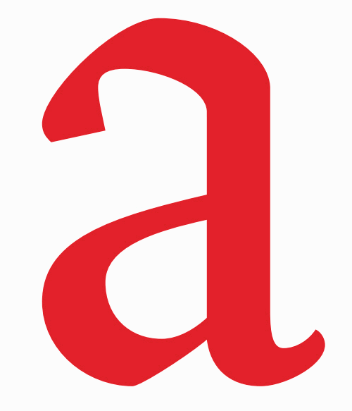
Espinosa Nova: Regular (not free anymore) Espinosa Nova is a revival of the types used by Antonio de Espinosa, the most important Mexican printer of the 16th century and quite probably the first punch cutter anywhere on the American continent (1551). All of the fonts intended for setting text include small caps, five sets of figures (old-style and lining, both proportional and tabular, plus tabular small caps), many “f” and long “s” ligatures and a capital sharp “S” (U+1E9E). Designed by Cristóbal Henestrosa.
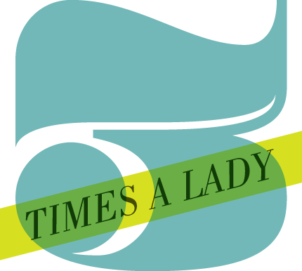
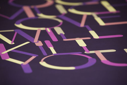
Color Lines This decorative font can be used for a variety of products, such as posters, packaging and label design. Original and unique. Designed by Anton Gridz, and available in AI format.
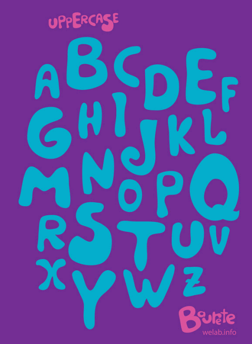
Baurete (free download)
A playful, intriguing typeface that could work for designs without rigid alignment or symmetrically positioned elements. Baurete is free to use for personal and commercial projects. If you want to use it, please contact the designers at [we {at} welab {dot} info]. You can download it for free.
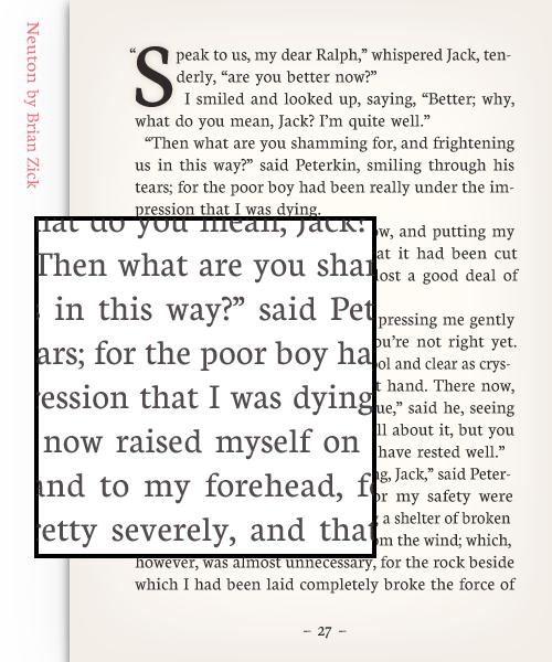
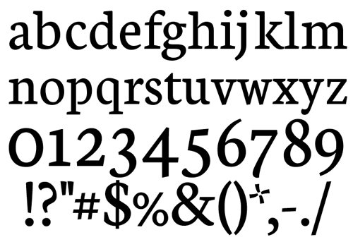
Neuton Font Neuton is a clean Times-Roman–like typeface by Brian Zick. In structure, it is a transitional type with Dutch inspiration. The x-height is high and the color dark, and it is economical in ascenders, descenders and width. Also available in the Google Font Directory.
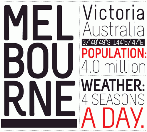
Melbourne (personal use only) Melbourne is a sans-serif with a strong modern presence. The designer’s intention was to create a calm space-saving typeface. The glyphs have rounded corners and relatively large tracking, which makes it a good fit for dictionaries, indexes, catalogues and so on. When used at a large size, Melbourne can be used as a display or headline font. The typeface is released as a draft, and suggestions for improvements are appreciated. Designed by Marco Müller.
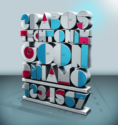
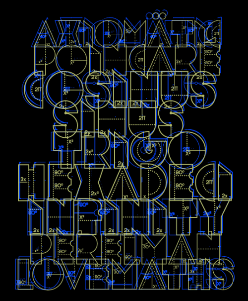
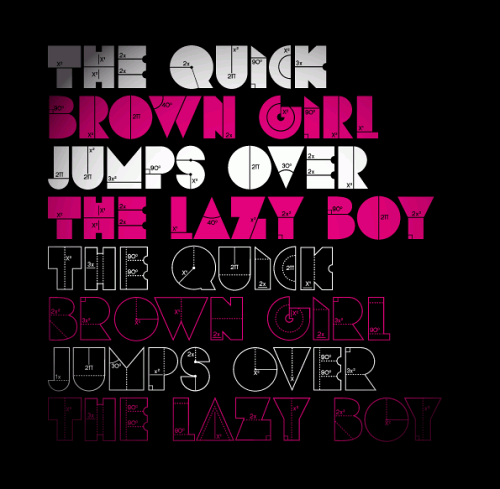
ROKE1984 A free display font based on geometric forms and mathematical symbols, this one includes accents and numerals. An interesting option for technical designs that call for a distinctive yet slightly challenging appearance. Designed by Wete. Available in OpenType format.
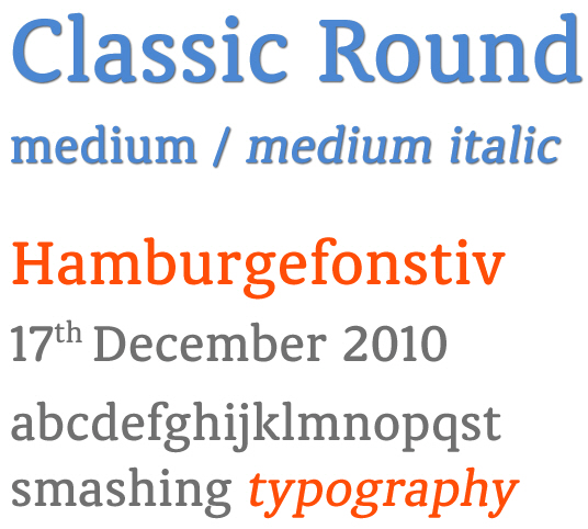
Classic Round: medium and italic (not free anymore) This typeface was designed for text and display use. In small text sizes, the typeface looks clean, inviting and legible. When used in big display sizes, it looks playful and interesting. Designed by Ben Blom.
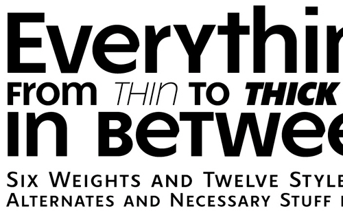
Free Font FR Hopper: regular and italic (not free anymore) FR Hopper is a sans based on geometric forms but still retaining a friendly personality. It is intended for mid-length texts, captions, titles and almost any other occasional use: posters, flyers and even websites. The typeface comes with 7 weights, 12 styles with 836 glyphs, and many advanced OT features such as small caps, discretionary ligatures, alternate characters, fractions, arrows and ornaments.
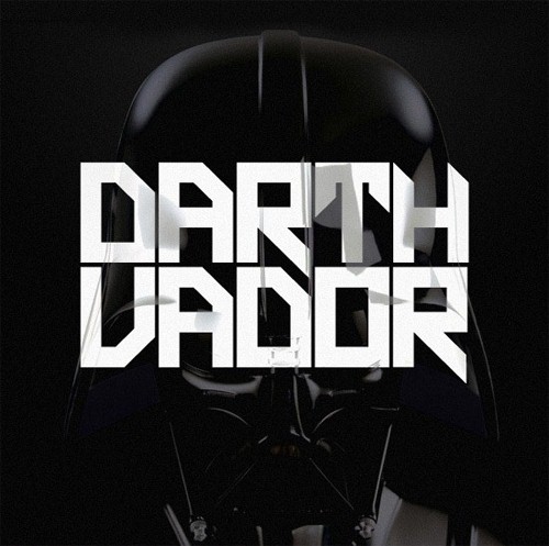
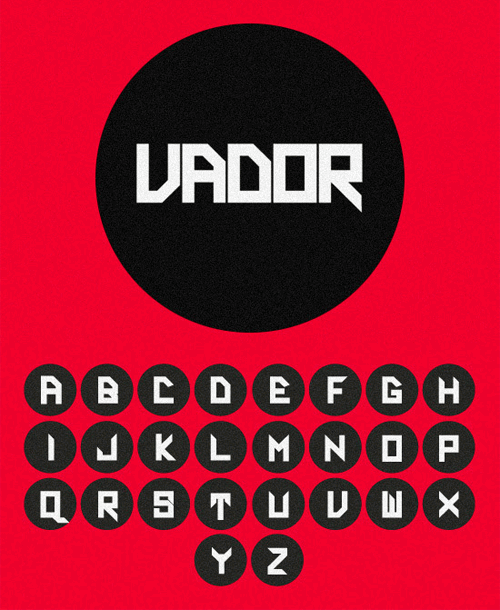
Darth Vador Free Font An original geometric font for the Darth Vador theme, designed by Juart Little from France.
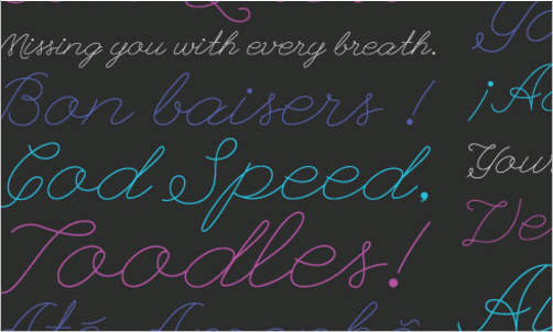
League Script #1 “League Script #1 is a modern coquettish script font that sits somewhere between your high-school girlfriend’s love notes and handwritten letters from the ’20s. It includes ligatures and will serve as the framework for future script designs.” Designed by Haley Fiege and available in OpenType format.
KanKin Free Font Free original and playful OpenType fonts available in two font weights, regular and italic. Supported languages are English and Russian only. Designed by Alexey Frolov.
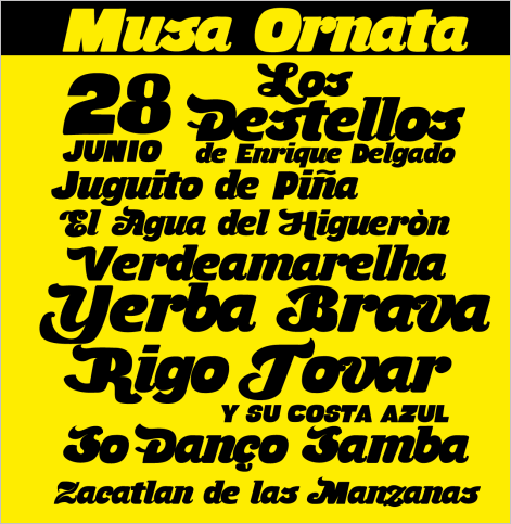
Musa Ornata This typeface, with its cheerful characters, could be a good fit for event announcements, grocery stores and public transport signage. To activate the alternative case, check the “Character Palette” in the OpenType options toolbar in your application. The download link is available at the bottom of the release post (above link). Designed by Carvente Dice.
Skyhook Mono: regular This family is a carefully handcrafted monospaced typeface family that is modern, sturdy and minimalist, yet distinctive enough for refined and classy uses. The regular weight is available as a free download. The free weight may not be used in political or religious works.
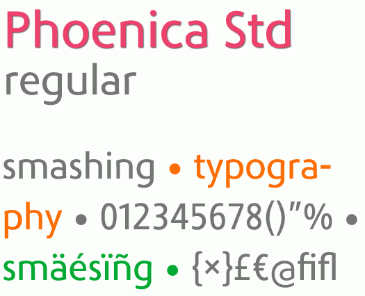
Phoenica Std (not free anymore) Phoenica offers an alternative to contemporary humanist sans serifs. It is a flexible family suitable for editorials and corporate branding. Phoenica comes in a big variety of weights, each available in both roman and italic. The regular width is available as a free download and for personal projects.
Indento: bold (registration required) “Indento is a multi-purpose modern geometric slab serif for headlines, posters and branding, but legible enough to be used for longer text. The straight and rounded corners, combined with the deep cuts and asymmetric serifs, give it a distinctive look while still keeping its legibility.” The bold weight is available as a free download in OpenType format. Designed by Mugur Mihai.
Free Font Adec This typeface was inspired by Art Deco and Constructivism. It would fit posters, magazines and logos. The distinguishing feature of this font is the combination of decorative elements, such as textures and frames. Designed by Serge Shi.
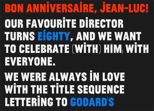
Jean-Luc (Godard) “Atelier Carvalho Bernau Design released Jean-Luc, a typeface inspired by the title cards of films like ‘Deux ou trois choses que je sais d’elle,’ to celebrate Jean-Luc Godard’s birthday. The style of lettering is so interesting to us because it is such a clear renunciation of the ‘pretty’ classical title screens that were common in that time’s more conservative films. It has a more vernacular and brutishly low-brow character; this lettering comes from the street.” To embed the font using @font-face, a copyright code must be appended as a comment in the source code.
Arvo Font Family This slab-serif typeface was created by Anton Koovit especially for the Google Font directory. It is optimized for Web use. The typeface is “monolinear-ish” but has a touch of contrast. For Windows users, the smaller 9, 12, 14 and 16 point sizes are hinted in Truetype format.
Thunderball This heavy sans font with 178 characters could be useful for posters, postcards and similar designs. Released under a Creative Commons license.
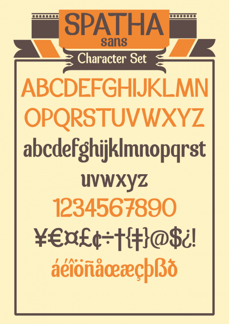
Spatha Sans A sans-serif font with organic playful shapes that set a friendly tone and are easy to read. The font could be a good fit for titles and maybe short text. Designed by Carvente Dice.
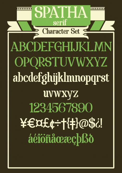
Spatha Serif
As a counterpart to the above-mentioned Spatha Sans, the glyphs in Spatha Serif have classic proportions and short serifs, which retain the playful and organic design. The font can also be embedded using @font-face, but a credit link is required. Designed by Carvente Dice.
My Fair Cody An interesting playful typeface that makes a an impression with its personality and warmth. The tone is inviting and informal, and as such might not be the best fit for a corporate context. Designed by Darim Kim, and available in OpenType format. You may use the font in your private and commercial projects; but if you embed it using @font-face, then a credit link is required.
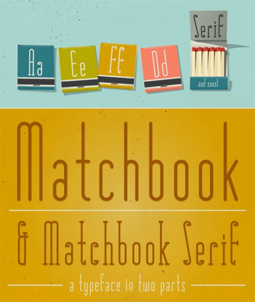
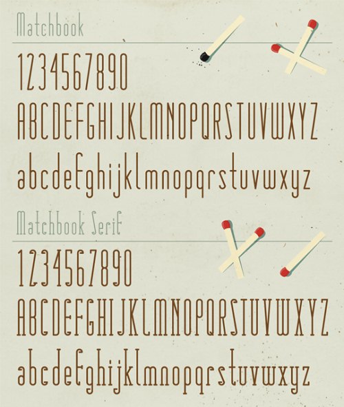
Matchbook Matchbook is a simple and functional set of two typefaces, designed in serif and sans-serif versions. Each set includes all accented characters and works beautifully in larger sizes.
Mota Pixel Mota Pixel is a simple pixel font with simple roots. The regular weight was created as a custom design for TypeShow and is now available for free to the public. Optimized for use in 20-pixel increments, it is a larger than normal pixel design. Still, the regular is rather thin and delicate, expressing some tendencies of an upright italic.
Further Resources
- Soma FontFriend FontFriend is a bookmarklet for typographically obsessed web designers. It enables rapid checking of fonts and font styles directly in the browser without editing code and refreshing pages, making it the ideal companion for creating CSS font stacks.
- Cure for the Common Webfont: Alternatives to Georgia For nearly fifteen years, if you wanted to set a paragraph of web text in a serif typeface, the only truly readable option was Georgia. But now we’re starting to see some valid alternatives for the king of screen serifs. What follows is a list of serif typefaces that have been tuned for the screen.
- How to Detect Font-Smoothing Using JavaScript Some fonts look bad on computer monitors without font-smoothing enabled in the operating system. The author of this article initially thought there wasn’t a way, but after seeing a promising but incomplete method of detecting font-smoothing, he spent a few days devising a way to do it.
- When Free Fonts Aren’t Free To ensure that you’re using “free” fonts as their creators intended, here are four things to look for when you’re scanning a EULA.
- iOS Fonts An overview of font families available on iOS devices such as iPhone and iPad.
- Free Typography A blog dedicated to free fonts.
Also, you may want to take a look at…


