What Font Should I Use? 5 Principles for Choosing and Using Typefaces
For many beginners, the task of picking fonts is a mystifying process. There seem to be endless choices — from normal, conventional-looking fonts to novelty candy cane fonts and bunny fonts — with no way of understanding the options, only never-ending lists of categories and recommendations.
Selecting the right typeface is a mixture of firm rules and loose intuition, and takes years of experience to develop a feeling for. Here are five guidelines for picking and using fonts that I’ve developed in the course of using and teaching typography.
1. Dress For The Occasion
Many of my beginning students go about picking a font as though they were searching for new music to listen to: they assess the personality of each face and look for something unique and distinctive that expresses their particular aesthetic taste, perspective and personal history. This approach is problematic, because it places too much importance on individuality.

The most appropriate analogy for picking type. (Photo credit: Samuuraijohnny. Used under Creative Commons license.)
For better or for worse, picking a typeface is more like getting dressed in the morning. Just as with clothing, there’s a distinction between typefaces that are expressive and stylish versus those that are useful and appropriate to many situations, and our job is to try to find the right balance for the occasion. While appropriateness isn’t a sexy concept, it’s the acid test that should guide our choice of font.
My “favorite” piece of clothing is probably an outlandish pair of 70s flare bellbottoms that I bought at a thrift store, but the reality is that these don’t make it out of my closet very often outside of Halloween. Every designer has a few favorite fonts like this — expressive personal favorites that we hold onto and wait for the perfect festive occasion to use. More often, I find myself putting on the same old pair of Levis morning after morning. It’s not that I like these better than my cherished flares, exactly… I just seem to wind up wearing them most of the time.
Every designer has a few workhorse typefaces that are like comfortable jeans: they go with everything, they seem to adapt to their surroundings and become more relaxed or more formal as the occasion calls for, and they just seem to come out of the closet day after day. Usually, these are faces that have a number of weights (Light, Regular, Bold, etc) and/or cuts (Italic, Condensed, etc). My particular safety blankets are: Myriad, Gotham, DIN, Akzidenz Grotesk and Interstate among the sans; Mercury, Electra and Perpetua among the serif faces.
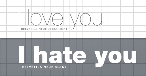
A large type family like Helvetica Neue can be used to express a range of voices and emotions. Versatile and comfortable to work with, these faces are like a favorite pair of jeans for designers.
2. Know Your Families: Grouping Fonts
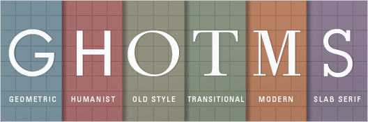
The clothing analogy gives us a good idea of what kind of closet we need to put together. The next challenge is to develop some kind of structure by which we can mentally categorize the different typefaces we run across.
Typefaces can be divided and subdivided into dozens of categories (Scotch Modern, anybody?), but we only really need to keep track of five groups to establish a working understanding of the majority of type being used in the present-day landscape.
The following list is not meant as a comprehensive classification of each and every category of type (there are plenty of great sites on the web that already tackle this, such as Typedia’s type classifications) but rather as a manageable shorthand overview of key groups. Let’s look at two major groups without serifs (serifs being the little feet at the ends of the letterforms), two with serifs, and one outlier (with big, boxey feet).
1. Geometric Sans
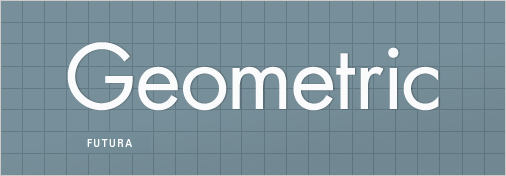
I’m actually combining three different groups here (Geometric, Realist and Grotesk), but there is enough in common between these groups that we can think of them as one entity for now. Geometric Sans-Serifs are those faces that are based on strict geometric forms. The individual letter forms of a Geometric Sans often have strokes that are all the same width and frequently evidence a kind of “less is more” minimalism in their design.
At their best, Geometric Sans are clear, objective, modern, universal; at their worst, cold, impersonal, boring. A classic Geometric Sans is like a beautifully designed airport: it’s impressive, modern and useful, but we have to think twice about whether or not we’d like to live there.
Examples of Geometric/Realist/Grotesk Sans: Helvetica, Univers, Futura, Avant Garde, Akzidenz Grotesk, Franklin Gothic, Gotham.
2. Humanist Sans
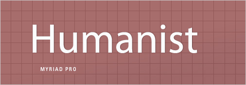
These are Sans faces that are derived from handwriting — as clean and modern as some of them may look, they still retain something inescapably human at their root. Compare the ‘t’ in the image above to the ‘t’ in ‘Geometric’ and note how much more detail and idiosyncrasy the Humanist ‘t’ has.
This is the essence of the Humanist Sans: whereas Geometric Sans are typically designed to be as simple as possible, the letter forms of a Humanist font generally have more detail, less consistency, and frequently involve thinner and thicker stoke weights — after all they come from our handwriting, which is something individuated. At their best, Humanist Sans manage to have it both ways: modern yet human, clear yet empathetic. At their worst, they seem wishy-washy and fake, the hand servants of corporate insincerity.
Examples of Humanist Sans: Gill Sans, Frutiger, Myriad, Optima, Verdana.
3. Old Style
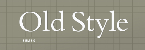
Also referred to as ‘Venetian’, these are our oldest typefaces, the result of centuries of incremental development of our calligraphic forms. Old Style faces are marked by little contrast between thick and thin (as the technical restrictions of the time didn’t allow for it), and the curved letter forms tend to tilt to the left (just as calligraphy tilts). Old Style faces at their best are classic, traditional, readable and at their worst are… well, classic and traditional.
Examples of Old Style: Jenson, Bembo, Palatino, and — especially — Garamond, which was considered so perfect at the time of its creation that no one really tried much to improve on it for a century and a half.
4. Transitional and Modern
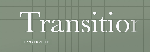
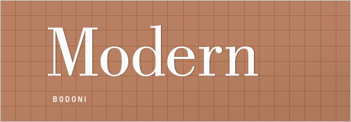
An outgrowth of Enlightenment thinking, Transitional (mid 18th Century) and Modern (late 18th century, not to be confused with mid 20th century modernism) typefaces emerged as type designers experimented with making their letterforms more geometric, sharp and virtuosic than the unassuming faces of the Old Style period. Transitional faces marked a modest advancement in this direction — although Baskerville, a quintessential Transitional typeface, appeared so sharp to onlookers that people believed it could hurt one’s vision to look at it.
In carving Modernist punches, type designers indulged in a kind of virtuosic demonstration of contrasting thick and thin strokes — much of the development was spurred by a competition between two rival designers who cut similar faces, Bodoni and Didot. At their best, transitional and modern faces seem strong, stylish, dynamic. At their worst, they seem neither here nor there — too conspicuous and baroque to be classic, too stodgy to be truly modern.
- Examples of transitional typefaces: Times New Roman, Baskerville.
- Examples of Modern serifs: Bodoni, Didot.
5. Slab Serifs
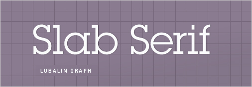
Also known as ‘Egyptian’ (don’t ask), the Slab Serif is a wild card that has come strongly back into vogue in recent years. Slab Serifs usually have strokes like those of sans faces (that is, simple forms with relatively little contrast between thick and thin) but with solid, rectangular shoes stuck on the end. Slab Serifs are an outlier in the sense that they convey very specific — and yet often quite contradictory — associations: sometimes the thinker, sometimes the tough guy; sometimes the bully, sometimes the nerd; sometimes the urban sophisticate, sometimes the cowboy.
They can convey a sense of authority, in the case of heavy versions like Rockwell, but they can also be quite friendly, as in the recent favorite Archer. Many slab serifs seem to express an urban character (such as Rockwell, Courier and Lubalin), but when applied in a different context (especially Clarendon) they strongly recall the American Frontier and the kind of rural, vernacular signage that appears in photos from this period. Slab Serifs are hard to generalize about as a group, but their distinctive blocky serifs function something like a pair of horn-rimmed glasses: they add a distinctive wrinkle to anything, but can easily become overly conspicuous in the wrong surroundings.
Examples of Slab Serifs: Clarendon, Rockwell, Courier, Lubalin Graph, Archer.
3. Don’t Be a Wimp: The Principle of Decisive Contrast
So, now that we know our families and some classic examples of each, we need to decide how to mix and match and — most importantly — whether to mix and match at all. Most of the time, one typeface will do, especially if it’s one of our workhorses with many different weights that work together. If we reach a point where we want to add a second face to the mix, it’s always good to observe this simple rule: keep it exactly the same, or change it a lot — avoid wimpy, incremental variations.
This is a general principle of design, and its official name is correspondence and contrast. The best way to view this rule in action is to take all the random coins you collected in your last trip through Europe and dump them out on a table together. If you put two identical coins next to each other, they look good together because they match (correspondence). On the other hand, if we put a dime next to one of those big copper coins we picked up somewhere in Central Europe, this also looks interesting because of the contrast between the two — they look sufficiently different.
What doesn’t work so well is when put our dime next to a coin from another country that’s almost the same size and color but slightly different. This creates an uneasy visual relationship because it poses a question, even if we barely register it in on a conscious level — our mind asks the question of whether these two are the same or not, and that process of asking and wondering distracts us from simply viewing.
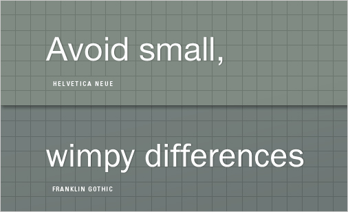
When we combine multiple typefaces on a design, we want them to coexist comfortably — we don’t want to distract the viewer with the question, are these the same or not? We can start by avoiding two different faces from within one of the five categories that we listed above all together — two geometric sans, say Franklin and Helvetica. While not exactly alike, these two are also not sufficiently different and therefore put our layout in that dreaded neither-here-nor-there place.
If we are going to throw another font into the pot along with Helvetica, much better if we use something like Bembo, a classic Old Style face. Centuries apart in age and light years apart in terms of inspiration, Helvetica and Bembo have enough contrast to comfortably share a page:
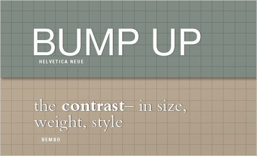
Unfortunately, it’s not as simple as just picking fonts that are very, very different — placing our candy cane font next to, say, Garamond or Caslon does not guarantee us typographic harmony. Often, as in the above example of Helvetica and Bembo, there’s no real explanation for why two faces complement each other — they just do.
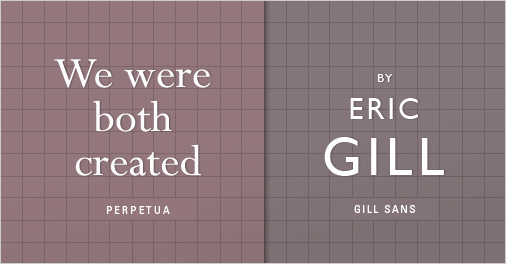
But if we want some principle to guide our selection, it should be this: often, two typefaces work well together if they have one thing in common but are otherwise greatly different. This shared common aspect can be visual (similar x-height or stroke weight) or it can be chronological. Typefaces from the same period of time have a greater likelihood of working well together… and if they are by the same designer, all the better.
4. A Little Can Go a Long Way
‘Enough with all these conventional-looking fonts and rules!’ you say. ‘I need something for my rave flyer! And my Thai restaurant menu! And my Christmas cards!’ What you’re pointing out here is that all the faces I’ve discussed so far are ‘body typefaces’, meaning you could conceivably set a whole menu or newspaper with any of them; in the clothing analogy presented in part one, these are our everyday Levis. What of our Halloween flares?
Periodically, there’s a need for a font that oozes with personality, whether that personality is warehouse party, Pad Thai or Santa Claus. And this need brings us into the vast wilderness of Display typefaces, which includes everything from Comic Sans to our candy-cane and bunny fonts. ‘Display’ is just another way of saying ‘do not exceed recommended dosage’: applied sparingly to headlines, a display font can add a well-needed dash of flavor to a design, but it can quickly wear out its welcome if used too widely.
Time for another clothing analogy:
(Photo credit: Betsssssy. Used under Creative Commons license.)
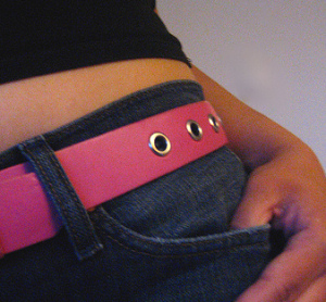
Betsey’s outfit works because the pink belts acts as an accent and is offset by the down-to-earthiness of blue jeans. But if we get carried away and slather Betsey entirely in pink, she might wind up looking something like this:

(Photo credit: Phillip Leroyer). Used under Creative Commons license.)
Let’s call this the Pink Belt Principle of Type: display faces with lots of personality are best used in small doses. If we apply our cool display type to every bit of text in our design, the aesthetic appeal of the type is quickly spent and — worse yet — our design becomes very hard to read. Let’s say we’re designing a menu for our favorite corner Thai place. Our client might want us to use a ‘typically’ Asian display face, like Sho:

So far, so good. But look what happens when we apply our prized font choice to the entire menu:
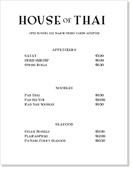
Enough already. Let’s try replacing some of the rank-and-file text copy with something more neutral:
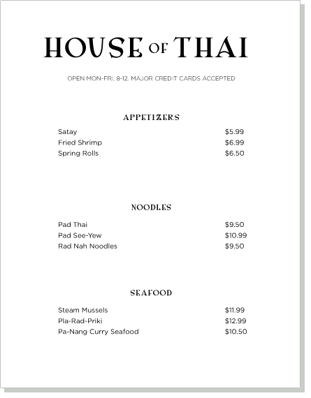
That’s better. Now that we’ve reined in the usage of our star typeface, we’ve allowed it to shine again.
5. Rule Number Five Is ‘There Are No Rules’
Really. Look hard enough and you will find a dazzling-looking menu set entirely in a hard-to-read display font. Or of two different Geometric Sans faces living happily together on a page (in fact, just this week I wound up trying this on a project and was surprised to find that it hit the spot). There are only conventions, no ironclad rules about how to use type, just as there are no rules about how we should dress in the morning. It’s worth trying everything just to see what happens — even wearing your Halloween flares to your court date.
In Conclusion
Hopefully, these five principles will have given you some guidelines for how to select, apply and mix type — and, indeed, whether to mix it at all. In the end, picking typefaces requires a combination of understanding and intuition, and — as with any skill — demands practice. With all the different fonts we have access to nowadays, it’s easy to forget that there’s nothing like a classic typeface used well by somebody who knows how to use it.
Some of the best type advice I ever received came early on from my first typography teacher: pick one typeface you like and use it over and over for months to the exclusion of all others. While this kind of exercise can feel constraining at times, it can also serve as a useful reminder that the quantity of available choices in the internet age is no substitute for quality.
Other Resources
You may be interested in the following articles and related resources:
- Typedia Type Classifications A more extensive list of different categories and sub-categories of typefaces than the simplified version presented in this article.
- So You Need A Typeface? Useful — and humorous — flowchart for selecting type, brought to you by Julian Hansen via Inspiration Lab.
- The Elements of Typographic Style by Robert Bringhurst Link to the Amazon.com order page for this 1992 classic.
- Best Practices of Combining Typefaces This article takes a close look at some of the best practices for combining typefaces — as well as some blunders to avoid.
Further Reading on SmashingMag:
- How To Choose The Right Face For A Beautiful Body
- The @Font-Face Rule And Useful Web Font Tricks
- Best Practices of Combining Typefaces
- Avoiding Faux Weights And Styles With Google Web Fonts


 Try ProtoPie AI free →
 Register Free Now
 Celebrating 10 million developers

 SurveyJS: White-Label Survey Solution for Your JS App


