Showcase of Beautiful (Or Creative) E-Commerce Websites

Email Newsletter
Weekly tips on front-end & UX.
Trusted by 182,000+ folks.
 Register for Free
 Celebrating 10 million developers
 Custom Web Forms for Angular, React, & Vue. Your backend.


Designers are constantly striving to create eye-catching designs without losing the usability features that add significant importance to the experience of online shopping. Today’s showcase presents a variety of websites with elegant design solutions and innovative design techniques. We have analyzed the designs and now discuss their advantages and disadvantages in this review.
We also suggest improvements and further ideas that could help improve shopping experience on these sites. Hopefully, you can learn something useful from our thoughts.
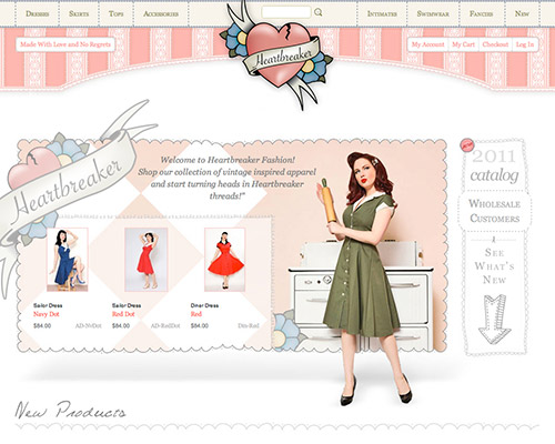
Heartbreaker Fashion
With clothing inspired by ’50s and ’60s fashion, pin-up girls and vintage culture, Heartbreaker’s design nicely fits the company’s profile, with its pastels and retro textures. Good use of dotted and dashed borders, which separate the various elements rather delicately. Notice how well the designers keep the vintage theme across the product and category pages, with nice attention to detail for the credit card icons in the footer.
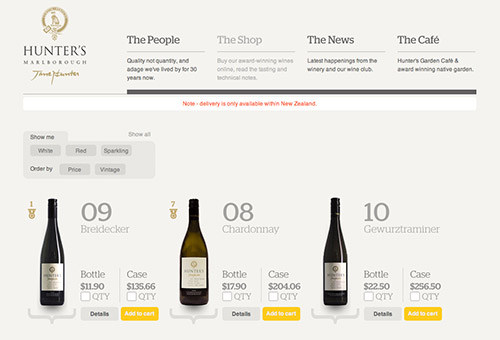
Hunter’s Wines
Hunter’s Wines is an online wine store. The front page introduces some dynamics in its grid by placing text blocks next to each other in a somewhat chaotic manner. Notice how well the design separates sections of the pages by using yellow color in the background of the wine bottles. Product pages contain an interactive, sophisticated search filter, backed by a pastel color scheme and beautiful typography that nicely fits the overall feel of the site. The color of the text on call-to-action buttons could be improved.
Also, we have doubts about some elements on the page. A symbol under the wine bottles doesn’t really have any purpose and the arrow in the right upper corner of sections in product pages doesn’t seem to work properly. Overall, a very nice design which could use just a bit of rethinking to improve the shopping experience.
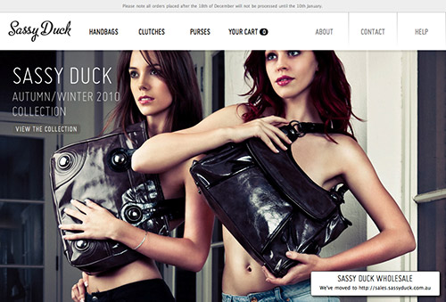
Sassy Duck
Sassy Duck is a young fashion-forward handbag brand that creates luscious accessories for the modern woman. This website literally elicits a hunger for those female accessories. Again, large product photography is striking on the website, trying to evoke an emotional response from the site’s visitors. It’s interesting that the overview pages do not contain prices — they are displayed only once the visitor hovers over the product image. The call-to-action buttons could use some :hover, :focus and :active states to make the buttons a bit more responsive. The horizontal product navigation pans across as the mouse nears the edge of the page. A nice example of how an e-commerce website can work with a minimal amount of text.
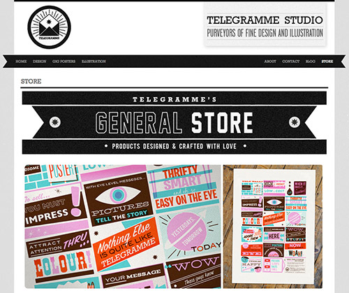
Telegramme Studio
Probably the most eye-catching detail in Telegramme Studio’s design is vivid, high-resolution product typography displayed in the horizontal slideshow in the upper area of the front page. The slideshow might be moving a bit too quickly for some visitors. The grid remains consistent across the pages, always focusing on the designs produced by the agency. A nice example of a site on which high quality product shots are integral to each page.
Oi Polloi
Oi Polloi is small retail store based in the Northern Quarter, Manchester, UK. This website design is (again) in retro style, supported by the typewriter-style typograph and old print-style textures. They capture the Oi Polloi brand well. The navigation menu is a good old drop-down which doesn’t quite work, especially because the page has six of them on top. This requires a bit more clicks than you’re used to on an e-commerce website. When you roll over an item on a product page, a tooltip provides details about available (and unavailable) colours and sizes. It might be useful including these options in the search as well.
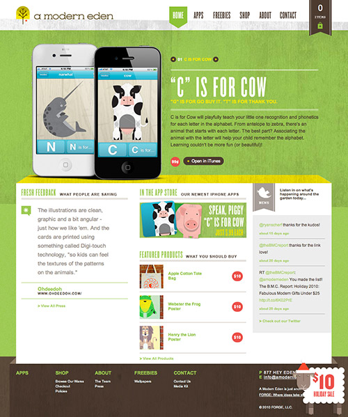
A Modern Eden
A Modern Eden sells posters and iPhone applications. The design also features a large horizontal slideshow area on which all illustrations have a nice shadow to make them look a bit more realistic. The fonts used are chosen carefully and used consistenly throughout the design. The shopping basket ribbon placed next to the main navigation in the right upper corner is a nice touch. Product pages are nicely designed, with attractive green call-to-action buttons. It’s interesting how the designers display the price tag: it’s put somewhat above the product item’s title with a red circle in the background.
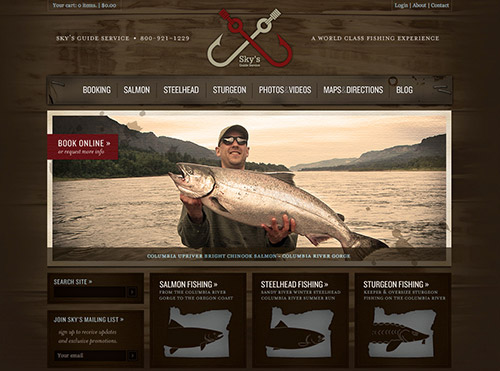
Sky’s Guide Service
Sky’s Guide is a wonderful example of what a service website can look like with a quality set of textures and images. The choice of colors for design elements and body copy nicely complements the theme of the website and logo of the company (dark red and light brown). Call-to-action buttons are carefully designed to stand out against other elements and capture the user’s attention.
Notice a simple yet striking grid in the footer and a consistent use of fonts across the site. However, the site misses subtle hover effects to make the experience a bit more responsive. The font size of some texts on the site could be increased as well.
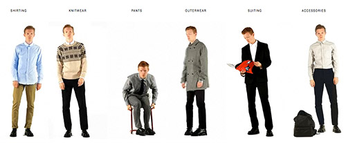
Patrik Ervell
Patrik Ervell demonstrates innovation at its finest. Category pages present a Flash video of the clothes being modelled on an actual male model, giving the customer a sense for how the clothing would actually look on them. The website also gracefully degrades to static images for browsers without Flash support. A very interesting take on the modern clothing website, and good use of white space. Unfortunately, the product page does not have a Flash video, although it might be a bit annoying if it did. The typography could be improved a bit to make the texts more readable and more pleasing to read.
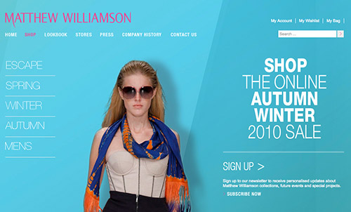
Matthew Williamson
Designer fashion outlet Matthew Williamson demonstrates good use of fonts, contrast and high-quality images. The product pages allow users to zoom in and out to take a closer look at the shop items. Also, the product page provides a size guide, a delivery guide, a return guide for customers as well as comprehensive product details. The website does not feel particularly dynamic, though; the sidebar navigation has to reanimate after each page load. The splash page isn’t necessary, either. An example of how beautiful imagery doesn’t quite work when overall usability of the website isn’t good enough.
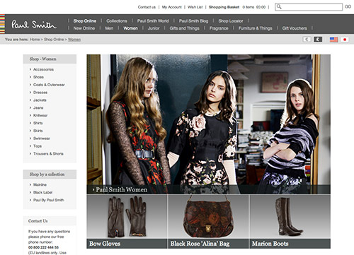
Paul Smith
The Paul Smith website has an elegant design that emphasizes the quality of the brand. There is something quite appealing about the simple navigation at the top, especially the logo and colored horizontal stripes. The main shop page has a bottom-top navigation (instead of the traditional drop-down) which is not quite intuitive at the first glance. What is striking is that each product page has plenty of high-quality product images which is unfortunately not that usual on e-commerce websites.
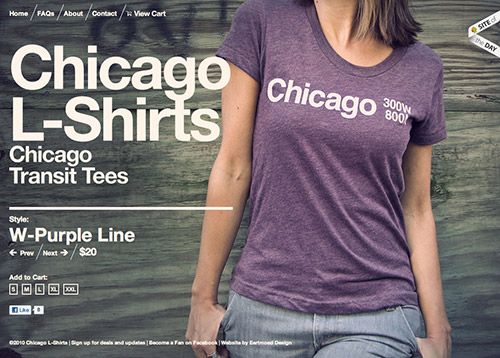
Chicago L-Shirts
Chicago L-Shirts is big and bold on Helvetica and the dark processed vintage illustrations. The website is unique and hits you straight away with the featured product on sale, which fills the entire background. What’s interesting is that the shop doesn’t really have an overview page on which all t-shirts would be presented. Instead, the visitor has to navigate using “Prev” and “Next” links. And actually, it works quite well, because there are not so many t-shirts to browse through. A nice example of a shop which makes sure that every product page has a strong photographic presence. Unfortunately, arrows in the navigation aren’t clickable and different views (e.g. side view) of every t-shirt aren’t available.
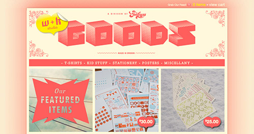
W+K Studio
WK Studio sells various stationary, t-shirts and children’s clothing. The color scheme is warm and friendly, and so is the stylish navigation and large product previews. Built on the BigCartel shopping cart, the shopping experience is pleasurable for a small store. Notice the lovely price tags shaped in the form of the heart which is an essential part of the studio’s logo. The color and typography of the body copy could be improved, and so could the typography. Very simple design that doesn’t look too simple because of the very well thought-out style and theme of the site.
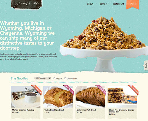
Marie Catrib’s
Probably the most striking attribute of this website is its playfulness. The typography is inviting and attractive and makes the reading experience pleasurable. The navigation menu on the top is very simple, but nice; subtle use of texture fits nicely to the style of the website. Also, notice the dashed horizontal line on the top and the decorative ellipses spinned in the footer of the page. When you hover on an item on the products overview page, two additional navigation options appear: “More info” and “+ Cart” which is a nice example of a context-sensitive navigation. Great use of subtle colors, textures and bold fonts bring out the tastiness of the freshly baked bread and confectioneries offered at Marie Catrib’s.
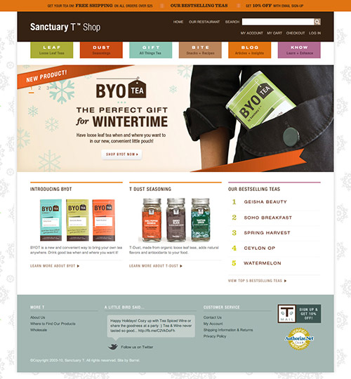
Sanctuary T Shop
The landing page for Sanctuary T really helps to sell the brand and welcome customers. Best-selling teas are beautifully listed underneath the large eye-catching slideshow. New products are introduced using striking, pleasing and eye-catching illustrations. The site uses many colors (7 on the front page), and although they do fight for user’s attention, they actually never really get in the way. The typography is pleasant and inviting, however, mostly images are used to embed the fonts on the pages (and sometimes, Cufón is used). Notice how wonderfully the designers use tea cups to display the rating of every tea. Sanctuary T is a prime example of a website that brings the best out of square-edge elements and white space dividers.
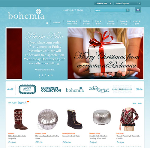
Bohemia
There is certainly a lot to like about this website: the blended shades of blues, contrasting orange highlights, delicately patterned borders (complemented with an equally elegant choice of typography) and the subtle shadows on the roll-over navigation tabs. The design shows a lot of attention to small details, be it texture in the background or a “telephone” icon in the footer which works very well with the style of the site. The mega drop-down menu looks nice and stands out on hover. The page has a lot of whitespace, especially on overview pages and product pages and makes the shopping experience lightweight and easy.
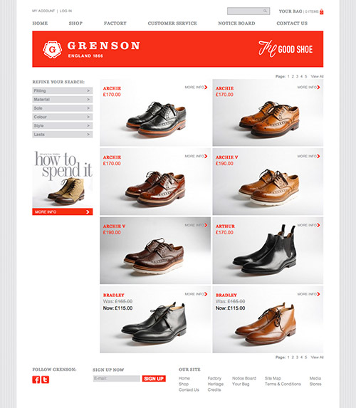
Grenson
Grenson is exemplary for a very strong and consistent grid layout. The design is accentuated with red highlights. The most striking element of the website is the roll-over product previews on single product pages, which automatically zooms in and pans to wherever the mouse is. It’s quite a nice touch and removes the extra clicks required to zoom and pan. A clean and good design without distractions and unnecessary trickery.
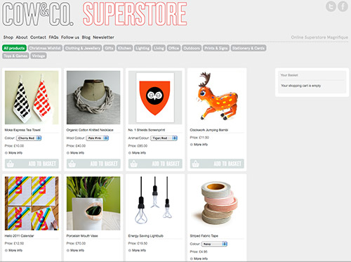
Cow&Co. Superstore
Cow&Co demonstrates good use of interactive elements in the filtered navigation to make page selection a little more interesting. Adding items to the basket is quick and easy, and a lot of the navigation occurs without having to reload the page. The designers of the shop do not highlight “Add to basket” buttons, although it would actually make it just a bit easier if the buttons would stand out a bit more. The interesting part is that when you click on a product image on the overview page, the details are displayed on the right, without the page being reloaded. It’s hard to say if it’s a good idea or not: this behvaior might be a bit confusing for visitors who wouldn’t be able to locate the detail page. It would be useful to highlight it in some way when it appears after the click, though.
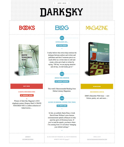
Dark Sky
Dark Sky’s website shows how dots can be used to build and structure the layout of the page. The typography is just wonderful: attractive, yet not too eye-catching to distract. Notice the whitespace in the vertical grid layout and on the product pages. Call-to-action-buttons have the same background color as many other elements on the page which may be a bit confusing at first. However, other colors probably wouldn’t work that well together with other elements.
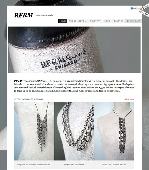
RFRM
By itself, RFRM would be a very simple and not that remarkable website with handmade, vintage inspired jewelry. What sets this online shop apart from other sites is that the centrepiece of the website is the large window, or “hole,” that exposes the background layer image below. When you scroll the website, it feels like you’re looking out of the window — which looks very interesting and unusual.
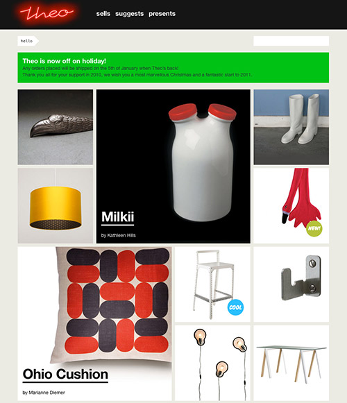
Theo
This website doesn’t look remarkable, but it uses a nice design technique that helps it stand out. Each product page has a large seamless header that creates a large frame for the product. This allows for large product shots of background images that can be used on each page. Interesting idea that may find its place in your e-commerce website as well. The downside of the design is the not so comforable navigation: all navigation items are always hidden in the horizontal navigation on the top of every page.
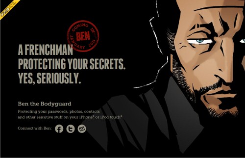
Ben The Bodyguard
This website of an upcoming app for iPhone or iPod touch has been discussed a lot over the last months, and rightly so. The site is a remarkable example of how an original, innovative design can bring a lot of attention to the site that actually hasn’t been released yet. As you scroll the page down, Ben the Bodyguard is following you through the city, leaving comments about the neighbourhood and services he provides. There are also some tricks which become apparent if you try resizing your browser. Ben’s path ends at the e-mail subscription box. Wonderful idea, wonderfully executed. A wonderful example of storytelling. The Web could use more websites like this one.
In Conclusion
It goes without saying: large high quality product shots are a key element of success on e-commerce websites. JavaScript-based image slideshows of products, elegant rich typography and meaningful use of white space all enhance the shopping experience and increase conversion rates.
Some good websites experiment with innovative design techniques, yet all good websites pay a lot of attention to the look and feel of every single design element, be it a shopping cart, search box or headings. We are looking forward to more beautiful and usable e-commerce websites appearing online in the months to come.
Further Reading
- The Current State Of E-Commerce Filtering
- A Little Journey Through (Small And Big) E-Commerce Websites
- How To Plan Your Next Mobile E-Commerce Website
- An Exploration Of Carousel Usage On Mobile E-Commerce Websites


