Mastering Photoshop: Noise, Textures, Gradients and Rounded Rectangles
Email Newsletter
Weekly tips on front-end & UX.
Trusted by 182,000+ folks.
 Celebrating 10 million developers
 Custom Web Forms for Angular, React, & Vue. Your backend.


Often, it’s the little details that turn a good layout into a great design; details such as subtle textures, shading and smooth shapes. Photoshop contains a vast array of tools for embellishing a design, but choosing the right one isn’t always easy. Being the obsessive-compulsives that we are, we’ve conducted a huge range of experiments to determine the benefits and disadvantages of each technique. Here, then, is an obsessive-compulsive’s guide to some frequently used tools and techniques for Web and UI design in Photoshop.
You may want to take a look at the following related posts:
- Techniques For Creating Custom Textures In Photoshop
- The Whys And The Hows Of Textures In Web Design
- Pixel Perfection When Rotating, Pasting And Nudging In Photoshop
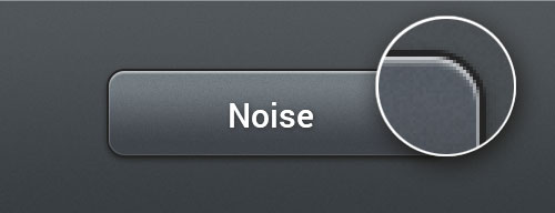
Noise and Textures
Subtle noise or texture on UI elements can look great, but what’s the best way to add it? Our goal is to find the best method that maintains quality when scaled but that is also easy to implement and edit. To find out which is best, we’ll judge each method using the following criteria:
- Number of layers used: fewer is better.
- Ability to scale: if the document is resized, will the effect maintain its quality?
- Can the noise be on top of the Color and Gradient layer styles?
- Can the method be used with any texture, not just noise?
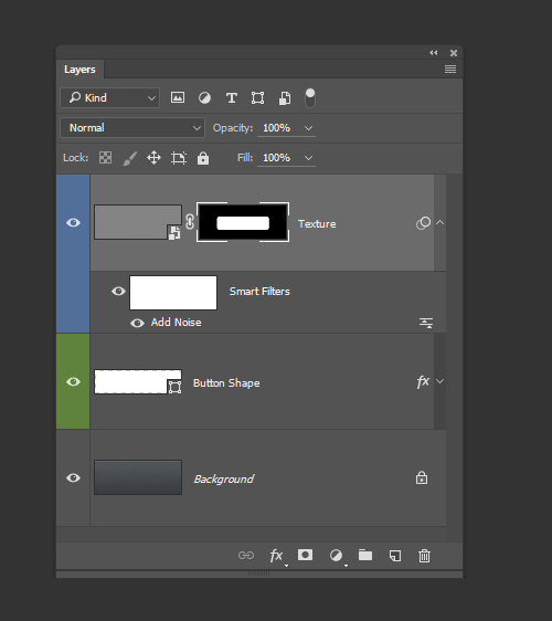
1. Bitmap Layer With Noise
Probably the most obvious method for adding texture to a shape is to create a normal bitmap layer, fill it with a color, select Filter → Noise → Add Noise, then apply a mask or Vector Mask to match the element you’re adding noise to.
Using a high amount of noise, setting the layer blending mode to Luminosity and reducing the opacity will yield the most control over the noise with the least disturbance to the underlying layers. A noise setting of 48% gives a high dynamic range without clipping the noise. (Clipping results in higher contrast, which might not be desirable.)
- Layers: 2
- Scales: No, texture will have to be recreated if the document is scaled
- Works with Color and Gradient layer styles: Yes
- Works with any texture: Yes
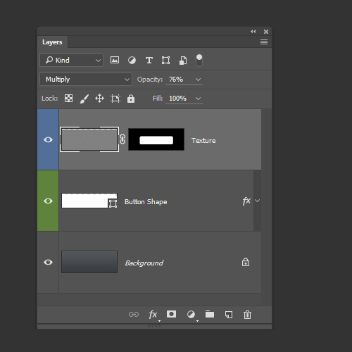
2. Inner Glow Layer Style
Adding an Inner Glow layer style with the source set to center and the size to 0 will let you use the noise slider to add texture to any layer. It’s a good solution, provided you’re not already using the Glow layer style for something else. The noise is added above the Color, Gradient and Pattern layer styles, which is great.
Unfortunately, the noise can only lighten or darken the underlying elements. The previous bitmap layer method can add highlights and shade at once while maintaining the average luminosity, and it looks far better in my opinion.
- Layers: 1
- Scales: Yes, texture will be remade automatically
- Works with Color and Gradient layer styles: Yes
- Works with any texture: No
3. Smart Object with Filter
Create a Solid Color layer, convert it to a Smart Object, select Filter → Noise → Add Noise, apply a Vector Mask to match your element, set the layer blending mode to Luminosity and reduce the layer’s opacity.
It’s a fairly involved process, but it can accommodate a combination of effects that can be remade if the document gets scaled.
- Layers: 2
- Scales: Yes, texture will be remade automatically
- Works with Color and Gradient layer styles: Yes
- Works with any texture: No
4. Pattern Overlay Layer Style
Start by creating a noise or repeating pattern in a new document, then choose Edit → Define Pattern. Once you’ve defined the pattern, it will be available in the Pattern Overlay layer style options. As with previous methods, using Luminosity as a blending mode and reducing the opacity to suit it yield great results.
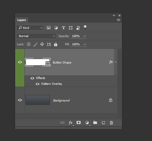
The Pattern layer style is composited below the Color and Gradient styles, ruining an otherwise perfect noise and texture method. However, you can create a second layer that just holds the texture if you need to, or start with a Gradient Fill layer, sidestepping the limitation.
- Layers: 1
- Scales: Yes, but you’ll need to change the Layer style scale to 100% after scaling
- Works with Color and Gradient layer styles: No, the pattern appears underneath
- Works with any texture: Yes
Which Method Is Best?
Although a little cumbersome, creating a Gradient Fill layer, adding a Pattern layer style, then creating a Vector Mask seems to be the best method possible. This can be used to create flexible, scalable and editable single-layer UI elements with texture. As a bonus, Gradient Fill layers can be dithered and so also produces the highest quality results (Gradient layer styles cannot be dithered).
We’ve created some examples below and included the source document so that you can see how they were built.
Download the PSD (.zip)
Rounded Rectangles
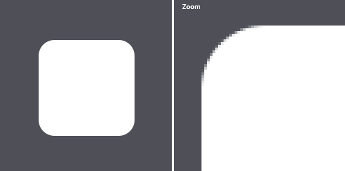
Rounded rectangles, or “roundrects” as QuickDraw so fondly calls them, are standard fare on a Web and interface designer’s utility belt. They’re so common that it’s rare for Web pages or apps to not contain a roundrect or two. Unfortunately, pixel-locked rounded rectangles can actually be fairly difficult to draw in Photoshop. (By pixel-locked, I mean that every edge falls on an exact pixel boundary, creating the sharpest object possible.)
Experienced Photoshop users will probably already know one or two ways to draw a roundrect. Hopefully, after reading this article, they’ll also know a couple more, as well as which methods produce pixel-perfect results.
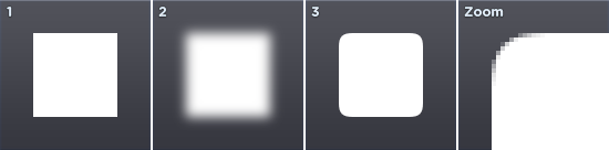
1. Rounded Rectangle Vector Tool
Photoshop’s Rounded Rectangle vector tool is the ideal candidate for the task. The result is perfect roundrects, every time. And the corner radius can be altered during or after drawing the shape (Window > Properties). On the positive side, keeping your objects as vectors means that you’ll be able to resize the document and the corners will take full advantage of any extra resolution. There is one small caveat though: if you resize, you’ll have to do it as an exact multiple, or risk fuzzy non-pixel–locked edges.
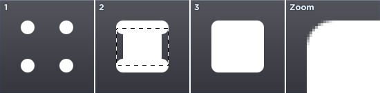
2. Blur
The blur method is a bit of a hack that involves creating a selection, blurring it, then increasing the contrast so that you’re left with a sharp mask that’s antialiased nicely.
It’s seven steps in total and is prone to being inaccurate; plus, the radius of the corners can’t be changed on the fly. Applying levels can also be a bit fiddly. One advantage is that different levels settings can be used to obtain different degrees of antialiasing, from incredibly soft to completely aliased.
- Create a new layer.
- Draw a rectangular selection.
- Enter quick mask (
Q). - Gaussian blur by half the radius that you’d like for the rounded corners. (For example, a 10-pixel radius would need a 5-pixel blur.)
- Apply Levels (
Command + L), and use about 118 for the black point and 137 for the white point on the input levels. - Exit quick mask (
Q). - Fill selection.
On the positive side, this blur method can be used to quickly create some interesting and organic shapes that would be difficult to draw by hand.

3. Circles
The circles method is very accurate and easily reproducible, but has a whopping 13 steps. That’s a lot of clicking for just a single roundrect.
- Create a new layer.
- Make a circular selection that is twice as large as the radius you would like (for example, a 10-pixel radius would require a 20x20-pixel circle).
- Fill the selection.
- Move the selection right. This can be done quickly by holding down Shift and pressing the right-arrow key a few times.
- Fill the selection.
- Move the selection down.
- Fill the selection.
- Move the selection left.
- Fill the selection.
- Make a rectangular selection that covers the entire vertical span of the roundrect but that starts and ends halfway through the circles at the ends.
- Fill the selection.
- Make a rectangular selection that covers the entire horizontal span of the roundrect but that starts and ends halfway through the circles at the ends.
- Fill the selection.
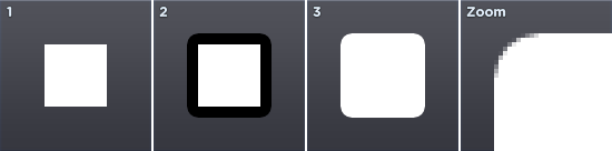
4. Stroke
The stroke method is very accurate, easily reproducible and has only about four steps, depending on the result you’re after. The corners are a bit sharper than those of the circle method, though. That may be a good thing or a bad thing, depending on your preference.
- Create a new layer.
- Draw a rectangular selection that is smaller than the area you require (smaller by double the radius, if you want to be exact).
- Fill the selection.
- Add a stroke as a layer style that is as thick as the corner radius you would like.
If you’d like to flatten the object to remove the stroke, keep following the steps below.
- Create a new layer.
- In the Layers palette, select the new layer and the previous layer.
- Merge layers (
Command + E).
It’s possible to automate the flattening with a Photoshop Action. This can also be set up as a function key to speed things up further.
A huge advantage of the stroke method is that it’s dynamic, so the radius can be edited in real time. It can also be used to easily create other rounded shapes, as seen below.
Which Method Is Best?
In most cases, using the Rounded Rectangle tool will give great results and be the quickest method.
Gradients
Gradients are a great way to add life-like lighting and shading to surfaces. When built with gradient layers and layer styles, they also ensure that UI elements can be scaled and reused easily.
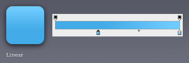
Linear Gradients
Linear gradients are gradients in their most basic form — a gradual blend of colors and following a straight line. I’m sure you knew that, so onto the more interesting stuff.
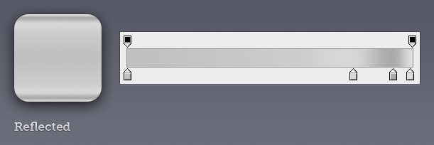
Reflected Gradients
Reflected gradients are like their linear friends, but they repeat the gradient twice, with the second repeat mirrored. This makes editing a little less tedious, provided it fits the result you’re after.
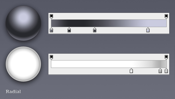
Radial Gradients
Radial gradients start from the center (or any chosen point) and grow outward in a circular pattern. They’re handy for creating spheres and applying effects to the edge of circular elements. The center point of the gradient can be moved by clicking and dragging on the canvas while the gradient window or layer styles window is open.
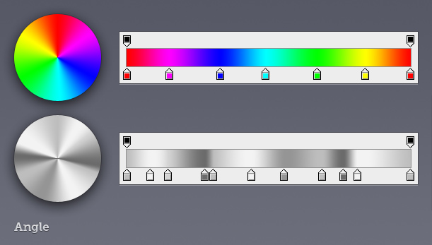
Angle Gradients
Angle gradients can be a great way to mimic environmental reflections found on highly polished metallic objects. The center point of the gradient can be moved by clicking and dragging on the canvas while the gradient window or layer styles window is open.
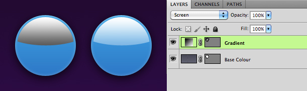
Gradients on Gradients
Anything worth doing is worth overdoing, right? Combining a gradient layer with a gradient layer style lets you overlay two different gradients, giving more complex and — here’s the good part — completely dynamic results. To combined the gradients, you’ll need to set a blending mode for the gradient layer style. For the examples below, I’ve used either Screen (good for lightening) or Multiply (good for darkening).
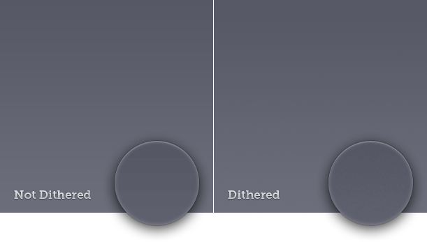
Dithering Is Everything
Adding dithering to a gradient produces smoother results. Non-dithered gradients often contain visible banding. Dithering is even more important if your artwork is being viewed on cheaper 6-bit per channel TN LCDs and certain display types that tend to amplify posterization problems.
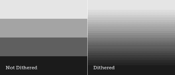
If you’re not seeing the difference, here’s an extreme and completely unrealistic example of gradient dithering in action:
Ensuring that your gradients are dithered is easy: just check the appropriate box in Photoshop.
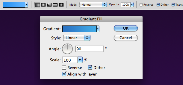
Note that gradient layer styles can’t be dithered, and gradients in placed objects (such as stuff you’ve pasted from Illustrator) aren’t dithered.
If you use transparency in a gradient, that won’t be dithered either, which can be a huge issue at times. There is a solution for some specific cases: if you’re using a gradient with transparency to lighten an area with white, then using a non-transparent gradient with a Screen Layer blending mode will let you dither it. The same technique can be used for darkening with the Multiply blending mode.
A combination of the gradient techniques described above were used to create the Mac app icon below.
![]()
Gradient Maps
Quite different to other types of gradients, gradient maps can be a great way to add color treatment, allowing for very precise control. Gradient maps use the brightness of each pixel to map to a corresponding color in a gradient.
If the gradient starts at red and ends at blue, then everything white in the image will turn red, and everything black will turn blue. Everything in the middle tonally will map to the gradient, depending on how bright it is.
The image below was used in a poster for Kingswim, a swimming school:

With a gradient map. Large view
Without the gradient map, things look quite different. It’s a composite of about seven photos; the boy and background were shot on black and white film with intentionally low contrast so that the grain would be more prominent when the contrast was pushed by the gradient map. The gradient map also hides the color mismatches in the compositing.
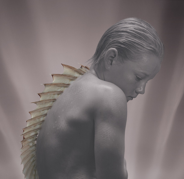
Gradient map off. Large view
A Little Obsessed?
Absolutely. I conducted all of the tests above to learn more about some common techniques that I already use: that is, to reassess and fine tune, with the aim of improving my designs. Creating great artwork without intimately knowing your tools is certainly possible, but the more you know, the more likely you are to work faster and with greater confidence.
(al), (dm)


