10 Useful Typography Tips For Adobe Illustrator
Typography is not only an all-important aspect of design, it is also an art form in and of itself. Choosing the right font, the perfect spacing and even the correct shape of text can be an important factor as to whether a project fails or succeeds. Although Illustrator is not really used for multiple-paged projects, many would agree that it is one of the most powerful applications for creating vector graphics, such as logos, and it is also often used for one-page documents, such as business cards, posters, or postcards.
Since we can easily transfer graphics from Illustrator to Photoshop and InDesign, designers often use Illustrator to create vector type that they can then incorporate into projects in another program. For instance, you can create a nice type design within Illustrator, then add some extra effects in Photoshop. Or you may need to design a text illustration within Illustrator to place within your brochure project in InDesign.
Further Reading on SmashingMag:
- Drawing A Cartoon In Illustrator
- 40 Excellent Adobe Illustrator Tutorials
- 35 Excellent Adobe Illustrator Video Tutorials
- 35 Incredible Digital Painting Tutorials
If you have never taken the time to explore the type side of Illustrator, you may be surprised at the powerful tools that Illustrator provides for working with type. Similar text features found in Photoshop and InDesign are also available in Illustrator — only Illustrator comes with its own unique set of typographical features as well. So for those of you who use another Adobe Suite program, you will easily catch on to Illustrator’s type idiosyncrasies.
No matter what your purpose for working with type in Illustrator is, as a designer, you will not only improve your work, but also save valuable time by knowing the different typographical tools available. Here, we will focus on some of the most important aspects of typography that every Illustrator user should know:
- Metric vs. Optical Kerning
- Roman Hanging Punctuation
- The Glyphs Panel
- Hyphens and Dashes
- Styles Panels
- Placing Type on a Path
- Point Type vs. Area Type
- Creating Columns of Text
- Text Flow Between Containers
- Scaling Area Type Numerically
1. Metric Vs. Optical Kerning
Kerning is an important aspect of design. It has to do with the adjustment of space between letters in order to improve the visual treatment of typography, and Illustrator provides the right kerning tools for designers. In more recent versions of Illustrator’s CS series, three automatic kerning options are available: “Auto” (also known as metric), “Optical” and “Metrics – Roman Only.” In addition, manual kerning is available. All have their place in design, but knowing which one to use when can be confusing without some basic knowledge.
Auto, or metrics, kerning is built into type using kern pairs; for instance, all PostScript fonts have kern pairs built into them. Illustrator interprets this kerning code to determine how much space to put between certain letter combinations, such as “WA,” “LA,” “To” and “Ty.”
Optical kerning is also an automatic kerning option built into type but slightly different than the Auto option. It uses the shapes of the letters to determine the space to put between characters. Optical kerning works well when combining letters of more than one font or when a font has little to no kerning built in. Use manual kerning where possible, since it provides the highest level of control. Most often, though, one would use manual kerning only in display copy, headlines, business cards and other short blocks of text.
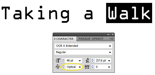
The “Metrics – Roman Only” option, which was added into Illustrator in the CS4 version, is for Japanese typography. This option adds kerning only to Roman glyphs or any character that rotates in vertical text. Basically, it works with Latin characters, such as Basic Latin or Latin Extended, and the half-width Katakana. To switch to Optical kerning, first select the text you wish to change. Then, under the Characters palette (Window → Type → Character), click on the Kerning drop-down menu. Then select “Optical.”
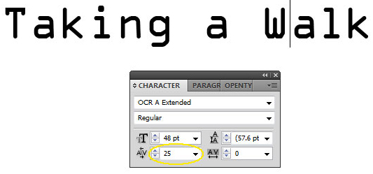
Or, if you would like to manually kern letters yourself, place the cursor between two letters, and choose a value in the Character palette:
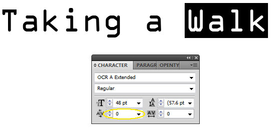
To turn off kerning between selected characters, set it to “0”:
Keep in mind that to adjust the value between entire groups of letters, you will have to use the tracking settings in the Character palette. The tracking is adjusted in the drop-down menu located to the right of the Kerning drop-down menu. Hover your mouse over the menu to see “Set the tracking for the selected characters,” as in the screenshot below:
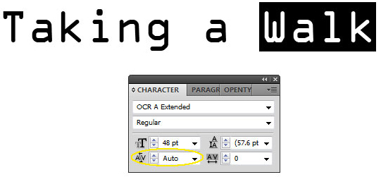
Illustrator’s default kerning is “Auto,” so simply select this if you would like to turn it back on.
Useful Tip: One excellent way to save yourself some time while designing is to use Illustrator’s keyboard shortcuts to change manual kerning and tracking settings. To change the kerning between two characters, simply place the cursor between the two letters. Then use Alt/Option + left/right arrow. The kerning will decrease with Alt/Option + left arrow and increase with Alt/Option + right arrow.
To change the tracking for an entire group of letters, first select the letters you want to change. As with kerning, use Alt/Option + left arrow to decrease tracking and Alt/Option + right arrow to increase tracking.
2. Roman Hanging Punctuation
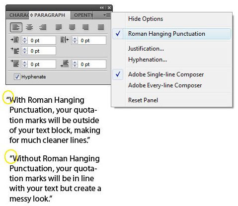
Roman hanging punctuation will give your blocks of text a clean appearance, taking your typography from amateur to pro. But what exactly is this tool that is hardly talked about? Turning on the Roman hanging option in Illustrator will make the text line up evenly by “hanging” quotation marks in the margin. Otherwise, quotations are set flush with text, within the margin.
To turn on Roman hanging punctuation, open the Paragraph tool panel, and click on the arrow on the upper right of the box. A drop-down menu will appear in which you can choose “Roman Hanging Punctuation.”
Keep in mind that you can turn on or off the Roman Hanging Punctuation for entire blocks of text. Just select the blocks of text and use the same drop-down menu to change the setting.
3. The Glyphs Panel
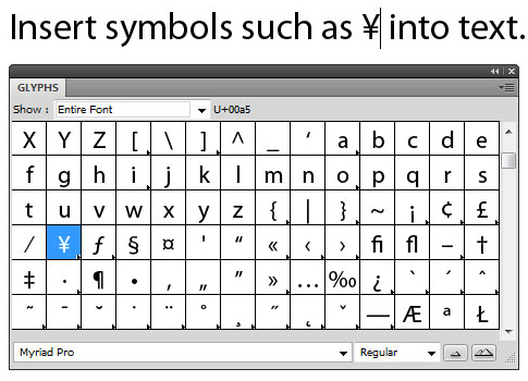
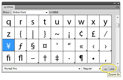
Glyphs are any characters found within a font family. The Glyphs panel in Illustrator is the place to locate font objects, from normal characters to the special symbols. Whatever font you have selected when you open the glyphs panel is the menu that will be displayed. Fortunately, you do not have to keep exiting the Glyphs panel every time you would like to see the glyphs for another font or see glyphs similar to the one you’ve selected. You can also keep the Glyphs panel open while moving your cursor to different locations in the document.
To open the Glyphs Panel, go to Window → Type → Glyphs. Click on a glyph to select it; double-click to insert it in the line of text. Illustrator places the character wherever your blinking text cursor is located.
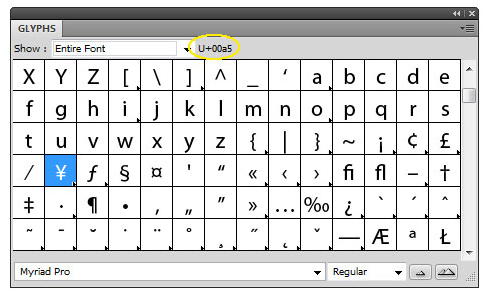
Hover your mouse over glyphs to see the Unicode (the name given to each character in the Glyphs panel); the Unicode is displayed at the top of the panel. Once you have found the glyph you would like to use, simply double-click on the character to insert it into your current project.
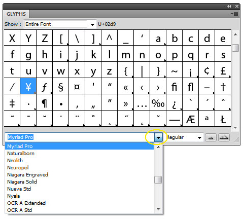
To see a different font, simply choose a different family and style from the drop-down boxes at the bottom of the panel.
To see the glyphs in a larger or smaller preview display, click on the zoom in and out buttons located in the lower-right corner of the panel.
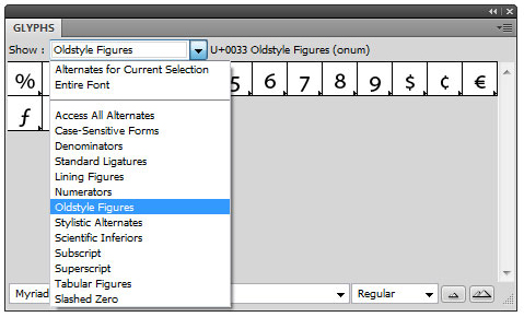
In the “Show” menu at the top of the panel, you can limit the type of characters displayed in that font; for instance, “Oldstyle Figures.”
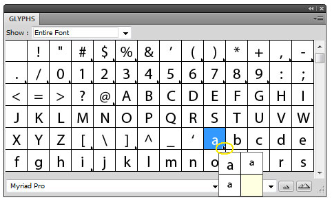
You might notice that some characters in a font include an arrow in the lower-right corner of the character box in the Glyphs panel. This arrow indicates that alternate glyphs are available for this character. To access these alternates, simply click and hold the character. Drag your cursor over the alternate glyph you would like to use, and release the mouse. The glyph should now be inserted in the text.
4. Hyphens and Dashes
One of the easiest ways to disqualify yourself as a professional designer is by using hyphens and dashes incorrectly. The rules are somewhat tedious but fairly easy to learn and remember.
A hyphen is the shortest in length and is located on the keyboard next to the “+” sign. It has three functions. It is used when a word is split at the end of a line of text. It is used to join two words together to create a compound word, such as “fun-loving dad” and “anti-American.” A hyphen is also used with two-word numbers, such as forty-two. If in doubt, look up the word in a dictionary and use a hyphen if the word is not present. Example: “Twenty-two dollars is all that your un- line break loving dad will give to a well-intentioned suitor.”
An en dash is the second longest in length and is used to show a span of time or a numerical range; for example, 5–9, July–September, 1:00–8:00. In the Glyphs panel in Illustrator, the en dash Unicode is U+2013. Example: “Our vacation is from June 13–18.”
An em dash is the longest in length of the three and is used to show a break in thought. For instance, “Down the road—and a long winding road it was—they traveled as quickly as possible.” In Illustrator, the em dash Unicode is U+2014. Example: “We gathered our supplies — all eight truck loads — and started slowly up the bypass.”
5. Styles Panels
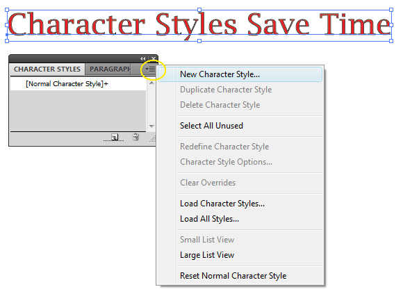
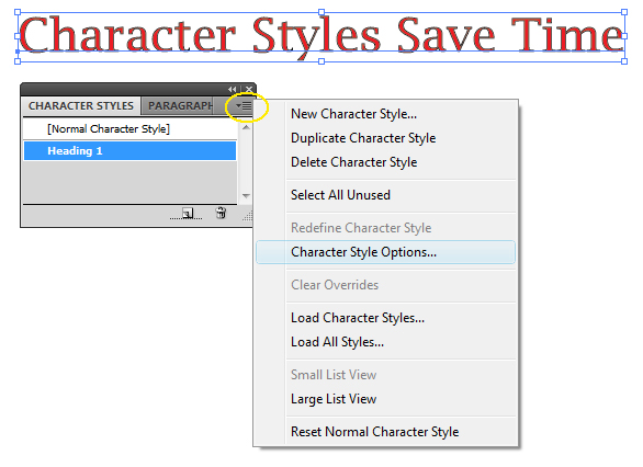
When working with large amounts of text in Illustrator, you do not have to keep applying the same font styles manually to every heading and block of text. You can simply save your settings using the Character Styles panel or the Paragraph Styles panel. Both can be found under Window → Type.
To set a style, simply type your heading or paragraph using the font styles you want to save. Then go to Window → Type → Character Styles, or Window → Type → Paragraph Styles. A Styles panel box will appear, and in the upper-right corner will be a small arrow, which is the Styles menu. To create your own name for the style, choose “New Character” or “Paragraph Style,” type a name, and click OK.
When you would like to add your new Character or Paragraph Style to text, select the text. Then click on the style that you created in the Style panel box. The style you saved will now be added to the text.
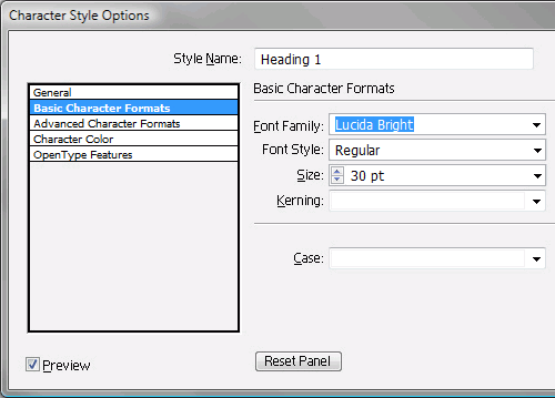
To edit a style, click on the style in the panel box, then click to the Character and Paragraph Style options in the drop-down menu, or simply double-click on the style you want to change.
Now on the left side of the dialog box that pops open, click on a formatting category. Make the changes you need, click OK, and all text that you’ve applied to this style will be changed. Keep in mind that if text is selected, the changes will be made to it only. Click on the Selection tool and then click anywhere on the work desk to make sure that text is not selected before attempting to change the style of all text.
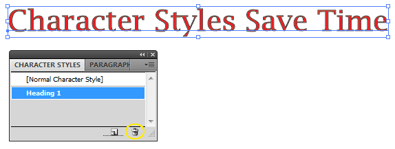
To delete a style, select it in the Character or Paragraph Styles panel. Then click the “Delete” button in the bottom-right corner of the panel. Or just drag the style onto the “Delete” button. The formatting of text associated with this style will not change, but a style will no longer be applied to this text.
6. Placing Type On a Path
Most Illustrator users know that type can be placed on a path to create shaped text or text that wraps around an object. The technique for applying text to a path is different depending on the path, though. Type can be placed on either an open path, which is a line with a beginning and end, or a closed path, such as a circle or square.
Open Paths
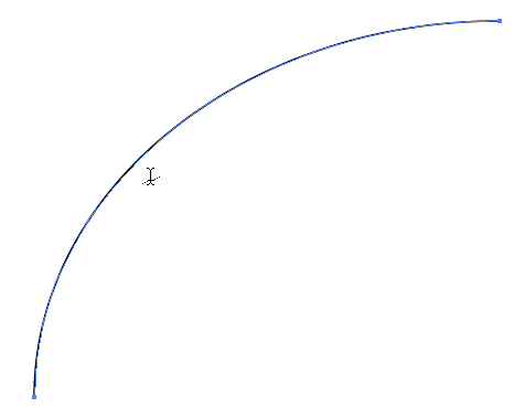
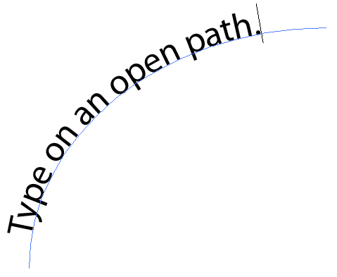
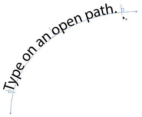
To place type on an open path (i.e. a line with a beginning and end), begin by creating a path, such as a curved line. Make sure to select the Type tool, and then move your cursor over the path until the cursor changes to a Type on a Path icon, which has a line through it.
Then just click on the path, and you will have created a Path Type object. The Stroke objects will be gone, and a blinking cursor will appear in which you can type your message.
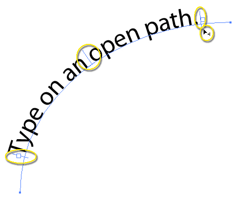
To make any changes to your open path type, choose the Selection tool and click on the path. In and out ports (small white boxes) will appear at either end of the path and a line in the center and on the far left and right. Basically, Illustrator is now treating the path as it would area type. Drag one of the lines to make the text path shorter or longer; make sure that your cursor is an arrow with a line-and-arrow symbol next to it.
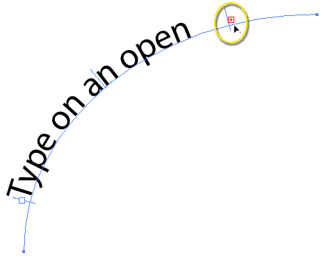
You can change the actual type just as you would any other area type, including by changing the font size. Doing this, though, may make the text extend outside of the area type’s boundaries. If this happens, a red plus sign will appear.
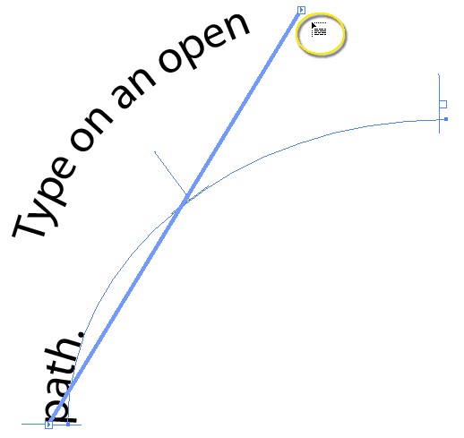
If you click on the plus sign, the cursor will change to a linked container cursor (it looks like a text box). Then, click on another area in your project to create another open path line of the same size and shape as your first. New text will continue to flow onto this new line.
Or simply drag the beginning and end lines to make text fit on the path:
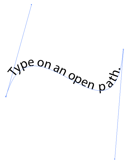
Make changes to the actual path that the text sits on by choosing the Direct Selection tool and then clicking on the path. You can now lengthen or shorten the path or change the shape, just as you would with any other path.
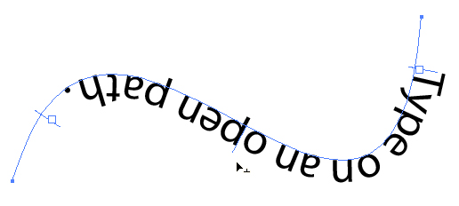
You can also move the type to sit underneath the path by dragging the center line to the opposite side of the path. Or go to Type → Type on a Path → Type on a Path Options. In the box that appears, check the “Flip” box and click OK.
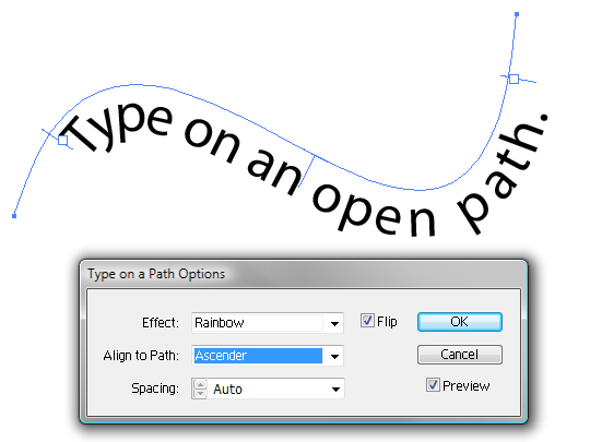
To flip type over, go to Type → Type on a Path → Type on a Path Options. Select the Flip box and then select “Ascender” in the “Align to Path” menu. Other changes can be made in this dialog box as well: change the effect, choose other path alignment options or adjust the spacing.
Closed Paths
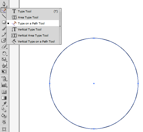
The confusing part of placing type on a closed path is that the start and end points are in the same place. With an open path, your starting point is wherever you click with the Type tool to create a Path Type object, and the end point is the end of the path. On a closed path, both the start and end points are wherever you click, because the object creates a continuous line. The center line on a closed path, such as a circle, would then be at the bottom of the circle if your start point is at the top. To place type on a closed path, you will have to choose the Type on a Path tool by clicking on the Type tool and dragging to pull out the Type menu.
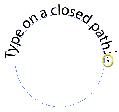
Then click on the path where you would like the text to start and begin typing. Once again, make sure the cursor changes to the Type on a Path symbol.
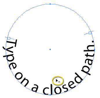
Just as with an open path, you can change the location of the start and end points and, therefore, move the location of the text on the object.
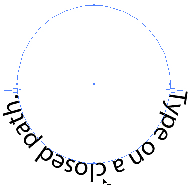
You can also move type underneath the line or flip type over the same way as you would with open type. Simply go to Type → Type on a Path → Type on a Path Options, and change the settings to get the desired effect. Or you can make changes by dragging the center line.
7. Point Type vs. Area Type
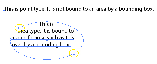
Point type, created by selecting the Type tool, is so called because it adds text to a certain point in an image. Area type, created by selecting the Area Type tool, adds text to fill a specified area of an image.
Point type is often used for headlines and other single lines of text. The more you type, the longer the text line becomes. To move text to another line, you must manually press Enter or Return on the keyboard. Area type is used for paragraphs of text and is surrounded by a bounding box. As you type, the text automatically flows to fill the box. The bounding box in area type will have two large boxes, called ports, in addition to the normal bounding box handles. These ports are the in and out boxes from which text flows between area type containers.
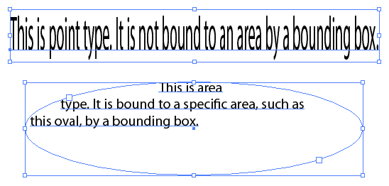
When selecting point type with the Selection tool and if you have selected “Show Bounding Box” in the View drop-down menu, a bounding box will appear surrounding the text. However, when changing the shape or size of the bounding box with point type, the text will become distorted because no shape is holding the text. On the other hand, changing the size or shape of area text will simply change the way the text fills the bounding box.
8. Creating Columns of Text
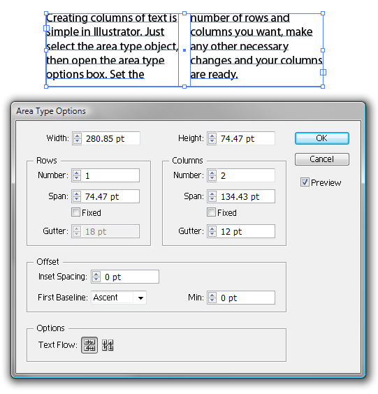
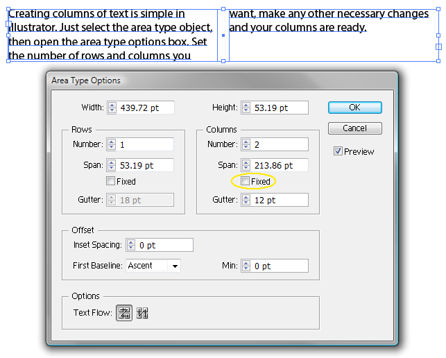
Any area type can easily be divided into columns, or even rows, whenever needed. First, create the area type, and then select it. Go to Type → Area Type Options. In the box that appears, you will see options for changing the settings of both rows and columns, as well as for resizing the area type.
Change the number of rows or columns by changing the Number settings underneath the Row or Column settings. The “Span” changes the width of individual rows or columns, and the “Gutter” changes the distance between each row or column.
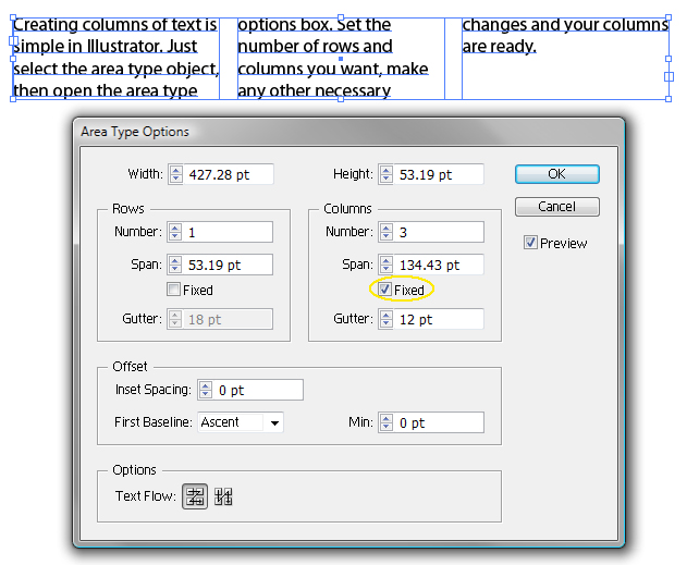
If you select the “Fixed” box, then you can resize the area, and the number of rows or columns will change, not their width.
With the Fixed box deselected, the size of the rows and columns will increase or decrease when resizing, but the number of rows or columns will remain the same.
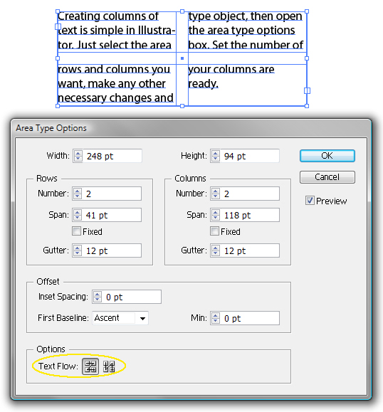
If you break the text into both columns and rows, rather than just one or the other, then you will want to choose the way text flows between columns and rows in the Options section. Selecting “By Rows” will cause the text to be read from left to right, first in the top row and then in the bottom row. Selecting “By Columns” will cause the text to be read left to right, first in the left column and then in the right column.
9. Text Flow Between Containers
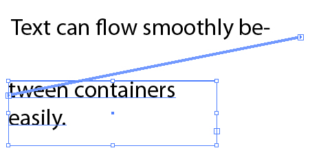
With certain projects, you may need to make text flow from one area type container to the next. For instance, you may have created an area type frame in the exact size you need, but as you type, the text “overflows,” which Illustrator alerts you about with a red box with a plus sign inside.
Clicking on this plus sign with the Direct Selection tool will change your cursor to the linked container symbol.
Click again on the artboard and Illustrator will create a new container of the exact same size as the first. Text will now continue to “flow” from the previous container into this new one.
If you would like to create a container of different proportions, though, then click and drag on the artboard until the container is the size you desire.
10. Scaling Area Type Numerically
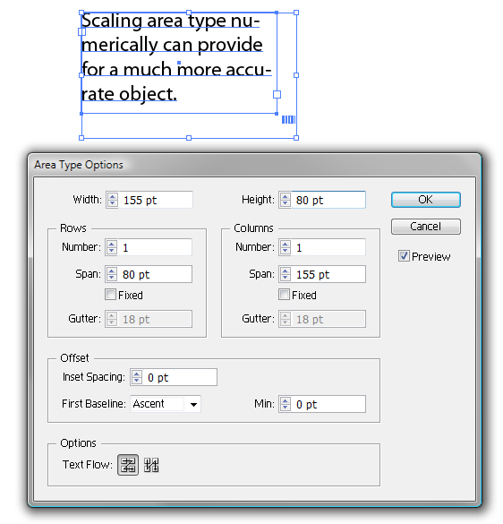
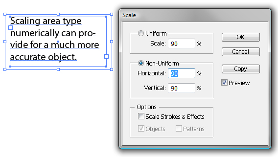
Instead of resizing an area type bounding box by using the handles, you can scale it numerically, making for a more accurate size that can be repeated. Go to Type → Area Type Options, and enter the size of box you need.
Or you can go to Object → Transform → Scale to size a bounding box numerically. Keep in mind that these techniques will also change the scale of the text. To keep text the same while changing the box only, click on a side of the frame using the Direct Selection tool, and then scale the bounding box. The text should remain the same while the size of the bounding box changes.
Type Tool Shortcuts
Keyboard shortcuts will make your work in Adobe Illustrator go that much faster. Memorize each of the following to improve your workflow:
Shift+Control/Command+O: Create outlines.Alt+Control/Command+I: Show or hide hidden characters.T: This way you can select the Type tool faster.Control/Command+T: Show or hide the Character panel.Shift+Control/Command+T: Show or hide the Tabs panel.Alt+Control/Command+T: Show or hide the Paragraph panel.Alt+Shift+Control/Command+T: Show or hide the Open Type panel.Shift: Hold down while the Type tool is selected to switch between horizontal and vertical text.Escape: Press while typing to escape from the type object. The Selection tool and type object will also be selected.
Keep in mind that these are only type tool shortcuts and commands. Print out a complete list of shortcuts from KeyXL to have on hand if needed.
Other Resources
You may be interested in the following articles and related resources:
- Illustrator’s Type Tool: A Comprehensive Introduction, Vector Tuts+ Learn about Illustrator’s Type tool in this comprehensive introduction.
- Vertical Type Tools, Bloomsburg University, IT Department Another excellent article with basic tips on using Illustrator’s Type Tool.
- Using Adobe Illustrator CS4: Type, Adobe Look up specific help on type in Illustrator from Adobe itself.
(al) (ik) (vf)


 See the full picture →
 SurveyJS: White-Label Survey Solution for Your JS App
 Celebrating 10 million developers

