CSS: Innovative Techniques and Practical Solutions

Email Newsletter
Weekly tips on front-end & UX.
Trusted by 182,000+ folks.
 Register for Free
 Custom Web Forms for Angular, React, & Vue. Your backend.
 Celebrating 10 million developers


Although CSS isn’t that difficult, useful CSS techniques are not easy to find. Sometimes finding a cross-browser solution might take time, but you don’t have to reinvent the wheel every single time. Other designers may have had the same problem in the past and thus the main goal of this round-up is to share with you a goldmine of new techniques which you will hopefully find very useful and valuable. We also hope that these tutorials and articles will help you solve common design problems and find new ways of approaching tricky CSS issues.
Further Reading on SmashingMag:
- 50 New Useful CSS Techniques, Tools and Tutorials
- 50 Useful Coding Techniques
- Mastering CSS, Part 1: Styling Design Elements
- Responsive Web Design Techniques, Tools and Design Strategies
The main goal of the article is to present powerful new CSS techniques, encourage experimentation in the design community and push CSS forward. Please notice that we feature both experimental demos and practical techniques in this article. Next week we will present even more useful new tools and resources for front-end developers. We sincerely appreciate the efforts of the design community — thank you, guys!
Interesting and Original Techniques
Wonder-Webkit: 3D Transforms This is a remarkable example of what can be done using CSS3 3D transformations. The interesting stuff is the possibility of manipulate the transformation matrix of any element of the DOM, In this case we get the matrix given only the four end points of the element. Don’t forget to click on the items, too. Who thought a couple of years ago that something like that would be possible with only CSS?
CSS Box Shadow and Text Shadow Experiments
The CSS box-shadow and text-shadow allow us to create some pretty cool design elements that don’t even look like shadows. The key is to think about how CSS shadows work and use them to get the desired effect. The article features three remarkable examples of using box-shadow property creatively to achieve effects that don’t have much to do with shadows.
CSS3 Depth of Field
Sawyer Hollenshead’s experiment is an attempt to create the “Depth of Field” effect with CSS. The blurry text is accomplished using text-shadow, with the text color set to transparent. Take a look at the demo and don’t forget to press ‘n’ to toggle animation.
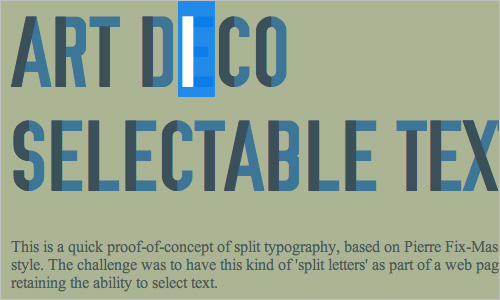
Art Deco Selectable Text This is a quick proof-of-concept of split typography, based on Pierre Fix-Masseau’s Art Deco style. The challenge was to have this kind of ‘split letters’ as part of a web page layout, while retaining the ability to select text.
CSS3 :toggle-button without JavaScript
This demo presents a CSS3 toggle-button that works without JavaScript. If you ever need it: You stack two <a>s on top of each other and then disable pointer-events for the top <a> on :target.
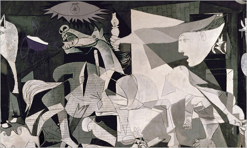
About War and Bananas This student project explores new ways of styling and designing websites in an artistic way. The students from Merz Akademie in Germany used Picasso’s “Guernica” as the footage, seperated the picture into different layers and animated them using CSS.
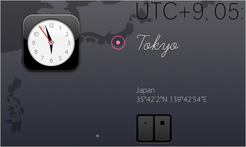
WebKit Clock This demo is driven by HTML5 canvas, CSS3, JavaScript, Web Fonts, SVG and no image files. The CSS file is huge, yet the result is quite remarkable.
Pure CSS Slideshow This technique uses CSS transforms and positioning to create the pure CSS-based slideshow. Unfortunately, no documentation is available (yet).
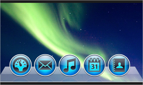
CSS Dock
This is a quick CSS3 experiment trying to replicate the Dock of OS X, complete with labels, animations, reflections and indicators. It uses CSS transitions for the magnification effect and the :target pseudo-class and CSS animations for the bouncing effect.
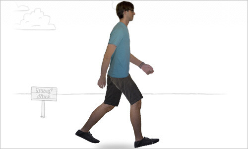
Andrew Hoyer An interesting experiment by Andrew Hoyer. The walking man is implemented using only CSS3 animations and simple HTML. The key idea behind all of this is the fact that a CSS transformation applied to an element also applies to all of its children. Works in Webkit-browsers only.
Type study: An all CSS button
Dan Cederholm explains how through the use of box-shadow, text-shadow, border-radius, and CSS gradients, we can create a highly polished three-dimensional, responsive button that doesn’t require images.

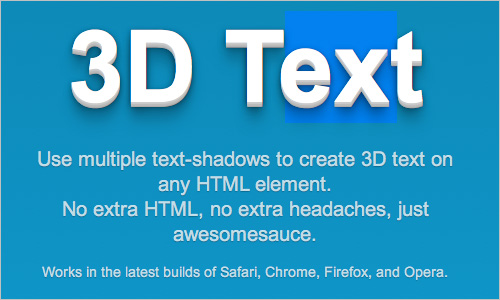
3D Text
This technique uses multiple text-shadows to create a 3D appearance of the text on any HTML element. No extra mark-up is used. Works in the latest builds of Safari, Chrome, Firefox, and Opera.
Spin those Icons with CSS3 Tom Kenny features a neat effect which spins the social icons with the help of a CSS transforms and transition when you hover over them. A very nice enhancement.
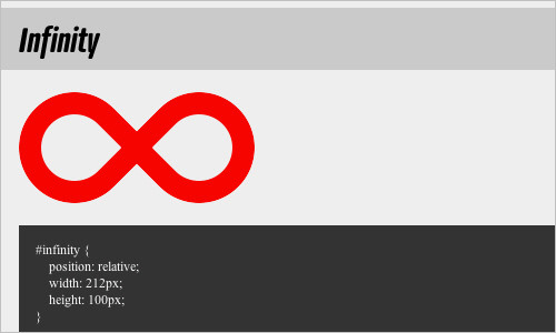
The Shapes of CSS The article presents various geometrical forms, all created using CSS and a single HTML element. The following forms are presented: square, rectangle, circle, oval, triangle, parallelogram, trapezoid, star, pentagon, hexagon, octagon, heart and infinity — all using CSS only.
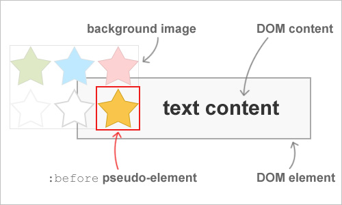
CSS background image hacks Emulating background image crop, background image opacity, background transforms, and improved background positioning. The article explains a few hacks relying on CSS pseudo-elements to emulate features unavailable or not yet widely supported by modern browsers.
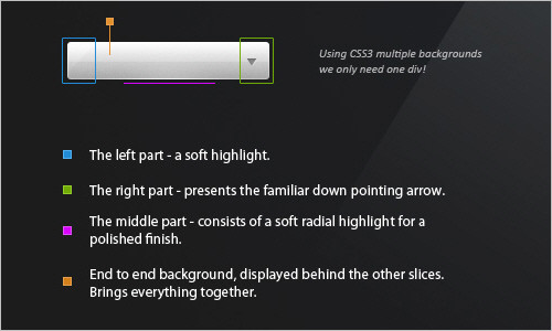
Making Better Select Elements with CSS3 and jQuery
This tutorial explains how to take an ordinary select element, and replace it with a better looking version, while keeping all the functionality intact. It uses CSS3 multiple background and a transparent PNG image as a sprite. Currently, multiple backgrounds are supported by Firefox, Safari, Chrome and Opera. For Internet Explorer and older versions of the first browsers, a fallback is defined, which is basically just a regular version of the background. When parsing the CSS document, browsers that do not understand multiple background will just ignore the rule and use the plain one.
CSS-Only 3D Slideshow
This tutorial shows how to create a 3D slideshow using only HTML and CSS. No JavaScript required. You’ll be able to mimic a click event with CSS using the :focus pseudo-class and the HTML5 element <figcaption>, but the idea is the same. As the author admits, this method isn’t necessarily “better” than using JavaScript, but simply a neat alternative that takes advantages of the newest HTML5 elements.
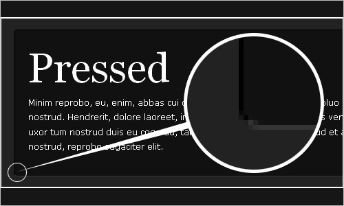
Have Fun with Borders This tutorial shows three simple technique to add a light shadow, “pressed” and “beveled” states to text blocks and images. By Soh Tanaka.
Animated CSS3 Owl “What about having an owl that moved his eyes every so often and when hovered over would raise his wings while a few light rays would spin in the background. A little excessive? Probably. Necessary? Not at all. However, that’s exactly what I was looking to do with CSS3 transforms, transitions, and animations.” An interesting experiment, best viewed in Safari or Chrome.

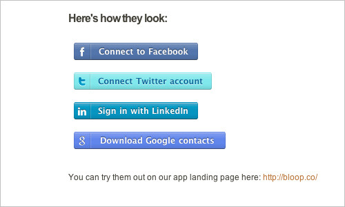
CSS Social Sign-in Buttons
This blog post describes a fairly simple technique for creating nice responsive CSS-buttons using a CSS sprite, border-radius, shadows and CSS gradients.
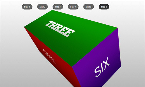
Rotating color cube box with CSS3 animation, transforms and gradients A yet another remarkable experiment that presents a rotating color cube using CSS3 animations and transforms. Be aware that the browser may slow down a bit when loading the demo.
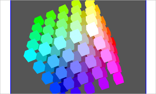
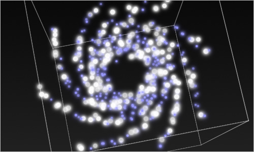
CSS3 Demo: 3D Interactive Galaxy A CSS3 demo where you can interact with a procedurally generated 3D galaxy. In order to create the effect, the designer used 3D CSS properties available in Safari 5 and on the iPhone and iPad.
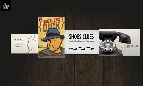
Getting Hardboiled with CSS3 2D Transforms Andy Clarke explains how to use CSS3 two-dimensional transforms to add realism to a row of hardboiled private detectives’ business cards. The working demo is available as well.
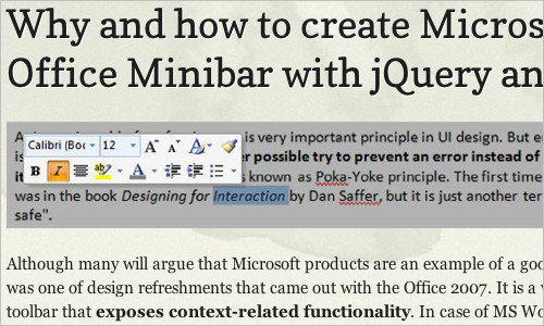
How to create Microsoft Office Minibar with jQuery and CSS3 Janko Jovanovic explains how to create a Microsoft Office Minibar that exposes context-related functionality. In case of MS Word, context is a text selection. Since Minibar always pops up near the mouse pointer it enables users to quickly perform actions related to a selection.
Angled Content Mask with CSS This article explains how to create angled CSS content “masks”. The idea is pretty simple and uses CSS transform property (rotation, to be more precise).
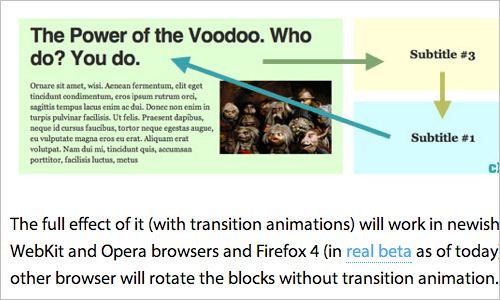
Rotating Feature Boxes All the animation here are CSS3 transitions. JavaScript only watches for the clicks and applies and removes classes as needed. So when you click on a block, that block’s class’ is adjusted. The new classes have different size and position values. Because the block has transition CSS applied, those new sizes and postion values are animated as well.
Pure CSS3 box-shadow page curl effect Okay, the CSS3 code here is quirky and might seem a bit bloated first, but it’s a nice example of using various CSS3 features together to create an effect that would usually require images.
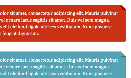
Pure CSS Folded-Corner Effect Learn how to create a simple CSS folded-corner effect without images or extra markup. It works well in all modern browsers and is best suited to designs with simple colour backgrounds; supported by Firefox 3.5+, Chrome 4+, Safari 4+, Opera 10+, IE 8+.
Useful Practical Techniques
Smooth Fading Image Captions with Pure CSS3 Learn how to use CSS3 transitions to create nice, animated, semitransparent image captions. Full example and code download included.
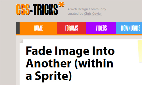
Fade Image Into Another Learn how to create an image rollover by giving the element a background image. There are three ways to fade in the opacity. Click here to find out more:
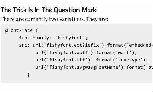
New @Font-Face Syntax: Simpler, Easier With IE9 and FF4 nearing release, Ethan Dunham from Font Squirrel has revisited the problem of a cross-browser CSS @font-face syntax and found a new and simpler solution. In this article, Richard Fink explains the new syntax and its variations and suggests the most reasonable syntax to use. Also, check FontSpring’s The New Bulletproof @font-face Syntax. Please notice that this technique no longer works in Internet Explorer 9.
The New Clearfix Method
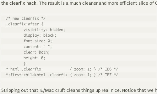
The clearfix hack, or “easy-clearing” hack, is a useful method of clearing floats. The original clearfix hack works great, but the browsers that it targets are either obsolete or well on their way. The new clearfix method applies clearing rules to standards-compliant browsers using the :after pseudo-class. For IE6 and IE7, the new clearfix method triggers hasLayout with some proprietary CSS. Thus, the New Clearfix method effectively clears floats in all currently used browsers without using any hacks.
Quick Tip: Mimic a Click Event with CSS Jeffrey Way shares with us a quick tip with a video that will illustrate a nifty technique by using plain and simple CSS to mimic click events.
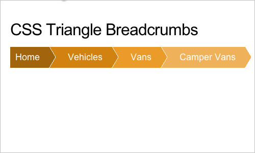
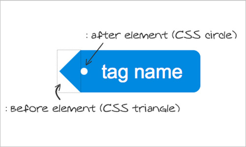
Breadcrumb Navigation with CSS Triangles This article describes a fairly simple technique for creating triangles with pure CSS. You just make a block level element with zero width and height, a colored border on one side, and transparent borders on the two adjacent sides. Useful for little arrow sticking out from speech bubbles, navigation pointers, and more.
Responsive Images: Experimenting with Context-Aware Image Sizing Since Ethan Marcotte coined the term, responsive Web design has gained a lot of attention in the Web design community, mainly due to its remarkable potential for flexible layouts that respond to the browser’s viewport for the best user experience. The main problem with such designs, however, is figuring out how to serve small images to mobile devices and tablets and large ones to desktop displays. The goal of this technique is to deliver optimized, contextual image sizes for responsive layouts that utilize dramatically different image sizes at different resolutions.
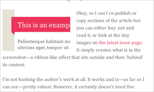
CSS powered ribbons the clean way
Harry Roberts presents a simple technique that uses an image and CSS to create clean ribbons. This technique creates a white <h2> with a pink background, pulls the <h2> out of the content area with a negative margin and then places the image absolutely left-bottom of the <h2> in a :before pseudo-element.
Create a centred horizontal navigation
Centring block level elements is easy, just define a width and set margin: 0 auto;, but what if you don’t know that fixed width? You could use text-align: center;, but that won’t work on 100%-width block-level elements either. However, there is a way to have a centred horizontal navigation without knowing an explicit width, and without adding CSS.
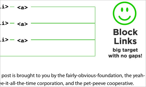
Keep Margins Out of Link Lists
When building a menu or other list of links, it’s generally a good practice to use display: block; or display: inline-block; so that you can increase the size of the link target. The simple truth: bigger link targets are easier for people to click and lead to better user experience. Make sure list items don’t have padding, but links do and don’t use margins, so there are no un-clickable gaps.
Pure CSS3 Post Tags This is a rather simple pure CSS trick you can use to style your blog post tags, usually placed at the bottom of the posts. See also Image-Free Tag Shape.
Styling children based on their number, with CSS3
Lea Verou presents an interesting technique for styling children based on their number. It is based on the relationship between :nth-child and :nth-last-child. With the technique, the number of total rules is still O(N), but the number of selectors in every rule becomes just 2, making this trick practical for far larger numbers of children.
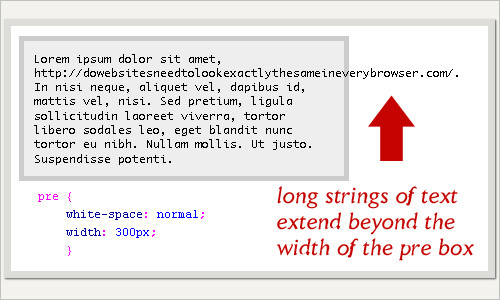
Wrapping Long URLs and Text Content with CSS
To wrap long URLs, strings of text, and other content, it’s enough to apply a carefully crafted chunk of CSS code to any block-level element (e.g., perfect for <pre> tags). Very useful for cases when code snippets need to be presented in a blog post with a fixed content width.
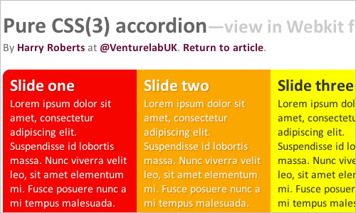
Pure CSS(3) accordion An interesting accordion technique that uses nothing but semantic HTML, CSS and some progressive CSS3. There are also two versions, a horizontal one and a vertical one.
Target iPhone and iPad with CSS3 Media Queries A detailed explanation of how to se CSS3 media queries to apply CSS style to the portrait and landscape modes in mobile devices such as iPad or iPhone.
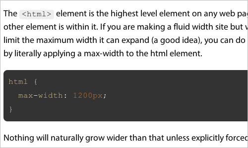
Rein In Fluid Width By Limiting HTML Width
If you are making a fluid width site but wish to limit the maximum width it can expand, you can do so easily by literally applying a max-width to the html element. Quick and useful tip.
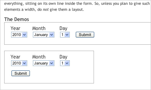
Inline Boxes with Bottom Alignment Imagine that you want to keep a “Submit” button at the bottom of a line box, aligned with form controls positioned below their label (see below). If the containing block is not wide enough for the “Submit” button to flow next to the other controls, that button must be displayed at the beginning of the next line box with minimal space above it. The article explains a solution for this problem.
Transparent CSS Sprites
The idea of the technique is to create a transparent sprite allowing the background-color to show through. If you are familiar with CSS Sprites, you should be able to grasp this twist relatively easily. Simply, an image with a transparent “knocked-out” transparent center is placed over a background colour. Changing the background colour changes the appearance of the element.
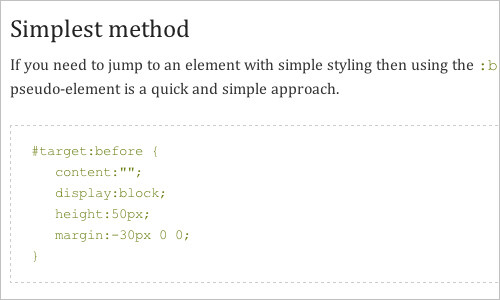
Jump links and viewport positioning “Using within-page links presses the jumped-to content right at the very top of the viewport. This can be a problem when using a fixed header. With a bit of hackery, there are some CSS methods to insert space between the top of the viewport and the target element within a page.”
Mimic Equal Columns with CSS3 Gradients “What happens when your main content area needs two specific background colors: one for the primary content, and another for the sidebar? If you’ve ever tried applying the background to each container itself, you’ll no doubt have realized that your layout quickly becomes fragmented as soon as the primary content section exceeds the height of the sidebar. Generally, the solution is to set a background image on the parent element, and set it to repeat vertically. However, if we get clever with CSS3 gradients, we can achieve the same effect with zero images.” A nice piece by Jeffrey Way.
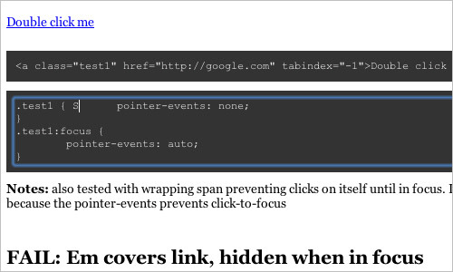
Double Click in CSS There has been some interesting talk about how we essentially lose the :hover pseudo class in CSS as well as mouseenter, mouseleave, and mousemove in JavaScript. Now, here is the idea: can we somehow pull off a double click with pure CSS? Yes, we can, if the input covers link, buries on focus, which triggers hover on link keeping it on top. Work on WebKit (including Mobile) and Firefox. So we’ve basically created a “light” alternative to hover for the sequence tap → change state / activate link → tap again to visit link.
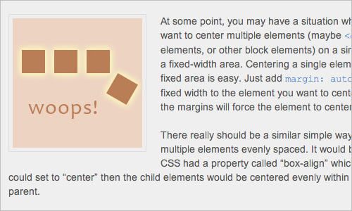
Center Multiple DIVs with CSS
At some point, you may have a situation where you want to center multiple elements (maybe «div» elements, or other block elements) on a single line in a fixed-width area. Centering a single element in a fixed area is easy. Just add margin: auto and a fixed width to the element you want to center, and the margins will force the element to center. You can achieve something similar by taking advantage of CSS’s flexibity with “recasting” elements.
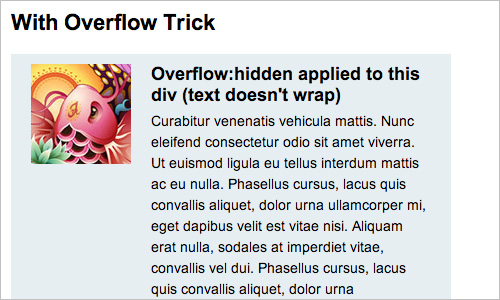
Clearing Floats with Overflow
One of the common problems we face when coding with float-based layouts is that the wrapper container doesn’t expand to the height of the child floating elements. The typical solution to fix this is by adding an element with clear float after the floating elements or adding a clearfix to the wrapper. But you can also use the overflow property to fix this problem. It’s not a new trick, but still very useful.
Different Transitions for Hover On / Hover Off
The idea of this technique is to solve an interesting problem: what about using different transition for hover on and off? In the example, when you hover over, the :hover transition overrides the transition set in the regular state, and that property animates. When you hover off, the transition from the regular state takes over and that property animates. Useful.
Stretch a Box to its Parent’s Bounds
A powerful feature that enables absolute positioning of stretching a box. The most popular use is having a box positioned in either top or bottom and right or left coordinates.
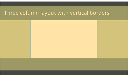
Equal Height Column Layouts with Borders and Negative Margins in CSS This article demonstrates different construct techniques and brushes up on a few concepts you might have missed.
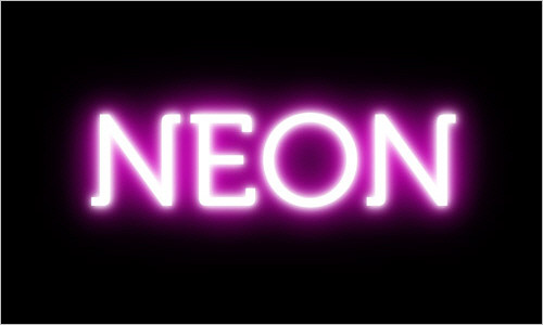
Using CSS Text-Shadow to Create Cool Text Effects The CSS3 text-shadow property has been around for some time now and is commonly used to recreate Photoshop’s Drop Shadow type shading to add subtle shadows which help add depth, dimension and to lift an element from the page. A demo is available if you’d like to see what it looks like before you give it a try yourself.
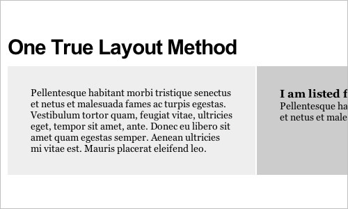
Fluid Width Equal Height Columns Equal height columns have been a need of web designers forever. If all the columns share the same background, equal height is irrelevant because you can set that background on a parent element.
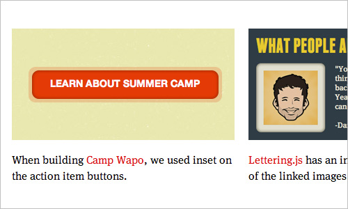
CSS Box-Shadow:Inset It’s always nice to be able to add a vignetting effect to photos sans-Photoshop, but the way browsers interpret box-shadow:inset is to throw the shadow behind the image, rendering it invisible. While this seems pretty useless, it does make sense when you consider other kinds of content.
Flexible Navigation An interesting technique for a navigation that uses only CSS transforms and transitions and no JavaScript.
Circle Zoom A very nice hover effect: the Twitter icon has a circle as a background and the circle increases its radius when the users hovers the mouse over it.

Last Click
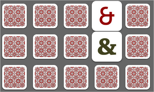
CSS3 Memory A game of memory in which you will have to find three matching cards (as a tribute to the CSS transitions).
CSS 3D Scrolling @ BeerCamp at SXSW 2011 Now, that’s innovative: while you are scrolling down the page, the site appears to have a 3D scrolling effect. And it has a nice Inception reference. Can you discover it?
50 New Useful CSS Techniques, Tutorials and Tools The previous round-up of CSS techniques on Smashing Magazine. In this post we present recently released CSS techniques, tutorials and tools for you to use and enhance your workflow, thus improving your skills.