Examining The Design Process: Clichés And Idea Generation
Where do good ideas come from? It’s a question that matters a great deal to designers, yet seems to be curiously discounted in the common perception of graphic design. Any time I talk with, say, an uncle at Thanksgiving about my work, I’m reminded that, in most people’s minds, the job of being a designer is mainly a matter of learning a set of computer applications — programs which, when properly operated, presumably do the work of generating ideas on their own.
If pressed further, most people will offer up some version of the Genius Theory: the idea that certain individuals are simply blessed with a force called ‘creativity’ that (as the theory goes) allows them to summon remarkable visual solutions to problems where the rest of us see only a blank canvas.
Further Reading on SmashingMag:
- Using Brainwriting For Rapid Idea Generation
- How Many Ideas Do You Show Your Clients?
- The Creative Way To Maximize Design Ideas With Type
- How To Make Innovative Ideas Happen
In this article, we will look at four examples of successful visual solutions created by well-known designers, and examine the process by which each designer arrived at his final concept. In each case, we will see that the solution did not arrive as a sudden flash of inspiration from out of the blue; rather, a good idea emerged methodically out of a sensible analysis of readily-available ideas and impressions.
In particular, we will zero in on the dual role played by clichés in this process: while clichés can derail the creative process, for seasoned designers they can act as the building blocks for effective solutions by telling them what not to do. In the final balance, we will see that good ideas are not created by magic, nor are they generated by computers — the process of developing them is a skill that can be learned, taught and practiced, and, like a muscle, gets stronger the more it is used.
Exhibit A: Imaginary ‘Drive Safe’ Campaign for Teens
Suppose we are working together at a studio and we receive a job to design a poster for a public service campaign aimed at educating teenagers about the dangers posed by drinking and driving. We meet for our first internal review to critique our initial ideas, and I present the following proposal:

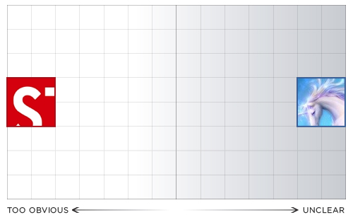
In this case, the problem with my work is painfully easy to diagnose: the image simply has no connection to the message. It may or may not be nicely illustrated… but this is somewhat beside the point: unless it’s trying to speak to eight-year-old girls, this poster is not going to make a meaningful impression on its audience. If we imagine a spectrum of all possible design solutions to this job ranging from ‘totally clear’ to ‘totally unclear’, this would rank pretty far in the latter direction:

‘Fine,’ I reply, tearfully storming back to my desk. A week later, I present a revised concept, confident that it speaks to the audience more directly:

This time, the problem is a little harder to put one’s finger on. The image communicates clearly… but it does so at the cost of boring us half to death, with no humor, inflection or engagement. Also disturbing is the fact that I’m using a pre-existing visual symbol from the urban environment — the stop sign — to do my communicating for me.
If we had never before seen a red eight-sided shape with the word ‘STOP’ inside, it might be a powerful and abstract creation; as things stand, however, the symbol has become so deadeningly familiar that it has lost all capability to impact us in a meaningful way. In my eagerness to communicate clearly, I’ve run headlong into the arms of a cliché — which, in the context of graphic design, can be defined as ‘an image that may or may not have been memorable at one point, but has since been so overused that it has lost all ability to surprise.’
The Problem of Clichés
This imaginary case study demonstrates why clichés are such a stubborn problem for designers. In the example above, I didn’t arrive at a cliché because I’m a terrible or uncreative person; I arrived at it because I took the most readily-available solution from the environment around me, and stopped there.
Clichés are hard to banish from our thoughts because their sheer familiarity makes them appealing: they are always at hand, ready to be put into service; and — especially if we are working under pressure — their familiarity offers a certain amount of reassurance, a guarantee that we won’t be misunderstood. Design solutions that employ clichés are the hardest for me to critique in the feedback sessions that I run as a teacher: often, there is the frustrating sense that the student has done nothing wrong exactly, yet the overall design leaves us wanting more.
Most depressing of all is the fact that clients often prefer clichéd solutions to original ones. This is the syndrome of the Chinese restaurant owner who wants us to use the same tired chopstick lettering for her sign because ‘that way, people will know it’s a Chinese restaurant’. Wanting only to be correctly identified, the client is drawn to the universality of clichés: they have, after all, the same meaning for everybody within a particular culture, which — if only they weren’t so hackneyed — would make them an ideal communication tool for designers.
In the haste to fit in, the need to stand out has been forgotten. It is our responsibility as designers to make the case that design can serve both ends at once: it can speak plainly while still leaving a mark on its audience.

Every area of graphic design has its built-in clichés. But none more so than images that seek to convey a sense of ethnicity, where the same predictable type choices pop up again and again (shown left to right: Sunamy, Papyrus, Neuland). See Rob Giampierto’s indispensable article New Black Face for more on this topic.
Clichés, in short, are the empty calories of the design world: like junk food, they are available everywhere and easy to consume, but pass through us without leaving nutrition behind. Their prevalence arises from the shared nervousness with which designers often view their clients and their clients view design: satisfied merely to get to the point across in an obvious manner, both sides neglect to create a message that will live in a viewer’s memory and foster long-term recognition and loyalty.
If the above hypothetical campaign has given us examples of two flawed extremes — one too obvious and the first not obvious enough — what does it look like when a designer hits the sweet spot in between? And, more importantly, how did he or she get there?
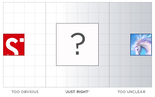
Exhibit B: Craig Frazier
In 1987, the designer Craig Frazier did a poster for this very purpose, a public service campaign aimed at persuading kids to not drive home drunk from their senior high school prom. His poster:
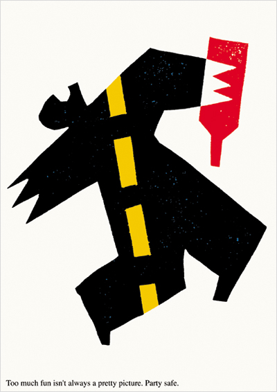
Like Goldilocks’ bowl of porridge, this solution is just right: it communicates its message with appropriate urgency, but the weapon of surprise is also part of the attack. “It has an art quality that removes it from the realm of ordinary public service campaigns,” Frazier noted in a 1996 interview with Critique magazine, in which he also identified it as a personal best. “It presents a visual riddle that’s almost attractive at first glance, but gets more gruesome the more you study it.”
The unconventional presentation of the subject matter requires us to spend a split second visually decoding the image, discerning its story… and, in that moment of cognitive engagement, a connection is formed between viewer and image. The abstract and original treatment of the topic allows the poster to sneak past our defenses — in Frazier’s words, “it proves that you don’t have to be condescending to convey a deadly serious message.” Whereas the Stop Sign approach droned authoritatively at its viewer, this execution lures the onlooker into a perceptual dialogue, and refrains from talking down to its touchy teenage audience (note the quiet treatment of the tagline in the lower left corner).
In sum, by avoiding an overly obvious delivery, the designer cleared the way for a work that leaves a lasting impression: “I still get tingles when I think about the poor guy on the road,” Frazier commented nearly ten years later. “I have a visceral, emotional reaction.” Impactful? Check. Emotional? Check. Clear in meaning? Check. “What makes the poster work is the same thing that makes any good ad or brochure work,” Frazier concludes: “It’s engaging and memorable to its intended audience.”
So how did he get there? Not, as my uncle might assume, by virtue of being a creative genius who effortlessly vaults over commonplace ideas (nor simply by owning a computer). Rather, to judge from his own comments, Frazier arrived at his solution by taking accurate stock of the commonplace and determining in what direction the fresh territory lay: “These kids had already been hit with plenty of preaching and scare tactics about drunk driving and drug abuse, not only from their parents, but also the media,” the designer recalled, explaining his thought process.
“I knew what I didn’t want to do — a poster that presented the consequences in such a grizzly fashion that the student could dismiss it as another image from a Highway Patrol film. Even though I knew these images could be effective — like the ads of that time by Fallon McElliot — I wanted this poster to be gripping, not scolding.” Put in the simplest possible terms, Frazier came up with his idea by identifying the resident cliché and then setting out in the opposite direction.
Simple as this approach might sound, the tangible benefits are worth taking note of: “All reports indicated that the students received the poster well,” Frazier recalled, “and many students requested copies for their bedroom walls. The effectiveness of any poster is hard to measure, but the fact that they looked at it, and are still looking at it, makes it a success.” What the reaction to Frazier’s poster, and the process behind its making, point to is the surprisingly transparent nature of graphic design — the extent to which the creator’s subjective experience in making a piece bleeds over into the observer’s reaction to it.
Creative solutions that take no searching on the part of the designer rarely make a mark on the audience either. If the designer is willing to set out in a direction whose end point is not immediately apparent, on the other hand, the journey taken is relayed back to the viewer in the split second of perception, and this experience of distance — of having a message relayed to us in terms that are clear and yet outside the ordinary — can make the experience of seeing memorable. In the next section, we will look at another work whose dramatic impact derives from the fact that its author moved beyond his immediate first impressions in order to create it.
Exhibit C: Art Spiegelman
Best known as the creator of the acclaimed graphic novel Maus, Art Spiegelman was working as a staff artist for the New Yorker magazine on September 11th, 2001. A resident of downtown Manhattan, he lived a short distance from Ground Zero and was grappling with the day’s events when a call came through from the New Yorker office explaining that, incredibly, the magazine would be putting out a special issue at the end of the week and needed a cover from him as soon as possible.
Settling down to a daunting task, Spiegelman started out by painting his most immediate visceral impressions of the day: the vivid blue sky that hung over New York on that day and its incongruity with the smoke, ruin and destruction that had transpired. After a while, he had created an illustration that looked something like this:
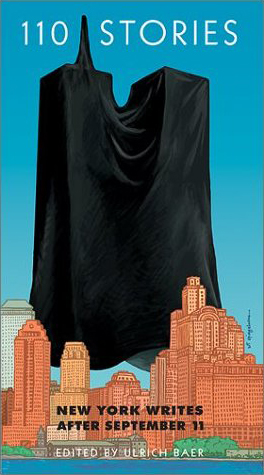
We know what this image looked like because Spiegelman later used it for the cover for an anthology of writing about the September 11th attacks called 110 Stories. But, for his magazine cover, Spiegelman rejected this direction. Why? “I was barking up the wrong tree,” he later told The Progressive magazine: “It had a blue sky and orange building; it was channeling [René] Magritte, with the thought bubble, ‘It’s such a nice day, what a bummer.’ It was a reasonable cover for a book that came out a year later, but it just wasn’t sufficient, because anything with a nice blue sky and pretty orange building was just too pretty. And pretty outweighed whatever meanings those shrouds had.”
Spiegelman’s use of blue sky here isn’t a cliché in the conventional sense… but in the context of his design process, it was functioning in much the same way that a cliché does: a too-readily-available impression that speaks too literally to its audience and thereby dulls the piece’s potential emotional charge.
Rather than trashing his canvas and starting from scratch, however, Spiegelman simply responded to what he didn’t like: “I kept trying to gray down and dim down the image, so, OK, a less blue sky, less orange buildings. […] Then I finally said to Francoise that it should just be a black-on-black cover because every time I was walking to my studio from my house I kept finding myself turning around to make sure the towers were not there, as though they were a kind of phantom limb”:

What binds both Frazier and Spiegelman’s accounts together is the evidence that neither artist could have visualized his final solution from the outset of the process. Both used (perhaps it’s even fair to say needed) the intermediary steps of (a) identifying cliché and (b) reacting to cliché to set them in the right direction.
Exhibit D: Ivan Chermayeff
Our fourth example involves a case where simple associations were not so much rejected as stitched together in an imaginative manner to create a complex and engaging message.
For decades, the office of Chermayeff & Geismar has managed to produce memorable images with a narrative capability, pieces that quickly tell a story in an engaging manner. One such work is Ivan Chermayeff’s poster for a television series called Between the Wars that covers the diplomatic efforts that transpired between 1914 and 1940. Even more overtly than Craig Frazier’s poster, this work deliberately presents a puzzle to the viewer, whose enjoyment of the piece lies in the process of assembling its visual clues:
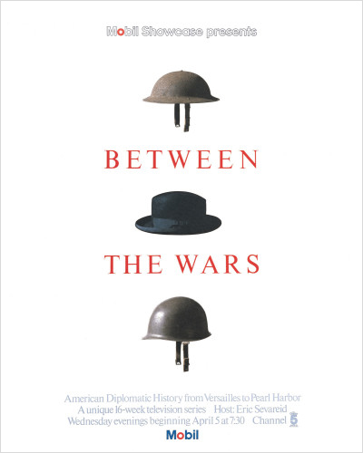
The designer did not, however, set out with the intention of being clever. When I emailed Chermayeff to ask about the challenge of Between The Wars, he replied as follows: “A title which raises many questions. The process of illustrating such a title was the search for images that will immediately answer those questions. Together those images must connect as a coordinated and related whole image.”
“What are possible symbols of World War I and World War II that existed and that are immediately recognized in our time?” Note that, again, the process again begins with the gathering of simple, readily-apparent associations: ”Maps, armaments, tanks, nationalities and their physical characteristics, trends, battlefields — there are many, many things. Most of them too complex to be a simple, resonating image.” In response to the problem — complexity — the designer sets out looking for its opposite, simplicity: “One thinks and searches, one looks at the available visual records of two world wars, and what comes up —Helmets!”
“Helmets evolved and they changed over the years. But they are always there in the photographs. Once seen, they are seized. One can hold them in one’s hand, and everyone recognizes them. So what remains to fill the gap between 1918 and 1940? What is the image of the 22 years between to match the simplicity of the two helmets at either side? Talk and discourse and ambition all surround the nations engaged in these two conflicts. The common thread is diplomacy. What is like a helmet but not a part of war? A hat! A diplomatic hat of a statesman in the twenties and thirties is the homburg, and it fits between the wars on the head just like a helmet.”
In this case, the final design does not so much refute the clichés of the field as cleverly assemble them. But the thought process behind it works in the same way: it starts with the readily-available information and works methodically, step by step, to react to what is lacking in the first sweep of associations.
Exhibit E: Jesse Bennett-Chamberlain
It seems to be easier to talk about idea generation in the context of print than web. A designer’s success, or lack thereof, in coming up with a good idea shows itself more plainly when the medium is something like a poster (as in the Frazier and Chermayeff examples above) or a magazine cover (Spiegelman), which are only called upon to communicate a single visual message to the onlooker. A typical web interface, in contrast, must balance a host of competing priorities — navigational, functional, hierarchical — the sum of which can frequently obscure our understanding of how successful the designer was in one particular area.
Nevertheless, web design needs fresh thinking just as much as print design, and the role played by clichés can be every bit as detrimental. Jesse Bennett-Chamberlain’s account of redesigning the website for Steinway and Sons explains how a formulaic approach to one issue (in this case, layout) can deprive the design of strength in another key area (aesthetic/emotional impact). Bennett-Chamberlain has a nice write-up of this project in the Notebook section of his site, 31three.com — the following discussion is drawn from his account and from follow-up questions I posed to him by email.
Having never worked with the client before, Bennett-Chamberlain recounts that he “played it safe” in his initial process and “started off with a design that closely followed a wireframe that they provided”:
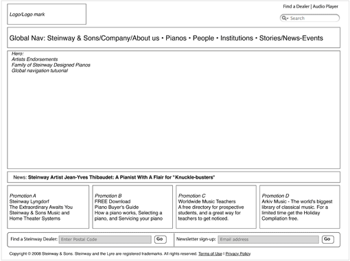
This wireframe suggests a classic template for usability — “a layout that was very typical,” Bennett-Chamberlain recalls, “and reminded me mostly of Apple”. (In fact, you can see that this layout is almost exactly that of Apple’s homepage). While there is nothing necessarily wrong with following the lead of an acclaimed site like Apple’s, in this case, the boxy, conventional guidelines proposed by the client’s wireframe led to an initial design that failed to do justice to the subject matter:

Not a bad design, by any means… and yet if you removed Lang Lang from his piano bench and placed him inside a luxury car, this could quickly become a site for Audi or Lexus. “I thought the initial design was okay,” Bennett-Chamberlain explains, “but it still didn’t feel ‘Steinway’ to me. It seemed a bit underdeveloped, too easy of a solution for such an elegant brand.”
Much of the problem lay with the cookie-cutter wireframe: “Although the image of Lang Lang was dynamic and had some energy, the layout of the site felt pretty linear, boxy, and well… boring.” Lost in the conventional presentation were the aspects of the grand piano that make it truly remarkable: its shape, its contours, and, of course, its sound. “I wanted the piano to be in the spotlight,” he recalls, “and not share the stage with anything else.” Bennett-Chamberlain presented a variant design that strayed a bit from the recommended wireframe by “placing the piano front and centre, and then building the site around it”:

In the final iteration, Lang Lang has been reluctantly whisked off the stage, and the instrument itself is the star of the show. The piano’s distinctive contours are emphasized by the graceful arc placed behind it, and by the decision to have its lid peek up above the designated promo area into the top nav. The background motif of piano strings has been ramped up to create a semi-abstract, radial representation of sound (indeed, you can almost hear the piano in the final design).
In the nav bar area, the usual ‘logo left’ convention has been discarded here for centered treatment that makes you feel like you’re sitting on the bench itself and gazing at the Steinway and Sons trademark sitting over middle C. Yet nothing has been lost in terms of ease-of-use compared with Bennett-Chamberlain’s original design — it simply took an effort of self-critique and problem-solving to do justice to both the functional and aesthetic possibilities of the project: “I figured that if these guys can spend a year making a single piano, I could probably spend an extra couple hours here and there on refining these details.”
Putting It Into Practice
These works by Frazier, Spiegelman, Chermayeff and Bennett-Chamberlain are classic examples of what designers like to call ‘process work’ or ‘methodology’, terms that refer to a method of drawing ideas, direction and inspiration from the process of working on the design itself, rather than simply having a fixed destination from the outset. No one can write step-by-step instructions on how to do this — the entire point, after all, is to react, rather than obeying fixed directives — but there are certain steps we can take at the outset of a project that help clear the way to let this process happen:
- Start with a sketchbook, not a computer. There was a time when I once suspected that the teachers who tried to impress this point on me were just cranky technophobes… but over time, I came to appreciate the wisdom of this suggestion. The computer is a bad companion to start with because its particular toolset pushes us in certain directions (towards clearly defined shapes and hard edges) and because it tempts us to focus overly on execution (by offering up sexy drop shadows and whatnot) before our concept has really come together.
- Using your sketchbook, start by drawing every association you come up with for the subject matter. Draw it quickly, and don’t be critical. At this stage, it’s not about making pretty pictures, and it’s not about evaluating your ideas (in fact, the ability to turn the critical part of your brain on and off is one of the most helpful tricks you can develop).
- Don’t try to avoid clichés — let them happen. Trying not to think of clichés is like the old joke where someone says ‘Don’t think of a pink elephant.’ It’s best to get them down on paper and get them out of your system.
- Once you’ve jotted down every association you can think of, take a break, come back and jot down a few more. Then, take a longer break…
- Come back with fresh eyes and look at what you have in front of you. Now is the time to be critical, but also to be fair. Seeing our own work clearly for its merits, without bias and defensiveness, is one of the hardest things for graphic designers to do. George Orwell wasn’t thinking about graphic designers when he wrote, “To see clearly what is in front of one’s face requires constant struggle,” but he might as well have been.
Conclusion
There is no single answer to the question of where good ideas come from. Some designs actually do seem to come out of thin air, like the Citibank logo that Paula Scher infamously drew on a napkin during an early meeting with the client. But a great many more good ideas come about through the incremental process described in this article, of gathering and making decisions about readily-available information.
The viability of this approach suggests that coming up with good ideas is not a matter of genius, but rather simply a challenge of seeing clearly and thinking sensibly. The good news that this implies is, idea generation is a learnable skill that can be cultivated in many of us, not just in a chosen few. The only disappointing part is that you don’t get to feel like a genius while you’re doing it.
If idea generation is a process that is accessible to everyone, then what accounts for the fact that it can be so hard to pull off? Part of the answer lies in our inability to get out of our own way, a condition which stems largely from our ideas about what it means to be a ‘professional’. The term ‘professional’ is generally used to connote a person who is in control of their work process at all times… and, yet, as we’ve seen in this article, the condition of absolute control is rarely a place where exciting design comes from.
“What is required in our field, more than anything else, is the continuous transgression,” Milton Glaser writes in his wonderful essay Ten Things I Have Learned. “Professionalism does not allow for that because transgression has to encompass the possibility of failure and if you are professional your instinct is not to fail, it is to repeat success.” Graphic design is one of the few fields where it works to our advantage if we can let go of the reins from time to time, a feature that makes it to be an exhilarating place to work if we can manage not to find it unnerving.
Credits
I would like to thank Craig Frazier for his assistance in locating a copy of the Critique ‘My Best / My Worst’ interview used in this article, and also Ivan Chermayeff and Jesse Bennett-Chamberlain for taking the time to answer my questions.
Sources
- Neumeier, Marty and Frazier, Craig (1996) ‘My Best / My Worst’, Critique, Summer 1996
- Siegal, Nina (2005), ‘Art Spiegelman Interview’, The Progressive, January 2005
- Unicorn illustration by Xploitme, used under Creative Commons license
Other Resources
You may be interested in the following articles and related resources:
- Craig Frazier Studio Web site for this noted designer, illustrator and writer
- Chermayeff & Geismar Founded in 1958, Chermayeff & Geismar is one of the world’s most acclaimed brand design firms, and have also produced their fair share of remarkable and engaging poster work
- Art Spiegelman Interview in The Progressive Complete transcript of interview quoted from in this article
- Ten Things I Have Learned Interview with Milton Glaser, another long-time practitioner of idea-driven design
- Brainstorm #9 Logo Process Nice writeup from Fabio Sasso tracing the creative process behind a specific logo project
(ik) (vf)


 See User Testing Live
 Custom Web Forms for Angular, React, & Vue. Your backend.

 Celebrating 10 million developers


