Useful Photoshop Tips And Tricks For Photo Retouching
Email Newsletter
Weekly tips on front-end & UX.
Trusted by 182,000+ folks.
 Register for Free


 Custom Web Forms for Angular, React, & Vue. Your backend.
 Celebrating 10 million developers
I’ll be covering some of the useful techniques and tricks which I’ve learned from my experience. You may know some of them, but hopefully not all of them. All images used in this article were purchased and are used according to their licenses.
Here is a short overview of the techniques we’ll be covering:
- Naturally Increased Light
- Simulate Infrared Images
- Levels
- Color Look With An Adjustment Layer
- Controlling Mid-Tone Contrasts
- Sunset
- Creating Smiles
- Colorful Water Drops
- Skin Color
- Matching Skin Tones
- Reducing Noise
- Retro Look With Curves
- Identifying Layers
- Conserving Resources
- Classy Sepia Look
- Precise Positioning
- Applying Layer Styles Multiple Times
Naturally Increased Light
The light of the sun creates texture. There are shadowy areas and spots where the sunlight can shine without interference. To control the intensity, you can draw more light onto a separate layer or increase already existing light. Create a new layer by going to Layer → New → Layer, or by pressing Shift + Control + N on Windows or Shift + Command + N on a Mac. Set the blending mode to “Color Dodge” and the opacity to about 15% - 30%.
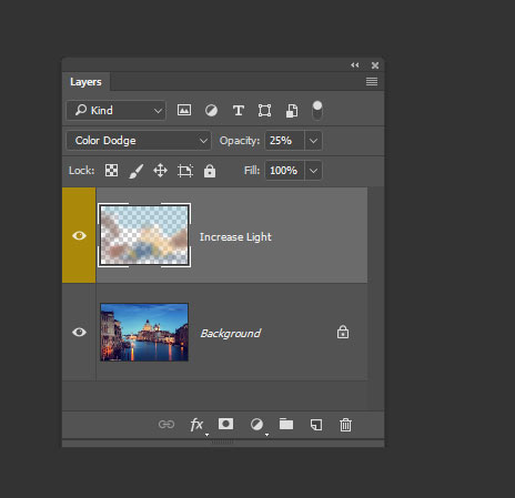
Then use the brush tool with a soft brush, and hold the Alt/Option key to pick up colors from the area that you want to brighten. Continue to brush in some light, picking up appropriate colors if the background changes. Use a second layer in “Overlay” mode. This way, you increase not only the light, but the saturation, which makes for more realistic results.
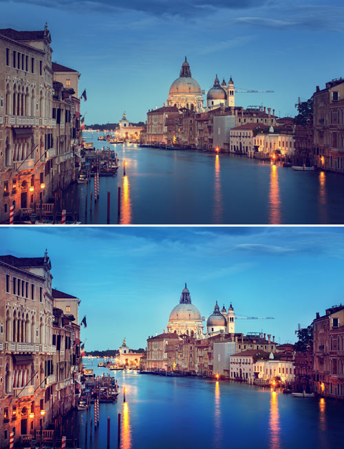
More realistic results with the blending mode Color Dodge
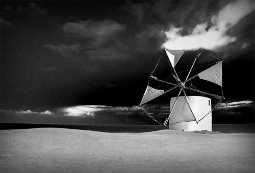
Simulate Infrared Images
Open a photo in Camera Raw; you can do this either in Bridge, using the right mouse key and clicking “Open in Camera Raw,” or directly in Photoshop, by selecting File → Open as Smart Object. Apply basic adjustments to optimize your image (for example, with the “Recovery” and “Fill Light” slides), then switch to the “HSL/Grayscale” tab. Check “Convert to Grayscale,” and set the Blues down to around -85. Set the Greens to +90 and the Yellows to +20.
Trees and bushes should now shine in the typical white, and the sky should appear almost black. If you want to go on and simulate some grain, switch to the “Effects” tab, and enter 15 for the amount, 20 for size and 80 for roughness. You could also apply a “Vignette.” Here I used -30 for the amount, 40 for the midpoint and -35 for roundness.
Levels
When applying a “Levels adjustment,” you can set black and white points in order to decrease color tints, but where are the darkest and brightest spots in the image? Go to New Adjustment Layer → Threshold to find those areas. This function is available under the “Layer” menu.
Move the slider so far to the right that only a few white spots remain in the document. Use the “Color Sampler tool” and set down a point there. Move the slider to the left until only a few black spots remain, and set a second point down there.
One could also find a neutral gray in the image by using a “Threshold adjustment layer.” Add a new blank layer between the original image and the threshold adjustment layer, and fill this layer with 50% gray. Go to Edit → Fill or press Shift + F5, then select “50% Gray” under “Contents” and click “OK.”
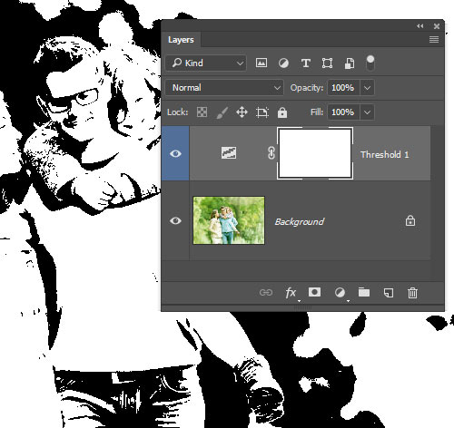
Here is the threshold adjustment layer at work.
Change the blending mode of this layer to “Difference.” Select the “Threshold adjustment layer” again and move the slider all the way to the left. Slowly move the slider back to the right until black dots start to appear. These are the neutral gray areas in the image (if neutral grays are present). Add a “Color Sampler spot.”
Now delete both the threshold adjustment layer and the 50% gray layer. Create a new adjustment layer, “Levels.” Use the first Eyedropper tool to click on the darkest area, then use the third Eyedropper on the brightest area.
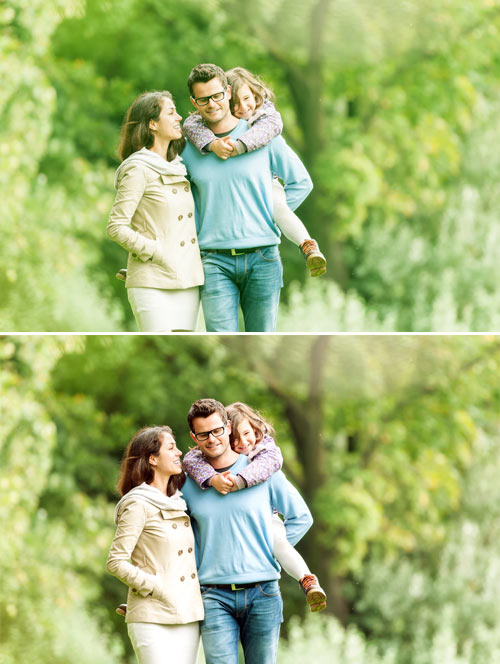
Here’s a before-and-after comparison.
Now you can use the gray Eyedropper tool on the third Color Sampler spot. The color tint will be decreased. Color Sampler spots can be deleted by dragging them off the canvas with the Color Sampler tool.
Color Look With An Adjustment Layer
Go to the Layer menu, and then New Adjustment Layer → Hue/Saturation, and set the blending mode to “Soft Light” and check “Colorize.” Use the Hue, Saturation and Lightness sliders to control the color: for a cool look, for example, set the hue at 210, the saturation at 50 and the lightness at 10; for a warm look, set the hue at 30, the saturation at 30 and the lightness at 5.
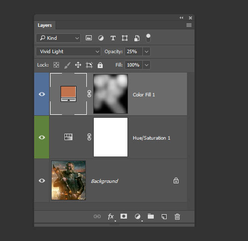
Here is Hue/Saturation and Color Fill.
Alternatively, you could use several color layers. Create them from the layer palette with the “New Fill/Adjustment Layer” button. Choose a color, then set the blending mode to “Vivid Light.” Reduce the opacity to about 25%, and invert the layer mask with Control/Command + I. Paint in the colored light with a big brush and white color. This works especially well for the lighting in portraits that have a textured background.
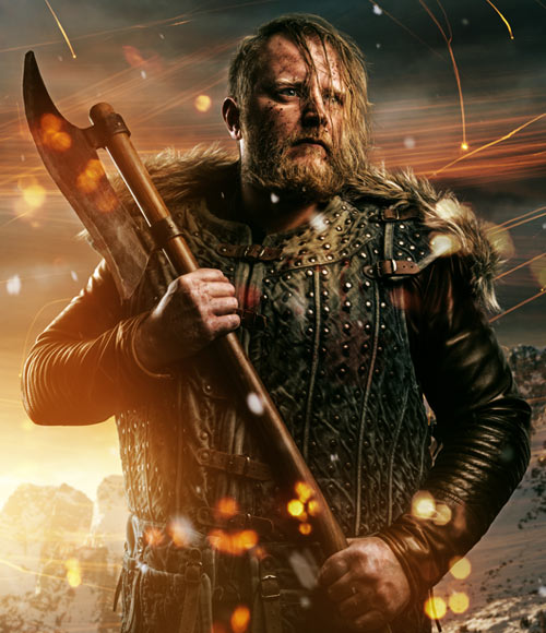
Here’s the Color Look with an Adjustment Layer.
Controlling Mid-Tone Contrasts
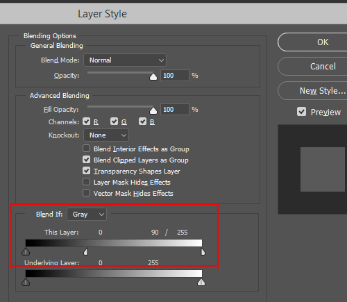
To increase detail in landscape shots, boost the mid-tone contrast. Copy the background layer with Control/Command + J, and then click on Filter → Convert for Smart Filters in the menu. Then go to Filter → Other → High Pass and enter a radius of 3 pixels. Change the blending mode to “Overlay” and double-click the layer next to its name to open the “Layer Style” window.
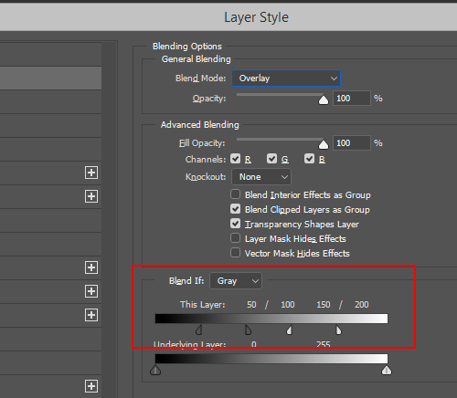
For the first gradient, “This Layer,” split the sliders by holding the Alt/Option key and trim the layer effect to the “50/100” and “150/200” ranges. As soon as you move the sliders, you’ll see where those numbers are. This increases contrast only for the mid-tones. Double-click the “High Pass” filter in the layer palette to bring the dialog box up again in order to adjust the radius to your liking.
Sunset
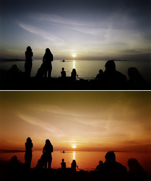
A sunset, especially at sea, can be an amazing color spectacle. The hues will depend heavily on the weather, though — but you can push them a bit with a gradient map. Click on the “New Fill/Adjustment Layer” button in the Layer palette and select “Gradient Map” from the list. Click on the gradient to open the “Gradient Editor.”
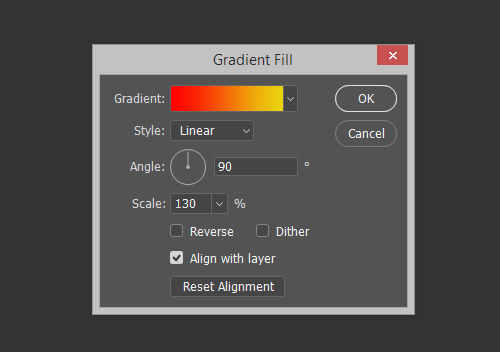
Click on the first color patch below the gradient, and change the color to red. Set the color patch on the opposite side to yellow, and click “OK.” Set the blending mode to “Soft Light” and reduce the opacity to about 50%. This will create a warm, almost golden sunset.
Creating Smiles
Roughly select the area around the mouth with the Polygon Lasso tool. Go to Select → Modify → Feather, and enter a radius of 10 pixels. Confirm, then click on Layer → New → Layer via Copy (or press Control/Command + J), then Edit → Puppet Warp. Photoshop will put a mesh over the entire layer in the shape of your previous selection.
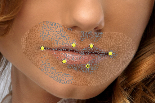
You can control the size of the mesh with the “Expansion” value in the Options bar. Increase the density to “More Points” for increased precision. Press Control/Command + H to hide the mesh, then set the first pins to the corners of the mouth. Add more pins to distinctive spots of the mouth. By clicking and dragging the mesh, you can shape a nice smile.
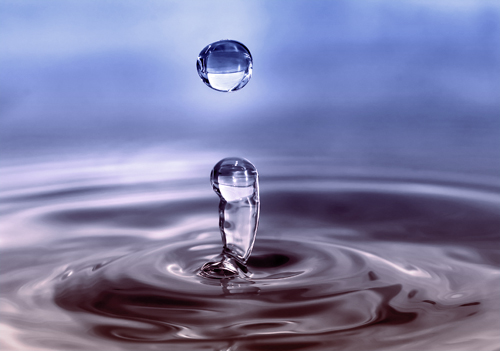
Colorful Water Drops
Macro shots of water drops are appealing, and shapes can be further accentuated with discreet coloring. You could treat the bland surface with a linear gradient from #772222 (RGB 119, 34, 34) to #3333bb (RGB 51, 51, 187). If the photo is on a layer of its own, click on Layer → Layer Style → Gradient Overlay or double-click the layer next to its name.
Macro shots of water drops are appealing, and shapes can be further accentuated with discreet coloring. You could treat the bland surface with a linear gradient from #772222 (RGB 119, 34, 34) to #3333bb (RGB 51, 51, 187). If the photo is on a layer of its own, click on Layer → Layer Style → Gradient Overlay or double-click the layer next to its name.
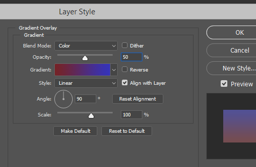
Layer Style: Gradient Overlay
Set the blend mode to Color, the opacity to 50%, the gradient to “Foreground to background color” and the angle to 90%. The gradient will be saved as a layer style, so you can come back at any time to adjust the values. Double-clicking the style name opens up the dialog window once more.
Skin Color
If the skin is not quite perfect after retouching, it might be because of the general hue. You can control it by going to New Adjustment Layer → Hue/Saturation. Click on the miniature mask, and press Control/Command + I to invert the mask.
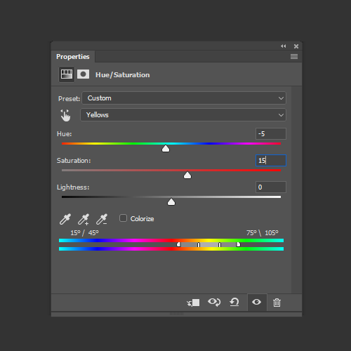
Using white color and a soft brush, paint over the skin areas so that only they get treated. For the adjustment, switch from Standard to “Reds” (found in the Hue drop-down menu of the Adjustment layer), and use the Hue, Saturation and Lightness sliders to adjust the skin color. Switch to “Yellows” and optimize the skin tone. Getting the colors exactly right depends very much on the image material. Rely on your common sense.
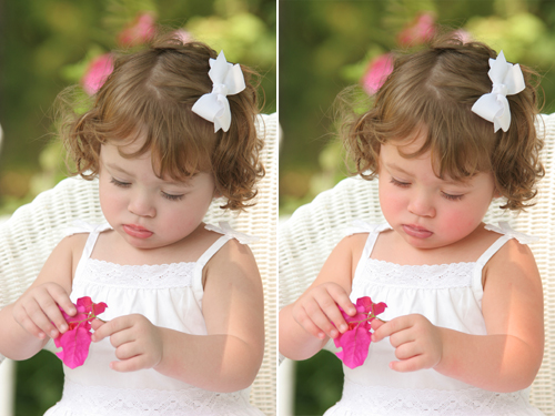
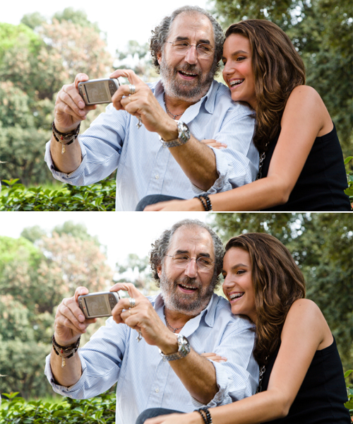
Matching Skin Tones
A sunburn or a blush can disrupt a portrait, especially if there is a contrasting pale person nearby. Photoshop has a tool to correct that: “Match Color” offers control over skin tones. Open your image and use the Quick Selection tool to roughly select the red skin areas.
You can hold down the Alt/Option key and subtract areas from the selection. Click on Select → Modify → Feather and enter a value of about 15 pixels. Use the Control/Command + J shortcut to copy the selection to a new layer.
Using the same technique, copy the non-reddened skin to a new layer. In the next step, you’ll have to differentiate between the source layer and the layer to edit, so rename these two layers meaningfully; all it takes is a double-click on the layer name. You could use the naming scheme shown here and call them “Beautiful skin” and “Reddened skin.”
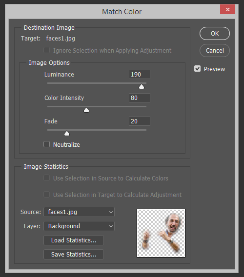
Activate the layer with the red skin, and select Image → Adjustments → Match Color from the menu. For “Source,” select the current document, and for “Layer,” select the one with the beautiful skin. Control the effect using the “Luminance” and “Color Intensity” sliders in the Image Options area. Once you confirm, you can control the effect’s strength with the Opacity slider.
Reducing Noise
Noisy images are annoying. One way to reduce noise is through the channels. Copy the background layer by pressing Control/Command + J, switch to the Channels palette, and select the channel that shows the least noise. Drag that channel down to the “New Channel” icon (next to the trash can) and go to Stylize → Find Edges. Then apply a Gaussian Blur with a radius of about 3 pixels.
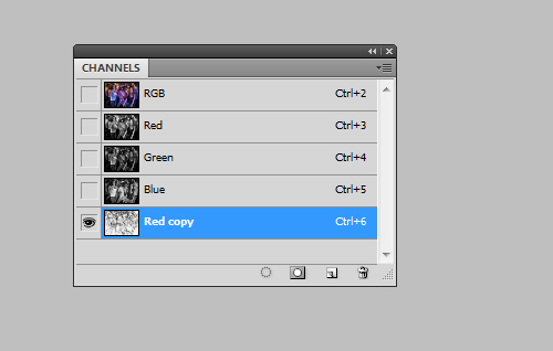
Click on the new channel’s miniature icon while holding the Control/Command key to select the content. Activate the “RGB channel” (top-most), and switch back to the Layers palette. When the duplicated background is selected, click on the “Add Layer Mask” icon.
Click on the Layer Miniature icon, and select Filter → Blur → Surface Blur from the menu. Play around with the Radius and Threshold sliders until the noise has been reduced as much as possible. Thanks to the mask you created, the contours are safe.
Retro Look With Curves
Go to Layer → New Adjustment Layer → Curves and switch from RGB to Reds. Then drag the line downwards a little for the shadows and upwards for the highlights, creating a slight “S” curve. Do the same for the Greens. For the Blues, drag the highlights down a little and the shadows up (for an inverted S shape). The shadows should now be slightly blue-ish, the highlights slightly yellow-ish.
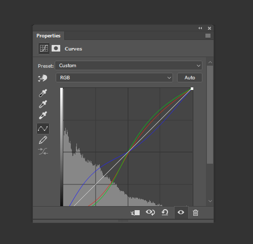
Create a new layer with Shift + Control/Command + N, and fill it with #000066 (RGB 0, 0, 102). Set the blending mode to “Exclusion.” Now copy the background layer by clicking it and pressing Control/Command + J. Set the blending mode for this copy to “Soft Light.”
To decrease the effect overall, activate the top-most layer and then click on the background copy while holding the Shift key, thereby selecting both layers. Alternatively, you can add them to a group with Control/Command + G. Reduce the layer’s (or group’s) opacity. Note that in Photoshop versions prior to CS5, you’ll have to reduce the opacity for each layer individually.
Identifying Layers
If you’re ambitious with your collages, then you’ll be familiar with this problem: meaningful layer names are often neglected during the creative process. This can result in layer names like “Layer 4” and “Layer 5 Copy 2,” which are not very helpful when you need to quickly identify the contents of a layer.
Photoshop offers a number of solutions for our laziness. For example, you can click on the element you want to select by using the “Move tool” and holding the right mouse key; you’ll see which layer contents are below the tool. Photoshop will display a list in a drop-down menu, from which you can easily select the desired element.
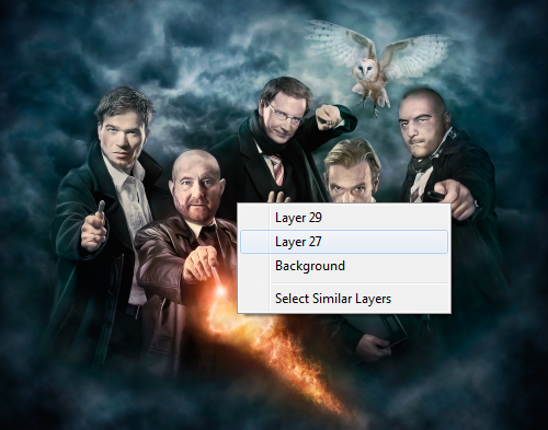
Control/Command + left-click with the Move tool selected and, in most cases, you’ll select the corresponding layer of the element that your mouse is over (unless Photoshop can’t distinguish between the multiple layers).
You could also Control/Command + left-click on a layer’s miniature icon to get a selection of the content of that layer. The marching ants will show you what is on that layer and where it is.
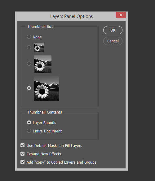
Another option is to click on the Layer palette’s Options icon, in the top-right corner, and select “Layers Palette Options.” From here you can adjust the size of the layer’s miniature preview and concentrate the miniature’s content to the layer’s bounds, which should cut down on future guesswork when it comes to layer contents.
Conserving Resources
Plug-ins save time, but they’re a bit resource-hungry; at least, they lengthen Photoshop’s start-up time. Your plug-ins might have functionality that you rarely use, so deactivate them until you need them. To do so, create a new folder by going to Adobe → Adobe Photoshop CS5 (or whatever your version) and name it something like Plugins_deactivated.
Now move all of the extensions that you don’t need for the moment. When you restart Photoshop now, those plug-ins won’t load, so the program will start up quickly. Your RAM will be relieved. Because you neither deleted nor uninstalled the plug-ins, they’re available to use anytime. If you need them, just move them back to the plug-in folder.
Classy Sepia Look
The sepia look is an absolute classic. To enhance a black and white image with a classy sepia tone, follow these steps. Click on Layer → New Adjustment Layer → Photo Filter, and select the Sepia filter, with a density of 100%. Double-click the layer (not the layer name) to open up the Layer Style window. This will show the Blending options.
At the bottom of the dialog box for the first gradient, move the white slider to the left while holding the Alt/Option key. This creates a smooth transition between adjusted and unadjusted areas. The sepia will now look elegant.
Precise Positioning
I’m sure you’ve often been irritated by Photoshop’s tendency to position elements on its own, but the program is just trying to help you align an element that is on its own layer with the outer edge of the document or with the edge of another object. To your frustration, the layer’s content will jump to the edge, even though you wanted to leave a few pixels of space in between. You can temporarily deactivate the automatic snapping by holding the Control/Command key as you position.
Applying Layer Styles Multiple Times
Usually, layer styles can be applied only once. For example, if you click on Layer → Layer Style → Drop Shadow, you cannot create a double drop shadow, one of which has an angle of 120°, a distance of 2 pixels and a size of 2 pixels, and the other of which has an angle of 180°, a distance of 12 pixels and a size of 12 pixels.
Actually, it is possible! It just requires a little detour. Create the first drop shadow as you normally would. Then right-click on the layer and select “Convert to Smart Object” from the menu. This smart object can be assigned another drop shadow, and you can convert the smart object into yet another smart object. This way, you can easily add a third and fourth drop shadow. Alternatively, you could apply multiple strokes.
By the way, to put one or even several styles onto their own layers at once, right-click on the FX symbol and select “Create Layer” from the list. Now you can apply filters to these styles, but they won’t be editable anymore.
Huge thanks to Carlos Lanenga for his valuable suggestions for this article.
(al) (ik) (vf)


