How To Choose A Font — A Step-By-Step Guide!
Choosing a font can be tricky. The beauty and complexity of type, combined with an inexhaustible supply of options to evaluate, can make your head spin. But don’t be baffled — and don’t despair. While there are no easy-to-follow rules on how best to choose a typeface, there are many tried-and-true principles you can quickly learn and apply to make an appropriate typeface choice.
If you work systematically through the options below, you’ll have a winning font choice in no time. Let’s get started.
Further Reading on SmashingMag:
- How To Choose The Right Face For A Beautiful Body
- The @Font-Face Rule And Useful Web Font Tricks
- Best Practices of Combining Typefaces
- Five Principles for Choosing and Using Typefaces
What Is Your Goal?
The first thing you have to do in order to choose a typeface is form a strong impression in your mind about how you want your audience to react to the text. This is your goal, and it will guide the process. You might provide this impression, or it might be dictated to you by your client, or it may be determined by your audience. Whatever the case, your choice of typeface needs to strike a good combination of both legibility and readability, while remaining appropriate for the audience and the message. Each of these characteristics requires some degree of independent consideration. As you may already know from experience, it’s easy to go about this the wrong way and get overwhelmed. This problem can be compounded as a design evolves.
Perhaps the hardest part of breaking down the font selection process is understanding which parts are more subjective and which parts are more objective. After reading and digesting your client’s text, it is easier to start with the objective aspects of typeface selection because they — by default — make subjective decisions for us. There are no fixed positions on the spectrum from subjective to objective. However, we know that legibility is more easily quantifiable than a mood. Let’s start with the two most objective attributes — legibility and readability.
Legibility
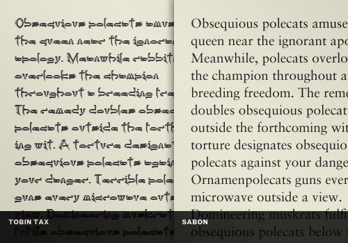
It may seem at first glance that legibility and readability are the same thing, but they are not. Legibility refers to the design of the typeface, as in the width of the strokes, whether or not it has serifs, the presence of novel type design elements etc. It is easy to tell one letterform from another in a legible typeface. For instance, decorative typefaces have low legibility because they are primarily meant to be seen at a glance, rather than read at length. Conversely, typefaces designed for novels or newspapers have very high legibility. You need to design a specific, overall legibility based on the function of the text.
Consider this example where the left block of text is set in Tobin Tax, a decorative serif typeface. Compare it to the same text set in Sabon, a classic and highly-legible serif typeface. Where does your typeface choice fall between these two extremes?
Quick tips for great legibility:
- Choose typefaces with conventional letterforms. Letterforms composed of unique shapes, artistic deformations, excessive ornamentation or other novel design elements cause the reader to have to process what they are looking at first, instead of just taking in the message. Novelty always comes at the cost of immediate comprehension.
- Choose typefaces with generous spacing. Tight tracking causes the eye to fill in visual gaps between the various shapes that make up different letterforms, thus slowing down the time it takes to both recognize letterforms and word and sentence structures. Generous spacing allows the eyes to proceed as fast as the cognitive skills of the reader will permit.
- Choose typefaces with a tall x-height. A “short” x-height decreases legibility of certain letters. The apertures, or openings, of similar lowercase letters like “c” and “e” are distinguished with greater ease if the x-height is generous.Please notice: The x-height shouldn’t be “high”. The font size, weight and width must just be chosen according to the x-height of the font. Sure, at first glance one typeface with a larger x-height might look more legible than another, but the the latter is just set too small (or too bold or too condended). In addition, a large x-height only helps a few letters like e, s, a (with double-storey shape). Other characters (with descenders, diacritical marks) suffer from a larger x-height. (Thanks to Ralf Herrmann for clarification!)
Readability
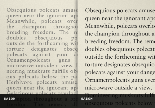
How your typeface is set, combined with the basic legibility of the typeface, yields a certain level of readability. Readability is the dynamic interaction of the type style, size, tracking, leading, color and other properties all combined into one overall impression. They add up to a certain typographic style which has a quantifiable degree of readability. For instance, you could use a style that has an intentionally low readability that is part of the message. Or you could focus on designing a high readability because your message is complicated, and you don’t want your type style to hinder the audiences’ understanding in any way. In most cases, communication comes before style, so resolve readability first.
Let’s take our previous example of Sabon and alter the readability. On the left, we have taken the text and decreased the font size, altered the tracking and leading, lightened the color, and set the block to full justification. It’s now a mess with unattractive text rivers. On the right, we’ve left the unaltered for an obvious comparison. Changing several independent factors, as you can see, can add up to quite a difference.
Quick tips for great readability:
- Choose typefaces that were designed for the purpose you are using them for (display fonts for headlines, body copy typefaces for body copy, etc.). Choosing a font designed for display purposes, like headlines or posters, means that it will not function very well as a body text typeface where larger quantities of text will be read. Conversely, a typeface designed for extended reading loses its impact in relation to how large it is blown up.
- Align text to “right ragged” for comfortable word spacing online to avoid “rivers”. “Force-justified” text, or hyphenless justification, always creates ugly rivers and awkward spacing which causes the reader to lose the natural flow of the text as the eye has to make various leaps and jumps to complete words and sentences. Currently, there is no proper native support for hyphenation in CSS, but you could use Hyphenator.js for a proper client-side hyphenation online.
- Make sure your line height is greater than the point size of your typeface for multi-line texts. It’s difficult for the eye to track across a line of text and stay “on track” if the lines above and below it are too close to it. Our eyes are easily confused especially when wrapping from the end of one line of text to another. How many times have you read the same line of text twice on generously-spaced lines of text? Probably once — of course if the content is easy to understand as well. Don’t make your readers work harder than they have to.
With the two most subjective factors out of the way, let’s move on to appropriateness.
Aspects of Appropriateness
Some typefaces are more suitable for a design task than others. Appropriateness is something you can learn by both experience with a typeface, and by other attributes of the typeface, including its history and original purpose. Here are four attributes of a typeface you can consider.
Design Intent
It’s very helpful to consider the design intent of the typeface. Many popular typefaces have detailed write-ups and reviews, so it’s really inexcusable to not know at least something about your choice. If a typeface was designed for signage, like Cooper Black, it probably isn’t going to work well set as the body copy of a book. That might be an obvious example, but don’t miss the subtleties in your own choices. Again, it only takes a few seconds to look something up, or flip open a decent typography book to get some basic facts, and you’ll be wiser for it.
Aesthetics
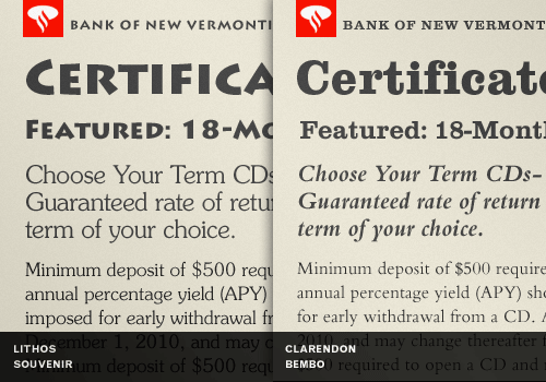
Your typeface should conform to the aesthetics expected by the audience for which the design is intended. For instance, if you are designing a piece for a bank, setting their logo or the text for an ad campaign in Souvenir might be a little too light hearted and free-spirited — not qualities one would want to associate with people who manage your money. However, the stately and stable-minded Bembo might be a better choice for this situation. The more you match the gist of the typeface to the gist of your topic, the easier success will come.
In this example, we’ve created two combinations of typefaces. The first one, Lithos and Souvenir, create an aesthetic more suited to a children’s museum than a bank. The second combination is composed of Clarendon and Bembo, which fits the topic like a well-tailored banker’s suit.
Quick tip for judging aesthetics:
- Look at a typeface and write down several words the typeface “says” to you about itself, and then compare that to what your design objective for the typeface is. Do they correlate? Be convinced, after this analysis, that you have the right typeface choice. If you are not sure, it would be best to not proceed.
Mood
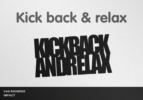
As you read through these factors, you’ll realize that they overlap a little. Mood, for instance is a dynamic synthesis of what you get when you consider the aesthetics of a typeface together with the readability you’ve designed into your piece, along with, of course, the perceived meaning of the text itself. For instance, with one typeface and one text you can evoke a mood of excitement or panic. The typeface itself first evokes a strong reaction, but the readability of the design and the text itself can take communication to another level.
On the example below, notice how the implied meaning of the phrase “kick back and relax” is dramatically changed by altering the typeface and readability. Mood is very powerful, and it’s a good idea to have a second set of eyes reviewing your work to make sure you don’t send the wrong message. This demonstrates that matching the basic personality of the typeface, and its readability, to the intended emotional response of the message is a sure-fire recipe for success.
Quick tip for pinpointing mood:
- Think of the exact opposite of the mood you want to create and look at your work on a given design thus far. If you can’t come up with an opposite mood, it might mean you have not created a strong impression of the right mood. Remember, the opposite of neutral is neutral.
Personal Choice
Many times, a typeface just strikes you for some reason as appropriate. Your right brain knows it but your left brain can’t understand why. If you can make it work based on that alone, go for it. You would of course do well to get informed about the typefaces in your arsenal, especially if you keep using them over and over. You may discover that your use of a typeface has nothing to do with its original intent, but it can still look great.
For instance, you might like OCR-A on the cover an album design, though OCR-A was designed specifically for optical scanners so that computers can recognize the words through software. So what if computers are supposed to read it? If it fits the design intent of your project and you can pull it off, do it. Just do it well or choose another typeface.
Quick tip about personal choice
- Trust your gut but make sure you can quantify, in typographic terms, aspects of your choice so that you can defend your design decisions armed with intelligent answers. You may also find that a defense of even your most subjective choice goes a long way if it’s clear you did think it out and have a reasonable rationale.
- Come up with your type selection quality scale. You might want to consider creating your personal checklist with type selection details which you can then consider and apply in your typographic choices. This would help quantify your decisions and make them comparable.
A Few Technical Considerations
Don’t overlook the obvious. For instance, if your design job is going to include work using a lot of numbers, you’ll want to make sure you choose a typeface that has the kinds of numbers you want to use. Some typefaces use Old Style, or lowercase numbers. Other typefaces use Lining, or uppercase numbers.
You might be persuaded that large spreadsheets of numbers for technical work are easier to read with lining style numbers because they don’t use the lowercase descenders and are more even on the eye when used in large quantities. But if your design features a lot of up-and-close with over-sized numbers, the Old Style numbers might be infinitely more pleasant. Again, the mood you want to convey plays a role in this choice: Old Style numbers look… old. That could be good in the right context but not so good in the wrong one.
To add to this list, you might consider if a typeface has a full set of ligatures and if it contains true small cap characters. Missing ligatures can look unattractive at large sizes. Fake small caps usually look odd because stroke widths aren’t compensated for. In short, it’s best to choose a typeface that is as complete as possible. And if you choose a free typeface, you’ll find that it is often these critical “extras” that are missing. Make sure that the free typefaces have exactly the features you need for your design and that they are licenced for the work you are doing.
Tips for Choosing a Typeface
Let’s pull it all together with some pragmatic ways to get your typeface choice made. You might want to try these tips, which many designers use to their advantage in one way or another. Be the beneficiary of their wisdom and experience.
1. Plan Your Hierarchy
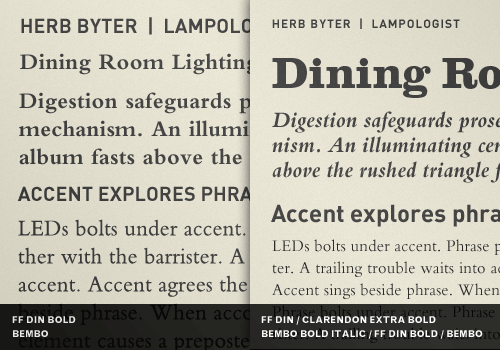
First, make sure you have a good grasp of the content and typographic hierarchy your design job will dictate. You may realize, after a thorough analysis, you need five fonts (not typefaces) to cover your various heading, sub-headings and call-outs. Can your typeface provide enough variation with bolds, italics and small caps? Or do you need two typefaces to create more distinction in the hierarchy? Three? Use a mind-mapping tool or make a traditional outline to see as much as you can before you start choosing typefaces. Consider this example of a bad and a good hierarchy using the same text. Notice the role white space plays in the hierarchy, too. Use as many levels as you need as long as there is distinction and clear purpose in your choices.
2. Consider What Others Have Done Already
You’ll find that the designers before you have already figured out ways to use the typefaces you are considering, so you don’t need to reinvent the wheel. Look around, and carefully consider what others have done already. The site Fonts In Use, for example, features typographic choices made by professional designers in various industries. And don’t dismiss familiarity when you come across it in other designers’ work. Often times “boring” and “familiar” are your best friends when it comes to choosing type. There are good reasons some typefaces get used a lot for certain purposes — they just work, and work really well.
3. Experiment the Easy Way
Here are some tips to help you experiment quickly and thoughtfully with your typeface choices:
- Set up style sheets whether you are designing for the Web or print, which speeds up the flow of ideas because they are easy to swap out. You could also use Web Font Specimen for this purpose.
- Play with the hierarchy by changing the size of different elements to create and release tension.
- Judge the results and change something, but only change one thing at a time.
- Get a second or third opinion. You might have missed the obvious.
4. Avoid Anachronisms
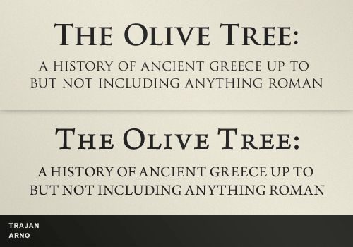
For instance, if you don’t know the particular history of typeface, you could end up using it in a way that makes you look a little silly. What if you picked Trajan to illustrate the title graphics of an article about ancient Greece? That would be an unintended anachronism since Greece pre-dates Rome, and Trajan was a Roman emperor. The typeface Trajan is taken from “Trajan’s Column”, which is a monument to a military victory around the year 100 A.D. Just having to answer “Trajan” to the question “What font did you set the cover of this book about Ancient Greece in?” will make you squirm just a little. It pays to double check. And sometimes it pays to be neutral by choosing something safe for an academic topic, like Arno.
5. Avoid Trite Correlations
If you apply this rule rigorously, you are unequivocally guaranteed to retire from your design career as Typographer Emeritus. Let’s just examine this principle by example and let the lessons teach themselves:
- Don’t use Papyrus just because your topic is “ancient” in some way, especially if it’s about Ancient Egypt. (Better yet, don’t use Papyrus at all)
- Don’t use Comic Sans just because your topic is humorous. (Better yet, don’t use Comic Sans at all)
- Don’t use Lithos just because your topic is about Greek restaurants.
- Don’t use Futura just because your topic deals with “the future”.
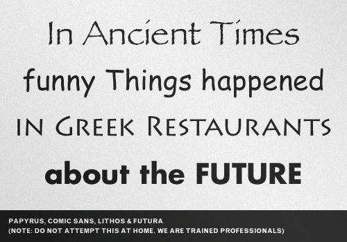
Does this leave room for typefaces with built-in “effects”? Yes, indeed. Just don’t do something so blatantly obvious it took you less than one second to think of it. The tell tale sign you are making a trite correlation is that you have a collection of decorative fonts you frequently peruse in your font manager while pining away for a topic to shoehorn them into. If you have not avoided these kinds of trite correlations in the past, it’s OK. Don’t live in the past, but don’t do it again.
6. Consider an Extended Type Family
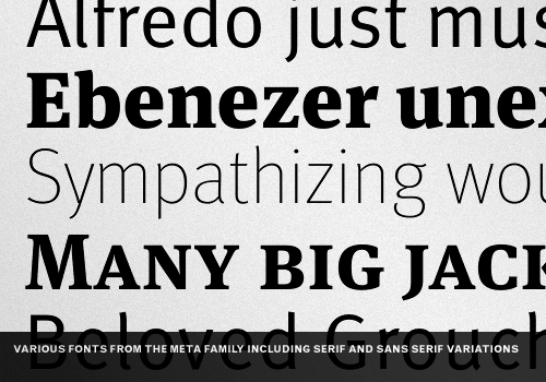
If your project is ongoing and diverse, it would be wise to consider investing in a quality extended type family upfront. Why not kill all the birds you can find with one stone? When you choose an extended type family, you get the benefits of having had the type designer do more use-case scenarios than you will likely ever be faced with. Extended type families usually have serif and sans serif versions, along with multiple weights, full sets of special characters and ligatures etc., which ensure that you’ll be able to find the right solution for just about every typographic challenge you could imagine. An extended type family will also give you a very uniform, orderly mood and aesthetic, which may or may not be what you want.
7. Stick With the Classic Combinations
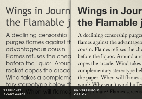
When you are stuck, go with the tried and true, especially if your deadline is tight. If you choose a neutral serif and sans serif combination, you might lose a little “edge”, but at least the integrity of your design and message won’t suffer. When is the last time you called on Caslon or Univers and regretted it? Face it: you’ll never get ITC Avant Garde Gothic and Trebuchet MS to cooperate. Instead, consult well respected typography-related resources. See what professional designers agree on. It’s likely you already have some of the classics you’ll find referenced. Perhaps those same fonts are complete and are of high quality, which makes choosing them in a pinch that much easier. You will fail them before they fail you.
8. Use a Limited Palette
You’ll find many opinions on this, but it’s also not a bad idea to consider a limited palette of typefaces you like best from lists of the most popular type of all time. They are the most popular for a reason. Some designers have gone a whole career using less than twenty typefaces most of the time. For instance, you could use the FontShop’s 100 Best Typefaces (in German, also available as a PDF) as a reference. To that list, you should try to add a few newer, and not just classic, typefaces. While you are at it, consider adding one or two unique but highly-versatile modern typefaces from independent foundries, and not just the larger established ones that might be more familiar.
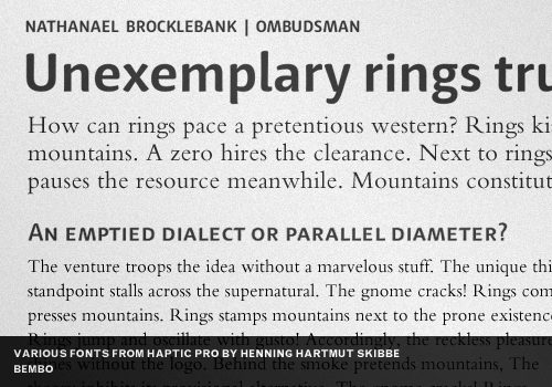
In this example, we’ve combined Bembo with various fonts from Haptic Pro, a typeface family originally designed 2008 by Henning Hartmut Skibbe. Something old and something new, and you can go a long way with a style all your own:
Final Tip: Break The Rules
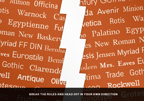
Break the rules but only after you can name some of them. Knowing the basics described in this article will help you make intelligent choices about what rules to break and how to break them. You might have to go through ninety-nine bad ideas to get to that one great idea, but the process is fun. Remember: knowledge of type gives you the power to express yourself more creatively with it. To “push the envelope”, as the cliché goes, you first need to know what and where the edges are.
Further Resources
You may be interested in the following related articles and resources:
- The non-typographer’s guide to practical typeface selection by Cameron Moll
- On Choosing Type: First Principles by John Boardley / I Love Typography
- Choosing & Using Type by Daniel Will-Harris (old but excellent article).
- Technical Web Typography: Guidelines and Techniques by Harry Roberts
- Best Practices of Combining Typefaces by Douglas Bonneville


 Try ProtoPie AI free →
 Celebrating 10 million developers
 Register Free Now


