How To Use CSS3 Pseudo-Classes
CSS3 is a wonderful thing, but it’s easy to be bamboozled by the transforms and animations (many of which are vendor-specific) and forget about the nuts-and-bolts selectors that have also been added to the specification. A number of powerful new pseudo-selectors (16 are listed in the latest W3C spec) enable us to select elements based on a range of new criteria.
Before we look at these new CSS3 pseudo-classes, let’s briefly delve into the dusty past of the Web and chart the journey of these often misunderstood selectors.
A Brief History Of Pseudo-Classes
When the CSS1 spec was completed back in 1996, a few pseudo-selectors were included, many of which you probably use almost every day. For example:
:link:visited:hover:active
Each of these states can be applied to an element, usually <a>, after which comes the name of the pseudo-class. It’s amazing to think that these pseudo-classes arrived on the scene before HTML4 was published by the W3C a year later in December 1997.
Further Reading on SmashingMag:
- An Ultimate Guide To CSS Pseudo-Classes And Pseudo-Elements
- Learning To Use The :before And :after Pseudo-Elements In CSS
- Take Your Design To The Next Level With CSS3
- CSS3 Flexible Box Layout
CSS2 Arrives
Hot on the heels of CSS1 was CSS2, whose recommended spec was published just two years later in May 1998. Along with exciting things like positioning were new pseudo-classes: :first-child and :lang().
:lang
There are a couple of ways to indicate the language of a document, and if you’re using HTML5, it’ll likely be by putting <html lang="en"> just after the doc type (specifying your local language, of course). You can now use :lang(en) to style elements on a page, which is useful when the language changes dynamically.
:first-child
You may have already used :first-child in your documents. It is often used to add or remove a top border on the first element in a list. Strange, then, that it wasn’t accompanied by :last-child; we had to wait until CSS3 was proposed before it could meet its brother.
Why Use Pseudo-Classes?
What makes pseudo-classes so useful is that they allow you to style content dynamically. In the <a> example above, we are able to describe how links are styled when the user interacts with them. As we’ll see, the new pseudo-classes allow us to dynamically style content based on its position in the document or its state.
Sixteen new pseudo-classes have been introduced as part of the W3C’s CSS Proposed Recommendation, and they are broken down into four groups: structural pseudo-classes, pseudo-classes for the states of UI elements, a target pseudo-class and a negation pseudo-class.
Let’s now run through the 16 new pseudo-selectors one at a time and see how each is used. I’ll use the same notation for naming classes that the W3C uses, where E is the element, n is a number and s is a selector.
Sample Code
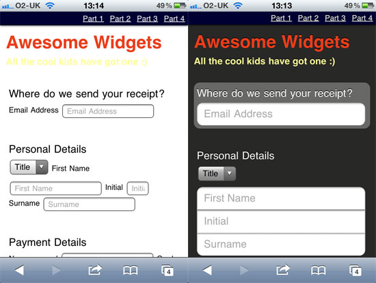
For many of these new selectors, I’ll also refer to some sample code so that you can see what effect the CSS has. We’ll take a regular form and make it suitable for an iPhone using our new CSS3 pseudo-classes.
Note that we could arguably use ID and class selectors for much of this form, but it’s a great opportunity to take our new pseudo-classes out for a spin and demonstrate how you might use them in a real-world example. Here’s the HTML (which you can see in action on my website):
<form>
 <hgroup>
 <h1>Awesome Widgets</h1>
 <h2>All the cool kids have got one :)</h2>
 </hgroup>
 <fieldset id="email">
 <legend>Where do we send your receipt?</legend>
 <label for="email">Email Address</label>
 <input type="email" name="email" placeholder="Email Address" />
 </fieldset>

 <fieldset id="details">
 <legend>Personal Details</legend>
 <select name="title" id="field_title">
  <option value="" selected="selected">Title</option>
  <option value="Mr">Mr</option>
  <option value="Mrs">Mrs</option>
  <option value="Miss">Miss</option>
 </select>

 <label for="firstname">First Name</label>
 <input name="firstname" placeholder="First Name" />

 <label for="initial">Initial</label>
 <input name="initial" placeholder="Initial" size="3" />

 <label for="surname">Surname</label>
 <input name="surname" placeholder="Surname" />
 </fieldset>

 <fieldset id="payment">
 <legend>Payment Details</legend>

 <label for="cardname">Name on card</label>
 <input name="cardname" placeholder="Name on card" />

 <label for"cardnumber">Card number</label>
 <input name="cardnumber" placeholder="Card number" />

 <select name="cardType" id="field_cardType">
  <option value="" selected="selected">Select Card Type</option>
  <option value="1">Visa</option>
  <option value="2">American Express</option>
  <option value="3">MasterCard</option>
 </select>

 <label for="cardExpiryMonth">Expiry Date</label>
 <select id="field_cardExpiryMonth" name="cardExpiryMonth">
  <option selected="selected" value="mm">MM</option>
   <option value="01">01</option>
   <option value="02">02</option>
   <option value="03">03</option>
   <option value="04">04</option>
   <option value="05">05</option>
   <option value="06">06</option>
   <option value="07">07</option>
   <option value="08">08</option>
   <option value="09">09</option>
   <option value="10">10</option>
   <option value="11">11</option>
   <option value="12">12</option>
 </select> /
 <select id="field_cardExpiryYear" name="cardExpiryYear">
   <option value="yyyy">YYYY</option>
    <option value="2011">11</option>
    <option value="2012">12</option>
    <option value="2013">13</option>
    <option value="2014">14</option>
    <option value="2015">15</option>
    <option value="2016">16</option>
    <option value="2017">17</option>
    <option value="2018">18</option>
    <option value="2019">19</option>
 </select>

 <label for"securitycode">Security code</label>
 <input name="securitycode" type="number" placeholder="Security code" size="3" />

 <p>Would you like Insurance?</p>
 <input type="radio" name="Insurance" id="insuranceYes" />
  <label for="insuranceYes">Yes Please!</label>
 <input type="radio" name="Insurance" id="insuranceNo" />
  <label for="insuranceNo">No thanks</label>

 </fieldset>

 <fieldset id="submit">
 <button type="submit" name="Submit" disabled>Here I come!</button>
 </fieldset>
</form>1. Structural Pseudo-Classes
According to the W3C, structural pseudo-classes do the following:
… permit selection based on extra information that lies in the document tree but cannot be represented by other simple selectors or combinators.
What this means is that we have selectors that have been turbo-charged to dynamically select content based on its position in the document. So let’s start at the beginning of the document, with :root.

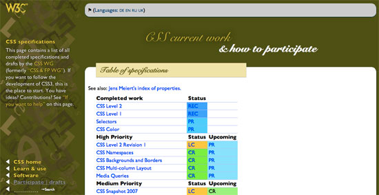
Level 3 selectors on the W3C website.
E:root
The :root pseudo-class selects the root element on the page. Ninety-nine times out of a hundred, this will be the <html> element. For example:
:root { background-color: #fcfcfc; }It’s worth noting that you could style the <html> element instead, which is perhaps a little more descriptive:
html { background-color: #fcfcfc; }iPhone Form Example Let’s move over to our sample code and give the document some basic text and background styles:
:root {
color: #fff;
text-shadow: 0 -1px 0 rgba(0,0,0,0.8);
background: url(…/images/background.png) no-repeat #282826; }
E:nth-child(n)
The :nth-child() selector might require a bit of experimentation to fully understand. The easiest implementation is to use the keywords odd or even, which are useful when displaying data that consists of rows or columns. For example, we could use the following:
ul li:nth-child(odd) {
background-color: #666;
color: #fff; }
This would highlight every other row in an unordered list. You might find this technique extremely handy when using tables. For example:
table tr:nth-child(even) { … }The :nth-child selector can be much more specific and flexible, though. You could select only the third element from a list, like so:
li:nth-child(3) { … }Note that n does not start at zero, as it might in an array. The first element is :nth-child(1), the second is :nth-child(2) and so on.
We can also use some simple algebra to make things even more exciting. Consider the following:
li:nth-child(2n) { … }Whenever we use n in this way, it stands for all positive integers (until the document runs out of elements to select!). In this instance, it would select the following list items:
- Nothing (2 × 0)
- 2nd element (2 × 1)
- 4th element (2 × 2)
- 6th element (2 × 3)
- 8th element (2 × 4)
- etc.
This actually gives us the same thing as nth-child(even). So, let’s mix things up a bit:
li:nth-child(5n) { … }This gives us:
- Nothing (5 × 0)
- 5th element (5 × 1)
- 10th element (5 × 2)
- 15th element (5 × 3)
- 20th element (5 × 4)
- etc.
Perhaps this would be useful for long lists or tables, perhaps not. We can also add and subtract numbers in this equation:
li:nth-child(4n + 1) { … }This gives us:
- 1st element ((4 × 0) + 1)
- 5th element ((4 × 1) + 1)
- 9th element ((4 × 2) + 1)
- 13th element ((4 × 3) + 1)
- 17th element ((4 × 4) + 1)
- etc.
SitePoint points out an interesting quirk here. If you set n as negative, you’ll be able to select the first x number of items like so:
li:nth-child(-n + x) { … }Let’s say you want to select the first five items in a list. Here’s the CSS:
li:nth-child(-n + 5) { … }This gives us:
- 5th element (-0 + 5)
- 4th element (-1 + 5)
- 3rd element (-2 + 5)
- 2nd element (-3 + 5)
- 1st element (-4 + 5)
- Nothing (-5 + 5)
- Nothing (-6 + 5)
- etc.
If you’re listing data in order of popularity, then highlighting, say, the top 10 entries might be useful.
WebDesign & Such has created a demo of zebra striping, which is a perfect example of how you might use nth-child in practice.
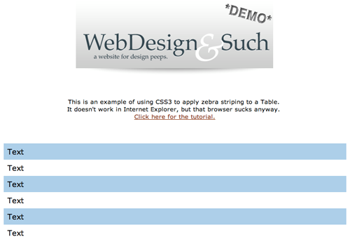
Zebra striping a table with CSS3.
If none of your tables need styling, then you could do what Webvisionary Awards has done and use :nth-child to style alternating sections of its website. Here’s the CSS:
section > section:nth-child(even) {
background:rgba(255,255,255,.1)
url("../images/hr-damaged2.png") 0 bottom no-repeat;
}
The effect is subtle on the website, but it adds a layer of detail that would be missed in older browsers.

The :nth-child selectors in action on Webvisionary Awards.
iPhone Form Example
We could use :nth-child in a few places in our iPhone form example, but let’s focus on one. We want to hide the labels for the first three fieldsets from view and use the placeholder text instead. Here’s the CSS:
form:nth-child(-n+3) label { display: none; }Here, we’re looking for the first three children of the <form> element (which are all fieldsets in our code) and then selecting the label. We then hide these labels with display: none;.
E:nth-last-child(n)
Not content with confusing us all with the :nth-child() pseudo-class, the clever folks over at the W3C have also given us :nth-last-child(n). It operates much like :nth-child() except in reverse, counting from the last item in the selection.
li:nth-last-child(1) { … }The above will select the last element in a list, whereas the following will select the penultimate element:
li:nth-last-child(2) { … }Of course, you could create other rules, like this one:
li:nth-last-child(2n+1) { … }But you would more likely want to use the following to select the last five elements of a list (based on the logic discussed above):
li:nth-last-child(-n+5) { … }If this still doesn’t make much sense, Lea Verou has created a useful CSS3 structural pseudo-class selector tester, which is definitely worth checking out.
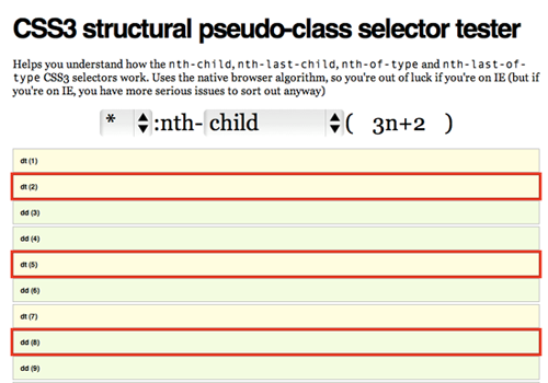
CSS3 structural pseudo-class selector tester.
iPhone Form Example
We can use :nth-last-child in our example to add rounded corners to our input for the “Card number.” Here’s our CSS, which is overly specific but gives you an idea of how we can chain pseudo-selectors together:
fieldset:nth-last-child(2) input:nth-last-of-type(3) {
border-radius: 10px; }
We first grab the penultimate fieldset and select the input that is third from last (in this case, our “Card number” input). We then add a border-radius.
:nth-of-type(n)
Now we’ll get even more specific and apply styles only to particular types of element. For example, let’s say you wanted to style the first paragraph in an article with a larger font. Here’s the CSS:
article p:nth-of-type(1) { font-size: 1.5em; }Perhaps you want to align every other image in an article to the right, and the others to the left. We can use keywords to control this:
article img:nth-of-type(odd) { float: right; }
article img:nth-of-type(even) { float: left; }
As with :nth-child() and :nth-last-child(), you can use algebraic expressions:
article p:nth-of-type(2n+2) { … }
article p:nth-of-type(-n+1) { … }
It’s worth remembering that if you need to get this specific about targeting elements, then using descriptive class names instead might be more useful.
Simon Foster has created a beautiful infographic about his 45 RPM record collection, and he uses :nth-of-type to style some of the data. Here’s a snippet from the CSS, which assigns a different background to each genre type:
ul#genre li:nth-of-type(1) {
  width:32.9%;
  background:url(images/orangenoise.jpg);
}
ul#genre li:nth-of-type(2) {
  width:15.2%;
  background:url(images/bluenoise.jpg);
}
ul#genre li:nth-of-type(3) {
  width:13.1%;
  background:url(images/greennoise.jpg);
}
And here’s what it looks like on his website:
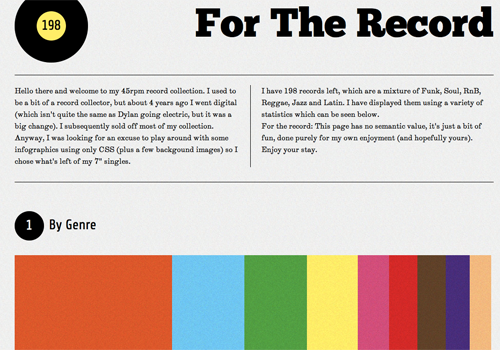
The :nth-of-type selectors on “For the Record.”
iPhone Form Example Let’s say we want every second input element to have rounded corners on the bottom. We can achieve this with CSS:
input:nth-of-type(even) {
border-bottom-left-radius: 10px;
border-bottom-right-radius: 10px; }
In our example, we want to apply this only to the fieldset for payment, because the fieldset for personal details has three text inputs. We’ll also get a bit tricky and make sure that we don’t select any of the radio inputs. Here’s the final CSS:
#payment input:nth-of-type(even):not([type=radio]) {
border-bottom-left-radius: 10px;
border-bottom-right-radius: 10px;
border-bottom: 1px solid #999;
margin-bottom: 10px; }
We’ll explain :not later in this article.
:nth-last-of-type(n)
Hopefully, by now you see where this is going: :nth-last-of-type() starts at the end of the selected elements and works backwards.
To select the last paragraph in an article, you would use this:
article p:nth-last-of-type(1) { … }You might want to choose this selector instead of :last-child if your articles don’t always end with paragraphs.
:first-of-type and :last-of-type
If :nth-of-type() and :nth-last-of-type() are too specific for your purposes, then you could use a couple of simplified selectors. For example, instead of this…
article p:nth-of-type(1) {
font-size: 1.5em; }
… we could just use this:
article p:first-of-type {
font-size: 1.5em; }
As you’d expect, :last-of-type works in exactly the same way but from the last element selected.
iPhone Form Example
We can use both :first-of-type and :last-of-type in our iPhone example, particularly when styling the rounded corners. Here’s the CSS:
fieldset input:first-of-type:not([type=radio]) {
border-top-left-radius: 10px;
border-top-right-radius: 10px; }

fieldset input:last-of-type:not([type=radio]) {
border-bottom-left-radius: 10px;
border-bottom-right-radius: 10px; }
The first line of CSS adds a top rounded border to all :first-of-type inputs in a fieldset that aren’t radio buttons. The second line adds the bottom rounded border to the last input element in a fieldset.
:only-of-type
There’s one more type selector to look at: :only-of-type(). This is useful for selecting elements that are the only one of their kind in their parent element.
For example, consider the difference between this CSS selector…
p {
font-size: 18px; }
… and this one:
p:only-of-type {
font-size: 18px; }
The first selector will style every paragraph element on the page. The second element will grab a paragraph that is the only paragraph in its parent.
This could be handy when you are styling content or data that has been dynamically outputted from a database and the query returns only one result.
Devsnippet has created a demo in which single images are styled differently from multiple images.
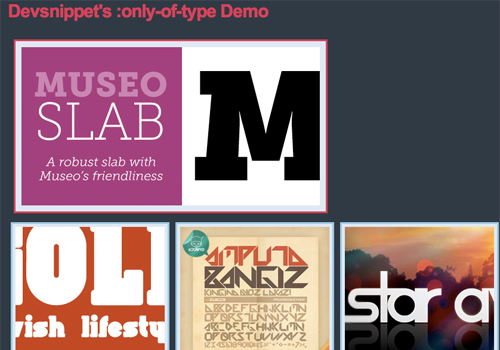
Devsnippet’s demo for :only-of-type.
iPhone Form Example In the case of our iPhone example, we can make sure that all inputs that are the only children of a fieldset have rounded corners on both the top and bottom. The CSS would be:
fieldset input:only-of-type {
border-radius: 10px; }
:last-child
It’s a little strange that :first-child was part of the CSS2 spec but that its partner in crime, :last-child, didn’t appear until CSS3. It takes no expressions or keywords here; it simply selects the last child of its parent element. For example:
li {
border-bottom: 1px solid #ccc; }

li:last-child {
border-bottom: none; }
This is a useful way to remove bottom borders from lists. You’ll see this technique quite often in WordPress widgets.
Rachel Andrew looks at :last-child and other CSS pseudo-selectors in her 24 Ways article “Cleaner Code With CSS3 Selectors.” Rachel shows us how to use this selector to create a well-formatted image gallery without additional classes.
The CSS for :last-child in action, courtesy of Rachel Andrew.
:only-child
If an element is the only child of its parent, then you can select it with :only-child. Unlike with :only-of-type, it doesn’t matter what type of element it is. For example:
li:only-child { … }We could use this to select list elements that are the only list elements in their <ol> or <ul> parent.
:empty
Finally, in structural pseudo-classes, we have :empty. Not surprisingly, this selects only elements that have no children and no content. Again, this might be useful when dealing with dynamic content outputted from a database.
#results:empty {
background-color: #fcc; }
You might use the above to draw the user’s attention to an empty search results section.
2. The Target Pseudo-Class
:target
This is one of my favourite pseudo-classes, because it allows us to style elements on the page based on the URL. If the URL has an identifier (that follows an #), then the :target pseudo-class will style the element that shares the ID with the identifier. Take a URL that looks like this:
https://www.example.com/css3-pseudo-selectors#summary
The section with the id summary can now be styled like so:
:target {
background-color: #fcc; }
This is a great way to style elements on pages that have been linked to from external content. You could also use it with internal anchors to highlight content that users have skipped to.
Perhaps the most impressive use of :target I’ve seen is Corey Mwamba’s Scrolling Site of Green. Corey uses some creative CSS3 and the :target pseudo-class to create animated tabbed navigation. The demo contains some clever use of CSS3, illustrating how pseudo-classes are often best used in combination with other CSS selectors.
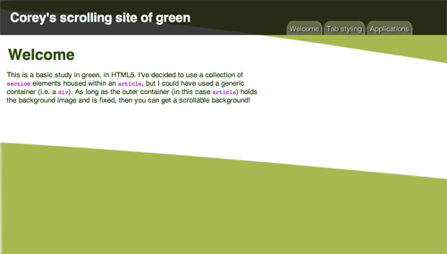
Corey’s Scrolling Site of Green.
There’s also an interesting example over at Web Designer Notebook. In it, :target and Webkit animations are used to highlight blocks of text in target divs. Chris Coyier also creates a :target-based tabbing system at CSS-Tricks.
iPhone Form Example As you’ll see on my demo page, I’ve added a navigation bar at the top that skips down to different sections of the form. We can highlight any section the user jumps to with the following CSS:
:target {
background-color: rgba(255,255,255,0.3);

-webkit-border-radius:
10px;}
3. The UI Element States Pseudo-Classes
:enabled and :disabled
Together with :checked, :enabled and :disabled make up the three pseudo-classes for UI element states. That is, they allow you to style elements (usually form elements) based on their state. A state could be set by the user (as with :checked) or by the developer (as with :enabled and :disabled). For example, we could use the following:
input:enabled {
background-color: #dfd; }

input:disabled {
background-color: #fdd; }
This is a great way to give feedback on what users can and cannot fill in. You’ll often see this dynamic feature enhanced with JavaScript.
iPhone Form Example
To illustrate :disabled in practice, I have disabled the form’s “Submit” button in the HTML and added this line of CSS:
:disabled {
color: #600; }
The button text is now red!
:checked
The third pseudo-class here is :checked, which deals with the state of an element such as a checkbox or radio button. Again, this is very useful for giving feedback on what users have selected. For example:
input[type=radio]:checked {
font-weight: bold; }
iPhone Form Example As a flourish, we can use CSS to highlight the text next to each radio button once the button has been pressed:
input:checked + label {
text-shadow: 0 0 6px #fff; }
We first select any input that has been checked, and then we look for the very next <span> element that contains our text. Highlighting the text with a simple text-shadow is an effective way to provide user feedback.
4. Negation Pseudo-Class
:not
This is another of my favorites, because it selects everything except the element you specify. For example:
:not(footer) { … }This selects everything on the page that is not a footer element. When used with form inputs, they allow us to get a little sneakier:
input:not([type=submit]) { … }
input:not(disabled) { … }
The first line selects every form input that’s not a “Submit” button, which is useful for styling forms. The second selects all input elements that are not enabled; again useful for giving feedback on how to fill in a form.
iPhone User Example
You’ve already seen the :not selector in action. It’s particularly powerful when chained with other CSS3 pseudo-selectors. Let’s take a closer look at one example:
fieldset input:not([type=radio]) {
margin: 0;
width: 290px;
font-size: 18px;
border-radius: 0;
border-bottom: 0;
border-color: #999;
padding: 8px 10px;}
Here we are selecting all inputs inside fieldset elements that are not radio buttons. This is incredibly useful when styling forms because you will often want to style text inputs different from select boxes, radio buttons and “Submit” buttons.
Check out our final page.
What’s Old Is New Again
Let’s go back to the beginning of our story and the humble a:link. HTML5 arrived on the scene recently and brought with it an exciting change to the <a> element that gives the CSS3 pseudo-selector an additive effect.
An <a> element can now be wrapped around block-level elements, turning whole sections of your page into links (as long as those sections don’t contain other interactive elements). Whereas JavaScript was once popular for making entire <div> elements clickable, you can now do so by wrapping sections in <a> tags, like so:
<a href="https://www.smashing-magazine.com">
<div id="advert">
<hgroup>
<h1>Jackson’s Widgets</h1>
<h2>The finest widgets in Kentucky</h2>
</hgroup>
<p>Buy Jackson’s Widgets today,
and be sure of a trouble-free life for you,
your widget and your machinery.
Trusted and sold since 1896.</p>
</div>
</a>
The implication for CSS pseudo-selectors is that you can now style a <div> based on whether it is being hovered over (a:hover) or is active (a:active), like so:
a:hover #advert {
background-color: #f7f7f7; }
Anything that decreases JavaScript and increases semantic code has to be good!
Cross-Browser Compatibility
You had to ask, didn’t you! Unbelievably, Internet Explorer 8 (and earlier) doesn’t support any of these selectors, whereas the latest versions of Chrome, Opera, Safari and Firefox all do. Before your blood boils, consider the following solutions.
Internet Explorer 9
Unless you’ve been living under a rock for the last week, you’ll have heard that Microsoft unleashed its latest browser on an unsuspecting public. The good thing is, it’s actually quite good. While I don’t expect people who are reading this article to change their browsing habits, it’s worth remembering that the majority of the world uses IE; and thanks to Windows Update and a global marketing campaign, we can hope to see IE9 as the dominant Windows browser in the near future. That’s good for Web designers, and it’s good for pseudo-selectors. But what about IE8 and its ancestors?
JavaScript
Our old friend JavaScript comes to the rescue. I particularly like Selectivizr by Keith Clark. Keith has put together a lovely script that, in combination with your JavaScript library of choice, adds CSS3 pseudo-class selector functionality for earlier versions of IE. Be warned that some libraries fare better than others: if you’re using MooTools with Selectivizr, then all the pseudo-classes will be available, but if you’re relying on jQuery to do the heavy lifting, then a number of the selectors won’t work at all.
Keith recently released a jQuery plug-in that extends jQuery to include support for the following CSS3 pseudo-class selectors:
:first-of-type:last-of-type:only-of-type:nth-of-type:nth-last-of-type
It’s also worth looking at the ubiquitous ie7.js script (and its successors) by Dean Edwards. This script solves a number of IE-related problems, including CSS3 pseudo-selectors.
So, Should We Start Using CSS3 Pseudo-Selectors Today?
I guess the answer to that question depends on how you view JavaScript. It’s true that pseudo-selectors can be completely replaced with classes and IDs; but it’s also true that, when styling complex layouts, pseudo-selectors are both incredibly useful and the natural next step for your CSS. If you find that they improve the readability of your CSS and reduce the need for (non-semantic) classes in your HTML, then it I’d definitely recommend embracing them today.
You could use two selectors and fall back on a class name, but that would just duplicate work. It also means that you wouldn’t need the pseudo-classes in the first place. But if you did choose to go down this path, the code might look something like this:
li:nth-of-type(3),
li.third { … }
This method is not as flexible as using pseudo-classes because you have to keep updating the HTML and CSS when the page content changes.
If a lot of your users don’t have JavaScript enabled, that puts you in a bit of a bind. Many Web designers argue that functionality (i.e. JavaScript) is different from layout (i.e. CSS), and so you should not rely on JavaScript to make pseudo-selectors work in IE8 and earlier.
While I agree with the principle, in practice I believe that providing the best possible experience to 99% of your users is better than accounting for the remaining 1% (or however big your non-JavaScript base may be).
Follow your website’s analytics, and be prepared to make decisions that improve your skills as a Web designer and, more importantly, provide the best experience possible to the majority of users.
Final Thoughts
It’s hard not to be depressed by IE8’s complete lack of support for pseudo-classes. Arguably, having the browser calculate and recalculate page styles in this fashion will have implications for rendering speed; but because all other major browsers now support these selectors, it’s frustrating that most of our users can’t benefit from them without a JavaScript hack.
But as Professor Farnsworth says, “Good news everyone!” Breaking on the horizon is the dawn of Internet Explorer 9, and Microsoft has made sure that its new browser supports each and every one of the selectors discussed in this article.
CSS3 pseudo-selectors won’t likely take up large chunks of your style sheets. They are specific yet dynamic and are more likely, at least initially, to add finishing touches to a page than to set an overall style. Perhaps you want to drop the bottom border in the last item of a list, or give visual feedback to users as they fill in a form. This is all possible with CSS3, and as usage becomes more mainstream, I expect these will become a regular part of the Web designer’s toolbox.
If you’ve seen any interesting or exciting uses of these selectors out there in the field, do let us know in the comments below.
Other Resources
You may be interested in the following articles and related resources:
- The Official CSS3 Selectors Proposed Recommendation Everything you need to know, from the folks in charge.
- Wikipedia’s Guide to Cascading Style Sheets A good background read, and the bibliography is a great resource.
- How nth-child Works A comprehensive guide from the ever-reliable Chris Coyier.
- Internet Explorer 9 If you haven’t yet played around with Redmond’s latest offering, you’re in for a pleasant surprise.
(al) (ik)


 See the full picture →
 SurveyJS: White-Label Survey Solution for Your JS App


 Celebrating 10 million developers

