Showcase Of Creative Navigation Menus: Good And Bad Examples

Email Newsletter
Weekly tips on front-end & UX.
Trusted by 182,000+ folks.
 Register for Free


 Custom Web Forms for Angular, React, & Vue. Your backend.
 Celebrating 10 million developers
Good navigation is the main cornerstone of an effective website. In practice, however, it’s often a tough challenge to come up with a meaningful, unambiguous way to organize, arrange, and display content to users; and it’s often not much easier to find a visually interesting solution either. The wide adaption of JavaScript libraries like jQuery is making it increasingly easy to add various kinds of sleek animations to navigation design.
For instance, many recent promo websites are essentially single page websites with an array of animation effects used to make navigation a smoother and richer user experience.
We need to be very careful and cautious when using these dynamic effects in our designs. A simple, calm navigation is usually much more user-friendly than an evolved, dynamic one. Users want to use the website, not be baffled by the weird and hardly usable navigation. But that’s not to say that a creative navigation should be avoided at all costs; in some contexts, an interactive menu does make sense, especially when it comes to promotional websites such as online campaigns, portfolios or advertising — on these sites, interactive navigation can lend some dynamics to an otherwise dull and boring experience.
Below we present some interesting examples of website navigation menus — they are not necessarily very usable, but they are certainly inspiring and original and thus you could build your designs upon the ideas presented below: use them, tweak them and improve upon them. We also discuss the potential usability problems of each of the techniques presented in this post. Before using a similar technique in your design, please make sure that it fits the context of your design. Test, validate and verify that the technique would actually make sense in your website. Approach these techniques with caution. Let’s take a look at some interesting ways to present navigation menus content for both smaller promotional pages and deep informational websites.
Parallax and Scrolling
Parallax is an animation effect that allows layers to move in response to a particular viewpoint. The effect is used to add a three-dimensional depth illusion to the design and make interaction more responsive and interesting. Recently, this technique has been frequently used to animate background images, as in the famous Nike Better World site.
Nike Better World
Rich graphics and parallax 3D effects
On the Nike page, the effect is visible when a user scrolls the page vertically. The background images seem to overlap, as if they were piled up in a slide deck. This effect is particularly strong when you click on the circles in the right area of the site. Notice the dashed horizontal and vertical lines which are displayed as you scroll the page. They vividly connect parts of the site and help to create a more consistent user experience.
One drawback of the navigation here is that the navigation controls are very subtle. In fact, on many sites which use this technique, the strong emphases are on the rich, detailed illustrations which make it a bit more challenging to actually find the navigation. In this example, perceiving the dots on the right side as navigation and not mistaking them for part of the design may take a while. Still, a very original and memorable design.
Rosso Carmilla
Horizontal parallax animation
Rosso Carmilla features an interesting twist on a combination of the Parallax-effect and scrolling navigation. The designer uses a horizontal rather than a vertical orientation, with a classic navigation menu at the top. As the user hovers over visual elements, they seem to move, creating the illusion of depth. The limited color palette and original illustrations work very well with the animation to create a memorable experience. The subtle animations are visible only when the user hovers over the content area.
The idea is very interesting, and the execution is done fairly well. However, a larger font size and additional navigation controls for a smooth transition between sections might improve the overall usability of the site: the horizontal scroll bar at the bottom of the page isn’t easy to notice and isn’t very comfortable to use.
Discover Tennessee Trails & Byways
Horizontal scrolling navigation, clarified.
Discover Tennessee Trails & Byways incorporate a “trail viewer” navigation for their users. The designers of the site use the same idea of horizontal scrolling navigation with a Parallax animation, but they decided to explain to users first how to use the navigation on the site. Usually, this is not a sign for an effective navigation, but it works quite well in this example, especially because the overall design appears to be very novel, playful and experimental to users anyway. In the case of uncommon or particularly innovative design techniques, this kind of instruction might be necessary until users understand the paradigm of the new navigation pattern.
When the user clicks on a trailer icon, further related details are displayed in a lightbox. Also notice how the “map” with trailer on the right side moves when the user uses the main “trail viewer” navigation. The other interesting navigation menu on the site is the one displayed at the bottom of the page; when a user selects an area, secondary options are displayed in the menu on the right side and this selection doesn’t change wherever the user’s mouse is. This navigation menu is also very nicely integrated in the overall site’s design.
Siebennull
‘Cluttered desk’ meets Parallax
Strikingly original, Siebennull features a ‘cluttered desk’ style wooden theme, along with a 3D feel provided in part by shadows and other realistic graphics and in part by the Parallax effect which is applied to the whole page. The overall effect feel very interconnected without too much clutter.
One pitfall with an animated background, however, is that the background doesn’t necessarily hold still while the user is viewing something in detail, whether in a model box or a simple zoom-in. This can make it more difficult to read large blocks of text. The page does feel a bit difficult to focus on due to a strong Parallax-effect. This is probably an example of the Parallax-effect being used too strongly, thus deteriorating the purpose of navigation.
Storytelling
It’s common practice to keep the design as simple and intuitive as possible, making it very easy for the user to click from one page to the next, almost mindlessly — “don’t make the user think” is the rule. However, you could as well engage users on your site, making them think about what’s going on in the page and involving them in the experience on a deeper level. For instance, you could employ storytelling to increase the engagement on your site by telling a story that your users would like to pursue or interact with.
One way to make your visitors feel involved is to turn the website into an interactive journey. While users interact with the page, they can learn something along the way, being baffled by the originality and uncertainty of the site. This technique is probably best-suited to promotional landing pages rather than content-heavy websites. If a story is intriguing and presented in an interesting, perhaps unconventional way, it will capture users’ attention and encourange them to continue through to your site’s call to action. A few fine examples of these types of navigation are highlighted below.
Ben the Bodyguard
A narrated landing page
The designers of the Ben the Bodyguard landing page have chosen a very memorable metaphor for their main character. Instead of presenting a generic “coming soon” page with a description of the upcoming service, the site effectively tells a story. The main tagline of the page is “A Frenchman protecting your secrets. Yes, seriously.” Next to this statement, a description of the tool is presented subtly. The mysterious character is displayed in the background, yet it very well captures users’ attention and interest.
The actual interesting part of the page happens when you scroll the page slowly. If you pay attention to illustrations and read all the details presented, you can watch as a story unfolds. While the narrator walks down the street, he gives you some explanation, but only enough to raise your interest. As you keep scrolling, the story reaches its climax and ends with a prominent call-to-action buttons. Notice that the design is responsive and the illustrations adjust to the user’s viewport. On the whole, it’s not classic navigation, but it’s not a traditional site either. Ben the Bodyguard is a remarkable website and storytelling works very well in this context of a promotional piece. That’s the reason why the site has received so much attention when it was initially released.
Youzee
Smooth, gentle storytelling
Youzee is another example of a smooth, vertical one-page scrolling navigation which employs storytelling. The page has the main navigation at the top, yet it is not linked to separate pages, but rather to the sections of the loaded page. In fact, each section slides up neatly, with a bit of animation but not enough to make the user dizzy.
Notice how carefully the designers use storytelling to involve the user in a story and engage them in learning about the tool. Opposite to Ben the Bodyguard, the design doesn’t rely heavily on a character, but rather uses more familiar, existing metaphors to unfold the story. The main area on the top isn’t saying what the service is about; the user learns it along the way as he scrolls the page. Also notice how well designers use the “Turn on” metaphor for the button on the top of the page; it looks as if it wanted to be clicked on and responds appropriately to a click. Well done, guys, well done.
Scrolling Navigation
Tried and true, scrolling navigation is a simple and elegant way to guide users through your content. Many designers are experimenting with scrolling navigation on single page designs which accomodate the full information of a website on one page rather than spreading it across multiple pages that would load separately. Usability studies are required to determine if this navigation pattern is more effective than a classic one, and it would be wrong to apply it to contexts without verifying its usefulness first. Some ways of making your scrolling navigation unique are highlighted below.
Polecat
Back to the basics
Polecat is a yet nice example of a single page site with scrolling navigation. The primary navigation in the upper right corner is very minimal, plain text almost, but it works well because it’s not in the way; it’s clearly available and makes the user feel like they know exactly where they are. The illustrations are unique and engaging. When you visit the page for the first time, you might feel overwhelmed with a number of information items thrown at you, but this feeling goes away shortly after the site is explored in more detail.
When a navigation item is clicked, the page smoothly scrolls to the chosen section of the page. The interesting part is that various parts of the page are clearly divided using distinctive background colors, so the user always knows exactly where a section begins and where it ends. Also, each section is vividly illustrated, leaving a lasting and memorable impression. It has a more interesting and engaging design for a portfolio website than many of the similar websites out there.
The main drawback: at first glance, it’s not quite clear which elements are clickable and how the navigation works, which can be a bit confusing at first.
Cornerd
Simple vertical scrolling navigation
Very much like Polecat, Cornerd features lots of illustrative eye-candy. The monster theme is working very well and subtle eye movements of the monsters create an inviting, playful atmosphere. The designer Denise Chandler does not take herself too seriously and this is exactly what invokes empathy and sympathy on the site, making it easier to develop trust for designer’s ability to produce engaging and attractive work.
The sections of the page work well, but a fixed navigation at theop might really help to establish more of a sense of freedom, especially in the long sections like the portfolio section. Instead of that, the user is only provided with the option to move back up.
Curious Generation Group
Single page scrolling with a twist
While clean and organized, Curious Generation Group feels a bit unexpected with its colorful round shapes. A simple static navigation bar at the top is both subtle and plays well with the overall design of this website. Sometimes a fixed navigation bar can feel clunky and distracting, but this one feels light and airy with its transparency. The positioning of the content works well with the animation of the scrolling and does a good job of leading your eye through the website. Notice that all single areas are interconnected: for each area, there is a sidebar navigation displaying further navigation options. A very vivid, colorful and memorable design.
Eric Johansson
Riding on a scooter
Eric Johansson does a couple of things that make the exploration of his site interesting for the user. The page provides subtle cues on how to use the navigation and there is also a (kind of) horizontal scrollbar which appears within the context of the page. It’s a small difference, to have a scrollbar a few pixels above the bottom of the window as opposed to using the browser scrollbar itself, but it provides almost enough distinction to make it clear that the user is supposed to click and drag.
As the users scroll the page, they need to look out for arrows and handles that need to be clicked on in order for further navigation options to be displayed. Eric is playing with the users, and does so in a very unique way. Users that do not feel comfortable with it are nevertheless provided with the option to View the extended & “normal” site. The graphics on the page could be improved a bit to make the design look a bit realistic, but maybe it is designed this way on purpose. But it would be great if the users could scroll the page without necessarily using the integrated scroll bar on the bottom of the page (see Scroll Page Horizontally With Mouse Wheel).
Haunted Cathouse
Vertical scrolling navigation with storybook graphics
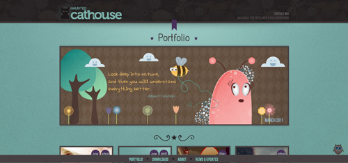
Haunted Cathouse is a yet another, very detailed and very illustrated page which breaks the flow of the page by displaying unique illustrations between the sections of the page. As the user scrolls vertically, he can either see the current section, jump to the previous one or to the next one.
Clicking on the little owl in the lower right corner reveals a slide in navigation bar at your service wherever you are on the site, a better indicator however may save the visitor some time. While some users may be happy to start scrolling away on their mouse to get to the content, in this particular design it might be useful to provide multiple options. A top-level navigation bar also provides a way to highlight what kind of content users can expect to find below.
Sam Web
Horizontal scrolling within horizontal scrolling
Sam Web’s horizontal scrolling panels, while a fairly classic navigation model, are very cleanly executed. It’s also nice that some sections slide horizontally while the contact link scrolls to the bottom, since that element is present globally.
The interesting thing here is the nested horizontal scroller on the portfolio page. Since it scrolls in the same direction as the main content area, but isn’t controlled by the same navigation, it has some potential to confuse users. The left and right arrows are visual indicators that something is different about this section, but it also might benefit from being a slightly different kind of scroller, or using some other interaction to navigate that content. It’s a tricky thing, finding a slick way to add navigation to subcontent already inside of some sort of interactive navigation.
Denny’s Restaurant
Too much of anything is bad for you
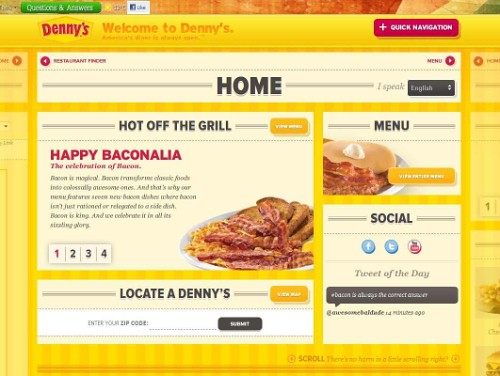
The designers of Denny’s Restaurant probably overshot when searching for a way to accommodate a lot of content. The combination of horizontal and vertical scrolling is rather disorienting than helpful. Without the small hint on the home screen, the user may even miss the content only reachable through the extra vertical scroll. Additional content is hidden in sliders and it seems easy to get lost. In addition to being confusing, the site is not very friendly to mobile users, looking to order or find a restaurant on the go. The site might create a feeling of “fluid content” which is a bit difficult to grasp and focus on, since everything is moving; everything is interactive and everything is changing. The design could use a bit more calm.
Experimental Navigation Menus
It seems that designers often feel a bit underwhelmed with classic navigation pattern and inventing new methods of navigation or just add a new twist to convenient design patterns. The sites featured below present navigation in some interesting ways.
Ferocious Quarterly
The more unconventional tabs
Ferocious Quarterly’s tabs in the upper section of the site are a little out of the ordinary. The single fact that they are presented in a different way, creating an illusion of depth, makes the design stand out a bit. A good example of how a small detail can make an otherwise quite unspectacular design look a bit more interesting.
Zut Alors [Warning: First five seconds may cause a headache!]
Pop-up-mania at its best
Overall, ZUT ALORS! is extremely avante garde and very non-traditional. The large front and center letters are the only content on the page, and they are the navigation. Each letter pops open a series of thoroughly arranged pop-ups with subsequent page content.
While this approach is unique and bound to stand out, it will also deter average users. The short, simple statement on the landing page isn’t very informative and makes the user get confused. The pop-up secondary pages could backfire though: if the user has many windows open, the new opened ones won’t necessarily be the primary focus, which could make the design confusing. Although it is possible that that was the intention of designers in the first place. A very weird, noisy and extremely memorable design. Please do not try this at home.
Method Design Lab
Up-to-date news
Method Design Lab’s menu to follow their feed is one of a kind. Following their activity on the site is made easy by the graphic equalizer-like history in the top right hand corner. Clicking on an hour brings up all posts, media releases and tweets of the past hours. Differentiating between the different types is easy since each is assigned a specific color. A click on one of the news bubbles pops open a window with the actual message. Both the idea and the implementation are quite refreshing and do not overstrain the visitors patience.
The Web Standards Sherpa
Skipping through content
The Web Standards Sherpa basically comes without much of a navigation. The content is presented on slides that can be skipped through. The arrows clearly indicate the preceding and following articles. While it is still manageable to skip through less than ten articles, this type of navigation is of no greater use once more than twenty articles are up for view. The link to a list of all published articles as well as the search function takes care of this. A level deeper into the site, the horizontal navigation only consists of three clear options that leave no one in the dark about their whereabouts.
BonLook
Illustrated Drop-Down Menu
BonLook features a nice example of a clean and simple illustrated drop-down menu. Choosing glasses by shape instead of brands makes the product catalog easier for any customer’s browser. In general, using pictograms in menu contexts eases orientation and helps customers find what they are looking for.
Design Intellection
Right-side dynamic navigation tabs
The guys at Design Intellection present their portfolio-style site with a tab navigation on the right hand side. Interestingly enough, the navigation changes appearance when scrolling into the context section of each page, replacing the original literal menu with small icons. A click on the icons brings the user back to the top of each section, giving them a quick hint that the icon style is simply a smaller version of the main menu, not a submenu for the specific content section.
Generally a nice and intuitive menu style worth adapting and easily extended to cover subsections of content.
Bernat Fortet Unanue
A creative and interesting way to present your work
Fortet features 22 categories of work in the form of circular navigation buttons. The full menu reappears at the end of every page, making the site easy to skim through. Even though it is quite space intensive, the user is already used to its look and recognizes the visited categories. Another example of a clear visual indication contributing positively to the look and feel of the site.
Lega-Lega
Intuitive and clear pictograms with roll-over titles
The Lega-Lega is simply structured and slick. The menu only consists of seven categories, each featuring a single layer. Only minus: the horizontal scroll-bar may easily be mistaken for part of the layout rather than being recognized as a scroller. Adding a mouse-over effect might fix the issue. A clean and easy site with straightforward navigation — you certainly will not get lost here.
Bluecadet Interactive
Clean submenu
Bluecadet sets an example in implementing a clean version of a graphics-heavy submenu. The design features a slider on the right side; as the user browses the items of the slider, the background image changes as well. Once an item in the navigation is chosen, the page displays the previous and next projects as well as provides a link to get back to the main menu. Also, the user can personally check the categories being displayed.
Danilo Iurlaro
Creative animation effects
Danilo Iurlaro features a creative use of scrolling animation effects, and it certainly stands out in a crowd. However, the text that jumps down from the top whenever a navigation item is clicked is truly annoying and distracting. At first, it gives the impression that this text is the title of the page, not just a transitional graphic, which actually isn’t the case. Letting the users scroll down manually to view the actual content with such a large navigation area is quite a challenge.
When using novel navigation techniques that many users might be unfamiliar with, it’s really important to utilize clear labelling to help them find their way through the site.
Fantasy Cartography
A map of navigation
Fantasy Cartography is a site showcasing maps, with navigation that is modelled after a map itself. While the content sections are basically a take on scrolling navigation, the organization and layout of the navigation options is unusual. The site is also full of ‘soft effects’ which tie it well in with the illustrations.
Clear visual indication using the link-corresponding dots correlates the active tab with the displayed content. Labelling is key in atypical navigation situations.
C&C Coffee Company
Charming animation
The upper navigation of C&C Coffee Company is an example of animated navigation that is minimal, simple, and although being dynamic, doesn’t force itself onto users. The dynamic navigation elements fit nicely to the overall design of the page which also contains other “hand-written” elements, giving the brewery a more personal, friendly touch. Still, having seen the animation once may be enough for some visitors.
Breadcrumbs
NOS
Context-sensitive breadcrumbs
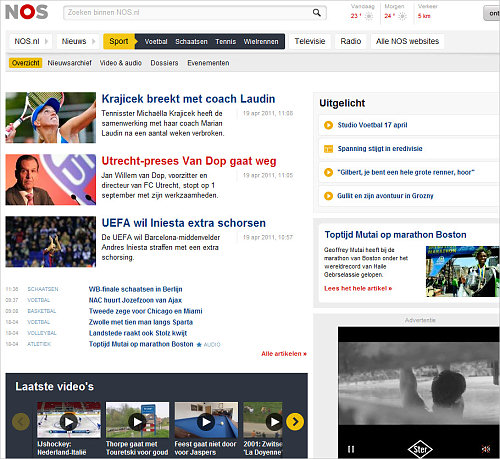
The top-level navigation in this example is really simple, but very clever. NOS displays sub-categories to the right of each top-level category when clicked, almost like a breadcrumb. This is a really interesting take and a good way to handle a large content-heavy site with a lot of categories. It lends itself well to the blog format where a lot of different new categories may be coming and going constantly.
MDM Bank
Persistent breadcrumb
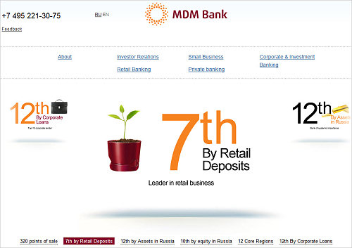
MDM Bank features a classic breadcrumb-style navigation. However, it not only keeps track of where users have been so they can always return easily to any given point, but clicking on the site map tab reveals the complete interactive map for easy pinpoint navigation throughout the site.
Sliding Sections
Sliding sections are a great way to display a lot of content in less space. You have the advantage of focusing the user into that specific content block at a time, which can be useful if you’d like to present certain information and are trying to not distract the user with other information at the same time. Below are some examples of effective implementations.
Directions
Accordion style navigation links
Directions is a well-executed example of sliding sections. There’s a lot of content on this one page, but it doesn’t feel overwhelming because not all of it is displayed at the same time. This is a good method for a site with a lot of links, or that’s just deep.
The secondary navigation is carried through to the secondary pages, so users won’t get lost. One suggestion, however, would be that if the navigation pattern would somehow reappear on the secondary pages as well, instead of the classic navigation. This might just help make the site appear a bit more striking and coherent.
Coexhibitions
Expand to see content
Coexhibitions basically is one big sliding menu. Clicking on the titles reveals information about past and current events taking place in their showrooms. Certainly a good choice for a site with limited content, even though an easy way back to the top is not offered. Hiding the content in sliders is comfortable. In this case it helps create a calendar of events taking place at the venue.
Bankwest
Multiple expanding levels
Bankwest does not use sliding animations, but it’s a good example of a multi-tiered navigation system. They have a left-aligned top level navigation, which expands first vertically and then horizontally as the user navigates deeper. This is another good strategy for a very deep, content-heavy site. While it works very well as it is, a little JavaScript interaction allows users to peruse the deeper levels of navigation a bit more easily, making it even more effective. Notice the breadcrumbs navigation at the top of the content area: it supports the navigation and helps the users track their path throughout the website.
Elliot Lepers
Sliding boxes with captions
Elliot Lepers uses an interesting grid layout with interactive sliding boxes. They load quickly and the website is easy to navigate. The simplicity of the information being on the main page makes it extremely difficult to get lost, as there are always arrows to follow and to click. The colors are quite energizing and the content nicely organized.
The secondary pages for each project are also well-done. The big arrow on the left is the only navigation that appears on each, but since the primary navigation is the front page, it still perfectly serves its function.
Global Humanitarian Assistance
Hidden sections help deal with large amounts of content
One of the first things a user probably should notice on Global Humanitarian Assistance is the bright yellow left slide-out menu. It’s neatly executed, yet because all other elements are yellow, too, it doesn’t really jump to an eye. The site is very data-heavy and intended to provide visitors with access to many reports and case studies which are all hidden behind the yellow bar; in general, it’s a very neat and simple way to hide secondary navigation until it’s needed (context-sensitive navigation). An interesting idea: such slide-out panels are generally a good way for content-heavy sites to hide things while making them globally available. In this specific case, the secondary navigation panel could have been a bit thicker to attract the user’s focus.
Creative NZ
A lot of information in a small amount of space
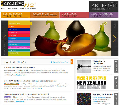
Creative NZ features a “mega drop-down-menu”. This is a nice example of a navigation that makes good use of the space by adding classic navigation (like the contact form, advanced search, etc.) as well as informative blocks along the bottom of each one. If you’re going to use such a menu, it’s really worth taking the time to carefully study the content and make sure that you’re efficiently selecting the content to be included in each submenu.
Additionally, notice the categorized slider on the main page. By making use of categories, it actually presents multiple slideshows at once.
Conclusion
Some final points to keep in mind when working with creative navigation:
- Use appropriate descriptions to clarify when necessary. Not every engaging navigation paradigm is self-explanatory; sometimes a little explanation or introduction to the technique may be of greater help to the users of the site. Do not exaggerate and do not overcomplicate things, though. The experience should be smooth and simple.
- Consistency is crucial. Even completely avante garde navigation can work well when key elements are always accessible, allowing the user to permanently have an overview as well as a sort of life buoy.
- Use clear labels. Simple image cues aren’t always enough to guide users, and animated clues might not be perceived as navigational elements.
- Consider telling a story. You could employ storytelling to increase the engagement on your site by telling a story that your users would like to pursue or interact with. This technique is probably best-suited to promotional landing pages rather than content-heavy websites.
Related Posts
- Showcase of Interesting Navigation Design Trends
- Showcase of Modern Navigation Design Trends
- Showcase of Well-Designed Tabbed Navigation
Note: Thank you to Smashing Magazine’s proofreader, John von Bergen.
Further Reading
- Planning And Implementing Website Navigation
- Web Design Navigation Menus – Articles And A Beautiful Showcase
- Efficiently Simplifying Navigation, Part 1: Information Architecture
- Mobile Navigation For Smashing Magazine: A Case Study
 (ik, vf, mrn)

