Using CSS3: Older Browsers And Common Considerations

Email Newsletter
Weekly tips on front-end & UX.
Trusted by 182,000+ folks.


 Custom Web Forms for Angular, React, & Vue. Your backend.
 Celebrating 10 million developers
With the arrival of IE9, Microsoft has signalled its intent to work more with standards-based technologies. With IE still the single most popular browser and in many ways the browser for the uninitiated, this is hopefully the long awaited start of us Web craftsmen embracing the idea of using CSS3 as freely as we do CSS 2.1. However, with IE9 not being supported on versions of Windows before Vista and a lot of businesses still running XP and reluctant (or unable) to upgrade, it might take a while until a vast majority of our users will see the new technologies put to practice.
While plenty of people out there are using CSS3, many aren’t so keen or don’t know where to start. This article will first look at the ideas behind CSS3, and then consider some good working practices for older browsers and some new common issues.
A Helpful Analogy
The best analogy to explain CSS3 that I’ve heard relates to the world of film. Filmmakers can’t guarantee what platform their viewers will see their films on. Some will watch them at the cinema, some will watch them at home, and some will watch them on portable devices. Even among these few viewing options, there is still a massive potential for differences: IMAX, DVD, Blu-ray, surround sound — somebody may even opt for VHS!
So, does that mean you shouldn’t take advantage of all the great stuff that Blu-ray allows with sound and video just because someone somewhere will not watch the film on a Blu-ray player? Of course not. You make the experience as good as you can make it, and then people will get an experience that is suitable to what they’re viewing the movie on.
A lot about CSS3 can be compared to 3-D technology. They are both leading-edge technologies that add a lot to the experience. But making a film without using 3-D technology is still perfectly acceptable, and sometimes even necessary. Likewise, you don’t need to splash CSS3 gradients everywhere and use every font face you can find. But if some really do improve the website, then why not?
However, simply equating CSS3 to 3-D misses the point. In many cases, CSS3 simply allows us to do the things that we’ve been doing for years, but without all the hassle.
To Gracefully Degrade or Progressively Enhance?
In film, you create the best film you can make and then tailor the product to the viewing platform. Sound familiar? If you have dabbled in or even taken a peek at CSS3, it should.
There are two schools of thought with CSS3 usage, and it would be safe to say that the fundamental principle of both is to maintain a website’s usability for those whose browsers do not support CSS3 capabilities, while providing CSS3 enhancements for those whose browsers do. In other words, make sure the film still looks good even without the 3-D specs. In many ways, the schools of thought are similar, and regardless of which you adopt, you will face many of the same concerns and issues, only from different angles.
Graceful Degradation
With graceful degradation, you code for the best browsers and ensure that as the various layers of CSS3 are peeled away on older browsers, those users still get a usable (even if not necessarily as pleasing an) experience.
The approach is similar (although not identical) to using an IE6-only style sheet, whereby you serve a certain set of styles to most users, while serving alternate styles to users of IE6 and lower. Normally, the IE6 version of a website removes or replaces styling properties that don’t work in IE6, along with fixes for any layout quirks. Graceful degradation differs in that it makes use of the natural fallbacks in the browser itself, and fixes are determined by browser capabilities rather than specific browser versions. Also, graceful degradation does not normally require an entirely different set of styles. The result, though, is that the majority of users get the normal view, and then tweaks are applied for people who have yet to discover a better browser.
Aggressive graceful degradation is at the heart of Andy Clarke’s recent book, Hardboiled Web Design, and the accompanying website makes great use of graceful degradation. There are plenty of other examples, including Do Websites Need to Look Exactly the Same in Every Browser.com, which was built to showcase the technique, and Virgin Atlantic’s vtravelled blog, designed by John O’Nolan, which shows some great subtle fallbacks that most users wouldn’t even notice. And if you’re a WordPress user, why not compare your admin dashboard in IE to it in another browser?
Progressive Enhancement
Progressive enhancement follows the process in reverse: that is, building for lower-support browsers and then using CSS3 to enhance the experience of those with more capable browsers. This used to be done, and still is by some, with separate enhancement style sheets.
As a starting point, most people will code for a sensible standards-based browser, then add some code to support browsers such as IE7 and 8, and then possibly thrown in some fixes for IE6 for good measure, and then step back and think, “How can I improve this with CSS3?” From there, they would add properties such as rounded corners, gradients, @font-face text replacement and so on.
As browser makers add support, progressive enhancement appears to be taking a back seat to graceful degradation. But progressive enhancement is a very good approach for getting started with CSS3 properties and learning how they work.
Examples of the technique include the personal websites of Sam Brown and Elliot Jay Stocks, which both feature enrichment-type style sheets, Elliot has spoken on the matter, and the slides from his 2009 Web Directions South talk, “Stop Worrying and Get on With It (Progressive Enhancement and Intentional Degradation),” make for good reading.

Comparing the two, graceful degradation can be considered a top-down approach, starting with browsers most capable of utilizing CSS3 and working down to older browsers that lack support.
Progressive enhancement works the other way, bottom-up, using a standards-based browser of choice as the baseline, along maybe with IE7, and then adding CSS3 for browsers that support it. Its benefit is that it is easy to work with when you’re just getting used to CSS3, and it’s also a sensible approach when adding CSS3 to older websites. Whichever approach you choose, there are a number of things to consider, what with all the CSS3 properties that are coming out. Later on, we will look at considerations for certain key properties.
How To Do It?
Whatever your approach, you will no doubt find yourself thinking through the common fallback process at some point: what would this element look like with a certain property, and what would it look like without it? Would it look fine or broken? If it would look broken, there’s a good chance you will need to do something about it.
As a typical path, you would first implement a feature with CSS3, then with CSS 2.1, then (maybe) with JavaScript, and then with whatever hack you used to use for legacy browsers. You could argue that progressive enhancement would slightly modify this path, using CSS 2.1 first, then CSS3.
At each stage, you should determine whether degrading or enhancing a feature would become unnecessarily complex and whether simply providing an alternative would be more sensible.
Ordering Properties
Let’s take a quick look at ordering properties and how browsers interpret them. Browser makers initially offer CSS3 functionality via browser prefixes: -moz for Mozilla, -webkit for Chrome and Safari, -o for Opera, etc. Each browser then ignores any prefixes not meant for it. The convention is to list the browser-specific prefixes first and then the default property, as follows:
.somediv {
   -moz-border-radius: 5px;
   -webkit-border-radius: 5px;
   border-radius: 5px; }
Yes, this creates a little overhead, but when you consider how such effects were achieved before CSS3, it’s really not much.
Browsers that don’t support the property will ignore it. Any browser that does support it will implement its browser-specific version; and when it eventually supports the generic property, it will implement that.
Why order it in this way? Once all of the browsers implement a property the same way, then they will adopt the default version of the property; until then, they will use the prefixed version. By listing the properties in the order shown above, we ensure that the standard version is implemented as the fallback once it is supported, hopefully leading to more consistent rendering across browsers.
JavaScript
JavaScript is the most common method of enabling cross-browser CSS3 features support, and it can either be used as a substitute for or to enable CSS3 properties in older browsers or be used as an alternative.
Modernizr
A useful JavaScript tool for implementing CSS3 fallbacks is Modernizr. For anyone working with CSS3 in a production environment (as opposed to merely as a proof of concept), it is essential. Modernizr enables you to use CSS3 for properties where it is supported, and to provide sensible alternatives where it isn’t.
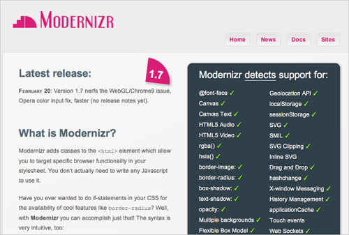
Modernizr works by adding classes to the html element of the page, which you would then call in the style sheet.
For example, to display a different background when CSS3 gradients are not supported, your code would look something like this:
.somediv {
   background: -webkit-gradient(linear, 0% 0%, 0% 100%,
     from(#660C0C), to(#616665), color-stop(.6,#0D0933)); }

.no-cssgradients .somediv {
   background: url('/images/gradient.jpg'); }
Conversely, to display a different background only where the CSS3 property is supported, you would do this:
.cssgradients .somediv {
   background: -webkit-gradient(linear, 0% 0%, 0% 100%,
     from(#660C0C), to(#616665), color-stop(.6,#0D0933));}

.somediv {
   background: url('/images/gradient.jpg'); }
In this way, you control what is shown in the absence of a property, and you tailor the output to what is sensible. In this case, you could serve a gradient image in the absence of support for CSS3 gradients.
With this additional control, you can tailor the output quite accurately and avoid any clashes that might arise from a missing property.
CSS3 PIE
Sadly, this has nothing to do with the tasty dessert. CSS3 PIE stands for progressive Internet Explorer. As the official description says:
“PIE makes Internet Explorer 6 to 8 capable of rendering several of the most useful CSS3 decoration features.”
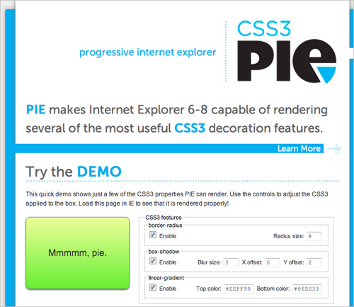
While it doesn’t support a myriad of features, it does allow you to use box-shadow, border-radius and linear gradients in IE without doing much extra to the code. First, upload the CSS PIE JavaScript file, and then when you want to apply the functionality, you would include it in the CSS, like so:
.somediv {
   -webkit-border-radius: 5px;
   -moz-border-radius: 5px;
   border-radius: 5px;
   behavior: url(path/to/PIE.htc); }
Fairly straightforward, and it can save you the hassle of having to use JavaScript hacks to achieve certain effects in IE.
Selectivzr
CSS3 has expanded its repertoire beyond advanced selectors such as [rel=“selector”] and pseudo-selectors such as :focus, to include selectors such as :nth-of-type, which give you much more control and focus and allow you to dispense with a lot of presentational classes and IDs. Support for selectors varies greatly, especially with the wide variety of additional selectors being introduced.

Therefore, the third weapon in your CSS3 arsenal will most likely be Selectivzr, which enables advanced CSS3 selectors to be used in older browsers and is aimed squarely at old IE versions.
Head over to the Selectivizr website and download and add the script. You will have to pair it with a JavaScript framework such as jQuery or MooTools, but chances are you’re working with one already. The home page is worth a quick look because not all selectors are supported by all JavaScript libraries, so make sure what you need is supported by your library of choice.
Problems?
The main issue with all of the solutions above is that they’re based on JavaScript, and some website owners will be concerned about users who have neither CSS3 support nor JavaScript enabled. The best solution is to code sensibly and make use of natural CSS fallbacks and allow the browser to ignore CSS properties that it doesn’t recognize.
This may well make your website look a bit less like the all-singing, all-dancing CSS3-based design that you had in mind, but remember that the number of people without CSS3 support and without JavaScript enabled will be low, and the best you can do is make sure they get a usable, functional and practical experience of your website, thus allowing you to continue tailoring the output to the user’s platform.
Some CSS3 Properties: Considerations And Fallbacks
Many CSS3 properties are being used, and by now we have gotten used to the quirks and pitfalls of each iteration of the CSS protocol. To give you a quick start on some of the more popular CSS3 properties, we’ll look at some of the issues you may run into and some sensible ways to fall back in older browsers.
All of the information in this article about browser support is correct as of May 2011. You can keep up to date and check out further information about support by visiting findmebyIP. Support has not been checked in browser versions older than Chrome 7.0, Firefox 2.0, Opera 9, Safari 2 and Internet Explorer 6.
Border Radius
Support: Google Chrome 7.0+, Firefox (2.0+ for standard corners, 3.5+ for elliptical corners), Opera 10.5+, Safari 3.0+, IE 9
Property: border-radius
Vendor prefixes: -webkit-border-radius, -moz-border-radius
Example usage (even corners with a radius of 5 pixels):
.somediv {
   -moz-border-radius: 5px;
   -webkit-border-radius: 5px;
   border-radius: 5px; }
Fallback behavior: rounded corners will display square.

Without the hassle of extra divs or JavaScript or a lot of well-placed, well-sliced images, we can give elements rounded corners with the use of the straightforward border-radius property.
What about browsers that don’t support border-radius? The easiest answer is, don’t bother. Is having rounded corners in unsupported browsers really worth the hassle? If it is, then you need only do what you’ve been doing for years: JavaScript hacks and images.
Could this property trip you up? Actually, border-radius is pretty straightforward. Be careful using it on background images, because there are certainly some bugs in some browser versions that keep the corners of images from appearing rounded. But aside from that, this is one of the best-supported CSS3 properties so far.
Border Image
Support: Google Chrome 7.0+, Firefox 3.6+, Opera 11, Safari 3.0+, no support in IE
Property: border-image, border-corner-image
Vendor prefixes: -webkit-border-image, -moz-border-image
Example usage (a repeating image with a slice height and width of 10 pixels):
.somediv {
   -webkit-border-image: url(images/border-image.png) 10 10 repeat;
   -moz-border-image: url(images/border-image.png) 10 10 repeat;
   border-image: url(images/border-image.png) 10 10 repeat; }
Fallback behavior: shows standard CSS border if property is set, or no border if not specified.

border-image demo on CSS3.info. The bottom paragraph shows a standard property of border: double orange 1em.The border-image property is less heralded among the new properties, partly because it can be a bit hard to wrap your head around. While we won’t go into detail here, consider the image you are working with, and test a few variations before implementing the property. What will the border look like if the content overflows? How will it adjust to the content? Put some thought into your choice between stretch and repeat.
Experiment with an image before applying a border to make sure that everything is correct, and test different sizes and orientations to see how a repeating border looks.

There isn’t much in the way of fallbacks, aside from the traditional method of coding for eight slice-image borders, mapped out with extra containing divs. This is a lot of work and is really unnecessary. Selecting an appropriate border color and width should be a sensible fallback for browsers without border-image support.
Box Shadow
Support: Google Chrome 7.0+, Firefox 3.6+, Safari 3.0+, IE 9
Property: box-shadow
Vendor prefixes: -webkit-box-shadow, -moz-box-shadow (-moz no longer needed as of Firefox 4)
Example usage (showing a black shadow, offset down by 10 pixels and right by 10 pixels, and with a blur radius of 5 pixels):
.somediv {
   -moz-box-shadow: 10px 10px 5px #000;
   -webkit-box-shadow: 10px 10px 5px #000;
   box-shadow: 10px 10px 5px #000; }
Fallback behavior: shadow is not displayed.
Box shadow allows you to quickly and easily add a little shadow to your elements. For anyone who has used shadows in Photoshop, Fireworks or the like, the principles of box shadow should be more than familiar.

In its absence? You could use selective borders (i.e. a left and bottom border to imitate a thin box shadow).
.somediv {
   -moz-box-shadow: 1px 1px 5px #888;
   -webkit-box-shadow: 1px 1px 5px #888;
   box-shadow: 1px 1px 5px #888; }

.no-boxshadow .somediv {
   border-right: 1px solid #525252;
   border-bottom: 1px solid #525252; }
RGBa and HSLa
RGBa support: Google Chrome 7.0+, Firefox 3.0+, Opera 10+, Safari 3.0+, IE 9
HSLA support: Google Chrome 7.0+, Firefox 3.0+, Opera 10+, Safari 3.0+
Property: rgba, hsla
Fallback behavior: the color declaration is ignored, and the browser falls back to the previously specified color, the default color or no color.
.somediv {
   background: #f00;
   background: rgba(255,0,0,0.5); }
In the example above, both background declarations specify the color red. Where RGBa is supported, it will be shown at 50% (0.5), and in other cases the fallback will be to the solid red (#f00).

While there is broad support for opacity, its downside is that everything associated with an element becomes transparent. But now we have two new ways to define color: RGBa (red, green, blue, alpha) and HSLa (hue, saturation, light, alpha).
Both offer new ways to define colors, with the added benefit of allowing you to specify the alpha channel value.
The obvious fallback for RGBa and HSLa is a solid color; not a problem, but the main thing to watch out for is legibility. A semi-transparent color can have quite a different tone to the original. An RGB value shown as a solid color and the same value at .75 opacity can vary massively depending on the background shade, so be sure to check how your text looks against the background.

If transparency is essential, you could also use a background PNG image. Of course, this brings with it the old IE6 problem, but that can be solved with JavaScript.
Transform
Support: Google Chrome 7.0+, Firefox 3.6+, Opera 10.5+, Safari 3.0+
3-D transforms support: Safari
Property: transform
Vendor prefixes: -o-transform
Example usage (rotating a div 45° around the center, and scaling it to half the original size — for illustration only, so the translate and skew values are not needed):
.somediv {
   -webkit-transform: scale(0.50) rotate(45deg)
      translate(0px, 0px) skew(0deg, 0deg);
   -webkit-transform-origin: 50% 50%;
   -moz-transform: scale(0.50) rotate(45deg)
      translate(0px, 0px) skew(0deg, 0deg);
   -moz-transform-origin: 50% 50%;
   -o-transform: scale(0.50) rotate(45deg)
      translate(0px, 0px) skew(0deg, 0deg);
   -o-transform-origin: 50% 50%;
   transform: scale(0.50) rotate(45deg)
      translate(0px, 0px) skew(0deg, 0deg);
   transform-origin: 50% 50%; }
Fallback behavior: the transform is ignored, and the element displays in its original form.

The transform property gives you a way to rotate, scale and skew an element and its contents. It’s a great way to adjust elements on the page and give them a slightly different look and feel.
A simple fallback in the absence of an image-based transform is to use an alternative image that is already rotated. And if you want to rotate content? Well, you can always use JavaScript to rotate the element. Another simple alternative is to rotate the background element in an image editor beforehand and keep the content level.
We’ve gotten by with level elements for so many years, there’s no reason why people on old browsers can’t continue to put up with them.
Animations and Transitions
Transitions support: Google Chrome 7.0+, Firefox 4.02, Opera 10.5+, Safari 3.0+
Animations support: Google Chrome 7.0+, Safari 3.0+
Property: transition
Vendor prefixes: -webkit-transition, -moz-transition, -o-transition
Example usage (a basic linear transition of text color, triggered on hover):
.somediv:hover {
   color: #000;
   -webkit-transition: color 1s linear;
   -moz-transition: color 1s linear;
   -o-transition: color 1s linear;
   transition: color 1s linear; }
A basic animation that rotates an element on hover:
@-webkit-keyframes spin {
   from { -webkit-transform: rotate(0deg); }
   to { -webkit-transform: rotate(360deg); }
   }

.somediv:hover {
   -webkit-animation-name: spin;
   -webkit-animation-iteration-count: infinite;
   -webkit-animation-timing-function: linear;
   -webkit-animation-duration: 10s; }
Fallback behavior: both animations and transitions are simply ignored by unsupported browsers. With animations, this means that nothing happens, and no content is animated. With transitions, it depends on how the transition is written; in the case of a hover, such as the one above, the browser simply displays the transitioned state by default.

Animations and transitions in CSS3 are slowly seeing more use, from subtle hover effects to more elaborate shifting and rotating of elements across the page. Most effects either start right at page load or (more frequently) are used to enhance a hover effect. Once you get down and dirty with animations, there’s great fun to be had, and they’re much more accessible to designers now than before.
Starting off small with the CSS3 transition property is best, subtly transitioning things such as link hovers before moving on to bigger things.
Once you’re comfortable with basic transitions and transforms, you can get into the more involved animation property. To use it, you declare keyframes of an animation with @-webkit-keyframes and then call this keyframe animation in other elements, declaring its timing, iterations, etc. Note that animations work better with CSS3 transforms than with other properties, so stick to transform and translate rather than shifting margins or absolute positioning.
Of course, people have been animating with JavaScript for years. But if you want to do something as simple as animating a hover state, then it hardly seems worth the extra coding. The simplest thing to do for unsupported browsers is to specify a state for hover, without any transition to it.
Font Face (not new in CSS3)
Support for different font formats: Google Chrome 7.0+, Firefox 3.1+, Opera 10+, Safari 3.1+, IE 6+
Property: @font-face
Example usage (a @font-face declaration for Chunk Five, an OTF font, and calling it for h1 headings):
@font-face {
   font-family: ChunkF; src: url('ChunkFive.otf'); }

h1 {
   font-family: ChunkF, serif; }
Fallback behavior: just as when any declared font isn’t available, the browser continues down the font stack until it finds an available font.

Okay, this isn’t strictly new to CSS3. Many of you will point out that this has been around as long as IE5. However, text replacement is certainly starting to see increased usage as browser makers roll out increased support for @font-face.
One issue that @font-face suffers from is that a font isn’t displayed on the screen until the browser has downloaded it to the user’s machine, which sometimes means that the user sees a “flash of unstyled text” (FOUT). That is, the browser displays a font from further down the stack or a default font until it has finished downloading the @font-face file; once the file has downloaded, the text flashes as it switches to the @font-face version. So, minimizing the flash by stacking fonts of a similar size and weight is important. If the stack is poorly compiled, then not only could the text be resized, but so could containing elements, which will confuse users who have started reading the page before the proper font has loaded.
The good news is that Firefox 4 doesn’t has a FOUT any longer, IE9, however, does have a FOUT but WebInk has written a script FOUT-B-GONE which takes these facts into account and helps you hide the FOUT from your users in FF3.5-3.6 and IE.

@font-face to serve the Prater font (bottom), falling back to Constina, Georgia (top) and Times New Roman.Many font delivery services, including TypeKit and Google Web Fonts, deliver their fonts via JavaScript, which gives you control over what is displayed while the font is being downloaded as well as what happens when the font actually loads.
Because browsers wait until the full file of a font kit has loaded before displaying it, plenty of services allow you to strip out unnecessary parts of the kit to cut down on size. For example, if you’re not going to be using small caps, then you can strip it out of the file so that the font renders more quickly.
Advanced Selectors
Support (varies depending on the selector used): Google Chrome 7.0+, Firefox 3.6+, Opera 9.0+, Safari 2.0+, IE 6+
Property: many, including :nth-of-type, :first-child, :last-child, [attr=“…”]
Example usage (coloring only links that point to Smashing Magazine, and coloring odd-numbered rows in tables):
a[href*=smashingmagazine.com] {
   color:#f00; }

tr:nth-of-type(odd) {
   background: #ddd; }
Fallback behavior: In the absence of support for advanced selectors, the browser does not apply the targeted style to the element and simply treats it as any other element of its type. In the two examples above, the link would take on the standard link properties but not the specified color, and the odd-numbered table rows would be colored the same as other table rows.
Advanced selectors are a great tool for reducing the code on a website. You will be able to get rid of many presentational classes and gain more control of the selections in your style sheet.
Using Selectivzr, you can get older browsers to support these advanced selectors, which makes the selectors easier to use and more robust.

nth-type selectors. However, because the styles in this example are tied directly to the content, sticking to class names would be better, unless you are 100% certain that the order of words won’t change.Abandoning classes and IDs altogether in favor of nth-type is tempting. But don’t throw them away just yet. Use advanced selectors when an element’s style is based on its location in the document or a series; for example, using nth-type(odd) for table rows or using last-of-type to remove some padding at the bottom of a list.
If an element’s style is based on its content, then stick with classes and IDs. That is, if inserting a new element or changing the order of items would break the style, then stick with the old method.
However, if an element is already sufficiently styled, then you probably don’t need an additional class or ID at all (nor an advanced selector, for that matter).
Columns
Support: Google Chrome 7.0+, Firefox 2.0+, Safari 3.0+, Opera 11.10+
Property: column-count
Vendor prefixes: -webkit-column-count, -moz-column-count
Example usage (splitting content into three columns):
.somediv {
   -moz-column-count: 3;
   -webkit-column-count: 3;
   column-count: 3; }
Fallback behavior: in the absence of support for multiple columns, the browser spreads the content across the full width that the columns would have taken up.

This property give you a nice easy way to spread content across multiple columns. The technique is standard in print, and on the Web it makes it easy to read content without needing to scroll. But you didn’t need me to tell you that, did you?
Because the property’s main purpose is to allow users to read horizontally without scrolling, first make sure that your columns aren’t too tall. Having to scroll up and down to read columns not only defeats their purpose but actually makes the content harder to read.
There are some JavaScript solutions for multiple columns. For older browsers, though, there’s generally no need to stick with a multi-column layout; rather, you could consider sensible alternatives for fallbacks.

In the absence of CSS3 support, the browser will flow content across the full width of the container. You’ll want to be careful about legibility. It can be very heard to read content that spans the width of an area that is intended to be broken into three columns. In this case, you’ll want to set a suitable line length. There are a few ways to do so: increase the margins, change the font size or decrease the element’s width. Floating elements such as images and block quotes out of the flow of text can help to fill up any leftover space in the single column.
Gradients
Support: Google Chrome 7.0+ for -webkit-gradient, Google 10+ for -webkit-linear-gradient and -webkit-radial-gradient, Firefox 3.6+, Safari
Property: linear-gradient, radial-gradient
Vendor prefixes: -webkit-gradient, -webkit-linear-gradient, -webkit-radial-gradient, -moz-linear-gradient, moz-radial-gradient
Example usage (a linear white-to-black gradient running from top to bottom — notice the lack of -linear- in the Webkit declaration):
.somediv {
   background-image: -webkit-gradient(linear, 0% 0%, 0% 100%,
     from(#ffffff), to(#000000));
   background-image: -webkit-linear-gradient(0% 0%, 0% 100%,
     from(#ffffff), to(#000000));
   background-image: -moz-linear-gradient(0% 0% 270deg,
     #ffffff, #000000);
   background-image: linear-gradient(0% 0% 270deg,
     #ffffff, #000000); }
A radial gradient running from white in the center to black on the outside:
.somediv {
   background-image: -moz-radial-gradient(50% 50%, farthest-side,
     #ffffff, #000000);
   background-image: -webkit-gradient(radial, 50% 50%, 0, 50% 50%, 350,
     from(#ffffff), to(#000000));
   background-image: -webkit-radial-gradient(50% 50%, 0, 50% 50%, 350,
     from(#ffffff), to(#000000));
   background-image: radial-gradient(50% 50%, farthest-side,
     #ffffff, #000000); }
Fallback behavior: the browser will show the same behavior as it would for a missing image file (i.e. either the background or default color).

Ah, the good ol’ Web 2.0 look, but using nothing but CSS. Thankfully, gradients have come a long way from being used for glossy buttons, and this CSS3 property is the latest step in that evolution.
Gradients are applied the way background images are, and there are a few ways to do it: hex codes, RGBa and HSLa.
Be careful when applying a background with a height of 100% to an element such as the body. In some browsers, this will limit the gradient to the edge of the visible page, and so you’ll lose the gradient as you scroll down (and if you haven’t specified a color, then the background will be white). You can get around this by setting the background-position to fixed, which ensures that the background doesn’t move as you scroll.
Specifying a background color not only is a good fallback practice but can prevent unforeseen problems. As a general rule, set it either to one end of the gradient or to a color in the middle of the range.
Legibility is also a consideration. Making text readable against a solid background color is easy. But if a gradient is dramatic (for example, from very light to very dark), then choose a text color that will work over the range of the gradient.
Radial gradients are a bit different, and getting used to the origins and spreads can take a bit of playing around. But the same principles apply. Note that Webkit browsers are switching from the -webkit-gradient property to -webkit-linear-gradient and -webkit-radial-gradient. To be safe, include both properties, but (as we have learned) put the old property before the new one.
These issues aren’t new; we’ve been using gradients for ages. If you really need one, then the obvious fallback is simply to use an image. While it won’t adapt to the dimensions of the container, you will be able to set its exact dimensions as you see fit.
Multiple Backgrounds
Support: Google Chrome 7.0+, Firefox 3.6+, Safari 2.0+, IE 9
Property: background
Example usage (multiple backgrounds separated by a comma, the first on top, the second behind it, the third behind them, and so on):
.somediv {
   background: url('background1.jpg') top left no-repeat,
     url('background2.jpg') bottom left repeat-y,
     url('background3.jpg') top right no-repeat; }
Fallback behavior: an unsupported browser will show only one image, the one on top (i.e. the first in the declaration).

Being able to set multiple background images is very useful. You can layer images on top of one another. And because CSS gradients can be applied as backgrounds, you can layer multiple images and gradients with ease.
You can also position background elements within dynamically sized containers. For example, you could have an image appear 25% down the container and then another at 75%, both of which move with any dynamic content.
If multiple backgrounds are essential to your website, you could insert additional elements and images into the DOM using JavaScript. But again, is this worth doing? A single well-chosen background image might work best. It could be a matter of picking the most important image or blending the images into a composite (even if this makes for a less dynamic background).
Use Only Where Needed
It’s worth repeating that CSS3 is not a necessity. Just because you can use CSS3 properties, doesn’t mean your website would be any worse off without them. Applying these effects is now so simple, and so getting carried away becomes all too easy. Do you really need to round every corner or use multiple backgrounds everywhere? Just as a film can work without 3-D, so should your design be able to work without CSS3 splashed everywhere indiscriminately. The technology is simply a tool to make our lives easier and help us create better designs.
It is a testament to those who are already using CSS3 that there are very few instances of its misuse at the moment. The websites that do seem to misuse it suggest that their designers either used CSS3 for its own sake or didn’t consider its implications on certain platforms.
In “Web Design Trends 2010: Real-Life Metaphors and CSS3 Adaptation,” Smashing Magazine’s Vitaly Friedman notes a number of misuses of the text-shadow property.

The text-shadow property has certainly become popular. One-pixel white shadows are popping up in text everywhere for no apparent reason. As Vitaly says:
“… before adding a CSS3 feature to your website, make sure it is actually an enhancement, added for the purpose of aesthetics and usability, and not aesthetics at the cost of usability.”
As you become familiar with CSS3’s new properties, you will learn to recognize when and where problems occur and where the properties aren’t really necessary.
Using CSS3
CSS3 is the future of the Web, no argument about that. So, versing yourself right now in the language of the future makes sense. While IE is still the single most popular browser, it now has less than half of the market share, meaning that the majority of people no longer use it and it can no longer be used as an excuse not to explore new possibilities and opportunities.
To use CSS3 means to embrace the principle that websites need not look the same in every browser, but rather should be tailored to the user’s browsing preferences via sensible fallbacks. It isn’t daunting or inaccessible, and the best way to learn is by diving in.
Other Resources
If you would like to learn more, plenty is out there. Here are some selections to get you started.
- Hardboiled Web Design Andy Clarke’s lauded book about CSS3 and HTML5.
- CSS3 for Web Designers Dan Cederholme’s book on using CSS3, what works and what doesn’t.
- HTML5 and CSS3 Support A page showing which browsers support which properties.
- CSS.info Documents news and articles about CSS3.
- CSS3 Working Group Blog Keeps you up to date on the progress of the CSS3 specification.
- “Take Your Design to the Next Level With CSS3” A Smashing Magazine article by Inyaili De Lyon that focuses on a few properties in more depth.
- “Why We Should Start Using CSS3 and HTML5 Today” A Smashing Magazine article that discusses the reasons why people are holding off working with CSS3 and HTML5.
- “CSS3 Mastery” A series of articles on Nettuts+ that give a good working introduction to various CSS3 properties.
Further Reading
- CSS Differences in Internet Explorer 6, 7 and 8
- The Principles Of Cross-Browser CSS Coding
- How To Support Internet Explorer and Still Be Cutting Edge
- The Life, Times (and Death?) of Internet Explorer 6 (Comic Strip)
 (al, ik, vf, mrn)

