Building An Effective ‘Coming Soon’ Page For Your Product

Email Newsletter
Weekly tips on front-end & UX.
Trusted by 182,000+ folks.
 Register for Free
 Custom Web Forms for Angular, React, & Vue. Your backend.


 Celebrating 10 million developers
I recently had to design a couple of teaser pages for a client and a personal project, and this led me to think about what exactly makes for a good teaser page — or to be more precise a “coming soon” page that companies often put up before they’re ready to launch their product. After careful research and many scientific tests in the brand new field of teaserology, I’ve developed a patented Teaser Effectiveness Analysis Matrix™, consisting of four elements. The perfect teaser page must score high on all four axis of the following:
- Memorability,
- Virality,
- Desirability,
- Data collection-ability.
I know that “data collection-ability” is not proper English, but inventing new words is one of the perks of being a scientist. As we’ll see, most teaser pages focus strongly on two or three of these elements but rarely hit all four.
Why Do I Need A Teaser?
Even though people seem to put out a teaser website for anything these days, let’s step back and think about why one would need a teaser. After all, putting one together takes time and energy, and you could argue that the effort would be better spent on the product itself.
But a teaser can go a long way to ensuring a successful launch. Raising awareness of your product long before it ships makes sense: people are more likely to interact with your app if they’re somewhat familiar with it, so letting them hear about it as soon (and as much) as possible helps. Ideally, you would create a climate of anticipation, and make people look forward to the release date. People love to know in advance about the next big thing, and you can use it to your advantage.
A Powerful Motivating Tool
Another factor that is not as obvious but perhaps even more important is motivation. When you’re working hard on something, without any guarantee of success, doubting yourself and losing motivation is easy, and this circumstance often leads people to abandon otherwise promising projects.
Raising awareness and collecting email addresses long before launch does two things to combat this lack of motivation. First, by putting the project out there, you make it much harder for yourself to quit, because we all hate to let people down. Secondly, pre-registering users shows you that there’s actual demand for what you’re building, which goes a long way to silencing those gnawing doubts. In this context, the teaser is a vital part of any product’s Web strategy.
Now that we know the why, let’s look at the how, and analyze a few strategies.
Teaser Page Strategies
Create a Strong Identity
As stated, the first dimension of a good teaser is memorability. One way to achieve this is with a strong brand. By “brand,” I mean all of the visual attributes that people associate with your product: logo, colors, style, etc. Once you launch, the website could end up looking very different than the teaser page, so having a strong brand is a great way to maintain continuity.
Many websites combine an attractive logo and strong color scheme to establish the brand’s identity, without even telling you what they do. It doesn’t have to be just color or a logo, though.
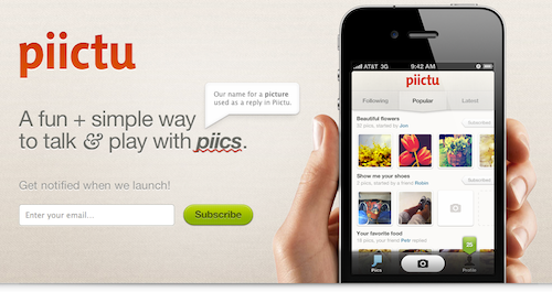
As for Piictu, nothing in its teaser stands out at first glance, but the care given to the overall design (from the subtle background pattern to the combination of typefaces and colors) is memorable in itself, putting the application in a class of its own.
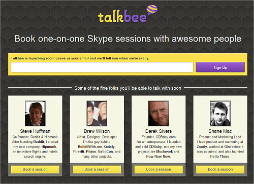
Talkbee (see the screenshot below) is a personal project of mine. I decided that I wanted a strong design with bright colors and a memorable logo to differentiate it from the competition.
Use a Gimmick
One design detail trumps even great branding: a gimmick, something special that people haven’t seen before. One of the most famous examples of this was the teaser page for Silverback, which included a CSS parallax effect (you can still see the effect on the current website if you resize your browser window). The website went viral in social circles and became hugely popular on the strength of that little CSS trick alone.
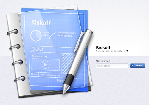
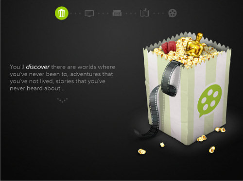
One popular technique that you could use to achieve a “gimmick” is animations, today usually created with CSS transitions and CSS animations. Animations could quickly get overwhelming and frustrating on “real” websites, but they’re appropriate in small doses in teasers. Recent examples of teasers with animation are Cloudring and Kickoff.
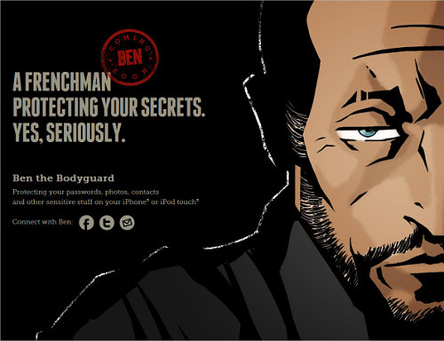
Another interesting techniques is to use vertical scrolling to tell a story. The poster child for this is certainly Ben the Bodyguard which doesn’t provide all information right away but rather unfolds a story using animations and scrolling.
A very similar idea was used by Dayri and the beautiful Youzee. The technique is successful because storytelling helps people make sense of their environment in a logical and linear way. A linear story hooks us much more effectively than disjointed facts.
Leverage the Power of Social Circles
A more interesting recent development in design of “coming sooon” pages is to include viral mechanisms in the pre-registration process itself. The simplest form of this is a simple “Tweet this page” button on the page.
LaunchRock, a service that lets you quickly generate a teaser page of your own, takes this a step further. After registering for a LaunchRock-powered website, the user gets a personalized link to the teaser. The more people register through this link, the sooner the user gets access to the website. In fact, LaunchRock itself uses this technique: in order to create your own teaser website through LaunchRock, you need to get three other people to sign up to the service… Confused yet?
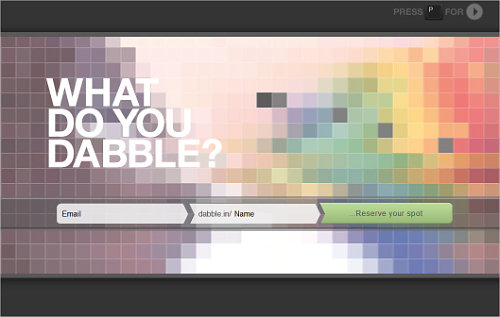
Another interesting idea is used by the “king of viral sign-ups” Dabble.in. Sharing Dabble.in’s link won’t get you early access. Instead, if multiple people request the same user name when signing up (say, “John”), then whoever gets more people to sign up wins the user name, while the others have to settle for less desirable alternatives (like, say, “John1986”).
If you’d rather not go to these extremes, then simple “Tweet” and “Like” buttons are still a good way to encourage people to spread the word. Of course, the easier it is for visitors to share your link, the more they’ll do it.
Give Something Back
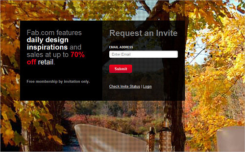
Probably the most effective way to make people share your teaser is to not just help them reserve a special spot, but also give something in return. For example, if enough of your friends sign up, Fab.com gives you up to $50 in website credit.
But you don’t have to offer money. You can imagine all sorts of deals: free icons, WordPress themes, etc. Even better, offer the product itself. For example, for every person you refer to its service, Dropbox credits you both with extra storage. The best part is that this strategy won’t cost you anything until you’ve actually launched, and even then, because it’s your own product, the costs remain low.
Make People Want It
A word of warning. No matter how clever the viral trick, it won’t matter if people don’t actually want to use your app. As smart as Dabble.in’s sign-up process is, nothing on the website hints at what the app actually does. The effect is that many users might find no incentive to share the teaser, because they’re not even sure why they’d want access to the website.
This is why the vast majority of teasers fail: they simply don’t make you want to use the product. The easy solution is to just come out and say what your product does. Show screenshots, post a short video or write some killer copy.
Even if you’re restricted in how much you can say about the product, you still need to make people care. You can do this through exceptional design, as Piictu, Youzee and Kickoff do. People will naturally assume that if your teaser is well designed, the product will be, too.
Collecting Data
Of course, if the teaser is successful and goes viral, you’ll face another problem: what to do with all of these visitors? The easiest thing would be to just collect email addresses and add them to your mailing list. You can use services such as MailChimp or Campaign Monitor to manage your list. Both services make it easy to embed and style a simple form on your page; and then you leave the rest to them.
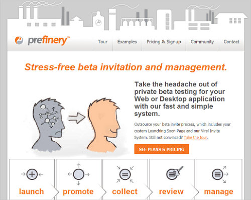
You also have more advanced options. For example, Prefinery promises to streamline the pre-launch process, taking care of everything from email collection to beta management. But obtaining data doesn’t necessarily mean collecting email addresses. You could poll visitors on your teaser page using a service like KISSinsights, or use Olark to let visitors chat with you in real time.
A Teaser Template
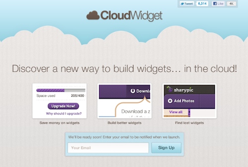
The teaser should be all about your product and should be tailored to your goals. That being said, I’ve designed a generic template for you to study, adapt and use as is in your own project. (Thanks to Sharypic for letting me use its screenshots.) You can download and use the PSD template for free in all your private or commercial projects.
Going Further
The teaser is just one piece of the puzzle. Other important parts of a successful pre-launch campaign are a Twitter account, Facebook page, blog, and others. Unlike on a teaser page, which is usually a one-way medium, people can reply to your tweets and leave comments on your blog. These channels are valuable because they help you get feedback on new ideas and maybe even correct course to better target your market.
Resources
- LaunchRock
- MailChimp
- Campaign Monitor
- Teaser pages on ThemeForest
- Placeholder theme from WooThemes
- “Designing Coming Soon Pages,” Smashing Magazine
- “What’s the Best Launch Strategy for a Startup?,” Robert Scoble
Disclaimer
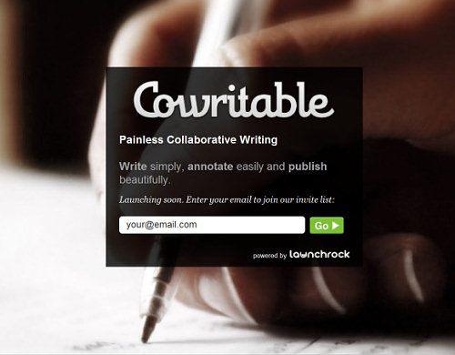
I’m involved in a few of the start-ups mentioned in this article. Talkbee is my own personal project, and I do design for Cowritable and Cloudring.
Further Reading
- Designing “Coming Soon” Pages
- Elements Of A Viral Launch Page
- What Is The Last Thing You Do Before You Launch A Website?
- 15 Essential Checks Before Launching Your Website


