Website Navigation: Planning And Implementing

Email Newsletter
Weekly tips on front-end & UX.
Trusted by 182,000+ folks.
 Register for Free
 Custom Web Forms for Angular, React, & Vue. Your backend.
 Celebrating 10 million developers


The thing that makes navigation difficult to work with in Web design is that it can be so versatile. Navigation can be simple or complex: a few main pages or a multi-level architecture; one set of content for logged-in users and another for logged-out users; and so on. Because navigation can vary so much between websites, there are no set guidelines or how-to’s for organizing navigation.
Designing navigation is an art in itself, and designers become better at it with experience. It’s all about using good information architecture: “the art of expressing a model or concept of information used in activities that require explicit details of complex systems.”
Organizing Navigation Structure
Perhaps the most difficult part about navigation on the Web is organizing and designing it. After all, coding it can be relatively easy. In this first section, we’ll go over some methods and best practices for organizing navigation, which can lead to a more intuitive user experience and higher conversion rates.
Primary vs. Secondary
Most websites, especially those with a lot of content or functionality, need navigation menus. But as a website grows in complexity, guiding users to that content and functionality shouldn’t be the job of any one menu. All of that content just doesn’t always fit in one large menu, no matter how organized it may be. While many websites need more than two, all websites have at least two main menus: primary and secondary.

You might assume that the primary and secondary navigations are marked in a wrong way on the image above, but I believe that this is not the case.
Primary navigation stands for the content that most users are interested in. But importance is relative; the type of content linked from the primary navigation on one website may be the same kind linked from the secondary navigation on another (for example, general information about the company or person).
Secondary navigation is for content that is of secondary interest to the user. Any content that does not serve the primary goal of the website but that users might still want would go here. For many blogs, this would include links for “About us,” “Contribute,” “Advertise” and so on. For other websites, the links might be for the client area, FAQ or help page.
If you’d like to learn more about primary and secondary navigation, “Understanding Site Navigation: Key Terms” is a great article with detailed explanations of different navigation terms, including for primary and secondary menus.
The first job in organizing navigation is to organize the content. Only after the content has been organized can you determine what is primary and what is secondary, and then you can determine the location and navigational structure of any remaining content. Content that fits neither the primary nor secondary navigation can go in other menus, whether a sub-menu, footer menu, sidebar widget or somewhere else. Not to suggest that primary navigation cannot go in these areas of the page; there are many instances where primary navigation is best suited to the sidebar or in drop-downs.
Also ask whether navigation is even needed beyond the primary menu? If a secondary menu is needed, then why and what’s the best way to implement it? No matter how organized the content is, if there’s a lot of it and thus a need for a more complex navigational structure, then distinguishing between primary and secondary content can be daunting. Fortunately, there’s a great method that designers can try: card sorting.
Information Architecture: Card Sorting
What’s the best way to organize content? How should the navigation be labelled and grouped and positioned? How will people use the navigation?
Card sorting is commonly used in information architecture and can help Web designers answer all of these questions even before the design phase begins. Card sorting basically helps designers organize navigation, especially complex navigation, in the most efficient way possible.
“One complaint I hear regularly about websites… is that they’re designed around how the organization is structured. Given that the information architecture is usually completed by internal teams, this makes sense. One way to get input on structuring a site to reflect a a visitor’s way of thinking is by collecting input from card sorts. Card sorts are a way to have website visitors organize and label content. It’s useful to have a visitor show you how she’d approach your website, and grouping and labeling are key elements for determining the best navigation for a website. Of course, you’re likely to get a variety of different groupings from users, so you’ll be looking for overlaps and commonalities while also considering how to help those who used varying groups and labels.” – Amy Hissrich
Card sorting can be used to determine menus and sub-menus, the wording on them and even their design and structure. We’ll go over the basics here, but be sure to check out the resources below for more information, guides and examples.

There are two types:
- Open card sorting is when participants are given cards with content topics and are asked to organize them into groups. They are given no information or context beforehand. Then they name the groups. Depending on the project, participants could be asked to create two groups, unlimited groups, sub-groups and so on. They could also be asked to organize the groups and content into the hierarchy they think best.
- Closed card sorting is when participants are given cards with content topics as well as the categories to put them into (and even sometimes sub-categories). Participants are not responsible for naming the cards. This option is great for exiting websites with established categories, menus, etc.
Below are some resources and further information on card sorting:
- Card Sorting: Introduction
- Card Sorting: Mistakes Made and Lessons Learned
- Card Sorting: Stacking the Deck for Better Navigation
There are also many applications for card sorting, some desktop and others online. Online card sorting can be easier to run, but it’s not always the right choice. A great article on UX for the Masses that covers the pros and cons of each approach: “Online Card Sorting: Even Better Than the Real Thing?” For easy card-sorting tools, check out OptimalSort, WebSort and UserZoom.
Grouped Content: Classification Schemes
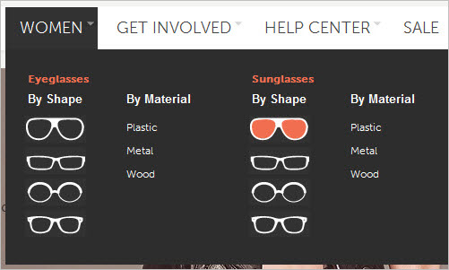
When a lot of content is grouped in one category, another issue arises: what order to put it all in? Card sorting and similar methods may help to create groups and a hierarchy and to differentiate between top-level and sub-levels of navigation, but how should content within those groups be ordered? Alphabetically? By most used or most popular? Most recent to oldest?
Below is a list of the most common content classification methods, along with suggestions for what each is best for:
- Most recent to oldest Suitable for time-sensitive content.
- Alphabetical Great for when the user needs to find something fast. This includes definitions, indexes and other content that users know about before they find it.
- Most popular or most used Great for interest-based browsing, rather than content that users need.
- Geographical Is certain content irrelevant to certain regions or sub-regions?
- In the order of the process If the content in some way represents a process (for example, “How to file your taxes”), then it could be organized according to the order of actions the user has to take. FeverBee has a great example of this: “How to Build an Online Community: The Ultimate List of Resources.” While the website is a blog, the content isn’t necessarily time-sensitive, so the author has created a great navigational structure that puts much of the content into a step-by-step process.
For more on classification schemes, check out UX Booth’s “Classification Schemes (and When to Use Them).”
Navigation And User Levels
For websites where navigation changes based on whether a user is logged in or out, other organizational challenges arise. Some websites may have a simple client area, while others have full-fledged communities. When this kind of interaction is involved, user roles and available content may vary, and owners may want to highlight some content or design it differently.
Below are a few tips for organizing navigation across membership levels:
- What user levels are there? Many website owners plan this out ahead of time, and it depends greatly on their business model. As the designer or developer, make sure you know what navigation levels are needed, and keep the content in them straight.
- Design and plan for each level separately. Don’t wait until the membership area is set up before considering the navigation structure of the levels. How should content be organized for logged-out users? How should it be structured for logged-in users? Administrators vs. basic members? Free accounts vs. paid accounts?
- What content should each type of user be able to access? A logged-out visitor will want to know more about the community or service. A logged-in member will already be convinced, and so the primary navigation for them should reflect what is available with their membership. Is there special content for paid members, and should it be highlighted to be more visible? Should special links or content be shown to logged-out administrators, or will that all be taken care of once they log in?
Planning for different user levels can be done with the same methods outlined for primary and secondary navigation. Card sorting can be helpful for each level. Think about what the primary navigation should be, what the secondary navigation should be, where everything should go (i.e. hierarchy), and how menu items should be labelled.
What do members need to do? What does they want to accomplish? These are great questions to ask when organizing beyond membership levels or beyond logged-in and -out states.
Take Facebook. Content is everywhere, and it’s user-generated. How does one organize the navigation around this? Facebook is structured by context; it’s defined and organized by how the user functions on the website. Feeds, messages, events and friends are part of the primary navigation, while the other navigation is based on specific applications, requests, friends’ friends, etc. The remainder of the navigation is based on how the user has used Facebook in the past.
Below is a selection of websites that have memberships, client areas and the like. It shows how varied websites can be in how they handle navigation and structure based on user levels and logged-in and -out states.
MailChimp
On MailChimp, the location of the primary navigation for logged-in and logged-out users is the same, but the content of the menus is different. For logged-out users (and new visitors), MailChimp’s navigation guides them to sign in and gets them interested in signing up, with items such as features and pricing. For logged-in users, the navigation becomes the control panel for the service.
Should navigation always change this much? Not at all, although in this case it was the most user-friendly solution. There are many other scenarios in which the primary navigation should remain the same, but supplemented with additional navigation for logged-in users.


Freelance Mingle
On Freelance Mingle, the secondary navigation is the only main menu that changes for logged-in and logged-out users. The mini menu up top handles the core needs of members, and the primary menu below and the footer navigation remain the same. Many areas of the website are accessible to both logged-in and logged-out members, which keeps the navigation fairly simple; but only members may post content.
Also, making the sections visible to new visitors, while limiting their functionality, serves as a live tour of the website. If you sign up, this is what you get!


FreshBooks
Some websites go in an entirely different direction. While the two examples above have a style and navigation scheme that is similar for logged-in and logged-out users, FreshBooks and many other websites have an entirely different layout and structure for members.
FreshBooks sells its service and promotes sign-ups to logged-out users. On clicking the “Login” link in the top-right area, the user is redirected to a log-in page. Once logged in, they are redirected to the client area, whose content is tailored to their preferences and which contains none of the content offered to logged-out users.


Business Catalyst
Business Catalyst does something similar but keeps more of its own branding, allowing for little customization in the client area. The home page for logged-out users is much the same as that of other websites; the content and navigation focus on getting new users to sign up. After logging in, the user is redirected to the client area, rather than a logged-in version of the home page. The layout, navigation structure and menu change completely for logged-in users, very tangibly separating the two areas of the website.
The client area exhibits an especially good organization of otherwise complex navigation. The first tab is for basic account information, and the other tabs are for other pages or sections. The main features for members are clearly separated in these tabs and in the mini-menu up top. The separate “Recent items” drop-down menu on the right is also great, making it easy for users to navigate to their recent and most used documents. Tools like this make it easier to use a large website with complex navigation.


Common Considerations
Navigation design is all about findability and usability. No matter how simple or complicated, navigation must work well for its users. Now we’ll look at some trends in navigation and how these designs might benefit or hinder websites.
Horizontal vs. Vertical
The decision of whether to make the navigation horizontal or vertical tends to be determined by the nature and focus of the website. Often, it’s a mix of both, but with primary navigation we see certain tendencies. Small websites often lean towards horizontal navigation at the top of the site, while large corporate websites often use both horizontal and vertical navigation (usually with drop-down menus). Blogs vary greatly; primary navigation (such as for categories or pages) is sometimes horizontal, while most of the other menus are vertical. On news website, the navigation is mixed, with no clear tendency either way.
A number of factors will influence the decision for horizontal or vertical navigation, including design, usability and density of content. Sometimes designers add icons to the navigation or add visual elements around it to make it better stand out. Rich typography is another common consideration: since the navigation is the most popular area of the website, it could be given a special typographic treatment to make the user experience a bit more distinctive and unique.

Amazon’s list of departments is much too long to go in a horizontal menu without looking crowded. Instead, across the top we find a search bar, which is a kind of navigation in itself. Many Amazon customers know exactly what they are looking for and so go to the search bar first; perhaps far more often than on other websites. Amazon puts its menu of departments along the left. Because the list is so long and varied, its purpose is chiefly for browsing; and vertical menus are good for browsing. The sub-menus, also vertical, help the user refine their browsing among departments and products.
Another thing to consider is the website’s primary language and whether the content will need to be translated into several languages. English words are relatively short compared to German and French words, so horizontal real estate is a consideration with horizontal menus. Will translated items require two lines instead of one or an overflow in the horizontal menu? Is more space required, and if so, is a vertical menu viable? One must always think about how the website will be read and used and about practical issues such as language.
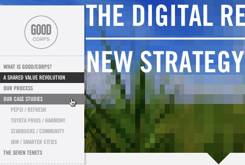
While it is generally good practice to make simple primary menus horizontal, it’s not essential. Below are a few designs that use vertical menus for primary navigation, and pull it off. However, all of these websites have simple menus and fairly minimal design and content; websites with a lot of content could easily overpower vertical menus. Good/Corps (the first site below) is a nice example of how a quite large amount of information is presented in a very compact, even minimalistic way. Subsection are indented, providing users with a clear sense of hierarchy on the site.
Good/Corps
Stura TU-Chemnitz
Baltic International Bank

Analogue Digital

Cambrian House

Divensis

Mellasat

Debbie Millman

Of course, horizontal menus can work really well, too, and menus that follow best practices don’t have to be boring. In fact, combining horizontal and vertical menus is even a possibility.
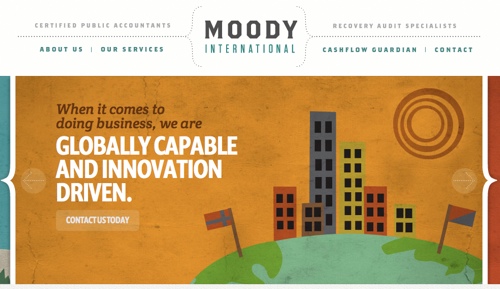
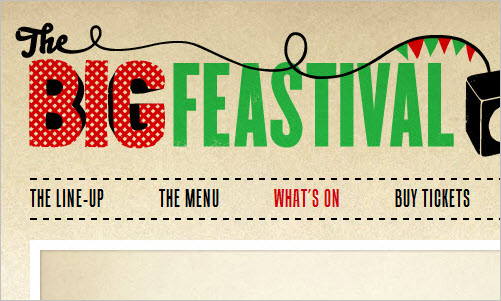
Below is a small showcase of horizontal menus in action, at either the primary or secondary level.
Moody International
The Big Feastival
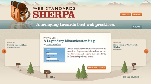
Web Standards Sherpa
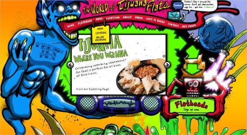
Tijuana Flats
Unlocking.com

Cultural Solutions
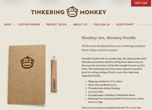
Tinkering Monkey
Drop-Downs And Mega Drop-Downs
While horizontal menus are best for top-level navigation, larger websites often need more in-depth navigation. Drop-down menus can fit a lot of items in one space, thus saving valuable real estate and keeping the navigation organized. The hierarchy can be refined with sub-levels and even sub-levels of sub-levels, helping users filter the information to get to the page or section they want.
Even more useful are mega drop-downs, which can accommodate an even wider variety of content and layouts, but more importantly provider larger click areas for users. They can be used to better organize navigation, as well as contain more content while saving space. They are also a great place for additional features and otherwise non-essential content. In both cases it is important to clearly indicate that the drop-down menu is available, either by using arrows or icons or something else.
Below is a small showcase:


See how some of these menus are creative in their organization of content and navigation. Below are a few points to note:
- Much of the navigation the small showcase above is organized into categories and sub-categories, which can be determined with the card-sorting method above.
- Many of the websites have a different layout and style for each drop-down menu under each top-level link. This creates more variety and creates the appearance of sub-pages under the main page of a design.
- Some of the websites have icons, images and regular text for link items; these elements could be used for promotion, navigation usability or simply organization.
These are just a few of the features in the drop-down designs above, but of course many more interesting solutions could be found. The point is that navigation is sometimes so extensive that sub-menus (whether via drop-downs or mega drop-downs) are necessary.
With smart CSS and semantic mark-up, implementing mega drop-downs shouldn’t be much harder than building traditional drop-down menus. However, one could run into issues. For example, in Safari, mega drop-downs tend not to display over Flash content. There are several workarounds to this, but the most popular seems to be to wrap the Flash in a div or other layer and then hide it when the drop-down is expanded.
Below are a few tutorials on drop-down and mega drop-down menus:
- “How to Build a Kick-Butt CSS3 Mega Drop-Down Menu”
- “Mega Menus: The Next Web Design Trend”
- “Mega Drop-Down Navigation Menus Work Well”
- “Mega Menus Gone Wrong”
Conclusion
Navigation that is complex, whether because of content volume or membership considerations or something else, can add a lot of work to the design and development process. But with solid pre-planning and good organization, the work can be fairly easy. Organizing, designing and coding navigation can take many shapes, but there are definite trends to follow and resources to turn to for help at every stage.
Feel free to share other tips, examples and best practices related to complex navigation. There are probably many approaches to each stage of navigation development, and hearing about the practices and experiences of other designers and developers would be great.
Further Reading
- Breadcrumbs In Web Design: Examples And Best Practices
- Responsive Menus: Enhancing Navigation On Mobile Websites
- The Elements Of Navigation
- Creative And Innovative Navigation Designs
 (al, mrn)

