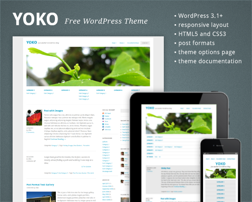
Free HTML5/CSS3 WordPress 3.1+ Theme With Responsive Layout: Yoko

Email Newsletter
Weekly tips on front-end & UX.
Trusted by 182,000+ folks.
 Register for Free

 Custom Web Forms for Angular, React, & Vue. Your backend.
 Celebrating 10 million developers
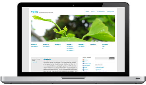
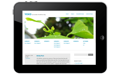
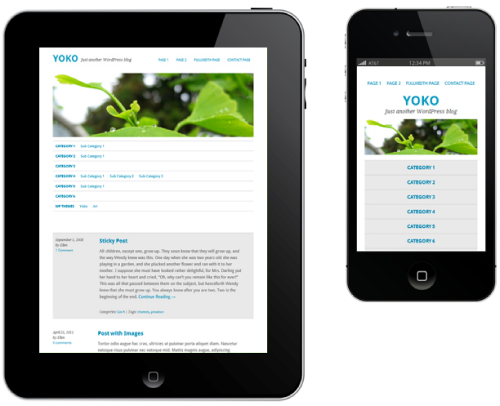
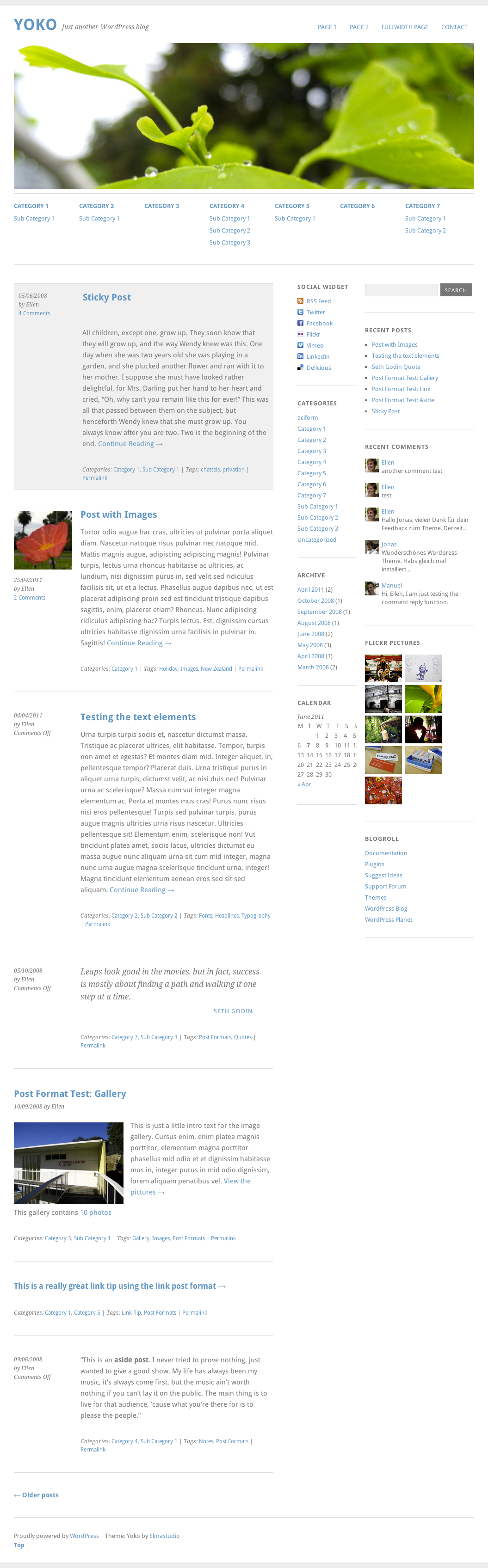
Yoko is a modern and flexible WordPress theme. With the responsive layout based on CSS3 media queries, the theme adjusts to different screen sizes. The design is optimized for big desktop screens, tablets and small smartphone screens. To make your blog more individual, you can use the new post formats (like gallery, aside or quote), choose your own logo and header image, customize the background and link color.
Download The Theme for Free!
The theme is released under GPL. You can use it for all your projects for free and without any restrictions. Please link to this article if you want to spread the word. You may modify the theme as you wish.
- live demo
- large preview (.png, 1.5 Mb)
- download the package (2.2Mb, .zip)
- release on the developer’s site (with documentation in English and in German)
- Documentation PDF file (in English)
- Installation Video Tutorials
Features
The theme requires WordPress 3.1+ to run. It has following features:
- Cross-browser compatible (tested in Chrome, Firefox, Safari, Internet Explorer 8+)
- HTML5 (with fallback for IE < 9) and CSS3
- Responsive layout (CSS3 media queries, not supported in IE < 9, but you can use libraries like Respond.js by Scott Jehl or CSS3-Mediaqueries-js by Wouter van der Graaf to make it work in older versions of IE.)
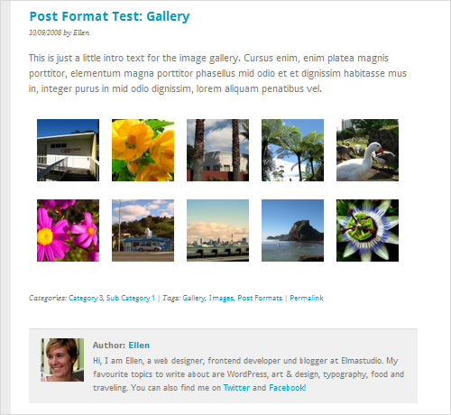
- WordPress post formats (aside, gallery, image, video, link and quote)
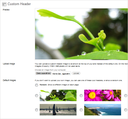
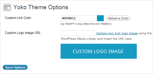
- Theme options page, custom background, custom header image
- Optional sub menu
- A custom social links widget to promote your RSS-Feed, Facebook, Twitter, Flickr, Vimeo, LinkedIn or Delicious profile
- Full-width page template
- Google Web fonts in use (Droid Sans and Droid Serif)
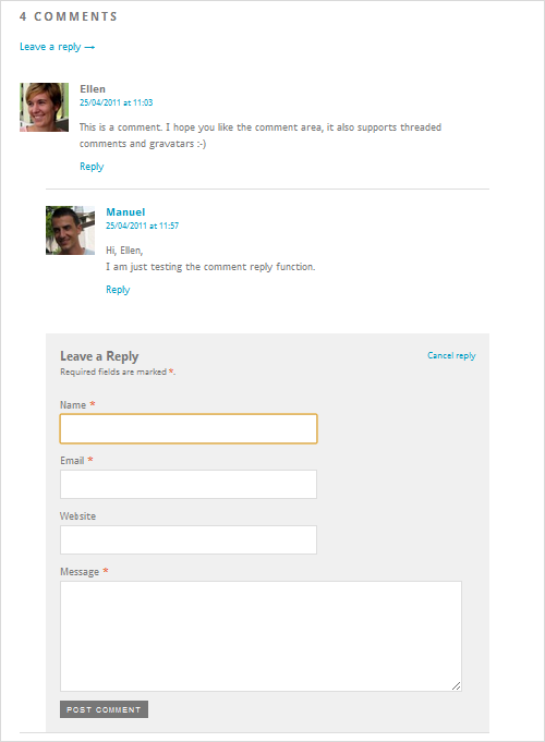
- Threaded comments with Gravatar support
- Shortcodes for multiple columns, info boxes in three colors and highlighted text
- Currently available in English, German and French.
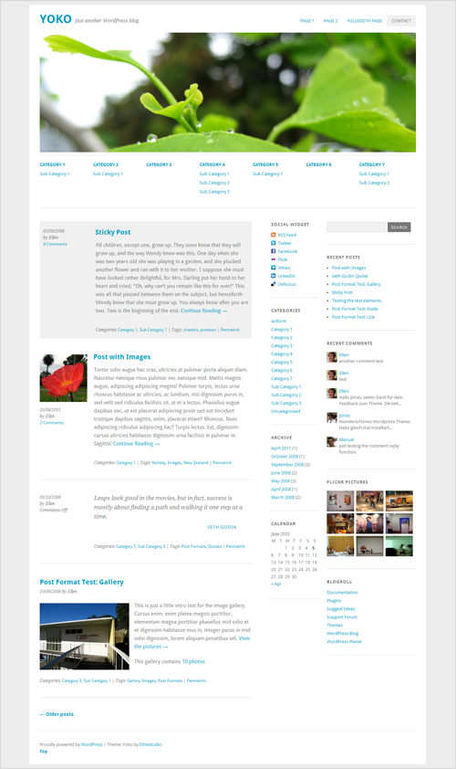
Screenshots
Behind The Design
As always, here are some insights from the designers:
“Since the mobile Web is getting more and more popular every day, we think that it’s also time for WordPress themes to become more flexible and adapt to different devices and screen sizes. While designing the Yoko theme, our goal was to create a minimalistic design with focus on content and good readability on various devices. Also we wanted the theme to be easy to use and customizable for everybody, so we kept the theme options simple while still including the most important options to add a personal style to the theme.The main problem to solve during the design and development process was to make sure that all the different contents and plugins that people will use still work in the responsive layout. Of course the responsive design approach is still in development but we think it’s a lot of fun to explore new possibilities and as doing so make Web design and WordPress themes more powerful and flexible to use.”
Thank you, Ellen and Manuel! We sincerely appreciate your work and your good intentions!
Further Reading
- Free SSL For Any WordPress Website
- Making A WordPress Plugin That Uses Service APIs
- 3 Approaches To Adding Configurable Fields To Your WP Plugin
- Useful Tips To Get Started With WordPress Hooks
- How To Make WordPress Hard For Clients To Mess Up
 (mrn)
(mrn)

