Useful Ideas And Guidelines For Good Web Form Design

Email Newsletter
Weekly tips on front-end & UX.
Trusted by 182,000+ folks.
 Claim Your Free Spot!
 Celebrating 10 million developers

 Register Free Now
 SurveyJS: White-Label Survey Solution for Your JS App
The input form is an essential element of almost any website or application these days. Input is a core method of interaction, and in many cases it represents the hard conversion point between success and failure. With the amount time and effort we put into bringing users to our sign-up and contact forms, it’s surprising that we tend not to spend a proportional amount of time on the forms themselves.
A number of techniques and elements can be used in Web forms to turn them from abject failures into successful conversion points. In this article, we’ll present some interesting examples and useful guidelines for Web form design.
A Dash Of Quirkiness
Part of Web design is about communicating personality and being relatable, because people enjoy dealing with other people. One quality that almost always helps is a bit of quirkiness and fun. A small dose of friendliness and personality will make the input process a bit more enjoyable and human.
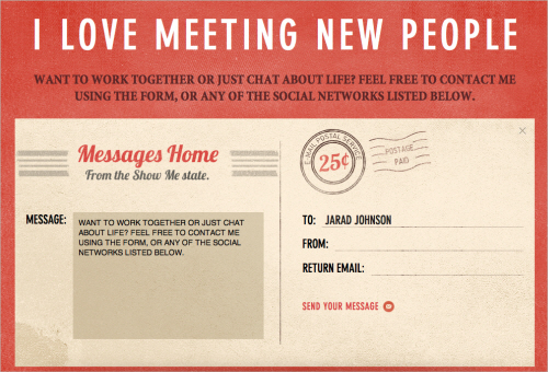
Jarad Johnson
Jarad Johnson‘s contact form has a flavor of good ol’ post card. The visual appearance of the form makes it stand out from the usual generic forms found elsewhere. A very nice touch to an often forgotten element of Web designs. By the way, the Postage for the email postal service was already paid. Good to know. Very well done.
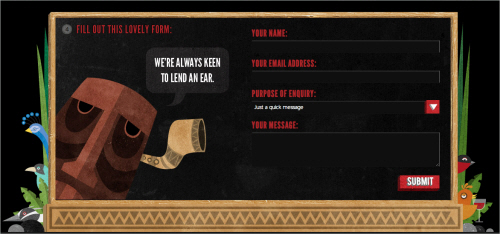
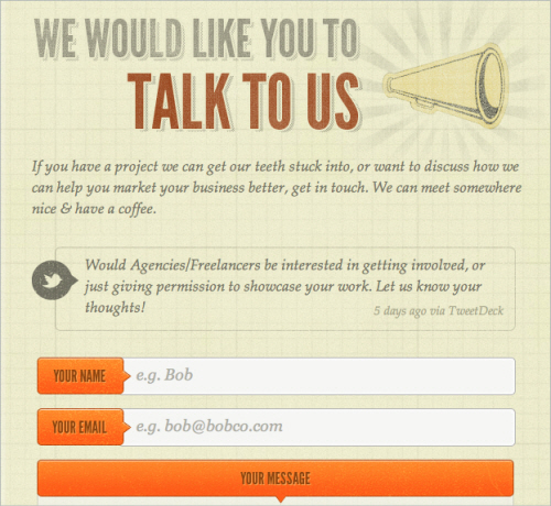
Red Tiki
Red Tiki’s quirkiness is tied to the company’s brand and identity, but is powerful here nonetheless. From the frame motif to the wooden character peeking out, this form feels fun and approachable. Little colloquial phrases like “This lovely form” and “We’re always keen to lend an ear” are fantastic ways to make the company more relatable. The form is bursting with personality and flare, which helps the user complete the form and click the “Submit” button.
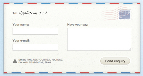
Applicom
Applicom’s form is a great example of how to be clean and professional without being sterile. Styling the form like a letter — with a stamp, subtle paper texture, striped edge and handwritten addressee name — may seem cliche, but it demonstrates a certain level of personality and care. Language such as the “Do: Be fine, use your real address. Don’t: Be negative, spam” may seem trivial, but it’s important. At the end of the day, it makes users feel like they are dealing with people who aren’t afraid to speak to them. Craftsmanship always indicates care and professionalism. People like that.
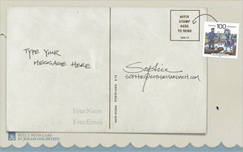
Sophie Hardach
Sophie Hardach‘s form is another example of a post card idea implemented in a contact form. The input fields are a bit clearer than one would think, yet the “Submit”-button is a bit more difficult to find. In order to send the message, a stamp in the right upper corner needs to be dragged to the Stamp area of the form. In fact, the form is not only very original, but also accessible. Excellent work.
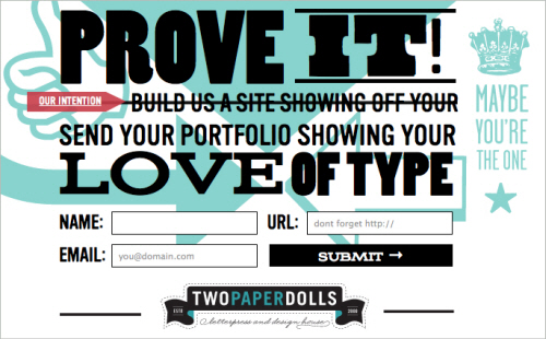
Two Paperdolls
Two Paperdolls has probably the busiest contact form of all the forms featured in this article. However, the form fits wonderfully to the overall design of the page which is a “We Are Hiring” page for designers with strong focus on typography. Notice the clean real-time validation for the form: the error indicator is diplayed in the right upper corner of each input field. Too bad that the navigation through form fields doesn’t work properly with “Tab”.
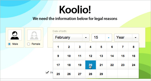
Kontain
Kontain uses a different kind of a date picker for letting users pick the date for the form. The designers have arranged the dates in four rows rather than displaying them all vertically. A nice idea for reducing the horizontal scrolling for the users.
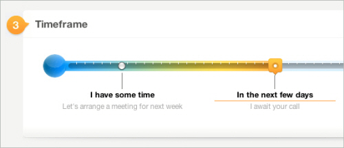
Wopata
Wopata’s slider for the timeframe in their contact form is much different from the generic sliders, select-menus and radio buttons. This is a proof that filling in Web forms can be fun.
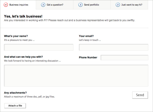
Fi
The language used on Fi is more friendly than formal. The inviting nature is reinforced by the short colloquialism for each form field that illustrates why the information is being requested. The language of labels should give off a little charm, without being insincere or overbearing. Isn’t everyone more engaged in a conversation if the other person is pleasant and approachable?
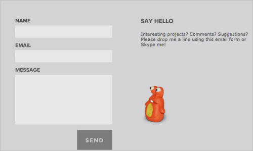
egopop
egopop has a very simple, perhaps oversimplified contact form which however has a nice touch. The weird character on the right side plays wonderfully together with the other characters on the site and makes the contact form less boring than it would be otherwise. The contact form opens in a lightbox.
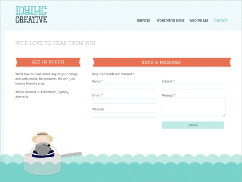
Idyllic Creative
Some forms are boring, while some are beautiful. Idyllic Creative‘s contact form is remarkably simple yet beautiful. Another example of a design agency which integrated a character from their work in their contact form.
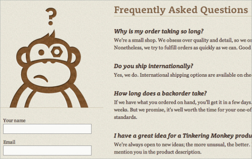
Tinkering Monkey
Tinkering Monkey’s character on their contact page is another interesting example of how the contact form page can be made a bit less boring. Notice the FAQ area on the right side of the contact form. An excellent idea for helping customers quickly find answers to their questions once they feel lost and can’t find a solution to their problem.
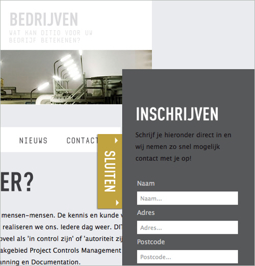
Ditio
Ditio’s designers have decided to combine their sign up form and a contact form in a hidden sidebar box, very much like it’s often done with the fixed “Give feedback” buttons on the left or right side. Once a trigger button “Inschrijven” is clicked, users can sign-up for their account and even upload a CV. Notice that there is no textarea available for lengthy details.
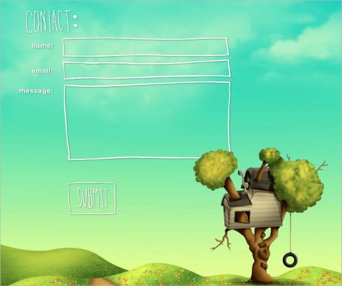
Treehouse Editing
Treehouse Editing’s contact form is another example of a quirky design with a clean and lean layout. When the user navigates to the page, the background changes to a spring theme, which is itself associated with making contact, thus encouraging them to fill out and send off the form. Notice that all that is necessary for initial contact fits into a couple of fields; further information can be collected in subsequent correspondence. Ask yourself whether a minimal layout would do the trick on your website as well.
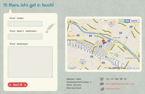
Amazee Labs
Amazee Labs doesn’t have to do much to make its form usable and inviting. The form has only a few quirks, namely the texture, the “Hi there, let’s get in touch!” line, and the “Send It!” button. It may not seem like much, but the casual language, careful color choice and overall texture help Amazee Labs instantly feel like a friendly and easygoing bunch.
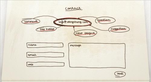
Wing Cheng
The motif of Wing Cheng’s website is an open sketchbook, with most of the sections designed as sketches and thumbnail drawings. The contact form maintains this personality and coherency by following the motif. The form is simple and appropriate. The thought diagram with the email address adds visual interest. Maintaining the hand-drawn style is what brings out the quirkiness. Imagine how jarring and uninviting this form would be if it was a default HTML field set stuck on top of a beautiful paper texture.
Break It Down
No one likes a humongous unending list, especially a list of elements to fill in or interact with. Just as a giant paragraph of text is daunting to the user, so is a giant block of empty fields. To coax the user to the finish line, the designer should make them feel like they are completing steps, or bite-sized chunks. Take a giant web project: trying to wrap your head around it all at once is almost impossible. But if you break it down into goals, and then stages, and then sets of tasks, it becomes much more manageable. This is what we want in a Web form, especially if you’re asking for a sizeable amount of information. Keep in mind that you can organize a form simply by sectioning off parts of it or by arranging the content into columns.
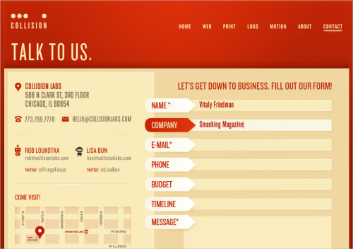
CollisonLabs
CollisonLabs‘s contact form might appear to be a bit too complicated at the first glance, but it’s quite straightforward. The left side of the contact page contains alternative contact information as well as a map which is designed with the overall design of the website in mind. On the right side, each input field is clearly represented and highlighted when the user fills out the form. Nice, clean work.
Visual Republic
Visual Republic‘s choice of design for input field labels is similar to the solution by guys over the CollisonLabs. Giving the field label a solid background with an arrow to indicate where the text would need to be typed is a nice technique that could be used more often.
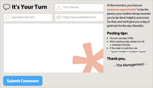
CSS Tricks
CSS Tricks’s comment area is a great example of a well-organized, helpful and clean comments area. Notice how the “star” image in the text area fades away as the user types in some text in the form.
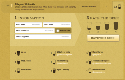
Barley’s Greenville
Barley’s Greenville’s form for beer rating is an interesting example of how multiple sections can be combined to make the form intuitive and easy to use. Notice the arrow-like symbol between the first and the second section as well as various shades of the brown color within the form.
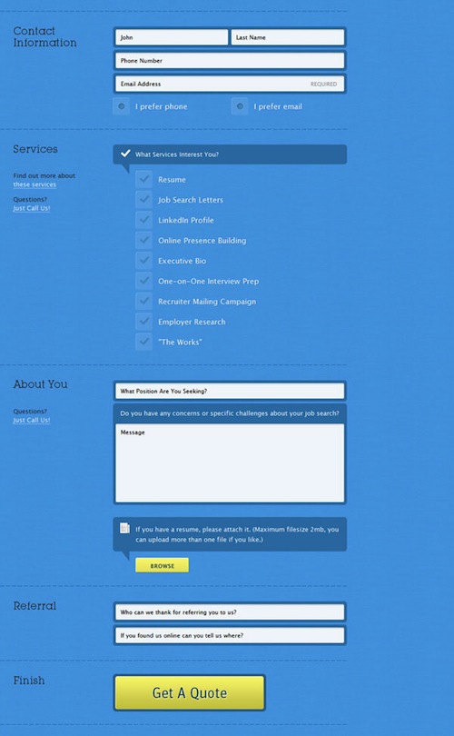
Blue Sky Resumes
Blue Sky Resumes uses sections to make its extremely long form much more manageable. Standard headings and horizontal rules are used to divide sections. The designer was also careful to visually distinguish the different sections so that the form doesn’t look like a long list of fields.
Validate Clearly
Users will not spend extra time making sure they have given you all of the information you need. Many designers believe that form validation detracts from the user experience, but its effects are adverse only when done poorly. When validation is simple and clear, it merely offers alerts and guidance to the user.
Make sure that you clearly mark the problem and tell the user exactly what is wrong. The fastest way to kill the user experience is with generic error alerts that mean nothing to the user. People are more than happy to quickly fix an issue if it is pointed out to them plainly.
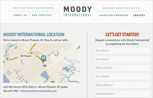
Moody International
Moody International provides an excellent example for a contact form that nicely combines different types of contact information in one place. On the left, you’ll find a postal address along with a map, a phone number as well as the company’s email address. The right side is dedicated for more detailed inquiries and consulation requests. The form’s labels disappear once the user has provided their data. Unfortunately, the form doesn’t have an instant real-time validation and uses JavaScript pop-ups to inform the users about their input mistakes. Besides, the map on the left side could be integrated a bit better by using zoom controls as well as search functionality provided by Google Maps.
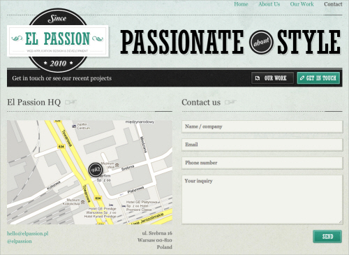
El Passion
El Passion is another example of a contact form that combines various types of contact information in a very compact and meaningful way. Real-time validation in use. The map on the left side could be zoomable, though.
Orlando Advertising
Orlando Advertising‘s form beautifully integrates its branding colors in a clean and attractive Web form. The red borders might be misunderstood and could be used to visually highlight errors in the form, but instead validation errors are displayed once the “Submit” button is clicked.
Reinvigorate
There are usually two essential elements to effective form validation: identifying the specific problem, and clearly marking how and where to fix it. Reinvigorate uses an alert icon and a loud red outline to indicate the problem, and then it uses the side column to tell the user what’s wrong with the information. Moreover, the user gets a visual indication when the information is corrected. Being clear about the problem and not leaving the user in the dark make for a smooth experience.
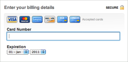
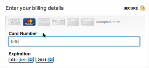
GitHub
GitHub‘s sign up form is as simple as its overall design, yet its beauty lies not in aesthetics, but in its functionality. When you enter your credit card details, GitHub automatically recognizes the credit card provider and visually highlights it in the form, thus providing instant feedback to the user. A wonderful example of invisible design.
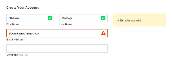
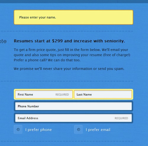
Blue Sky Resumes (revisited)
I would like to point out another great part of Blue Sky Resumes’ form. The error alert is clear and specific. By specifically telling the user that their name is missing, the user is spared confusion and is able to find their bearings quickly. To reinforce this message, the name field is clearly highlighted and marked as required.
Interactivity
A form is an interactive part of a website or application. In general, people want to interact with elements that feel alive and that follow convention. Many forms have a slight indent, creating a slight 3-D effect, whereas other forms simply show a box outline to delineate form fields. The key to any interaction is expectation and feedback. Make sure your forms react to user input, mainly by specifying the focus and hover states of input elements.
Grooveshark VIP
On Grooveshark, its styling of the focus and active element makes it clear which field is being interacted with. Besides, erors are displayed in a nice, helpful way while error messages are displayed at the top of the “window” using Ajax.
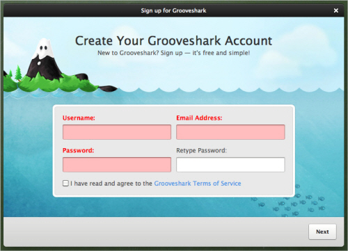
The design helps the user to maintain focus and to breeze through the form. It even makes it kind of fun, because the user wants to see a response when they click on or interact with an element.
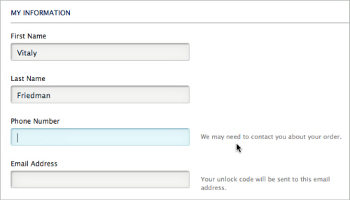
Unlocking
Unlocking’s checkout form is a nice example of how simple design can work very well with appropriate level of responsiveness. The input fields look nice, the hover state is very clear and the hints on the right side are helpful and unobtrusive. The contact form shows a subtle blue background when the user focuses on a field. The form uses an additional color to highlight fields. As long as the interaction creates a noticeable effect, the form will be more usable. The highlighting is not as bold as on some other sites featured above, but still effective and interactive and perhaps even more usable.
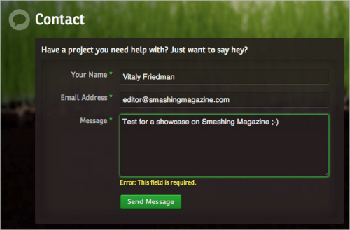
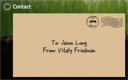
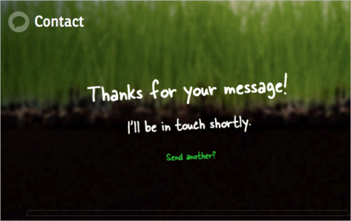
Jason Long
Jason Long‘s form silently sits on the page, doing nothing, unless… well, unless you send it out. Jason uses an animated contact form which flips and changes as the message is being sent. An interesting, memorable tweak that makes the user experience just a tiny bit more interesting.
The Finish Line
An effective Web form should get the user to cross the finish line. It might be a “Submit” button, an order confirmation button or a sign-up button. At the end of the day, the designer wants the user to hit that conversion point and be reasonably happy with their decision.
Make sure that the way of submitting the form is bold and specific. Where possible, use language like “Send email” or “Finish signing up,” so that the user understands exactly what the button will do.
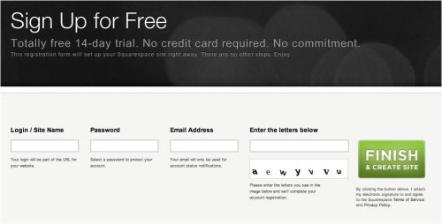
Squarespace
On Squarespace, the designer has gone as far as to label the button “Finish & Create Site” and has also made note of its function just below. This page is especially effective because of the contrast: the layout is completely monochromatic, so making the button green puts more focus on completing the process.
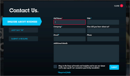
BLITZ
BLITZ has come up with an interesting solution for their contact form. A content block appears in a lightbox and presents three different types of contact forms: inquiry about business, jus saying “Hi” and CV submission. The forms have a similar appearance but have a different structure. In all cases, the user has a checkbox for email updates at the bottom as well as postal address under the form. One confusing bit is that the form fields get a red border when you type in your data. Some users might confuse it with error notifications.
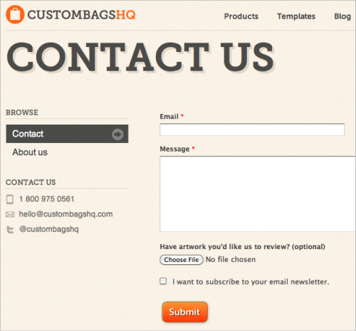
Custom Bags HQ
Custom Bags HQ has tried to combine various content blocks within one context. The “Contact” link in the upper navigation leads to a page which contains both the contact form and the “About us” information. In our opinion, “About us” doesn’t really detract from the user experience, but it doesn’t enhance it either. The link doesn’t feel right here, at least at the first glance. Interesting idea: the form contains a checkbox asking users if they are interesting in receiving an email newsletter. A smart handle to keep customers close to you and keep them informed about your updates and news in the future.
Clear Labels
Any interaction that we encourage must be as non-threatening as possible. After all, we are asking for personal information of the user. They are under no obligation to provide it. The first step to avoiding frustration and confusion is to use plain and simple language. Make it to the point and not flowery.
Foundation Six
Foundation Six’s labeling is effective because it streamlines the process and simplifies commitment for the user. The company boils each category of information down to one word. The “Submit” button is also clear and straightforward. There is no confusion in the user’s mind. Another strength here is the balance between multiple choice and fill in the blank (which we’ll get to below).
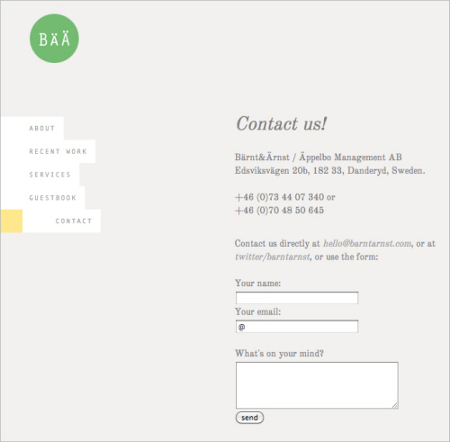
Bärnt&Ärnst
Bärnt&Ärnst‘s designers follow their minimalistic approach to design and provide all contact information such as postal address, phone numbers, email as well as a short form for user’s convenience. Often you really don’t need to require more information than that for the initial email.
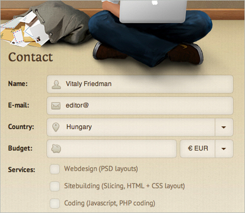
Zoltan Hosszu
Zoltan Hosszu’s contact page illustrates how icons can be used effectively to indicate the purpose of input fields. The form itself is very simple and quite unspectacular, but icons as well as some subtle textures make it a bit more distinctive and interesting.
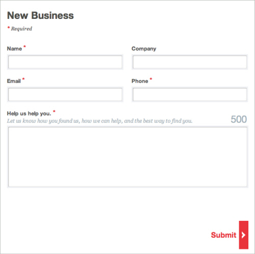
Stuck Axiom
The labels in Stuck Axiom’s “New business” contact form are short and concise. The simple language and clear labeling make the form non-threatening and easy for the user to fill out. Contrasting with the gray of the form fields, the “Submit” button is set off and accented in red, making it clear where to click.
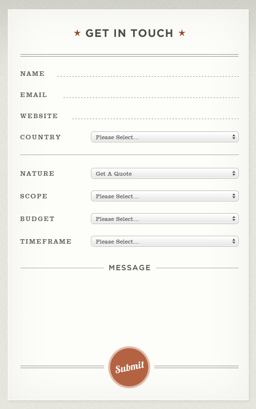
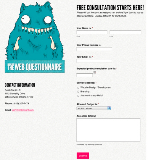
Solid Giant
With clear labeling, not too many check box options and predefined budget ranges, Solid Giant can get back to a potential client with a precise offer. The “Submit” button is clear and straightforward, marking the end of an intuitive path through the form. All elements are described carefully, and there is no room for the user to misinterpret what information to enter where.
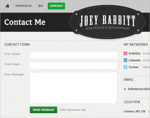
Joey Rabbitt
Joey Rabbitt isn’t a fan of lengty emails. The message of the textarea can contain at most 500 characters. However, if the user would like to email Joey directly, he can use an email on the right side of the page. Joey also showcases the networks he is a member of as well as his current location. Notice how beautifully the content is designed by using icons and various colors of grey throughout the page.
Multiple Choice Vs. Fill In The Blank
Selecting items from a list is naturally easier than filling in a blank. A blank sometimes raises more questions than it answers, especially if the labeling is not clear or there are too many empty fields. The user may be confused by the format, the type of information being requested or how exactly to answer a question. In general, a choice is better than a blank, especially with information that could be confusing, such as scope, budget, project type, etc. This is why most order forms do not require you to fill out every piece of information.
Pieoneers
Pieoneers uses the fill-in-the-blank format in the left column for generic information, with established conventions for format and type. On the right, more complicated questions are in the form of drop-down boxes, letting you choose between broad options, so that there is no confusion or hesitation.
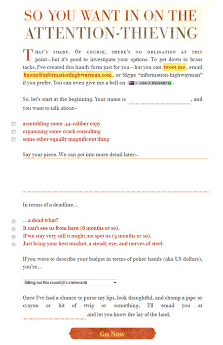
Information Highwayman
Information Highwayman cleverly combines multiple choice and fill in the blank. The empty fields are for simple bits of information specific to the user: name, email address, comment. These are all non-threatening and could not be formatted as multiple choice. Questions related to services sought and budget tend to be more complicated. Giving user some options here simplifies the process of explaining what you’re asking for.
Facio Design
Facio Design’s contact form is probably the most difficult contact form featured in this article, and rightly so. The choice of typeface and the font size is suboptimal as it is very difficult to read, especially on Windows. The designers have tried to mimic the appearance of a letter, but it doesn’t quite work here. Perhaps a very simple, basic form would work better here. Please notice that according to some studies, using this Madlib style form design could increase conversion (thanks, Larry from the comments), but we believe that in this specific case aesthetics doesn’t aid the functionality of the form.
Conclusion
This overview covers a few simple best practices that you can apply to Web forms. Just remember to spend the extra time on your next website; many of these approaches are not hard to implement and will lead to much higher conversion rates, but they are often overlooked. We spend so much time getting people to the door that we forget to make the door as inviting and useful as the path to it.
Useful Sources
- “Sensible Forms: A Form Usability Checklist,” Brian Crescimanno Read up on some basic facts and rules for styling and setting up forms on your websites.
- “Form Design: 11 Patterns For Accepting User Input,” Linda Bustos This article identifies which input patterns are useful and explains when hinting and prompting are useful.
- “Best Practices for Web Form Design,” Luke Wroblewski This walks you through the importance of form design, going over best practices based on website analytics, usability testing and eye-tracking studies.
Further Reading
- An Extensive Guide To Web Form Usability
- Free Download: Cheat Sheet For Designing Web Forms
- Useful Ideas And Guidelines For Good Web Form Design
- Forms On Mobile Devices: Modern Solutions
 (al, il, vf, sp, mrn)

