Best Practices For Web Design For Kids

Email Newsletter
Weekly tips on front-end & UX.
Trusted by 200,000+ folks.


 Flexible CMS. Headless & API 1st

 Register!
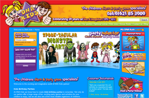
Designing websites and related media for kids presents plenty of opportunities for Web designers. Openings are available at many businesses and schools, as well as through parents and kids themselves, giving designers many ways to find work on electronic and print projects that appeal to kids. The types of work range from interface designs for video games to websites for birthday parties.
There was a time when kids’ websites were brash and busy, packed with colors and cartoon typography. Fortunately, the scale of the children’s market across most product ranges has resulted in rapid innovation in recent years. Most websites aimed at children (or children and adults) now follow principles that take some account of kids’ perspectives on Web design.
Both young kids and teenagers appear to like many of the same design traits that adults like, including clarity and high-quality content. At the same time, kids seem to enjoy a wider range of interactive features and greater novelty. This article explores child- and teen-friendly Web design guidelines and looks at the steps designers should consider before getting involved in work that will be marketed to kids and their parents or caregivers.
Hopefully, Web designers will be able to use these guidelines to attract more business from clients who deliver Web services to children, by demonstrating an awareness of the needs of this special age group.
Show Respect
Children become sophisticated consumers from a surprisingly early age. They are sensitive to age-targeting and bias in website design, so it’s important not to talk down to them.
A designer’s best defence against patronizing youngsters is to get some kids to comment on the design in the planning stage, because there’s a difference between remembering what it was like to be a kid and being a kid. This distinction operates on a number of levels in a design, ranging from the stylistic preferences discussed on Jacob Nielsen’s usability website to the emerging behaviors brought on by widespread generational changes to Internet use.
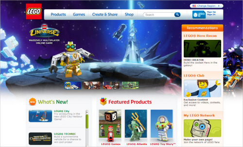
Lego’s shopping website shows considerable respect for kids and parents alike. Products are arranged in clear categories, the overall styling is clean and consistent, and visitors can zoom in on products to see exactly what they will be buying. Kids can browse and navigate freely, while focusing on the product rather than being distracted by intrusive advertising and gimmicks. When they find the product they want, the child can easily draw their parent’s attention to the splendid item they’re about to pay for.
Stick To Plain Talk
Research-based guidelines by Usability.gov state that adults like plain speaking as much as kids. Consequently, there is little to be gained from excluding kids from any website by making the language, layout, navigation or typography any more complex than is necessary. At the most basic level, over-elaborate language and dense text risk turning a website into a picture gallery, because the text, the wider message and the sale are lost when a child disengages from most of the content. The approach is simply not necessary because more able or sophisticated readers are happy to read concise language and seek further details as required.
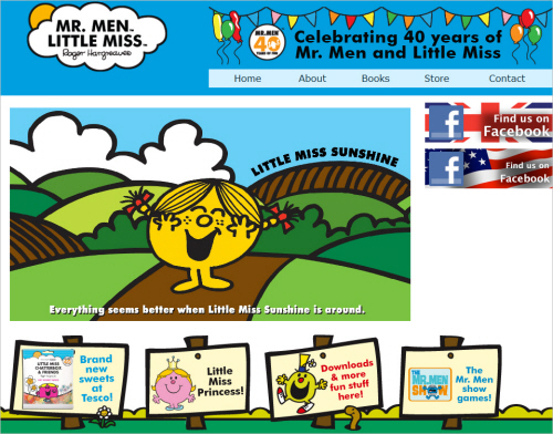
Mr. Men is a website aimed at pre-schoolers and their parents. The straightforward design, with its white space, bright colors, concise text and blocky buttons, draws visitors in. The big buttons filter visitors to age-relevant sections of the website. The website features images of all of the characters, activities for pre-schoolers and shopping options. The shopping is outsourced to stores such as Amazon; as a result, Amazon gets most of the cash, but the owner needs to do very little to maintain the website.
Gain Trust
Parents and children look for safe, reputable, secure websites where content is actively moderated and support is on hand. Parents in particular will appreciate a certain amount of hand-holding in the form of accessible tutorials and walkthroughs. One of the most successful websites in recent years to build trust also happens to be one of the most controversial.
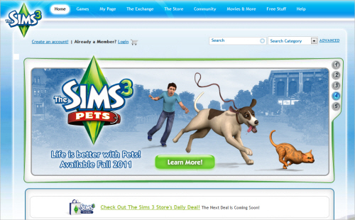
The various Sims games and websites (such as the Sims 3 website displayed below) cover a wide range of teenage and adult themes. The characters of players can get blind drunk, stay up all night, have kids way too early and do a good deal more. Electronic Arts gets around parental concerns by using its website to convince parents to trust the company. It does so with a well-rounded and integrated set of support services. The clear interface, familiar features from the games, forums, contact details, concise documentation and abundance of video tutorials all contribute to portraying the games as safe, consequence-free sandbox worlds. From there, it’s not a stretch for many parents to think that letting their kids look after a couple of virtual toddlers is not such a bad idea.
One critical part of the hand-holding process for any website is the sign-up process, which Debra Gelman discusses in detail over on A List Apart. The article is recommended reading, because sign-ups are critical to the success of most websites and should be trustworthy and convenient to use.
Web designers might also wish to read through the Byron Report, which investigates the concerns of UK adults regarding children’s websites. The report’s attention on the opinions of adults seems worthy, given that they are the ones completing sales and paying for purchases.
Interact
According to Jacob Nielsen’s research on teenagers, interactive website features (such as forums, mini-games, polls, ranking systems, competitions and 3-D interfaces) are valued by kids if they build a sense of community and foster participation. Bolting such features on will not likely prove effective, because kids will soon see the gaps and re-evaluate the website, despite any initial interest.
Stardoll integrates a range of interactive features and community support very well, offering a glitzy, glamorous look at fashion for tween and teenage girls. Any number of other websites allow you to dress up avatars and chat about your creations online with friends; Stardoll stands out by offering plenty of options for styling avatars and for its friendly and well-integrated community. The interactive community gives it a leg up on websites that offer only interactivity or only a static community.
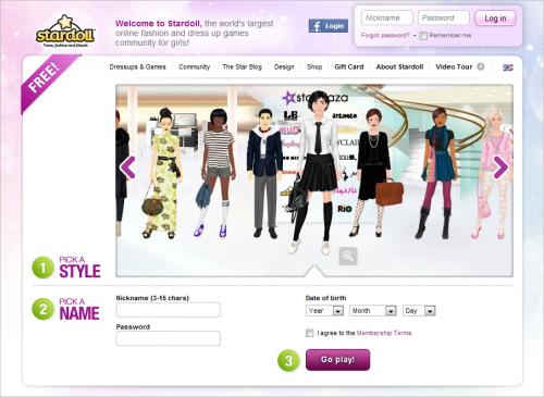
A recent report (PDF) from PlayScience proposes that the blend of interactive content and community features found on websites such as Stardoll is particularly effective on websites aimed at girls. The research depicts boys as being more focused on games, while girls switch between many different social and interactive activities.
Reward Loyalty
Kids consider their virtual goods and reputation as meaningful possessions, which is the reason they spend money on advancements, awards, objects and other persistent virtual items. With global sales of virtual goods already running at $7 billion annually, many online businesses would likely benefit from design features that attract and retain customers and that promote repeat purchases.
At present there tends to be a divide between website-specific award and ranking schemes on the one hand and aggregated personal content on social networks on the other. A kid’s badges, high scores, avatars and items are generally specific to a website, while their photos, chats, links and music live on a social networking platform.
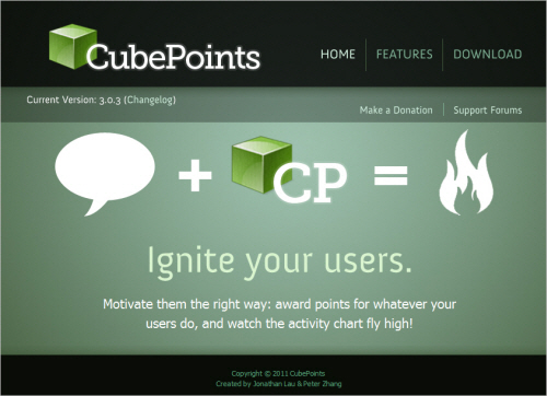
Websites looking to capture that all-important loyalty that leads to subscriptions and sales of virtual goods might want to take account of how to build and sustain loyalty. If the economics of the website call for a proprietary approach, then beefing up the internal model is probably necessary. If fuller integration is commercially viable, then standalone systems like CubePoints demonstrate the type of coherent schemes that could be put in place. For example, even a standard WordPress subscription website can bring together a reward scheme and social networking functionality with the quick addition of a
CubePoints plug-in and a forum plug-in.
Offer Choice
There are many ways to present kids with choices through thoughtful design. Just a few options are consultative polls, competitions, push-button style makeovers and a lot of custom avatars. Typically, these basic elements should gel with the overall style and, particularly, with any other interactivity on the website.
In addition, Web designers might consider it a priority to offer their own in-house or site-specific choices. Opening up choice in this way involves looking at users’ workflow and the motivations underlying their use of the website. The following are a few ways to create more choice:
- Allowing visitors to adjust the pace and frequency of interaction,
- Offering flexible or open-ended environments,
- Varying the range of activities offered,
- Helping visitors construct and extend their own goals,
- Offering multiple levels of hand-holding,
- Enabling the construction and deconstruction of sections of the user’s experience.
Among such options, the greatest choice comes with co-design, where kids go beyond decorating avatars and completing polls and start to independently shape their own gameplay.
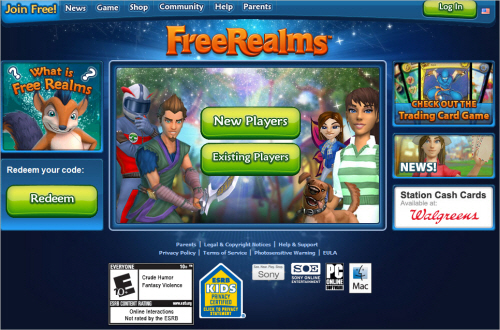
FreeRealms is perhaps the most effective co-design website around now. Players learn the interface, play mini-games, advance through levels and collect possessions. Then, quite suddenly, they are running wizard schools, setting up modest online ventures and investing in real estate. This happens without any instruction or guidance from the game, but rather from within the safety of a moderated and fully logged Web environment. For all intents and purposes, the website operates much like Second Life, without the live ammunition.
Aim For High Impact
For some, high-impact Web design equates with 3-D graphics and both feet jammed on the accelerator. This presents a problem, because few things will make the user’s progress through a website go slower than lavish 3-D content. Certain types of gaming websites are suited to in-your-face 3-D experiences, but there are a lot of ways to achieve high impact.
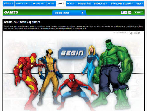
Comic websites (such as those by Marvel and DC Comics) are particularly good at using existing content to bolster subscription services, mainly by recycling characters and artwork from their extensive libraries. Visitors have pretty much instant access to many high-impact static images and the means to build their own mini-comics and heroic characters in 2-D. There’s no need for much 3-D in these circumstances, because the websites are mainly about enjoying the comic book format. Video games and movies linked to recognized comic brands are already licensed to alternative distribution channels.
Be Child-Centered
Education Arcade’s report (PDF) discusses attempts to combine video game entertainment and education (or “edutainment”) several years ago. These efforts show the dangers of passing off learning activities as fun by sugar-coating them with mini-games. Some game websites, including Sony’s FreeRealms, have succeeded in offering independent learning within a decidedly gaming world. For now, delivering formal learning through genuinely entertaining websites remains a relatively expensive proposition.
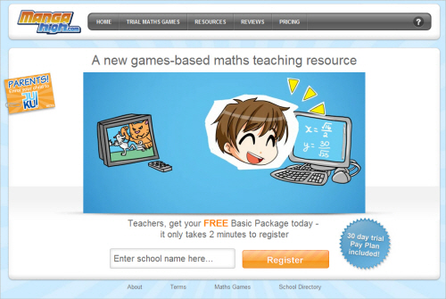
However, Sims 3 and Free Realms are examples of highly flexible but not hugely expensive resources that support a wide range of curriculum priorities. For those who need more convincing, the relatively new start-up MangaHigh is an encouraging effort to combine purposeful number-crunching alongside genuinely entertaining design and gameplay.
The dividing line can be uncertain and contextual, but as soon as kids sense that an activity or interaction prioritizes a lesson ahead of engagement and motivation, they seem to switch off.
Conclusions
Ordinarily, now would be the time to highlight a couple of points as key considerations. But it might be more helpful to draw attention to a particular approach that hasn’t been covered yet but that stands out from the rest.
Kids enjoy novelty, and adults go to a lot of trouble to organize parties and outings that give kids new ideas and novel experiences. Ideally, a website aimed at kids does the same. Ask yourself what you could offer that would fit seamlessly in their existing Web experience and that would enable them to do something they haven’t done before.
If you want to do that, you’ll need to suppress the urge to start on screen and spend a bit more time in the planning stage. The reward is a much tighter fit between your design and the kids you’re designing for.
Case Studies And Tutorials
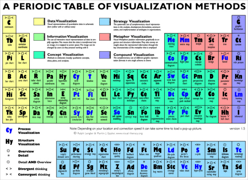
The websites identified above as examples of good design share a number of characteristics, including a strong visual style, plenty of color and a focus on clarity. Cartoons are perhaps the most popular style right now, but designers have a lot of options. A look at the Periodic Table of Visualization Methods would help most teams. The right side of the table is the place to pick up ideas on designing for kids.
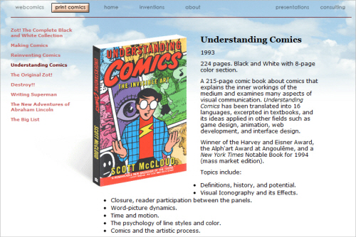
Archives and Museum Informatics reviews the design process for the Tate Gallery’s online resources for kids aged 6 to 12. The case study, titled “Doing It for the Kids: Tate Online on Engaging, Entertaining and (Stealthily) Educating Six to 12-Year-Olds,” offers a step-by-step approach to meeting the design requirements of a large organization. Cartoons and comics are not the only option, but they have a visual language that many kids appreciate. Scott McCloud’s Understanding Comics has been around for a while, and it is an invaluable guide to designing comic art or in a comic style in any media.
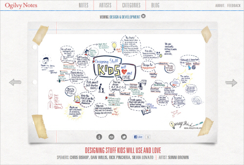
Participants in the 2011 SxSW Interactive festival visualized the entire conference using infographics. Their efforts led to the remarkable display of sketches, charts and diagrams on display at Ogilvy Notes. One of the visualizations is all about Web design for kids and well worth a visit. The chart provides a good starting point for thinking about what factors to take into account when mapping out a website for kids.
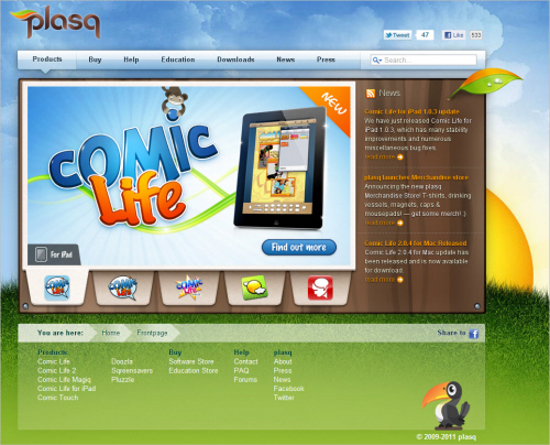
Web designers with strong graphic design skills have a valuable weapon in their arsenal. Those without affordable access to such skills could be at a disadvantage, but it’s surprising how much can be achieved with a digital camera and some cheap software. For example, Comic Life is inexpensive and able to apply a wide range of comic layouts and styles, yielding some fairly credible results in PDF format.
Further Resources
- Jacob Nielsen’s website on usability research
- “Usability of Websites for Teenagers,” Jacob Nielsen
- “Why Generation Y Is Changing the Web,” ReadWriteWeb
- “Designing Web Registration Forms for Kids,” Debra Gelman, A List Apart
- “Digital Natives: The Gender Issue” (PDF), PlayScience
- “Teenagers Love Digital Possessions Researchers Find,” Digital Trends
- “Guidelines,” Usability.gov
- Education Arcade
- Byron Report
Further Reading
You might be interested in the following related posts as well:
- Designing Websites for Kids: Trends and Best Practices
- Useful Ideas And Guidelines For Good Web Form Design
- Showcase of Creative Navigation Menus: Good and Bad Examples
- Designing For Kids Is Not Child’s Play


