Picking A Mobile Support Strategy For Your Website
The number of people browsing the Web from a mobile device has more than tripled since 2009, and it is sure to continue growing, with browser platforms such as iOS and Android offering mobile browser support that is almost identical to what we have come to expect from a desktop experience. As the mobile consumer market continues to grow, so will the aspirations of individuals and companies who look to embrace what the mobile Web has to offer.
With this in mind, many website owners have begun to develop a strategy for providing information and services to their mobile visitors. However, mobile strategies can vary massively from website to website, depending on what the company wants to offer visitors. For example, eBay’s strategy will be very different from an individual’s strategy for a portfolio website, which might simply be to improve readability for those viewing on a mobile device.
So, as website owners define the level of support they aim to provide, a scale of support for mobile devices emerges. Picking where on the scale your website should sit can be quite tricky; each level of support is not without its pros and cons. Let’s take a look at some of the more common approaches:
Approach A: Tweak What You Have
The most basic and, thus, quickest option is to do only what is required to get the website to work on mobile devices. I use the word “work” loosely here because it can be very subjective, but the main goal is to ensure that the website displays and functions properly on mobile devices and perhaps similarly to the desktop experience.
Sure, delivering a desktop experience on a mobile device is not ideal by any stretch of the imagination, but this option simply offers the minimum required to get the website to function and display OK. With modern mobile devices offering good CSS support and zooming functionality, visitors should at least be able to access the information they need.
How to Implement This Approach?
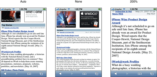
Simple tweaks could include adjusting the viewport and text size, which will affect the way the website displays on a mobile device. The default viewport dimensions should work well for most layouts, but we can make adjustments using the meta element:
<meta name="viewport" content="width=device-width" />Text size can also be adjusted for some mobile devices using the CSS text-size-adjust property which specifies a size adjustment for displaying text content:
html {
-webkit-text-size-adjust: auto; /* Automatically adjusted for Safari on iPhone. */
-ms-text-size-adjust: auto; }
More information on the text-size-adjust property is available in the Safari Developer Library. With a small number of tweaks, you should be able to optimize your website to appear as usable as the desktop experience.
Be careful when making any adjustments to the CSS for mobile visitors: you do not want desktop users ending up with a 200% font size by default! If you think this might happen or you want to further improve the experience, consider putting the CSS in a separate file:
<link rel="stylesheet" href="…" media="handheld, only screen and (max-device width: 480px)" />Pros:
- Quick to implement;
- Minimal work required to replicate the desktop design;
- Strong brand identification with basic consideration for mobile visitors.
Cons:
- Mobile users could suffer from a poor experience;
- Slow due to users downloading styles and large assets;
- Content and navigation path are not optimized for mobile visitors.
Other Resources
- The State Of Responsive Web Design
- Responsible Considerations For Responsive Web Design
- Losing Users If Responsive Web Design Is Your Only Strategy
Approach B: Adaptive Layout (Media Queries)
Media-dependent styling has been around for a long time; you will almost certainly have used “media types” before:
<link rel="stylesheet" href="…" media="print" />Media queries, on the other hand, have really started to gain popularity since browser vendors began to support the W3C’s CSS3 “Media Queries” specification.
Recommended reading: Responsively Retrofitting An Existing Site With RWD Retrofit
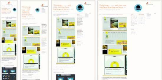
Most modern browsers, including mobile ones, should now be able to query such things as width, height, device width and height, orientation and more. This has led to more people using media queries to provide responsive designs to their visitors:

For older browsers, including Internet Explorer 6 to 8, several solutions are available that add some level of support for media queries, such as Respond.js by Scott Jehl.
How to Implement This Approach?
We can target specific resolutions and device sizes. For example, we could target mobile devices with a maximum device width of 480 pixels, such as the iPhone:
<link rel="stylesheet" media="only screen and (max-device-width: 480px)" href="mobile.css" />Or we could put the same media query in our CSS file:
@media only screen and (max-device-width: 480px) {
    // insert styling here…
}
Adaptive layouts need to work with the content already available on your website. This means that the source order and mark-up can play a vital role in providing a logical order to content when linearized for narrow layouts. You will also need to take into account that images will need to scale to fit as their containing elements adapt to different layouts. One way to achieve this is to specify a maximum width:
img { max-width: 100%; }You could consider providing the mobile experience as the default and the desktop experience through media queries, an idea discussed by both Luke Wroblewski and Peter Gasston. Combining this approach with something like Adapt.js or 320 and up could improve performance for mobile visitors.
However, making the mobile experience the default isn’t without its own problems. Always consider your audience, and review visitor data before finalizing your approach.
Pros:
- Quick to develop, especially when considered from the start;
- Cheap to produce because minimal additional design is required;
- Can result in improved readability and experience for mobile visitors.
Cons:
- Older mobile and desktop browsers, including Internet Explorer 8, do not natively support media queries;
- Visitors could face a short learning curve if the navigation and layout are altered;
- Rendering could potentially be slower as images and non-critical content in the HTML are being downloaded.
Both approach A and approach B beautifully embrace the “One Web” philosophy which sees the Web as one universal medium that should adjust itself to the different environment of its users. Using mobile tweaks and media queries can help to keep the website a standalone, universal entity optimized for both mobile and desktop user experiences. As Jeremy Keith writes in his article,
“Recent developments in areas like performance and responsive design means that we can realistically pursue that vision of serving up content at a URL to everyone to the best ability of their device. At the same time, the opposite approach—creating multiple, tailored URLs—is currently a popular technique.”— Jeremy Keith, One Web
We will discuss the latter approach in the next sections of this article.
Other Resources
- Responsive Web Design: What It Is and How To Use It
- How to Use CSS3 Media Queries to Create a Mobile Version of Your Website
- High-Performance Mobile
Approach C: A Dedicated Mobile Website
A website dedicated to mobile users aims to deliver an optimized, and often very different, experience to visitors. These micro or mobile websites can take on a life of their own and often require a lot of research and analysis in order to prioritize and deliver the most important content to users.
Mobile websites from the likes of eBay and Amazon show a very different strategy than their desktop equivalents because screen space and file sizes are at a premium.
How to Implement This Approach?
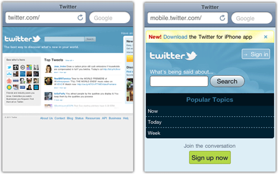
A dedicated mobile website will normally reside on its own domain or sub-domain, such as mobile.twitter.com:

Redirecting mobile traffic to a dedicated website ensures that visitors arrive in the right place. But if you do this, provide a link to allow visitors to access to the full version! Also make sure that mobile users are redirected to the correct page when deep linking from another source.
Assets such as images should be kept to a minimum. And popular content, common tasks and key navigational paths should be highlighted to give users exactly what they want. More often than not, there is no room for advertisements in mobile versions.
Despite the extra work, the result can be a faster, more streamlined experience that puts the most important features and content at the user’s fingertips.
Pros:
- Greatly improved performance;
- Optimized paths make it easy and fast for users;
- Enhances your support of and appeal to growing mobile consumer market.
Cons:
- Relatively expensive to build and maintain;
- Time-consuming because assets must be optimized and content prioritized;
- Higher learning curve if the layout and content are very different from the desktop versions.
Other Resources
Approach X: Native Apps
Finally, another option to consider is a native app. Apps can be the ultimate in an optimized, streamlined journey for visitors, and they often have native controls. Several properties, such as eBay, Twitter and Amazon, have clear user goals and have therefore invested time and effort into creating native apps that provide the best possible experience on a wide range of devices.
How to Implement This Approach?
A native app should provide the best possible experience for users on the go, while taking full advantage of device-specific features and controls. This approach is very different from the others described, and the project could be considered “ad hoc” development, correlating more closely to the user’s goals than the content or features on your website.
If this appeals to you, consider using an SDK, such as the ones available from PhoneGap and Appcelerator. These SDKs enable developers with a Web background to create applications and tap into native APIs that are not always available in the browser. Native app development can be quite bespoke and is sometimes undertaken parallel to the main website.
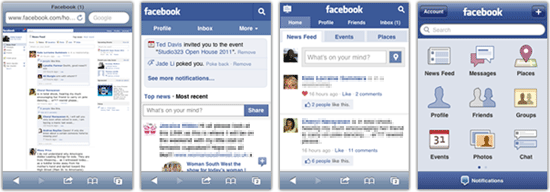
Facebook, which offers a native app, is a good example of how a integrated approach can ensure that content is accessible through full, mobile, touch and app versions, each optimized for the best possible experience.

Pros:
- Streamlined journeys;
- Device controls are native and optimized for platform in terms of speed and performance;
- Incredibly lightweight, with minimal bandwidth usage.
Cons:
- Requires bespoke development;
- Creating and maintaining apps for a range of devices is time-consuming;
- Third-party approval is required before the app is available in stores.
Which Approach Is Right For You?
Approach A and Approach B offer varying levels of support and often could be considered as a “quick win” strategy. Consider them if you want to improve the experience and optimize readability for mobile visitors at minimal cost.
A strongly related design strategy would be to start with a mobile layout of the website first, having a strong focus on content and navigation and then extend the mobile experience to larger desktop experiences. You can find some interesting workflow techniques for this strategy in Luke Wroblewski’s conference notes of Ethan Marcotte’s talk The Responsive Designer’s Workflow. For instance, you might need to consider using server-side media queries as well as fluid images in the development process.
Approach C requires considerably more time to develop and maintain but results in a faster, more streamlined website for task-oriented visitors. Approach X requires significantly more time to develop and approval from third-party app stores. But it might be ideal if your brand has many mobile users who expect a flawless experience. The main problem with these two approaches is that they aren’t scalable as new mobile devices might require new versions of the websites which increases costs and makes maintenance more difficult.
Ultimately, your approach should be guided by your content, objectives and visitors. What might work in theory doesn’t necessarily work in practice. A bit of digging in your analytics might show that a large proportion of visitors are on mobile devices, and so the extra time spent improving their experience would be worth it. Once you have all of the data, you can make an informed decision about which approach will benefit you — and more importantly — your visitors.
Further Reading
- Supporting Your Product: How To Provide Technical Support
- How To Deliver Exceptional Client Service
- Improving Customer Service with UX
- Taking A Customer From Like To Love


 See the full picture →

 Celebrating 10 million developers
 SurveyJS: White-Label Survey Solution for Your JS App


