Clear Indications That It’s Time To Redesign

Email Newsletter
Weekly tips on front-end & UX.
Trusted by 182,000+ folks.
 Register for Free
 Celebrating 10 million developers

 Custom Web Forms for Angular, React, & Vue. Your backend.

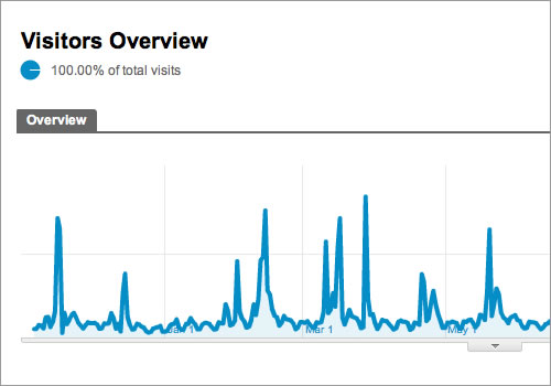
 The first and most important indicator that your website is in need of a rethink is metrics that are beginning to tank. There certainly could be other reasons for this symptom (such as your product not fitting the market), but once those are eliminated or mitigated, a constant downward trend in conversions, sales, engagement activities and general user participation indicates that the efficacy of your current design has worn off.
Redesign. The word itself can send shudders down the spines of any Web designer and developer. For many designers and website owners, the imminent onslaught of endless review cycles, coupled with an infinite number of “stakeholders” and their inevitable “opinions,” would drive them to shave their heads with a cheese grater if given a choice between the two. Despite these realities, redesigns are a fact of any online property’s life cycle. Here are five key indications that it’s time to redesign your website and of how extensive that redesign needs to be.
Metrics Are Down
The first and most important indicator that your website is in need of a rethink is metrics that are beginning to tank. There certainly could be other reasons for this symptom (such as your product not fitting the market), but once those are eliminated or mitigated, a constant downward trend in conversions, sales, engagement activities and general user participation indicates that the efficacy of your current design has worn off.
Further Reading on SmashingMag:
- Redesign: When To Relaunch The Site and Best Practices
- Stop Redesigning And Start Tuning Your Site Instead
- Building An Effective ‘Coming Soon’ Page For Your Product
Many people call it “creative fatigue,” but what this really indicates is a disconnect with your audience. The key to solving this in the redesign is to figure out where in the workflow the design is breaking down and then address those areas as top priorities.
The metrics are the most important indicator.
The extent to which you redesign to solve sagging metrics could be limited either to adjusting your conversion funnel, if that’s where the problem resides, or to optimizing the product’s main workflow. It does not necessarily mean having to rethink the entire face that your product presents to the world.
Your Users Tell You It’s Time
Metrics give you immediate insight that something is wrong, but to get to the core of what needs to be addressed in the redesign you need to speak with your customers. Surveys work well, but usability testing is most effective. The fluidity of face-to-face conversation allows you to explore the dynamic threads that surveys restrict. If through these conversations you notice consistent patterns that shed light on the drivers behind your downward-trending metrics (and you will), then it’s time to redesign. In addition, these user conversations will reveal prevalent attitudes towards your brand, which can also be addressed in the redesign. In some instances, negative brand perception should be enough to trigger a redesign — but you’d never know about it unless you talk to your customers.
The final decisions are still up to you. (Image: Kristian Bjornard)
Customer feedback will tell you not only whether to rethink parts of your website, but to what extent. Typically, customer conversations focus on specific elements of your workflow. Those areas are the ones that the redesign should focus on. In most cases, this wouldn’t be the whole website, but if the feedback is broad and far-reaching, then tackling the entire experience may be a priority.
The Tech/UX “Debt” List Is Longer Than Your Forearm
Over the course of building a product or website, an organization begins to accrue tech and UX debt. This debt is made up of all the things you should have done during the initial build but either didn’t get around to or had to cut corners on in order to ship the product on time. Each subsequent iteration inevitably adds more debt to the list, until the list becomes so long that it is almost insurmountable. While there are many ways to tackle tech and UX debt on an incremental level, there comes a point when the website, in essence, becomes “totalled.” Like a car that has sustained damage greater in cost than its value, your website gets to the point where starting over would be cheaper than fixing all of the items on your debt list. This is a perfect time for a redesign.
When the debt list gets this long, taking on “incremental redesigns” is easy, where you knock off bits from the list but not the majority of it. This turns into death by a thousand paper cuts, because as you fix elements on the list, you start to accrue more debt around other features. If the list truly is longer than your forearm, then rethink the website if possible.
It Just “Looks” Old
The website’s aesthetic reflects directly on the perception and trustworthiness of your brand. Even if your design was the hotness when it first launched, aesthetics evolve. An old design will be detrimental to your product, leading to the declining metrics mentioned earlier. How can you tell whether your website’s aesthetic is outdated? Look at your competition. Look at hyped-up newly launched services in other sectors. Compare your aesthetics to those of brands that are performing well. Those factors provide excellent barometers by which to assess the currency of your design. The challenge is to review these other websites objectively. Living with your website day in and day out can amplify the feeling that it’s stale and old. Ensure that your assessment is accurate by reviewing your findings with a cross-section of employees in your company.

Decide on what to lose and what to add. (Image: Kristian Bjornard)
In this case, the redesign would essentially be a facelift, a superficial upgrade of the presentation layer that doesn’t necessarily address the fundamental workflow or conversion funnel — although those aspects will undoubtedly be affected by this aesthetic upgrade.
It’s Been More Than 12 Months Since Your Last Refresh
Even if none of the above indicators apply to your website, the shelf life of an aesthetic in today’s highly iterative online reality is hardly ever more than 12 months. If it’s been a year or longer since you last redesigned your website, then it’s time to redesign. Not only will it refresh the experience for your loyal customers, it will attract new ones. In addition, it will breathe life into the brand and show your user base, the press, your investors and staff that you’re committed to keeping the experience fresh and top of mind.
Again, the focus here is on an aesthetic improvement that keeps the brand current, not necessarily an overhaul.
In Conclusion
These are five simple indicators that it’s likely time to redesign your website, but the list is certainly not exhaustive. The number of them that apply to your situation will determine whether a redesign is imperative. But each indicator on its own is still a strong reason to kick off the next phase of your website’s life. Maintaining a current and fresh face for the online world will yield dividends in customer acquisition, conversion and retention. Also, your staff will stay immersed in the latest technologies, design trends and presentation-layer wizardry if they know that they’ll soon get to exercise their chops in a redesign.
What indicators have you found work best in your organization to drive a website redesign?
(Cover image: una cierta mirada)


