27 Beautiful High-Quality Free Fonts

Email Newsletter
Weekly tips on front-end & UX.
Trusted by 182,000+ folks.
 Register for Free
 Custom Web Forms for Angular, React, & Vue. Your backend.
 Celebrating 10 million developers

Every now and then, we look around, select fresh free high-quality fonts and present them to you in a brief overview. The choice is enormous, so the time you need to find them is usually time you should be investing in your projects. We search for them and find them so that you don’t have to.
In this selection, we’re pleased to present Tondu, Banda, Morning Glory, Matilde, Bohema, Weston Round Slab, Highlands, Cabin, Linden Hill and other fonts. Please note that while most fonts are available for commercial projects, some are for personal use only and are clearly marked as such in their descriptions. Also, please read the licensing agreements carefully before using the fonts; they may change from time to time.
New High-Quality Free Fonts
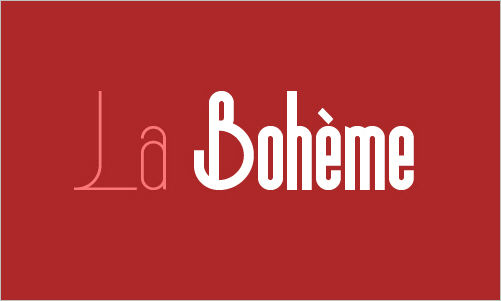
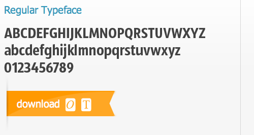
Bohema
Bohema is a unique art-deco typeface with a modern twist. The unpredictability of some glyphs makes it looks original and interesting, although sometimes a bit troublesome. Bohema is available in eight distinct styles and could be a great fit for headlines, editorial lettering, branding, merchandising and special occasions. You can download one weight, Bohema Regular Alternative, for free, although it’s not quite as useful as the rest of the type family.
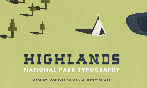
Highlands
Highlands is a charming slab-serif font that draws inspiration from the US’ good ol’ National Park posters. Designed by Tyler Galpin, the fonts could be a great fit for headlines and posters. Currently only an uppercase set is available. Released under a pay-what-you-want license.
Bender
The Bender font family is an extravagant Russian typeface for special occasions. Use it for your graphic design work, portfolio or print products. Eight font weights are available, all as free downloads. But registration on MySpace is required.
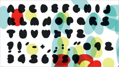
Ovalian Type
An experimental, playful font based on oval and circle shapes. Obviously not a good fit for corporate or elegant projects, but Ovalian Type could be quite useful in projects that invite experimentation, engagement and creativity. Available in TrueType format.
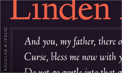
Linden Hill
Linden Hill is a digital version of Frederic Goudy’s Deepdene. This small serif family designed by Barry Schwartz includes roman and italic styles. Available in OpenType format, Linden Hill is available under the SIL Open Font License.
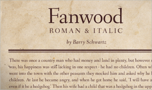
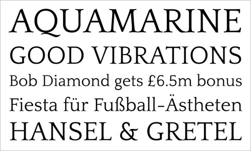
Fanwood
Fanwood is a carefully crafted serif typeface with a flavor of classic roman typefaces. The font package includes roman and italic styles, both optimized for the screen. It’s an excellent typeface, making for a pleasing reading experience, including in headings and body copy. Released under the SIL Open Font License).
Matilde
A friendly thin typeface with extra-tall capitals and subtle decorative elements. Matilde would work nicely for headings, short paragraphs, children’s books, posters and brochures. The family contains 212 symbols and glyphs. Two styles are available: Normal and Sketch. The font also contains decorative frames and patterns.
Weston Round Slab
This typeface contains rounded slab-serif fonts designed by Pavel Pavlov specifically for use in logos and headlines. Regular and light all-caps versions are available in OpenType formats for free downloading.
Banda Typeface
Banda is a semi-serif typeface characterized by a tall x-height and rounded semi-serifs. Although first designed as a display typeface, Banda quickly evolved into a more complex set, consisting of seven weights plus their respectful italics. Banda can be used for short passages of text as well as fancy displays. Spanning the elegant finesse of the thinner weights to the almost childish bubbliness of the heavier weights, Banda is a great all-round performer, suitable for logos, headlines, packaging and food products and much more.
Fabrica
Practice Foundry is an independent foundry that releases fonts under a pay-what-you-want license. The sans-serif font was intended to be the most legible typeface for mobile screens. Its details are drawn from the more systematic constructed Neo-Grotesques, giving it a neutral tone of voice. Although Fabrica was developed primarily for mobile screens, the typeface is suitable to any application, big or small. The font is available in OpenType format for Mac and PC.
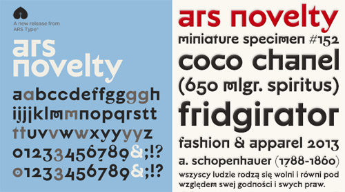
ARS Novelty
This typeface is a result of the unconventional approach of Angus R. Shamal. The designer has come up with a fun and by no means less-than-functional experiment in hybrid styles and historical influences, joining the baroque serif with the geometric sans, the formal with the decorative flourish. ARS Novelty is apparently a typeface that tries to make sense of it all. A single weight is available, with stylistic alternates, numerals, standard ligatures and discretionary ligatures, case-sensitive forms, ordinals and localized forms. In OpenType format.
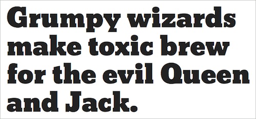
Bevan
Bevan is a reworking of a traditional slab-serif display typeface created by Heinrich Jost in the 1930s. In Bevan, Jost’s earlier letter forms have been digitized and then reshaped for use as a Web font. The counters have been opened up a little, and the stems optimized for use as a bold display font in modern Web browsers. It’s a good choice for bold headings and promotional brochures. Released under the SIL Open Font License and available in the Google Web Fonts repository. Designed by Vernon Adams. You might want to take a look at other free fonts by Vernon Adams: Rokkitt, Shanti, Muli.
Sansus Webissimo
This typeface is a contemporary open grotesk typeface available in OpenType and TrueType formats. Sansus is a potentially great fit for both headings and body copy, both online and in print. Two font weights are available, regular and italic. The family is released under the Creative Commons Attribution 3.0 License.
Quattrocento Roman
Quattrocento Roman is a classic, elegant and strong typeface that perhaps lacks some maturity in certain details (the “g” and “e,” for example, do not quite seem to fit together). The typeface has wide and open letterforms, and the good x-height makes body text legible even at small sizes. As a classic Roman typeface, Quattrocento is a good choice for big bold headlines. Fontlab source files are included in the download package. Available as a Web font, Quattrocento Sans is a free download as well.
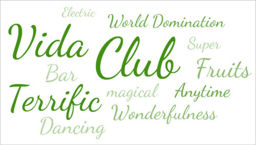
Dancing Script
Dancing Script is a lively, casual script whose letters bounce and change in size slightly. The font references popular typefaces from the ’50s. It recalls Murray Hill (by Emil Klumpp, 1956) in its weight distribution and Mistral (by Roger Excoffon, 1953) in its bouncing effect. Dancing Script could be handy if you are looking for a casual, friendly, informal and spontaneous typeface, and it’s a pretty good replacement for Comic Sans, too! Also available as a Web font.
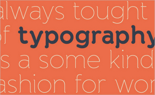
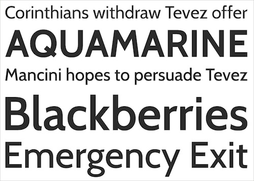
Cabin
Cabin is a humanist sans serif inspired by Edward Johnston and Eric Gill’s typefaces, with a touch of modernism. Cabin incorporates modern proportions, optical adjustments and some elements of the geometric sans. As the designer puts it, “It remains true to its roots, but has its own personality.” An excellent typeface for body copy and headings on small and large screens. Four font weights are available, with corresponding italic styles.
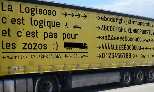
Logisoso
Logisoso is an ongoing type design project. Created during a signage project for a logistics center, where it was used to identify different buildings, the font was later completed with Inkscape and generated with FontForge. The download package contains the source files for you to improve and optimize the font.
Novecento
Novecento is an uppercase-only font family inspired by the European typographic trends of the first half of 20th century. The typeface looks rational, geometric and blocky. But it is based on optical, not geometric, proportions. Novecento could be used for headlines, visual identities and short sentences. The lighter weights provide a more contemporary look and feel, while the bolder ones have a retro flavor.
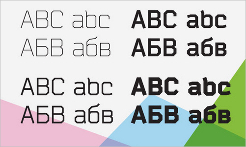
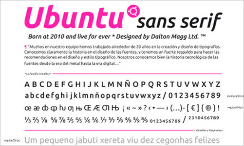
Ubuntu
The Ubuntu font family is a set of new open sans-serif fonts. The family includes all of the languages used by Ubuntu users around the world. Designed by Dalton Maag for the Ubuntu operating system, and open source.
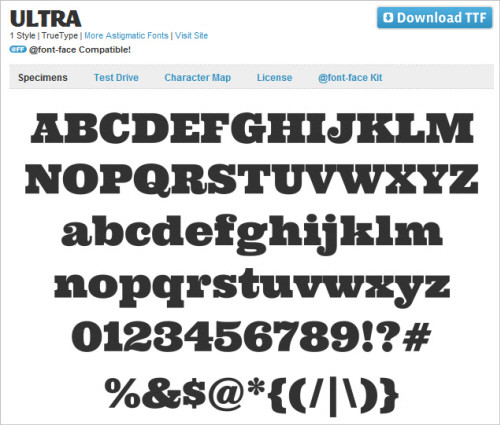
Ultra
Ultra’s beauty lies in its boldness. This decorative Western font with elegant serifs has a sharp and inviting presence, especially in the subtleties of the “J,” “7” and “f.” The font has an extended European character set and is available as a free download in TrueType format. Licensed under the Apache License version 2.
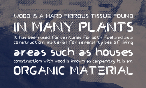
CS Benwood
This font is unique and would serve a large variety of print design work, be it posters, CD covers or any other project that requires a non-traditional typographic spin. Each glyph has its own unique “woody” appearance. Designed by BenChalit Sagiamsak, and available in OpenType format.
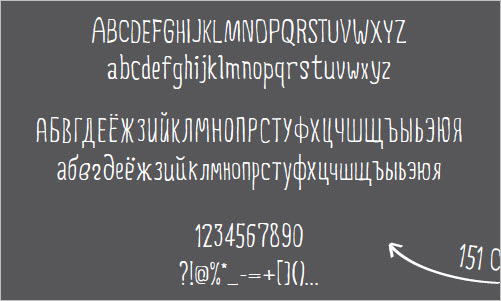
Five Minutes
This font was created by Oleg Zhuravlev and is meant for illustrations that display your brainstorming and other creative ideas. The letters are not quite optimized and appear to be a bit loose, but you wouldn’t expect anything more from your own scribbled notes either. The font contains 151 glyphs, including Latin and Cyrillic alphabets, numerals and some special characters.
Maven Pro
Maven Pro is a free sans-serif typeface with a unique curvature and flowing rhythm. The extensive collection of characters totals over 530 glyphs! Many languages are supported (too many to list), including basic Latin and Western European diacritics. The vast number of glyphs make it highly usable for just about any textual content: spreadsheets, documents and especially websites. The typeface is also great for printed collateral and can scale down very small while maintaining legibility. Available in four styles: black, bold, regular and medium.
TypoFlat
Typoflat’s founder, Branislav S. Cirkovic, loves experimenting with type. The company’s website contains a number of experimental vector typefaces (only EPS format is available), all available for free downloading and use.
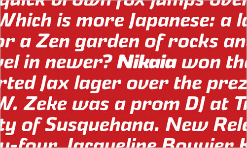
Nikaia
The Miller Type Foundry has released three font weights of its type family Nikaia for free downloading. Nikaia is a futuristic geometric typeface for headlines and body copy. Nikaia, Nikaia Regular Italic and Nikaia Script have been released for free. To download the files, you will need to register on MyFonts.
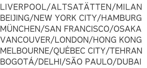
Eau Sans
This sans-serif typeface was originally designed by Yamaoka Yasuhiro in 1992, yet the nicely shaped glyphs make it a timeless, sturdy tool for any typographic work. The family consists of six font weights, with numeric characters in three variations: proportional, old-styled and lining numerals.
Podkova
Podkova is a monoline slab serif with diagonal terminals. Wide proportions and clean features aid with legibility at small sizes. The unusual letterforms provide enough character to be used at display sizes. Designed by Ilya Yudin in 2010.
Last Click
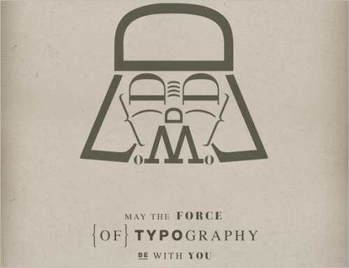
The Force of Typography
May the force of typography be with you! Matteo Civaschi and Gianmarco Milesi have proved that the power of typography can go far beyond traditional text and headings. Have you ever tried to design Yoda, stormtroopers or Darth Vader with type? Well, they have. And the result is nothing less but spectacular!
Related Posts
You might be interested in the following related posts:
- 25 New Free High-Quality Fonts (December 2010)
- 30 New Free High-Quality Fonts (August 2010)
- 20 Fresh High-Quality Free Fonts (May 2010)
Further Reading
- The Good, The Bad And The Great Examples Of Web Typography
- Taking A Second Look At Free Fonts
- 8 Simple Ways to Improve Typography In Your Designs
- 40 Delightful High-Quality Free Fonts


