Freebie: Responsive jQuery Slider Plugin Flexslider

Email Newsletter
Weekly tips on front-end & UX.
Trusted by 200,000+ folks.


When it comes to responsive design, it’s not just about fluid images or adaptive layouts. It’s also about the responsive methodology behind the entire design process.
In responsive design, we are creating responsive experiences, meaning that all design components need to be able to adapt to the environment in which they are displayed and have to interact with.
This is why we create tables, navigation menus, videos and other design elements responsive as well (see Responsive Web Design Techniques and Design Strategies for more details). It just makes sense to consider each and every design component — including the image slider.
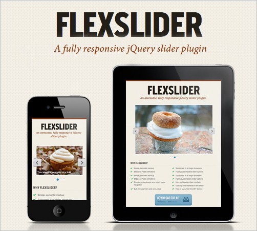
In this post, we are glad to release a responsive jQuery slider plugin Flexslider which has been created, developed and maintained by Tyler Smith and released for Smashing Magazine and its readers. As usual, the plugin is absolutely free to use in private and commerical projects.
The plugin includes fade and slide animations, customizable options as well as all the navigation options you would expect in such a plugin — touch gestures inclusive! It uses simple, semantic markup to create the slider and is lightweight, weighing only 5 Kb (minified). The plugin has been tested in Safari 4+, Chrome 4+, Firefox 3.6+, Opera 10+, and IE7+. iOS and Android devices are supported as well. In three simple steps, you can have a fully responsive slider for your responsive design.
Download The Plugin For Free!
The plugin is released under the MIT license. You can use it for all your projects for free and without any restrictions. Please link to this article if you want to spread the word. You may modify the plugin as you wish.

- Large Preview (.jpg, 0,17 Mb)
- Download the .zip-package (zip, 0.6 Mb)
- Release on the Developer’s Site
Features
- Simple, semantic markup.
- Supported in Safari 4+, Chrome 4+, Firefox 3.6+, Opera 10+, and IE7+.
- iOS and Android devices are supported as well.
- Slide and Fade animations.
- Highly customizable slider options.
- Directional, keyboard, and touch swipe navigation.
- Lightweight (5 Kb minified).
- You can use all HTML elements in the slides.
- Free to use under the MIT license.
Behind The Design
As always, here are some insights from the designer:
“My motivation behind creating this plugin was the difficulty I had building my first responsive slider. There were no resources to pull from and I spent hours banging my head against the wall working through the logic. My goal was to make it easier for others doing the same thing. I wanted to build a plugin that served the newest of beginners, while providing seasoned developers a tool they could use with confidence.FlexSlider serves beginners by being virtually plug and play, needing only the FlexSlider files and some images to get started. To seasoned developers, FlexSlider should be seen as a tool that gets them rolling quickly. It doesn’t add unnecessary markup and gives complete freedom to use any HTML element within each slide.
The most exciting thing about FlexSlider at this point, in my mind, is the slide animation. It was a challenge to construct, but the resulting responsive behavior is very cool. When you mix the slide animation with touch gestures, it creates a great experience across iOS and Android devices.
Problems I encountered when building the plugin was ensuring that the plugin would work across all different types of responsive builds, browsers, and devices. To accomplish that, I made sure the plugin did exactly what it needed too, and nothing more. For example, many sliders use fixed dimensions and absolute positioning to create animation effects, but this is not possible with fully fluid responsive design. Avoiding this practice, I limited my use of the
$(window).resize()function and let the slider dimensions remain organic to the content within. The downside to this is that the fade animations can’t overlap, which is indeed a nice effect.The most important lessons I’ve learned are that overusing
(window).resize()function to control element sizing will make you cringe, which is why you won’t find much at all in FlexSlider. Keep your responsive design as light as you can. Remember the audiences you are extending to reach are on far less capable devices, especially with JavaScript.”
Thank you, Tyler. We sincerely appreciate your work and your good intentions.
Further Reading
- C-Swipe: A Solution To Navigation Fragmentation On Android
- An Exploration Of Carousel Usage On Mobile E-Commerce Websites
- A Guide To The Android Carousel Design Pattern
- How To Design For Android Tablets
 (mrn)
(mrn)

