Content Prototyping In Responsive Web Design
Michelangelo once said, “The best of artists has no conception that the marble alone does not contain within itself.” Translate this to the world of Web design and you might say, “No matter how great a designer you are, you’re only as good as your content.” While the reality of client work sometimes makes it challenging to gather and produce content prior to starting the design, this is now widely accepted as being necessary.
You may have heard this referred to as content-driven design. I’m not the first to suggest that our current approach to responsive Web design could be improved by imparting a bigger role to content in determining how our websites respond. However, I haven’t seen many (if not any) practical explanations on how to do this. I’d like to start this conversation by introducing a theoretical concept called a “content prototype.”
What Is A Content Prototype?
A content prototype is an HTML-and-CSS-based fluid-grid prototype, consisting of layout and typography, that consists of the project’s actual content. Its greatest usefulness may be in determining where to apply media queries to make the Web design responsive.
For centuries, we have shaped our layouts and typefaces according to the meaning of the content. This has traditionally been done on fixed-width pages. We have inherited a fixed-width mentality in designing for the Web, when in fact the Web is not fixed-width. Users come to our websites for content. We should strive to present this content in the most appropriate and readable way possible.
Let’s Get Theoretical
The following is a theoretical walk-through of how one might use a content prototype in real life. Again, this is intended to begin a conversation on how we can marry the concepts underlying content-driven design and those of responsive Web design.
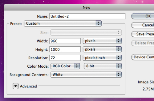
Imagine that you are about to begin designing a website. The website will consist of a single page, which contains a block of text and a few short excerpts of related text. You’ve done your homework, and the content is fully written. You have solid documents of the architecture and wireframe that establish the priorities for this page. You also know that the website will be responsive. You’ve opened up your design tool of choice, and you’re now looking at the “File → New” dialog. What to enter in those pesky little “width” and “height” fields?

Perhaps it doesn’t matter.
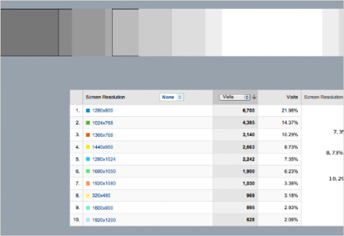
Consider this. The goal of this process is to create a website that begs to be read at any resolution. So, start at whatever resolution you’d like, whatever you’re comfortable with. Every resolution is important, not just the resolutions that last month’s analytics say are the most popular.
Because we’re following the principles of content-driven design, start with the highest-priority content on the page (the real content). Don’t worry about anything other than the typeface, font size, column width and layout. Make it a pleasure to read. This is about as basic as you can get, because you haven’t yet created icons, textures or illustrations; those elements are important, but they should support the content, and you can work on them later.
Next, code the simple page that you’ve designed using a fluid grid. This is critical; when your browser’s window is about the same width as the canvas that you started with, the content prototype should look very much the same. This gives you the chance to play with the prototype in a browser and make informed decisions about where your media queries should fire. Using this method, the content will dictate where your fluid grid breaks down. These breakages are where you should apply media queries; they are opportunities for more dramatic changes. Make these changes, always focusing on the legibility of the content.
Following this pattern, you would add media queries at points where the fluid grid falls apart. Soon, you will have a full spectrum of resolutions, with beautiful and appropriate reading experiences. Once this is done, you will have a finished content prototype that demonstrates the readability of your content outside of the context of any device-specific resolutions.
Benefits Of A Content Prototype
Thinking this way about the process of responsive Web design makes the content a filter through which all other decisions are made. The goal is to add a degree of cohesion between the message and the design of the website that would be difficult to achieve without such an approach.
Another challenge with responsive Web design is in testing usability across all resolutions. A round of usability testing with a completed content prototype could quite possibly give an early glimpse of problems with changes to the layout. The sooner you can identify these problems, the lower the cost of fixing them.
Additionally, content prototypes give you an opportunity to show that layout changes are possible before spending days designing every detail. The iterative nature of content prototyping invites collaboration between designer and coder — even if they happen to be the same person.
Design In The Browser
If you are one of those designers who also codes, then you’ve probably recognized that this can all happen right in the browser. If you have the skills to do both, then by all means, start in the browser. With the emergence of CSS3 features like border-radius, text-shadow and gradient, designing in the browser is more feasible today than ever before.
We’re all frustrated with our tools. Perhaps this is because they are all fixed-width tools! But regardless of whether we have the right tools for the job, we cannot continue to rely on common device-specific resolutions if we want to build websites that work well into the future. A content prototype gets our content into the browser as early as possible.
Problems With Content Prototypes
Obviously, this approach does have some limitations. Foremost, not every website is content-driven; many websites are workflow-driven. Without getting sidetracked by the whole question of what content is, we can recognize that this process wouldn’t necessarily work if you don’t have the content first.
Also, if you’re a designer who is not also a front-end developer, then a lot of back and forth will be required to complete the content prototype. This is not necessarily bad, but it will certainly take time.
Then there is the problem of what to do once you have a completed the content prototype. You could continue designing and adding to the code that you have. But if you do choose this route, then you will need to start with the smallest resolution first, because this is the best practice for coding a responsive website.
Alternatively, you could use this process merely to determine where your media queries should fall. In this case, this would be a lot of work just to find the proper breaks in the content’s readability.
Alternative Approaches
There are other ways to make these decisions. Using traffic data, some people might build a graph to determine the breaking points in their design.

Ethan Marcotte describes a similar process in his book Responsive Web Design, but he also suggests resolutions that are common among popular devices these days. Also, coding a responsive website that has already been fully designed could cause problems if you’re not sure whether the layout can be achieved with CSS alone. As mentioned, content prototyping lets you experiment with these layouts before fully committing to a change for a given resolution.
The point of all this is to make our content more readable, independent of what device it’s being viewed on. If content prototyping doesn’t work, maybe we could find some way — other than relying on which devices are currently popular — to make content-driven decisions about the design and layout. The guys at Front have been experimenting with this as well, calling it “The Goldilocks Approach to Responsive Design.” Their technique is to use an em-based layout (instead of the typical fluid-grid approach of percentage widths) to create a great reading experience at all resolutions.
A Helpful Tool
One of the developers on our team recently created a media query bookmarklet, which displays in real time your browser’s width and height and any media queries that have been triggered. This tool can be very helpful when doing responsive Web design. Feel free to experiment with it; I hope it simplifies the process for you as it has for us.
Building For The Future
The aim is lofty, designing for the future. Just as we build websites to be accessible to the widest audience possible — because that is the right way to build them — we should build websites that embrace the fluidity of the Web. A challenge is before us to find ways to present our content appropriately without knowing which devices it will be viewed on. We must shift our focus back to the user. A content-out approach is a user-centered approach.
It won’t be long before we’re interacting with the Web in ways we never imagined. We may be near a time when fixed-width websites are considered outdated. Whether or not that happens, our websites should be flexible enough to present readable content to all of our users. Moreover, assuming what a user with a small screen wants from your website can be dangerous. Mobile-specific websites are certainly appropriate at times, but there are a few reasons why a website should not (at a minimum) be built responsively.
In order to get better at what we do, we must keep pushing the process forward. If you have other ideas on how to separate our decisions about a website’s design from popular device resolutions, or even knowledge of the benefits or problems of content prototyping, please share.
Further Reading
- Content-First Prototyping
- Creating Content Wireframes For Responsive Design
- Design Better And Faster With Rapid Prototyping


 Register!
 Flexible CMS. Headless & API 1st


