Establishing Your Grid In Photoshop
Creating a grid is typically one of the very first things you do when starting a design comp. After all, it provides the basic structure on which the rest of your design will lie. In this article, we’ll provide two different methods for efficiently establishing a grid. These methods enable you to quickly and smartly form a grid so that you can spend more time designing.

Method 1
The first method uses GuideGuide by Cameron McEfee to set up vertical columns. This Photoshop plugin is said to be in beta, but from my experience with it everything works perfectly well, and there is even talk of the release of GuideGuide 2, which will include more features. Instructions on installing it can be found on the GuideGuide page. There is also a video tutorial on using it that was put together by Russell Brown at Adobe.

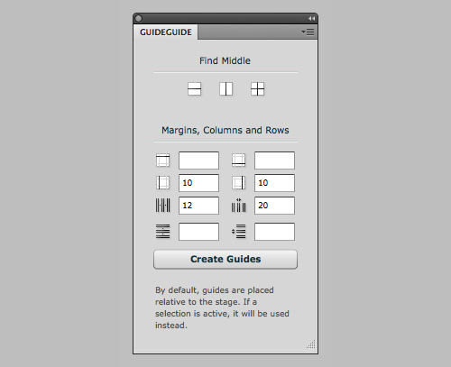
Set Up Your Grid in 5 Seconds
- Determine the margins, number of columns and gutter widths. Then click “Create Guides.”
- If the canvas for your design comp is wide, do the quick math so that the margin lengths allow for the grid to be constrained to your 960 pixels. For example, if the canvas is 1200 pixels wide, then the left and right margins would be 120 pixels each.

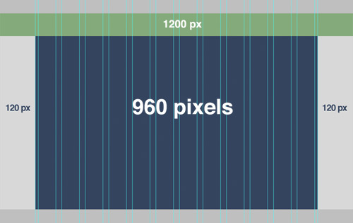
An example of 12 columns with 20-pixel gutters and margins set to 120 pixels.
You can also set a baseline grid this way, but you’d end up with a lot of guides. A better option might be the method featured on a Method & Craft video by Mike Precious…
Method & Craft’s Extensible Baseline Grid
Here is a brief summary of the steps for setting up an extensible baseline grid.
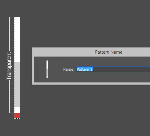
- Establish the grid’s baseline value, then create your pattern template. The baseline grid is determined by the leading (or line height) of the body text. For example, if the main body copy of your design is set in 13-point Helvetica, with the leading at 18 points, then you would set up an 18-pixel baseline grid.
- Create a Photoshop file that is the height of your baseline grid, fill the bottom pixel, and leave the remaining pixels transparent. In this case, the dimensions of your canvas would be 1-pixel wide and 18-pixels tall.
- “Select All,” and then save this as a new pattern. You can do this by going to Edit → Define Pattern…

- Go to Adjustment Layer → Pattern, and select your newly created grid pattern.

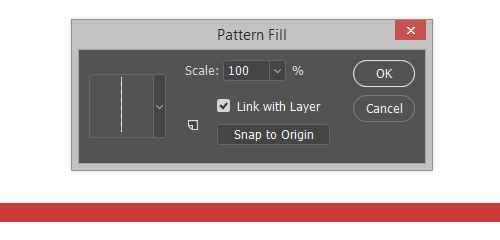
- Adjust the opacity as desired.

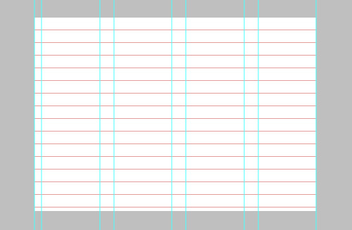
An example of method 1 with the columns and baseline grid together.
Advantages
- You get an optional baseline grid, which you can use independent of the vertical column grid. A baseline grid can create visual clutter when laid over top a design comp. With this method, it can just be toggled on when needed.
- If you prefer to use guides for your grid, this is the better solution.
- You can hide and show the grid through an easy shortcut.
Drawbacks
- Using vertical guides to mark other elements in the document can be difficult because you might confuse them with the grid.
- Compared to method 2, your options for the grid are not as specific or comprehensive (such as setting the height of the horizontal module).
- Grid lines are determined mathematically and won’t necessarily align with the pixel grid. This means that your guides could in some cases fall unevenly and end up being positioned down the middle of the actual pixels.
- This method requires two separate processes to create a vertical and baseline grid, compared to just the one method coming up.
Method 2
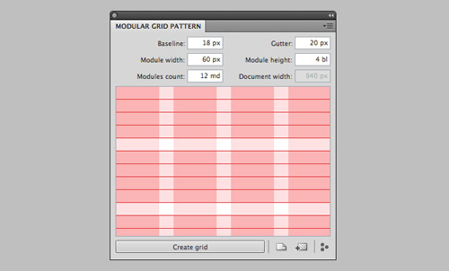
Modular Grid Pattern is an all-in-one grid solution. The tool creates a vertical columnar grid and a baseline grid all as one pattern. There are two ways to go about using Modular Grid Pattern:
Application Panel
In addition to Photoshop, this also works with Fireworks, GIMP and Microsoft Expression Design. Please note that you must have the latest software (Adobe CS5 or the equivalent of one of the other applications) and an Internet connection for this panel to work. That being said, if you have already created a pattern and saved it in your library, then you would be able to access it without needing anything else.

Web app
This works in Chrome, Firefox, Safari and Opera. The Web app enables you to create a grid pattern and download it straight from the browser in all formats.

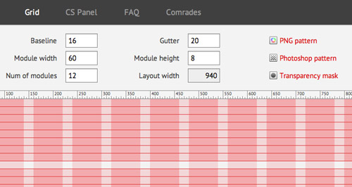
Whichever way you choose, just pick a module width, gutter width and baseline number, and Modular Grid Pattern does the rest. You can also specify a height for the horizontal module.
Advantages
- This is a fast way to get it all; an all-in-one layer.
- You have the option to download a Photoshop pattern file, PNG or transparency mask.
- You can label the patterns and put them in a folder so that you can come back to the grid with virtually no set-up required at all.
- Frees your guide to be used for other purposes.
- You can specify a height for the vertical module to establish an overall vertical rhythm.
- The grid can be overlaid with varying degrees of opacity, so you can make it less distracting as you are designing.
- Supports applications other than Photoshop.
Drawbacks
- If your canvas is wide, then making the grid a pattern will make it extend across the entire page, which could be annoying and make it harder to see the boundaries of the content. This can be fixed in a couple of ways:
- Apply a layer mask to constrain the grid to just the main content area.
- Draw a rectangle the size of the main content area (for example, 960 × 1200 pixels), and apply the grid as a layer style, with the fill set to 0% in this case.
- This method forces you to choose a baseline grid, preventing you from just creating vertical columnar modules.
- It requires you to manually hide and show the grid layer, without the benefit of a keyboard shortcut.
Concluding Thoughts
We hope these methods will increase your efficiency and precision in establishing a grid. In the end, the way you set up the grid will depend on your workflow. Evaluate your needs, then choose the method best suited to them. Either method requires minimal set-up but can save much time and frustration.
Additional Resources
If neither method interests you, quite a few templates out there would also do the job. I recommend checking out Mindy Wagner’s layout template and Robbie Manson’s 960-pixel grid templates. Also, The Grid System links to a number of quality resources and tools.
(al)


Vladan Krstic
November 9th, 2011 5:20 amNice one, from my experience modular grid pattern is the better solution.
Florescu Adrian
November 9th, 2011 5:36 amI use 960.gs Photoshop Action for all my designs. You have 3 options 12, 16, 24 columns. This is all I need!
Nick
November 9th, 2011 10:58 amYou should start looking at the 1140 grid as another option rather than limiting yourself to the 960 grid: http://cssgrid.net/
The above options are also good because they don’t restrict you to a 12, 16 or 24 grid system. Though those are the most practical, the web is morphing at such a high rate that alternative grids are becoming increasingly popular and useful. I encourage you to take off the blinders a bit :)
Viktor
November 11th, 2011 7:33 amI see you have never worked with 960.gs Nick.
960.gs doesn’t limit u to 960 px.
U can go as wide as u want, and as many columns as u want to – very flexible plugin.
Kaitlin
November 9th, 2011 11:00 amNo need to reinvent the wheel right? I use the 960 photoshop templates as well. When I started my job and told my developer how I set up my files he practically cried with happiness. The last designer did everything out in indesign.
Vladimir Carrer
November 9th, 2011 5:49 amReally cool and useful tools. I actually build separate scripts and patterns for solving this problem.
Method 3: Using JavaScript: http://www.vcarrer.com/2011/11/make-photoshop-guides-grid-with.html and the baseline grid patterns (Photoshop .pat and png files) http://www.vcarrer.com/2011/05/baseline-grid-patterns-for-photoshop.html
Daniel
November 9th, 2011 8:11 amI use Photoshop CS3, as I see it is impossible to use GuideGuide with this version of PS?
Johan
November 14th, 2011 1:54 pmHmm no I used it with cs3 on my old comp, have you tried?
Nathan Davis
February 10th, 2012 10:40 amHi – How did you install guide-guide on cs3?
thanks :-)
Brad Hussey
November 9th, 2011 8:30 amI’m into using grids, I think they’re a great idea. Sometimes instead of using Photoshop to setup my grids and wireframes, I use Gridbooks. Check em out, maybe you’ll love them! – gridbooks.ca
Horace
November 9th, 2011 12:58 pmIs it possible to apply the same design thecniques using Gimp?
S. Albano
November 9th, 2011 2:36 pmIn the image menu, there is a configure grid option that gives you a nice regular grid though without gutters.
Method & Craft’s Extensible Baseline Grid should work just fine with the GIMP’s gradients as well.
The article states that Modular Grid Pattern works with the GIMP.
Subvert
November 9th, 2011 11:29 pmGood to see those up here!
I’ve been using both in combination lately, works really well to set up a solid grid and adding guides to it
Tim Hyde
November 10th, 2011 12:12 amAre people still designing for 960px? Most designs are going responsive these days, so maybe you should have a tutorial on how to set a photoshop grid to handle that!!
I think this is where Illustrator works better for me. You can have different artboards for the different target resolutions you will handle in the responsive layout – all in the same file. Save common elements as symbols and you can resize the same element for use in different situations. And they are all kept in the same file.
mono
November 10th, 2011 2:00 amResponsive Design doesn’t knock out 960px grids. At least you can use it for the desktop resolution.
Does anybody know if there’s a Photoshop plugin or action for the responsive Zurb Foundation Framework yet? That’s based on 980px and has some wider gutters than the 960gs. Would be great help to have that :)
Luke Burford
November 30th, 2011 11:18 amYou can find a PSD starter template for Zurb Foundation here: http://madiganconsulting.com/2011/11/zurb-foundation-photoshop-grid-file/
Mike
November 10th, 2011 4:32 amThe Modular Grid Pattern looks great, but without guide lines there’s no way to “snap” your shapes/layers/etc. to the grid—you’ll have to eyeball it, which sort of defeats the purpose of a Photoshop grid framework to save time and effort. For textual rhythm, however, it’s a great tool.
jUAN
November 10th, 2011 5:18 amResponsive Design doesn’t knock out 960px grids. At least you can use it for the desktop resolution.
Saad Benryane
November 11th, 2011 1:15 amNice article Steve! I’m an extensive grid user and that pattern horizontal line technique was something I never thought of!
Thanks
Jeremiah
November 12th, 2011 8:50 amGreat tutorial, I use the 960 most common grid. I’ve got a lot of customers in Africa where their screen size is still rather small.
Cheers,
roan
November 12th, 2011 10:38 pmNice article.
I use the GuideGuide – it works very well. An I thank the authors of this plugin every time I use it because it saves so much time!
Martin
November 14th, 2011 6:03 amWhy you use Photoshop for webdesign? Im always used Illustrator. All Documents in one file. Symbols can easy change and refresh changes automatic on all sites. Use Photoshop to correct photos and not for webdesign.
Dean Oakley
November 15th, 2011 12:26 amI find guides really annoying and using a pattern is unnecessary. It’s much easier to use the standard grid [ view -> show -> grid ] and create a few elements to build your layout. This will align to your pixel grid as long as you have your units in pixels.
Then use a grid generator to easily find the column sizes. This one works great http://www.gridsystemgenerator.com/gs04.php
Ivan Sulimenko
November 28th, 2011 9:07 amAnother tool / method – 960 grid tool from Divine Elemente. Google it: divine elemente 960 grid. Nice thing about it is that you can create a fast mockup of WordPress theme.
Green Hat
November 29th, 2011 4:44 amI have just discovered Guide Guide and use it all the time. I change the grid in Photoshop preferences also so they work together. Really helps the design look balanced. Then the developer gets hold of it…
John Stanowski
April 25th, 2012 9:18 amI think I missed something. In the illustration at the bottom of the GuideGuide section, you have 12 columns with 20px gutters, but you also have 10px gutters on the far left and right of the columns. How in the world did you do that with GuideGuide?
UPDATE: Actually I think I figured it out. You entered left and right margins of 130px, 12cols, and 20px gutters. Then you cleared GuideGuide and entered new left and right margins of 120px. Yes?