The Data-Pixel Approach To Improving User Experience

Email Newsletter
Weekly tips on front-end & UX.
Trusted by 182,000+ folks.
 Register for Free


 Celebrating 10 million developers
 Custom Web Forms for Angular, React, & Vue. Your backend.
This article came out of my own questions about how to make the realignment philosophy practical and apply it to my day-to-day work — especially when what’s needed is more than a few tweaks to the website here and there.
Further Reading on SmashingMag:
- Reducing Cognitive Overload For A Better User Experience
- How Functional Animation Helps Improve User Experience
- Improve User Experience With Real-Time Features
- Improving User Flow Through Page Transitions
I propose an approach to redesign through realignment, by using a framework adapted from Edward Tufte’s principles on the visual display of quantitative information.
But first, a little context.
Redesign Through Realignment
Let’s recap the redesign versus realign argument. Here is Cameron Moll in “Good Designers Redesign, Great Designers Realign”:
The desire to redesign is aesthetic-driven, while the desire to realign is purpose-driven. One approach seeks merely to refresh, the other aims to fully reposition and may or may not include a full refresh.
A realignment can include a full refresh, but the starting point is not the visual layer. The starting point is an understanding of the website’s users and their objectives, of market trends and of brand strategy. These are the hard questions that guide a realignment — not a desire to try out some new fonts or see whether a +1 button would look good on the home page.
But surely a visual refresh can be beneficial, too? What’s the danger in giving users something new to look at? In an essay that builds on Cameron’s article, Francisco Inchauste sums up the problem as follows:
Great designers adjust an existing work with little disruption of the foundational design for a goal or purpose. The end result is a modification to the design that improves the user experience. Good designers, on the other hand, recreate existing work focusing on the aesthetic, with a misunderstood notion that it will always improve it. However, they end up disrupting and/or damaging the user’s experience, making no real impact with the effort.
The main problem with big redesigns, therefore, is that, even though objectively the UX might have been improved, users are often left confused about what has happened and are unable to find their way. In most cases, making “steady, relentless, incremental progress” on a website (to borrow a phrase of John Gruber) is much more desirable. With this approach, users are pulled gently into a better experience, as opposed to being thrown into the deep end and forced to sink or swim.
So, if we agree that a realignment is preferable to a redesign (and I’m sure we never will, but let’s assume we do for the sake of this article), a big question remains unanswered: What happens when a realignment requires major changes to the website? What happens when small tweaks aren’t enough, when a website’s UX is so far gone that you’re tempted to scrap everything and start over?
One way to go about it is to use a continual realignment process to redesign the website. Build a vision, and know where you’re going in the long term; but get there incrementally, not with a big-bang release. Remaining rooted in the realignment approach ensures that the focus remains purpose-driven, even if the process results in major visual changes. “That’s fine,” you say, “but how do you do it? Where do you begin with such a project?” Let’s now look at one possible approach to redesigning through realignment.
Edward Tufte And The Data-Ink Ratio
I’ve always been intrigued by Edward Tufte’s principles for visualizing large quantities of data. The Visual Display of Quantitative Information is one of my favorite books of all time. Recently, I’ve been wondering whether its principles could be applied to Web design and, specifically, the realignment process. The deeper I got into it, the more I realized that within Tufte’s principles lies a goldmine for people who make websites.
One of Tufte’s central principles in The Visual Display of Quantitative Information is what he calls data-ink:
Data-Ink is the non-erasable core of a graphic, the non-redundant ink arranged in response to variation in the numbers represented.
Before we unpack what this means for Web design, it’s important to note that Tufte’s work applies specifically to information graphics and the display of quantitative data, not to the design of graphical user interfaces. However, when carefully interpreted and applied to the field of Web design, the principles are extremely useful.
With that in mind, I propose the concept of data-pixels for the design of user interfaces to mirror Tufte’s data-ink for information graphics. In the context of Web design, we can then think of data-pixels as the simplest and most desirable path that a user can take through a flow (the “non-erasable core of an interface”). It is what would remain in “focus mode” — if nothing else existed on the screen, just the design elements that enable users to get from one screen to the next.
For example, on a payment screen, data-pixels would be the credit-card fields, text labels and “Pay now” button. Nothing else. This is obviously not possible — you need headers, payment summaries, tooltips, trust seals, etc. But the “core data” are the elements of the page that we cannot remove without the user getting stuck with no ability to recover.
From this irreducible point of the design, you can start to add other elements as necessary, and this is what Tufte’s work is all about. Much of what Tufte espouses is finding the right data-ink ratio (or what we’ll call data-pixel ratio) for quantitative data, so that the core data can shine through. He lays out five principles for data-ink. Here is an overview and how these principles can be adapted to redesign through realignment.
Principle 1: Above All Else, Show the Data
Data graphics should draw the viewer’s attention to the sense and substance of the data, not to something else. – Edward Tufte, The Visual Display of Quantitative Information
During a realignment, we should be guided by the principle that every page should be focused on the core data and the primary task that users need to take in that particular flow. Anything else is noise and should be added only after very careful consideration.
Craig Mod has written a great article titled “The Shape of Our Future Book.” In it, he describes the “quiet confidence” that a Kindle has when it is woken from its sleep state (compared to the iPad in particular), and then he addresses the data-pixel issue as follows:
I think the same concept of “quiet confidence” can be applied to data. Namely, in designing user experiences, we need to produce data that doesn’t draw attention to itself explicitly as data.
This doesn’t mean that design has to be boring or that aesthetics are not important. It means that we need to be mindful that any layer of design we add to the core data has to serve a specific function and cannot distract from the data itself.

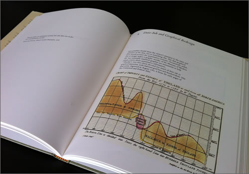
Image credit: Sarah Blake
Principle 2: Erase Non-Data Pixels, Within Reason
While it is true that these boring [pixels] sometimes help set the stage for the data action, it is surprising […] how often the [pixels] themselves can serve as their own stage. – Edward Tufte, The Visual Display of Quantitative Information
Once the context for the realignment is set by the overarching principle of focusing on core data, it’s time to evaluate the design and start improving the data-pixel ratio.
The first step is to look for ways to erase non-data pixels — the parts of the design that don’t directly apply to the user’s primary task. Look for elements that cannot be connected to guiding a user to the desired outcome, such as:
- Colors that don’t support the visual hierarchy through contrast;
- Typefaces that draw attention to themselves for no good reason;
- Gratuitous imagery (stock photography in particular) that does nothing more than break up the page (consider using white space and proximity grouping to create natural breaks instead);
- Alignment, sizes and color contrast that draw unwanted attention (for example, indented paragraphs, large social-media icons, a bright ad that doesn’t fit the website’s visual style).
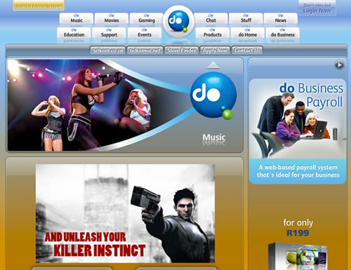
One website that could certainly benefit from the removal of non-data pixels is doHome. Notice the gratuitous reflection of the navigation menu, the unnecessary stock photography, and the fact that so little content on the page tells you what the website is about:
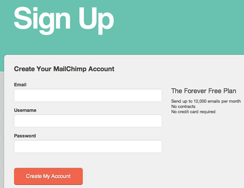
MailChimp does a good job of limiting the non-data pixels on its sign-up page. Clear language indicates what to do; large fields with top-aligned labels ensure that you complete the form quickly; some information is included about the plan you’re signing up for; and the button to sign up is big and high-contrast.
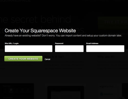
Squarespace’s sign-up page removes as much non-data pixels as possible to put all the focus on the task at hand. The background disappears as soon as you click the “Sign up” link, and you’re presented with the following zero-distraction form:
Google+ is another example of a design that employs minimal non-data pixels. As Oliver Reichenstein says:
It is extremely difficult to keep a complicated user interface so light, white and free of lines, boxes and ornaments. The content hierarchy is always clear, color definitions and consistent and clear without labeling them.
This list isn’t exhaustive, but it illustrates the purpose of the principle: to critically evaluate the visual elements in order to strip out what isn’t necessary.
Principle 3: Erase Redundant Data-Pixels, Within Reason
Gratuitous decoration and reinforcement of the data measures generate much redundant data-[pixels]. – Edward Tufte, The Visual Display of Quantitative Information
“Redundant data-pixels” refer to elements of the design that are repeated without good reason. Some examples:
- Rows of products in a table with an “Add to cart” button next to each one. (Consider using check boxes, with one “Add to cart” button at the bottom.)
- Animation as a way to draw attention to an element. (Consider using high-contrast color and size instead.)
- “Are you sure you want to do this?” dialogs for simple tasks such as adding a product to a cart. (For potentially catastrophic actions, like deleting an account, this type of dialog is, of course, appropriate.)
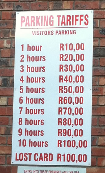
Below is an example from the offline word, courtesy of Allan Kent. The chart shows the price of parking per hour. Surely a simple sign that reads “R10 per hour” would suffice?
Note the addition of “within reason” to each of the data-pixel principles. Tufte himself acknowledges that redundant pixels are sometimes necessary:
Redundancy, upon occasion, has its uses: giving a context and order to complexity, facilitating comparisons over various parts of the data, perhaps creating an aesthetic balance.
The exception, then, is when, in Tufte’s words again, “redundancy has a distinctly worthy purpose”. A “Pay now” button at the top and bottom of a check-out page could be an example of this. One of the buttons is redundant, yet it introduces efficiency so that users don’t have to scroll up or down to place their order.
The guiding principle here is to strive for a minimalist aesthetic, adding redundant pixels only when they serve a larger purpose (for example, when they’re essential to the brand’s promise or to user efficiency).
Principle 4: Maximize the Data-Pixel Ratio, Within Reason
Every [pixel] on a graphic requires a reason. And nearly always that reason should be that the [pixel] presents new information. – Edward Tufte, The Visual Display of Quantitative Information
Once you’ve erased as many non-data pixels and redundant data pixels as possible, the next step is to figure out what (if anything) is missing from the design. The goal of this principle is to add more pixels to the design, if necessary.
There should always be a reason for adding elements to a design, and the reason will usually be that those elements provide information and/or functionality that increases usability. Some examples:
- Breadcrumbs that tell users where they are on the website and give them an easy way to get back to where they came from.
- An aesthetic layer of color, typography, layout and so on, to ensure consistency between brand perception and the website.
- Hover states or tooltips to provide appropriate guidance or contextual help to users.
An example of necessary pixels is relevant inline error messages. Consider the sign-up form on Quora below. Very few non-data pixels are on the page. The form’s layout is simple, with no extraneous decoration. But if you try to enter only your first name, the page instantly reminds you that a full name is required:
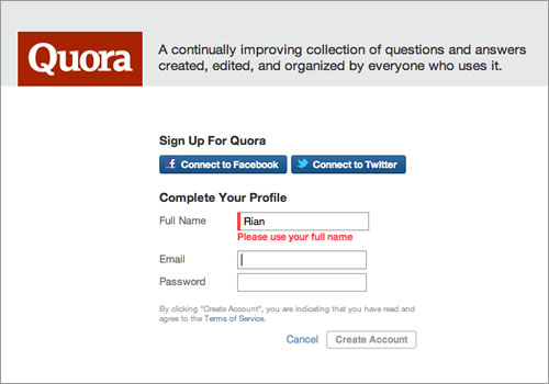
One could argue that this isn’t technically part of the “core data” of the design. Quora could have let this slide and either allowed accounts with first names only or sorted it out after users have signed up. But it has decided that data integrity is important from the start, so it has added this real-time check.
A little closer to home, this is what the header of kalahari.com (where I currently work) looked like when I started at the company:

Identifying the non-data pixels in this design is easy: very large radii on the rounded corners, color that grabs too much attention, too many unimportant links, etc. After maximizing the data-pixel ratio to put the focus on the core data (which is search), we ended up with this header:

Principle 5: Revise and Edit
Probably, indeed, the larger part of the labour of an author in composing his work is critical labour; the labour of sifting, combining, constructing, expunging, correcting, testing: this frightful toil is as much critical as creative. – T.S. Eliot, Selected Essays, 1917–1932
Tufte quotes T.S. Eliot to describe the relentless effort of editing and revising in graphic design work, and it’s certainly true for Web design.
Once you’ve completed a cycle through these principles, it’s time to go back and start again. Every realignment cycle exposes new opportunities to “above all else, show the data”. UX is a never-ending cycle of improvement, and following a realignment process bakes this constant cycle into the strategy in a very natural way.
Summary
As I mentioned at the beginning of this article, there are many approaches to redesigning a website. The hardest part often is knowing how and where to start. As I’ve shown, Edward Tufte’s timeless principles for the visual display of data can be adjusted and used as a framework to get over that initial hump and serve as a catalyst for a cycle of continual improvement through realignment.
What other models or approaches are there to frame a realignment project? How do you get started?
Front page image source: Elliot Jay Stocks
 (al)
(al)

