Free Icon Set For Web Designers: Aroma (250+ PNG Icons)
Today we are delighted to release another freebie for our design community. There are many free icon sets out there, and there are quite many commercial ones as well. Yet a good, consistently designed icon set is always a welcome addition to any designer’s toolbox. 
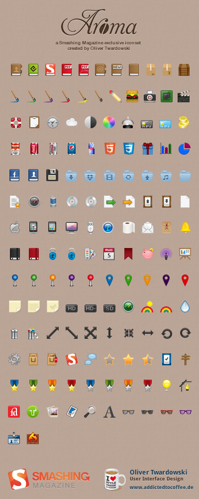
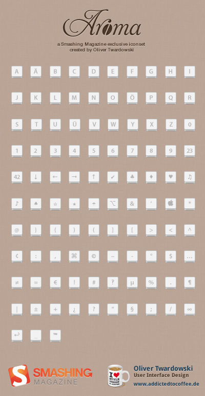
Oliver Twardowski had released the Ultimate Free Web Designer’s Icon Set (750 icons, including PSD sources) in the past, and this time he has prepared a fresh, new icon set which contains over 250 original high quality PNGs. Please notice that some icons may be similar to the ones released in the previous set.
Download the Collection for Free!
The elements contained in this collection are free for personal and commercial use. Please link to this article if you want to spread the word or give it a tweet or share it on Facebook! You may modify the file as you wish but please do not redistribute them elsewhere without written permission from Smashing Magazine and Oliver Twardowski.
- high resolution preview
- download the icon set for free (.zip, 1.7 Mb)
Behind the Design
As always, here are some insights from the designer:
“This set was started out in January 2011, so the whole design process took me nearly a year to finish. Including all the tiny, little, shy transparent PNGs and keys, the set is build out of 145.728 pixels. All icons were made with love in Cologne, Germany.
If you think that some icons are missing in this set, feel free to share your thoughts and ideas in the comments section below, contact me at aroma[at]addictedtocoffee[dot]de or find me via twitter at @mywayhome. Oh and did I mention: I’m always available for exciting freelance projects :)
Stay tuned! You never know — there might be a second part of the set coming out quite soon!”
Thank you, Oliver Twardowski. We appreciate your work and your good intentions!
(il) (vf)


Oxana
November 17th, 2011 6:02 amThank you Oliver! Wonderful icons!
Marios Lublinski
November 17th, 2011 6:03 amWow Thank you those icons are just incredible, and almost one year of hard work to create them, great gift to the community…
Simmm
November 17th, 2011 6:09 amSorry but I have to say it: those icons are really ugly.
Oliver Twardowski
November 17th, 2011 6:10 amCan you tell me what you don’t like here? Maybe I can do better the next time. ;)
Justin St. Germain
November 17th, 2011 8:10 amI think Simmm is crazy. Oliver, you did an amazing job. This shall be useful in the future for myself and not worrying about spending a ton of time making icons for a site. Thanks for your hard work and dedication.
mUhAmAr
November 17th, 2011 9:13 amHa ha, you just managed to draw the attention to you (Troll). I personally like them but as always: tastes are different.
nadim
November 22nd, 2011 9:23 pmBeauty lies in the eyes of the beholder… What is beautiful for someone may not be for another one. BTW, no need to have eyes checked. It’s natural.
ferso
November 23rd, 2011 8:42 pmThis is always a problem when you tell truth. We are living in the world of lies, everybody wants to hear it. I agree, most of those icons looks like from win98 era, but not all, there are also nice icons.
Peter Faarup
November 17th, 2011 6:12 amI have to say it: those icons are really nice – great details!
Thank you Oliver Twardowski!
Christopher
November 17th, 2011 6:17 amI don’t think they’re bad, they’re just not particularly good. The fact that they’re so tiny really limits their use too. Appreciate your hard work in creating them regardless.
Raymond
November 17th, 2011 6:20 amThose are some nice icons you’ve got there, thanks. :-)
Damian
November 17th, 2011 6:22 amGreat, great share!!! Thanks a lot Oliver!
Mark
November 17th, 2011 6:33 amSome of these remind me of Ubuntu for some reason.
All the same great icons, thanks!
Mundstrøm
November 17th, 2011 6:44 amI think they’re pretty good all in all. Hey, they’re not ugly! That’s a matter of taste. But I’d certainly consider the context if I were to use them. They’re colorful and “toy-like” so they’re probably not good for minimalistic, corporate designs.
The thing that’s really… really… really incredibly hard to do with icon sets, is to make the “style” consistent from end to end and that’s where they come up short. I can’t describe it without using terms like visual weight, color intensity, lighting, outlines and bevels. The biggest issue is the inconsistent perspective (the viewing angle).
Also – Try to keep the concept consistent – Decide if you’re going to use visual metaphors or actual illustrations of what the icons represent? Sometimes an icon represents an action, sometimes an object, sometimes a term.
Icons are hard work and very time consuming – keep it up!
AshleyEllen
November 17th, 2011 6:55 amWhy do they have to be one consistent perspective? That’s like saying that the proportions are off because the garbage can is the same size as the can of coke. Honest question.
Mundstrøm
November 17th, 2011 6:58 amthey don’t – but it’s one of many ways to improve theme consistency.
AshleyEllen
November 18th, 2011 1:01 amUnderstood. Thanks!
( I’m just learning – give me a break guys! :D )
Arne
November 17th, 2011 6:47 amToo colorful, to inconsistent. Some look really flat, others shiny. Not my cup of tea.
TOM
November 17th, 2011 7:23 amDuplicate files in Zip package confuse me :D
Vitaly Friedman (editor-in-chief of Smashing Magazine)
November 17th, 2011 8:41 amMistake fixed! Please re-download the package. And thanks for reporting it!
bogdan
November 17th, 2011 9:07 amIt’s funny to see people immediately jumping on the backs of users leaving negative comments about this. It seems the Smashing community has resigned itself to a collective orgasm of any freebie that is posted on the website, and thinking any different is considered a capital sin.
Freebies are nice and the work should, of course, be appreciated, but this will still have to pass through the filter of utility and aesthetics. And surely an objective designer will see how this set falls short on both accounts. Fine, so aesthetics may be a question of taste and style, but an icon set that has more representations of fizzy pop cans than files (actions) is hardly handy. They are flat, they are bluntly contoured, and their gimmicky colourful nature might make them usable in some contexts (very few), but only if they were provided in a reasonable size.
Sorry, but a useless set altogether.
Thomas
November 17th, 2011 10:01 amThough I respect the nice offer, the icon set isn’t that good in my opinion.
Less is more – its far more important that the icons are in the same style/size/perspective and have a neutral look to be styled within multiple context (like Helveticons).
Daniel
November 17th, 2011 10:42 amWow, this took a year to create?
Oliver Twardowski
November 17th, 2011 1:20 pmIt’s been nearly a year from the first sketches to the final set, but I’ve not worked on it daily. :)
Geo
November 17th, 2011 11:33 amHaben wir denn schon Weihnachten?
Thank you Oliver!
Sue
November 17th, 2011 11:37 amThank you, Oliver. I really appreciate the effort put in to create these and I will certainly be using them.
I will also say that I’m appalled by the pathetic anonymous (typical of the interwebs) snarking by the NON-contributors with their smug & *edgy* criticism of a GIFT. Get your hand out of your pants, people and perhaps try and create something yourself. Or not.
bogdan
November 17th, 2011 12:41 pmHow are the negative opinions anonymous exactly? Would I have to leave my full name and address for my comment to qualify as a relevant post? Gifts aren’t excluded of criticism just because they are free. The author isn’t a primary school pupil to be fed constant positivity for the fear of his self esteem being affected.
It’s called having an “opinion”. Look it up, you might find the concept groundbreaking.
Andre
November 17th, 2011 11:46 amI LOVE YOU!!!
thank you Oliver…
Alex Juel
November 17th, 2011 12:37 pmI think these icons are great, Oliver. I especially love the Campbells soup can :D
Also, interesting timing on this because a designer friend of mine just released a free icon set of her own today, if anyone wants check it out – designfiles.net/design/phases-design-studio-introduces-uplinks-icon-set/
Laura
November 17th, 2011 3:10 pmNice icons, but both this set and the previous one of 750 icons are missing something I’d consider pretty basic: a good old-fashioned, universally-understood telephone! (Most icons of a cellphone are too easy to mistake for something else.) You might be consoled by the fact that that I’ve yet to find an icon set that includes all the icons I’m looking for – something that includes both social media icons, as well as those for different ways to contact us (in person, email, phone, chat, and by appointment.) Thanks for your work!
Asher
November 17th, 2011 4:40 pmReally good job Oliver.I can’t believe how people can complain about such a great freebie! It takes a lot of effort to create so many icons at such a small size.
Julian Gaviria
November 17th, 2011 5:15 pmA phone icon would have been great.
Sally
November 17th, 2011 6:37 pmAww! love the icons, Thanks for sharing it :) it surely going to brighten my Desktop
Bharat
November 17th, 2011 8:20 pmGreat !!! thanks buddy it helps me allot.
Andik
November 17th, 2011 9:51 pmnice work Oliver… two thumbs up for you…
ask permission to download… :)
Marlou
November 18th, 2011 1:00 amThank you for making and sharing these icons. I might use some of them, but I don’t think they work very well as a complete set.
For instance, the keys look like a completely different set, I don’t understand why they are part of the same download.
The rest of the icons also look like different sets put together. The post-its and the folders look very lite and clean, the chip and facebook look very colorful and crisp, the control buttons look very harsh and some of the icons look just completely off, like the speach bubbles and concierge bell. I’m not an icondesigner myself, but I think you should try keeping iconsets in the same contrast. Going for lite and clean? Make them all that style. Going for clean pixel lines all around? Make all of them like that. But that’s just my opinion!
Mundstrøm
November 18th, 2011 1:32 amOK, I’ve been thinking more about how to explain what I mean. I hope you’re finding this constructive instead of critical -) I think we need more icon designers so please be encouraged to improve :) Things are a mix of being viewed:
1) Straight on (2D)
• The coke can
• The CD
2) At an angle (3D)
• Book icons
• Toilet roll
3) Orthographic (no depth in perspective)
• Book icons
• Toilet Roll
4) With depth perspective
• Folders
• Wooden crate and boxes
I’m a bit of a cheat – I design my icons in a 3D app, then I can adjust viewing angle, lens perspective, lighting etc. as needed. However, it requires a LOT more work. I try to build up a collection of objects to reuse and build my icons almost like virtual lego.
Marcel
November 18th, 2011 1:38 amWhat was the idea behind this set, exactly? I’m currently involved in making web-based software for the healthcare, financial and education industries. You have an icon for an address book, which is nice if our users want to send messages. But you have no icon that displays an e-mail message, a send-icon, a cancel icon or even a new-message icon, for example.
Furthermore, software tends to have users. You don’t have a user-icon, let alone an icon for adding, removing or editing – whether that be users, posts, other types of records or anything else.
You do supply a search icon and a settings icon. Both often found in web-apps. Then again, you also supply icons for toilet paper, coke, html5, hamburgers and Smashing Magazine’s book.
I can’t seem to find any particular use for this set. Any particular use I might use these icons for would immediately disqualify this set as a viable icon set because it’s incomplete for any specific purpose.
Ask yourself this: Who would ever use a coke icon and hamburger icon in their software, and also go: “I’m so glad there’s a rainbow icon in here, too!”
It’s a rather pretty set, but very incomplete. Thanks though!
dla seniora
November 18th, 2011 4:08 amFree icons. Thanks:) Great design.
aalex57
November 18th, 2011 6:12 amMerci pour la sélection !!
Jason
November 18th, 2011 8:06 amThanks! Great set.
Sleepless
November 18th, 2011 8:38 amGreat work and even greater that Oliver is giving them away for free. Thank you.
SiGa
November 18th, 2011 10:32 amBeautiful set – many thanks to Oliver and Smashing Magazine for sharing!
Bethany
November 18th, 2011 10:51 amThank you for the gift!
I think plenty of people have left their criticisms of what it’s missing, but I can definitely use some of these, so thank you.
adumpaul
November 19th, 2011 3:46 amNice article.Web Fly Software is one of the best web development and web design company in India,webflysoftware are committed to deliver high standard and affordable web solutions involving an advanced approach together with years of experience and expertise.
Adrian
November 20th, 2011 7:28 amThanks. It’s simply great for web development
Especially online store
softmace
November 20th, 2011 10:18 pmNice collection. Thumbs up for Oliver Twardowski.
dice
November 21st, 2011 2:54 amwow, great icons, thanks a lot :)
James
November 21st, 2011 3:48 pmThanks Ollie!
Jane Su
November 22nd, 2011 10:20 amOliver,
How did you make the icon soooo refine and sharp?
Amazing icons, thank you for sharing with us! Great job~~~!!
Peter
November 22nd, 2011 8:04 pmThanks Oliver! The symbol of beauty and I need to let my Web.
Peter
(Admin: kissinggamesnow.com)
Raine
November 23rd, 2011 8:50 amI like these, thank you Oliver. These have a bit of a ‘retro’ 8-bit feel to them (may be it’s just me), which is very nice.
I would love to see a smartphone icon though, or something that has a distinct “I’m a mobile phone” connotation. Would be very useful in a lot of cases.
Thanks again, Great job!
Julianne Bueno
November 23rd, 2011 1:45 pmGreat icon set, thanks!
Gordon
November 24th, 2011 12:44 amI’m still looking for a real replacement for the famfamfam iconset, but whilst it’s definitely showing its age it does have a huge variety of icons. I’d love to see an iconset that is an updated version of famfamfam or a superset (Includes updated versions of all the icons plus ones that aren’t in the original famfamfam set).
heike
November 28th, 2011 2:57 pmvery cool image set!
but …. :-) …..missing the “tabular” icon :-]
Green Hat
November 29th, 2011 4:41 amNice styling, shame they are so small, but at the end of the day, they are FREE.
Sascha
November 30th, 2011 6:03 amWow, nice collection… thanks for that.
Nikita
December 3rd, 2011 11:20 amThank you!
Ace
December 8th, 2011 11:55 amIts a hard work. so i just thank u! If they r ugly or beautifull, i do not want to hurt you.. and tell you nice work dud. keep it up
Monika Malhotra
December 8th, 2011 10:40 pmWow!……What a icon’s….I really Like it very much…Keep it up!..
Good Work! specialy Milky ICon’s
Michael
December 11th, 2011 3:14 amVery poor quality ¬¬
yuifreelance
December 21st, 2011 9:10 amThank you Oliver :)