Easier Is Better Than Better

Email Newsletter
Weekly tips on front-end & UX.
Trusted by 182,000+ folks.
 Register for Free


 Custom Web Forms for Angular, React, & Vue. Your backend.
 Celebrating 10 million developers
Common sense would dictate that if you were given a list of choices, you would choose the one that is most important to you, when in reality humans usually choose the one that is easiest for them to understand and evaluate. Very often we do so because we don’t have the time to put in the research necessary to make an informed decision. Politicians are rarely elected based on the majority of people doing research on their background and the policies they support. They are elected for the fact that people can relate to the message they are spreading and because we have heard of them before.
When it comes to our own designs, we imagine people being able to make informed decisions on what the next step should be. However, they are already making 400+ decisions throughout the rest of the day that are likely more important than what they will deal with in our design.
Further Reading on SmashingMag:
- Designing For Explicit Choice
- How Simple Web Design Helps Your Business
- How To Convince The Client That Your Design Is Perfect
Do you think most people realize there are benefits to driving a manual transmission car over an automatic? Do you think they care? Automatic is easier to pick up so why bother with any other choice? How often do we stay in relationships that we shouldn’t, simply because it’s easier to just deal with it than face the repercussions of having to confront the person?
Have you ever been to In ‘N Out Burger? I’ve heard great stories about this place and their mythical burgers and fries. The catch behind this place is that they have a very limited menu. You order a Double Double, cheeseburger or hamburger. You can add fries, milkshake and beverage to that if you wish. That’s all of your options (unless you know about the secret menu). Now, I’ve been there and tasted their food and it’s good, but it is not much different than Wendy’s. The appeal of the place is that your choices are limited. It’s easy to order there because you don’t have to decide which type of chicken sandwich you feel is the best option for you. In ‘N Out makes the fast food experience easy for you. Having it your way is not the way we want.
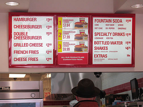 In ‘N Out is known for their very limited menu. Too many choices are distracting and require more time for making a final decision what to order. Image source
Woot.com is an online store with a twist. Instead of browsing through hundreds or thousands of items, you are offered only one item a day. If you like it, you buy it and if you don’t, you wait until tomorrow to see what is going to show up. The site is successful and yet the logic of it all seems backwards. However, if I’m running a store, does it really matter whether I’m selling 100 units of 1 item or 100 different items for 1 unit at a time? Woot makes the shopping experience easy by making our choice simply “yes” or “no”.
How much less fun would Angry Birds be if you had to select the birds you could use before each level? Taking away that choice and letting us focus on how to use the birds we are given makes the game much more enjoyable.

By not choosing which bird to play with in each level, one can focus more on how to use them. Image source
How many of your friends choose to buy a computer for their home simply because they use the same one at work? Since they have been using it at work, it has become easy for them to use. Doesn’t mean it is the better computer — it is simply the one that is easiest for them. Our selections don’t have to be the best choices — they just have to be ones that we are okay with.
How often do you come across a site that offers you better features than their competitors, but they aren’t as easy to use. There is no reason to switch over to a service that is harder to use even if they have more features. If the features aren’t there to make my life easier then what good does the service do me?
Back when image hosting was cool, the sites that won were the ones that allowed you to upload an image without having to register or login. You simply uploaded your image and you were done. Imgur is a great example of this and has now become one of the most popular image hosting sites in the world. That doesn’t mean sites like Flickr couldn’t thrive — they just had to work much harder to achieve more users and show that going through the hassle of registering was indeed worth it.
User Settings And Choice
In a recent article, Jared Spool did a study that found that only 5% of users changed their default settings in MS Word. Being a computer nerd, this surprised me because I like to dive into the settings of all of my applications to see what I can tweak. The large majority of people don’t seem to want to tweak though — they just want to use the application:
“We embarked on a little experiment. We asked a ton of people to send us their settings file for Microsoft Word. At the time, MS Word stored all the settings in a file named something like config.ini, so we asked people to locate that file on their hard disk and email it to us. Several hundred folks did just that.We then wrote a program to analyze the files, counting up how many people had changed the 150+ settings in the applications and which settings they had changed.
What we found was really interesting. Less than 5% of the users we surveyed had changed any settings at all. More than 95% had kept the settings in the exact configuration that the program installed in.”
It is great to provide the user with the ability to make changes, but settings aren’t a must-have feature. Building a great product that just works should be priority number one and once you begin to understand what settings might be tweaked, should you then start to think about adding a settings panel.
Users assume you are giving them the settings that are best for them right off the bat. If you aren’t, then they might view your product as a failure.
The Paradox Of Choice
The paradox of choice says that the more options available to an individual, the harder it becomes to make a selection. For example, if there are free samples of jam being given out at the store, you are more likely to get people to buy a jar of jam when only six selections are available as opposed to 24. More choices don’t make the selection process easier for people, but having no choices takes away some of the freedom they believe they have.
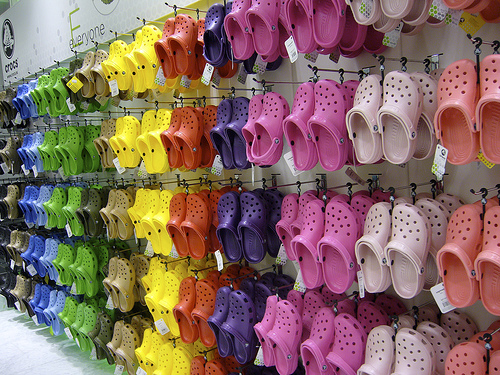
According to Barry Schwartz, it is much easier to find your pair of crocs if there are fewer color options available. Image source
When deciding on which of the new iPhones you should get, you can either get it in black or white and three different memory options. Add in multiple carriers though and the choice starts to become a little more complicated.
If a client tells you that you can do their design any way you choose, it is more difficult than having to do a design with constraints because your options are endless. We need constraints, limited choices, to be built into everything that we do. This makes decision making easier and the benefit of this is an easier design to use.
If somehow you can make the easiest product and the best product in the industry, you have yourself a winner. You have to consider how many choices we are given daily so it’s in your best interest to limit the ones your customers have to make because there is a good chance it isn’t the most important decision of the day for them.
What this means is that the design that is easiest to evaluate (less options to choose from) will win most of the time. Make your copy straight to the point. Don’t waste your time on graphics that don’t drive the point home. Funny t-shirts and bumper stickers are effective because they are easy to evaluate. I have a hard enough time picking my outfit in the morning — don’t make me try to decide which one of the 250 default avatars I should use.
What Do You Think?
This article is part of our Opinion Column section where we provide a platform for designers and developers to raise their voice and discuss their opinion with the community. Feel free to share your thoughts in the comments section below.


