The Perfect Paragraph

Email Newsletter
Weekly tips on front-end & UX.
Trusted by 200,000+ folks.
 Register!
 Flexible CMS. Headless & API 1st

This is a mistake. Here, we’ll refer to some time-honored typesetting conventions, with an emphasis on readability, and offer guidance on adapting them effectively for devices and screens. We’ll see that the ability to embed fonts with @font-face is not by itself a solution to all of our typographic challenges.
Be sure to check out the following articles:
- 8 Simple Ways to Improve Typography In Your Designs
- How To Become a Better Reader
- Photoshop-Inspired Techniques with 100% CSS
- Applying Macrotypography For A More Readable Web Page
A Web Of Words
In 1992, Tim Berners-Lee circulated a document titled “HTML Tags,” which outlined just 20 tags, many of which are now obsolete or have taken other forms. The first surviving tag to be defined in the document, after the crucial anchor tag, is the paragraph tag. It wasn’t until 1993 that a discussion emerged on the proposed image tag.
Bursting with imagery, motion, interaction and distraction though it is, today’s World Wide Web is still primarily a conduit for textual information. In HTML5, the focus on writing and authorship is more pronounced than ever. It’s evident in the very way that new elements such as article and aside are named. HTML5 asks us to treat the HTML document more as… well, a document.
It’s not just the specifications that are changing, either. Much has been made of permutations to Google’s algorithms, which are beginning to favor better written, more authoritative content (and making work for the growing content strategy industry). Google’s bots are now charged with asking questions like, “Was the article edited well, or does it appear sloppy or hastily produced?” and “Does this article provide a complete or comprehensive description of the topic?,” the sorts of questions one might expect to be posed by an earnest college professor.
This increased support for quality writing, allied with the book-like convenience and tactility of smartphones and tablets, means there has never been a better time for reading online. The remaining task is to make the writing itself a joy to read.
What Is The Perfect Paragraph?
As designers, we are frequently and incorrectly reminded that our job is to “make things pretty.” We are indeed designers — not artists — and there is no place for formalism in good design. Web design has a function, and that function is to communicate the message for which the Web page was conceived. The medium is not the message.
Never is this principle more pertinent than when dealing with type, the bread and butter of Web-borne communication. A well-set paragraph of text is not supposed to wow the reader; the wowing should be left to the idea or observation for which the paragraph is a vehicle. In fact, the perfect paragraph is unassuming to the point of near invisibility. That is not to say that the appearance of your text should have no appeal at all. On the contrary: well-balanced, comfortably read typography is a thing of beauty; it’s just not the arresting sort of beauty that might distract you from reading.
(Image: Marcin Wichary)
As a young industry that champions innovation and rates its practitioners based on their ability to apprehend (sorry, “grok”) the continual emergence of new technologies, frameworks, protocols and data models, we are not particularly familiar with tradition. However, the practice of arranging type for optimal pleasure and comfort is a centuries-old discipline. As long ago as 1927, the noted typographer Jan Tschichold spoke of the typesetting “methods and rules upon which it is impossible to improve” — a set of rules it would be foolish to ignore.
So, please put your canvas element and data visualization API to one side just for a short while. We are about to spend a little time brushing up on our typesetting skills. It’s called “hypertext,” after all.
Setting Your Paragraphs
The Typeface
Your choice of font is important, but the kind of “family” you choose is project-specific, and we won’t discuss it here except to make one point: the conventional wisdom among Web designers that only sans-serif fonts are suitable for body text is just a rule of thumb. Although serif fonts, with their greater complexity, may tend to be less effective at small sizes, there are many other factors to consider. A diminutive x-height, for example, could impair the readability of a font from either camp. Some serif fonts are highly legible and attractive for paragraph text if they are set properly. Matthew Carter’s screen-sympathetic Georgia is a case in point.
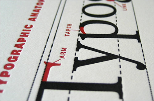
X-height is the distance between the baseline and midline — a measure of lowercase character height. (Image: adactio)
Having dispensed with the subject of preference, let’s cover some important technical issues relating to one’s choice of typeface.
The first thing to consider when choosing a Web font (read: @font-face font) is the breadth of the family. Does the font include all of the necessary bold, italic (or even better, semi-bold and bold-italic) styles? One style is fine for headings, but paragraphs need greater variety. Without these variations at your disposal, not only will your text look insipid, but the lack of proper emphasis will make your writing difficult to follow.
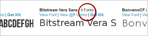
I personally don’t like Bitstream, but it is fully functional for paragraph text
With the full gamut of stylistic variations at your disposal, you will not have to rely on the unsatisfactory “faux” styles that are applied to a regular font when font-style: italic or font-weight: bold is called. Typefaces are not designed to be contorted in this way. Using the proper styles provided by a family like Bitstream (above) will make your typography not only more attractive but more accessible: dedicated italic glyphs have a much clearer intent than text that is simply “leaned over a bit.”
The trick is to make sure that the declaration of, for example, font-style: italic requests the italic resource rather than triggers the faux style. It should be as effortless as using a system font family such as Georgia. This is probably best explained, like so many things, in commented code. For brevity, we’ll set up just a regular font and an italic (not bold) style variation.
@font-face {
   font-family: 'MyWebfont';  /* Change this to whatever you like. */
   src: url('mywebfont-regular.ttf') format('truetype');  /* The "regular" font resource. */
   font-style: normal;  /* Associates values of "normal" with this resource. */
   font-weight: normal;  /* As above for weight. */
}

@font-face {
   font-family: 'MyWebfont';  /* Importantly, the same as in the above block; the family name. */
   src: url('mywebfont-italic.ttf') format('truetype');
   font-style: italic;  /* Associates values of "italic" with this resource. */
   font-weight: normal;  /* ... It's not a bold-italic font style. */
}

body {
   font-family:'MyWebfont', georgia, serif;  /* Provides a system font fallback. */
}

em {
   font-style: italic;  /* If @font-face is supported, the italic Web font is used. If not, the italic Georgia style is lifted from the user's computer. Either way, a faux style is not allowed to creep in. */
}
Our second typeface consideration relates to rendering. Some fonts, replete with beautiful glyphs and exceptional kerning as they may be, simply don’t render very well at small sizes. You will have noticed that embedded fonts are often reserved for headings, while system fonts (such as Verdana here) are relied on for body text.
One of the advantages of Verdana is that it is a “well-hinted” font. Delta hinting is the provision of information within a font that specifically enhances the way it renders at small sizes on screen. The smaller the font, the fewer the pixels that make up individual glyphs, requiring intelligent reconfiguration to keep the font legible. It’s an art that should be familiar to any Web designer who’s ever tried to make tiny icons comprehensible.
Hinting is a tricky and time-consuming process, and not many Web fonts are hinted comprehensively. Note the congealed upper portion of the bowl in the lowercase “b” in the otherwise impressive Crimson font, for instance. This small unfortunate glitch is distracting and slightly detracts from a comfortable reading experience. The effect is illustrated below and can be seen in context as a demo.
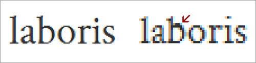
Slightly unsatisfactory hinting for the Crimson Roman style. I love Crimson all the same.
The good news is that, as font embedding becomes more commonplace, font designers are increasingly taking care of rendering and are supplying ever better hinting instructions. Typekit itself has even intervened by manually re-hinting popular fonts such as Museo. Your best bet is to view on-page demonstrations of the fonts you are considering, to see how well they turn out. Save time by avoiding, sight unseen, any fonts with the words “thin” or “narrow” in their names.
Font Size and Measure
As a recent Smashing Magazine article compellingly attests, you put serious pressure on readability by venturing below a 16-pixel font size for paragraph text. All popular browsers render text at 16 pixels by default. This is a good enough indication (given the notorious tendency among browser makers to disagree) that 16 pixels is a clear standard. What’s more, the standard is given credence by an equivalent convention in print typography, as the article points out.
We often express 16px as 100% in the declaration block for the body in our CSS reset style sheets. This makes perfect sense, because it is like saying, “100% the same as the browser would have chosen for you.” If you want the paragraph text to be bigger than 16 pixels, just edit this value in the body block using a percentage value that equates to a “whole pixel.” Why whole pixels? Two reasons. First, whole numbers are less ungainly and are easier to use as multipliers in style sheets. Secondly, browsers tend to round “sub-pixel” values differently, giving inconsistent results. An 18-pixel font size expressed as a percentage is 112.5% (1.125 × 16).
Normalizing the size of default text (or “paragraph text,” if you’re being good and semantic) in such a way is extremely important because it sets us up to use ems as a multiplier for the size of surrounding headings and other textual elements. For instance, to render an h3 heading at 1.5 times the font size of the paragraph, we should give it the value of 1.5em. Because ems (pronounced as in “Emma,” not E.M. Forster) are relative units, they change according to the default font size. This makes it much easier to maintain style sheets and, more pertinently, ensures that the perceived importance of headings is not increased or diminished by adjusting the size of the paragraph text.
The “measure” is the number of characters in a line of text. Choosing a comfortable measure is important for usability, because if lines are too long, then scanning back to find the start of the next line can be awkward. Without conscious effort, the reader might miss or reread lines. In The Elements of Typographic Style, Robert Bringhurst puts a good measure at somewhere between 45 and 75 characters. It is the main reason why we use the max-width property when designing elastic layouts.
Whatever your page’s ideal maximum width, it is likely much narrower than what you are used to seeing. According to an in-depth study of typographic design patterns published on Smashing Magazine, the average website exhibits a measure of 88.74 characters, far exceeding the optimal range.
Leading and Vertical Rhythm
(Image: andrechinn)
Leading (pronounced “ledding”) is the spacing between consecutive lines of text. Leading has a similar impact on readability as “measure,” because it helps to define and demarcate the rows of glyphs that one must traverse from left to right and back again. The trick with leading is to avoid adding too much: text with lines that are too far apart appears fragmented, and the intent of a judicious use of leading is undone by a negative result.
In mechanical typesetting, leading was set by inserting strips of lead metal (hence the pronunciation) between lines. In CSS, the line-height property is the tool we use, and exposure to it is much less likely to make you go mad.
Instead of accounting for space between lines, as with leading, line-height is a vertical measure of the whole line — including the text itself and any spacing to follow. There are three ways to set it: the wrong way, the redundant way and the right way.
The wrong way to set line-height is in pixels. By introducing an absolute value, we would undo all of the good work from the previous section. As the font-size increases (either in the style sheet or the user’s browser settings), the line-height would persist. This produces an interesting effect:
Absolute and relative values do not mix.
So, should we use the same em multipliers that we saw in the last section? This is the redundant way. Although the method would work, providing an em unit is not necessary. Rather, a value of 1.5 for the line-height that is 1.5 times that of the font size will suffice. The line-height property belongs to an exclusive club of CSS properties that accept unit-less numeric values.
p {
font-size:; /* Silence is golden; implicity 1em. */
line-height: 1.5;
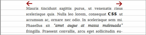
}The attentive among you will have noticed that so far I have only mentioned font sizes that are even numbers. The reason is that I favor a line height of 1.5. So, a font size of 18 pixels means lines with a height of 27 pixels or, if you prefer, lead strips that are 9 pixels thick. Using even numbers is another bid to maintain whole pixel values — I know that any even number multiplied by 1.5 will result in a whole number. A line-height stated in whole pixels is particularly important, because it is the key value used to achieve “vertical rhythm.”
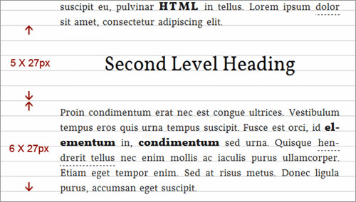
All components on the page should have a height divisible by the height of one line of paragraph text.
Maintaining vertical rhythm (or composing to a baseline grid) is the practice of making sure that the height of each textual element on the page (including lists, headings and block quotes) is divisible by a common number. This common number (the single beat in a series of musical bars, if you will) is typically derived from the height of one paragraph line. You should be able to see by now why an impossible value like 26.5 pixels would be a mistake for such an integral measure.
The benefits of vertical rhythm to readability are much subtler than those of hinting, measure or leading, but they are still important. Vertical rhythm gives the page decorum. Because we have made sure so far that all of our measurements are co-dependent and relative, altering the font size for the body (all the way up at the top of the cascade) will not damage the page’s vertical rhythm.
It is worth noting that, although a line height of 1.5 is fairly dependable, not all fonts are made equal. Fonts with a tall x-height or long descenders might benefit from more generous, separative leading. When basic readability is at stake, adopting a more complex vertical rhythm algorithm is worth it.
Word Spacing and Justification
Without intervention, paragraph text on Web pages is set “ragged right” (text-align: left in CSS): the start of each line is flush with the left margin, but the lengths of the lines vary, giving an uneven “ragged” effect on the right side. If you’re like me, you prefer the tidiness of full justification (illustrated below). But implementing justification without impairing readability is not as straightforward in HTML as it is by using desktop-publishing software.
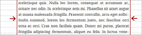
Fully justified text necessitates, arguably, a narrower measure than text set ragged right.
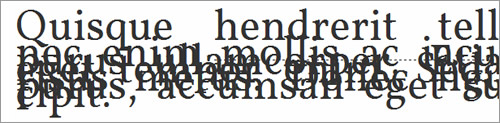
The problem with justified text in HTML (text-align: justify) is word spacing. In print media (such as newspapers), hyphenation is used to break up long words. This results in more components (words or part words) per line, thus improving distribution and curbing aggressive word spacing. Browsers do not hyphenate automatically, and the soft hyphen (­) is implemented inconsistently. Besides, imagine having to manually insert ­ all the way through your copy. CSS3’s text-justify property, which aims to give us more control over text-align: justify, could ease the problem by enabling inter-character distribution. Bizarrely, it is currently available only with Internet Explorer.
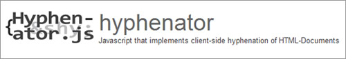
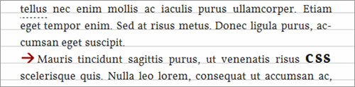
Thankfully, Firefox and Safari now support the CSS3 property hyphens, which can automatically insert hyphens much as you would manually with ­. In fact, you can revert to manual hyphenation in a document set to hyphens: auto by using the hyphens: manual override. Browser prefixes are required, but Lea Verou can help you with that.
Until the other browsers catch up, a consistent cross-browser solution is currently possible only with JavaScript. Hyphenator.js is a powerful tool that takes a library of syllabic patterns specific to each language and uses them to dynamically insert soft hyphens in the correct places. It is a bit pricey (two scripts at a total of 72 KB uncompressed just for the English implementation), but it does work. Its effect is shown in the first screenshot for this section.
Finishing Touches (Styling Contextually)
Now that we have dealt with the important business of sizing, setting and distributing our paragraphs compellingly, you may wish to apply a few small enhancements and decorations for the purpose of signposting the document. These nuances concern only certain paragraphs, and choosing which paragraphs to set off is a question of context. With the help of special selectors and combinators, we are able to target specific paragraphs depending on where they appear on the page, making sure that the difference in their design is consistent with their intended role and meaning.
Paragraphs separated with a margin (such as margin: 0 0 1.5em;) do not require indentation. With paragraphs, margins and indentation serve the same purpose.
Let’s use indentation as an introductory example. Although less common in Web typography than in print, indenting the first line of each paragraph is a conventional method of grouping paragraphs into chunks of information. In terms of rhythm, it is also a sort of punctuation: the reader is invited to pause briefly before each paragraph. Because no indentation is required for the first paragraph — why pause before we’ve even started? — we should exclude this paragraph from our CSS rule. Using the adjacent sibling combinator, we are able to target only paragraphs with a preceding paragraph, and so the convention that has been familiar to book typography over the centuries is ably reproduced.
p + p {
   text-indent: 1.5em  /* I like to keep the indentation length equal to the line height. */
}
In the next example, I have combined the adjacent sibling combinator with the :first-letter pseudo-class to create a pronounced introductory glyph or “elevated cap”:
h1 + p:first-letter {
   font-size: 2em;
   line-height: 0;  /* The line-height must be adjusted to compensate for the increased font size, otherwise the leading for the overall line is disrupted. I find that any values below 0.4 work. */
}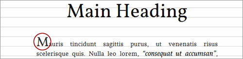
The beauty of adding these refinements (many more of which are demonstrated by Jon Tan, including “drop caps” and “outdents”) contextually is that they are activated only when semantically meaningful and appropriate. For instance, our :first-letter style above is appropriate only for introductory copy. Because the introductory paragraph is always (in this particular schema) preceded by an h1 heading, we have a way to bind its style to its particular role in the document’s flow. In other words, we can honor its meaning through its design.
As long as we rigorously adhere to semantic HTML, we can employ many nuances that are impervious to both the rearrangement of the page itself and the introduction of dynamic content.
Conclusion

(Image: primatage)
Walking down an aisle in a library, I no more than glance at the vast majority of books shelved on either side of me. Only a madman would suggest that my disregard of these books should sanction their pages being torn out. Nonetheless, because research has shown that visitors don’t read the average Web page in full, and because the “success” of a page is more easily measured by user action than cognition, we are often encouraged to marginalize our writing in favor of visual signifiers or action cues.
Sure, most people will “bounce” your content, but if you really have something to say, don’t alienate the people who are willing to give your writing a chance. Good typography does justice to your words, and good wording does justice to your ideas. If readers are comfortable reading your type, then they will more likely be comfortable with what you are writing about.


