Designing for the Mind

Email Newsletter
Weekly tips on front-end & UX.
Trusted by 182,000+ folks.
 Register for Free
 Celebrating 10 million developers


 Custom Web Forms for Angular, React, & Vue. Your backend.
Do you know what makes a design good? Is it merely an opinion, or is there something more to it? Breaking design down seems like such an abstract thing. Even the designers who are able to create thought-provoking work seem purely talented and have natural abilities that can’t really be nailed down to a process. But what if there were principles that captured why design and art worked the way that they do?
There are many beautiful designs that have been created on both a conscious and unconscious level. The downside of a designer continuing to create on an unconscious level is that the decisions they make appear somewhat random. For example, think if you were to ask a pilot why they clicked a few switches and they answered, “It just feels like the right switches to me,” rather than, “I need to adjust the wings to reduce wind drag.” As a passenger, the second would make us feel safer and confident in the pilot’s abilities.
Further Reading on SmashingMag:
- Symmetry: A Balancing Act In Two (Or More) Parts
- Visual Perception And The Principles Of Gestalt
- Design Principles: Visual Weight And Direction
- The Principles Of Similarity And Proximity
There is a real power that comes from being able to identify and speak to what makes your design meaningful. In the story of the Joshua Tree (Sidebar) we learn that once you recognize and understand something, it unlocks a new level of perception. In this article we’ll take a look at some principles that make the aesthetics of design attractive to people, and explanations on why they do. The more you become conscious of how design works the better you are able to communicate and judge design decisions.
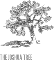
“Many years ago I received a tree identification book for Christmas. The first tree in the book was the Joshua tree because it took only two clues to identify it. Now the Joshua tree is a really weird-looking tree and I looked at that picture and said to myself, ”Oh, we don’t have that kind of tree in Northern California. That is a weird-looking tree. I would know if I saw that tree, and I’ve never seen one before.”
So I took my book and went outside. I had lived in that house for thirteen years, and I had never seen a Joshua tree. I took a walk around the block, and there must have been a sale at the nursery when everyone was landscaping their new homes – at least 80 percent of the homes had Joshua trees in the front yards. And I had never seen one before. Once I was conscious of the tree, once I could name it, I saw it everywhere. Which is exactly my point. Once you can name something, you’re conscious of it. You have power over it. You own it. You’re in control.”
Hello, I’m Your Brain
Design is powerful because of the way our brain processes visuals. We might think of vision working by our eyes pulling in images and projecting them in the back of our mind. If this were the case then there would no be design or art. There are in fact 30 areas in the back of your brain that process different aspects of the image. The various vision processing areas of the brain are individually recreating the design. So, in a way, the viewer is also an artist. In reality, design and art stimulate the mind more than a realistic image would do. Which is why it affects us differently. Randomly placing objects on a screen do not create the same reaction. There must be purpose to the visual distortion/arrangement for the mind to pick up.
It would be nearly impossible to lock down all the various styles of design that are out there. Sure, we can categorize them into bigger buckets and generalize with words like “clean,” or “grunge,” and designers certainly understand what kind of design to expect from those words. Although at the surface there is a difference between them, at their very core the brain is being stimulated by them in the same way.
The principles below are based on studies of the brain and neurological research that have been presented a variety of ways online. In this article I have attempted to present them in a way that best relates them to design.
The Principles of Aesthetic Experience
Grouping
When you look at a design layout and notice subtle touches — like the links of a specific color — this is not just a nice design touch, or good usability. It is tapping into the way your mind groups together things like shapes or colors. This technique is used heavily in design and plays off the mind’s natural tendency to try and find connections in elements. For example, in logos like FedEx, the arrow is created in the mind by grouping the negative space between the “E” and the “X.”
The neural mechanisms that we are tapping into are the same as those that evolved as a survival trait in the brain to protect us from predators and defeat their camouflage. Consider an early human seeing a golden color behind some foliage. The mind grouped those together as one whole so we can tell that there is a lion waiting behind the leaves. There are a set of design principles known as Gestalt Theory which breakdown the various types of grouping into specific categories. These can be explored for further understanding of grouping.
Symmetry and Balance
A symmetrical object taps into the same neural machinery made to help the mind detect other people or predators. The more symmetrical and balanced something like a human face is, the more perceived beauty that is interpreted by the mind. No human face is perfectly symmetrical, however when the two sides are nearly equal, they are seen at a metacognitive level as more beautiful. Some scientists have argued this is because asymmetrical organisms are suffering from disease and the mind has evolved to recognize that.
So, when we create symmetry and balance in a design through the use of guides like the grid and specific sizing of elements, we are creating something that is more perfect (almost hyperreal) compared to what is found in naturally created objects or organisms. It can be argued that most design is asymmetrical, however there must be a balance in the design. If that balance is not there, the mind will see the layout as asymmetrical and potentially awkward or wrong.
Peak Shift
Peak shift is how the mind reacts to differences between elements. The more you exaggerate those differences the more you are drawn to them. For example, If you were to present a lab rat with a square and a rectangle and teach it that the rectangle will get them food, and the square will not, it will obviously go for the rectangle. If you add a third element, a longer, skinny rectangle, the rat will be drawn to that more than the other one because the form has been exaggerated.
This same principle is applied to viewing a realistic drawing and a caricature of a person. To the mind the caricature looks almost closer to the person than the realistic drawing. The mind picks up on the differences that have been accentuated.
We notice this done in many designs with lighting for example. The shadows and reflections, or soft spotlights behind elements is an exaggerated version of what occurs with natural lighting. By pumping up these effects we are creating a more aesthetically appealing lighting in our compositions.
Isolation
As designers we learn to create focus on the essential elements of a layout and simplify the message that we are trying to communicate. In art, a drawing that is merely a minimal outline of the subject can be much more powerful than a 3D rendition of the same thing. This is why a sketch is more effective as art than a full color photo.
The principle of isolation is removing the gratuitous visual information that might clutter the design and concentrating on the essentials. It directs attention to what matters. By extracting what is critical and only showing that, the mind reacts strongly to this.
Perceptual Problem Solving
When watching a horror movie the directors have setup the scenes to play off of this principle. The longer the monster or killer in the film remain in the shadows or only revealed in small pieces, the more frightening the film is. The fear is created in your mind and imagination. If during the entire film you saw the killer or creature in daylight, there would be nothing that scary about it.
Perceptual Problem Solving is forcing the mind to try and figure out, or imagine, what the object looks like. The struggle almost introduces pleasure and forces the mind to figure out the image. This stimulates the mind more than just being literal with something, but rather teasing the mind with pieces of it and building up to a big reveal.
Contrast
We know contrast well as a graphic design principle in relation to light versus dark, curves versus angles, and dynamic versus static. This contrast is in how the human retina and brain respond more to the edges and sharp stepped changes in color or gradation. The visual information mainly is in the area of change like the outline/edge of a person and the color wash background. Therefore, this becomes a more interesting and attention grabbing area for the eye and brain to focus.
So, by adding other dimensions of contrast to the design, like texture or color, the design attracts the cells and holds their attention. Contrast can also exist as repetitive elements like black and white lines that create a sort of visual rhythm for the eye to follow. Creating areas of that contrast each other is vital to a dynamic and well-composed design.
Generic Viewpoint
When given an object to view the mind prefers a less complex vantage point. Take for example the cubes in the image to the right. The one on the left looks to us like what a cube should look like, because it is from a generic viewpoint. The cube on the right appears to be a flat hexagon to most people because it is from a very specific viewpoint. With the sides filled in with color we can finally see the cube. So although there are exceptions to this rule, this more generic viewpoint is usually more aesthetically pleasing.
Metaphor
Designers understand the use of metaphor very well. It is used in creating a familiar user experience by tapping into real objects that people already understand. In this case the understanding of metaphor is a bit different. The metaphor is a sort of mental tunnel between two objects that at first seem unrelated. On an unconscious level though, the mind has already made the association.
Some examples of this are Shakespeare saying, “Juliet is the sun.” In this case he is relating Juliet to being warm and nurturing, not that she is an object in our solar system. Good metaphors are easy to grasp and universal. Some design or imagery is compelling – because of the use of metaphor – the moment we see it. That is because before we even understand why, our mind has already deciphered it.
![]()


Knowledge Is Power
Great artists, like Monet, were experts at employing principles like peak shift into their work. Although, I’m not sure he ever had to present designs to a client like we do today. Sometimes it seems like a lack of (design) understanding gives the client an upper hand. The difference between you and your client’s neighbor’s friend’s 13-yr-old kid with a copy of Photoshop is that they have to pay you more. Which really means that unfortunately to many clients you are both the same.
Experience and your portfolio of work certainly matter. But each client is completely different with how they judge design. Paul Rand described business clients as this:
“It is their uninformed, unfocused preferences or prejudices, their likes or dislikes that too often determine the look of things. Yet, much of the time, they are not even discriminating enough to distinguish between good and bad, between trendy and original, nor can they always recognize talent or specialized skills.”
In the end it is up to the designer to communicate the decisions they made in creating their solution. Understanding some of these principles won’t help you decide what style of design to use, or what colors are best. There are differences on cultural levels or project goals that affect things like that. However, knowing what these principles are and why they work will help you create effective designs and hopefully help to give you (the designer) some of that power back.
Credits
The information and references in this post can be credited to Vilayanur Ramachandran and his talks and studies regarding the mind. He has spoken at TED several times and published many papers on the complexity of the brain and how we process information like art and aesthetics.
The Joshua Tree story is from the Non-Designers Type Book by Robin Williams.
Images are linked to sources.


