Japanese Writing, A Beautifully Complex System

Email Newsletter
Weekly tips on front-end & UX.
Trusted by 182,000+ folks.
 Register for Free
 Custom Web Forms for Angular, React, & Vue. Your backend.
 Celebrating 10 million developers


As a Japanese person living in Europe, I’m sometimes asked: “Japanese is a difficult language, isn’t it?” Those asking are often surprised when my answer is a simple: “No, actually, it’s not.”
While it is true (at least to many Westerners) that Japanese is an exotic language, when compared to learning other European languages, it may seem harder because it has no relation to their own language. But from my own experiences of learning English and German (and also from seeing some European friends learning Japanese), I can say with confidence that learning spoken Japanese is, in fact, not so difficult. The grammar is in many ways simpler than most European languages. Take for example the fact that we don’t have cases, grammatical genders, nor articles. However, Japanese writing and reading is… well, not so simple.
While discussing typography we most often focus on English language problems, which is only natural considering that the majority of design material is written in English. However, a lot can be gleaned from looking at how other languages are used as part of communication and design — it helps to lend context and a different point of view.
Further Reading on SmashingMag:
- Writing Systems And Calligraphy Of The World
- Interview With Type Designer Akira Kobayashi
- How To Be A Samurai Designer
- Brush Lettering: It Only Gets Better After Practice
Japanese Writing Scripts
Modern Japanese is written in a mixture of three basic scripts: Kanji — which are Chinese ideographic symbols — as well as Hiragana and Katakana — two phonetic alphabets (syllables). There are a few thousand Kanji characters, while Hiragana and Katakana have 46 each. Although there is a basic rule for when to use which script, there are many exceptions, and what’s worse is that words written in Kanji have often multiple pronunciations, depending on the context or conjunction. This is hard enough for native speaker to get right every time, so I almost feel sorry for those non-natives who are learning to read and write Japanese.

From top to bottom: Kanji is mainly used for the lexical elements: nouns, verb stems, adjective stems, and so forth; Hiragana has rounded letter shapes, which are mainly used for the grammatical elements of sentences such as particles, auxiliary verbs, and suffixes of nouns; Katakana has an angular letter shape, which is most often used for foreign words and also for the purpose of emphasis.
Some say that the “tragedy” started when Japan decided to “import” the Chinese writing system, inscribing it into their own language in the 3rd century.
Since Japanese is as different from Chinese as it is to any other language, simply using the Chinese writing system was not sufficient, and a more appropriate way of writing Japanese was sought out. Some Chinese characters began to be used not for their meaning, but purely for their phonetic value. So by the 9th century, Hiragana and Katakana scripts were derived from simplified Chinese characters that were used to write Japanese phonetically.
The story doesn’t end there. As if using three scripts isn’t enough, we write in both horizontal and vertical orientation.
Horizontal? Vertical? The Unique Case Of Japanese Typography
“Vertical or horizontal?” — when setting a piece of text in Japanese, this is a question that Japanese designers constantly need to ask themselves. Being able to use both vertical and horizontal writing orientations is something so normal for us native Japanese speakers that most of us won’t even stop to wonder why this is possible, or even when and how it was first introduced.
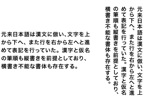
The identical piece of text set vertically (right) and horizontally (left). When it is set vertically it’s read from top to bottom, as the lines go from right to left; when it is set horizontally, it is read from left to right, like in European languages.
In general, these two writing orientations have a clear usage: vertical for something “Japanese”, “traditional”, “novels and other humanistic writings”; horizontal for “contemporary”, “business documents”, “scientific & foreign language related writings” and so on. When a main text is set horizontally, the binding is on the left-hand side, and pages progress to the right, like books in Latin scripts. Traditional books in vertical setting are the other way around, with the binding at the right hand side, and pages progressing to the left. So when you handle a Japanese book, don’t confuse the front with the back!
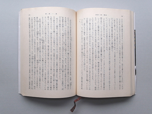
A typical page layout of a Japanese paperback novel using a vertical setting. Ogai Mori (1913), “Abe Ichizoku”, Shincyo-bunko.


Needless to say, traditional calligraphy is always done vertically. With their organic flow, characters are often connected and have different heights and widths — which makes it impossible to disconnect and align them horizontally. Calligraphy by Keiko Shimoda, 2011 (tsukushidesign.com)
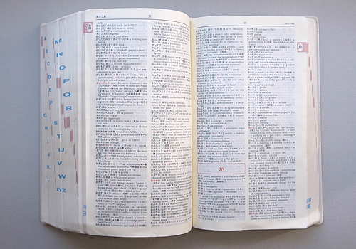
Horizontal setting is preferred for scientific texts, mathematical texts and language related books, where words and phrases in foreign scripts and signs are often included, as they are more easily incorporated horizontally. The example (above) is a Japanese-English dictionary. (Pocket Comprehensive English-Japanese / Japanese-English Dictionary, 2000, Obunsha)
Where the efficient use of space is important — namely newspapers and magazines — both orientations are often combined. Although it may appear a bit chaotic, or even random to foreign eyes, these two directions are usually used in a systematic way as a means to indicate different text elements on a page. For instance, a main text is often set in a vertical setting, but headings and captions may be set in a horizontal setting.
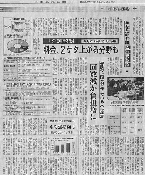
A typical newspaper layout — the main text is vertical but headings, diagrams, tables, and captions are placed horizontally.
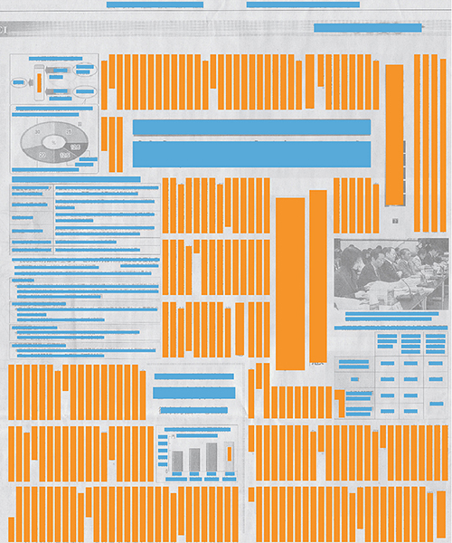
The same newspaper as above, but highlighting the vertical text (orange) and the horizontal text (blue). © The Nikkei (May 8th, 2009)
In a way, it’s comparable to “typographic variants” which are found in Latin typography — in Latin script text one may use bold, italic, or a different font to differentiate things such as pull quotes from the main text, whereas in Japanese we can do this by using a different orientation. Publications which accommodate non-linear or complex text (as opposed to linear text, such as novels) seem to benefit in particular from having these two orientations, which allow the layout to be highly flexible, and also to create strong visual impact.
The extreme cases of “space-efficiency-oriented typography” are informational-heavy pieces of text, such as diagrams and signage — also exploiting the two directional orientations. The Tokyo Metro map (Fig 10) is a good example of this — as you can see, both orientations are used accordingly, so that everything fits best within the limited space.
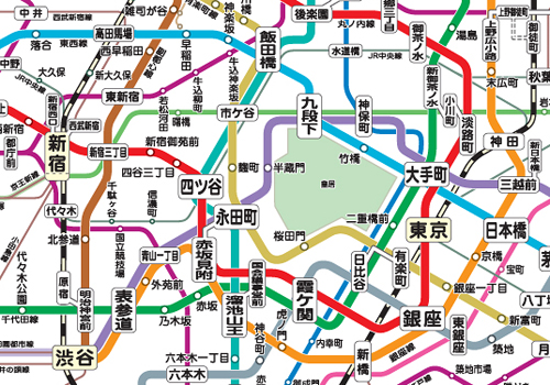
Tokyo Metro map
Tokyo Metro route map. The large type on the top is the station name which is placed horizontally. The name of the metroline may be horizontal, but the name of the stops are placed vertically.
It’s true that in many cases they look quite chaotic and sometimes even aesthetically questionable to eyes that are used to “orderly” design. But it’s easy to appreciate the visual impact and energy they create — they remind you that effective, appealing informational design does not always have to look “neat and tidy”.

Letters from my friends: when it comes to handwriting, orientation is up to a personal preference or simply one’s “mood”. But when you are writing a more official letter, or writing to somebody who is much older than you, it’s probably safer to opt for vertical orientation.
What’s Happening On Screen-Based Media?
Since the introduction of horizontal writing in the Japanese language, print-based media and signage have been employing both of these writing orientations effectively, and in ways that complement one another. But what’s been happening to screen-based media? With a few exceptions — such as word-processing machines made exclusively for the Japanese text output, or subtitles for film and TV screens, which tend to use either depending on the background image — horizontal orientation has been the dominant choice.
The prime example of this is the Web: horizontal orientation has been used almost exclusively. For the past 15 years, I have hardly come across a website that uses vertical setting. Mobile phone screens also use a horizontal orientation. I believe this may be due to the relations of hardware, operating systems and user interfaces that have become the norm, all of which have been designed to work with horizontal writing. It feels somewhat awkward to see vertical writing while all the other elements on the screen, such as the menu bar and UI elements, are horizontal.
Needless to say, the technical limitations (the support of a vertical setting by browsers is a fairly recent introduction) have largely contributed to this too. Perhaps underestimated, maybe the biggest factor for not using vertical setting for screen-based media could well be the mental association with horizontal orientation being used for something “modern” and “contemporary”.
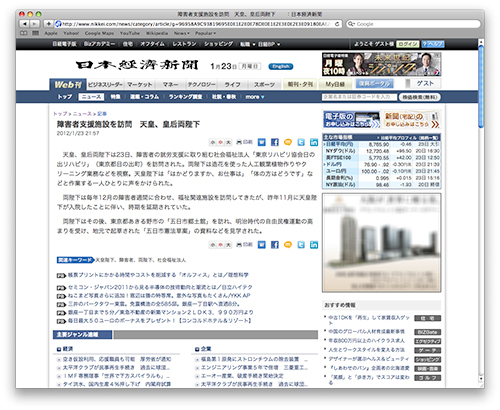
The Nihon Keizai Newspaper website. Although the printed newspaper employs a vertical setting for the body texts, the web-version uses a horizontal setting.
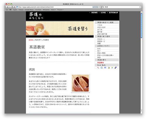
So far, even with content as Japanese as a tea ceremony, a website will use a horizontal setting. (Accessed Jan. 20th, 2012)
Will Vertical Writing Orientation Die Out?
Will vertical writing orientation die out from screen-based media? Or can it make a comeback, when the technological environment allows us to use vertical settings more easily? Many e-book apps on smart phones and tablets have already started using vertical settings. With its intuitive way of navigating the screen along with the lack of external input devices (and apps being able to have more flexible/responsive layout), vertical writing seems to be incorporated much more comfortably.
I’ve spent some time reading these e-books — and pleasantly surprised at how easy they are to read. Apart from the fact that you need to scroll the screen horizontally, it’s just as comfortable as reading “normal” or horizontally set text. In fact, it’s even better for some types of publications like novels, or Manga. Our association towards this type of content when compared to the vertical setting is pretty strong; it would somehow feel “wrong” to see them set horizontally.
Amazon’s Kindle has yet to support the Japanese language, but apparently they’re on their way to doing so. If they seriously want to attract Japanese readers, it would be unthinkable for them not to support vertical setting.
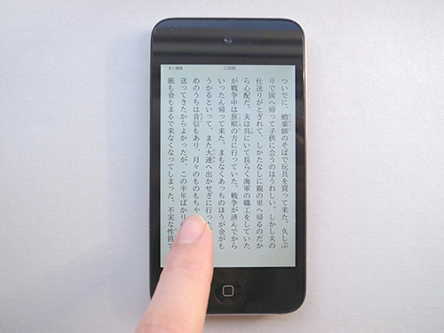
Soseki Natsume’s “Sanshiro” (1908) e-book on iPhone.
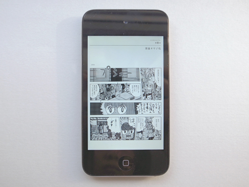
Kotobuki Shiriagari’s “OSHIGOTO” (2010) e-book on iPhone.
The situation also seems to be slowly changing on the Web — some interesting attempts have been made in order to familiarize ourselves with Web pages that have vertical setting. One such example is Taketori, which works just like Google translate — you can type in the URL of a Web page you wish to see in vertical setting, and Taketori does it for you. There’s also a piece of software called Kagetaka, which can switch any Web text into a vertical orientation.
Personally, I’m not too sure how well vertical setting will be supported by the users of normal Web pages, unless the way we navigate Web pages is re-developed, or a new type of browser with more innovative UI appears. Even though I complained earlier about the difficulty of the Japanese writing system, I do appreciate its diversity and flexibility, while making use of its three scripts and two orientations allows us to express subtle nuances of content — and we have been benefiting from that for decades.
I thought it would be a shame if we lose these methods of textual articulation in an age of screen-based media. But what has been happening for the last couple of years on touch-screen mobile devices (as well as the Web) can reassure us that both writing orientations may happily co-exist and collaborate on screen in the future, just as they have done off-screen for the last hundred years.
Feel free to share your thoughts in the comments section below.
(jvb) (il)


