Redesigning With Personality
We are very happy to present a sample chapter from the SOLD OUT printed Smashing Book #3, written by Aarron Walter. In this chapter, Aarron explains how sharing our personalities can help us create lasting relationships with users, and how it can improve the bottom line of our business. The sample is also available for free download in PDF, EPUB and MobiPocket. —Editorial Team
Written by Aarron Walter, reviewed by Denise Jacobs.
Redesigning a website can be the seven-layer taco dip of hell. You’ve searched for inspiration on dozens of websites, captured screenshots, jotted down notes, consulted friends and colleagues, maybe even interviewed users. But despite your due diligence, your vision for the new website remains unclear.
Further Reading on SmashingMag:
- Stop Redesigning And Start Tuning Your Site Instead
- 35 Gorgeous PDF Posters: Redesign The Web
- Redesign: When To Relaunch The Site and Best Practices
- Redesigning Craigslist With Focus On Usability
I feel your pain, my friend. I have been there many times. A redesign brings with it the pressure to innovate, to reimagine, to make a better version of the website so that it lasts for years to come. It can be paralyzing.
The cover image from Aarron Walter’s chapter in the printed Smashing Book #3. Designed by Kate McLelland.
Whether the website is for a client or for yourself, if you’re struggling to find your way, it’s probably because you are starting from the wrong place. The inspiration you seek is not where you think it is. It’s not in a blog post entitled “25 Amazingly Beautiful Websites.” It’s not in your Twitter stream, nor on Facebook. It’s not even on the Web. It’s right there on your seat. It’s you.
Just for a moment, stop thinking about HTML semantics, CSS magic and jQuery tricks. Instead, ask yourself, “Who am I, and what do I want to say?” What do you stand for, what’s important to you, and who are you speaking to? Let’s make the answers to these questions the trailhead of your redesign journey.
We Web designers have many tantalizing tools at our fingertips, and because the Web is a large community centered on sharing, new ideas and fancy techniques enter our field of vision daily. But in this chapter, I would like to turn your gaze from those shiny objects and focus it on what we’re really trying to do with our medium. Our true aim is to communicate clearly and to create human connections.
We achieve that goal not by collecting bells and whistles for our next project, but by discovering who we are and what our message is. The interfaces we design are not walls upon which our users click and tap. They are windows through which we show the world who we really are. As we will see in the principles and examples to come, sharing our personality can help us create lasting relationships with the people who use our websites, and it can improve the bottom line of our business.
Personality will set your brand apart from competitors and help you connect with a passionate audience. Making personality central to the ethos of your redesign might sound scary, especially if you’re working with a big corporation accustomed to speaking like the Borg. But even the biggest corporations can communicate with a human voice.
Who Are “They”?
Big redesign projects often begin by researching users. We sit down with people to discuss their goals for our website and the expectations they have; we look at demographics, analytics and search logs. It is a lot of data to sift through, but it’s not idle footwork. From this research we can create portraits of our archetypal users. This dossier on individuals in our target audience is called a user persona. It answers an important question in the redesign process: who are “they,” the people we’re communicating with, and what do they expect of us?
Chances are, if you’ve spent even a little time working in Web design, you have probably heard of user personas. Maybe you’ve even created a few. We have been asking ourselves “Who are they?” since Alan Cooper introduced user personas to interaction design in 1995, and they have been a staple of user-centered design ever since. If personas are new territory for you, you will find a concise introduction to the topic in The Project Guide to UX Design[1] by Russ Unger and Carolyn Chandler. If you would like to dig deeper into user research, check out Alan Cooper’s industry-changing book The Inmates Are Running the Asylum.[2]
With personas in hand, we have a solid starting point for a redesign. But something is missing. Personas show us only half of what we need to see. Truly effective communication is bidirectional. We now know who “they” are, but who are we? If we share a bit of ourselves in our design, we cannot only gain the trust of our audience, but also inspire impassioned users.
PERSONALITY
Lasting relationships center on the unique qualities and perspectives we all possess. We call this amalgam of traits personality. Through our personality, we express the entire gamut of emotions. Personality is the mysterious force that attracts us to certain people and repels us from others. It is like a signpost for compatibility, stirring an emotional response that we cannot ignore.
We have all experienced the magic of meeting someone whose personality captivates us. A chance encounter brings us together, and the magnetism of our personalities keeps us together. Personality helps our brains perform a simple cost-benefit analysis when we meet someone.
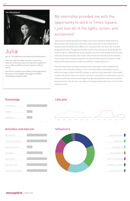
Figure 8.1. A persona paints a portrait of an archetypal user in our target audience and informs our design decisions. This one was created by Todd Zaki Warfel of messagefirst.com
Though we may not always be conscious of it, we evaluate the world around us with a simple question, “Is this good or bad for me?” Personality provides us with all of the cues we need to determine whether a relationship with a new acquaintance is in our best interest or could be harmful. Because personality plays such an important role in our decision-making process in our social circles, it can be a powerful tool in design as well.
A LONG TIME AGO IN A GALAXY FAR, FAR AWAY
It wasn’t that long ago when those of us publishing on the Web felt compelled to inflate ourselves for the public. Did you have a website in the late 1990s during the dot-com boom? I did, and like so many others, I wrote copy for my websites in the royal “we” to give the impression that I had a corporation as big as iXL or Razorfish (kids, go ask your parents). Throw in stock photography of fictitious partners and meetings, and you’re on your way to transforming a one-man show operating out of a bedroom into a global corporation.
It was a facade I had created because I believed no one would take me seriously if I was honest. I wasn’t the only one duping my audience. At the time, most small businesses and freelancers were painting a picture of corporate grandeur when there was nothing but one or two individuals behind the curtain.
Things are different these days. We’ve opened up our lives to the world on Twitter, Facebook and other social media. We no longer maintain separate personas for our personal and professional lives. The line that once separated them is now blurred, and we now offer one authentic personality for the world to experience, for better or worse.
Because we’ve opened ourselves up to one another, we have come to expect the same of the brands we interact with. In a consumption-centric world where products are pushed on us and companies are always taking instead of giving, we crave real human interaction that is reciprocal and respectful.
A few companies have figured this out and are forging emotional connections with their customers by sharing their personality. We have now come to expect this of small startups, such as Carbonmade, a zany Web app that helps designers create a portfolio, and Photojojo, a playground for photographers. These companies are free of corporate constraints and brimming with youthful creativity. Their design and marketing are filled with wit that sets them apart from competitors. But personality is a powerful design tool that works even with gigantic conglomerates.
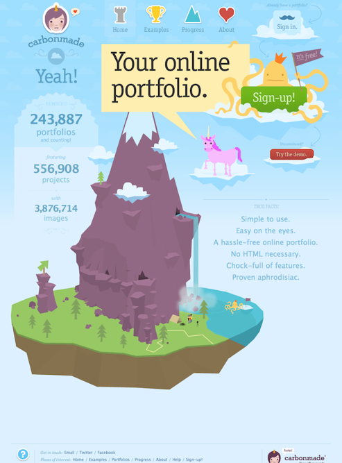
Figure 8.2. Carbonmade is an app that helps designers create an online portfolio.
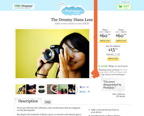
Figure 8.3. Carbonmade and Photojojo both have distinct personalities that set them apart from competitors and attract impassioned users.
General Electric, a Fortune 100 company with 287,000 employees (making it, um, 36 times bigger than the town where I grew up), dwarfs nearly every company on the planet. Most corporate behemoths like to market themselves with generic copy, stock photography and whitewashed promises, but GE is trying something different. It is telling stories through the eyes of its employees about how it is changing the world.
In a video on GE’s home page, workers from Durham, North Carolina, share with us a glimpse of the work they do to create massive jet engines that lift commercial airplanes 3,000 feet in the air. The video is not about the mind-boggling complexity of the technology that goes into the engines, though, but a collection of personal stories about Seth, Mark, Kareem, Tom and their colleagues putting their hearts into their work. The stories express their love for what they do. It is clear that this small team of individuals goes to work each day not just for a paycheck, but because they feel a sense of responsibility and because they care for the passengers that their engines carry.

Figure 8.4. GE shares personal stories on its home page from the individuals who make its products. The company’s personality shines through in individuals who have a passion for their work.
As the video concludes, the team members are taken to a runway where they get to see a jet outfitted with their engines take flight. All stand rapt as the jet makes its ascent. Tears spill from the eyes of one man who is overcome with pride. The honesty in their message and their earnest delivery make it hard for viewers not to feel emotionally engaged and inspired.
Products Are People, Too
Personality determines how we express emotions and the degree to which we do it. It’s the framework within which we share jokes, select our circle of friends and even find a mate. It is at the heart of all human interaction.
Steven Pinker, Johnstone Family Professor in the Department of Psychology at Harvard University, points out in his bestselling book How the Mind Works[3], “Much of the variation in personality—about fifty percent—has genetic causes.” That’s right: the moment you enter this world, half of your personality is already predetermined.
The other half is primarily shaped by social and cultural influences. Only about 5% of your personality is influenced by your parents’ nurturing. As a dad, I find this painfully depressing. The fact that so much of our personality is genetic indicates the extent to which it shapes our lives and ensures our survival.
So what if the websites, products and services we design could be imbued with personality? Personality is a natural interface that is familiar to humans. We already know how to respond to people we meet based on cues from their tone of voice, language, appearance and posture. We process this information subconsciously and behave accordingly. If we detect courteousness and trustworthiness in a person, then we might share more of ourselves and linger in conversation. If a person is rude or suspect, we are likely to make excuses for a sudden departure.
The cues we naturally take from people’s personalities can also come through in design. Color, type, imagery, copy and interaction patterns can all serve as channels for a personality. Just as our personality influences the behavior of the people around us, personality in design can shape the behavior of visitors to our websites.
There are four key benefits to expressing your personality in design:
- In a crowded market, personality helps distinguish you from competitors.
- Personality elicits an emotional response from the audience that encourages long-term memory of your brand.
- Personality attracts those who get you and deters those who don’t.
- Personality impassions users, who will become your most powerful marketing channel.
Let’s look at each of these in detail.
ONE OF THESE WEBSITES IS NOT LIKE THE OTHERS
No matter what kind of website you’re publishing, dozens of others like it are on the Web. Put yourself in your audience’s position. How will they distinguish your website from all of the others? What makes yours different? The travel-booking company Hipmunk carefully considered these questions before launching into a very competitive marketplace. Travelocity, Orbitz, Expedia and several others have had a tight grip on online travel booking for some time, but Hipmunk has managed to stand out from the crowd.
Visit a few well-known travel websites and you’ll see common traits among them that express something about their personalities. Advertisements for last-minute travel deals and money-back guarantees litter their home pages, each distracting users from the central goal of the page, which is to get them to book a flight. Each of these elements is asking something of users. “Gimme, gimme!” they scream.
I hate making travel plans because it’s such a stressful experience. Coordinating schedules, figuring out time constraints, paying high fees for basic services, and fearing the airline will once again screw something up—all leaving me frazzled and gun-shy.
This emotional state is not helped by the attention-assaulting design of most travel websites. A calm, focused personality is the best medicine for a stressful situation. That is exactly what Hipmunk offers on its website. Its home page is squarely focused on one thing: choosing a flight. A cheery chipmunk adds much-needed levity to an otherwise stressful interaction. No discount offers distract users or add to their stress.
Hipmunk’s search results are equally as focused, showing an empathy for users that is unseen in any competitor. Instead of simply listing flights by time and airline, it presents an “Agony” index, showing users which flights will be the most painful. Flights with early departures, late arrivals or long layovers rank higher in the Agony index. One could argue that this feature is simply a clever design pattern, but something more is going on. The Agony index literally communicates to users that Hipmunk is sympathetic: it feels your pain.
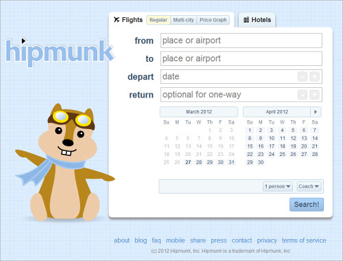
Figure 8.5. Hipmunk’s cheery personality and focus on one task are the perfect remedy for the stressed-out emotional state of so many users of travel-booking services.
Very few websites possess these traits. Just as an act of kindness on the street says something about the individual who extends it, sympathetic interaction design can convey a designer’s compassion for their audience. It’s the sort of thing users will not soon forget.
I Remember
Emotional experiences make a profound imprint on our long-term memory. Both the generation of emotion and the recording of memories happen in the limbic system, a collection of glands and structures under all of the folded gray matter of the brain. There is a good reason why the limbic system unites these essential functions. The brain couples emotion and long-term memory because, otherwise, humans would be doomed to repeat negative experiences and would not be able to consciously repeat positive experiences. As John Medina explains in his book Brain Rules: 12 Principles of Surviving and Thriving at Work, Home and School[4], our brains take note of emotionally charged events:
“The amygdala is chock-full of the neurotransmitter dopamine, and it uses dopamine the way an office assistant uses Post-It notes. When the brain detects an emotionally charged event, the amygdala releases dopamine into the system. Because dopamine greatly aids memory and information processing, you could say the Post-It note reads “Remember this!” Getting the brain to put a chemical Post-It note on a given piece of information means that information is going to be more robustly processed. It is what every teacher, parent, and ad executive wants.”
Experiences that lack an emotional charge tend to fade from memory. Thus, conservative, familiar designs are likely to be forgotten. Medina eloquently sums up the main reason why we designers should employ personality and emotion in design: “The brain doesn’t pay attention to boring things.” When we design with personality, we are building a framework through which emotional experiences will remain in the memories of our users.
I’ll be honest: there is some risk in designing with personality. Not everyone will like the result. But if you design to please everyone, you will please no one. As we will see in the next section, an interesting dichotomy of positive and negative emotions is elicited by the expression of personality.
I LOVE YOU, I HATE YOU
It’s OK if some people hate your redesign and do not connect with the personality you’re sharing. That’s a sign that you are indeed engaging with your audience on an emotional level. Disdain is always better than apathy.
Showing personality in your design always carries some risk. Some people will feel very connected to it, while others will be turned off. When you share a bit of yourself with the world, someone is not going to like you. But that’s fine. The people who are turned off by your personality are not the people you want to court. They are the ones who would cause the most problems in your product support queue or who would constantly insist that you change your product into something it isn’t.
If you’re a freelancer or agency on the hunt for new projects, you can ward off clients from hell by expressing your personality on your website. The people who are turned off by your website will not want to work with you—and I can tell you from experience, that’s not a bad thing!
Even the design process we typically follow for a project reminds us that we are not designing for everyone. The reason we do user research is to find out who we’re actually designing for. If the goal was to design for everyone, research would be unnecessary.
In our personal lives, we have all encountered individuals with whom we just don’t see eye to eye. Although painful to accept, some people not liking our personality is perfectly fine. It is a fool’s game to try to cater to the desires of every person we encounter. The best we can do is be ourselves and trust that some people on this planet will accept us as we are. (OMG! Did we just sneak a life lesson into a Web design book?)
This lesson holds true with design. Personality will help you filter the audience down to those with whom you share common values, interests and goals. These folks are your passionate users. They are the ones to cater to, and they will express their love for your brand openly.
As the user experience lead at MailChimp, I’ve seen this first hand. The humor, bonmots and good times I experience every day with my colleagues is visible in the copy, illustrations and interaction design of the stuff we make. The quips of Freddie von Chimpenheimer IV, our chimp mascot, that sit atop each page of the app are collected from people in the company, providing a snapshot of our sense of humor. When you interact with MailChimp, you interact with the people who make it.
We have heard from a few people that the humor woven into the interface is distracting or annoying. When you put your personality out there, that kind of feedback can sting.
We were concerned that these perceptions were widely held by our users, so we did some research. We created an option called Party Pooper mode, which disables Freddie’s jokes and buttons up the informal copy throughout the app. After tracking its usage, we discovered that only 0.007% of our customers actually turned off our personality. The lesson learned was that a bit of criticism is no reason to stop being yourself.
We have found that expressing our personality in the things we make has overwhelmingly greater benefit than risk. It distinguishes our brand from competitors; it helps our customers remember their experiences with us; and it makes many of our customers fall in love with our products. Oh, and it doesn’t exactly hurt your marketing budget either, as we will see in the next section.
YOUR USERS HAVE A WAY WITH WORDS
Personality in design will help spread the word about your website, no ad campaign required. Wufoo, creator of a Web app that makes it easy to build Web forms and to manage the data they collect, eliminated its marketing budget entirely when it discovered that users market the app for it.
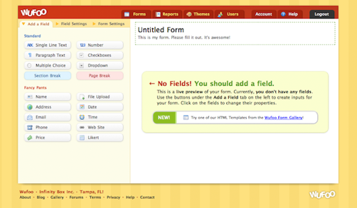
Figure 8.6. Wufoo’s unique approach to designing a business-focused Web app has elicited admiration and joy in customers, who are anxious to tell the world about their positive experiences.
Tweets, blog posts and word of mouth brought in new users more effectively than banner ads. Its youthful design, witty copy and occasional rogue dinosaur set Wufoo in stark contrast to its competitors, which are much more reluctant to express personality. When using Wufoo, we can easily see the personalities of the people who made it. Having a product that is beloved by users and that grows constantly by word of mouth made Wufoo an attractive acquisition for SurveyMonkey, which purchased it in 2011 for an estimated $35 million.
PERSONALITY: NOT JUST FOR DESIGNERS ANYMORE
Respected user experience designers such as Stephen Anderson and Andy Budd have been thinking and talking about the connections between personality, emotion and design for a few years now. The topic has gained traction with designers. But we are not the only ones who recognize the power of personality in a crowded marketplace. The people who fund startups are getting it, too.
On his blog, Fred Wilson, venture capitalist and principle of Union Square Ventures, advocates for clarity of voice and personality in product design, suggesting that the two are “critical to building a successful product.”
Dave McClure, angel investor and founder of the business incubator 500 Startups, is of the same mind. He sees personality and emotion as important factors in the success of a product. In his talk at the Warm Gun conference in 211, McClure told designers and entrepreneurs, “Be yourself, your super-self. What can you be authentic about and comfortable with? Find an essence that you think is you and amplify it. Find a feeling or emotion that you can sustain.”
Business news outlets are exploring the role of personality in design, too. Forbes contributor Anthony Wing Kosner attests that personality can make a website more memorable:
“Why are some companies’ websites more memorable than others? On the surface, it might seem to have to do with originality, visual impact and branding. But what if I were to tell you that the most important factor is how a site makes a visitor feel?”
Wilson, McClure and Kosner are all describing something we saw earlier in this chapter. GE made its giant corporation feel more human by sharing the individual personalities of its workforce. It showed us the passion and pride it has for its craft, and we felt it.
The informal personality of Hipmunk’s website allays the stress and negativity that so many travellers feel when booking a flight. The Agony index literally ranks results based on emotional response, which not only helps customers make a decision, but makes them grateful for Hipmunk’s empathy.
And Wufoo eliminated its entire marketing budget after realizing that passionate users were spreading the word for it. The personality in its app brightens the day of thousands of workers who carry out the data-collection orders of their corporate overlords while festering in gray cubicles. The levity, color and personality of Wufoo are to users as water is to a desert wanderer.
Once upon a time, personality and emotion in design were a novelty of small-scale websites powered by one or two creative individuals. Today, we are seeing personality being carefully infused into the websites of many brands, small, gigantic and everything in between. Designers are not the only ones who see the value in making the user experience more human; investors now recognize that personality is a key factor in the success of a product.
However, starting a redesign by thinking about personality can be nebulous. Clearly defining the traits of your personality before jumping into Photoshop or Illustrator would be more helpful. That is exactly what a design persona is for.
DEFINING YOUR PERSONALITY WITH A DESIGN PERSONA
Earlier in the chapter we talked about the user persona, which is like a dossier of your archetypal user. It answers the question, “Who are they?” A design persona flips that question on its head, asking, “Who are we?” Both user and design personas set the parameters for the design process. They help us overcome blank-canvas syndrome.
With so many possibilities, where do we start? By understanding both your users and yourself, the options are no longer vast, and the direction is clearer.
Think about it: if your website were a person, who would it be? Would the person be a serious, buttoned-up, all-business type, yet trustworthy and capable? Or a wisecracking buddy who makes mundane tasks fun? A design persona is a document that outlines the key traits of the personality you wish to convey in a design. We’ll look at a real-world example of a design persona momentarily, but let’s first look at the structure of the document.
A design persona has nine parts: You can download a template for user personas from here.
- Brand name The name of your company or product.
- Overview A short overview of your brand’s personality. What makes it unique?
- Personality image This is an actual picture of a person who embodies the traits you wish to convey. This makes the personality less abstract. Pick a famous person or someone with whom your team is familiar. If your brand already has a mascot or representative that does this, use it. Describe the attributes of the mascot that communicate the brand’s personality.
- Brand traits List five to seven traits that best describe your brand, along with one trait you want to avoid. This will help those who design and write the website to construct a consistent personality, while avoiding traits that would take your brand in the wrong direction.
- Personality map We can map this personality on a graph. The x axis ranges from unfriendly to friendly, and the y axis ranges from submissive to dominant.[5]
- Voice If your brand could talk, how would it speak? What would it say? Would it speak in a folksy vernacular or a refined style? Describe the particular aspects of your brand’s voice and how it might change in various situations. People change their language and tone to fit the situation, and so should your brand.
- Copy examples Provide examples of copy that might be used in different scenarios on your website. This will help the writers understand how the design should communicate.
- Visual lexicon If you are creating this document for yourself as the designer or for a design team, develop a visual lexicon that summarizes the colors, typography and visual style of your brand’s personality. You can be general in concept or include a mood board.
- Engagement methods Describe the methods by which you might emotionally engage users in order to create a memorable experience. Stephen Anderson’s Mental Notes card deck is a handy collection of such methods.
CREATING YOUR DESIGN PERSONA
The process of creating a design persona is as valuable as the document itself. When you stop to consider the traits you want in the design, you gain clarity of what you wouldn’t have had, had you jumped straight into your favorite design app. Defining a personality through a team brainstorming session will help the writers, designers, information architects and developers think about your website as a person and recognize the boundaries they are working within.
To get started on your design persona, download the template and sample files first. If you’re working on a team, gather everyone together with some snacks and a whiteboard to work through the initial ideas of the persona. It’ll be fun—and a cooler full of adult beverages wouldn’t hurt either.
Start the discussion by asking, “What seven words best describe who we are?” Be honest. You might hear some traits mentioned that you’re not proud of. Now tweak the question: “What seven words best describe who we hope to become with this redesign?” Redesigns are inherently aspirational, and being specific about your aspirations early on is helpful.
Now look for overlap between the two lists. Discuss how you might go about transforming the traits you don’t like into some of the aspirational traits. If the remaining list contains more than seven traits, continue whittling it down to seven or fewer, because a personality can become diluted and insincere if you try to be everything to everyone.
With the final list of traits scribbled on the whiteboard, reflect on the boundaries of each trait. What don’t you want your personality to become? For instance, if you have listed “fun” as a trait, that can mean a lot of things. Is it fun like Tickle Me Elmo, or fun like driving a Ferrari California along the winding Blue Ridge Parkway? Boundaries add clarity to a design persona and will help you see when a line has been crossed during the project.
To get a better sense of how traits and boundaries work, let’s look at the ones we defined for MailChimp’s persona:
- Fun but not childish,
- Funny but not goofy,
- Powerful but not complicated,
- Hip but not alienating,
- Easy but not simplistic,
- Trustworthy but not stodgy,
- Informal but not sloppy.
A little list like this one is a value system. It tells you who you are, guides your voice and helps shape the audience’s perception of your brand.
Now that you know what personality traits you want and don’t want, can you think of a person—either a celebrity or someone you know—who could serve as a common reference point for you and your team? Putting a face to these traits will make it even easier during the design process to answer the question, “What would my persona do in this situation?”
Write an overview of this personality to flesh it out further. Describe the voice of the personality, and write out examples of copy to illustrate. How would the personality manifest itself in color, typography and visual style? At the end of this exercise, you will have learned a lot about your starting point for the design.
When creating a personality for your website, keep one important rule in mind. Make the personality an honest reflection of the company you’re working for or yourself. You will have a hard time staying true to the design persona if the personality is a stretch. In all of the examples we saw earlier in this chapter, the personalities of the people who created the websites were evident. They were not idealistic concoctions.
We can tell in an instant when a person is pretending to be someone they aren’t, and the same holds true in design. The whole point of conveying personality in design is to share more of ourselves so that we can forge meaningful connections with other people. Faking it won’t work; not only is it difficult to do, but you’ll miss out on connecting with your ideal audience.
When we created our design persona at MailChimp, we were simply documenting the collective personality of the people on our teams. Actually, we found that the exercise wasn’t difficult because we had hired like-minded people with similar senses of humor and complementary personalities. Although our primary goal in putting together a team was to find people who would work well together, the process turned out to be helpful for defining the brand’s personality, too. Here’s the design persona we created for ourselves:
Brand name:
MailChimp
Overview:
Freddie von Chimpenheimer IV is the face of MailChimp and the embodiment of the brand’s personality. Freddie’s stout frame communicates the power of the application, and his on-the-go pose lets people know that this brand means business. Freddie always has a kind smile that welcomes users and makes them feel at home. The cartoon style communicates that the brand offers a fun and informal experience.
Yes, he’s a cartoon ape, but Freddie is still cool. He likes to crack witty jokes, but when the situation is serious, the funny business stops. MailChimp often surprises users with a fun Easter egg or a link to a gut-busting You-Tube video. Fun is around every corner, but never gets in the way of the workflow.
Brand traits:
Fun but not childish. Funny but not goofy. Powerful but not complicated. Hip but not alienating. Easy but not simplistic. Trustworthy but not stodgy. Informal but not sloppy.
Voice:
MailChimp’s voice is familiar, friendly and—above all—human. The personalities of the people behind the brand shine through honestly. MailChimp cracks jokes (ones you can share with your mom), tells stories and communicates in the folksy voice you might use with an old friend.
MailChimp uses contractions like “don’t” instead of “do not” because that’s how real humans speak to one another. MailChimp uses casual interjections, like “Hmm” when he’s thinking hard, and “Blech! That’s awful” to communicate empathy.
Figure 8.7. The design persona that was created to guide the personality of MailChimp.
Copy examples:
- Success message: “High fives! Your list has been imported.”
- Error message: “Oops! Looks like you forgot to enter an email address.”
- Critical failure: “One of our servers is temporarily down. Our engineers are already on the case and will have it back online shortly. Thanks for your patience.”
Visual lexicon::
- Color: MailChimp’s bright yet slightly desaturated palette conveys fun—although not to the point of being Romper Roomy. In line with the brand’s traits, the colors convey humor and yet are powerful and refined.
- Typography: MailChimp is easygoing, efficient and simple to use, and its typography reflects this. Simple sans-serif headings and body copy vary appropriately in scale, weight and color to communicate information hierarchy, making MailChimp feel like a familiar, comfortable cardigan that is both functional and beloved.
- General style: Interface elements are flat and simple, keeping everything easy to understand and unintimidating. Soft, subtle textures may appear in spots to warm up the space and make it feel human. Freddie should be used sparingly, and only to inject a bit of humor. Freddie never gives application-related feedback or statistics, nor does he help with tasks.
Engagement methods::
Surprise and delight: Themed log-in screens commemorate holidays, cultural events and beloved figures in history. Easter eggs create unexpected moments of humor, sometimes conveying nostalgia or referencing kitschy pop culture.
Anticipation: Freddie’s random funny greetings at the top of each main page create anticipation for the next page. These greetings do not provide information or feedback; they are a fun layer that never interferes with functionality or usability. We created this design persona primarily to guide the design of the application. It helped us dial in the voice we wanted for important elements such as success and error messages, and it helped us reconsider small design elements that were starting to deviate from our personality.
The design persona is not a style guide. It’s not intended to dictate how a logo can or cannot be used. It contains no color or typography specifications. It is simply a summary of the spirit of a design. When creating a design persona, you discover so much about yourself and your colleagues, which you can then share with your audience. It’s not a document to be policed, but rather a compass to keep you pointed in the right direction.
With personality on our minds, we started to recognize its presence in everything we were creating, especially our writing. Blog posts, product copy, knowledge-base articles and support guides all convey our personality. We didn’t always do a great job of it, though. We were injecting humor at inappropriate times. When a user is stressed out because they can’t figure out a workflow that they desperately need to complete in order to meet a deadline, a joke or informal tone is not welcome.
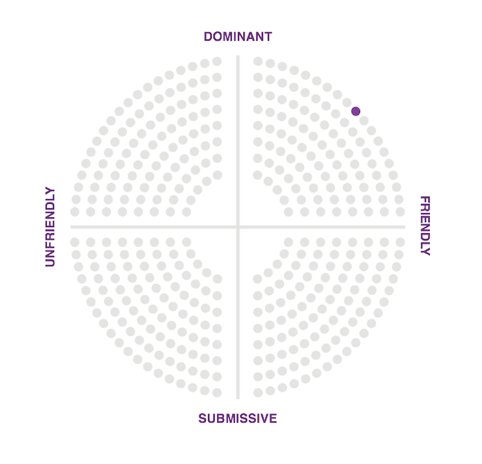
Figure 8.8. MailChimp’s personality map.
While the design persona helped to establish our voice, we found that further clarity was needed. Our content curator, Kate Kiefer-Lee, discovered that although a brand’s voice must remain consistent in design and writing, the tone should change to match the emotional context of users. Determining the relationship between voice and tone is tricky, but Kate found an interesting solution.
DEFINING VOICE AND ADAPTING TONE
Have you ever tried to write a style guide that sets the design or writing standards for a company? Style guides identify a myriad of scenarios in which design or copy might get mangled, and they provide a framework within which everyone on a team can stay on the same path.
Many redesigns start with a well-intentioned style guide, but more often than not it’s abandoned because having to constantly refer to it is impractical, and it makes people feel like the creativity police are peering over their shoulder. Kate Kiefer-Lee penned the content style guide for us to help current and incoming writers, and she had some reservations about how colleagues would receive it. Would people actually use it, or would it be seen as a burden? Having guidance on grammar and punctuation was handy, but the essence of what she wanted to communicate to the team was the relationship between voice and tone.
As Kate combed through blog posts, the knowledge base, microcopy, tutorials and guides to take stock of the company’s voice, she noticed areas where MailChimp’s voice was clear but the tone was off.
Would you tell a joke while comforting a widow at a funeral? Would you use informal language when meeting the Queen of England? I hope not! You’d certainly want to be yourself, but you would adjust your tone to suit the occasion.
In the design persona laid out above, a few examples of copy were included to show the language style and, to some degree, the variance in tone for different situations. Error messages in an application are the wrong place for a joke because the user is likely confused or stressed at the time. But a success message is a great place to employ humor or an informal tone because the user has just had a positive experience.
Rather than write a formal style guide to govern communication, Kate decided to take a different approach, one that would make understanding the voice of the brand and the variations in tone easy and fun. With the help of some colleagues, Kate created Voice and Tone, an interactive guide that ties tone of voice to the emotional state of readers.
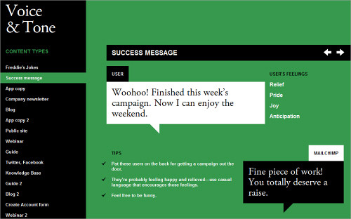
Figure 8.9. Voice and Tone helps anyone who writes for MailChimp maintain the voice and personality of the brand while adapting the tone to match the reader’s emotional state.
This approach to defining personality and writing style has been well received; it’s easy for people to understand, and it’s fun for people to use. It’s not full of rules and regulations. No one wants to be governed by the personality police. This guide gives people the freedom to write using the MailChimp voice while guiding tone in the right direction.
Kate sees a close connection between voice and personality: Voice is closely connected to personality. It’s who we are. It’s our perspective and it’s what we bring to every piece of content our customers are reading. Voice is from our end. It’s all about us. And tone is something we adapt to match our readers’ feelings.
The examples of copy on Voice & Tone not only identify the feelings of readers in particular situations, but are accompanied by matching colors on the page’s background. A red background indicates anger or frustration in the reader, while green signifies delight or joy. Like any style guide, Voice & Tone helps authors establish and maintain consistency, an often-preached brand trait that fosters customer trust and strengthens relationships. But it also suggests that adaptability is important; rather than being dogmatic about style, it simply illustrates the spectrum of communication styles that writers can use in various situations (Check out the bonus content for this chapter).
Conclusion
So often in our industry, the motivation for starting a project is to use a new technology or technique. While expanding our skill set is lovely, technique is not the reason we fell in love with this medium. The real reward of our work is the human connections we build on the Web with our fellow designers and the people we design for. Sharing more of ourselves on our websites amplifies those connections.
We’ve seen many examples of personality and many methods of cultivating it in this chapter. Hipmunk expresses empathy for its users with its Agony index. Wufoo managed to eliminate its marketing budget by sharing its personality in its interface and letting customers spread the word. MailChimp shaped its personality through design personas and an interactive writing guide.
These examples are shared here not to suggest that you do the same in your next project, but to spark new ideas in your work and to help you see the power of personality in design. A design that conveys a clear personality stands out in a crowded market. It elicits an emotional response from the audience that fosters long-term memory of your brand. It attracts the people you want and deters those who will be burdensome. And it impassions those users who will be your most powerful marketing channel.
Make the starting point of your next redesign this simple question, “Who am I, and what do I want to say?” Once you’ve answered that, then design elements and a writing style will emerge that bring out the personality at the heart of your work.
About the reviewer: Denise Jacobs
Denise Jacobs (1968) was born in Springfield, Ohio, and graduated from Stanford University, the University of Washington in Seattle and Université de Paul-Valéry, Montpellier 3 in France. The motto of her life is, “Feel the fear and do it anyway.” Denise lives in a medium-sized home close to Coral Gables in Miami, Florida. She had almost completely landscaped her backyard in 2009—but then started writing a book. She’s never been able to get the garden back to its former glory since then, but she does have banana trees, and her neighbor’s avocado tree is abundant.
Denise speaks at conferences and writes books and articles. She designs stuff and likes to teach people stuff. Denise loves organic gardening, making jewelry, dancing (especially samba and salsa), improv comedy and acting, self-improvement and reading. The most important lesson Denise has learned is that you just can’t do everything. Trying to be super-human is vastly overrated, and there is more to life than working. Her personal message to readers is to follow your passions and your dreams, and dream big. It will change your life for the better.”
Footnotes
[1] Russ Unger, Carolyn Chandler. “A Project Guide to UX Design: For user experience designers in the field or in the making”, New Riders Press, 1st edition, 2009.
[2] Alan Cooper. “The Inmates Are Running the Asylum”, Sams - Pearson Education, 1st edition, 2004.
[3] Steven Pinker. “How the Mind Works”, W. W. Norton and Company, Reissue edition, 2009.
[4] John Medina. “Brain Rules: 12 Principles for Surviving and Thriving at Work, Home, and School”, Pear Press, Reprint edition, 2009.
I Remember
Emotional experiences make a profound imprint on our long-term memory. Both the generation of emotion and the recording of memories happen in the limbic system, a collection of glands and structures under all of the folded gray matter of the brain. There is a good reason why the limbic system unites these essential functions. The brain couples emotion and long-term memory because, otherwise, humans would be doomed to repeat negative experiences and would not be able to consciously repeat positive experiences. As John Medina explains in his book Brain Rules: 12 Principles of Surviving and Thriving at Work, Home and School[4], our brains take note of emotionally charged events:
“The amygdala is chock-full of the neurotransmitter dopamine, and it uses dopamine the way an office assistant uses Post-It notes. When the brain detects an emotionally charged event, the amygdala releases dopamine into the system. Because dopamine greatly aids memory and information processing, you could say the Post-It note reads “Remember this!” Getting the brain to put a chemical Post-It note on a given piece of information means that information is going to be more robustly processed. It is what every teacher, parent, and ad executive wants.”
Experiences that lack an emotional charge tend to fade from memory. Thus, conservative, familiar designs are likely to be forgotten. Medina eloquently sums up the main reason why we designers should employ personality and emotion in design: “The brain doesn’t pay attention to boring things.” When we design with personality, we are building a framework through which emotional experiences will remain in the memories of our users.
I’ll be honest: there is some risk in designing with personality. Not everyone will like the result. But if you design to please everyone, you will please no one. As we will see in the next section, an interesting dichotomy of positive and negative emotions is elicited by the expression of personality.
I LOVE YOU, I HATE YOU
It’s OK if some people hate your redesign and do not connect with the personality you’re sharing. That’s a sign that you are indeed engaging with your audience on an emotional level. Disdain is always better than apathy.
Showing personality in your design always carries some risk. Some people will feel very connected to it, while others will be turned off. When you share a bit of yourself with the world, someone is not going to like you. But that’s fine. The people who are turned off by your personality are not the people you want to court. They are the ones who would cause the most problems in your product support queue or who would constantly insist that you change your product into something it isn’t.
If you’re a freelancer or agency on the hunt for new projects, you can ward off clients from hell by expressing your personality on your website. The people who are turned off by your website will not want to work with you—and I can tell you from experience, that’s not a bad thing!
Even the design process we typically follow for a project reminds us that we are not designing for everyone. The reason we do user research is to find out who we’re actually designing for. If the goal was to design for everyone, research would be unnecessary.
In our personal lives, we have all encountered individuals with whom we just don’t see eye to eye. Although painful to accept, some people not liking our personality is perfectly fine. It is a fool’s game to try to cater to the desires of every person we encounter. The best we can do is be ourselves and trust that some people on this planet will accept us as we are. (OMG! Did we just sneak a life lesson into a Web design book?)
This lesson holds true with design. Personality will help you filter the audience down to those with whom you share common values, interests and goals. These folks are your passionate users. They are the ones to cater to, and they will express their love for your brand openly.
As the user experience lead at MailChimp, I’ve seen this first hand. The humor, bonmots and good times I experience every day with my colleagues is visible in the copy, illustrations and interaction design of the stuff we make. The quips of Freddie von Chimpenheimer IV, our chimp mascot, that sit atop each page of the app are collected from people in the company, providing a snapshot of our sense of humor. When you interact with MailChimp, you interact with the people who make it.
We have heard from a few people that the humor woven into the interface is distracting or annoying. When you put your personality out there, that kind of feedback can sting.
We were concerned that these perceptions were widely held by our users, so we did some research. We created an option called Party Pooper mode, which disables Freddie’s jokes and buttons up the informal copy throughout the app. After tracking its usage, we discovered that only 0.007% of our customers actually turned off our personality. The lesson learned was that a bit of criticism is no reason to stop being yourself.
We have found that expressing our personality in the things we make has overwhelmingly greater benefit than risk. It distinguishes our brand from competitors; it helps our customers remember their experiences with us; and it makes many of our customers fall in love with our products. Oh, and it doesn’t exactly hurt your marketing budget either, as we will see in the next section.
YOUR USERS HAVE A WAY WITH WORDS
Personality in design will help spread the word about your website, no ad campaign required. Wufoo, creator of a Web app that makes it easy to build Web forms and to manage the data they collect, eliminated its marketing budget entirely when it discovered that users market the app for it.

Figure 8.6. Wufoo’s unique approach to designing a business-focused Web app has elicited admiration and joy in customers, who are anxious to tell the world about their positive experiences.
Tweets, blog posts and word of mouth brought in new users more effectively than banner ads. Its youthful design, witty copy and occasional rogue dinosaur set Wufoo in stark contrast to its competitors, which are much more reluctant to express personality. When using Wufoo, we can easily see the personalities of the people who made it. Having a product that is beloved by users and that grows constantly by word of mouth made Wufoo an attractive acquisition for SurveyMonkey, which purchased it in 2011 for an estimated $35 million.
PERSONALITY: NOT JUST FOR DESIGNERS ANYMORE
Respected user experience designers such as Stephen Anderson and Andy Budd have been thinking and talking about the connections between personality, emotion and design for a few years now. The topic has gained traction with designers. But we are not the only ones who recognize the power of personality in a crowded marketplace. The people who fund startups are getting it, too.
On his blog, Fred Wilson, venture capitalist and principle of Union Square Ventures, advocates for clarity of voice and personality in product design, suggesting that the two are “critical to building a successful product.”
Dave McClure, angel investor and founder of the business incubator 500 Startups, is of the same mind. He sees personality and emotion as important factors in the success of a product. In his talk at the Warm Gun conference in 211, McClure told designers and entrepreneurs, “Be yourself, your super-self. What can you be authentic about and comfortable with? Find an essence that you think is you and amplify it. Find a feeling or emotion that you can sustain.”
Business news outlets are exploring the role of personality in design, too. Forbes contributor Anthony Wing Kosner attests that personality can make a website more memorable:
“Why are some companies’ websites more memorable than others? On the surface, it might seem to have to do with originality, visual impact and branding. But what if I were to tell you that the most important factor is how a site makes a visitor feel?”
Wilson, McClure and Kosner are all describing something we saw earlier in this chapter. GE made its giant corporation feel more human by sharing the individual personalities of its workforce. It showed us the passion and pride it has for its craft, and we felt it.
The informal personality of Hipmunk’s website allays the stress and negativity that so many travellers feel when booking a flight. The Agony index literally ranks results based on emotional response, which not only helps customers make a decision, but makes them grateful for Hipmunk’s empathy.
And Wufoo eliminated its entire marketing budget after realizing that passionate users were spreading the word for it. The personality in its app brightens the day of thousands of workers who carry out the data-collection orders of their corporate overlords while festering in gray cubicles. The levity, color and personality of Wufoo are to users as water is to a desert wanderer.
Once upon a time, personality and emotion in design were a novelty of small-scale websites powered by one or two creative individuals. Today, we are seeing personality being carefully infused into the websites of many brands, small, gigantic and everything in between. Designers are not the only ones who see the value in making the user experience more human; investors now recognize that personality is a key factor in the success of a product.
However, starting a redesign by thinking about personality can be nebulous. Clearly defining the traits of your personality before jumping into Photoshop or Illustrator would be more helpful. That is exactly what a design persona is for.
DEFINING YOUR PERSONALITY WITH A DESIGN PERSONA
Earlier in the chapter we talked about the user persona, which is like a dossier of your archetypal user. It answers the question, “Who are they?” A design persona flips that question on its head, asking, “Who are we?” Both user and design personas set the parameters for the design process. They help us overcome blank-canvas syndrome.
With so many possibilities, where do we start? By understanding both your users and yourself, the options are no longer vast, and the direction is clearer.
Think about it: if your website were a person, who would it be? Would the person be a serious, buttoned-up, all-business type, yet trustworthy and capable? Or a wisecracking buddy who makes mundane tasks fun? A design persona is a document that outlines the key traits of the personality you wish to convey in a design. We’ll look at a real-world example of a design persona momentarily, but let’s first look at the structure of the document.
A design persona has nine parts: You can download a template for user personas from here.
- Brand name The name of your company or product.
- Overview A short overview of your brand’s personality. What makes it unique?
- Personality image This is an actual picture of a person who embodies the traits you wish to convey. This makes the personality less abstract. Pick a famous person or someone with whom your team is familiar. If your brand already has a mascot or representative that does this, use it. Describe the attributes of the mascot that communicate the brand���s personality.
- Brand traits List five to seven traits that best describe your brand, along with one trait you want to avoid. This will help those who design and write the website to construct a consistent personality, while avoiding traits that would take your brand in the wrong direction.
- Personality map We can map this personality on a graph. The x axis ranges from unfriendly to friendly, and the y axis ranges from submissive to dominant.[5]
- Voice If your brand could talk, how would it speak? What would it say? Would it speak in a folksy vernacular or a refined style? Describe the particular aspects of your brand’s voice and how it might change in various situations. People change their language and tone to fit the situation, and so should your brand.
- Copy examples Provide examples of copy that might be used in different scenarios on your website. This will help the writers understand how the design should communicate.
- Visual lexicon If you are creating this document for yourself as the designer or for a design team, develop a visual lexicon that summarizes the colors, typography and visual style of your brand’s personality. You can be general in concept or include a mood board.
- Engagement methods Describe the methods by which you might emotionally engage users in order to create a memorable experience. Stephen Anderson’s Mental Notes card deck is a handy collection of such methods.
CREATING YOUR DESIGN PERSONA
The process of creating a design persona is as valuable as the document itself. When you stop to consider the traits you want in the design, you gain clarity of what you wouldn’t have had, had you jumped straight into your favorite design app. Defining a personality through a team brainstorming session will help the writers, designers, information architects and developers think about your website as a person and recognize the boundaries they are working within.
To get started on your design persona, download the template and sample files first. If you’re working on a team, gather everyone together with some snacks and a whiteboard to work through the initial ideas of the persona. It’ll be fun—and a cooler full of adult beverages wouldn’t hurt either.
Start the discussion by asking, “What seven words best describe who we are?” Be honest. You might hear some traits mentioned that you’re not proud of. Now tweak the question: “What seven words best describe who we hope to become with this redesign?” Redesigns are inherently aspirational, and being specific about your aspirations early on is helpful.
Now look for overlap between the two lists. Discuss how you might go about transforming the traits you don’t like into some of the aspirational traits. If the remaining list contains more than seven traits, continue whittling it down to seven or fewer, because a personality can become diluted and insincere if you try to be everything to everyone.
With the final list of traits scribbled on the whiteboard, reflect on the boundaries of each trait. What don’t you want your personality to become? For instance, if you have listed “fun” as a trait, that can mean a lot of things. Is it fun like Tickle Me Elmo, or fun like driving a Ferrari California along the winding Blue Ridge Parkway? Boundaries add clarity to a design persona and will help you see when a line has been crossed during the project.
To get a better sense of how traits and boundaries work, let’s look at the ones we defined for MailChimp’s persona:
- Fun but not childish,
- Funny but not goofy,
- Powerful but not complicated,
- Hip but not alienating,
- Easy but not simplistic,
- Trustworthy but not stodgy,
- Informal but not sloppy.
A little list like this one is a value system. It tells you who you are, guides your voice and helps shape the audience’s perception of your brand.
Now that you know what personality traits you want and don’t want, can you think of a person—either a celebrity or someone you know—who could serve as a common reference point for you and your team? Putting a face to these traits will make it even easier during the design process to answer the question, “What would my persona do in this situation?”
Write an overview of this personality to flesh it out further. Describe the voice of the personality, and write out examples of copy to illustrate. How would the personality manifest itself in color, typography and visual style? At the end of this exercise, you will have learned a lot about your starting point for the design.
When creating a personality for your website, keep one important rule in mind. Make the personality an honest reflection of the company you’re working for or yourself. You will have a hard time staying true to the design persona if the personality is a stretch. In all of the examples we saw earlier in this chapter, the personalities of the people who created the websites were evident. They were not idealistic concoctions.
We can tell in an instant when a person is pretending to be someone they aren’t, and the same holds true in design. The whole point of conveying personality in design is to share more of ourselves so that we can forge meaningful connections with other people. Faking it won’t work; not only is it difficult to do, but you’ll miss out on connecting with your ideal audience.
When we created our design persona at MailChimp, we were simply documenting the collective personality of the people on our teams. Actually, we found that the exercise wasn’t difficult because we had hired like-minded people with similar senses of humor and complementary personalities. Although our primary goal in putting together a team was to find people who would work well together, the process turned out to be helpful for defining the brand’s personality, too. Here’s the design persona we created for ourselves:
Brand name:
MailChimp
Overview:
Freddie von Chimpenheimer IV is the face of MailChimp and the embodiment of the brand’s personality. Freddie’s stout frame communicates the power of the application, and his on-the-go pose lets people know that this brand means business. Freddie always has a kind smile that welcomes users and makes them feel at home. The cartoon style communicates that the brand offers a fun and informal experience.
Yes, he’s a cartoon ape, but Freddie is still cool. He likes to crack witty jokes, but when the situation is serious, the funny business stops. MailChimp often surprises users with a fun Easter egg or a link to a gut-busting You-Tube video. Fun is around every corner, but never gets in the way of the workflow.
Brand traits:
Fun but not childish. Funny but not goofy. Powerful but not complicated. Hip but not alienating. Easy but not simplistic. Trustworthy but not stodgy. Informal but not sloppy.
Voice:
MailChimp’s voice is familiar, friendly and—above all—human. The personalities of the people behind the brand shine through honestly. MailChimp cracks jokes (ones you can share with your mom), tells stories and communicates in the folksy voice you might use with an old friend.
MailChimp uses contractions like “don’t” instead of “do not” because that’s how real humans speak to one another. MailChimp uses casual interjections, like “Hmm” when he’s thinking hard, and “Blech! That’s awful” to communicate empathy.
Figure 8.7. The design persona that was created to guide the personality of MailChimp.
Copy examples:
- Success message: “High fives! Your list has been imported.”
- Error message: “Oops! Looks like you forgot to enter an email address.”
- Critical failure: “One of our servers is temporarily down. Our engineers are already on the case and will have it back online shortly. Thanks for your patience.”
Visual lexicon::
- Color: MailChimp’s bright yet slightly desaturated palette conveys fun—although not to the point of being Romper Roomy. In line with the brand’s traits, the colors convey humor and yet are powerful and refined.
- Typography: MailChimp is easygoing, efficient and simple to use, and its typography reflects this. Simple sans-serif headings and body copy vary appropriately in scale, weight and color to communicate information hierarchy, making MailChimp feel like a familiar, comfortable cardigan that is both functional and beloved.
- General style: Interface elements are flat and simple, keeping everything easy to understand and unintimidating. Soft, subtle textures may appear in spots to warm up the space and make it feel human. Freddie should be used sparingly, and only to inject a bit of humor. Freddie never gives application-related feedback or statistics, nor does he help with tasks.
Engagement methods::
Surprise and delight: Themed log-in screens commemorate holidays, cultural events and beloved figures in history. Easter eggs create unexpected moments of humor, sometimes conveying nostalgia or referencing kitschy pop culture.
Anticipation: Freddie’s random funny greetings at the top of each main page create anticipation for the next page. These greetings do not provide information or feedback; they are a fun layer that never interferes with functionality or usability. We created this design persona primarily to guide the design of the application. It helped us dial in the voice we wanted for important elements such as success and error messages, and it helped us reconsider small design elements that were starting to deviate from our personality.
The design persona is not a style guide. It’s not intended to dictate how a logo can or cannot be used. It contains no color or typography specifications. It is simply a summary of the spirit of a design. When creating a design persona, you discover so much about yourself and your colleagues, which you can then share with your audience. It’s not a document to be policed, but rather a compass to keep you pointed in the right direction.
With personality on our minds, we started to recognize its presence in everything we were creating, especially our writing. Blog posts, product copy, knowledge-base articles and support guides all convey our personality. We didn’t always do a great job of it, though. We were injecting humor at inappropriate times. When a user is stressed out because they can’t figure out a workflow that they desperately need to complete in order to meet a deadline, a joke or informal tone is not welcome.

Figure 8.8. MailChimp’s personality map.
While the design persona helped to establish our voice, we found that further clarity was needed. Our content curator, Kate Kiefer-Lee, discovered that although a brand’s voice must remain consistent in design and writing, the tone should change to match the emotional context of users. Determining the relationship between voice and tone is tricky, but Kate found an interesting solution.
DEFINING VOICE AND ADAPTING TONE
Have you ever tried to write a style guide that sets the design or writing standards for a company? Style guides identify a myriad of scenarios in which design or copy might get mangled, and they provide a framework within which everyone on a team can stay on the same path.
Many redesigns start with a well-intentioned style guide, but more often than not it’s abandoned because having to constantly refer to it is impractical, and it makes people feel like the creativity police are peering over their shoulder. Kate Kiefer-Lee penned the content style guide for us to help current and incoming writers, and she had some reservations about how colleagues would receive it. Would people actually use it, or would it be seen as a burden? Having guidance on grammar and punctuation was handy, but the essence of what she wanted to communicate to the team was the relationship between voice and tone.
As Kate combed through blog posts, the knowledge base, microcopy, tutorials and guides to take stock of the company’s voice, she noticed areas where MailChimp’s voice was clear but the tone was off.
Would you tell a joke while comforting a widow at a funeral? Would you use informal language when meeting the Queen of England? I hope not! You’d certainly want to be yourself, but you would adjust your tone to suit the occasion.
In the design persona laid out above, a few examples of copy were included to show the language style and, to some degree, the variance in tone for different situations. Error messages in an application are the wrong place for a joke because the user is likely confused or stressed at the time. But a success message is a great place to employ humor or an informal tone because the user has just had a positive experience.
Rather than write a formal style guide to govern communication, Kate decided to take a different approach, one that would make understanding the voice of the brand and the variations in tone easy and fun. With the help of some colleagues, Kate created Voice and Tone, an interactive guide that ties tone of voice to the emotional state of readers.

Figure 8.9. Voice and Tone helps anyone who writes for MailChimp maintain the voice and personality of the brand while adapting the tone to match the reader’s emotional state.
This approach to defining personality and writing style has been well received; it’s easy for people to understand, and it’s fun for people to use. It’s not full of rules and regulations. No one wants to be governed by the personality police. This guide gives people the freedom to write using the MailChimp voice while guiding tone in the right direction.
Kate sees a close connection between voice and personality: Voice is closely connected to personality. It’s who we are. It’s our perspective and it’s what we bring to every piece of content our customers are reading. Voice is from our end. It’s all about us. And tone is something we adapt to match our readers’ feelings.
The examples of copy on Voice & Tone not only identify the feelings of readers in particular situations, but are accompanied by matching colors on the page’s background. A red background indicates anger or frustration in the reader, while green signifies delight or joy. Like any style guide, Voice & Tone helps authors establish and maintain consistency, an often-preached brand trait that fosters customer trust and strengthens relationships. But it also suggests that adaptability is important; rather than being dogmatic about style, it simply illustrates the spectrum of communication styles that writers can use in various situations (Check out the bonus content for this chapter).
Conclusion
So often in our industry, the motivation for starting a project is to use a new technology or technique. While expanding our skill set is lovely, technique is not the reason we fell in love with this medium. The real reward of our work is the human connections we build on the Web with our fellow designers and the people we design for. Sharing more of ourselves on our websites amplifies those connections.
We’ve seen many examples of personality and many methods of cultivating it in this chapter. Hipmunk expresses empathy for its users with its Agony index. Wufoo managed to eliminate its marketing budget by sharing its personality in its interface and letting customers spread the word. MailChimp shaped its personality through design personas and an interactive writing guide.
These examples are shared here not to suggest that you do the same in your next project, but to spark new ideas in your work and to help you see the power of personality in design. A design that conveys a clear personality stands out in a crowded market. It elicits an emotional response from the audience that fosters long-term memory of your brand. It attracts the people you want and deters those who will be burdensome. And it impassions those users who will be your most powerful marketing channel.
Make the starting point of your next redesign this simple question, “Who am I, and what do I want to say?” Once you’ve answered that, then design elements and a writing style will emerge that bring out the personality at the heart of your work.
About the reviewer: Denise Jacobs
Denise Jacobs (1968) was born in Springfield, Ohio, and graduated from Stanford University, the University of Washington in Seattle and Université de Paul-Valéry, Montpellier 3 in France. The motto of her life is, “Feel the fear and do it anyway.” Denise lives in a medium-sized home close to Coral Gables in Miami, Florida. She had almost completely landscaped her backyard in 2009—but then started writing a book. She’s never been able to get the garden back to its former glory since then, but she does have banana trees, and her neighbor’s avocado tree is abundant.
Denise speaks at conferences and writes books and articles. She designs stuff and likes to teach people stuff. Denise loves organic gardening, making jewelry, dancing (especially samba and salsa), improv comedy and acting, self-improvement and reading. The most important lesson Denise has learned is that you just can’t do everything. Trying to be super-human is vastly overrated, and there is more to life than working. Her personal message to readers is to follow your passions and your dreams, and dream big. It will change your life for the better.”
Footnotes
[1] Russ Unger, Carolyn Chandler. “A Project Guide to UX Design: For user experience designers in the field or in the making”, New Riders Press, 1st edition, 2009.
[2] Alan Cooper. “The Inmates Are Running the Asylum”, Sams - Pearson Education, 1st edition, 2004.
[3] Steven Pinker. “How the Mind Works”, W. W. Norton and Company, Reissue edition, 2009.
[4] John Medina. “Brain Rules: 12 Principles for Surviving and Thriving at Work, Home, and School”, Pear Press, Reprint edition, 2009.
[5] To learn more about personality mapping and the research behind it, see “Emotional Design With A.C.T.: Part 1” by Trevor van Gorp on Boxes and Arrow.
Download the full version of the chapter for free!
You can download this chapter in various formats:
- download the chapter in PDF (3.68 Mb),
- download the chapter in ePUB (1.57 Mb),
- download the chapter in Mobipocket (Kindle) (1.98 Mb) or
- download the chapter’s .zip with all formats (6.61 Mb).
(vf) (il) (aw) (dc) (al)


 See the full picture →


 SurveyJS: White-Label Survey Solution for Your JS App
 Celebrating 10 million developers

