Drop Caps: Historical Use And Current Best Practices With CSS
The practice of using a large letter to mark the start of a text has been around for almost two thousand years. Illustrated caps increased usability by marking important passages and guiding readers through the text. Unlike their historic counterparts, drop caps on the Web don’t add value in terms of usability or readability—and they are hard for Web developers to control, often rendering differently across browsers.
Yet, front-end designers and clients often want to use drop caps as decorative elements. How should we implement them? Just as scribes, artisans, and early printers had a variety of methods for creating initial capitals, we Web designers have multiple methods to choose from. We can use an image of a letter, create a class to enlarge and place a letter, or use a first-child:first-letter to enlarge and place the first letter of the first paragraph. But which method should we use? Which method remains consistent across browsers? Which is most accessible?
Further Reading on SmashingMag:
- 5 Useful Coding Solutions For Designers And Developers
- Weird And Wonderful Typography – Yet Still Illegible
- The Perfect Paragraph
- Understanding The Difference Between Type And Lettering
Initial Caps In Manuscripts
Examples of initial caps have been found dating back to the 4th century CE. Early codex books (books with pages, as opposed to scrolls) did not have word spaces, sentence breaks, or paragraph breaks. The written word was not “read” the way it is now. Written text represented sounds; sounds held meaning. “Readers” lived in a primarily oral culture and verbalized the sounds to help them remember ideas and information already committed to memory.
Historically, initial caps were not just decorative elements. Scribes used them to mark where a new section—a new idea—started in the text. This in turn helped “readers” find their place in a text.
Even as late as the 15th century, monks and scribes used initial caps to aid in visually “chunking” texts. Figure 1 shows a manuscript (lettered by hand) bible from 1407. The initial cap (P in the word Petrus) contains a picture of St. Peter, and is thus historiated; it relates to the text by showing a recognizable figure or scene. It is also illuminated; it is decorated with gold in order to bring the light of God to the reader.
Historiated caps not only helped mark the start of a new idea in the text, they acted as place markers for significant places in the text. Images related to the story served as memory aids for priests and monks who “read” the texts by flickering candle light.
But look closely (Figures 1 and 2) and you’ll see a far more subtle “initial cap.” The manuscript contains word spaces but does not contain a space between sentences. Thus, the letterer added strokes of red to the first letter of each sentence, giving visual separation to sounds represented on the page.
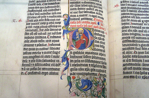
Figure 1: Illuminated, Historiated Cap in a Latin Bible, 1407. Lettering by Gerard Brils, Belgium. (Image: Adrian Pingstone)
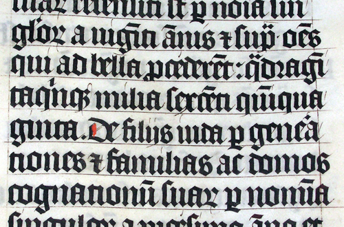
Figure 2: Detail of Latin Bible, 1407. Lettering by Gerard Brils, Belgium. Note the subtle use of color to emphasize the start of a new sentence. (Image: Adrian Pingstone)
Initial Caps In Printed Books
Of course, not all initial caps were as sexy as the image of St. Peter illuminated with pure gold. Initial caps were also used for mundane purposes: like indicating the alphabetical order of ideas. Routine today, alphabetizing was not originally used to organize information in books. Figure 3 shows a page from the table of contents of an incunabula (an early printed book). The initial caps were written in after the book was printed. The quality of lettering is not as beautiful as the St. Peter example above, but the letters serve an important purpose for the reader.
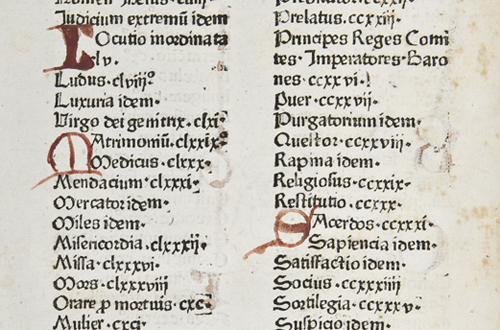
Figure 3: The last page of a table of contents from an early printed book. 1476. Initial caps added after the book was printed. (Image: used by permission of University of Glasgow, Special Collections)
Early printed books were often designed to replicate manuscripts. Printers left space in and around the text—so owners could hire an artisan to illustrate initial caps and borders. Figure 4 is an example of one such book; no initial cap was ever added. Note the initial space and guide letter provided for the illustrator. Even without the final initial cap, the text is readable (if you read Latin).
Figure 5 is a printed Bible from the same time and place (Venice, 1480). After it was printed, artisans supplied rubricated (written in red), decorated, and illuminated initials—thus continuing the formal tradition of the manuscript book.
Not all printed books required an artisan to finish the initial caps. Printers designed and created modular initial caps almost from the beginning. Figure 6 shows two inhabited caps (the illustrations do not represent a specific person or scene) set side-by-side, each starting a different translation of the New Testament. The inhabited caps and border where printed along with the text.
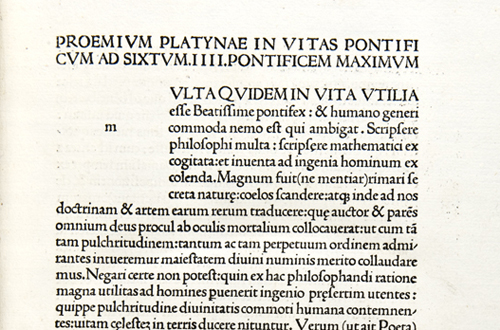
Figure 4: The printer left an initial space with guide letter. After printing, an artisan could be hired to add an initial cap. Venice, 1479. (Image: used by permission of University of Glasgow, Special Collections)
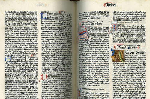
Figure 5: Printed Latin Bible. An artisan added various initials after the book was printed. Venice, 1480. (Image: used by permission of University of Glasgow, Special Collections)
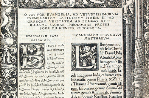
Figure 6: The first complete published text of the Greek New Testament. The inhabited caps and border were printed with the text. Basel, 1516. (Image: used by permission of University of Glasgow, Special Collections)
The role of written texts changed starting in the mid-1600’s, and initial caps fell out of favor. Newspapers allowed readers to share current ideas and information, scientific inquiry provided a basis of rational thought, and the typographic page simplified. The relationship between type and image continued to shift—primarily influenced by industrialization (which in turn influenced the art of printing, the speed at which goods could be produced and transported, and the development of a literate middle-class).
Drop Caps On The Web
Today, initial caps are no longer necessary; they are used primarily as decorative elements. Used for centuries in religious and scholarly texts, initial caps are associated with and communicate an “old” or “traditional” feeling. Thus, when we want to design a Web page that feels traditional, elegant, or historic, we find ourselves wanting to use drop caps.
There are four common methods for creating drop caps in HTML and CSS. But which one is best?
In an attempt to answer that question, I tested all four methods across 82 different browser-version-operating system combinations—including smart phones. (If you’re interested, you can read a list of the combinations and why I chose them). In an attempt to identify which methods are accessible, I also tested them using VoiceOver on the mac, with Safari 5.1.1.
Which method is best? The answer is… not clear-cut.
Method 1: Image Replacement
If you want a drop cap that shows up consistently across all operating systems—including smart phones—there isn’t one. But using the Image Replacement method (Figure 7) comes close. Using an image for the drop cap holds up beautifully across 79 of the 82 combinations tested. It shifted placement on Opera Mini 5.1 (Android 2.2), and Mobile Safari 4.0.5 (iPhone 4, iPhone 3GS).
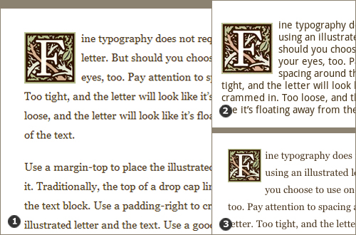
Figure 7: An inhabited initial cap similar to those used in the 1516 Greek New Testament shown in Figure 6 above. [1] Using an image for the drop cap holds up beautifully across 79 of the 82 browser-version-operating system combinations tested. [2] It shifted down slightly on Opera Mini 5.1 (Android 2.2). [3] It shifted up on Mobile Safari 4.0.5 (iPhone 4, iPhone 3GS), resulting in an awkward space below the image. (Drop cap illustration: Bruce Maddocks)
HTML for the “Image Replacement” Example
<p><span class="drop f">F</span>ine typography does not … </p>Note that I used two classes for the span. This allowed me to use one class (drop) to style the space, and use another class (f) to specify the image of the letter.
CSS for the “Image Replacement” Example
.drop{
    display:block;
    float:left;
    width:72px;
    height:72px;
    margin-top:5px;
    padding-right:8px;
    text-indent: -9000px;
    }
.f{
    background: url(images/f_small.jpg) 0 0 no-repeat;
    }
Note that I set the width and height of the space to the same dimensions as the image used to represent the drop cap. The text-indent attribute is used to place the actual letter outside the visible area of the space. We don’t want to see the HTML letter, but it’s important to include it so browsers without CSS enabled will show the entire word.
View the original Image Replacement example HTML document.
Method 2: Letter Over a Background Image
Placing a letter over a background image is a bit less successful (Figure 8). It works consistently across 77 of the 82 combinations tested. It posed a problem on the same three browsers as the Image Replacement method above—Opera Mini 5.1 (Android 2.2), and Mobile Safari 4.0.5 (iPhone 4, iPhone 3GS)—as well as Windows Vista IE7 and Windows XP IE7. Granted, PC users increasingly use Windows 7 with IE8 or higher, so the last two browsers may not be a problem.
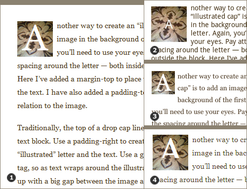
Figure 8: A decorated initial cap similar to one used in the 1480 Printed Latin Bible shown in Figure 5 above—created using a background image. [1] Placing a letter over a background image holds up beautifully across 77 of the 82 browser-version-operating system combinations tested. [2] The drop cap lost styling on the Opera Mini 5.1 (Android 2.2). [3] The letter and image shifted up on Mobile Safari 4.0.5 (iPhone 4, iPhone 3GS), resulting in an awkward space below the image. [4] The letter was cut off on Windows Vista IE7 and Windows XP IE7.
HTML for the “Letter Over Background Image” Example
<p><span class="cap">A</span>nother way to … </p>CSS for the “Letter Over Background Image” Example
.cap{
    display:block;
    float:left;
    width:72px;
    height:52px;
    font-size: 500%;
    color:#ffffff;
    margin-top:5px;
    padding-top:20px;
    margin-right:8px;
    text-align:center;
    background: url(images/flower.jpg) 0 0 no-repeat;
    }
Note that I added a padding-top in this version so the letter doesn’t touch the top edge of the background image.
View the original Letter Over Background Image example HTML document.
Method 3: Span Class, No Image
Creating a class for the drop cap (without a background image) is even slightly less successful (Figure 9). It works consistently across 76 of the 82 combinations tested. It posed a problem on the same five browsers as the Letter with a Background Image method above—Opera Mini 5.1 (Android 2.2), Mobile Safari 4.0.5 (iPhone 4, iPhone 3GS), Windows Vista IE7 and Windows XP IE7—as well as Windows XP IE6. Again, PC users increasingly use Windows 7 with IE8 or higher, so the IE6 browser may not be a problem.
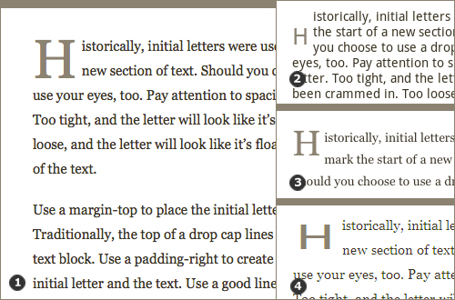
Figure 9: A simple initial cap similar to those used in the 1480 Printed Latin Bible shown in Figure 5 above. [1] Creating a class for the drop cap without a background image holds up across 76 of the 82 browser-version-operating system combinations tested. [2] The drop cap lost styling on the Opera Mini 5.1 (Android 2.2). [3] It shifted up on Mobile Safari 4.0.5 (iPhone 4, iPhone 3GS), resulting in an awkward space below the image. [4] The letter was cut off on Windows Vista IE7, Windows XP IE7, and Windows XP IE6.
HTML for the “Span Class, No Image” Example
<p><span class="dropcap">H</span>istorically,… </p>CSS for the “Span Class, No Image” Example
.dropcap{
    float:left;
    font-size:400%;
    margin-top:14px;
    margin-right:5px;
    color:#8C8273;
    }
Note that I added a margin-right of 5px in this version. The letter H worked well with this amount of space. The margin-right may need to change depending on the shape of the letter being used as a drop cap.
View the original Span Class, No Image example HTML document.
Method 4: First-Child:First-Letter
When it comes to consistency, using a p:first-child:first-letter is the least successful (Figure 10). It posed problems with the same 6 combinations as the Span Class, No Image method above—Opera Mini 5.1 (Android 2.2), Mobile Safari 4.0.5 (iPhone 4, iPhone 3GS), Windows Vista IE7, Windows XP IE7 and Windows XP IE6—and had inconsistent placement in the remaining 76 combinations tested. When setting the original drop cap placement for Firefox, 31 combinations remained properly aligned. The drop caps in the remaining 44 combinations were too high.
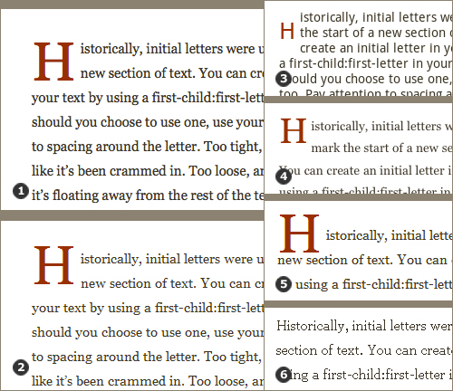
Figure 10: A rubricated (red) initial cap similar to those used in the 1476 and 1480 early printed books shown in Figures 3 and 5 above. [1] Using first:child-first:letter to create the drop cap resulted in proper placement in 31 of the 82 browser-version-operating system combinations tested. Note: the original placement was determined viewing the page in Firefox. [2] The drop caps in 45 versions were too high, resulting in an odd relationship between the drop cap and the text. [3] The drop cap lost styling on the Opera Mini 5.1 (Android 2.2). [4] It shifted up on Mobile Safari 4.0.5 (iPhone 4, iPhone 3GS), resulting in an awkward space below the image. [5] Again, the letter shifted up (Windows Vista IE7, Windows XP IE7), allowing one of the lines of text to move over and creating an awkward relationship with the text. [6] The letter lost all styling (including space) in Windows XP IE6.
HTML for the “First-Child:First-Letter (Firefox)” Example
<p>Historically, initial letters… </p>CSS for the “First-Child:First-Letter (Firefox)” Example
p:first-child:first-letter{
    float:left;
    font-size:400%;
    margin-top:7px;
    margin-right:5px;
    color:#992E00;
    }
View the original First Letter, FireFox example HTML document.
Testing for Accessibility: VoiceOver
Before deciding which of the four methods is best, I wanted to test them all for accessibility. Getting type to look good sometimes means choosing presentational markup over semantic markup—which can affect how well a screen reader reads a Web page.
Using VoiceOver on the mac (Safari 5.1.1), only the First-Child:First-Letter method was read correctly. The other three methods use a class to separate the drop cap from the rest of the text; VoiceOver verbally separates the initial letter from the rest of the word (e.g. “H”… “istorically”).
Thus, the method that is least successful visually is most successful in terms of accessibility. So I decided to do some more testing before choosing a best method.
Method 4 Revisited: First-Child:First-Letter—Placement Based on Both Firefox and Windows 7 IE8
Using a p:first-child:first-letter is still the least consistent method. It posed problems with the same 6 combinations as the First-Child:First-Letter method above—and continued to have inconsistent placement in the remaining 76 combinations tested.
But when I increased the size of the drop cap and set the original placement based on simultaneously considering the results in both Firefox and Windows 7 IE8, the shift in placement didn’t feel as random (Figure 11). Some drop caps align with the baseline of the second line of text (Figure 11:1). Some align with the top of the first line of text (Figure 11:2). There is too much space below the drop caps that align to the top—creating a white square that pops out and calls attention to itself—but if one is a stickler for accessibility and semantic markup, this method could work.
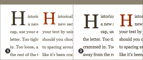
Figure 11: When working with first-child:first-letter, simultaneously consider multiple browsers when placing the drop cap. [1] The revisited drop cap, viewed in Windows 7 IE8. The letter aligns nicely with the baseline of the second line of text. My original first-child:first-letter drop cap (in red) didn’t line up with anything when viewed in Windows 7 IE8. The placement looked random. [2] The same revisited drop cap when viewed in Firefox. The drop cap continues to come in lower, but due to carefully chosen font-size and margin-top, it continues to align with the top of the first line of text. My original first-child:first-letter dop cap (in red) was perhaps more successful. It didn’t have the white space below it when viewed in Firefox. The first-child:first-letter method is not perfect, but might be a good choice when aiming for accessibility.
HTML for the “First-Child:First-Letter (revisited)” Example
<p>Historically, initial letters… </p>CSS for the “First-Child:First-Letter (revisited)” Example
p:first-child:first-letter{
    float:left;
    margin-top:7px;
    font-size:70px;
    margin-right:5px;
    color:#3D3529;
    }
View the original First Letter, Revisited example HTML document.
Letter Shapes And Letterspacing
Letters have different shapes (round, triangular, open, and square) which means they have different amounts of visual space around them (Figures 12 and 13).

Figure 12: The letters A and T naturally have more visual space than the letters O and M. Font designers adjust letterspacing so letters appear more even in text; the A and T are “tightened” in the final font.

Figure 13: Letter shapes and letterspacing change from font to font. Various Os have different visual space.
A well-designed font takes into account the varying amounts of visual space. Triangular and open letters are designed with tighter letterspacing (space is taken out). Square letters are designed with looser letterspacing (space is added). This approach to spacing is great in text; if type designers didn’t adjust spacing in a font, we’d end up with big gaps of space in the middle of words! But unfortunately, adjusted letterspacing creates problems in drop caps.
Letterspacing and the “Span Class, No Image” Method
Figure 14 shows various letters set as drop caps using the Span Class, No Image method. In Figure 14:1, the letters O and T look great, but the other four letters (C, A, K, L) are all a bit too tight to the text. In fact, the A and L look like they belong with the second line of their texts! (“A use various…” “Lit’s an open…”) Due to their open or triangular shapes, C, A, K and L have slightly tightened letterspacing in the font. This makes them look tight when used as drop caps, even though all the letters are set with the same right-margin: 5px.
In Figure 14:2, the letters are more comfortably spaced with their texts. Each letter has a unique class styled with an appropriate margin to each. Right margins range from 5px to 8px.
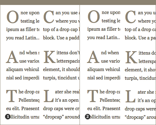
Figure 14: Different letters need a different amount of right margin. [1] The O and T have appropriate space around them. The other letters are too tight to their texts. [2] Using a unique class for each letter, right margins have been adjusted. The change is subtle, but the L no longer looks like it belongs with the second line of text!
HTML for the “Span Class Letterspacing” Example
<p><span class="dropcap_o">O</span>nce upon a time,... </p>
<p><span class="dropcap_a">A</span>nd when she tested... </p>
<p><span class="dropcap_t">T</span>he drop caps used... <p>
<p><span>C</span>an you use... </p>
<p><span>K</span>ittens don’t... </p>
<p><span class="dropcap_l">L</span>ater she realized... </p>CSS for the “Span Class Letterspacing” Example
.dropcap_a, .dropcap_c, .dropcap_k, .dropcap_l,.dropcap_o, .dropcap_t {
    float:left;
    font-size:370%;
    margin-top:14px;
    color:#8C8273;
    }
.dropcap_o,.dropcap_t{
    margin-right:5px;
    }
.dropcap_k {
    margin-right:6px;
    }
.dropcap_a, .dropcap_c {
    margin-right:7px;
    }
.dropcap_l{
    margin-right:8px;
    }
View the original Span Class Letterspacing example HTML document.
Letterspacing and the “First-Child:First-Letter” Method Letter shapes and letterspacing create similar problems in drop caps set using the First-Child:First-Letter method. In Figure 15, there is a generous space between the O and its text. The A, on the other hand, is too tight and looks like it belongs with the second line (“A various letters…”). Look at the O again; the curved bottom of the letter adds visual space and makes it look like it’s floating higher than the A and T in relation to the text.
The T has the best spacing—it’s tighter than the O and looser than the A—but creates an odd enclosed white space between the stem (the vertical stroke) of the T and the text. This happens when using the First-Child:First-Letter method because we have less control over the vertical placement of the drop cap (remember, we have to compromise size and placement to achieve the best results across browsers).
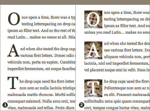
Figure 15: Two methods that apply identical spacing to every drop cap. [1] Using first-child:first-letter creates inconsistent visual space if different letters are used as drop caps on a web site. [2] Using an image behind the drop cap creates a consistent visual space for the drop caps to inhabit.
Unfortunately, we can’t adjust the letterspacing; it’s not possible to create 26 unique versions of first-child:first-letter and style them using only HTML and CSS. (If anyone has figured out a solution, please share it with us in the comments.) Thus a website using the First-Child:First-Letter method will be riddled with awkwardly spaced drop caps.
Letterspacing and the “Image Replacement” and “Letter Over an Image” Methods
Both the Image Replacement method and the Letter Over an Image method (Figure 15:2) have appropriate spacing regardless of the letter used. These methods set a consistent width to hold the image; variations in letterspacing take place within the image border—not between the drop cap and the text.
But what if you want to use the image replacement method to insert images of drop caps that don’t have a consistent width?
Figure 16 shows various letters set as drop caps using the Image Replacement method; without a background, the drop caps no longer have a consistent width. In the left panel (Figure 16:1), the letter M looks great, but the letters O and I have awkward spaces between the drop cap and the text. This variation in spacing is not due to letterspacing in the font; it occurs because the letters themselves have different widths. In the right panel (Figure 16:2), the letters are more comfortably spaced with their texts. Each letter has a unique class styled with an appropriate width. Widths range from 41px to 85px.
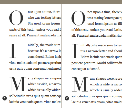
Figure 16: Letter width can also affect the amount of visual space around a letter. [1] The M has appropriate space around it. The O and I are narrower, so the space provided is too wide. [2] Using a unique class for each letter, widths have been adjusted.
HTML for the “Image Replacement, No Background” Example
<p><span class="drop_o o">O</span>nce upon a time... </p>
<p><span class="drop_i i">I</span>nitially, she made sure... </p>
<p><span class="drop_m m">M</span>any shapes were... </p>
Note that I used two classes for each span. This allowed me to use one class (drop_o) to style the space, and use another class (o) to specify the image of the letter.
CSS for the “Image Replacement, No Background” Example
.drop_o, .drop_i, .drop_m{
    display:block;
    float:left;
    height:72px;
    margin-top:8px;
    text-indent: -9000px;
    }
.drop_o {
    width:73px;
    }
.drop_i {
    width:41px;
    }
.drop_m {
    width:85px;
    }
.o{
    background: url(images/didot_o.jpg) 0 0 no-repeat;
    }
.i{
    background: url(images/didot_i.jpg) 0 0 no-repeat;
    }
.m{
    background: url(images/didot_m.jpg) 0 0 no-repeat;
    }
Note that I set the height of the space to the same dimensions as the image used to represent the drop cap. The widths are wider than the images; width provides a margin of space between the drop cap and the text.
View the original Image Replacement, No Background example HTML document.
The Best Method: Merging Tradition And Technology
Balancing issues of consistency, accessibility, and letterspacing, I recommend using either Method 1: Image Replacement or Method 2: Letter Over an Image. Both hold up well across most browsers tested; both methods allow Web designers to create elegant, decorative drop caps.
If you absolutely do not want to use images for your drop caps, then I recommend using Method 3: Span Class, No Image.
Drop Caps Do Not Promote Readability
Some may disagree with my recommendation and say that First-Child:First-Letter is a better choice due to accessibility issues; it was the only method to work properly with VoiceOver.
I understand that argument – I usually aim for accessibility. But when it comes to drop caps, I find the screen reader’s “incorrect” verbalization is ironically closer to the experience a sighted reader has. When reading text with a drop cap, we always “read” the letter, then the partial word, and then have to piece the two together. (Try it with Figure 16 above. Do you read “O” and then “nce” and then do a bit of mental gymnastics to read the word “Once?”)
The visual separation caused by using a drop cap interferes with word recognition for everyone. Drop caps are decorative elements. When we use them, we are setting a tone—often at the expense of readability.
Beautiful Drop Caps Can Be Inserted into the HTML Automatically
One could argue that First-Child:First-Letter is still a better choice because it eliminates the need to insert syntax in the HTML for every drop cap. Using first-child:first-letter, drop caps are created automatically.
But there’s another way to automatically create drop caps. With a little javascript you can insert span classes (with or without images) into your HTML. You can even create multiple unique classes (e.g. 52 classes, two for each letter) and articulate which class—or classes—to apply.
Jason Lynes of NorthTemple.com provides a clearly written case study on using jQuery and CSS to insert Image Replacement drop caps. Lynes’ case study highlights an article for the LDS Church. I’m not inviting conversation about the content of the article; I am providing the case study as an excellent tutorial on “automating” drop caps with jQuery and CSS.
I’ve tested Lynes’ method – I used it to create a page of Span Class, No Image drop caps. It works like a charm and degrades beautifully (drop caps revert to plain text on browsers that are not javascript enabled). View my original Span Class, jQuery example HTML document.
Beautiful Drop Caps Take Time and Effort
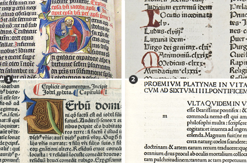
Figure 17: Another look at initial caps from (clockwise from top left) 1407, 1476, 1480, and 1479. [1] Two of the initial caps are painted with care. [2] The other two are examples of “quick solutions” to initial caps: a set of hastily written caps and an initial space set aside for an artisan to fill in.
Deciding to use drop caps on a website means making a conscious choice to use a primarily decorative element. Unlike initial caps in manuscripts and incunabula, a drop cap on the Web doesn’t add value in terms of usability or readability; its main purpose is to look good. And making a drop cap look good—whether in a manuscript, an incunabula, or on the Web—takes time (Figure 17).
Even if we automate our drop caps with jQuery, we need to do the preliminary work—make images, test letterspacing, and set up 26 (or 52) unique classes. Creating beautiful, high quality drop caps may sound like a chore, but we are continuing a respected tradition that is almost two thousand years old. When we look back through history, we see the best initial caps have always taken time and effort.


 Claim Your Free Spot!

 SurveyJS: White-Label Survey Solution for Your JS App
 Register Free Now


