Why Subtle Typographic Choices Make All The Difference

Email Newsletter
Weekly tips on front-end & UX.
Trusted by 182,000+ folks.
 See the full picture →
 Celebrating 10 million developers
 SurveyJS: White-Label Survey Solution for Your JS App

A strong understanding of how designers control meaning is essential for anyone interested in graphic design or typography. In a previous article, we discussed how sophisticated and complex visual and verbal language can get, examining instances that show how type can be used to effectively take control of meaning.
In this article, we’ll look at the reasons why subtle typographic changes can create considerable effect. We’ll refer to one or two linguistic and semiotic examples, as well as design case studies, to get to grips with why subtle changes can make all the difference.
Further Reading on SmashingMag:
- Letters Do Not Stand By Themselves
- Benton Modern, A Case Study On Art-Directed Web Typography
- The Good, The Bad And The Great Examples Of Web Typography
- Design Or Get Undesigned
Let’s consider a couple of simple sentences: “The boy walks a dog” and “The boy walks the dog.” The meanings are significantly different simply by the change of one small word. “A dog” is any old dog, while “the dog” is one we know and recognize. Similarly, small changes in typography can fundamentally alter impact and interpretation. For example, type size can be increased, the weight or font can be changed, and positioning within a frame altered; with each alteration, the meaning also changes. An authoritative, urgent, big, bold “STOP” suddenly becomes more lighthearted and less weighty and might even come across as teasing when rendered as “Oh, stop, stop it! I like it!”


Two visualizations of the same word but with typographic treatments that have entirely different emphases and meaning. (Credit: Bright Pink Communication Design)
The last couple of examples stem from the ideas of one of the fathers of 20th-century linguistics, Ferdinand de Saussure, who felt that each word (or “sign”) had one specific meaning (signification). Applying this concept to typography, de Saussure’s principles imply that each typeface and design choice carries a predetermined meaning. Just as in the two sentences about “the” and “a” dog and the two visuals showing different takes on “Stop,” each has a significantly different meaning. (To read about de Saussure’s ideas in depth, see Course in General Linguistics.)
However, meaning comes not simply from comparing one visual interpretation to another. As de Saussure suggests, meaning is also established by the context in which visuals are set. This idea, from 20th-century French philosopher Roland Barthes, is known as “secondary signification.” Barthes notes that a visual interpretation (sign) does not have just one meaning, as might be deduced from de Saussure’s work, but that a second socially and culturally specific meaning can be gleaned from the context in which the visual treatment appears. In Western society, you can find an example of this in the typographic styling of fashion brand Juicy Couture.

The name style of an iconic fashion brand.
The gothic letterforms are seen by the brand’s target audience as being the height of fashion and desirability. To some, however, the same typeface in a different context would imply tradition, heritage, reputation and possibly even political persuasion. A more traditional use of this style of font can be found in the masthead of the UK newspaper The Telegraph.

The online masthead of one of the UK’s premier newspapers.
Type undoubtedly plays a role in the creation of meaning, but connotation does, too. For example, the distinct stylings of handwritten text can be deliberately used to bring a range of meanings to a message. On the page from Ben and Jerry’s website shown below, we can discern economy, personal concern and friendliness, but look at how the casual font gets you to drop your guard for just a moment. This allows Ben and Jerry’s to talk about something as serious as citizenship, when you expect it to be talking about imaginative ice-cream flavors!

A page from the website of Ben and Jerry’s charitable foundation.
In a 2010 UK Volkswagen ad campaign designed by DDB UK, what appears to be slightly innocent, carefully hand-lettered text reinforces the message that the operating costs of a Volkswagen Golf car are 18% cheaper than the (unspecified) competition. This typographic approach also communicates the secondary yet equally important message that Volkswagen cars are affordable to purchase and that the company doesn’t produce extravagant, expensive ads — all to keep prices low for customers.

Ad for the Volkswagen Golf
Typography That Reinforces Meaning And Context
In their book Reading Images: The Grammar of Visual Design, Gunther Kress and Theo van Leeuwen confirm the role of the visual aspect of typography.
The visual component of text is an independently organized and structured message, connected with the verbal text, but in no way dependent on it and similarly the other way round.
Amazingly, we are conditioned to relate certain typographic styles, colors, shapes and patterns to certain products and situations. For example, you are not likely willing to clean your teeth with paste that comes out of a pack covered in brown, lightweight serif type. When aligned with our expectations, visual language can make a stronger impact than verbal meaning. Returning to our first example, the word “STOP” could now say “LOVE” and still be seen as an authoritative, urgent, big, bold warning sign.
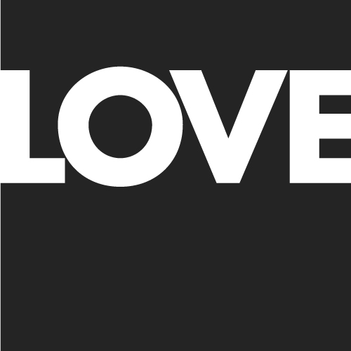
A typographic treatment that asserts “LOVE” as a powerful, consuming emotion. (Credit: Bright Pink Communication Design)
The impact that can be achieved by designers being involved in the writing or editing of copy is dramatic. If we combine the eloquence of the copywriter with the knowledge and skill of the designer or typographer, we are able to achieve surprising yet totally cohesive solutions to design problems. Words carefully selected not only for their literal meaning but also for their sound, length and shape can help to “sculpt” a particular message, thus enhancing its value.
An example of this level of collaboration can be found in the promotional brochure for UK homebuilders Wimpey. As with most consumables, all new homes could be said to share many similar characteristics, and most homebuilders could be said to employ similar promotions, language and terminology. So, vendors need to be distinctive in order to create that must-have feeling.

The synergy of type and language in this UK home-buying brochure builds atmosphere and maximizes desirability. (Image: Bright Pink Communication Design)
This double-page spread features an extract from the poem “Spring” by Christina Rossetti. Its descriptive tone not only conveys the development site’s proximity to the countryside and nature, but is also used as a pleasing metaphor for putting down roots and starting a new life.
The typographic treatment of the Rossetti poem emphasizes certain words both for their meaning and for their sound and shape. The highlighted words function as a group on their own, in addition to being integral to the poem as a whole. The poem allows the designer to be deliberate with the line lengths, with the words sitting comfortably together as a staggered group, complementing the other compositional elements on the page.
The result of collaboration between writer and designer is demonstrated in many of the promotional products of Ben and Jerry’s. Ice cream flavors are given humorous names and descriptions, accompanied by energetic design and typographic exuberance. This careful approach reinforces the message that Ben and Jerry’s is a speciality product — even handmade — produced with high-quality ingredients by caring individuals with a sense of humor and eye to all things fun.


There is a full range of Ben and Jerry’s highly memorable ads in its online gallery (currently unavailable).
The ads, which are done tongue in cheek, focus on the ingredients in the ice cream and suggest that competing products might not have the same quantity and quality of ingredients that consumers expect. The illustrations capture the hand-drawn style mentioned earlier and also heighten the customer’s anticipation — the cherries are drawn extra large and juicy; the nuts are varied and plentiful. The typography has been carefully selected to drive home these characteristics and get your taste buds moving and convince you that Ben and Jerry’s is the only ice cream worth eating.
Of course, endless examples can be found of how subtle typographic choices make all the difference. Whether designers and writers work together or independently, fine-tuning their words and designs can lead to clever and effective results. And yet there is no doubt that understanding the implications of typographic details and the use of verbal language enables us to maximize communication. Effective design begets effective communication, and while major design decisions are obviously important, the little things often make all the difference.
(al) (il)
Note: A big thank you to our typography editor, Alexander Charchar, for preparing this article.


