Let’s Play With Hardware-Accelerated CSS
In the context above, performance is usually about measurable aspects such as loading time and responsiveness to user interaction. But more often than not, statements about performance lie within the realm of animations and transitions and how smooth they are. [Links checked February/21/2017]
Further Reading on SmashingMag:
- Hardware Hacking With JavaScript
- GPU Animation: Doing It Right
- Prioritizing Devices: Testing And Responsive Web Design
How Do We Get Smoother Transitions In A Mobile Web App?
We humans tend to perceive a transition as being “smooth” when the number of frames per second (FPS) drawn on the screen is above a certain cognitive threshold — about 30 or so, arguably. And one of the things that native apps have been particularly better at than Web apps is keeping the FPS high while swiping, tapping, pinching, executing and all other such verbs that were nonexistent a little over six years ago.
This is possible because native applications can access the device’s graphical processing unit (GPU) to make pixels fly. Web applications, on the other hand, run in the context of the browser, which lets the software do most (if not all) of the rendering, resulting in less horsepower for transitions. But the Web has been catching up, and most browser vendors now provide graphical hardware acceleration by means of particular CSS rules.
Knowing this is the key to getting smoother transitions on mobile Web apps. But this is old news, you say?
For some it may be, because it has been around for a while and has found its way into respected mobile Web frameworks such as Sencha’s line of products. But if you’re doing any custom CSS or jQuery magic, then knowing how to kick those FPS up a notch manually is useful. So, in the name of science (and some good fun), let’s get our hands dirty.
Time To Roll Up Our Sleeves
We’re going to build a fun little slideshow that…
- uses hardware acceleration
- to present five full-screen slides
- of kittens
- to swipe through
- with a perfect touch:pixel ratio,
- that snap smoothly from one slide to the next,
- and that work on desktops, phones and tablets
- in portrait and landscape mode
- and throws Apple’s patented rubber-band-effect in the mix as a bonus,
- all in under 50 lines of code.
Really? Yes. Let’s get started!
First, we’ll create a simple HTML page that provides five full-screen slides of kittens, courtesy of placekitten, and allows you to scroll through them. The page will consist of a single #slides container with five .slide elements, each of which has a background image stretched by CSS to fully cover the slide.
<!doctype html>
<html>
   <head>
      <meta name="viewport" content="width=device-width, initial-scale=1, user-scalable=no"/>
      <link href="style.css" type="text/css" rel="stylesheet" />
   </head>
   <body>
      <div id="slides">
         <div class="slide"></div>
         <div class="slide"></div>
         <div class="slide"></div>
         <div class="slide"></div>
         <div class="slide"></div>
      </div>
   </body>
</html>
Most of this is fairly straightforward. We’re using well-known viewport meta tag to prevent user scaling:
<meta name="viewport" content="width=device-width, initial-scale=1, user-scalable=no"/>Note: We’ll use the -webkit- vendor prefix in the demo files just for the sake of keeping the code short, and we’ll stick to vanilla div elements and forget about user scaling to limit the scope of this article. This article does not attempt to be an example of how to make a cross-browser example for all mobile devices out there, but to illustrate the difference that GPU acceleration can make on mobile devices and—as the title suggests—“play” with it and get your coding hands dirty. In general, we should use prefixes for all browsers (at least the major ones) that support that feature (or plan to do so in near future): -moz-, -ms-, -o-, and -webkit-.
The style.css file will start with the following:
html, body {
  height: 100%;
}

body {
  margin: 0;
  overflow: visible;
  background: #333;
}

#slides {
  width: 100%; height: 100%;
  white-space: nowrap;
  font-size: 0;
  -webkit-transform: translate3d(0,0,0);
  -moz-transform: translate3d(0,0,0);
  -ms-transform: translate3d(0,0,0);
  -o-transform: translate3d(0,0,0);
  transform: translate3d(0,0,0);
}

.slide {
  width: 100%; height: 100%;
  display: inline-block;
  background-size: cover;
}

.animate {
  -webkit-transition: all .3s ease-out;
  -moz-transition: all .3s ease-out;
  -ms-transition: all .3s ease-out;
  -o-transition: all .3s ease-out;
  transition: all .3s ease-out;
}

.slide:nth-child(1) { background: url(https://placekitten.com/640/480);}
.slide:nth-child(2) { background: url(https://placekitten.com/641/480);}
.slide:nth-child(3) { background: url(https://placekitten.com/642/480);}
.slide:nth-child(4) { background: url(https://placekitten.com/643/480);}
.slide:nth-child(5) { background: url(https://placekitten.com/644/480);}
Let’s look at the #slides declaration:
#slides {
  width: 100%; height: 100%;
  white-space: nowrap;
  font-size: 0;
  -webkit-transform: translate3d(0,0,0);
  -moz-transform: translate3d(0,0,0);
  -ms-transform: translate3d(0,0,0);
  -o-transform: translate3d(0,0,0);
  transform: translate3d(0,0,0);
}
Our #slides div is set to be full screen. Because we’re using the html doctype, we also needed to make our html and body elements take up 100% of the width and height. The #slides container requires that none of its .slide children wrap, and the 0 font size removes any gaps between the slides when displayed horizontally.
The slides will be aligned like so:

The alignment of images used in our demo.
However, only one slide will be visible at a time in full screen. The semi-transparent red box below represents the browser’s full screen.

Only one slide will be visible at a time.
Then we’ll use the hardware-accelerated -webkit-transform: translate3d CSS rule to “translate” the slides’ horizontal (x) position to the left or right.
The WebKit blog describes translate3d as follows:
translate3d(x, y, z), translateZ(z) Move the element in x, y and z, and just move the element in z. Positive z is towards the viewer. Unlike x and y, the z value cannot be a percentage.
The fun part is that WebKit also offers a simpler 2D method that does the same thing: translate(x, y). But translate3d(x, y, z) uses the GPU, and that’s what we want. For now, we’ll set it to (0,0,0):
transform: translate3d(0,0,0);The following line makes sure that the slide’s background covers the entire element, regardless of its width or height:
background-size: cover;The combination of our viewport meta tag that sets the page’s width to device-width and each slide being 100% in width and height makes our application work full screen on desktops, tablets and mobiles, regardless of the viewport’s initial width. For instance, if you open up the page on an iPhone and scroll just a tiny bit to the left, you’ll see that the next slide is already entering the screen from the right:

Screenshot of our app on the iPhone, scrolled just a tiny bit to the left.
It doesn’t even matter whether you start in portrait or landscape mode (although today we won’t be adding support for adjusting to changes in orientation once the app has loaded).
To animate the slides to snap into view, we’ll define an extra class, named animate:
.animate {
  transition: all .3s ease-out;
}
This is a CSS3 transition that tells Webkit to animate all of its properties using the ease-out path over 300 milliseconds.
We use the CSS3 nth-child pseudo-class to make each slide display a different kitten in an image of the given width and height. We specify different dimensions in order to get different images because that’s how placekitten works.
.slide:nth-child(1) { background: url(https://placekitten.com/640/480);}
.slide:nth-child(2) { background: url(https://placekitten.com/641/480);}
.slide:nth-child(3) { background: url(https://placekitten.com/642/480);}
.slide:nth-child(4) { background: url(https://placekitten.com/643/480);}
.slide:nth-child(5) { background: url(https://placekitten.com/644/480);}
Let’s open this up in Chrome or Safari on a desktop. This is what you should be seeing right now:

Our Web app so far, without any code.
That’s right. We see only one kitten presented full screen and a large horizontal scroll bar that grants access to the other four slides. Right now, there’s no animation and no sliding other than the default scrolling behavior.
Adding The Page Slide Effect
Our approach to swiping each slide into view is for the user to hold down their finger or mouse and then move the entire #slide container, along with all of the slides in it. When the user stops moving, we let the browser animate the next (or previous) slide into view by means of a CSS transition. You can fine-tune or add to this basic set-up a lot afterwards if you like.
OK, first we need change overflow: visible to overflow: hidden in the body element’s CSS declaration to get rid of the default scrolling functionality.
body {
  margin: 0;
  overflow: hidden;
  background: #333;
}
Then, we include jQuery and our own script.js file just before the closing body tag:
<script src="https://ajax.googleapis.com/ajax/libs/jquery/1.7.1/jquery.min.js"></script>
<script src="script.js"></script>
Below is the entire contents of script.js. It consists of three methods: slideStart, slide and slideEnd.
$(function () {
  var sliding = startClientX = startPixelOffset = pixelOffset = currentSlide = 0,
  slideCount = $('.slide').length;

$('html').live('mousedown touchstart', slideStart);
  $('html').live('mouseup touchend', slideEnd);
  $('html').live('mousemove touchmove', slide);

function slideStart(event) {
    if (event.originalEvent.touches)
      event = event.originalEvent.touches[0];
    if (sliding == 0) {
      sliding = 1;
      startClientX = event.clientX;
    }
  }

 function slide(event) {
    event.preventDefault();
    if (event.originalEvent.touches)
      event = event.originalEvent.touches[0];
     var deltaSlide = event.clientX - startClientX;

if (sliding == 1 && deltaSlide != 0) {
      sliding = 2;
      startPixelOffset = pixelOffset;
    }

if (sliding == 2) {
      var touchPixelRatio = 1;
      if ((currentSlide == 0 && event.clientX > startClientX) ||
          (currentSlide == slideCount - 1 && event.clientX < startClientX))
        touchPixelRatio = 3;
      pixelOffset = startPixelOffset + deltaSlide / touchPixelRatio;
      $('#slides').css('transform', 'translate3d(' + pixelOffset + 'px,0,0)').removeClass();
    }
  }

function slideEnd(event) {
    if (sliding == 2) {
      sliding = 0;
      currentSlide = pixelOffset < startPixelOffset ? currentSlide + 1 : currentSlide - 1;
      currentSlide = Math.min(Math.max(currentSlide, 0), slideCount - 1);
      pixelOffset = currentSlide * -$('body').width();
      $('#temp').remove();
      $('<style id="temp">#slides.animate{transform:translate3d(' + pixelOffset + 'px,0,0)}</style>').appendTo('head');
      $('#slides').addClass('animate').css('transform', ’);
    }
  }
});
Our Code Explained
Let’s go over these lines of code, shall we?
Within the local scope that jQuery so kindly presents us with $(function() { … });, we start by defining a few required variables, which we’ll explain later. We’ll add cross-platform listeners for basic “dragging” functionality, which we’ll use to do the page sliding:
$('html').live('mousedown touchstart', slideStart);
$('html').live('mouseup touchend', slideEnd);
$('html').live('mousemove touchmove', slide);
The slideStart Method
The slideStart method is triggered on a mousedown or touchstart event; and for cross-platform-ness, we’ll redefine the event parameter to the first touch property in our touches collection (i.e. the first finger) — if we’re on a mobile device, that is:
function slide(event) {
  if (event.originalEvent.touches)
    event = event.originalEvent.touches[0];
Then, we detect whether the user is not sliding yet (sliding == 0) and store the mouse or touch position where the user initiated the slide:
if (sliding == 0) {
  sliding = 1;
  startClientX = event.clientX;
}
The Slide Method
Next, we’ll look at the slide method. This line stores the number of pixels that we’ve moved since our mousedown or touchstart event:
var deltaSlide = event.clientX - startClientX;So, if sliding was recently set to 1 and deltaSlide is not 0, then that means the user has moved for the first time! We can consider this the actual “slide start” event. Then, we set sliding to 2 (which means the user is actually moving), and we store the current pixels that the entire #slides container was already changed to:
sliding = 2;
startPixelOffset = pixelOffset;
If sliding is set to 2, then that means the user was already moving. So, we set touchPixelRatio to its initial value of 1, which means that the user is sliding exactly 1 pixel for every pixel of mouse or touch movement:
if (sliding == 2) {
  var touchPixelRatio = 1;
So, what does the following code do then?
if ((currentSlide == 0 && event.clientX > startClientX) ||
    (currentSlide == slideCount - 1 && event.clientX < startClientX))
  touchPixelRatio = 3;
Setting touchPixelRatio to 3 means the user has to move their mouse or finger by 3 pixels just to offset the slides by 1 pixel. See what we’re getting at here? Exactly: Apple’s rubber-band effect! The code above checks whether the user is sliding the first slide to the right or the last slide to the left. If they’re doing this, then we set touchPixelRatio to 3.
Then, we calculate the number of pixels that we need to offset #slides.
pixelOffset = startPixelOffset + deltaSlide / touchPixelRatio;To make the offset in pixels visible, we could use CSS left positioning or a negative left margin, but neither is hardware accelerated. That’s why we’ll use transform:translate3d(x, y, z) to make the offset final:
$('#slides').css('transform', 'translate3d(' + pixelOffset + 'px,0,0)').removeClass();So, we move x by the pixelOffset’s number of pixels, and we leave y and z alone. The removeClass() will remove the snapping .animation class that we will add in the slideEnd method, which we’ll now dive into.
The slideEnd Method
When the user stops sliding, we want the previous or next slide to smoothly animate into view. First, we need to know which slide should be in view:
function slideEnd(event) {
  if (sliding == 2) {
    sliding = 0;
    currentSlide = pixelOffset < startPixelOffset ? currentSlide + 1 : currentSlide - 1;
Then we min and max it out between 0 and slideCount:
currentSlide = Math.min(Math.max(currentSlide, 0), slideCount - 1);The value of the final pixelOffset is simple: it’s the viewport’s full width in pixels multiplied by the currentSlide’s number. And because we’re offsetting pixels to the left, we want the negative result:
pixelOffset = currentSlide * -$('body').width();Almost there. First, take a look at this line of code:
$('<style id="temp">#slides.animate{transform:translate3d(' + pixelOffset + 'px,0,0)}</style>').appendTo('head');This is the simplest approach to dynamically adding a new CSS rule. We create a style element, with an animate class applied to #slides, which would have changed its translate3d offset to the full slide’s pixeloffset. But because our original style.css file has this line…
So, what does the following code do then?
if ((currentSlide == 0 && event.clientX > startClientX) ||
    (currentSlide == slideCount - 1 && event.clientX < startClientX))
  touchPixelRatio = 3;
Setting touchPixelRatio to 3 means the user has to move their mouse or finger by 3 pixels just to offset the slides by 1 pixel. See what we’re getting at here? Exactly: Apple’s rubber-band effect! The code above checks whether the user is sliding the first slide to the right or the last slide to the left. If they’re doing this, then we set touchPixelRatio to 3.
Then, we calculate the number of pixels that we need to offset #slides.
pixelOffset = startPixelOffset + deltaSlide / touchPixelRatio;To make the offset in pixels visible, we could use CSS left positioning or a negative left margin, but neither is hardware accelerated. That’s why we’ll use transform:translate3d(x, y, z) to make the offset final:
$('#slides').css('transform', 'translate3d(' + pixelOffset + 'px,0,0)').removeClass();So, we move x by the pixelOffset’s number of pixels, and we leave y and z alone. The removeClass() will remove the snapping .animation class that we will add in the slideEnd method, which we’ll now dive into.
The slideEnd Method
When the user stops sliding, we want the previous or next slide to smoothly animate into view. First, we need to know which slide should be in view:
function slideEnd(event) {
  if (sliding == 2) {
    sliding = 0;
    currentSlide = pixelOffset < startPixelOffset ? currentSlide + 1 : currentSlide - 1;
Then we min and max it out between 0 and slideCount:
currentSlide = Math.min(Math.max(currentSlide, 0), slideCount - 1);The value of the final pixelOffset is simple: it’s the viewport’s full width in pixels multiplied by the currentSlide’s number. And because we’re offsetting pixels to the left, we want the negative result:
pixelOffset = currentSlide * -$('body').width();Almost there. First, take a look at this line of code:
$('<style id="temp">#slides.animate{transform:translate3d(' + pixelOffset + 'px,0,0)}</style>').appendTo('head');This is the simplest approach to dynamically adding a new CSS rule. We create a style element, with an animate class applied to #slides, which would have changed its translate3d offset to the full slide’s pixeloffset. But because our original style.css file has this line…
.animate {
  -webkit-transition: all .3s ease-out;
  -moz-transition: all .3s ease-out;
  -o-transition: all .3s ease-out;
  -ms-transition: all .3s ease-out;
  transition: all .3s ease-out;
}
… then a CSS animation will kick in using the hardware-accelerated translate3d property. Yay!
To clean up, we remove any existing #temp style elements from the head section prior to creating a new one:
$('#temp').remove();So, now we’ve got the current (runtime) style set to the current pixelOffset value, and the animate class is set to point #slides to the final position. All we need to do now is swap the style for a class, and the transition will take over:
$('#slides').addClass('animate').css('transform', ’);See? We’ve added the animate class and reset the style property of webkit-transform to nothing.
What Do We Have Now?
If all has gone well, we can open up our work in Chrome, Safari, iPad or iPhone and swipe through these kittens with ease. For those of you who didn’t code along, you can still see the result.
Remember when we hadn’t yet included our own JavaScript?
Our current result seems very similar to the result as viewed on an iPad or iPhone, doesn’t it? You can swipe to scroll, and it has rubber-banding. But our app snaps in between slides, and the fact that the smoothness of its scrolling is comparable to a native app’s means that hardware acceleration has indeed kicked up the user experience a few notches and brought it closer to the result otherwise seen only in native apps.
And that’s what we set out to do, isn’t it?
As icing on the cake, we can now add features such as a permanent scrub bar at the bottom; round bullets to indicate the number of slides and which slide is active; and a transparent logo to overlay the screen and have the slides move underneath it. I’ve gone ahead and added such features here, so you can view the source if you like.
Want Proof That Hardware Acceleration Is Enabled?
If the experience itself doesn’t convince you or your coworker, here’s how to know for sure that the GPU is doing the work. Surf to about:flags in Chrome, enable the FPS counter, and hit the “Relaunch now” button at the bottom of the page.
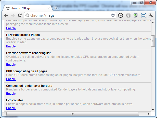
Chrome offers an FPS counter when hardware acceleration is active.
Chrome will now show a red FPS counter in the top-left corner of any screen whenever the GPU is active. If you open our demo now, this is what you’ll see:

Chrome with its FPS counter turned on, which is visible only when the GPU is active.
To see what happens when we do not access the GPU, we need to make some alterations. In style.css, remove this line from the #slides declaration entirely:
transform: translate3d(0,0,0);In script.js, replace the two occurrences of this…
translate3d(' + pixelOffset + 'px,0,0)… with this:
translate(' + pixelOffset + 'px,0)Note that the replacement translate method takes two arguments (x and y) instead of three.
Now, if you refresh the page in Chrome, you’ll see that the FPS counter is not active:

Our Web app with no FPS counter anymore.
Now that you’ve changed the sliding mechanism from translate3d to translate, try to swipe the kittens again. Notice the jagged behavior?
What Are The Cons?
We have demonstrated that using certain CSS3 properties will kick in the GPU. We have experienced smoother interaction and transitions as a result, so that’s pretty cool. But are there disadvantages to this approach?
Two come to mind — one of which might actually be a pro.
Stability
One thing to keep in mind is that the positive results we’ve seen might not be present in all hardware combinations, because these 3D CSS techniques are relatively new to the Web. On some machines you might experience no hardware acceleration, a garbled screen or no content at all depending on your GPU chip and its support by the browser.
Lucky for us, this does work on all (modern) iOS devices and quite a few newer Android gadgets. I did encounter hiccups on one iMac at the office, but its hardware chip seems to have been whitelisted recently because it seemed to work all of a sudden after the browser (Chrome) updated.
All other PCs and Macs that I tested showed positive results.
Battery Life
To be honest I don’t have statistics on this one. Using the GPU will use battery life, but it saves on CPU cycles, so I guess it could go either way. If you have any information or statistics on this, please share it in the comments below.
Final Thoughts
Knowing when and how to apply hardware acceleration to Web-based transitions and effects can be very helpful when building a mobile Web application or even a game. As the Web evolves, your options grow for creating a friendly experience for end users by speeding up basic things such as the page-sliding transitions that we covered here. And while you can safely use existing Web development frameworks and rely on them to make use of hardware-accelerated CSS when appropriate, having some hands-on experience with tweaking Web applications even further is useful.
(al) (jc)


 See User Testing Live

 Custom Web Forms for Angular, React, & Vue. Your backend.
 Celebrating 10 million developers


