Coding Q&A With Chris Coyier: Code Smell And Type On A Grid
Howdy, folks! Welcome to the new incarnation of Smashing Magazine’s Q&A. It’s going to work like this: you send in questions you have about CSS, and at least once a month we’ll pick out the best questions and answer them so that everyone can benefit from the exchange. Your question could be about a very specific problem you’re having, or it could be a question about a philosophical approach. We’ll take all kinds.
We’ve done a bit of this kind of exchange before with a wider scope, so if you enjoy reading the Q&A, check out my author archive for more of them.
Further Reading on SmashingMag:
- How To Optimize Email Newsletters With CSS
- Email Newsletter Design: Guidelines And Examples
- Typographic Patterns In HTML Email Newsletter Design
- CSS Baseline: The Good, The Bad And The Ugly
Designing For Email
Andrejs Abrickis asks:
“Sometimes I face trouble with HTML email design and the proper CSS code. It takes quite a lot of time to make it cross-client compatible. I would like to know your opinion about the best CSS reset that could help to speed up email newsletter development. Is there any good tool for testing HTML emails?”
First and foremost, I recommend keeping emails very simple. Ask yourself what the primary message of the email is and how well the current design of the email is serving that. Could it simply be text? Would it be better if it was text? I find that’s often true.
If you are certain you need to make an HTML email, I’d again err on the side of simplicity. An idea I’ve been toying around with is making the email design the size of a portrait smartphone layout. That constraint forces you to think about the message again, enforces simplicity (and as a side bonus, will look good on both mobile and desktop clients). When is the last time you got an email and thought: “Man, I wish this email was more complicated!”
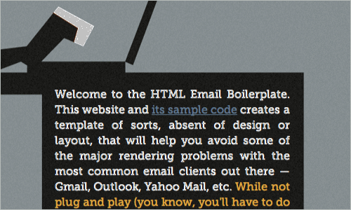
HTML Email Boilerplate provides a template of sorts, absent of design or layout, that will help you avoid some of the major rendering problems with the most common email clients out there — Gmail, Outlook, Yahoo Mail, etc.
But you wanted to know about cross-client compatibility and testing. Do check out the HTML Email Boilerplate. It was created in the same spirit as the HTML5 Boilerplate in that it addresses all the various quirks across email clients and gives an example of a very minimal structure by which to start. I’ve tried to use it as is, but I have to admit that I found it a bit too much for the simple email work I was doing. More complex and varied emails will certainly benefit from it and it’s also certainly a great reference for snagging quick problem-solving bits of code.
The two simple rules of thumb for HTML email development are:
- Use tables for layout. This is still the most sturdy layout method for cross-client.
- Inline style everything. Any other CSS support is spotty.
Designing using inline styles is a big pain in the butt, so I’d recommend developing with a <style> block in the <head> for your CSS. Save that as your development copy, and then just before deployment, run it through MailChimp’s Automatic CSS Inliner Tool which will do the dirty work of inline styling everything for you.
Speaking of MailChimp, you might want to consider just using their service to build and deploy emails. Their templates are already cross-client compatible (plus they have a testing service). Their designer tool is easy to use and helps you through the process. Not to mention, you get all these other huge benefits like better deliverability that you can’t get on your own, statistics, support, and many more features. Sorry if that sounded like an ad, but I’m all about using services that make our lives easier and better as developers.
MailChimp isn’t the only service on the block either, Campaign Monitor is also great, and do great things for the developer community, including maintaining this epic chart of CSS support for email clients.
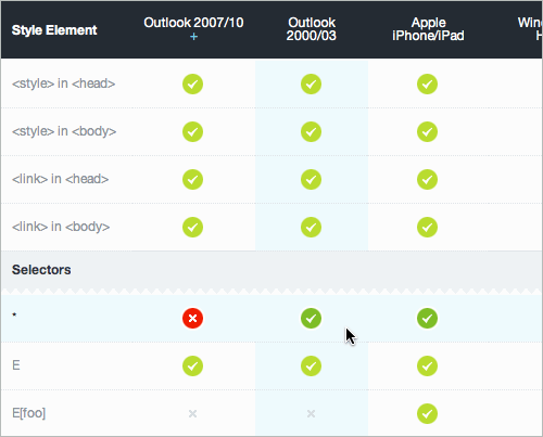
CSS support on Campaign Monitor.
Type On A Grid
Maxime Parmentier asks:
“I was wondering how you keep a consistent line-height in every element of your page? It’s much more difficult than it sounds in practice. Any tools or techniques that you can recommend?”
Often times that practice is called maintaining a “baseline grid.” Here’s a demo from a Richard Rutter article. And another demo from a Wilson Miner article. I’ve played with it myself a bit.
Dave Rupert offers a talk about responsive design, where he discusses how ems are useful for baseline grids because they are based on ratios. He also talks about how they are particularly good in the math-ridden world of responsive design. Here’s an example by Dave of type lining up nicely to a grid that also accommodates some of the weirdness of different-sized headers.
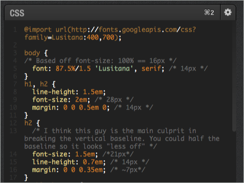
View this example.
There is a book by Khoi Vinh all about grids (including type grids) called Ordering Disorder: Grid Principals for Web Design. Khoi teaches all about grids but is clear that you don’t have to be dogmatic about them. Breaking the grid sometimes is OK, as long as you come back to it. I think a nice metaphor is syncopation in music—the rhythm is broken on purpose during a song, so that when it kicks back in, it’s noticed and feels good.
Centering And Resets
Smarajit Dasgupta asks:
“1. What is a decent browser-compatible way to center floated (or inline) elements like buttons and links in flexible (or unknown) width scenarios?2. What is your preferred CSS reset in the HTML5 age? Do you still advise the usage of the great Eric Meyer’s reset, which pretty much strips all the browser-induced styles for elements? Or do you use something such as normalize.css or write your own on a case basis?”
1. Inline elements are easy to center, as they respect the text-align value of the parent, which you can set to center. So say you have a bunch of anchor links in a row, you’d just wrap them in a nav element and apply the center text alignment to that (like this). If you need them to behave a bit more like block level elements (e.g. be of a set width or height), you can make them display: inline-block; and they will still stay centered (like this).
Unfortunately you can’t center a floated element. I’m not surprised really, as the “what happens if” scenarios surrounding that are too many to count. But just for funzies, let’s say you had two columns of text and you wanted to “center float” an image between them, meaning that the text in the left column would wrap to the left, and the text in the right column would wrap to the right. You can “fake” this by positioning two elements half the size (might as well be pseudo elements, because they have no semantic meaning) on the right-side of the left column and left-side of the right column. A picture is easier to understand:
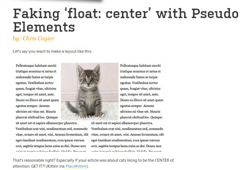
The floating kitty demo.
Then you would place the element in the space that makes sense (probably with absolute positioning). More about this idea here.
2. I like normalize.css. I don’t like the idea of stripping things away just to put them back. So my process is to take a copy of normalize.css, not remove anything, but change some declarations to my liking (which still ensures consistency, because you are being explicit). Then include that in my global style sheet like I would include a reset, and go from there.
Opacity Blues
Chris Klein asks:
“How do I stop inheritation of opacity? I can’t use another png with 50% opacity and higherz-indexabove it as the layout has to stay 100% liquid. Also, I tried to insert spans between the box with opacity and the following boxes—but the opacity still is inherited to all other boxes it follows. Even if the following boxes claimopacity: 1;, it doesn’t matter, inheritation goes on.”
There are a lot of little bits in there that make me wish we could look at the exact layout you’re working with. If the backgrounds in question are flat colors, just use RGBa or HSLa. These are both color value types you can use to declare an alpha value, which essentially means “what percentage transparent is this color?”. For instance rgba(255, 0, 0, 0.5) means “50% red”. This makes a lot more sense than using actual opacity on element, which as you know, affects everything inside (not just the background).
As you also know, opacity affects all child elements and you can’t fight against it by setting a child element’s opacity higher (the child does have full opacity by default, it’s just within a parent that doesn’t). It is like that for good reason. We would be much worse off if, in order to fade out an area of a website, we had to select theoretically infinite child elements and fade each individually.
If the background in your design isn’t a flat color, you can join the club for wishing there was a background-opacity property. One thing you may want to try are pseudo elements. Leave the main element at full opacity, but apply ::before and ::after selectors that you position as needed and apply opacity to those. Nicolas Gallagher has a demo of that.
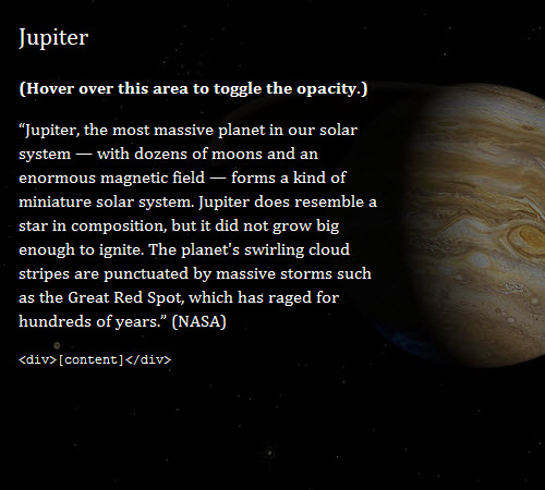
The Jupiter oppacity demo.
Border-Radius On Images
Donovan Hutchinson asks:
“Why isn’t it possible to directly applyborder-radiusto an image? And is the best approach to use a wrappingdiv?”
It is possible! You apply it just like you think you would:
img {
  border-radius: 10px;
}
Border Radius demo.
I think there was some confusion on this for a while, because in the not-so-distant past, Firefox 3.6 required the use of -moz-border-radius for rounded corners, and that implementation didn’t work on images. IE9 was the first version to support border radius and it does so un-prefixed and perfectly fine on images so even IE isn’t a concern here.
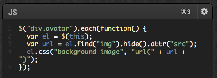
If you absolutely need Firefox 3.6 (and down) support (1.55% global usage and falling fast), yep, like you mentioned, you can get it by using a div instead and setting the background-image of the div to the src of the image. You would do that in your template wherever it spits out that URL (or if that’s not possible, with a bit of jQuery):
$("div.avatar").each(function() {
  var el = $(this);
  var url = el.find("img").hide().attr("src");
  el.css("background-image", "url(" + url + ")");
});
Spotting Bad Code
Michael Zanzini asks:
“How can you tell if your CSS code smells? What are the signs that the code is sub-optional, or that the developer hasn’t done a good job? What do you look for in the code to determine how good or bad it is?”
The most obvious way to tell: does the website look all screwed up? Then it’s bad CSS. If the website looks perfect, then it passes the first test.
The next thing I’d look for without getting too down and dirty is the formatting. I wouldn’t care about trivial things like tabs or spaces or spacing after selectors, but instead general cleanliness and consistency. Does it look like they have a style that they adhere to, or is it sloppy and random? Clean code is a sign of a respectful developer. It’s not proof the code is good but it’s a good start. Mind you, you should be looking at the authored CSS, not deployed CSS, as that could be altered during a build process.
After those rather obvious things, you’ll have to get mentally more into the code. Read through it. Do the selectors look nice and rational (e.g. nothing too ridiculously specific like .article #comments ul > li > a.button)? Does there appear to be an awful lot of repeated code (e.g. the same complex box-shadow declared 15 times)? Is it absolutely enormous (e.g. 100k would be be absolutely enormous, as a check)?
The last thing I might do is try and test understandability by running a personal test. Assuming that you are half-way decent at CSS yourself, think of a small task you might need to do on the website. Adjust the colors and spacing of a particular header. Try and do it. Was it easy? Good. Was it hard to figure out? Not good.
Submit Your Question!
Keep up the great questions, folks! Got a good one? Submit your CSS question via our form, and we’ll pick the best for the next edition. So long!


 Try ProtoPie AI free →
 Register Free Now
 SurveyJS: White-Label Survey Solution for Your JS App


