Separate Mobile Website Vs. Responsive Website
The US presidential race is heading into full swing, which means we’ll soon see the candidates intensely debate the country’s hot-button issues. While the candidates are busy battling it out, the Web design world is entrenched in its own debate about how to address the mobile Web: creating separate mobile websites versus creating responsive websites.
It just so happens that the two US presidential candidates have chosen different mobile strategies for their official websites. In the red corner is Republican candidate Mitt Romney’s dedicated mobile website, and in the blue corner is incumbent Barack Obama’s responsive website.
Why Bother With Mobile?
Why are the candidates attempting to create mobile-optimized Web experiences? Well, the US population is sitting at around 311 million. Of those 311 million people, about half of US adults own a smartphone. On top of that, for a whopping 28% of Americans, a mobile device is their primary way of accessing the Web. So, for a candidate looking to reach potential voters, mobile provides a tremendous opportunity to connect with their constituents.
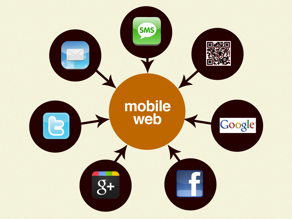
What’s more is that people are arriving to the mobile Web through more diverse channels than ever before. In addition to direct and referral traffic, candidates are using social networks, email campaigns, SMS campaigns, search and more. Because these activities are increasingly happening on mobile, creating Web experiences optimized for mobile makes even more sense for the candidates.
The candidates see mobile as a big opportunity to turn visitors into voters. We can see the candidates’ incentive, but now we must ask another important “Why” question.
Why Would Anyone Visit A Candidate’s Website?
Who is visiting these candidates’ websites? What are they looking for? Why might they want on a mobile device?
Visitors are generally either looking for information on the candidates or looking to take action.
The Information-Oriented Visitor
The information-oriented user might be looking for basic information about the candidate, such as his biography, background or stance on issues. They might also be interested in regularly updated information such as news, locale-specific blog posts and information like myth busting (where the candidate tries to dispel nasty rumors circulating in the media). The official websites give the candidates a chance to deliver information straight from the horse’s mouth, free from news media bias and inaccuracies that arise from crowd-sourced information.
The Action-Oriented Visitor
The action-oriented user is looking to support the candidate in some way, shape or form. Both websites prominently feature calls to action asking visitors to donate money to the campaign and to sign up for their email newsletter. Action-oriented users might also want to connect with the candidates on social media channels, volunteer their time at an event, make calls on the candidate’s behalf or shop for merchandise.
The candidates have accounted for these use cases in their Web experiences. Let’s look at how they execute on mobile.
Criteria For Judging: Layon’s Theory Of Mobile Motivation
The effectiveness of Romney and Obama’s positions on the economy, foreign policy, social issues and other important subjects depends on certain criteria. Likewise, we need to establish a set of criteria to determine the effectiveness of the candidates’ mobile Web experiences.
Mobile Web designer Kristofer Layon has a clever way of looking at the hierarchy of mobile needs. His “theory of mobile motivation” is based on Maslow’s hierarchy of needs, a psychological theory that identifies the various levels of human needs.
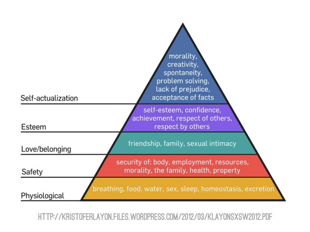
Kristofer Layon has applied that theory to the needs of mobile Web users, where primary access and navigation are the most essential aspects of an experience, and at the top of the pyramid are HTML5 enhancements (such as offline storage and a boatload of other features).
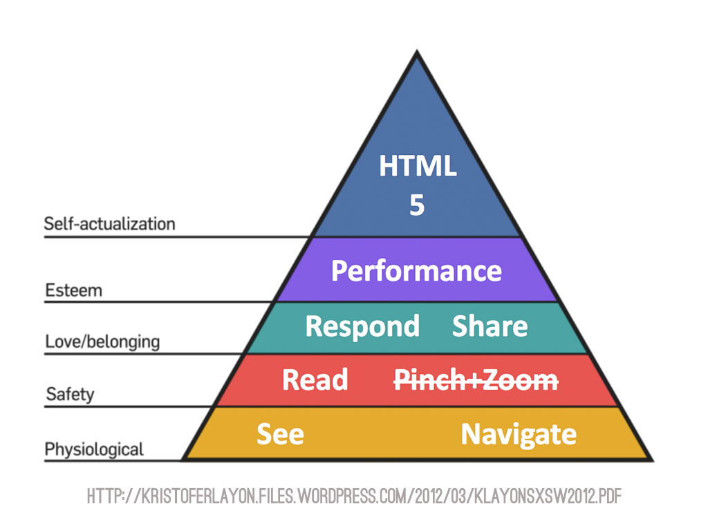
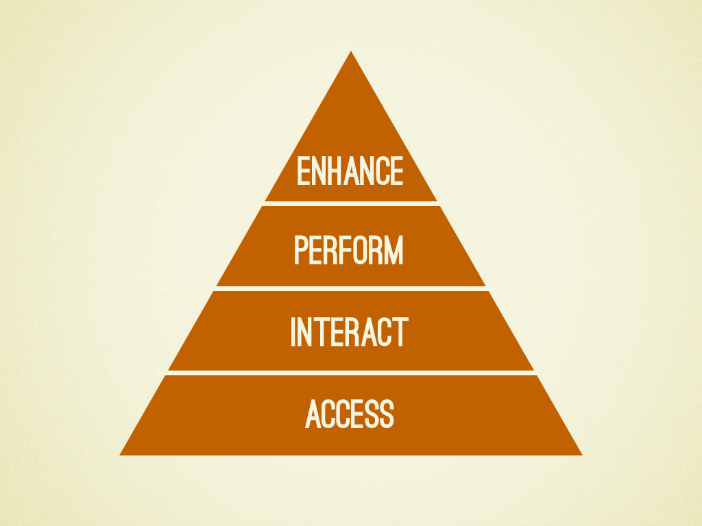
Let’s apply a simplified version of Kristofer’s hierarchy to evaluate how well each candidate’s website holds up.
Access
First and foremost, users need to be able to access an experience. The most beautiful design in the world will accomplish nothing if people can’t view it. Historically, the mobile Web has been viewed as the Web Lite™, whose users get served only a subset of content and functionality. However, a whopping 28% of US residents use a mobile device as their primary way to access the Web. With more people relying on their mobile devices to access the Web, achieving content parity and giving users access to a full experience regardless of their device or configuration are more important than ever. Let’s see how the presidential candidates’ mobile Web experiences hold up.
Barack Obama
Barack Obama’s “mobile” website has no “full site” link because it shares the same code base as the “desktop” website. Content on a responsive website lives under one roof, which gives the website a better chance of achieving content parity. And while responsive designers can (and do) hide content from small-screen users, responsive design affords less opportunity to fork the content and create disparate experiences, which would deprive certain users of valuable information and features.
Mitt Romney
Mitt Romney’s website uses device detection to route mobile users to a separate dedicated website. Creating this separate experience allows the designers to tailor the mobile Web experience, but a separate design and subdomain also opens the door to some serious problems.
The main problem with Mitt Romney’s mobile website is that only a fraction of the full website’s features are included.

It’s a myth that mobile users don’t want access to all of the information and functionality available to desktop users. The absence of key content on Romney’s mobile website leaves a lot of serious questions unanswered for potential supporters, such as “Who is this guy, anyway?,” “Where does he stand on issues?,” “What’s his plan for the economy?,” “What can he do for my state?” and “Where can I shop?”
Another common problem with separate mobile websites is URL management. Because desktop and mobile content live at separate URLs, device detection is required to route users to the appropriate site. Unfortunately, many websites don’t go deep enough in their URL redirection, so desktop users will get sent to mobile content and vice versa. This becomes apparent when mobile content gets shared by mobile users on social networks and then gets accessed by desktop users:
As we can see, having Web content all under the same roof and URL definitely makes it easier to give visitors access to the content they’re looking for, regardless of the device they happen to be using.
Interact
Basic access to a website is essential, but what happens once the visitor is on the website? They need to be able to interact with the content and get around the website. Let’s start with one of the most common and important interactions: navigation.
Navigation
Navigation, especially on mobile, should be like a good friend: there when you need it, but considerate enough to give you your space. When navigation takes up a ton of real estate, it gets in the way and becomes that annoying friend who won’t leave you alone. When it’s inaccessible, hidden or just hard to reach, it becomes that friend who’s conveniently absent when you’re looking for help to move to your new apartment.
Barack Obama
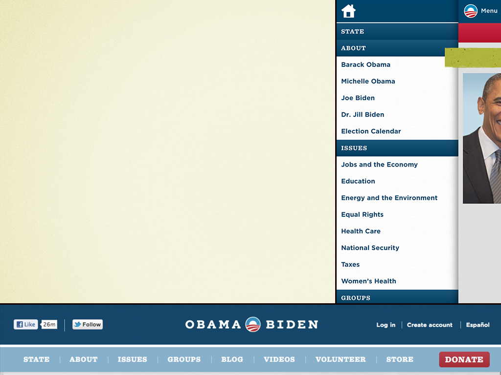
Obama’s website has Facebook-esque left fly-out navigation for small screen resolutions. Among popular responsive techniques, this one is relatively complex and opens the door to problems. As Stephanie Rieger points out in her post “A Plea for Progressive Enhancement,” Obama’s navigation fails on a whole load of mobile devices: “And the menu failed. Never even opened. Suddenly, the site was without navigation… at all.”
These situations, regardless of approach, can be avoided using proper progressive-enhancement techniques, but it’s a good example of the challenges that arise when creating adaptive experiences.
Mitt Romney
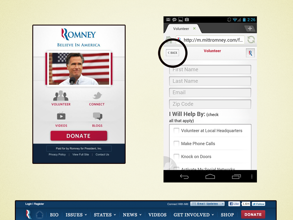
Romney’s relatively simple mobile navigation contrasts starkly with Obama’s navigation. It sits as a dashboard on the home page, and all inner pages simply include a “Back” button and a logo that links back to the home page.
This navigation technique certainly solves the problem of limited real estate and avoids complexity, but it creates other issues. Requiring a full page refresh just to jump to another section of the website isn’t very efficient. A logo as a button doesn’t exactly scream “Click me for navigation!” And the “Back” button does nothing if the visitor arrives at the website on a page other than the home page. It’s also worth noting that mobile browsers already have their own back buttons, so duplicating that functionality in the header could be regarded as wasted space.
Scrolling
Scrolling is an interesting interaction on mobile devices. The “fold” as a set pixel value is a myth, but users still need to be able to access the core content as quickly as possible.
Mitt Romney
Romney’s mobile website has an acceptable page length. Not much chrome or clutter before you get to the core content, and for the most part the user doesn’t have to scroll much to find what they need.
Barack Obama
Obama’s pages contain a massive amount of content, often introducing entirely new sections far down in the flow. The result is extremely long pages that have serious problems.

Scrolling through disparate content types is not a good experience. How do users figure out that other content exists? Finding what they’re looking for becomes a scavenger hunt. While they might be all right with sifting through one or two content types (for example, a blog’s main article and subsequent sidebar), a lot of disparate types makes the content unfindable and the page impractical.
While content parity is essential for mobile users, that doesn’t mean websites have to be one size fits all. Techniques like lazy loading and conditional loading enable Web creators to provide access to full content without having to stuff it all on the page at the same time. And while those techniques can be extremely effective, there’s no substitute for subtracting supplementary content everywhere to focus on core content.
In addition to the annoyance caused by having to scroll through so much content, these massively long pages have another downside: terrible performance.
Perform
Performance has gotten the short end of the stick. Web creators have assumed too much about the user’s context (“Of course, the user has a fast connection!” “Of course, their machine is powerful!”). As a result of these convenient assumptions, the average page now weighs a whopping 1 MB.
One MB might not seem like a big deal until we look at the mobile user’s expectations. 71% of mobile users expect mobile websites to load as fast, if not faster, than desktop websites, and 74% of mobile visitors will abandon a website if it takes more than 5 seconds to load. In other words, you have 5 seconds to get someone’s attention. Make it count.
To evaluate how well the candidates’ websites perform, we’ll use the excellent Blaze.io mobile performance test to capture performance results on real devices.
Mitt Romney
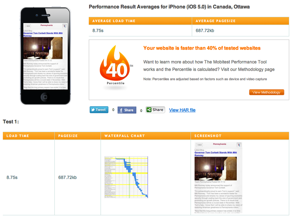
A typical page on Romney’s mobile website is about 687 KB and, as a result, takes about 8.75 seconds to load. While that’s over the 5-second mark, the pages still weigh less than the average size.
Barack Obama
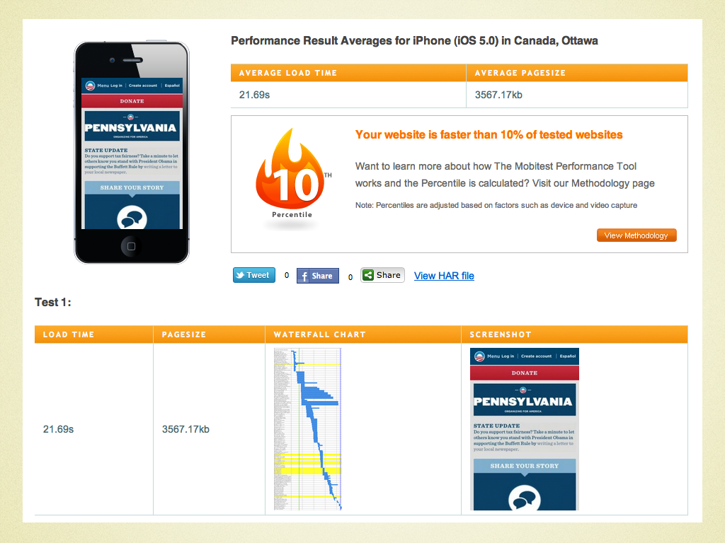
A typical page on Obama’s responsive website is a massive 4.2 MB, resulting in a 25-second loading time.
Despite the fact that only the most patient of visitors would wait 25 seconds for a page to load, such a large payload creates real accessibility problems. Some devices (such as my cousin’s company-issued BlackBerry) won’t even render the page because it’s too large.

While some of this is RIM’s or my cousin’s employer’s doing, it’s a legitimate constraint that we need to be mindful of.
Unfortunately, poor performance is prevalent among the current crop of responsive designs in the wild. Guy Podjarny, chief product architect at Akamai and CTO of Blaze.io, discovered that only 3% of small-screen versions of responsive websites are significantly lighter than their large-screen counterparts. This is all the more reason to focus on performance as a key component of adaptive Web design.
Enhance
We’ve talked about content parity and the importance of providing access to information and functionality regardless of device or configuration. But that doesn’t mean we have to settle on serving a one-size-fits-all experience. Many mobile devices and browsers can do things that desktops cannot. Making the most of these wonderful features will take the mobile experience to the next level.
Mobile Communication
Obama’s designers have implemented one huge enhancement: the ability to make calls on the candidate’s behalf directly from a phone. We tend to forget that mobile phones are, at root, voice-based communication devices and that mobile browsers can initiate a call when the user clicks a tel link. By exploiting this enhancement, Obama is able to mobilize his mobile users into action, which could have a big impact on the campaign.
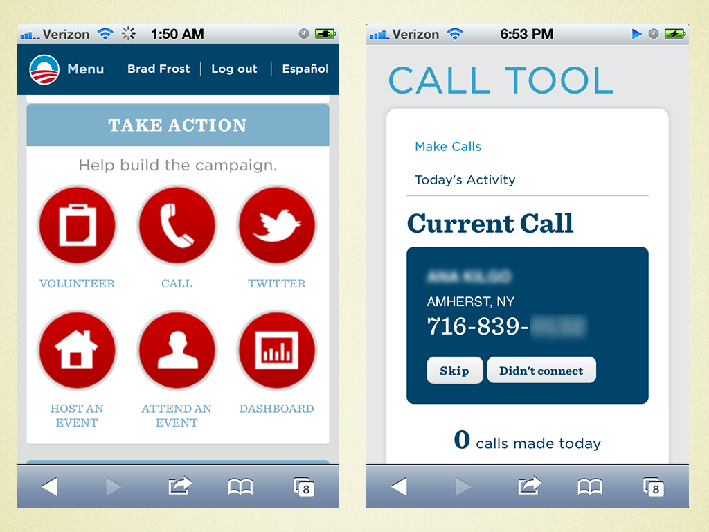
Besides enabling phone calls to be initiated from the browser, there are many other opportunities for mobile enhancement. Here are just a few ways that both websites could enhance the experience and make the most of the mobile Web.
Simple Form Enhancements
The great thing about form enhancements is that they require barely any effort. One enhancement for many mobile browsers is to specify an HTML5 input type to pull up the appropriate virtual keyboard for the user. While this enhancement isn’t particularly mind-blowing, anything that allows the user to complete their task more quickly certainly helps and could lead to more conversions.
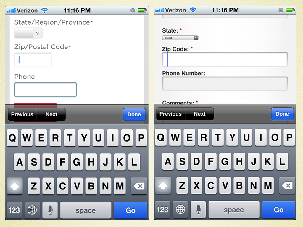
input type=number would pull up the appropriate virtual keyboard, thus saving the user an extra step.Geolocation
Detecting location is an extremely powerful way to provide users with contextually relevant information. Imagine dynamically displaying blog posts, news and upcoming events relevant to the user’s location. Obama’s website smartly allows users to choose their state; perhaps they could take it further and add geolocation as a way to identify it. Geolocation can also save steps when filling out forms, and it creates opportunities for innovative new features.
Touch Events
The beauty of touchscreens is that they give users a way to interact directly with content and can add a layer of fun to the experience. These websites could leverage touch events to allow users to swipe through photos in a gallery or to thumb through a quick overview of the candidates’ stances on important issues.
Many More
This is just a small sampling of enhancements. Support for a ton of features can be detected, and a ton of use cases emerge from the plethora of devices that access the Web. Ask questions. “Can I offer features that are useful to users on the go?” “How might I use offline storage to improve the experience?” “How can I take advantage of touch events?” Lay a solid foundation, and look for opportunities to enhance.
So, Who Wins?
If there’s one lesson to learn from analyzing these websites and techniques, it’s that this stuff is genuinely hard. A lot goes into making a great mobile Web experience, and I’m personally thrilled that the candidates have taken the important first steps toward making their websites mobile-friendly. Viewing the mobile web as a wonderful journey and not as a destination is absolutely essential. As we step into the deep end of multi-device Web design, we must strive to continually improve our websites and services in order to better serve our users — wherever they may be.
While the design of a candidate’s website might not determine the outcome of the presidential election, it will certainly influence how the world perceives the candidate. And for a Web-savvy voter like myself, a website’s design might just sway my vote. I know who I’m voting for in November!
Further Reading
- Building A Better Responsive Website
- Responsible Considerations For Responsive Web Design
- Losing Users If Responsive Web Design Is Your Only Strategy
- How To Provide The Greatest Mobile User Experience Possible


 See User Testing Live
 Custom Web Forms for Angular, React, & Vue. Your backend.

 Celebrating 10 million developers


