Server-Side Device Detection: History, Benefits And How-To

Email Newsletter
Weekly tips on front-end & UX.
Trusted by 200,000+ folks.


 Register!
 Flexible CMS. Headless & API 1st
Disclaimer: This article is published in the Opinion column section in which we provide active members of the community with the opportunity to share their thoughts and ideas publicly. Do you agree with the author? Please leave a comment. And if you disagree, would you like to write a rebuttal or counter piece? Leave a comment, too, and we will get back to you! Thank you.
The expansion of the Web from the PC to devices such as mobile phones, tablets and TVs demands a new approach to publishing content. Your customers are now interacting with your website on countless different devices, whether you know it or not.
As we progress into this new age of the Web, a brand’s Web user experience on multiple devices is an increasingly important part of its interaction with customers. A good multi-device Web experience is fast becoming the new default. If your business has a Web presence, then you need fine-grained control over this experience and the ability to map your business requirements to the interactions that people have with your website.
Drawing on the work of people behind the leading solutions on the market, we’ll discuss a useful tool in one’s armory for addressing this problem: server-side device detection.
The History Of Sever-Side Device Detection
First-generation mobile devices had no DOM and little or no CSS, JavaScript or ability to reflow content. In fact, the phone browsers of the early 2000s were so limited that the maximum HTML sizes that many of them handled was well under 10 KB; many didn’t support images, and so on. Pages that didn’t cater to a device’s particular capabilities would often cause the browser or even the entire phone to crash. In this very limited environment, server-side device detection (“device detection” henceforth) was literally the only way to safely publish mobile Web content, because each device had restrictions and bugs that had to be worked around. Thus, from the very earliest days of the mobile Web, device detection was a vital part of any developer’s toolkit.
With device detection, the HTTP headers that browsers send as part of every request they make are examined and are usually sufficient to uniquely identify the browser or model and, hence, its properties. The most important HTTP header used for this purpose is the user-agent header. The designers of the HTTP protocol anticipated the need to serve content to user agents with different capabilities and specifically set up the user-agent header as a means to do this; namely, RFC 1945 (HTTP 1.0) and RFC 2616 (HTTP 1.1). Device-detection solutions use various pattern-matching techniques to map these headers to data stores of devices and properties.
With the advent of smartphones, a few things have changed, and many of the device limitations described above have been overcome. This has allowed developers to take shortcuts and create full-fledged websites that partially adapt themselves to mobile devices, using client-side adaptation.
This has sparked the idea that client-side adaptation could ultimately make device detection unnecessary. The concept of a “one-size-fits-all” website is very romantic and seductive, thanks to the potential of JavaScript to make the device-fragmentation problem disappear. The prospect of not having to invest in a device-detection framework makes client-side adaptation appealing to CFOs also. However, we strongly believe that reality is not quite that simple.
The Importance Of Device Detection
Creating mobile websites with a pure client-side approach, including techniques such as progressive enhancement and responsive Web design (RWD), often takes one only so far. Admittedly, this might be far enough for companies that want to minimize the cost of development, but is it what every company really wants? From our long experience in the mobile space, we know one thing for sure: companies want control over the user experience. No two business models are alike, and slightly different requirements could affect the way a website and its content are managed by its stakeholders. That’s where client-side solutions often fall short.
We will look more deeply at the main issue, one that engineers and project managers alike will recognize: no matter how clever they are, usually “one-size-fits-all” approaches cannot really address the requirements of a large brand’s Web offering.
Catering To Devices And Business Requirements
The first point to note is that not all devices support modern HTML5 and JavaScript features equally, so some of the problems from the early days of the mobile Web still exist. Client-side feature detection can help work around this issue, but many browsers still return false positives for such tests.
The other problem is that a website might look OK to a user on a high-end device with great bandwidth, but in the process of creating it, several bridges have been burned and very little room has been left for the adjustments, backtracking and corrections brought about by the company’s always-evolving business model (let alone the advent of a new class of HTTP clients on the market). The maintenance of responsive Web sites is difficult. As an analogy, an engineer who deals with responsive Web design is like a funambulist, up in the air, on a long wire, with a pole in their hands for balance, standing on one leg, with a pile of dishes on their head. They might have performed well so far, but there is little else that one can reasonably ask them to do at this point.
Device-detection engineers are in a luckier situation. Each one of them has a lot more freedom to deliver the final result to the various target platforms, be it desktop, mobile or tablet. They are also better positioned to address unexpected events and changes in requirements. Extending the analogy, device-detection engineers have chosen different ways (than the suspended wire) to reach their destinations. One person is driving, another is on a train, yet another is biking, and a fourth is on a helicopter. The one with the car decided to stop at a motel for the night and rest a bit. The one in the helicopter was asked to bring the CEO to Vegas for a couple of days. No big deal; those changes were unexpected, but the situation is still under control.
No analogy is perfect, but this one is pretty close. Device detection might seem to cost significantly more than responsive design, but device detection is what gives a company control. When the business model changes, device detection enables a company to shuffle quite a few things around and still avoid panic mode. One way to look at it is that device detection is one application of the popular divide-and-conquer strategy. On the other hand, RWD might be very limiting (particularly if the designer who has mastered all of that magic happens to have changed jobs).
While many designers embrace the flexible nature of the Web, with device detection, you can fine-tune the experience to exactly match the requirements of the user and the device they are using. This is often the main argument for device detection — it enables you to deliver a small contained experience to feature phones, a rich JavaScript-enhanced solution to smartphones and a lean-back experience to TVs, all from the same URL.
In my opinion, no other technique has this expressive range today. This is the reason why Facebook, Google, eBay, Yahoo, Netflix and many other major Internet brands use device detection. I’ve written about how Facebook and Google deliver their mobile Web experiences over on mobiForge.
Speed And Efficiency
Device detection has some other key attributes in addition to flexibility and control:
- Rendering speed.
Because device-detection solutions can prepare just the right package of HTML and resources on the server, the browser is left to do much less work in rendering the page. This can make a big difference to the end-user experience and evidently is part of the reason why Twitter recently abandoned its client-side rendering approach in favor of a server-side model. - Efficiency.
Device-detection solutions allow the developer to send only the content required to the requesting browser, making the process as efficient as possible. Remember that even if you have a 3G or Wi-Fi connection, the effective bandwidth available to the user could be greatly less than it should be; ask anyone who has used airport Wi-Fi or congested cellular data on their mobile device. This can make the difference between a page that loads in a couple of seconds and one that never finishes loading, causing the user to abandon the website in frustration. - Choice of programming language.
You can implement the adaptation logic in whatever programming language you want, instead of being limited to just JavaScript.
Fine-Tuning Content To Device Capabilities
Another area where device detection has an advantage is in fine-tuning media formats and other resources delivered to the device in question. A good device-detection system is able to inform you of the exact media types supported by the given device, from simple image formats such as PNG, JPEG and SVG to more advanced media formats involving video codecs and bit rates.
Server-Side Vs. Client-Side Detection
Many client-side JavaScript libraries have recently been released that enable developers to determine certain properties of the browser with a simple JavaScript API. The best known of these libraries is undoubtedly Modernizr. These feature tests are often coupled with “polyfills” that replace missing browser capabilities with JavaScript substitutes. These clients-side feature-detection libraries are very useful and are often combined with server-side techniques to give the best of both worlds, but there are limitations and differences in approach that limit their usefulness:
- They detect only browser features and cannot determine the physical nature of the underlying device. In many cases, browser features are all that is required, but if, for example, you wish to supply a deep link to an app download for a particular Android OS version, a feature detection library typically cannot tell you what you need to know.
- The browser features are available only after the DOM has loaded and the tests have run, by which time it is too late to make major changes to the page’s content. For this reason, client-side detection is mostly used to tweak visual layouts, rather than make substantive changes to content and interactions. That said, the features determined via client-side detection can be stored in a cookie and used on subsequent pages to make more substantive changes.
- While some browser properties can be queried via JavaScript, many browsers still return false positives for certain tests, causing incorrect decisions to be made.
- Some properties are not available at all via Javascript; for example, whether a device is a phone, tablet or desktop, its model name, vendor name and maximum HTML size, whether it supports click-to-call, and so on.
While server-side detection does impose some load on the server, it is typically negligible compared to the cost of serving the page and its resources. Locally deployed server-side solutions can typically manage well in excess of tens of thousands of recognitions per second, and far higher for Apache and NGINX module variants that are based on C++. Cloud-based solutions make a query over the network for each new device they see, but they cache the resulting information for a configurable period afterward to reduce latency and network overhead.
The main disadvantages of server-side detection are the following:
- The device databases that they utilize need to be updated frequently. Vendors usually make this as easy as possible by providing sample cron scripts to download daily updates.
- Device databases might get out of date or contain bad information causing wrong data to be delivered to specific range of devices.
- Device-detection solutions are typically commercial products that must be licensed.
- Not all solutions allow for personalization of the data stored for each device.
Time For A Practical Example
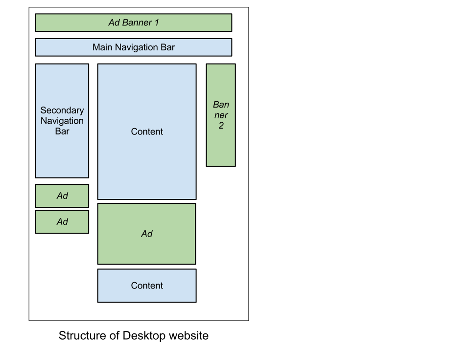
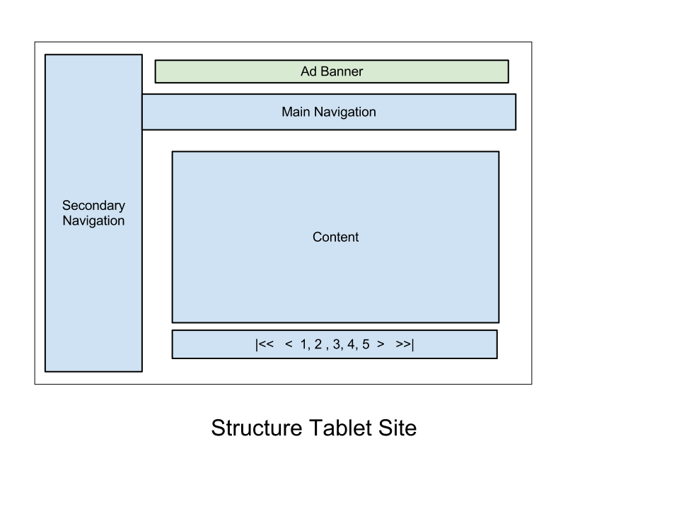
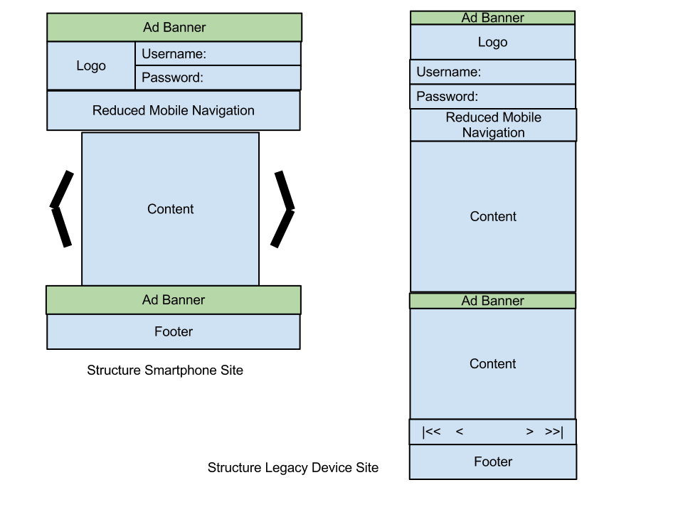
Having covered all of that, it’s time for a practical example. Let’s say that a company wishes to provide optimized user experience for a variety of devices: desktop, tablets and mobile devices. Let’s also say that the company splits mobile devices into two categories: smartphone and legacy devices. This categorization is dictated by the company’s business model, which requires optimal placement of advertising banners on the different platforms. This breakdown of “views” based on the type of HTTP client is often referred to as “segmentation.” In this example, we have four segments: desktop, tablets, smartphones and legacy mobile devices.
Some notes:
- The green boxes below represent the advertising banners. Obviously, the company expects them to be positioned differently for each segment. Ads are typically delivered by different ad networks (say, Google AdSense for the Web and for tablets, and a mobile-specific ad network for mobile).
- In addition to banners, the content and content distribution will vary wildly. Not all desktop Web content is equally relevant for mobile, so a less cluttered navigation model would make more sense.
- We want certain content to be available in the form of a carousel (i.e. slideshow) for tablets, but not other devices.
- Mobile should be broken down in smartphone and legacy devices. (Some companies want to stick to smartphones exclusively, whereas supporting the long tail of legacy devices would make more business sense for other companies, such as this one.)
We will show how the segmentation above can be achieved through device detection. A note about the main device-detection frameworks out there first.
Server-Side Detection Frameworks
Device-detection frameworks are essentially built around two components: a database of device information and an API that lets one associate an HTTP request or other device ID to the list of its properties. The main device-detection frameworks out there are WURFL by ScientiaMobile and DeviceAtlas by dotMobi. Another player in this area is DetectRight.
The code snippets below refer to the WURFL and DeviceAtlas APIs and show a rough outline of how an application could be made to route HTTP requests in different directions to support each segment.
The two frameworks are available either as a standalone self-hosted option or in the cloud. The pseudo-code below is inspired by the frameworks’ respective cloud APIs and should be easily adaptable by PHP programmers as well as programmers on other platforms.
A note about dispatching HTTP requests: The concept of “dispatching” a URL request is familiar to most Java and .NET programmers because most popular frameworks rely on it. Basically, it is about “assigning” an HTTP request to an appropriate “handler” behind the scenes, without implications for the URL that triggered all of the action. While not always immediately obvious, the same approach is also possible in all other Web programming languages. In PHP, it’s about having a “controller” PHP file invoke a different PHP file to handle the request.
DeviceAtlas
<?php

// include DeviceAtlas cloud API
include './DeviceAtlasCloud/Client.php';
$test_mode = false;

// get device data from the cloud
$da_data = DeviceAtlasCloudClient::getDeviceData($test_mode);

if (isset($da_data[‘properties’][‘isBrowser’])) {
  // Dispatch HTTP request to desktop view
} else {
  if (isset($da_data[‘properties’][‘isTablet’])) {
     // Dispatch HTTP request to tablet view
  } else {
     if (isset($da_data[‘properties’][‘mobileDevice’])) {
        // time to handle mobile devices
      if ($da_data['properties']['displayWidth'] < 320) {
            // Dispatch HTTP request to feature phone view
      }
     }
  }
}
// Dispatch HTTP request to SmartPhone view
?>
WURFL
<?php

// Include the WURFL Cloud Client
require_once '../Client/Client.php';

// Create a configuration object
$config = new WurflCloud_Client_Config();

// Set your WURFL Cloud API Key
$config->api_key = 'xxxxxx:xxxxxxxxxxxxxxxxxxxxxxxxxxxxxxxx';

// Create the WURFL Cloud Client
$client = new WurflCloud_Client_Client($config);

// Detect your device
$client->detectDevice();

if ($client->getDeviceCapability('ux_full_desktop')) {
  // Dispatch HTTP request to desktop view
} else {
  if ($client->getDeviceCapability('is_tablet')) {
     // Dispatch HTTP request to tablet view
  } else {
     if ($client->getDeviceCapability('is_wireless_device')) {
        // time to handle mobile devices
      if ($client->getDeviceCapability(‘resolution_width') < 320) {
            // Dispatch HTTP request to feature phone view
      }
     }
  }
}
// Dispatch HTTP request to SmartPhone view
?>
Of course, the dispatching part will involve the execution of the relevant PHP files (tabletView.php, desktopView.php, etc.). It goes without saying that each of those PHP files will need to be dedicated to supporting one user experience, not multiple ones (with the possible exception of minor UX adjustments within the view itself, which is always possible — there is no reason why, say, tabletView.php could access device-detection and further optimize the user experience for, say, an iPad user).
We picked PHP for the example above, but Java, .NET and many other languages are equally well supported. Any programmer in any language will make sense of the code above.
For the sake of simplicity, let’s define a smartphone as any device whose screen is wider than 320 pixels. This probably does not quite cut it for you. Engineers can use any capability or combination of capabilities to define smartphones in a way that makes sense for the given company’s business model.
The following table lists the capabilities involved in the example above. Each device-detection solution comes with hundreds of capabilities that can be used to adapt a company’s Web offering to the most specific requirements. For example, Adobe Flash support, video and audio codecs, OS and OS version, browser and browser version are all dimensions of the problems that might be relevant to supporting an organization’s business model.
| Category | WURFL Capability | DeviceAtlas Property |
|---|---|---|
| Desktop Web browser | ux_full_desktop | isBrowser |
| Tablet | is_tablet | isTablet |
| Mobile device | is_wireless_device | mobileDevice |
| Display width | resolution_width | displayWidth |
Image Resizing
One aspect that we did not touch on in our example but that certainly represents one of the main use cases of device detection is image resizing. Serving a large picture on a regular website is fine, but there are multiple reasons why sending the same picture to a mobile user is not OK: mobile devices have much smaller screens, (often) more limited bandwidth and more limited computation power. By providing a lower resolution and/or a smaller size of the picture, the mobile UX is made acceptable. There are two approaches to image resizing:
- Each published image can be created in multiple versions, with device detection used to serve a pointer to the most appropriate version for that device or browser.
- Software libraries such as JAI, ImageMagick and GD can be used to resize images on the fly, based on the properties of the requesting HTTP client.
An interesting article on .net magazine, “Getting Started With RESS,” shows an example of server-side enhanced RWD — i.e. how a website built with RWD can still benefit from image resizing and server-side detection. This technique is commonly referred to as RESS (responsive design + server-side components).
Single-URL Entry Points
We touched on this already when mentioning the dispatching of HTTP requests. Segmenting your content could lead to the mapping of different segments into different URLs. This in itself is not good because users might exchange links across devices, resulting in URLs that point to the wrong experience. It doesn’t need to to be that way, though. Proper design of your application (and proper management of URLs) makes it possible to have common URL entry points for all segments. All you need to do is dispatch your request internally. This is easily achievable with pretty much any development language and framework around.
Criticism Of Device Detection
Recently, we have observed a certain level of criticism of device detection and have found it odd. After all, device detection is an option for those who want extra control, not a legal obligation of any kind. Much of this criticism can be traced back to the abstract ideal of a unified Web (“One Web” is the key term here). Ideals are nice, but end users don’t care about ideals nearly as much as they care about a decent experience. In fact, if we called end-users by their other name, i.e. consumers, the sentence above would make even more immediate sense to everyone. How can anyone be surprised that companies care about controlling the UX delivered to their consumers, by whatever means they choose?
Interestingly, one doesn’t need to go any further than this website to hear vocal critics of server-side detection (or UA-sniffing, as they disparagingly call it). Interestingly, Opera adopted WURFL (a popular open-source device-detection framework) to customize its content and services for mobile users. In addition, the Opera Mini browser sends extra HTTP headers with device information to certain partners to enable better server-side fine-tuning of the user experience (X-OperaMini-Width/Height). For good measure, the device original’s user-agent header is also preserved in the X-OperaMini-Phone-Ua header. In short, ideals are one thing, but then there is the reality of the devices that people have in their hands.
Conclusion
Client-side detection is a viable way to render websites on smartphones and tablets. We believe that the approach is unlikely to afford the level of optimization, control and maintainability that enterprises demand for their Web (and mobile Web) content and services. In these cases, we are confident that server-side detection still represents the best and most cost-effective solution to deliver a rich Web experience to multiple devices.
About DeviceAtlas
For organizations and brands with business critical applications, DeviceAtlas provides rich, actionable intelligence on the devices that your customers are using, using data sourced from major industry partners. This server-side enterprise-grade device-detection solution is highly extensible and customizable, delivering unsurpassed accuracy for mobile device detection, testing and analysis. Cloud, locally deployed and OEM options are available.
About WURFL
Created in 2002, WURFL (Wireless Universal Resource FiLe), is a popular open-source framework to solve the device-fragmentation problem for mobile Web developers and other stakeholders in the mobile ecosystem. WURFL has been and still is the de facto standard device-description repository adopted by mobile developers. WURFL is open source (AGPL v3) and a trademark of ScientiaMobile.
Related Articles
- “Device-Agnostic Approach to Responsive Design”
- “Responsive Web Design Techniques, Tools and Design Strategies”
- “How to Build a Mobile Website”
- “Why We Shouldn’t Make Separate Mobile Websites”
- “Guidelines for Responsive Design”
- “Responsive Images With Wordpress”
Further Resources
- WURFL Cloud, ScientiaMobile A platform for Java, PHP, .NET, Python and Ruby. Includes a free offer.
- “WURFL Cloud: Getting Started,” ScientiaMobile
- Blog, ScientiaMobile
- Community Support Forum, ScientiaMobile
- “WURFL capabilities,” ScientiaMobile A list of device capabilities.
- DeviceAtlas
- DeviceAtlas Cloud
- White Papers, DeviceAtlas White papers on benchmarking your device-detection strategy and the future of the mobile Web.
Further Reading
- Server-Side Device Detection With JavaScript
- Building A Better Responsive Website
- Lightening Your Responsive Website Design With RESS
- Losing Users If Responsive Web Design Is Your Only Strategy
 (al, mrn)

